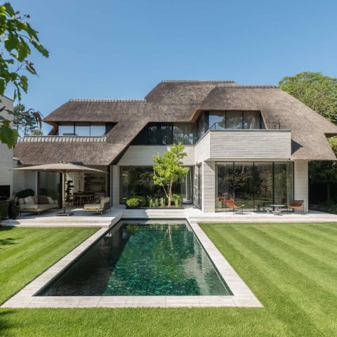
Classic family home with a characterful, robust interior
Brickwork sets the tone before the interior appears: a classic family home with a dark front door, shuttered windows and a measured, symmetrical rhythm in the openings. The garden sits close to that order, with clipped lawn edges, neat borders and a paved approach that leads the eye straight to the entrance. It is a house that reads clearly from the street, yet the details keep changing as you move closer.
Classic brick facade with dark doors, windows and shutters
The classic brick facade gains depth from its dark joinery. Windows, shutters and the front door all sit in contrast to the masonry, so the wall surface never feels flat. A stone arch around one window adds a slower note to the elevation, while the paired roof volumes keep the profile compact. The result is calm rather than ornamental, with the brick doing most of the work.
Across the front, the garden is arranged with the same restraint. Lawns run up to crisp edges, planting beds stay low, and the path to the entrance stays direct. In the wider exterior views, a timber outbuilding appears beside the main house, its wood cladding and double doors set against the brick house and the paving in front of it. That contrast of materials keeps the site readable from one image to the next.
A stair hall defined by dark flooring and a black balustrade
Inside, the tone changes immediately. A dark slate-like floor, laid in large tiles with pale grout lines, gives the hall a grounded feel and carries that effect into the adjoining rooms. The black balustrade at the staircase repeats the dark line of the floor, while white walls and a glazed internal door prevent the space from closing in. Light from the larger openings settles on the surface without softening the material contrast.
The stair hall feels less like a passage than a hinge between rooms. One view opens toward the dining area; another takes in the threshold and the geometry of the doorframes. Those black frames and clear lines help the route through the house stay legible. Even without decorative extras, the space has enough variation in texture to keep it from feeling spare: tile, metal, glass and plaster all register at once.
Living room with fireplace and white mantel surround
The living room is anchored by a fireplace that combines a brick core with a white mantel surround. Seen from across the room, the fireplace reads as a solid block, set into the dark floor and framed by light walls. The firebox and masonry make the room feel weighty, while the painted surround gives it a cleaner edge. It is the clearest example of the project’s robust interior with fireplace, built from a few firm materials rather than layered decoration.
Large windows bring in views of the garden and pull daylight across the seating area. Curtains soften the perimeter, but the room keeps its clear structure: fireplace at one end, seating in front, openings to the outside beyond. The dark floor helps the furniture settle in the room, and the white mantel keeps the fireplace visible even when the fire is not lit. In this part of the house, the character comes from proportion and material contrast, not from excess detail.
Fireplace wall and room edge
From a closer angle, the fireplace wall shows its layered construction more clearly: brick at the centre, a pale surround around it, and a dark floor that grounds the whole composition. The room edge remains clean, with minimal trim and straight wall surfaces. That simplicity lets the fireplace hold attention without competing with nearby elements.
Kitchen and dining area with wood fronts and glass cabinets
The kitchen and dining area shifts the palette toward wood, glass and stone. Cabinet fronts run in a warm timber finish, while glass-fronted cupboards introduce reflection and a lighter visual rhythm above the worktops. The kitchen island sits in the middle of the room as a working surface rather than a display piece, with a stone-like top and a compact, practical footprint. The kitchen with wood fronts keeps the room grounded, and the dining zone stays close enough for the two to function as one space.
Look closer and the joinery becomes the main feature. Glass cabinet doors expose shelves and dishware, turning storage into part of the composition. The island’s top catches light differently from the wood below it, so the horizontal plane is easy to read. Hanging lights above the table add another layer, but they remain modest against the larger shapes of the room. This is a kitchen dining area where the materials stay visible and the layout stays clear.
Black window frames and white wall surfaces sharpen the edges around the kitchen. A glazed connection between rooms keeps sightlines open, so the dining area does not feel cut off from the hall or living zone. The result is less about a single showpiece than about the way the joinery, floor and openings line up. In the project as a whole, that measured alignment matters as much as any individual cabinet or table.
A timber outbuilding that extends the material story
Outside, the timber outbuilding gives the property another layer of texture. Its wood-clad surfaces, dark roof and wide double doors stand apart from the masonry of the main house, yet the material language stays connected through the use of strong, plain forms. Seen from the paved area, the outbuilding feels practical and deliberately drawn, with no attempt to disappear into the background.
That same clarity shows in the side terrace view, where the house opens to a covered outdoor zone beside large windows. The paving runs along the base of the wall, linking the house to the exterior rooms and the outbuilding beyond. Across the different views, the project keeps returning to the same few elements: brick, dark joinery, timber, stone-like flooring and a fireplace with a white surround. Each one is used plainly, and that is what gives the house its strong read.
Why the exterior and interior speak the same language
The classic brick facade and the robust interior with fireplace are not separate stories here. Dark shutters, black frames, slate-like flooring and wood joinery repeat the same disciplined palette from outside to inside. Even the timber outbuilding picks up that logic in another material. The project does not rely on display pieces; it relies on surface, line and placement, from the entrance path to the kitchen island.
Want to see more of Vlassak-Verhulst? View the page of Vlassak-Verhulst for even more great projects and company information.




NEW 2026 Jubileum Edition The Best Interior Designers Benelux
Order Now €125


NEW 2026 Jubileum Edition The Best Interior Designers Benelux
Order Now €125


NEW 2026 Jubileum Edition The Best Interior Designers Benelux
Order Now €125


NEW 2026 Jubileum Edition The Best Interior Designers Benelux
Order Now €125


NEW 2026 Jubileum Edition The Best Interior Designers Benelux
Order Now €125


NEW 2026 Jubileum Edition The Best Interior Designers Benelux
Order Now €125


NEW 2026 Jubileum Edition The Best Interior Designers Benelux
Order Now €125


NEW 2026 Jubileum Edition The Best Interior Designers Benelux
Order Now €125


NEW 2026 Jubileum Edition The Best Interior Designers Benelux
Order Now €125