










Custom interior design with atrium and integrated kitchen
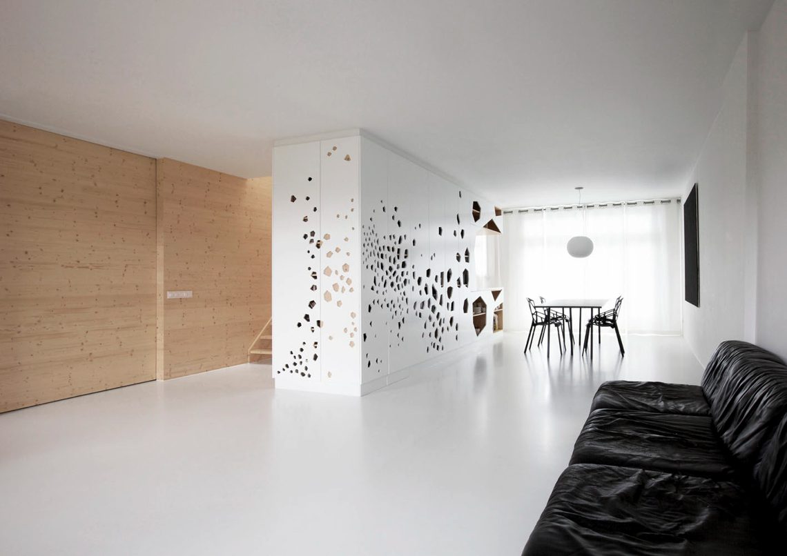
A white room-divider rises from floor to ceiling and sets the tone for the house before the rest of the layout even comes into view. It combines storage, the kitchen, and the hidden services into one continuous piece, with laser-cut fronts that alternate between open and closed sections. The pattern reads as a working surface rather than decoration alone. Around it, the rebuilt plan opens up into a light-filled home, shaped by a central atrium and a stairwell that pulls daylight deep inside.
A layout stripped back for a new domestic rhythm
The original 1930s layout had many small rooms, vestibules, and doors, a remnant of the house’s former service pattern. That structure has been removed almost entirely. In its place is a plan that reads more directly, with fewer interruptions and broader sightlines. Two floors were also brought together: a former storage level above now works with the floor below, giving the interior more height and a clearer vertical movement. The result is not an open plan in the generic sense, but a sequence of rooms that stay connected through light, openings, and the central void.
The atrium is the hinge in that sequence. It gathers the stair, the roof opening, and the circulation in one place, so the house does not rely on borrowed light from the perimeter alone. A glazed sliding roof above the stairwell opens the top of the volume and connects the interior to the roof terrace. That opening changes the way the living spaces feel throughout the day, because daylight lands on the white front panels, the timber walls, and the pale floor with different intensity as it moves across the house.
The room divider as the main piece of custom interior design
At the center of the ground floor, the room divider furniture carries more than one task at once. It conceals construction and pipes, organizes the kitchen, and marks a boundary between zones without building a heavy wall. Its white laser-cut fronts run from floor to ceiling, creating a dense but readable rhythm of solids and voids. Open shelves sit beside closed modules, and the cut pattern doubles as an integrated grip. Because the front is slightly translucent in effect, the piece reads as a layered volume rather than a flat cabinet line.
That layering matters in the room. From one angle the unit appears almost like a screen; from another, it reveals storage depth and the kitchen elements tucked behind the patterned face. The object does not sit apart from the interior. It helps define how the space is used, how the eye passes through it, and where the dining and living areas are allowed to breathe. For a project centered on custom interior design, this is the clearest expression of the brief: one built element carrying the spatial logic of the whole house.
Laser-cut fronts that switch between open and closed
The front pattern is not uniform, and that is what gives the unit its pace. Some sections open to shelves or service space; others close down to cleaner planes. The repetition is broken just enough to avoid a static wall of cabinetry. In the images, the white surfaces catch the light softly while the darker voids give the frontage depth. The effect is most visible when the furniture is seen beside the table and chairs, where the cabinetry reads as part of daily use rather than a standalone display piece.
Wood cladding brings the stairwell into the plan
A long timber wall with a large sliding door separates the first-floor living room from the entrance hall and the adjoining bedrooms. Rather than stopping at one threshold, the wood-clad stairwell continues through the atrium and carries upward, joining the levels into one continuous vertical element. It gives the circulation zone a distinct material presence. The grain is visible, the panels meet in clean joints, and the timber softens the sharper white cabinetry nearby without changing the restraint of the interior.
The stair itself is not treated as a hidden connector. It is part of the room composition. White wall sections, timber lining, and open treads or edges appear together in the images, so movement through the house becomes legible at a glance. The stairwell does more than link floors. It frames views back toward the atrium, brings the upper level into visual contact with the lower one, and gives the house a clear central axis. In a light-filled home like this, that axis is what keeps the plan from feeling loose.
Warm timber against white surfaces
The material contrast stays controlled. White fronts, pale walls, and a light floor create the background, while the timber comes in as a line, a panel, or a full wall surface. In the kitchen area, the wood is seen in the surrounding joinery and in the recessed niches. Elsewhere it wraps the stair volume and the doors. Because the tones stay close to one another, the project avoids visual noise. Instead, the viewer notices the edges where materials meet, the shadow gaps, and the way the timber guides the eye upward.
Light reaches the living areas through the central void
The strongest spatial move in the house is also the simplest: open a clear void, place the stair within it, and cap it with glass. That move allows daylight to travel beyond the atrium and into the living room, where it lands on the white cabinetry and the darker furniture in distinct patches. The roof opening also changes the reading of height. The merged upper level and the atrium together create a vertical section that feels more generous than the original arrangement, yet the interior remains controlled by the custom joinery and the timber partition.
Seen from the living room, the house works through partial views. The kitchen is present, but not exposed all at once. The stair is visible, but not left raw. The bedrooms remain behind the timber wall and sliding door, so the shared zones keep their openness while the private rooms sit slightly withdrawn. That balance is carried by construction details rather than by loose styling. The cabinetry, wall linings, and roof glazing all contribute to the same reading: a rebuilt interior that uses light and built-in elements to order the plan.
Even the storage reads as architecture here. The tall fronts stretch the full height of the room and make the walls feel deliberate rather than leftover. Open compartments break the surface, giving the eye places to pause. In the photos, the perforated pattern, the niches, and the flush panel joints all appear as parts of one system. That is what gives the project its strength: not a single dramatic gesture, but a set of linked decisions that turn a compartmentalized house into a clear and light-filled home.
By the time the plan rises to the upper level, the language is already established. Timber, glass, and the white cabinet skin continue upward through the atrium, while the merged floors make the vertical route easy to understand. The master bedroom with adjoining bathroom and the extra bedroom sit beyond that core, but the project’s identity has already been set lower down: in the room divider furniture, the integrated kitchen, and the stairwell that keeps the whole interior connected.
Want to see more of i29 interior architects? View the page of i29 interior architects for even more great projects and company information.





NEW 2026 Jubileum Edition The Best Interior Designers Benelux
Order Now €125


NEW 2026 Jubileum Edition The Best Interior Designers Benelux
Order Now €125


