










From bungalow to modern villa
A white façade with slender openings sets the tone before the front door even comes into view. The vertical rhythm is repeated in the narrow, tall windows, in the crisp edge of the exterior finish and in the detailing of the doors and built-in cupboards inside. What started as a request for a roof extension developed into a complete modern villa renovation, including garden design, and the result reads as one clear architectural move rather than a series of separate interventions.
Vertical lines that changed the house
The original bungalow was reworked around a strong vertical order. That decision is visible immediately in the façade, where light surfaces are cut by dark frames and thin window strips. The house now carries a more upright profile, with the entrance volume casting deeper shadows under the overhang. From the street, the composition feels composed from stacked lines and openings, not from decorative extras. It is the kind of house renovation where the shape of the windows does as much work as the material itself.
Those tall narrow windows do more than mark the elevation. They pull daylight into the rooms and set the pace of the interior layout. The same vertical language continues in the joinery, where built-in cupboards and door details follow the same disciplined line. ENZO’s direction is present in those transitions: outside to inside, wall to opening, storage to circulation. Nothing is left floating without relation to the rest of the plan.
From bungalow to villa, with a new layout at the core
Inside, the house was reorganised on a much larger footprint, with the central zone reserved for living and working. On both sides, the sleeping and bathing rooms sit in separate wings, which gives the plan a clear reading from the first step inside. The open-plan living dining area is not a single broad void, but a structured core where furniture, openings and walls help define the movement through the house. That middle zone is where the transformation becomes most legible.
The plan avoids a flat, all-purpose interior. Instead, it gives each part of the house a fixed position. The central living and work spaces stay connected to one another, while the side wings keep the quieter rooms apart. In a project like this, the value lies in the way the house renovation is organised. The villa does not depend on one statement gesture; it gains its presence from the sequence of rooms and the way the structure holds them together.
Custom interior details keep the language consistent
Several interior elements carry the same sharp vertical line as the façade. A built-in fireplace wall anchors the living area with a dark inset that stands out against the lighter room. Nearby, custom interior details appear in the joinery and wall recesses, including a niche with a stone-look panel and a built-in section that reads as part of the architecture rather than a separate piece of furniture. These details keep the room measured and precise, especially where large windows bring in more light than the walls can hold on their own.
The kitchen, too, is handled as part of the larger composition. White cabinetry, clean fronts and an uninterrupted worktop keep the room visually calm, while the adjacent glazing brings in daylight and a view across the living zone. A glass partition and dark structural elements create light division without closing the room off. In this setting, the house feels open-plan, but not undefined. Each surface has a clear edge, and each opening has a job to do.
The dining table at the centre of daily use
At the heart of the house sits the large dining table from the ZOEN by ENZO collection. It becomes the main point of pause in the interior, a place where the owner reads the newspaper and sits down with guests. Because the table is placed in the central zone, it connects the living and working parts of the home without trying to dominate them. The surrounding space stays quiet: pale floors, straight lines, a restrained palette, and the sharp outline of the glazing beyond.
That central table also explains how the rooms are meant to be used. The house is not organised around formal separation, but around a daily route through the middle. From the dining area, the eye moves toward the glazed walls, the fireplace recess and the adjacent transition spaces. The result is practical in use, but it is the arrangement of surfaces, light and furniture that gives the interior its character.
A garden design that extends the renovation
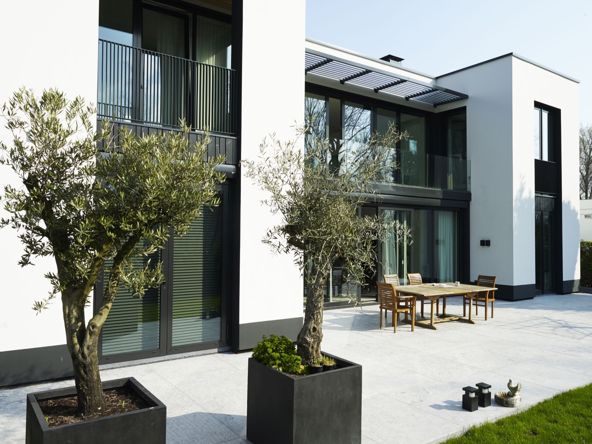
The garden design was developed as part of the project, so the outdoor area follows the same clear geometry as the house. Large light-grey terrace slabs sit close to the façade, while planting beds and gravel zones soften the edges without losing the straight layout. The exterior reads as an extension of the renovation rather than a separate landscape idea. Even the contrast between the pale house and the darker frames finds a counterpart outside in the hard surfaces and planting lines.
From the terrace, the house presents itself in layers: overhang, glass, wall, and then the garden beyond. That sequence matters. It gives the villa room to breathe without loosening the composition. The house renovation and the garden design work together because both are based on the same measured line work. What looks restrained at first becomes more detailed as you move closer, especially where the paving meets the planting and the opening of the façade.
A house that is opened up, not just enlarged
The old bungalow was not simply expanded; it was rethought from the inside out. The new villa is described in the source material as being twice as large, but the more telling change is spatial. The layout now supports central living and work areas, two side wings, and a stronger relationship between the rooms and the façade. The tall narrow windows, dark profiles and built-in elements turn that shift into something visible at every turn.
The owner’s enthusiasm is visible in the way the house is used. It is regularly opened as a reference project, which makes sense for a renovation that depends so much on detail and planning. Published at the end of December 2014 in Stijlvol Wonen Exclusief 2, the project remains easy to read today because its parts still speak the same language: vertical facade lines, custom interior details, an open-plan living dining core and a garden that follows the same disciplined order.
Want to see more of ENZO architectuur N interieur? View the page of ENZO architectuur N interieur for even more great projects and company information.





NEW 2026 Jubileum Edition The Best Interior Designers Benelux
Order Now €125


NEW 2026 Jubileum Edition The Best Interior Designers Benelux
Order Now €125


