










Furniture in a light interior with organic shapes
Daylight runs across the white plaster walls before it catches the rounded lamps above the room. Their glass globes pull the eye upward, while the black window frames keep the view sharply defined. In this bright interior, the furniture sits against a clean backdrop: a generous corner sofa, a round coffee table and a dining setup that stays close to the windows. The result is a clear example of furniture in a light interior, where soft tones and warm accents shape the pace of the rooms.
A lounge area that stays open to the windows
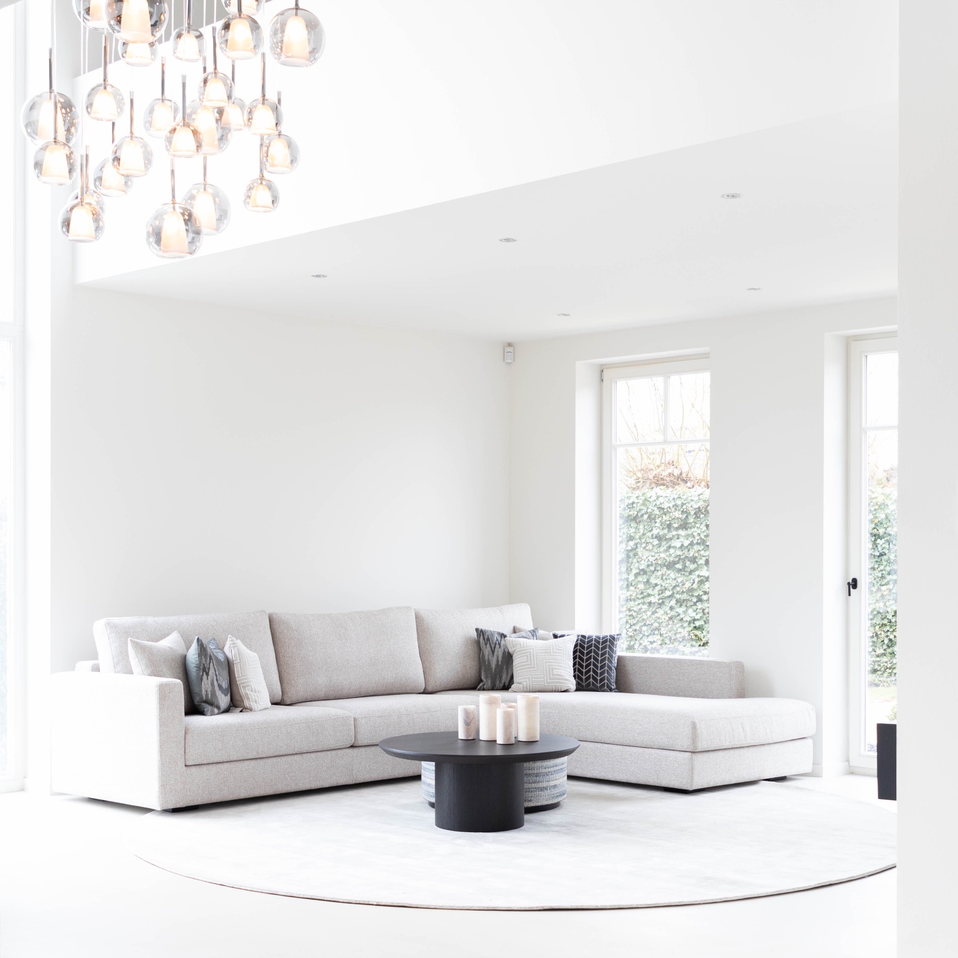
The lounge area with sofa is set out with little visual clutter. The corner sofa takes a broad position in the room, leaving the floor and the lines of the walls easy to read. A round coffee table softens the straight edges around it, echoing the organic interior shapes that return in the lighting above. The upholstery and cushions bring in muted colour, but the palette remains restrained, with white, beige, grey and deep blue working quietly against each other.
From this angle, the furniture in a light interior is not treated as an isolated group. It is tied to the architecture by the black-framed glazing and the pale floor. Daylight reaches deep into the seating zone, where the round forms of the lamps and table break up the stronger horizontal lines. The room avoids heavy contrast. Instead, the furniture seems to settle into the space through proportion and placement, not decoration.
Dining area with pendant lights and a fireplace niche
Near the large windows, the dining area with pendant lights is paired with an open fireplace niche in the wall. That combination gives the room two focal points: one from the glass and daylight, one from the recessed fire opening. A rectangular dining table sits between them, with light chairs that keep the view through the room open. The setting stays calm, but there is enough contrast in wood, stone-like surfaces and dark detailing to prevent it from becoming flat.
The fireplace niche is visible as part of the same composition, not a separate feature. It sits close to the dining area and makes the wall plane feel deeper. Above, the hanging lamps repeat the project’s round language. Their warm glow picks up the tones in the table area and softens the white plaster around it. This is where soft tones and warm accents become legible in a practical way: through the light that reaches the table and the materials that receive it.
Furniture that follows the room, not the other way around
The project reads as furniture in a light interior, but the stronger story is how the furniture responds to the space. The built-in cabinet with its black frame and open compartments acts like a feature wall, yet it still leaves room for the lighter surfaces around it. Behind the glazing and open sections, warm wood tones appear in contrast to the darker structure. The effect is measured, with the cabinet contributing storage and display without dominating the room.
Elsewhere, the kitchen area shows wood-fronted units and a darker niche or backsplash zone. A bar edge and stools are partly visible, enough to place the furniture within the flow of the home. The materials stay close to the project’s broader palette: pale walls, dark profiles, wood grain and reflective glass. Because of that, the custom furniture in modern interior spaces feels integrated by visual rhythm rather than by excess detail or overt styling.
Round lighting and straight lines in the stair hall
The stair hall shifts the mood without leaving the same visual language behind. A dark stair run cuts through the white envelope of wall and ceiling, and the contrast makes the route through the house easy to read. Nearby, a slim console and framed wall element sit against the pale surface, introducing another layer of geometry. Overhead, a cluster of round pendant lights appears again, linking the hall to the living spaces through the same soft, circular forms.
Here, the organic interior shapes are not limited to furniture alone. They appear in the lighting, in the rounded edges of the fixtures and in the way the room is punctuated by circles rather than sharp decorative gestures. The stair zone remains understated, but it is clearly part of the overall composition. Light, shadow and the dark stair finish give the hall its own pace before the plan opens back toward the more relaxed lounge and dining areas.
Material contrasts that stay visible
Wood, glass, plaster and dark metal define the project more than any single statement piece. The large windows with black frames set a firm outline around the rooms. Inside that outline, the furniture in a light interior can breathe: the sofa keeps a low profile, the dining table reads as a clear rectangle, and the round coffee table interrupts the straight grid with a softer gesture. The materials are visible enough to register, but they never compete for attention.
A closer image even shows the texture of a cushion and upholstery weave. That detail matters because it shows how the softer elements are used to temper the harder surfaces. Against the white plaster and the glass, textile brings another level of tactility to the room. It is a small point, but it explains much of the project’s tone: the spaces are drawn from clear lines, yet they are not visually hard. Their warmth comes from the finish of the objects placed inside them.
A bright interior shaped by placement and light
What stands out most is the discipline of the layout. The furniture is placed so that each zone keeps its own function while remaining visually connected to the others. The lounge area with sofa, the dining area with pendant lights and the built-in elements all belong to one bright interior, but each has a distinct role. Daylight from the large windows keeps the rooms open, while the warm lighting adds a second layer once evening falls.
That balance is carried by the objects themselves. The round lamps, the coffee table, the framed cabinet and the fireplace niche each hold a clear shape. None of them relies on ornament. Together they give the home a legible structure, with soft tones and warm accents used to ease the transitions between rooms. Seen in that way, the project is less about decoration than about selecting furniture and finishes that work with light, not against it.
In the end, the most memorable details are also the simplest ones: the black lines of the windows, the glow inside the pendant glass, the open fire in the niche and the grain in the wood fronts. They show how furniture in a light interior can carry the atmosphere of a home without overwhelming the architecture around it. The rooms remain bright, but they do not feel cold. Every visible element has a clear position, and that clarity gives the project its strength.
Want to see more of Charrell Home Interiors? View the page of Charrell Home Interiors for even more great projects and company information.




NEW 2026 Jubileum Edition The Best Interior Designers Benelux
Order Now €125


NEW 2026 Jubileum Edition The Best Interior Designers Benelux
Order Now €125


