









House renovation and extension with open-plan kitchen
Wood fronts, white walls and a pale tiled floor set the tone from the first step inside. The layout has been opened up, and that shift is most visible in the way the kitchen, dining area and terrace now read in one line of sight. Large glass doors pull daylight deep into the room, while the outdoor seating area is already present at the edge of the view. In this house renovation and extension, the open-plan kitchen becomes the hinge between daily cooking, eating and looking out.
Open-plan kitchen with island and custom cabinetry
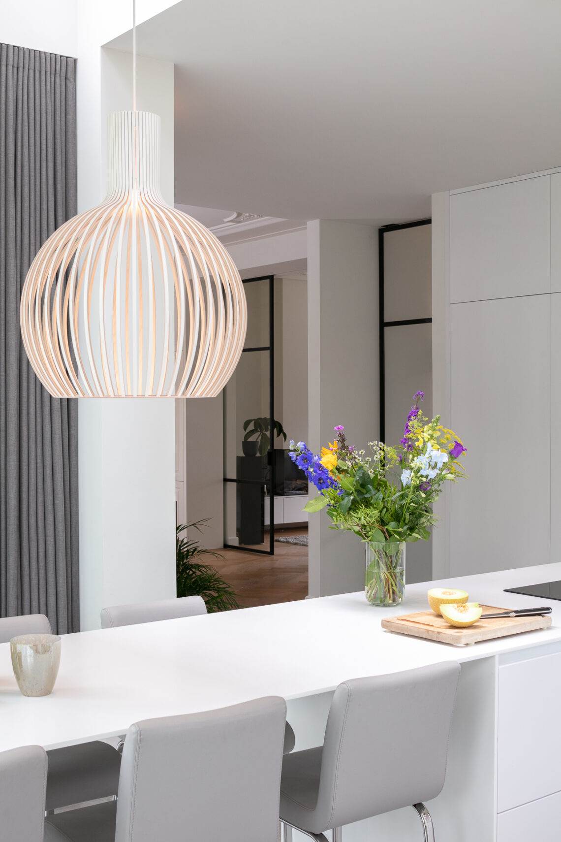
The kitchen is arranged around a kitchen island with custom joinery on the room side and a light worktop on top. Bar stools mark the point where the island changes from preparation surface to everyday perch. Along the wall, tall cabinetry keeps the run compact, with built-in appliances folded into the composition so the room stays visually calm. The mix of wood cabinetry and white finishes gives the kitchen a clear structure without flattening the detail. It is a practical centrepiece, but it also sets the rhythm for the rest of the house renovation and extension.
Above the table and work surface, track lighting with spots and pendants draws a precise line through the room. It gives the dining zone and the cooking area their own lighting, yet the ceiling treatment stays restrained. The table sits close to a niche and a wall unit, so plates and storage remain within easy reach. From that point, the terrace is never far from view. The large glass doors to terrace mean the outdoor space is not an afterthought; it sits directly inside the everyday route of the room.
Light that moves across floor and joinery
The pale floor runs through the kitchen and dining zone without breaking the room into fragments. That continuous surface keeps the extension readable, especially when the glass opening is wide and the outside plane is bright. White walls and ceiling take a step back, allowing the wood fronts to carry the visual weight. The result is not about display. It is about how the materials behave when daylight touches them, from the island edge to the tall wall of cabinets and the doorway that leads further into the house.
In the kitchen wall, appliances are built in rather than announced. Ovens and a fridge are tucked into the cabinetry, which keeps the vertical surface clean and lets the joinery read as one piece. A narrow niche with warmer-toned tiling appears in another view, bringing a slightly different surface into the same material language. This is where the house renovation and extension feels most exact: the room is not filled with gestures, but with carefully placed elements that hold the plan together.
Large glazed openings linking interior and terrace
The extension opens toward the terrace with broad glazed doors and a wide pui that makes the exterior part of the room’s everyday backdrop. A paved terrace sits directly outside, with outdoor furniture visible through the glass. The connection is immediate, but the transition is still clearly drawn by the frame of the opening, the dark window sections and the change from tile to paving. These indoor-outdoor sightlines keep the interior oriented toward the garden side without losing the focus of the kitchen itself.
Seen from another angle, the same opening gives the house a new depth. The glazed sections do more than admit light; they pull the eye through the room and out into the extension. A red brick wall and red roof tiles appear on the outside images, with a white column or lintel detail marking the edge of the opening. That exterior read is tied directly to the interior plan. The house renovation and extension is legible from both sides because the opening is doing spatial work, not just acting as a view.
Where cooking, dining and circulation meet
The dining table sits close to a wall cupboard and recess, and that proximity matters. Plates, serving pieces and storage stay within arm’s reach, so the room can work as one shared zone instead of separate functions placed side by side. The open path between kitchen and seating area is visible in the floor plan and in the furniture placement. A glass door, a white frame, a corner of cabinetry: each element helps define the route without using a solid partition. In a house renovation and extension like this, that clarity is what makes the plan easy to read.
Another room shows a slighter move but the same thinking. A slim wooden table stands against white walls, with a simple lamp above it. Nearby, a built-in seating niche catches light from a large opening above or beside it. The space is not overloaded; it offers a pause within the open plan. A low built-in bench in the living area does something similar, placed beneath a large window so daylight lands directly on the cushions and the wall behind them.
Doorkijken that keep the house connected
Glass panes, white frames and continuous flooring make the transitions between rooms easy to follow. One zone shifts from pale tile to wood floor, another returns to the lighter surface, and those changes quietly mark the route through the house. The sightlines remain open, so rooms are read through openings rather than shut off with heavy walls. That approach gives the house renovation and extension its pace: the eye moves from one zone to another, always catching a frame, a reflection or a sliver of daylight.
The stairway continues the same material logic. White side walls set off the wooden treads, and the grain of the wood stays visible rather than being hidden under a glossy finish. The steps are simple, but they do more than connect levels. With light coming in from above or beside, the stair zone feels less closed and more like part of the main route through the house. It is another example of how the renovation uses material contrast instead of extra decoration.
A bathroom that carries the same materials in smaller scale
The bathroom keeps the palette tight: a wooden vanity against white tile, a simple basin, a metal tap and a glass shower screen that leaves the room open to view. Large light tiles continue across the floor, and the toilet is built into a white wall composition. Nothing here tries to interrupt the rest of the project. Instead, the bathroom repeats the language of wood cabinetry and white finishes in a more compact layout, so the house renovation and extension holds together through repetition rather than through matching surfaces everywhere.
Across the project, the strongest thread is the way material, light and layout keep supporting one another. Wood gives the joinery and stair treads a visible edge, white walls keep the volumes open, and the pale floor ties kitchen, dining area and circulation together. Large glass doors to terrace bring the outdoor paving into the daily view, while the track lighting with spots and pendants gives the central rooms a clear working line after dark. The house renovation and extension reads as a sequence of connected spaces, each one defined by a practical detail that can be seen and used.
Want to see more of Kraal architecten? View the page of Kraal architecten for even more great projects and company information.




NEW 2026 Jubileum Edition The Best Interior Designers Benelux
Order Now €125


NEW 2026 Jubileum Edition The Best Interior Designers Benelux
Order Now €125


NEW 2026 Jubileum Edition The Best Interior Designers Benelux
Order Now €125


