









Integrated home cinema in a colorful villa
The first change is spatial, not decorative: living functions are pulled into a clearer order, and the integrated home cinema takes its place without fighting the rest of the house. In the same move, the interior paintwork is refreshed, so walls, ceilings and woodwork read more cleanly against the deep tones and patterned surfaces already present. The result is a better functioning home, where a classic villa interior now carries brighter color notes and a warmer contemporary style.
Rooms that now work in a different order
The project starts from a simple request, but the answer depends on placement. A home cinema needs its own rhythm, and the other rooms needed to be set in the right proportion around it. That is why the reorganisation of living functions matters as much as the visible finishes. Once circulation and room use are adjusted, the home no longer feels like a series of separate gestures. It reads as one interior, with each zone doing a specific job.
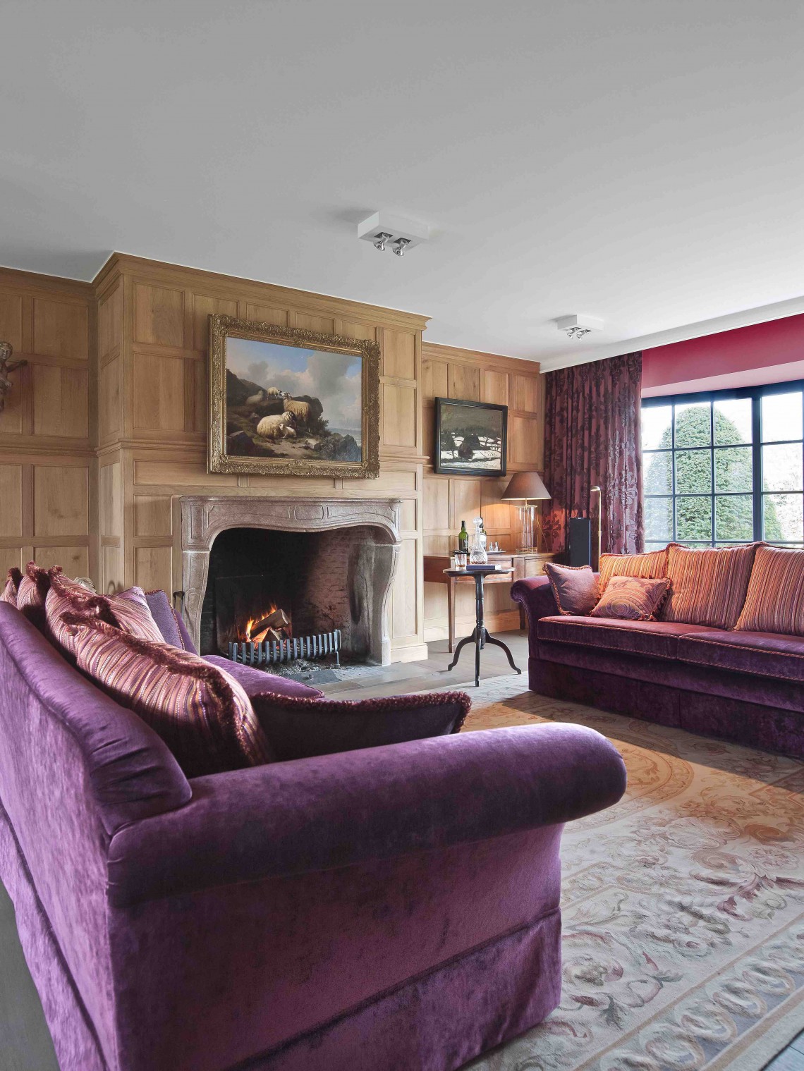
That shift is easy to see in the open living area, where the fireplace remains a strong anchor and the generous windows pull daylight across the floor. High ceilings keep the room from feeling compressed, while the patterned tile floor gives the central space a clear base. The eye moves from the seating area to the wall surfaces and then upward to the ceiling line, so the room feels measured rather than overfilled. The integrated home cinema sits in that broader domestic order instead of competing with it.
Paintwork as part of the reset
Fresh paint does more here than brighten the walls. It sharpens the contrast between plastered surfaces, wooden panelling and the darker furniture pieces that punctuate the room. In a classic villa interior, that matters. Older details can become heavy if the finish is tired, but once the paintwork is refreshed the moldings, wall textures and framed openings become easier to read. The color changes are restrained, yet they make room for the stronger accents already present in the house.
The home’s palette does not stay neutral for long. Colour appears in upholstery, in framed views, and in the way the furnishings sit against the wall surfaces. These colorful accents are not used as decoration for its own sake; they break up long walls, soften the heavier architectural lines and keep the rooms from feeling static. Against that background, the warm contemporary style comes across through placement and layering rather than through a single statement piece.
A kitchen that had already earned its place
The kitchen was tackled earlier and only needed to be refreshed in this phase. That history is visible in the way it sits within the house: a room with wooden fronts, a stainless-steel work zone and a direct, practical layout. Because the space had already been resolved, the later intervention could focus on renewal rather than replacement. The refreshed kitchen now continues the same interior language as the other living areas, with the materials kept clear and the surfaces visually calm.
This is also where the idea of a better functioning home becomes tangible. A kitchen that is still working well does not need to be reinvented; it needs to be brought back into step with the rest of the house. Here, that means the finishes are pulled back into line with the renewed walls and the revised living functions. The kitchen remains grounded by wood and steel, but it no longer feels separated from the larger composition around it.
Wood, paneling and open niches
Several details keep the interior from becoming too polished. Wooden cabinet walls with open niches break up storage into smaller parts, and the panelled sections add depth to otherwise flat surfaces. In one view, a large mirror and framed wall elements reinforce the sense of height, while the built-in joinery keeps the room anchored. These pieces do not shout for attention. They work by marking transitions: from one wall to the next, from sitting area to circulation, from older villa character to the refreshed layer now on top.
The same logic applies to the staircase zone. Its balustrade has a classic drawn line, but the wall finish around it has been updated so the stair corner no longer feels like a leftover passage. Light touches the surface in a different way there, picking out the texture of the walls and the curve of the railing. It is a small part of the house, yet it shows how the reorganised living functions extend beyond the main rooms.
Where the cinema room changes the mood
The integrated home cinema is visually the darkest part of the project, and that contrast is useful. The screen area is framed by LED light bands that bring a violet-blue edge to the room, while the rest of the setting stays subdued. Instead of trying to merge with the brighter villa spaces, the cinema room claims its own atmosphere through controlled light and darker finishes. That change in tone marks a deliberate transition from social living spaces to a more enclosed viewing space.
What makes the cinema insertion credible is not spectacle but placement. It sits as part of the house’s overall program, not as an isolated showpiece. The room’s darker surfaces, screen edge and lighting lines all support the idea that the home has been reorganised around different uses. In the larger composition, that means the home cinema is one function among several, but it is also the clearest sign that the interior has been thought through again rather than merely repainted.
Light, height and the larger villa envelope
Hanging above the open living and dining area, the large chandelier gives a fixed point in a room that is otherwise open to multiple directions. The high ceiling and visible roof structure keep the volume generous, while the wide windows and glazing around the adjoining spaces admit a steady wash of light. A sunroom or rear extension with wooden frames and a checkerboard tile floor appears as a lighter counterpart to the main room, showing how the house shifts between patterned, enclosed areas and brighter transitional spaces.
Outside, the villa’s thatched roof and garden edge are visible as context rather than focus. A broad terrace, lawn and water feature form the background to the interior story, reminding the viewer that the rooms are part of a larger domestic setting. Still, the real change happens indoors: in the way the living zones are set out, in the fresh paintwork, and in the renewed relationship between classical details and the colorful accents now threaded through the house.
Across the project, the interior never loses its villa character, but it becomes easier to live with. The fireplace, staircase, cabinetry and kitchen each keep their own role, yet the rooms now sit in a more deliberate sequence. That is what gives the house its revised rhythm: not a dramatic overhaul, but a careful reordering of what was already there, with the integrated home cinema, refreshing interior paintwork and refreshed kitchen carrying the change.
Want to see more of Helga interieur en architectuur? View the page of Helga interieur en architectuur for even more great projects and company information.





NEW 2026 Jubileum Edition The Best Interior Designers Benelux
Order Now €125


NEW 2026 Jubileum Edition The Best Interior Designers Benelux
Order Now €125


NEW 2026 Jubileum Edition The Best Interior Designers Benelux
Order Now €125


NEW 2026 Jubileum Edition The Best Interior Designers Benelux
Order Now €125


NEW 2026 Jubileum Edition The Best Interior Designers Benelux
Order Now €125


NEW 2026 Jubileum Edition The Best Interior Designers Benelux
Order Now €125


NEW 2026 Jubileum Edition The Best Interior Designers Benelux
Order Now €125


NEW 2026 Jubileum Edition The Best Interior Designers Benelux
Order Now €125


NEW 2026 Jubileum Edition The Best Interior Designers Benelux
Order Now €125


