Warm interior design for a charming townhouse
Glass catches the light first, then the route opens up: from the entrance hall through the living spaces and on toward the garden. In this interior design townhouse, the circulation is as legible as the materials. Glazed doors, room dividers and dark frames break the plan into clear views and passages, while the neutral palette keeps attention on the movement between rooms rather than on ornament.
Glass doors and sightlines that pull the house open
The project uses glass doors and sightlines to link the entrance, living room and dining area without flattening those spaces into one room. A stately column outside prepares the eye for a more generous entry sequence inside, where the hall feels framed rather than closed. Through the glazed partitions, one room leads into the next with a steady line of sight. That visual connection is repeated at different levels, so the house reads as a series of openings, thresholds and pauses.
Room dividers in the living room shape the way you move. They guide the walk from the front of the house toward the rear, and they also keep the spaces distinct enough to hold their own character. The result is not a straight corridor but a layered route, with glimpses of the kitchen, the dining area and the deeper parts of the home appearing and disappearing as you move through it. That sense of sequence is central to the interior design townhouse.
An entrance hall that sets the pace
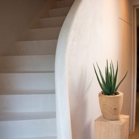
The entrance has more height and more breathing room than a typical threshold. Dark framing and generous glazing sharpen the geometry, while the sight of the stair and upper level adds depth immediately. Instead of a single front-to-back view, the hall offers several directions at once. Light lands on glass, wood and matte wall surfaces, and the eye keeps moving. It is a measured start to the house, one that makes the transition from outside to inside feel deliberate without becoming formal.
That same spatial clarity continues in the living zones. The neutral base allows the darker joinery, the glazed openings and the carefully placed lighting to stand out. A fireplace wall with a stone-look finish anchors one side of the living room, while open wall niches with warm light soften the straight lines around them. The room feels composed through contrast: hard edges, reflective surfaces and low, warm illumination working together rather than competing for attention.
The dining area connects to the kitchen through one glazed move
A glass sliding wall links the dining room to the kitchen, and it is one of the clearest gestures in the project. The two spaces stay visually connected, yet the sliding panel preserves a sense of separation when needed. Above the table, a chandelier with layered glass elements becomes part of the room’s centre line. Beneath it, the stone-look tabletop grounds the dining area with a more solid surface, offsetting the transparency around it.
The kitchen follows that same contrast. Dark custom cabinetry gives the room a firm edge, while the stone worktop and marble-look backsplash keep the surface reading crisp and calm. A visible extraction unit sits above the cooking zone, and the lines of the island and surrounding units stay clean and direct. The kitchen with stone worktop does not try to disappear into the house; it holds its place as a distinct part of the route from entrance to rear spaces.
Rounded forms soften the straight lines
Round shapes appear in small but telling ways. They interrupt the rectilinear plan without breaking it apart. The dining light, the curves in the private rooms and the circular language in the detailing keep the interior from feeling too rigid. In the living and dining spaces this is subtle, but it matters. The room dividers, glazing and cabinetry remain crisp; the rounded notes sit beside them like counterpoints. That is where the warm interior gains depth: not from colour alone, but from shape.
The lower floor keeps its colours restrained, which makes the darker wood and stone surfaces read more clearly. Light falls across the pale floor and onto the framed openings, and the house feels open without becoming bright in a generic way. The materials do the work. Glass reflects the room back to itself. Stone gives weight to the kitchen and fireplace zones. Wood brings density to the custom details. The palette stays controlled so the route through the house remains easy to read.
Private rooms with softer pink notes
Upstairs, the tone shifts. Soft pink bedroom accents appear more openly in the private rooms, and the colour is used with restraint rather than spread across every surface. One of the most memorable details is the lit floating ceiling above the bed, which forms two parallel half-circles. Below it, a soft rug echoes the curve. The relationship is simple but precise, and it gives the bedroom a quieter rhythm than the rooms below. This is where the interior design townhouse becomes more intimate without losing its clear line of composition.
The bedroom details rely on proportion rather than decoration. Light from the ceiling feature lands directly above the bed, while the rug anchors the floor in a different shape. Those two circles do not mirror each other exactly; they sit in parallel, which keeps the composition from becoming symmetrical in an obvious way. The room feels considered through geometry, not through excess. The pink tones stay in the background long enough to support the soft light and the curved ceiling line.
Bathroom details in stone, glass and reflection
The bathroom continues the same material language in a more compact setting. A round mirror hangs above a stone-look vanity top, and the reflection introduces a second light source into the room. Nearby, a dark cabinet and a white toilet keep the fittings clear and legible. In the shower area, the stone-look wall surface and the window with blinds add texture without distracting from the clean lines of the room. It is a small space, but the composition is not spare; each element has a defined place.
Seen as a whole, the project holds together because the details repeat without becoming repetitive. Glass doors and sightlines shape the route, the kitchen with stone worktop and dark cabinetry gives the ground floor weight, and the soft pink bedroom accents bring a gentler register upstairs. The warm interior is built from these shifts in tone and surface. Nothing relies on one dramatic gesture. Instead, the house moves from threshold to living space to private room with a steady sequence of light, line and material.
Custom interior design that follows the route of the house
This custom interior design is strongest when it is read as circulation rather than as isolated rooms. The glazed partitions, the room dividers, the dining link to the kitchen and the more intimate upper level all belong to one clear spatial story. The house lets you see ahead, then asks you to turn, pass through or pause. That is why the project stays memorable: not because of one single finish, but because the same disciplined language carries from the entrance hall to the rear of the house and into the private rooms above.
Want to see more of Studio van Strijdhoven | Interior Design Studio? View the page of Studio van Strijdhoven | Interior Design Studio for even more great projects and company information.



NEW 2026 Jubileum Edition The Best Interior Designers Benelux
Order Now €125


NEW 2026 Jubileum Edition The Best Interior Designers Benelux
Order Now €125


NEW 2026 Jubileum Edition The Best Interior Designers Benelux
Order Now €125


NEW 2026 Jubileum Edition The Best Interior Designers Benelux
Order Now €125


NEW 2026 Jubileum Edition The Best Interior Designers Benelux
Order Now €125