Luxury custom interior in a modern townhouse
Clean white planes, grey surfaces and a strong line of daylight set the tone here. The interior relies on restraint, but it is never bare. Built-in storage, fitted niches and a long run of joinery carry the rooms, while the staircase, kitchen and fireplace wall give the house its sharpest edges. The result is a luxury custom interior that reads as one continuous sequence of measured details.
Custom cabinetry and built-in niches
The clearest sign of the bespoke interior joinery is the amount of storage worked into the walls. Tall cabinetry sits flush with the room, and several openings are carved into those planes as shelves, recesses or display spaces. In the bedroom, the built-in wardrobes sit quietly against the white wall surfaces, while the hallway uses large circular mirrors and glass partitions to break up the straight lines. Nothing is overdrawn; the joinery does the practical work and keeps the sightlines clear.
That approach also shapes the way the rooms feel when you move through them. Instead of loose furniture interrupting the layout, the storage follows the architecture and keeps the floor open. In a project like this, custom cabinetry is not a decorative add-on. It is the structure that holds the rooms together, from the wardrobe wall to the shallow niches that catch light along the way.
Built-in wardrobes that stay close to the wall
The bedrooms show how built-in wardrobes can disappear into a calm interior without losing presence. Flat fronts and recessed details keep the volumes compact, while the white finish lets the daylight do most of the work. In one room, the wardrobe wall includes a niche that interrupts the surface just enough to create depth. It is a small move, but it gives the joinery a clear rhythm and prevents the storage from reading as a plain block.
A staircase with a concrete look and a monolithic profile
The staircase is one of the strongest visual elements in the house. Its straight treads and solid profile make it read almost like a single block, with little visual noise around the edges. The concrete-look staircase fits the rest of the interior language: pared back, firm in outline and precise in the way it meets the surrounding walls. A bright opening nearby brings daylight onto the steps, which keeps the mass from feeling heavy.
Seen from the landing and the hall, the staircase becomes part of the spatial circulation rather than a separate object. The edges stay crisp, the surfaces remain calm, and the material impression is deliberately restrained. That gives the interior joinery around it more room to breathe. The stair is not there to compete with the cabinetry or the wall openings; it anchors them.
The kitchen keeps to stone tones and straight front lines
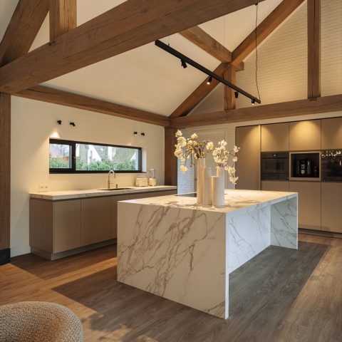
The kitchen continues the same vocabulary with a stone-look island, pale fronts and a long storage wall. The island sits in the middle of the plan like a low, steady volume, while the surrounding cabinetry stays flat and disciplined. The minimal kitchen design avoids ornamental hardware and relies on proportion, alignment and the contrast between smooth fronts and the more mineral surface of the worktop. Light from the larger windows keeps the stone tone readable without making the room cold.
Several built-in details make the kitchen feel tailored rather than standard. A coffee niche is set into the cabinetry, with open shelves and a compact recess for daily use. Nearby, an open storage niche holds tableware in plain view. These are small interventions, but they change how the kitchen works: tools and objects have a fixed place, and the main fronts stay free of clutter. That is where interior joinery earns its value.
Fireplace niche and living room storage wall
In the living room, the fireplace niche is embedded in a long, low wall opening that keeps the fire visually contained. The opening stretches horizontally, which suits the length of the sofa wall and the wide room proportions. Rather than creating a deep feature wall, the design leaves the surface almost flat and lets the flame sit within it. The result is understated, but the line is strong enough to tie the seating area together.
The room around it follows the same logic. A long sofa sits low against the wall, and the large windows bring in enough light to keep the greys and whites from closing in. Because the fireplace niche is cut into a restrained wall plane, it works as part of the joinery language of the house. It feels made for the room, not added to it afterwards.
Light, glass and the hall between rooms
The hall uses glass and reflection to open up a passage that could otherwise have felt narrow. Round mirrors soften the hard geometry of the walls, while transparent partitions let the eye travel further than the corridor itself. The white and light-grey palette continues here, so the reflections carry more weight than any ornament would. It is a small but effective way of keeping the luxury custom interior visually light.
Daylight is a constant in these spaces. Large windows brighten the dining area, where a round table sits under a broad opening, and the kitchen side reads almost like a frame around the view. The project never relies on one dramatic gesture. Instead, it uses repeated details: a recess, a flush front, a glazed edge, a line of daylight. Together they give the interior a clear order without making it rigid.
A walk-in shower kept deliberately quiet
The bathroom stays within the same calm palette. A glass partition defines the walk-in shower, allowing the room to remain open while still separating wet and dry zones. The washbasin area is reduced to a monolithic-looking surface, and the wall finish stays light, close to stone or tile rather than glossy decoration. That makes the room read as an extension of the wider interior rather than as a separate decorative statement.
The shower detail matters because it repeats the project’s central idea: every element is fitted, clear and stripped of excess. The glass does not interrupt the room; it marks the boundary. The basin does not dominate; it sits inside the overall composition. In a project centred on luxury custom interior work, that kind of discipline is what makes the joinery and the room planning legible.
Why the joinery holds the whole interior together
Across the townhouse, interior joinery keeps appearing in different forms: cabinetry in the bedrooms, niches in the kitchen, the fireplace recess in the living room and storage walls that sit flush with the architecture. Each one is modest on its own. Together they set the tone of the house. The rooms depend on fitted elements rather than loose additions, and the result is a plan where storage, circulation and material finish all follow the same line.
That is also where the project feels most convincing. The staircase in concrete look gives the interior a firm centre, the kitchen uses stone tones to stay grounded, and the built-in wardrobes keep the bedrooms quiet. Nothing is overdesigned for effect. The strength lies in the measured relationship between surfaces, openings and custom cabinetry, which is exactly where bespoke interior joinery has the most to say.
Want to see more of Boreas? View the page of Boreas for even more great projects and company information.




NEW 2026 Jubileum Edition The Best Interior Designers Benelux
Order Now €125


NEW 2026 Jubileum Edition The Best Interior Designers Benelux
Order Now €125


NEW 2026 Jubileum Edition The Best Interior Designers Benelux
Order Now €125