Modern fitted wardrobes in a sleek interior
Matte cabinet fronts set the tone before the room has time to do anything else. White and grey planes run across the walls, trimmed by black lines and broken only where a niche, appliance bay or open shelf interrupts the surface. In this interior, modern fitted wardrobes are not treated as separate furniture pieces. They sit flush with the room, so storage, wall and opening read as one system. The result is calm, but not blank: glass, wood and a polished concrete look keep the surfaces active.
Matte cabinet walls that hold the room together
The strongest impression comes from the long runs of storage. Large cabinet volumes in matte white and grey stretch across the walls with very few visible breaks, which keeps the eye moving along the line instead of stopping at each door. That matters in a project built around modern fitted wardrobes, because the joinery is doing more than storing things. It shapes how the room is read. Dark frames around openings and front sections mark out the edges, while the low-gloss finish catches light without glare.
In the kitchen, the cabinetry becomes even more precise. Built-in appliances sit inside a continuous run, with a vertical niche and open compartments interrupting the closed fronts at just the right points. The cabinet wall does not try to disappear; it stays present, but ordered. That mix of closed panels, reflective sections and open breaks prevents the joinery from becoming a single heavy block. Instead, the wall feels measured and layered, with each panel doing a different job.
Built-in appliance niche with room to breathe
The appliance zone is one of the clearest examples of how the joinery works. An oven and microwave are integrated into the wall, leaving the work surface free and keeping the equipment aligned with the rest of the cabinetry. The niche beside them adds a small shift in depth, so the wall can take on storage, display and equipment without losing its straight line. In a kitchen shaped by built-in appliance niche, that detail matters. It keeps the visual field tidy while still showing where the room is used.
Open shelving plays a similar role. A few recesses cut into the cabinet wall make space for books, objects or everyday items, but they also break up the rhythm of the fronts. The shelves are not decorative extras. They are part of the structure of the wall, and they give the large volumes some air. With the matte surfaces around them, the shelves read almost like pauses in a sentence, not separate statements. The whole kitchen remains controlled, even when the storage is full.
A kitchen island set in the centre of the route
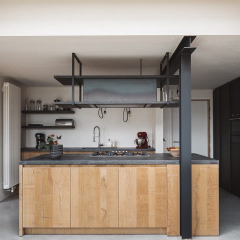
The modern kitchen island pulls the kitchen into the open plan layout. Its pale top stands out from the base beneath it, and the difference in tone makes the island easy to read as a working block. Above it, multiple light fixtures and a rounded tap define the work zone without crowding it. Large windows sit beyond the island, so light reaches across the surface and into the surrounding rooms. The island is not a barrier. It is a pivot point between cooking, eating and looking out.
From this position, the sightlines stay long and clear. A large dining table with a substantial top sits close by, and the path from table to kitchen remains open rather than compressed. The floor, with its polished concrete feel, pulls both zones into the same field. Wood adds weight through the tabletop, while black details at frames and edges give the composition a sharper outline. These are simple materials, but they are used to keep the movement through the space legible.
The effect of the open plan is not created by removing everything. It comes from placing each element where it can be seen in relation to the next one. The island faces the table, the cabinet wall holds the background, and the windows open the view outward. That sequence gives the kitchen a central role without turning it into a stage set. It stays connected to the rest of the interior through line, proportion and repeated materials.
A fireplace wall niche with a clear edge
In the living room, the fire sits inside a flat dark wall as a rectangular opening rather than a freestanding object. The opening reads as a niche cut into the surface, which makes the flame feel contained and precise. Around it, the wall stays plain, so the fire becomes the only active element in the plane. This fireplace wall niche is effective because it keeps the room visually still while allowing one point of focus to carry the scene.
That stillness is broken only by the wood nearby. A low table with a wood top sits in front of the seating area, and the grain softens the harder lines of the wall and floor. The route from the living room toward the kitchen remains visible in the background, which means the fireplace is never isolated from the rest of the project. It belongs to the same open sequence, where each zone is defined by its own detail but never cut off from the next one.
Seen from the seating area, the room depends on sightlines as much as on furnishings. The fireplace wall is dark and flat, the table is low and solid, and beyond them the kitchen keeps its white fronts and linear storage. That contrast gives the interior its rhythm. The eye moves from the fire to the cabinetry to the window light without encountering a hard stop. Nothing is oversized. The clarity comes from how the elements are placed against one another.
A bookshelf wall built from open shelves
The reading area turns the same joinery language into a wall of books. Bookshelf wall open shelves run across the room in a regular module, with a white built-in base supporting the open compartments above. The repetition gives the wall structure, but the compartments keep it from looking sealed. Books and objects sit in the openings, and the shelf rhythm makes those items part of the architecture rather than additions to it. The result is measured, not busy.
Lighting brings the lower sections forward. The built-in base catches the light, and the open modules above hold more shadow, so the wall gains depth without extra decoration. Even with many compartments, the shelving stays quiet because the spacing is consistent. That consistency links the reading space back to the kitchen and living room: the same matte surfaces, the same straight lines, the same preference for visible order. The room reads as part of the same interior logic.
Glass and wood details across the sightline
Glass takes over where the cabinets stop. A black-framed glazed wall marks the passage between rooms and keeps the view open while still giving the opening weight. The dark frame acts like a drawn line in the plan, and it makes the transparent parts feel deliberate rather than accidental. In a project built on open plan sightlines, this kind of threshold is important. It allows one room to remain visible from another, without letting the boundary vanish completely.
Wood works in a different way. It appears in the table top, in the fireplace area and in the visible beams of the bedroom, where it changes the mood without changing the overall language. The beams rise above a dark built-in wall under the sloped ceiling, while the bed remains low and the lighting stays compact. That room uses the same restraint as the rest of the project: one dark plane, exposed timber overhead, and only a few details to define the space.
Across the project, the repetition of matte cabinet fronts, glass, wood and concrete-like flooring creates a clear thread from room to room. What changes is the function of each zone. The kitchen uses the joinery to hide appliances and hold the island in place. The living room uses a wall niche for the fire. The reading area turns open shelves into a backdrop. The bedroom shifts the tone under the beams. In every case, the storage and wall treatment do the real work of shaping the interior.
Want to see more of Strakk Interior Design? View the page of Strakk Interior Design for even more great projects and company information.



NEW 2026 Jubileum Edition The Best Interior Designers Benelux
Order Now €125