










Modern home interior with open-plan living and stone fireplace wall
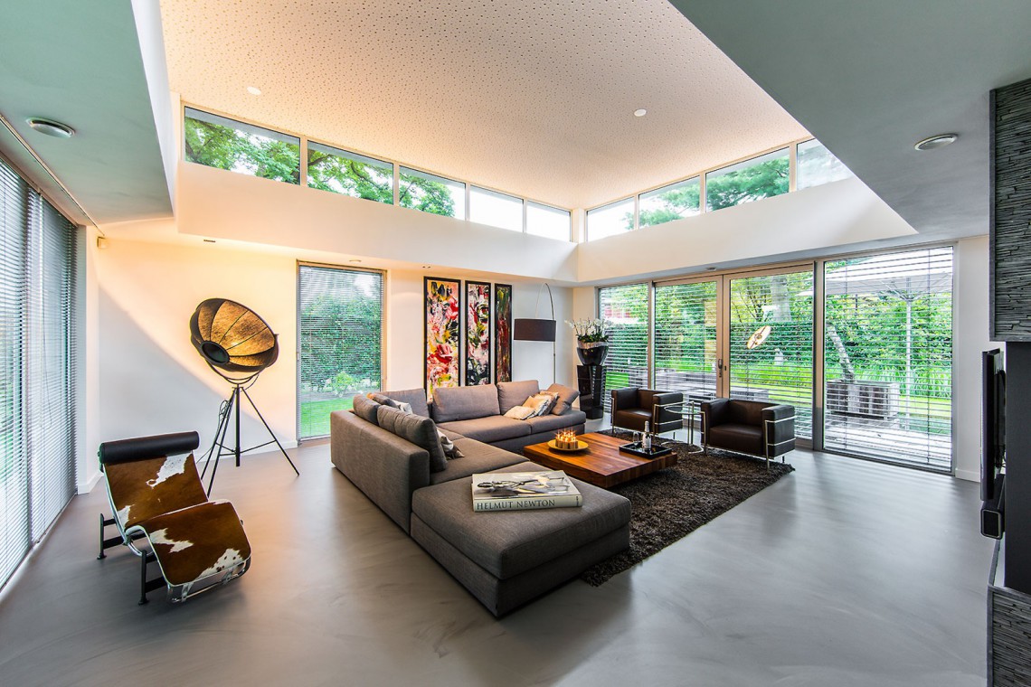
The living area opens wide, with sightlines running from the sofa zone to the kitchen and onward to the glazed wall. Large windows with blinds filter the daylight instead of blocking it, so the room keeps its depth even when the sun shifts. In the middle of that open-plan living kitchen, the stone fireplace wall pulls the eye in a single line, while the recessed ceiling spotlights keep the surfaces clear and the ceiling quiet.
Open-plan living area with strong sightlines
The main room is arranged around movement rather than partitions. A corner sofa sits low in the room, a dark rug anchors the seating group, and a wooden table adds a softer note against the light floor. The open-plan living kitchen reads as one continuous space, yet each zone keeps its own rhythm. From one angle the fireplace wall, the window band and the kitchen fronts line up in a sequence of stone, glass and white surfaces.
That sequence matters because the room is not built around decoration alone. The large windows with blinds shape how the interior feels during the day, letting the view and the light stay part of the room. At the same time, the spotlit ceiling design keeps the attention down at furniture height and wall level. The result is a living room that works through clear lines, not through excess detail.
Stone fireplace wall as the centre of the room
The modern living room with stone fireplace stands out because of the material shift. The fireplace wall uses a natural stone finish with a darker frame around the opening and a recessed niche beside it. That niche gives the wall a built-in look, and the stone strips or slate-like surface add texture without breaking the calm of the room. A television or screen sits close to the fireplace zone, so the wall also becomes the practical anchor of the living space.
Seen from across the room, the fireplace wall works like a vertical pause between the low furniture and the broad window openings. The contrast is straightforward: dark against light, rough against smooth, solid against reflective glass. Recessed spotlights in the ceiling reinforce the geometry above it, tracing the length of the room instead of drawing attention away from the wall itself. This is where the modern architect-designed home interior gains its strongest material note.
White kitchen with island and built-in appliances
Next to the seating area, the white kitchen with island stays visually light. The cabinetry is finished in white, with handle lines kept tight and the tall units holding the built-in appliances in a clean vertical block. The island brings a working surface into the open, and the visible tap confirms that this is not a display kitchen but an active centre for daily use. Pale fronts, a light grey floor and the muted wall finish keep the kitchen from closing in on the living zone.
In several views, the open-plan living kitchen shows how the kitchen fronts and the island sit in relation to the window wall. The daylight cuts across the worktop, while the spotlights above pick up the edges of the cabinets in the evening. Nothing here is overdrawn. The white kitchen with island relies on proportion, straight runs and the way the built-in appliances disappear into the tall storage rather than standing out.
Large windows with horizontal blinds
The large windows with blinds are one of the clearest features in the project. They stretch almost floor to ceiling and soften the outward view with horizontal lines that sit lightly in front of the glass. Because the blinds are set back visually, the room keeps its open feel while still having control over brightness and privacy. That combination gives the living area a measured pace: open when needed, filtered when the light becomes stronger.
These window bands also connect the interior to the terrace and the garden beyond. The frames, blinds and glass work together as one perimeter, so the eye keeps moving. In the living room, that means the furniture never feels boxed in. In the kitchen, it means the worktop and island receive daylight from the side rather than only from above. The effect is practical first, but it also gives the whole level a calmer reading.
Ceiling lines and spotlit zones
The recessed ceiling spotlights are visible in almost every interior view. They sit in neat rows and round points, keeping the ceiling surface itself understated. That makes the room feel organised without adding visual weight. In the living room, the spotlit ceiling design follows the plan of the space; in the kitchen, it marks the working strip above the island and tall cabinets. The lighting is built into the architecture rather than layered on top of it.
Material changes are easier to read because of that restraint. Stone, white lacquered fronts, wood and the light grey floor each hold their own position under the spotlights. The ceiling does not compete with the fireplace wall or the kitchen island. Instead, it frames them. In a project like this, that kind of lighting is not a backdrop detail; it is what lets the open-plan living kitchen keep its clarity after dark.
Minimalist bedroom with calm finishes
The minimalist bedroom shifts the tone without changing the project language. A dark bed frame sits against lighter surfaces, and the pale floor keeps the room from feeling heavy. The visible wall and wardrobe panels are restrained, with a reflective quality that catches light rather than scattering it. Round ceiling spots and a few accent points along the walls keep the room legible in the evening.
What stands out here is the absence of excess. The bedroom does not repeat the living room’s larger gestures, but it keeps the same discipline in finish and line. A small number of materials is enough: light flooring, darker furniture, smooth wall surfaces and controlled lighting. That makes the room read as part of the same modern architect-designed home interior, while still giving it a quieter tempo than the open living area.
Terrace with evening lighting
The terrace with evening lighting closes the sequence on a different note. In the evening image, the paving reads as a broad, hard surface beside darker garden edges and a wall in dark masonry or stone. Lights placed around the greenery and along the path draw a clear line through the outdoor space. Under the overhang, the ceiling lighting makes the boundary of the house visible without turning the terrace into a separate scene.
Seen from this angle, the terrace continues the same project language as the interior: straight lines, visible materials and controlled light. The outdoor lighting does not flood the garden. It marks the route, the edge and the sitting area. That keeps the terrace connected to the living room and kitchen inside, so the transition between open-plan living kitchen and garden feels direct in the photo sequence.
Across the whole set of images, the project stays focused on a modern architect-designed home interior with clear material contrasts. Stone, white cabinetry, glass, blinds and recessed lighting do most of the work. The living room, kitchen, bedroom and terrace each show a different part of that same approach, but the strongest impression remains the way the rooms open into each other and keep the view moving.
Want to see more of Stephen Versteegh? View the page of Stephen Versteegh for even more great projects and company information.





NEW 2026 Jubileum Edition The Best Interior Designers Benelux
Order Now €125


NEW 2026 Jubileum Edition The Best Interior Designers Benelux
Order Now €125


