Residence: modern home with open living space and glass staircase
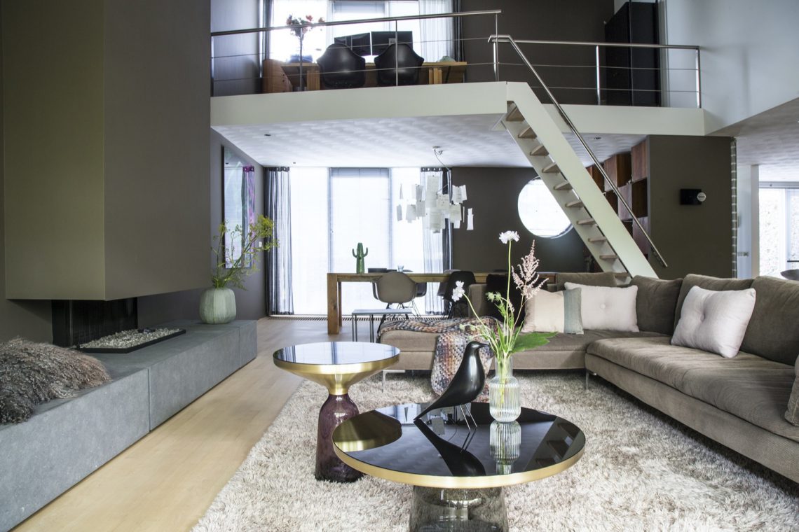
Light drops through the open living room void before it reaches the floor below, and the stair beside it reads almost like a clear line drawn through the house. The glass railing keeps the view open, so the movement between levels stays visible from both the sitting area and the rooms beyond. In this modern home with open living space and glass staircase, the interior is defined less by walls than by sightlines, tall openings, and the way one room frames the next.
A living room arranged around height and view
The main sitting area is built around the void, with the staircase pulling the eye upward and the large glazing opening the room to the garden. Grey built-in volumes sit into the wall and keep the floor area uncluttered, while the low seating holds the composition close to the ground. A dark wall section with a circular light detail adds contrast without interrupting the calm geometry. The result is not a room that tries to fill itself; it lets the vertical space do the work.
Seen from a second angle, the same open living room void becomes more architectural. The glass balustrade catches the light, and the stair treads appear lighter against the surrounding walls. The adjacent opening to the kitchen keeps the plan connected, so the living zone reads as one continuous field rather than separate enclosed rooms. That openness is reinforced by the straight edges of the walls and the absence of decorative excess.
Custom built-in cabinetry that stays close to the wall
Storage is folded into the architecture through custom built-in cabinetry and open niche-like compartments. One wall is organised as a measured grid of timber inserts, creating depth without breaking the line of the room. In another view, the cabinetry sits flush and pale, almost disappearing until the warm wood boxes are noticed. The effect is practical, but it also sets a rhythm along the wall, giving the room a place to pause between the larger glazed openings.
These built-ins are especially effective because they do not compete with the open plan. They hold smaller objects, define edges, and keep the circulation clear around the stairs and seating. In a house with so much glass, that kind of quiet storage matters: it stops the interior from becoming visually busy and lets the materials already in the room — glass, timber, plaster, and stone-like surfaces — remain legible.
Kitchen with pendant lights and a direct line to the table
The kitchen sits in a strong graphic frame of dark cabinetry, a pale worktop, and a clear run of wall surface. Above the working zone, the kitchen with pendant lights marks the table area and draws attention to the horizontal plane of the worktop. The sink is set into the counter with no unnecessary interruption, and the lighting hangs low enough to define the zone without closing it in.
What stands out here is the way the kitchen connects to the rest of the interior. The dining table sits nearby, under the same visual field, so cooking and gathering share one open territory. A large artwork on the wall and the dark chairs give the room a stronger edge, but the composition remains restrained. The kitchen does not become a separate display piece; it stays part of the broader living sequence.
Bedrooms shaped by tall windows and timber frames
In the bedroom, tall windows with wooden frames pull daylight deep into the space and set the tone for the room. Curtains soften the edges of the glazing, while the wall with open niches adds a built-in layer that keeps the room ordered. The palette remains controlled: pale surfaces, timber frames, and a light floor that reflects rather than absorbs the incoming light. Because of that, the room feels measured rather than overdesigned.
The bedroom with tall windows and wood frames also shows how the house handles private spaces. Instead of closing them off with heavy partitions, the room relies on proportion and detail. The opening to the outside brings in the garden view, while the custom wall element gives the room a fixed point for storage and display. It is a small set of moves, but each one helps the room stay calm and precise.
Bathroom surfaces cut with mosaic detail
Tilework takes the lead in the bathroom, where large beige wall tiles are broken by black mosaic bathroom details. The contrast is sharp but controlled, especially around the wash area where the darker pattern sits against the lighter field. A glass shower enclosure keeps the floor readable and prevents the room from feeling boxed in. Because the enclosure stays transparent, the tile pattern remains part of the full view instead of disappearing behind a solid partition.
The bathroom with mosaic accent depends on texture more than decoration. The large tile format makes the walls feel continuous, and the smaller mosaic sections introduce a finer scale at the points where the room needs emphasis. The glass shower enclosure, the pale console, and the straight lines of the wall all work together to keep the room clear and legible. It is a small interior, but the material changes give it enough depth to hold attention.
Glass, tile, and light in the wet room
In the wet area, the black mosaic bathroom details read almost like a border against the larger tiles, while the shower glass keeps sightlines open to the wall beyond. There is no heavy partitioning, only a sequence of surfaces: tile, glass, light reflection, then the pale floor line. That ordering makes the bathroom feel precise. It also underlines the project’s broader approach, where each room uses a limited set of materials and lets their edges do the visual work.
A garden terrace that extends the house outward
Outside, the green garden with terrace is arranged with straight paving, planted edges, and broad glazing that links it back to the house. The terrace sits as a clean plane beside the façade openings, so the boundary between indoors and outdoors becomes mostly a matter of threshold rather than separation. Trees and dense planting soften the hard lines of the paving, and the glazed sections reflect the surrounding greenery back into the interior.
This modern home with large glass openings uses the garden as another room in the sequence. From inside, the exterior reads as a bright extension; from outside, the terrace gives the house a grounded base against the vertical glass and timber. The result is clear in the photographs: a house that relies on opening, reflection, and measured detail rather than on ornament. Every room contributes to that reading, from the stair void to the kitchen, the bedroom, and the garden edge.
Want to see more of Nanne Schuiveling? View the page of Nanne Schuiveling for even more great projects and company information.





NEW 2026 Jubileum Edition The Best Interior Designers Benelux
Order Now €125


NEW 2026 Jubileum Edition The Best Interior Designers Benelux
Order Now €125


NEW 2026 Jubileum Edition The Best Interior Designers Benelux
Order Now €125