Modern kitchen and dressing renovation with natural elegance
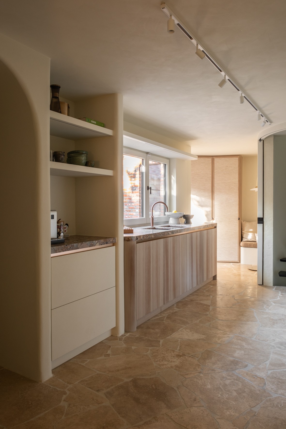
Warm wood veneer catches the light first, then the stone edge beside it. In the kitchen and dressing, the renovation is read through long cabinet runs, softened corners and a palette that stays close to sand, beige and charcoal. The result is less about display than about control: fronts that sit flush, niches that hold what needs to be close at hand, and a route through the rooms that keeps the eye moving from one tailored surface to the next. It is a clear example of a modern kitchen and dressing renovation shaped by material and line.
Wood veneer and stone set the tone
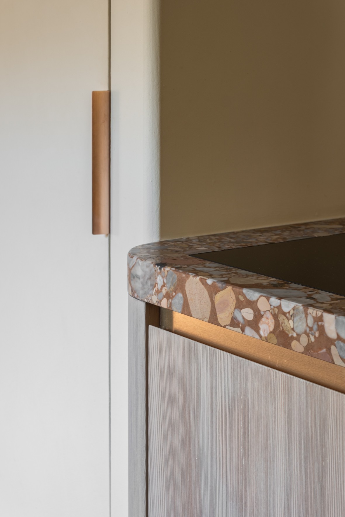
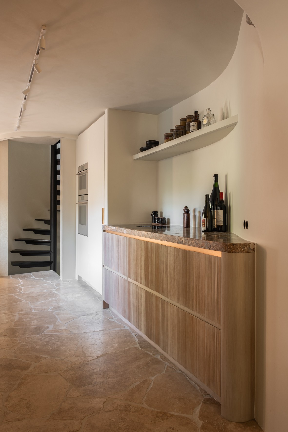
The kitchen starts with a run of custom kitchen cabinetry in a light wood finish, paired with stone worktops that pick up the same calm, matte look. On one wall, upper storage continues in a clean line, while an open niche breaks the mass and gives the composition a pause. The stone edge is visible rather than hidden, which gives the worktop a more grounded profile. This wood veneer and natural stone combination appears again in close detail, where the join between materials is precise and the grain remains visible.
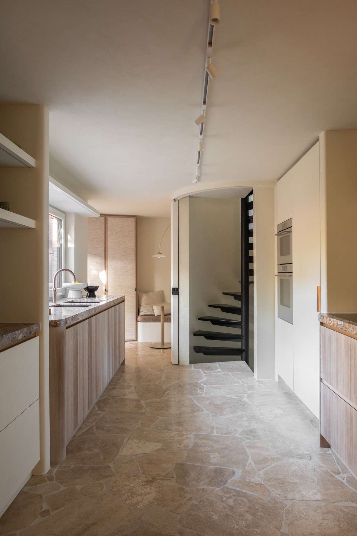
Handleless cabinetry keeps the front plane quiet. Instead of heavy pulls or visual interruption, the doors and drawers rely on thin shadow gaps and concealed grips. That choice matters in this room, because the cabinetry is extensive and the surfaces need to stay readable. The finish allows the storage to do its job without turning the wall into a pattern. In the same view, the track lighting kitchen plan reinforces that order: slim rails, directional spots and a soft wash across the ceiling keep the work zones legible after dark.
Rounded transitions soften the built-in volumes
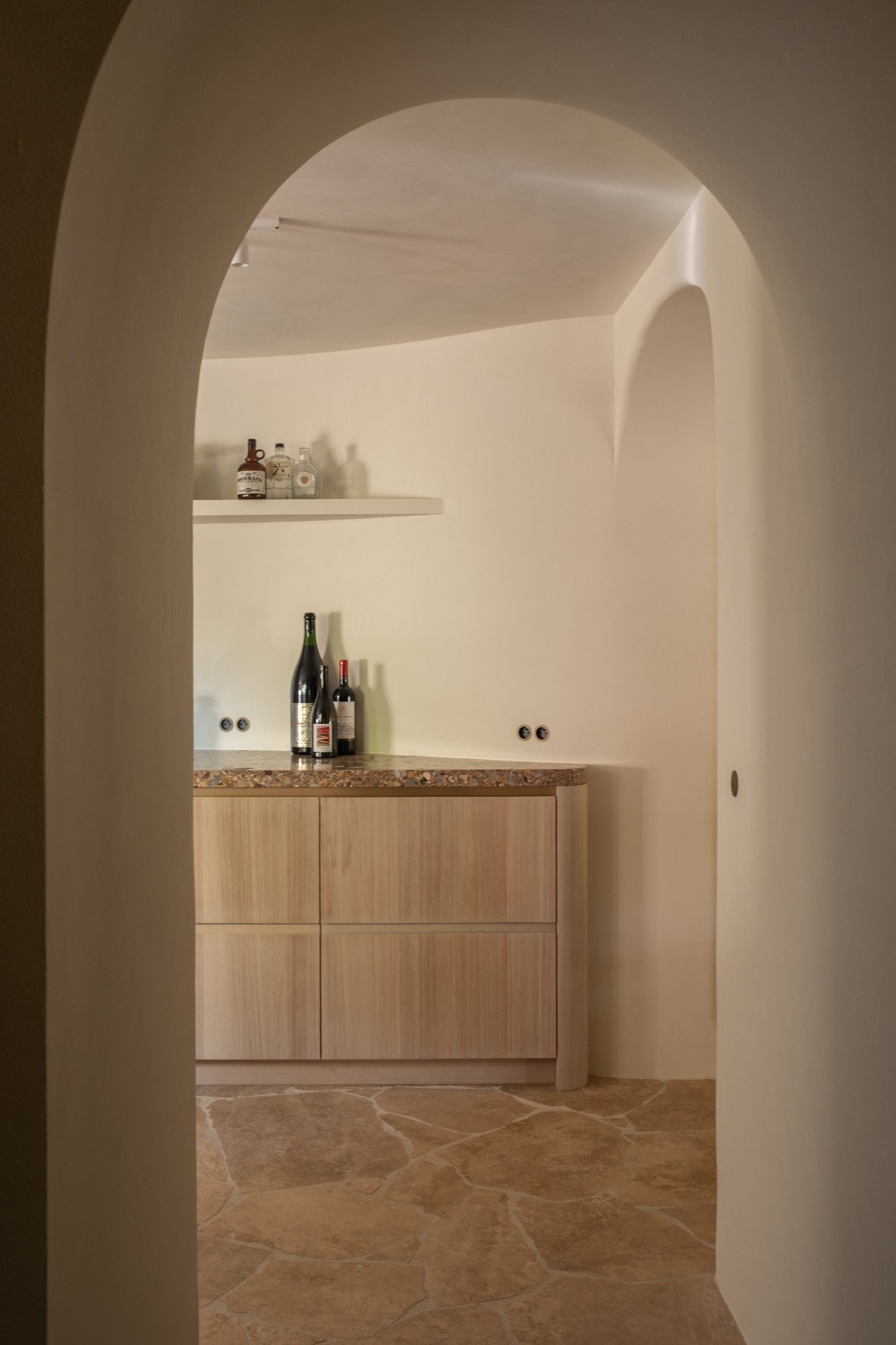
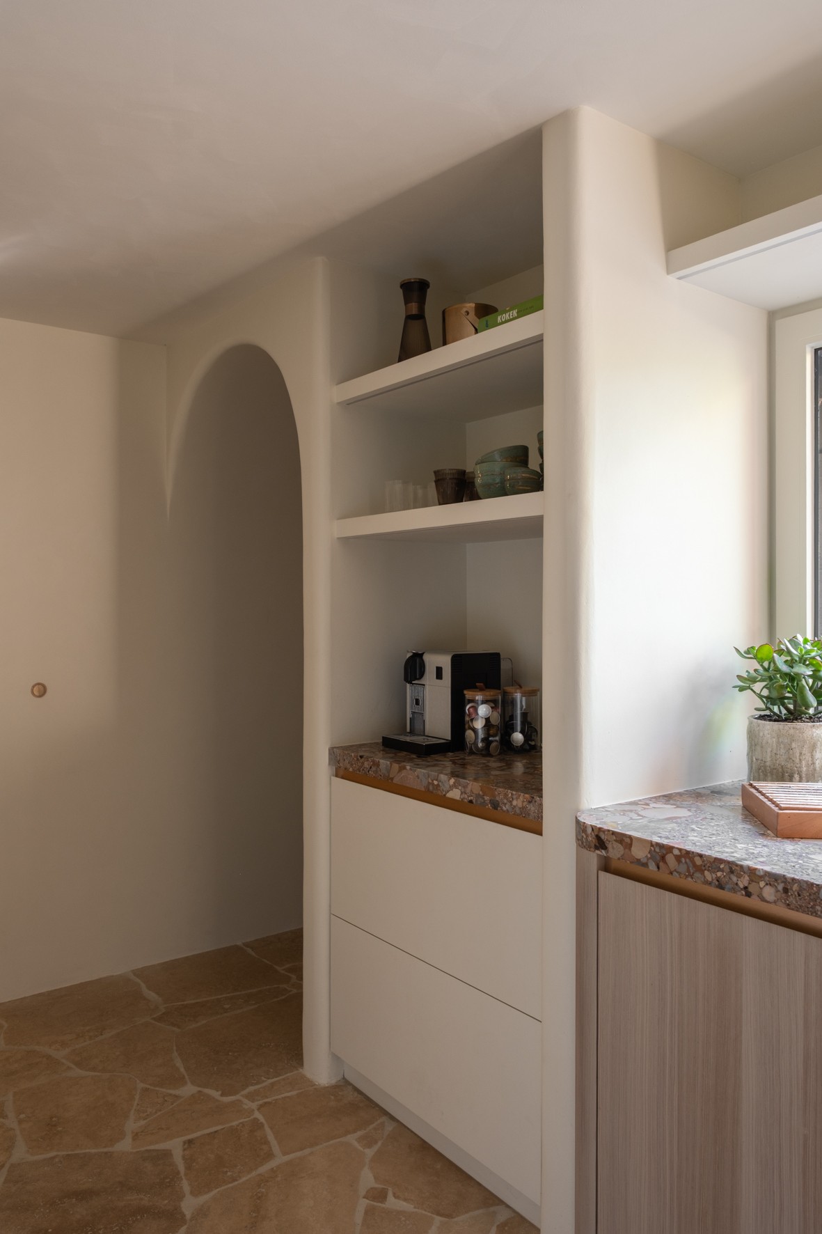
What changes the mood most is the way the straight cabinet lines are interrupted by curves. An arched opening interior appears in the circulation between kitchen and adjacent spaces, and the opening is echoed by rounded edges in the joinery. Rather than cutting abruptly from wall to opening, the project uses a softer transition that follows the architecture. The effect is visible in the way the wood panels wrap around the passage and in the curved corner at the niche, where the surface turns before it stops.
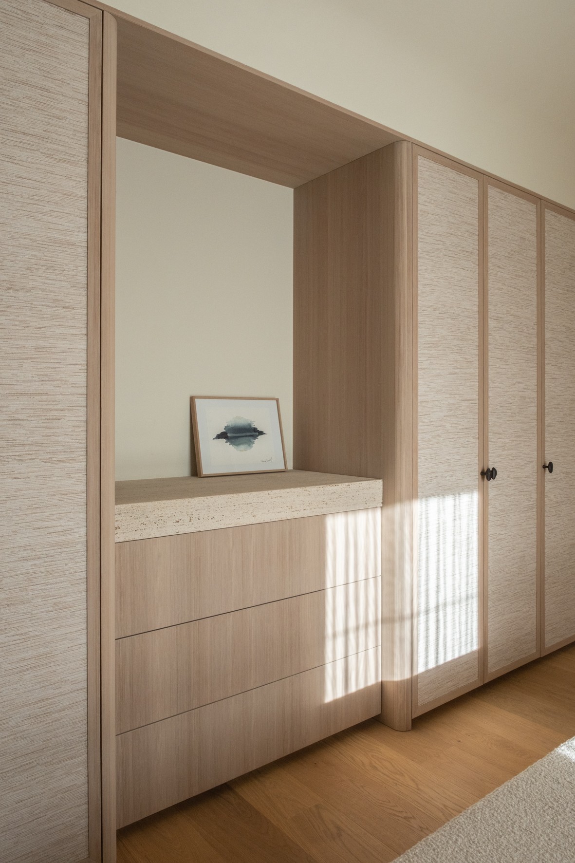
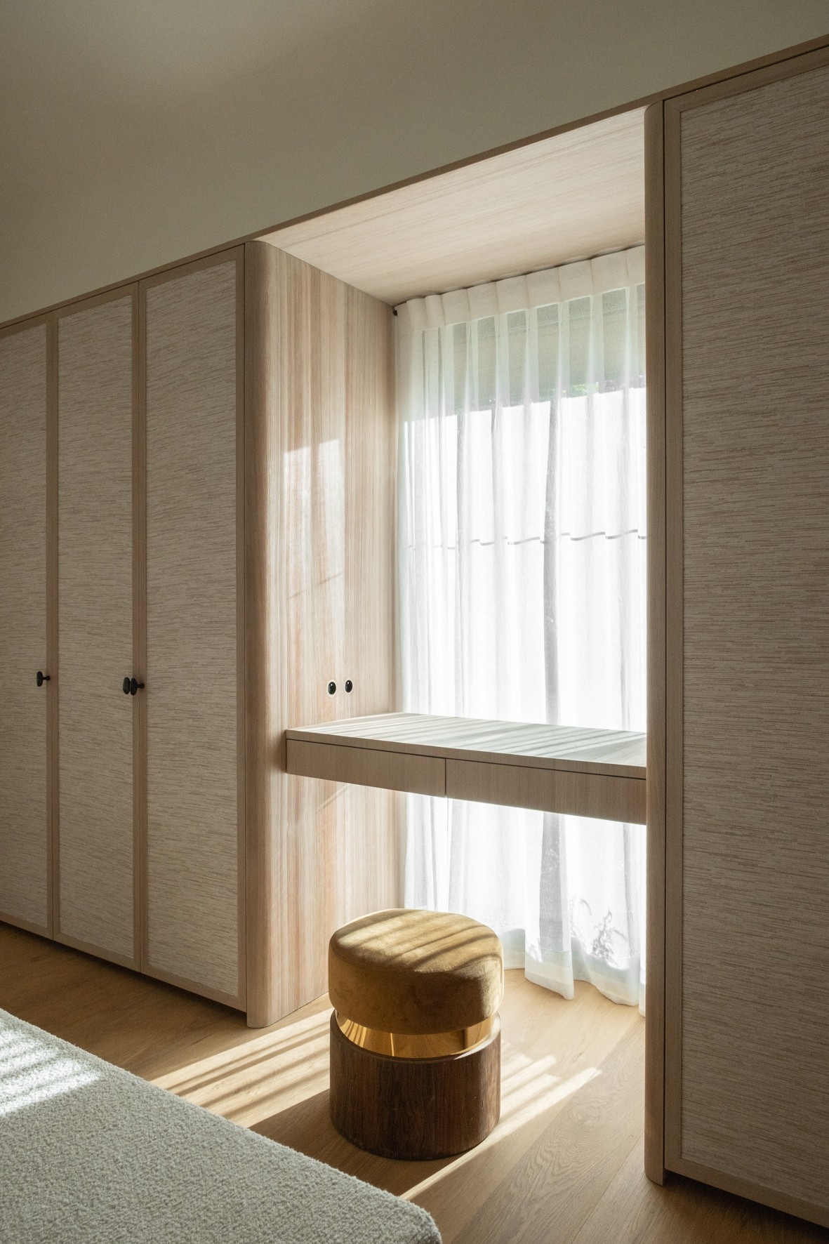
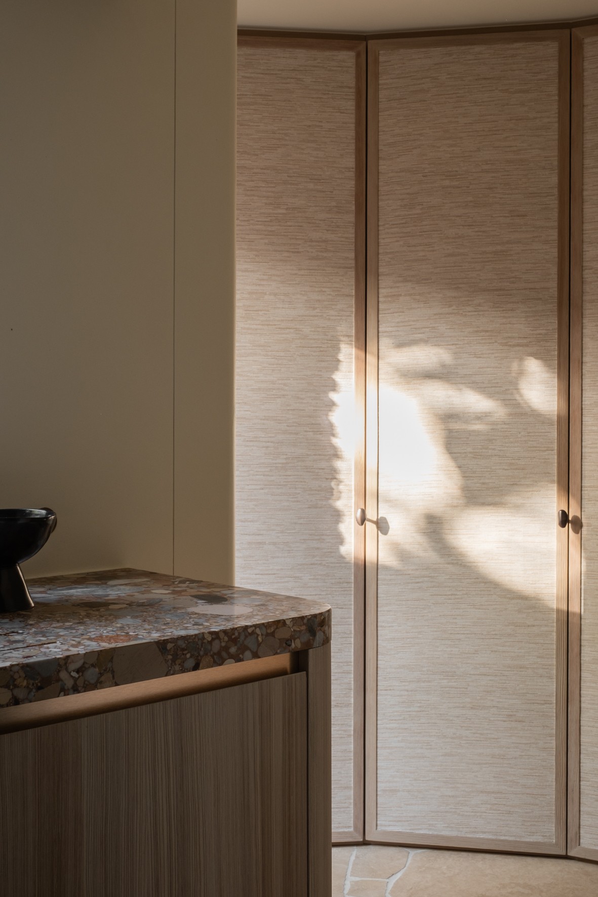
That same approach shows up in the dressing, where the storage is not treated as a separate object but as part of the room envelope. Tall panels rise with a strong vertical grain, then give way to a built-in niche with a bench-like ledge. The lines stay calm, but the surface treatment is not flat. A few dark round knobs interrupt the wood panels, adding a small, precise contrast without breaking the overall restraint. It is a dressing renovation that uses proportion and rhythm more than decoration.
Custom storage with open niches
The open shelving in the kitchen and dressing creates a practical counterpoint to the closed fronts. In the kitchen, a niche sits within the cabinet composition and leaves room for display or daily use items, while in the dressing a recessed shelf and ledge turn the wall into a built-in storage zone. These openings matter because they prevent the joinery from feeling sealed off. They also let the materials change: wood, stone and painted surfaces meet at visible edges, each one kept distinct rather than blended into a single finish.
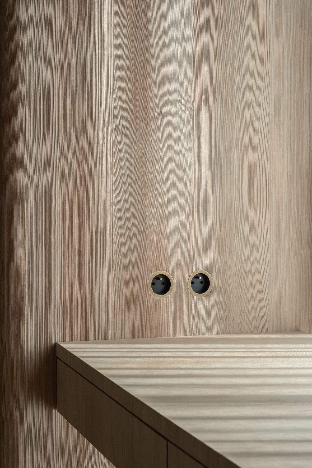
Seen in close-up, the cabinetry is a study in restrained detailing. A stone counter edge meets the wood front at a clean angle, and a set of circular wall openings is integrated into the panelled surface nearby. The image makes the craft legible without overstatement. There is no ornamental trim, no unnecessary framing. Just the junctions that need to exist, handled with enough precision that the eye can pass over them quickly. That is where the strength of the custom kitchen cabinetry becomes clear.
Light follows the room instead of flooding it
Track lighting kitchen fixtures run across the ceiling and bring focus to the working surfaces below. The spots do not try to fill every corner; they mark the main lines of the room and leave the surrounding zones softer. Against the warm wood, the light reads as another material layer. In the wider kitchen view, it picks out the worktop, the upper shelving and the transition toward the adjacent opening. The ceiling installation is slim enough to stay in the background, yet visible enough to shape how the room is used after dusk.
The floor supports that same clarity. Large ceramic tiles with a natural-stone look extend under the kitchen and toward the entry zone, where a low stair and an arched opening appear in the same field of view. The surface is quiet, but not blank; its scale helps the cabinetry stand out without creating a hard contrast. Because the tiles carry a pale, mineral tone, the wood veneer remains the warmer element in the room. The balance is subtle and built from material rather than decoration.
Dressings that read as part of the architecture
In the dressing area, the full-height fronts and internal ledges are fitted into the wall with the same discipline seen in the kitchen. The doors are tall, flat and close to the plane of the wall, which makes the room feel measured rather than crowded. A recessed bench or shelf is built into one section, creating a place for storage without adding a separate piece of furniture. The dressing wardrobes work best because they do not fight the room’s shape; they follow it, then stop where the opening or niche begins.
Close details matter here too. Dark rounded knobs sit on the wood panels like small punctuation marks, and the grain of the veneer remains visible across each vertical leaf. In another view, the edge of a stone-ledged bench curves gently, echoing the rounded transitions elsewhere in the project. These are modest interventions, but they give the dressing its clarity. The room is not filled with objects. It is defined by planes, junctions and the quiet repetition of custom fronts.
Material details keep the renovation grounded
The renovation depends on the way each surface is allowed to show its own character. Wood veneer carries fine lines and a warm tone; the stone surfaces add weight and a cooler visual note; the hardware appears only where it is needed. Even the visible plug openings in one wall fit that logic, cut into the surface rather than layered on top of it. The images show a project that values edges, thickness and transition. Those details are modest, but they are what make the rooms feel settled.
Across the kitchen and dressing, the same language repeats without becoming rigid. Cabinetry stays flush. Open niches interrupt the mass. Rounded corners soften the route from one zone to the next. The result is a modern kitchen and dressing renovation that relies on bespoke joinery and careful material shifts rather than on gesture. It is a project built from surfaces you notice because they are resolved, not because they are loud.
Want to see more of Vlassak-Verhulst? View the page of Vlassak-Verhulst for even more great projects and company information.



NEW 2026 Jubileum Edition The Best Interior Designers Benelux
Order Now €125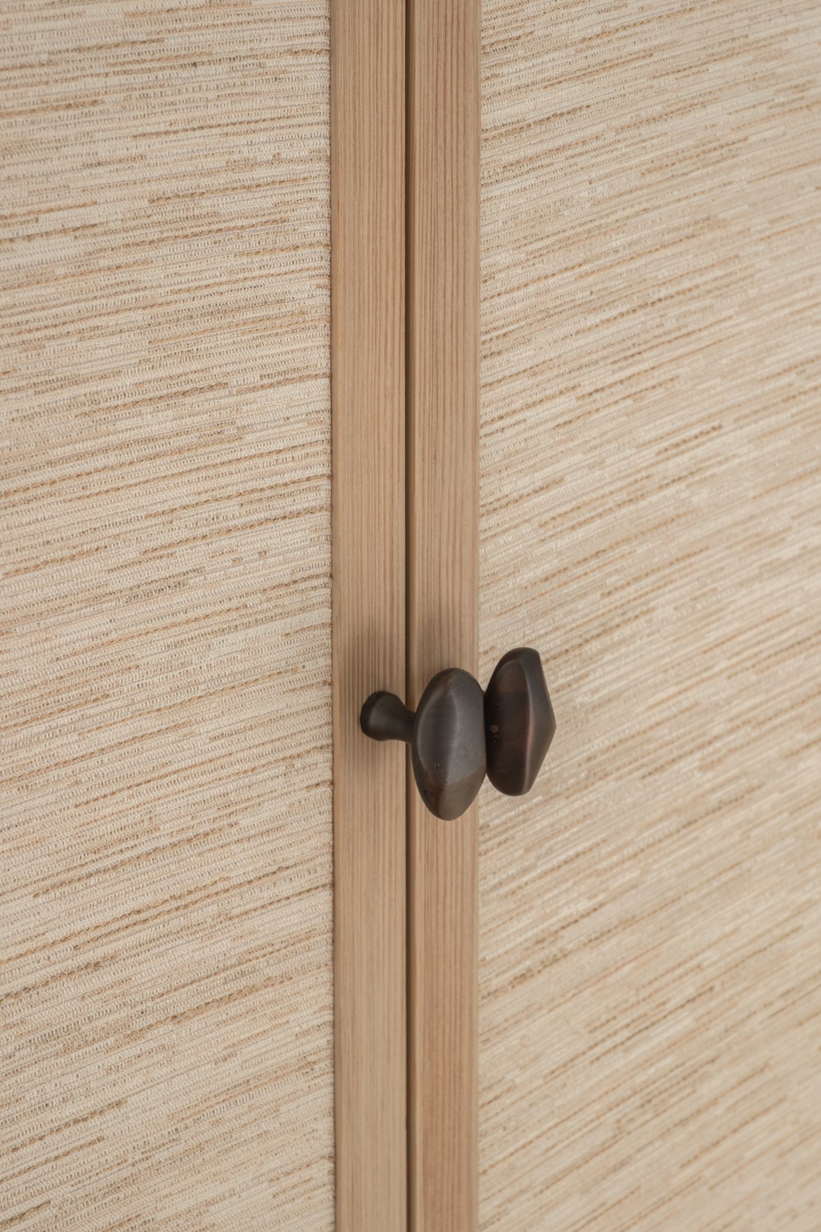
NEW 2026 Jubileum Edition The Best Interior Designers Benelux
Order Now €125