Modern luxury home interior with a double-vanity bathroom, accent walls and built-in lighting
The first thing that stands out in this modern luxury home interior is the way light is handled. A large window pulls daylight into the living area, while curtains soften the edge of the glass and frame the seating below. Elsewhere, inset spots pick out wall niches, door lines, and the edges of the bathroom joinery. The rooms are calm in tone, but they are not plain; wood, tile, glass, and patterned wall finishes keep the eye moving from one surface to the next.
Living room lines set by glass and curtains
The living room opens with low seating placed close to the window wall, so the room reads as broad and horizontal. Curtains hang in soft folds beside the glazing and introduce a second layer in front of the view. In another angle, built-in open shelves sit into the wall and are lit from within, turning a simple recess into part of the room’s composition. The ceiling carries a row of spotlights, with a chandelier visible in the same space, which adds another layer without crowding the room.
That combination of open floor area, framed glass, and built-in light defines the modern luxury home interior more than any single material. The seating stays low, the wall surfaces remain mostly white, and the wood tones are used where they can register clearly: on the floor, in the joinery, or in the more intimate corners of the plan. The result is a room that reads in long views, not in fragments.
A luxury bathroom with a double vanity and long mirror wall
The luxury bathroom with double vanity is set out with a wide basin unit and a long mirror wall above it. The mirror runs almost the length of the vanity zone, which stretches the room visually and brings more light across the tiled surfaces. Small niches are built into the wall, and ceiling spots sit in line above the basin area. In a separate view, the same bathroom shows a freestanding oval bathtub placed in front of a pale wall, with the tub’s curved outline breaking the otherwise rectangular geometry.
Blue accents appear in the tiled surfaces and around the bathing zone, where the finish shifts from plain white planes to bands of color. The tiled walk-in shower walls are equally direct: the shower area is separated by a wall and niche, and the rain shower head is clearly visible. Nothing is overdrawn. The room works through proportion, reflections, and the way the tile joints meet the built-in elements.
Tiled zones, niches, and the freestanding bath
In close view, the bathroom shows how the in-built parts carry the room. The basin area is compact but broad enough for two sinks, and the mirror above it is lit from within, which reduces shadow on the counter. Around the bath, tiled details wrap the edge of the room and bring the oval tub into focus. The freestanding bathtub with tiled surround is set against clean wall planes, so the curved form has space to stand out. A glass or transparent partition appears in one bathroom view, adding another layer without closing the room off completely.
Bedrooms shaped by pattern, paneling, and light
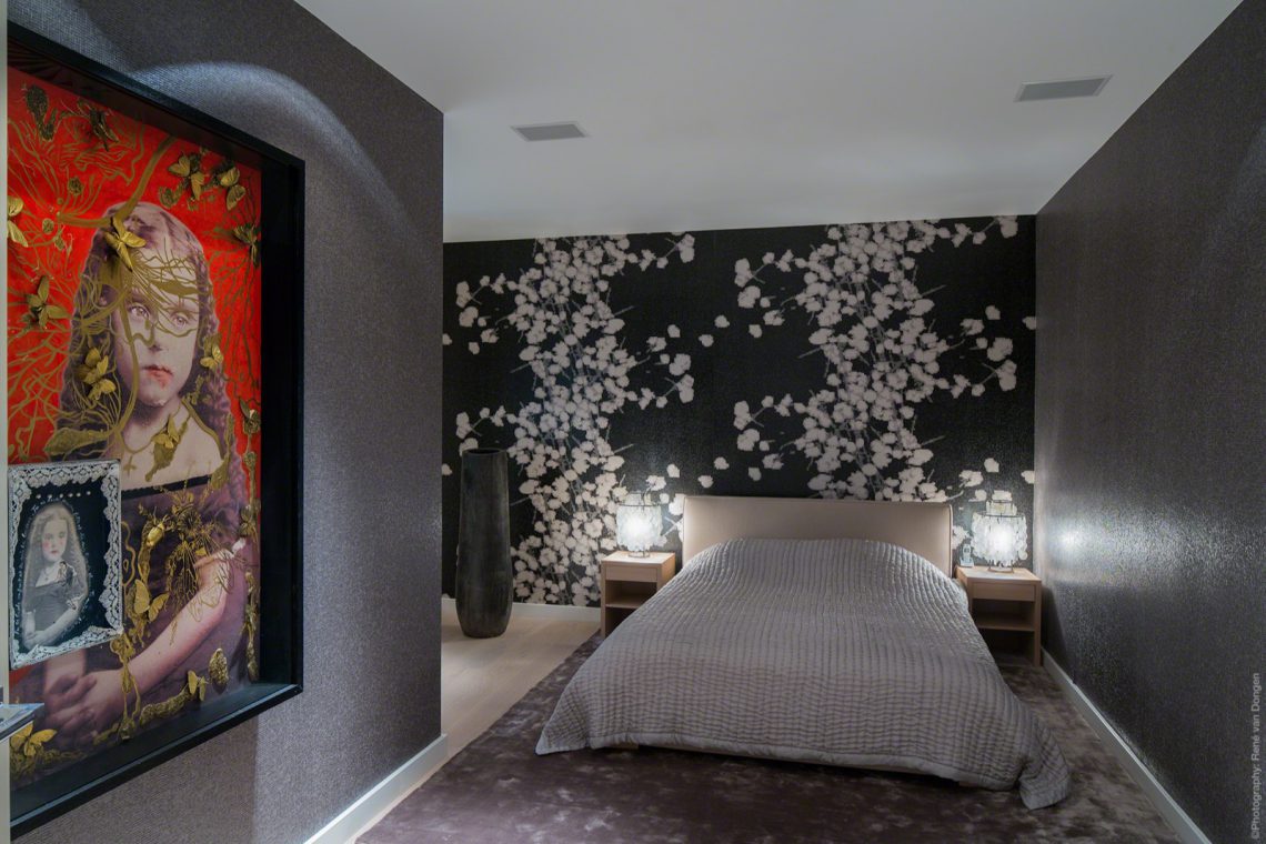
In the bedrooms, the strongest features are on the walls. One room uses a dark accent wall with a pale botanical pattern behind the bed, and the lighting is built into the niche and ceiling rather than left as separate objects. Another bedroom is organized around a panelled wall with rectangular divisions in a lighter tone, which makes the bed wall read as a measured backdrop instead of a blank surface. The bed itself stays low and upholstered, letting the wall treatment carry the scene.
The bedroom accent wall with integrated lighting appears again through the way the room is lit from above and from within the wall structure. A nearby view shows horizontal blinds in bedroom windows, which flatten the light and sharpen the lines at the window. In that room, the grey bed frame sits against a broad opening, and the ceiling spots repeat across the upper plane. The details are restrained, but they are carefully placed where the eye lands first.
A hallway of white doors and precise ceiling spots
The corridor and landing zone are more rigorous than the rooms around them. A row of white interior doors lines the passage, each with a simple metal handle, and the ceiling is punctuated by a narrow band of built-in spotlights. That long, linear strip of light draws the eye forward through the space. At the far end, a piece of wall art or relief gives the corridor a clear endpoint, so the route does not feel like a blank run between rooms.
Because the doors, walls, and ceiling remain white, the light reads clearly and the proportion of the passage becomes more visible. This part of the modern luxury home interior is not about display; it is about order, clear sightlines, and a quiet transition from one room to the next. The effect depends on repetition: repeated doors, repeated spots, repeated planes.
Children’s rooms with a sea theme and glass blocks
Two of the children’s rooms shift the mood through graphic surfaces. One children’s room sea theme wall shows an illustrated landscape with boat-like forms, paired with a bed built on a wooden platform. Horizontal blinds sit at the window, with curtains at the side, so the room can be darkened while keeping the upper wall open to the mural. Another room introduces a children’s room glass block wall, where the blocks form a grid beside a custom built-in unit and a blue upholstered seat.
The rooms do not rely on loose decoration. The wall surfaces do the work. In one room, the sea imagery stretches across the wall above the bed and gives the room its direction. In the other, the glass blocks bring a harder, more architectural surface into a space that is otherwise kept light and practical. A third children’s bathroom view adds blue-tiled bands, a bath, and ceiling spots, repeating the same visual language in a smaller scale.
Custom edges, blinds, and built-in storage
Small details give the children’s rooms their clarity. The window treatments sit close to the glass, and the blinds keep the openings visually neat. Built-in storage appears as part of the wall rather than as separate furniture, which makes the rooms easier to read. The blue seating, the platform bed, and the glazed or blocked wall surfaces all relate back to the same interior logic: fixed elements define the room, while loose pieces stay secondary.
Indoor wellness with wood slats and rounded texture
The wellness area changes material rhythm again. Wood slats line the room, and round wood-like texture appears across the walls and ceiling in small repeated elements. Benches sit low against the perimeter, and the circular ceiling lights echo the rounded surfaces below. This is the most tactile room in the project, but it still follows the same discipline seen elsewhere: a limited palette, repeated lines, and built-in elements that shape the space instead of filling it.
Viewed beside the bathrooms and bedrooms, the wellness room shows another side of the same interior approach. The surfaces are more enclosed, yet the details remain legible: slats, discs, benches, lights. In the context of this modern luxury home interior, it acts less like a separate statement and more like a room in the same measured sequence, where every surface has a clear role.
Room by room, the project stays close to the surface
What holds the interior together is the consistency of its visible decisions. Large windows, curtain layers, built-in spots, tiled shower walls, a freestanding bath, panelled bedroom walls, and themed children’s rooms all belong to the same house, but each room introduces its own surface logic. The project never depends on one finish alone. Instead, it uses light, reflection, grid lines, and material contrast to keep each space distinct while still reading as part of one modern luxury home interior.
Want to see more of Herman Peters? View the page of Herman Peters for even more great projects and company information.





NEW 2026 Jubileum Edition The Best Interior Designers Benelux
Order Now €125


NEW 2026 Jubileum Edition The Best Interior Designers Benelux
Order Now €125


NEW 2026 Jubileum Edition The Best Interior Designers Benelux
Order Now €125


NEW 2026 Jubileum Edition The Best Interior Designers Benelux
Order Now €125


NEW 2026 Jubileum Edition The Best Interior Designers Benelux
Order Now €125