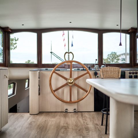
Modern luxury interior with built-in wardrobes, a white kitchen and a stone accent
Large panes pull daylight deep into the room, so the white fronts, pale walls and stone surfaces read almost in layers. The overall effect is a modern luxury interior, but the strongest impression is not polish. It is the way the open plan holds together through line, light and a few decisive materials: a stone column in the living room, a white fitted kitchen, and continuous wood-look flooring that runs toward the terrace.
Open sightlines around the stone column
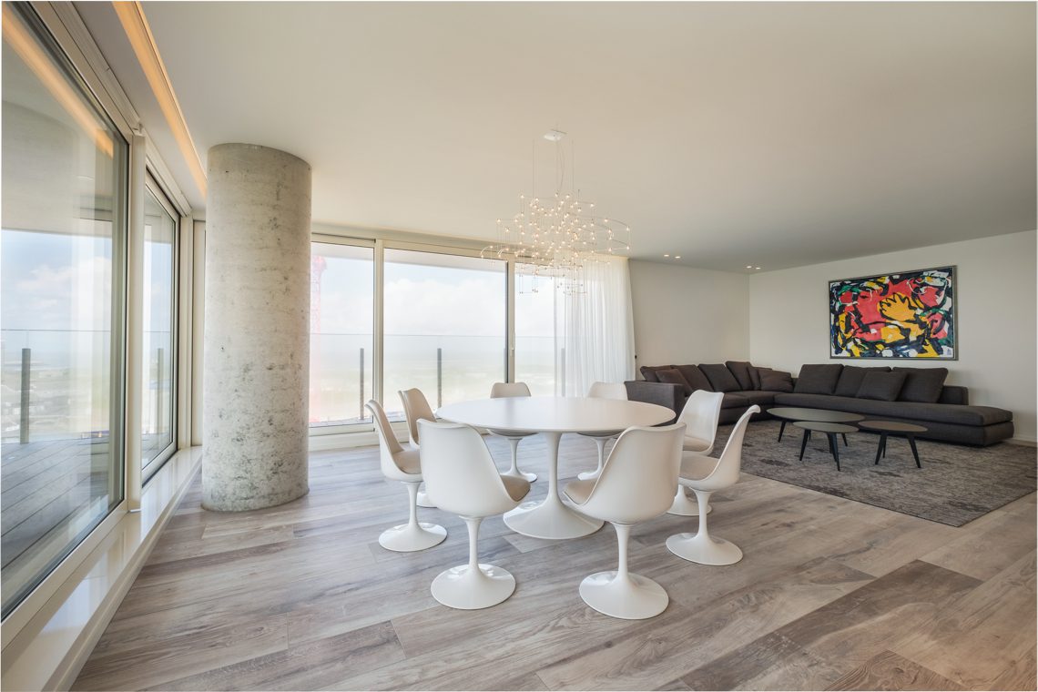
The living space opens wide, with the seating area set against a white wall and a soft grey rug that grounds the darker sofa and round coffee tables. A stone column stands near the glazing and gives the room a firmer vertical note among all the horizontal lines from the floor, the window frames and the long furniture runs. Seen from different angles, the column does more than divide the space; it marks the transition between dining, lounge and the bright edge of the house.
That same openness keeps the eye moving. A white dining table sits close to the glass, and the room beyond remains visible rather than blocked off. Curtain panels soften the large windows, but the structure of the space stays clear. In a minimalist interior, that clarity matters. Here it is reinforced by the restrained palette: white, grey, black and the muted grain of the wood-look floor boards.
A white fitted kitchen with a dark working line
The kitchen is drawn almost entirely in white, from the tall cabinet fronts to the wall units that rise close to the ceiling. The result is a clean block of storage rather than a scattered mix of elements. Against that pale field, the black ventilation strip and the dark cooktop zone read as one long horizontal accent. The contrast is sharp, but controlled, and it gives the white fitted kitchen its rhythm.
Under the worktop, a thin line of light follows the base and makes the island appear to float slightly above the floor. Close up, the kitchen reveals more than one surface at once: a recessed cooking area, built-in appliances set into the cabinetry, and a slim opening that breaks the white field without disturbing it. The arrangement keeps the kitchen visually quiet while still showing the mechanics of daily use.
Lighting that traces the edges
Linear LED lighting runs through the kitchen and adjacent living area like a drawn line. It does not aim to decorate the room; it defines the geometry. The light bar in the ceiling and the under-cabinet strip both emphasize length, which suits the open layout and the long white cabinet fronts. In photos where the light is on, the kitchen reads as a sequence of planes rather than a single block.
This is where the modern luxury interior becomes most legible. The lighting is integrated into the architecture, not added on top. It follows the cabinets, the ceiling edge and the working zone, so the room feels measured by light instead of ornament. Even the darker details — the black strip above the cooking area, the dark TV zone nearby — are placed to sharpen the composition rather than interrupt it.
Storage built into the room height
White built-in wardrobes rise to the ceiling in both the bedroom and the storage zones, creating flat surfaces that almost disappear into the wall. Their value is in the way they remove visual noise. Handles are kept discreet, door lines stay straight, and the cabinets meet the ceiling with little ceremony. In the bedroom, the same white cabinetry sits beside the bed and reflects the pale light that comes in from outside, which keeps the space calm without making it empty.
The built-in wardrobes to ceiling also make the room feel taller. That vertical reach matters in a project where most other elements stay low and horizontal: the sofa, the kitchen island, the long floor runs and the broad window openings. By stretching upward, the cabinets bring proportion to the interior and help the walls do more than simply close the room off.
Bathroom finishes kept plain and exact
The bathroom is stripped back to the essential elements visible in the images: white wall tiles, a freestanding rectangular bathtub and a radiator set against the tiled surface. The bathtub sits as a clear object in the room, not enclosed by heavy framing or decorative edges. Its shape is plain and direct, which suits the white tile details around it. The room does not depend on contrast for drama; instead, it uses repetition of pale surfaces and straight joints.
Another image shows a white basin set into a simple surface with the plumbing and surrounding lines kept understated. The same restrained approach continues in the wall treatment, where tile or stone-like surfaces stay light in tone and allow the fixtures to stand out by outline rather than by ornament. In a modern luxury interior, that kind of control is often what makes the room feel resolved.
White tile details around the bath
Close views of the bathroom show the white wall tile details more clearly. The joints are visible, the surfaces are flat, and the light catches the tile faces in a way that keeps the room from flattening out. The freestanding bathtub white tiles pairing is especially legible in these frames: one object with a rounded outer profile, one surface system built from repeated modules. The bathroom stays spare, but not bare.
From the living room to the terrace
At the edge of the interior, the floor continues toward the outside in wood-look boards that align the house with the terrace. This continuous wood-look flooring gives the transition a calm visual flow, even as the materials change from interior finish to outdoor surface. The terrace is protected by a glass railing with dark supports, so the view stays open and the boundary remains light in appearance.
Seen together, the glass railing terrace and the large openings behind it make the outdoor area feel like part of the same composition as the living room. The boards lead outward, the glass keeps the horizon visible, and the windows bring the exterior back into the interior. It is a measured move rather than a dramatic one, but it gives the project a clear spatial end point.
What the photographs keep returning to
The images keep circling back to the same few decisions: white cabinetry, long straight lines, stone in one vertical accent, and daylight crossing generous openings. That repetition is useful. It shows how the modern luxury interior depends less on isolated statement pieces than on a steady visual language. Even the grey sofa, the round tables and the patterned rug are part of that language because they sit quietly within it.
Another consistent thread is the balance between smooth surfaces and the more tactile ones: the pale cabinet fronts, the stone column accent living room, the wood-look floor, the white wall tile details and the clear glass at the terrace. Each material does a different job. Some absorb light, others reflect it, and the room is shaped by that exchange. The result is a project that reads clearly in photographs because the main elements are already doing the work of composition.
Want to see more of QTD Interieur Architecten? View the page of QTD Interieur Architecten for even more great projects and company information.




NEW 2026 Jubileum Edition The Best Interior Designers Benelux
Order Now €125


NEW 2026 Jubileum Edition The Best Interior Designers Benelux
Order Now €125


NEW 2026 Jubileum Edition The Best Interior Designers Benelux
Order Now €125


NEW 2026 Jubileum Edition The Best Interior Designers Benelux
Order Now €125