










Modern luxury interior with custom cabinets
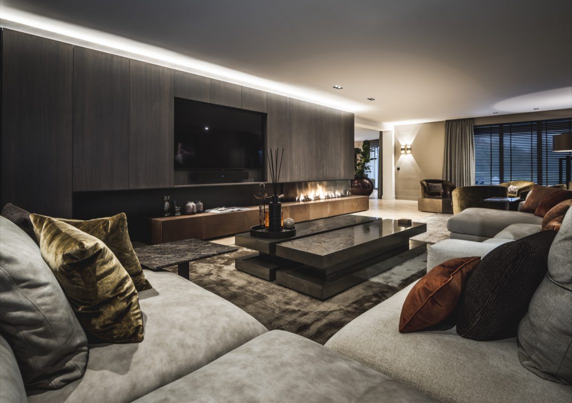
Black surfaces and warm light set the tone from the first room. In the living area, a black TV feature wall cuts into the composition, framed by integrated lighting that picks out the niche instead of flattening it. Nearby, vertical shutters, draped curtains and a dark coffee table keep the room grounded, while the pale floor opens up the seating zone. The result is a modern luxury interior that relies on line, contrast and measured light rather than ornament.
A living room built around light, shadow and storage
The living room shows how custom cabinets can do more than hold objects. A wall with built-in cabinets and illuminated niches turns storage into part of the architecture. The opening around the TV is treated as a deep recess, so the screen sits inside the wall instead of floating in front of it. That choice leaves the surrounding surfaces calm, with black detailing and soft light doing most of the work. Even the window treatment is handled as part of the room’s structure, with shutters and curtains softening the edge of the glazing.
Details that hold the room together
Small shifts in material keep the space from becoming flat. The dark tabletop, the warm reflections in the lighting and the pale wall planes create clear layers across the room. One detail leads to another: a lit niche, then the frame of the window, then the line of the floor. That rhythm gives the living area a controlled pace. It also makes the black TV feature wall feel anchored rather than decorative, which suits the rest of the interior’s restrained palette.
Custom cabinets carry the plan from room to room
Across the project, custom cabinets appear as a thread that connects the living area, hall, bedroom and dressing space. Some are closed and pared back, others open into shelves and display niches. In the detail views, the joinery is paired with warm indirect lighting so the edges of each compartment stay visible after dark. Built-in cabinets like these do not sit on top of the architecture; they form the walls, fill the recesses and guide the eye through the apartment. That is what gives the project its quiet precision.
The kitchen continues that logic with a dark work surface, glass elements and a clear line of sight toward the hallway and stair zone. It reads as part of the same interior language, not as a separate decorative idea. The glazing introduces reflection and transparency, while the surrounding white planes keep the open plan bright. Even without filling the frame with objects, the room feels resolved by the way the cabinetry and surfaces are held in place. In a modern luxury interior, that kind of discipline matters more than excess.
A walk-in closet framed by mirrors and glass
The walk-in closet is one of the clearest proofs of the project’s bespoke approach. White built-in storage runs across the wall, with open compartments, hanging rails and shelves arranged in a strict grid. Mirror and glass doors shift the depth of the space, while the illuminated cabinet runs keep the surfaces legible. The result is a walk-in closet that feels edited rather than crowded. Every compartment has a role, and the mix of open and closed storage keeps the room practical without losing its visual order.
Open shelving and reflected light
What stands out here is the way light lands on the joinery. The shelves catch it first, then the mirror doors send it back into the room. That reflection makes the narrowest parts of the closet feel less compressed. It also ties the storage to the rest of the project, where warm indirect lighting traces the edges of niches and wall openings. In this section, custom cabinetry becomes a spatial device. It marks the transition from dressing area to circulation without needing extra partitions.
The bedroom stays calm through texture, not excess
The bedroom uses fewer gestures, but each one is deliberate. A upholstered headboard with horizontal stitching sits against the wall, and black shutters give the window a firm vertical rhythm. The white paneled door and the darker wood floor keep the palette controlled. A lit wall niche nearby adds a small point of emphasis, but the room never competes with itself. Instead, the surfaces are arranged so that the bed, the window and the door line up with enough space around them to let the materials read clearly.
That restraint carries through the adjacent hall and detail shots, where panelled doors, warm wall lighting and darker flooring continue the same vocabulary. The room does not depend on decorative clutter. It relies on proportion, shadow and a few hard edges. Compared with the more open living areas, the bedroom feels enclosed in a useful way: the shutters filter the light, the headboard gives the bed a clear boundary, and the joinery nearby keeps the transition to storage smooth.
A bathroom of stone-look surfaces and clear lines
The bathroom moves into a more mineral register. Natural stone-look bathroom tiles cover the shower wall, their veining visible behind a glass partition that keeps the shower open to the rest of the room. The double vanity sits in a white base with a dark countertop, and the large mirror above it stretches the room laterally. A freestanding bath sits near the window with shutters, which adds another soft edge to a room built mostly from straight lines and hard surfaces. The balance comes from the materials themselves: glass, tile, metal and painted joinery.
Shower, vanity and niche in one view
The shower is defined by the walk-in shower glass partition and the dark stone-look finish behind it. The clear panel preserves sight lines, so the room reads as one continuous volume rather than a series of closed corners. In the vanity niche, a darker worktop and wall lighting sharpen the composition. The metal fittings introduce a subtle contrast without breaking the calm palette. These are small moves, but they matter. They give the bathroom the same discipline seen in the living room and closet, only with a different material emphasis.
Seen as a whole, the project depends on repetition with variation. Custom cabinets return in different forms, from integrated wall units to wardrobe storage and bathroom joinery. Warm indirect lighting appears in the living room niches, the closet shelves and the detail wall, always used to pick out depth rather than to decorate. The black TV feature wall anchors the public zone, while the bedroom, dressing room and bathroom each extend the same language through their own surfaces. That consistency keeps the interior legible as you move from one room to the next.
Want to see more of Ecker? View the page of Ecker for even more great projects and company information.




NEW 2026 Jubileum Edition The Best Interior Designers Benelux
Order Now €125


NEW 2026 Jubileum Edition The Best Interior Designers Benelux
Order Now €125


