Modern luxury interior with herringbone parquet
A dark stair rail, white kitchen fronts and herringbone parquet set the tone from the first view. The interior moves between light stone surfaces, warm wood and black frames, with integrated lighting drawing the eye into niches and cabinet lines. It reads as a modern luxury interior through restraint rather than excess: clean edges, measured contrast and a clear preference for custom interior detailing that keeps the rooms visually open.
White fronts and a darker work zone in the kitchen
The kitchen is built from calm, flat front panels in white, interrupted by a darker work zone that grounds the composition. LED in cabinets and above the niches brings out the depth of the joinery without adding visual clutter. In the wider view, the marmer-look tiles on the floor add a pale stone note that reflects the light back into the room. It is the kind of arrangement that depends on precise lines, especially where the storage runs meet the darker island edge.
Seen from across the room, the custom interior approach is easy to read in the way the cabinets sit flush and the lighting is hidden into the structure itself. Nothing asks for attention on its own. Instead, the white kitchen fronts, the darker counter zone and the recessed niche lighting work together as a sequence of surfaces. The result is not about decoration. It is about control over rhythm, shadow and the way the kitchen relates to the dining area.
Lighting built into the joinery
The linear light inside the niches gives the kitchen its clearest edge. It traces the shelves, softens the transition between upper cabinets and wall, and makes the storage feel lighter than it is. This use of LED in cabinets appears again as a practical visual device rather than a statement feature. The light marks the structure of the room. It also keeps the kitchen visually tied to the rest of the interior, where illumination is handled with the same restraint.
Herringbone parquet and a living space that stays open
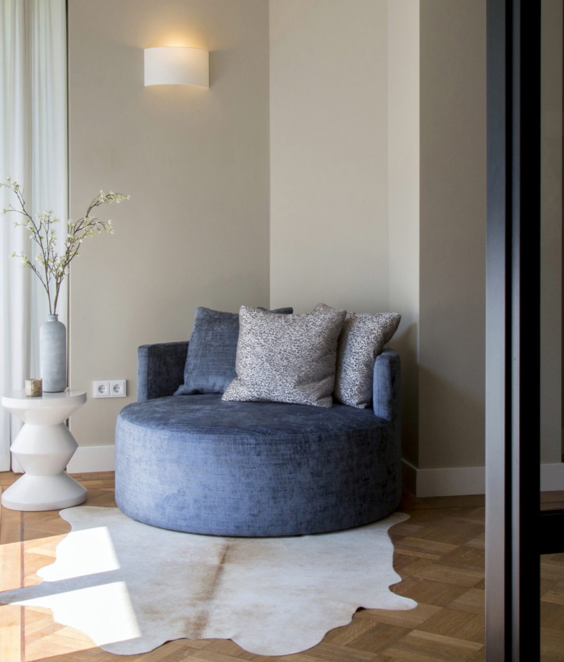
In the living room, the herringbone parquet brings direction to an otherwise calm palette. The wood pattern breaks up the larger surfaces and gives the seating area a grounded base. A round blue chair, a light rug and a grey sofa add softer shapes against the straight lines of the floor and window openings. The room relies on these contrasts: wood against plaster, curved seating against square openings, and daylight against the darker furniture edges.
The herringbone parquet is visible across the main living areas, tying the rooms together without flattening them into one surface. It works especially well with the white window frames and pale curtains, which keep the daylight broad and even. A black glass door in a profiled frame introduces a sharper note. Because the glass reflects the room, the passage between spaces remains visible, and the interior gains depth without losing clarity.
A staircase defined by black lines
The staircase has a darker finish that makes it read as a separate piece within the interior. Black window frames and a black railing with twisted balusters reinforce that contrast. The stair treads sit in a deep tone, while the adjacent floor turns lighter in stone-like tiles. That shift in material helps the transition zone feel deliberate. It is a compact intervention, but it changes how the eye moves through the house.
What stands out most is the way the dark staircase railing cuts across the pale surroundings. The profile is visible from several angles, and the turned spindles add texture without softening the line. This is where the modern luxury interior feels most explicit: not in ornament, but in the decision to let one strong black element anchor the route upward. The stair becomes a visual hinge between the open living space and the more enclosed upper level.
Stone underfoot, contrast above
At the foot of the stair, marble-look tiles and reflective surfaces create a cooler transition than the wood floor in the living area. The shift is practical, but it also sharpens the reading of the interior. Black frames nearby repeat the same graphic note seen in the railing. Together they set up a simple visual language: dark line, pale field, then wood again. That pattern gives the house a clear order without relying on decorative layers.
A compact toilet with strong surface contrast
The toilet shows how far the material palette has been carried into the smaller spaces. Small mosaic tiles cover part of the room, while marble-look tiles appear on the side wall. The combination adds texture through scale rather than through color. A metallic flush plate sits cleanly within the wall, and the compact fittings keep the focus on the surfaces around them. Even in this narrow room, the custom interior logic remains visible.
The mosaic introduces a fine grain that breaks up the larger tiled planes. Against that, the marble-look wall feels smoother and more reflective. This contrast is useful in a small room because it gives depth to a space that could otherwise disappear into plainness. The material shift is precise, and it keeps the toilet visually aligned with the rest of the project, where surfaces are chosen for the way they catch light and define edges.
Black-framed glass that keeps the plan connected
The black-framed glass door is one of the clearest threshold details in the project. Its profiled edge stands out against the lighter wall surfaces, while the transparency keeps the next room visible. Reflections in the glass add another layer, so the door does more than divide spaces. It frames them. That is important in a modern luxury interior like this one, where open sightlines matter as much as the materials themselves.
Across the project, the same discipline returns in different forms: herringbone parquet underfoot, white kitchen fronts, LED in cabinets, marble-look tiles and black frames. None of these elements acts alone. Each one is strongest when read beside the next surface or line. The result is a house that depends on measured contrast and custom interior detailing, with lighting and material transitions doing the work of decoration.
Seen together, the rooms are held together by a careful sequence of finishes rather than by a single gesture. The kitchen feels crisp because the white fronts stop cleanly at the darker work zone. The living room feels grounded because the herringbone parquet breaks up the expanse of floor. The stair makes the route legible with its black railing, and the glazed door keeps the plan open without losing definition. That is where this modern luxury interior lands: in visible decisions, not in excess.
Want to see more of Thomas de Gier? View the page of Thomas de Gier for even more great projects and company information.





NEW 2026 Jubileum Edition The Best Interior Designers Benelux
Order Now €125


NEW 2026 Jubileum Edition The Best Interior Designers Benelux
Order Now €125


NEW 2026 Jubileum Edition The Best Interior Designers Benelux
Order Now €125


NEW 2026 Jubileum Edition The Best Interior Designers Benelux
Order Now €125


NEW 2026 Jubileum Edition The Best Interior Designers Benelux
Order Now €125