Modern farmhouse home with interlocking gabled roofs
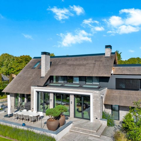
Two gabled roofs meet and slip into one another, giving this modern farmhouse home its clearest gesture. The front volume is laid in white limewashed masonry, while the set-back wing is wrapped in black timber cladding. That contrast is direct and easy to read from the first view. Blank oak appears at the front door, the barn doors, and the exposed timber structure, pulling the material palette away from hard edges and toward a more tactile finish.
Two roof forms, one grounded composition
The interlocking gabled roofs do more than shape the silhouette. They also create depth between the main house and the recessed annex, so the building never reads as a single flat block. White masonry holds the front volume in place, while the black timber cladding of the rear volume steps back visually. The shift in material is paired with a shift in volume, and that is what gives the composition its clarity. Along the rooflines, the straight tiles keep the profile crisp rather than heavy.
Large window openings cut into both volumes and bring light into the deeper parts of the house. Their rectangular format keeps the elevations calm, but the openings also work as frames for the rooms behind them. From outside, the glazing marks the points where the plan opens up. Inside, it allows the living spaces to stay connected to the terrace and the garden without relying on decorative gestures.
Oak details that soften the black and white palette
Blank oak is used in places where the eye naturally lands: the entrance door, the barn doors, and the visible timber structure. Because the oak is left light, it sits between the white masonry and the black cladding instead of competing with them. The material has enough presence to register from a distance, yet it stays honest to the structure. That is especially clear under the roof overhangs, where the wood reads as part of the house rather than as an applied finish.
The rear volume is finished in black timber cladding, which gives the recessed part of the house a darker weight. It contrasts with the white front volume, but it also recedes into the shadow of the gables. This is where the project’s material logic becomes strongest: white for the main body, black for the setback wing, oak for the parts you touch. The result is not decorative layering. It is a simple sequence of material roles.
A covered terrace that extends the living area
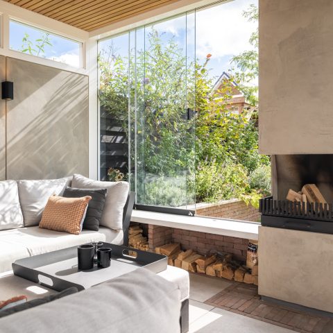
At the back, the house opens toward a covered terrace with wood and glass. The timber structure is visible, and the glazing lets the terrace sit between house and garden rather than closing it off. That middle zone matters here. It gives the rear elevation a deeper edge and turns the outside area into part of the daily route through the house. Seen from inside, the terrace works as an extension of the living space, not as a separate add-on.
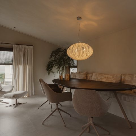
From the kitchen island, the view runs across the dining table, under the covered terrace, and out to the garden. That sightline from the kitchen island shapes how the rear of the house is used. Cooking, eating, and looking outside happen along one axis, with the island acting as the point from which the whole room can be read. The opening to the back is generous, but the layout still keeps the room anchored around the island and the long view beyond it.
Glass, timber, and the transition to the garden
The large glass openings at the rear make the transition to the garden feel immediate. They also reveal the timber structure of the terrace, which gives the outdoor edge more depth than a plain opening would. The house does not dissolve into the landscape; instead, it stops at a defined threshold of wood, glass, and shadow. That threshold becomes a useful place to sit, look out, and move between the interior floor and the terrace.
Because the terrace is covered, the rear façade can remain open without losing its sense of enclosure. The roof above catches the structure and gives the space underneath a clear boundary. In photographs, that boundary is visible in the line of the posts and the glazed surfaces beside them. It is a practical detail, but it also shapes how the back of the house reads: as a layered section rather than a single flat plane.
More floor area under the twin caps
The roof form also pays off inside. The upper floor continues fully under both caps, which creates more usable space than the exterior profile first suggests. From the street, the house appears compact and measured. Inside, the full depth beneath the roofs gives the plan a very different scale. That extra room is not announced with a dramatic gesture; it is simply built into the geometry of the two gables.
That kind of volume makes the interior feel open without requiring oversized rooms. The plan can spread out under the roof slopes, and the structural rhythm remains legible from one zone to the next. It is a useful reminder that roof shape is not just a matter of appearance. Here, it directly affects how the upper level works and how much room the house can hold.
An open staircase and a kitchen built around sightlines
Inside, the entrance sequence is kept clear. White walls and light grey floor tiles set a neutral base, and the open staircase becomes the main vertical element. Its wooden treads and dark side pieces give it a light visual grip, so it reads as a piece of structure rather than as a closed wall. The staircase also lets daylight move through the entry zone, where the materials stay restrained and easy to follow.
Kitchen with a white island and oak cabinetry
The kitchen carries the same material discipline into the living area. Oak cabinetry lines one side, while the white island keeps the center bright and visually light. From the island, the view reaches the dining table and then continues toward the covered terrace and the garden. That sightline from the kitchen island is the strongest organizing line in the interior. It connects the working part of the kitchen to the rest of the house without needing partitions or extra levels.
Elsewhere in the living space, built-in oak furniture and large glazed openings keep the room open to daylight and to the outside. The furniture does not sit apart from the architecture; it follows the walls and respects the long horizontal lines of the room. Taken together, the staircase, the kitchen island, and the broad windows give the interior a clear sequence of moves. You step in, turn toward the living area, and keep seeing through to the back of the house.
Want to see more of Bongers Architecten? View the page of Bongers Architecten for even more great projects and company information.




NEW 2026 Jubileum Edition The Best Interior Designers Benelux
Order Now €125


NEW 2026 Jubileum Edition The Best Interior Designers Benelux
Order Now €125


NEW 2026 Jubileum Edition The Best Interior Designers Benelux
Order Now €125