Renovation of a 1930s house
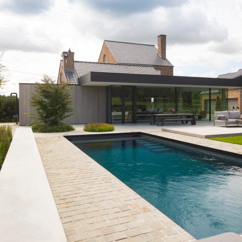
A new line of sight now runs from the kitchen to the terrace, with a glass opening, dark frames and a gas fireplace placed between the double doors. The renovation of a 1930s house turned an outdated interior into a light-filled family home, with a side and rear extension that gives the ground floor more depth and a clearer relation to the garden.
The kitchen wall now anchors the ground floor
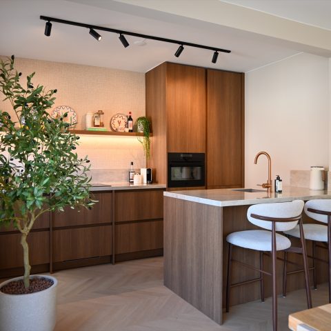
The custom kitchen wall sits at the center of the renewed plan. It is the first surface you read when entering the space: built-in elements, a niche and a strong work zone give the wall a precise presence without overloading the room. In the photo, the cooking area is set into a clean composition of cabinetry and openings, so the kitchen does more than serve meals. It shapes the route through the house and holds the living space together.
That role suits the wider renovation of a 1930s house. The kitchen is no longer a separate room at the back, but part of a sequence that links cooking, dining and sitting. The dark profiles around the glass keep the view steady, while the surrounding surfaces stay restrained enough for the kitchen wall to remain the visual focus.
Light enters from roof lights, side windows and double doors
Daylight was pulled deep into the house through roof lights, side windows and double doors. Each opening works differently. The roof lights lift the ceiling plane, the side windows brighten the edges of the plan, and the double doors open the rear wall toward the terrace. Together they make the interior feel longer and clearer, especially where the extension meets the original house.
The effect is most visible in the transition from the kitchen toward the garden. The glass area does not simply add more light; it sets up a sequence of views that moves from work surface to fire, then from interior flooring to the terrace outside. In a renovation of a 1930s house, that kind of daylight control changes how the rooms are read, even when the furniture stays modest and the palette remains grounded.
Steel doors and wooden wall cladding give the rooms a firmer edge
Steel doors bring a thin, graphic line to the interior. Against the wood wall cladding, they add contrast without breaking the calm of the room. The materials are straightforward: concrete underfoot, timber on the walls, steel in the frames. But the value lies in how they work together. Hard surfaces sharpen the plan, while the wood softens the larger walls and keeps the extension from feeling overdrawn.
That material mix also supports the idea of a light-filled family home. Concrete grounds the space. Wood adds texture to the longer wall runs. Steel keeps the openings crisp, especially where the doors and glazing meet. Instead of treating each finish separately, the renovation of a 1930s house lets them sit in one continuous field, so the eye can move from one zone to the next without interruption.
A side and rear extension with wooden accents
The side and rear extension extends the house in two directions at once. On the outside, wooden accents mark the added volume and give it a clear relation to the original structure. The extension is not pushed forward as a separate object; it is folded into the existing house, with the timber detailing helping the new parts read as additions rather than interruptions.
What changes most is the sense of width. The side extension opens the plan laterally, while the rear extension pulls the living area toward the garden. That gives the renovation of a 1930s house a broader domestic scale. The rooms can now work as one sequence, with the kitchen at the center and the terrace just beyond the double doors.
Inside and outside use the same material language
Outside, the pergola continues the logic of the interior. The same family of materials returns in a different setting, so the transition from house to garden feels measured rather than abrupt. The outdoor structure frames the space instead of filling it, and the repeating timber tones echo the wall surfaces inside.
This indoor-outdoor connection is one of the clearest parts of the project. The terrace is not treated as an afterthought. It sits directly in line with the glazed opening and the fireplace, which makes the outdoor space part of the daily route through the house. In a renovation of a 1930s house, that continuity matters more than decoration; it is what allows the living areas to extend beyond the walls.
The garden edge follows the rhythm of the house
The garden keeps the same calm reading. The pergola gives it structure, while the wider opening from the double doors defines where the interior ends. Nothing is overworked. The framing is enough. From the kitchen, the eye crosses the room, the glass, and the terrace before it reaches the garden structure. That long view is what makes the house feel more open than its older shell would suggest.
What started as a dated house now reads as a connected living sequence, with the extension, the daylight openings and the material changes all doing visible work. The renovation of a 1930s house is not described here as a cosmetic update, but as a reordering of space. The kitchen wall holds the middle, the garden answers it at the edge, and the rooms between them are shaped by light, steel, wood and concrete.
Want to see more of Lifs interior design? View the page of Lifs interior design for even more great projects and company information.



NEW 2026 Jubileum Edition The Best Interior Designers Benelux
Order Now €125


NEW 2026 Jubileum Edition The Best Interior Designers Benelux
Order Now €125


NEW 2026 Jubileum Edition The Best Interior Designers Benelux
Order Now €125


NEW 2026 Jubileum Edition The Best Interior Designers Benelux
Order Now €125


NEW 2026 Jubileum Edition The Best Interior Designers Benelux
Order Now €125