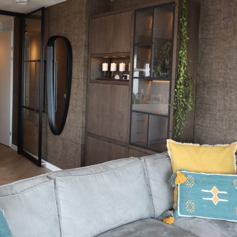
Wabi-sabi house design with exposed wooden beams
Warm timber runs across the ceiling, then breaks into a visible beam grid that keeps the rooms grounded in the material itself. In this wabi-sabi house design, the surfaces do not try to disappear. Wood, plaster, and masonry stay readable, and the tension between them gives the project its character. Light lands differently on each finish: on the chalk-like walls it softens, on the timber it sharpens the grain, and at the openings it slips outward toward the garden and patio.
Timber overhead, with the structure left in view
The clearest gesture is above eye level. Exposed wooden beams stretch across long ceilings and repeat in a measured rhythm, especially in the rooms where the roof line is most open. That structure does more than frame the space. It sets the pace of the interior and gives the house a sense of order without polishing away the material trace. The wood reads as both surface and support, which suits the restrained tone of the project.
In the kitchen, the ceiling shifts into a crossed timber pattern above a central work zone. A stone-topped island sits below it, edged in wood so the counter feels anchored rather than floating. Large panes around the room pull in greenery from several sides. The result is not a closed kitchen block but a place where the timber ceiling, the hard slab of the worktop, and the view outside stay in the same frame.
Exposed wooden beams as the room’s guiding line
Across the house, the exposed wooden beams do a quiet amount of work. They interrupt broad planes just enough to prevent the interior from becoming flat. In longer rooms, the beams mark direction; in lower areas, they compress the ceiling and sharpen the sense of enclosure. Because the timber remains visible, the construction reads as part of the finish. That openness suits the project’s interest in what is incomplete, ordinary, and still in process.
Textured plaster walls and pale masonry surfaces
The wall finishes are deliberately understated, but never blank. Textured plaster walls give the rooms a chalky surface that catches light unevenly, especially where the openings cut through the envelope. Some planes feel almost monolithic, while others show a rougher grain that sits beside the smoother timber. The palette stays close to white, light grey, sand, and muted blue-grey, so the material changes are easier to read than any color contrast.
That restraint makes small shifts more noticeable. A corner turns from plaster to wood. A lintel throws a short shadow. A niche beside an opening becomes a thin pocket of shade. Rather than masking those transitions, the project lets them stay visible. The effect is calm, but it is not polished into silence. It holds onto the slight irregularities that define a wabi-sabi house design.
Wood slat facade rhythm and vertical openings
Vertical openings and a wood slat facade rhythm give the exterior its pace. The façade is not treated as a single flat skin; it breaks into repeated lines, panels, and slats that register differently in daylight. Some elements read as screens, others as vertical markers around openings. Together they create a steady beat across the long elevation, with darker voids cutting through the lighter wall surface.
These wood elements also soften the transition between inside and outside. Where the slats sit near openings, they filter views and keep the depth of the wall visible. The façade therefore feels layered rather than sealed. It is a useful move in a house that gives so much importance to passing light, partial views, and the edges of rooms rather than to a single frontal gesture.
Large openings to the garden, held by shadow
Large openings to the garden appear throughout the project, but they never read as simple glass cuts. Each one is framed by thickness: a wall reveal, a beam overhead, a patch of shade on the threshold. That depth matters. It turns the opening into a space between rooms and landscape, not just an end point. In the images, the garden sits close enough to register as texture and reflection rather than backdrop.
The outdoor loggia with wood extends that threshold further. Tall walls and vertical timber elements define the sheltered edge, while the floor remains closely tied to the house. It is an outdoor room that keeps the material language of the interior alive. The light shifts here as well. Bright patches meet the grain of the wood, and the enclosing walls hold a pale surface that reflects the outside back into the space.
A house studied through material tactility
The project is still in progress, and that incompletion fits the brief. The house is conceived as an investigation into beauty that is imperfect, transient, and unfinished. That idea is present not only in the words that describe it, but in the visible choices: exposed structure instead of hidden construction, rough plaster rather than glossy finish, openings that keep the garden close, and timber details that remain legible as the building develops. The result is a wabi-sabi house design that is measured by surface, shadow, and the space between one material and the next.
What stays with the viewer is the way the rooms are held together by these visible decisions. The timber ceiling, the textured plaster walls, and the vertical rhythm of wood elements keep repeating in different registers, from kitchen to living space to loggia. None of them asks for decoration on top. The material itself carries the image. That is where the project settles: in a house where structure, finish, and opening all remain available to the eye.
Want to see more of David Bulckaen? View the page of David Bulckaen for even more great projects and company information.




NEW 2026 Jubileum Edition The Best Interior Designers Benelux
Order Now €125