Modern country style interior with a custom kitchen and wood-look cabinet wall
The kitchen sits at the center of the plan and does more than serve the room. From here, the route opens toward the living spaces, the glazed opening to the terrace, and the quieter built-in zones along the wall. In this modern country style interior with a custom kitchen, the straight cabinet fronts and wood-look panels take the lead, while the lighter surfaces keep the space from feeling heavy. The result is read through details first: the grain on the tall fronts, the long handles, the stone-like worktop, and the way the light lands on each surface.
A kitchen that links the house together
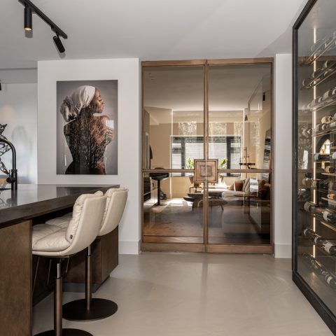
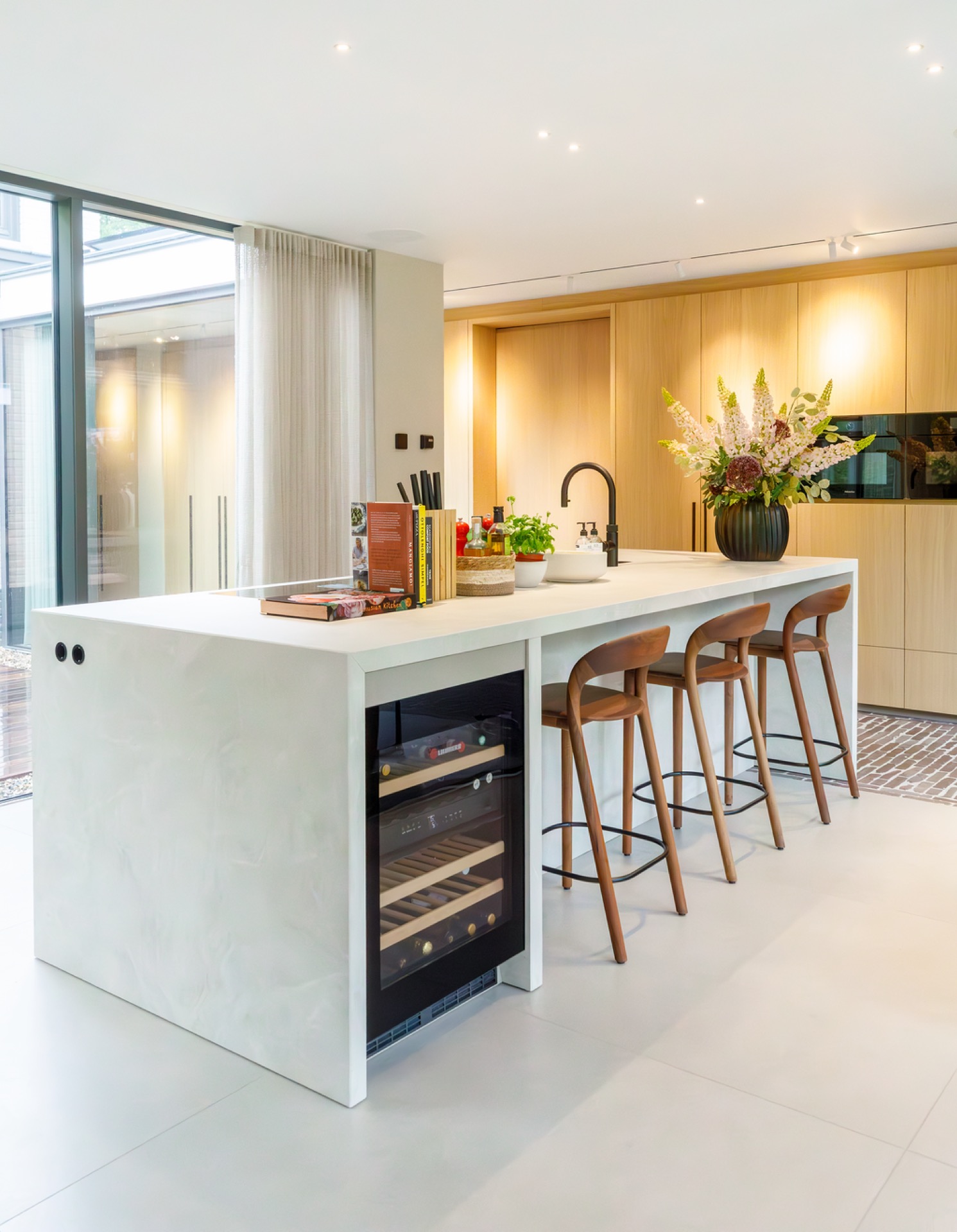
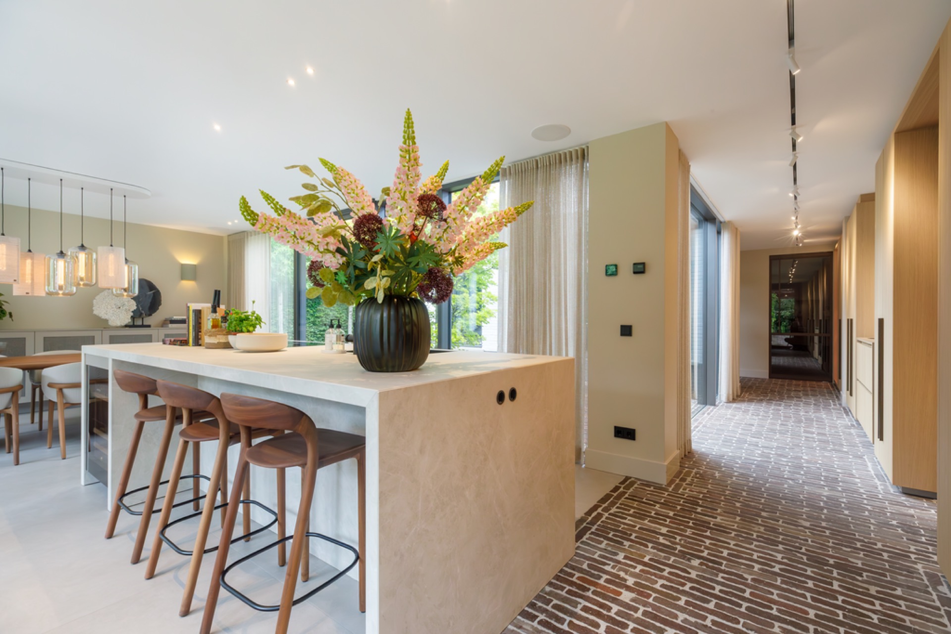
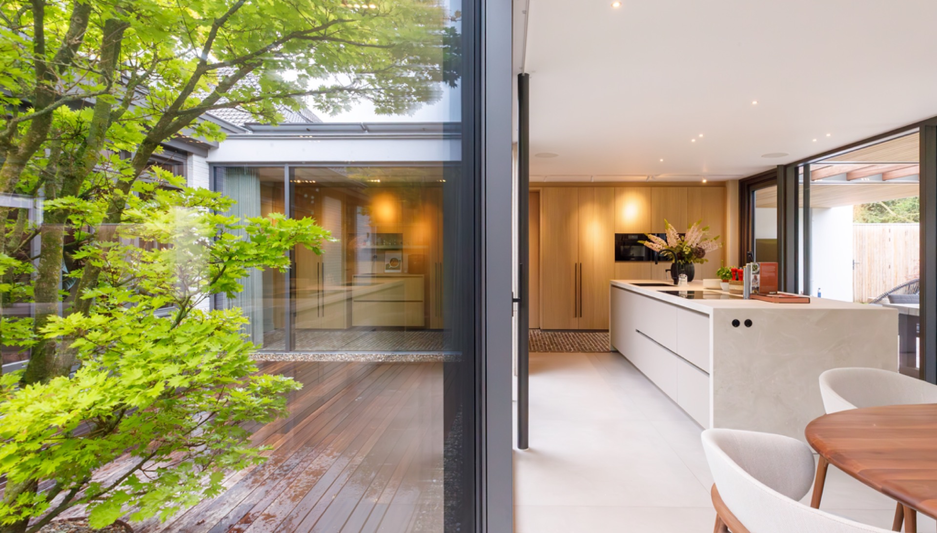
The layout is built around the kitchen island, which holds the main work zone in the middle of the room. Around it, the room stretches into adjoining areas without abrupt breaks, so the kitchen acts as a hinge rather than a closed-off zone. That role is visible in the sightlines: one direction looks toward the glass opening and terrace, another toward the passage and the rest of the interior. The island’s pale volume contrasts with the darker insert and the wood tones behind it, giving the room a clear center.
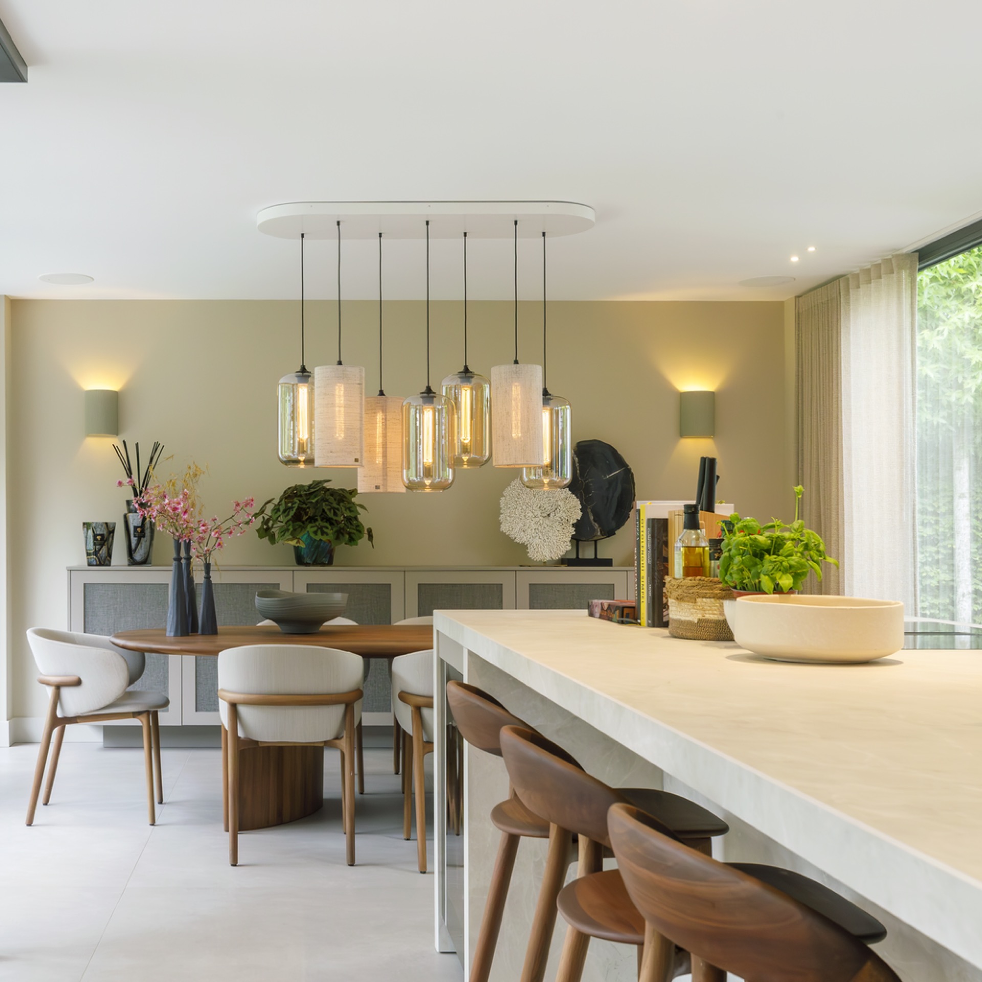
Warm track lighting runs across the ceiling and picks out the island, the worktop edge, and the cabinet wall beside it. The light is not decorative noise; it follows the main working line and makes the surfaces legible in the evening. A round pendant cluster appears further along the room, near the dining zone, where it marks the change from task area to table setting. The ceiling treatment stays restrained, so the fittings read as part of the room’s structure rather than as separate objects.
The wood-look cabinet wall and its quieter recesses
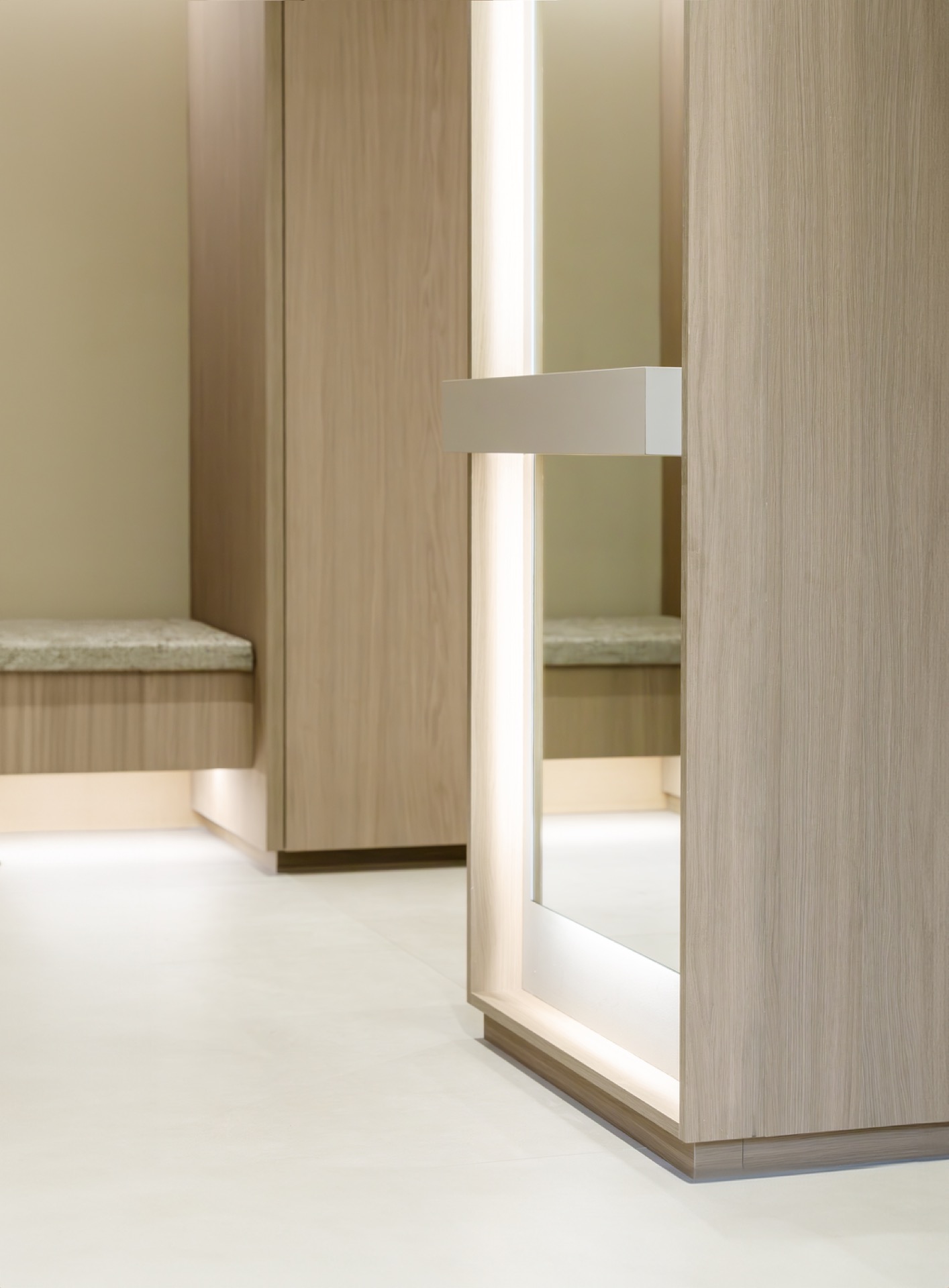
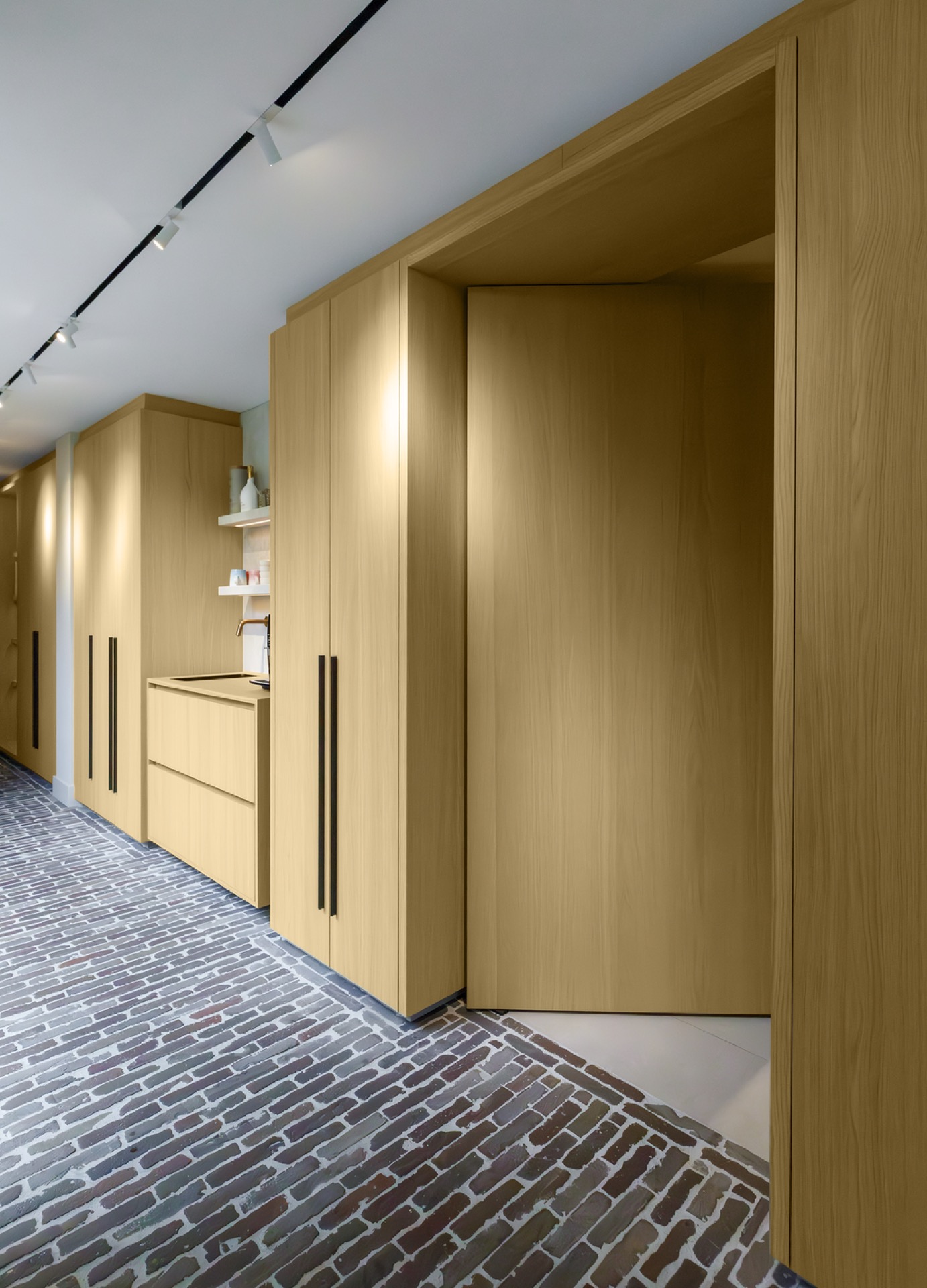
Along one side, the wood-look cabinet wall pulls the eye upward. The fronts are straight and uninterrupted, with long vertical handles that sharpen the profile. Between these taller elements, built-in niche storage breaks the surface into smaller moments: open shelves, shallow recesses, and a lit pocket that catches the grain of the material. These built-ins keep everyday objects close at hand, but they also give the wall a measured rhythm that would be absent in a flat run of closed cupboards.
The lit wood-look niche is one of the clearest details in the room. It turns a storage opening into a small display field and shows how the project handles contrast: dark line, warm interior, pale surround. Nearby, the cabinet fronts shift from closed storage to open portions, which keeps the wall from reading as a single block. The material remains consistent, but the layout changes from full height to inset to open shelf, and that variation is what gives the wall its character.
Built-ins that keep the room calm
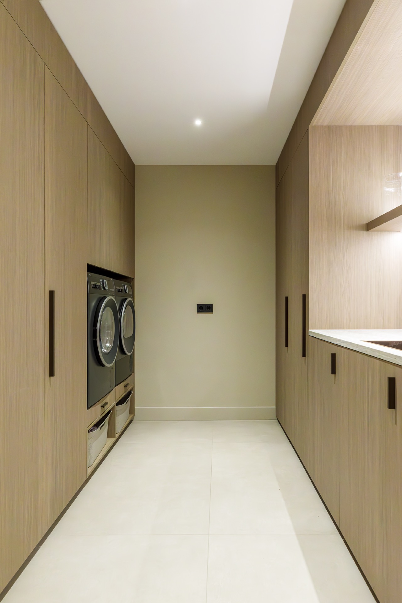
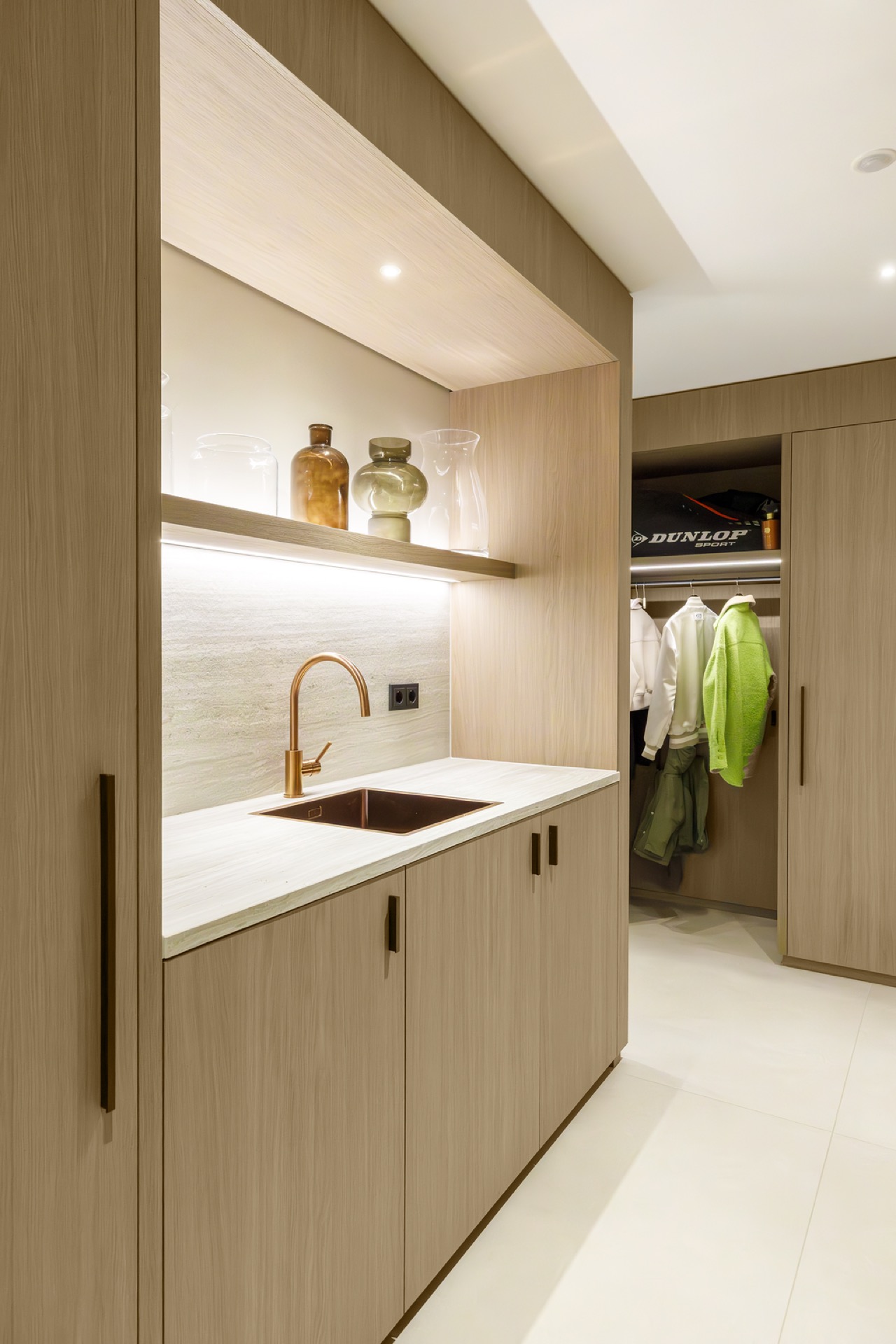
In the tighter zones, the same approach returns in smaller scale. A built-in laundry niche is folded into the cabinetry, with equipment set back behind a clean opening rather than left exposed in the main space. The surrounding panels keep the line of the wall intact, so the utility function sits within the interior instead of interrupting it. Elsewhere, open shelving and low ledges offer places for objects without crowding the room. It is a practical layer, but also a visual one, because the recessed shapes echo the larger cabinet composition.
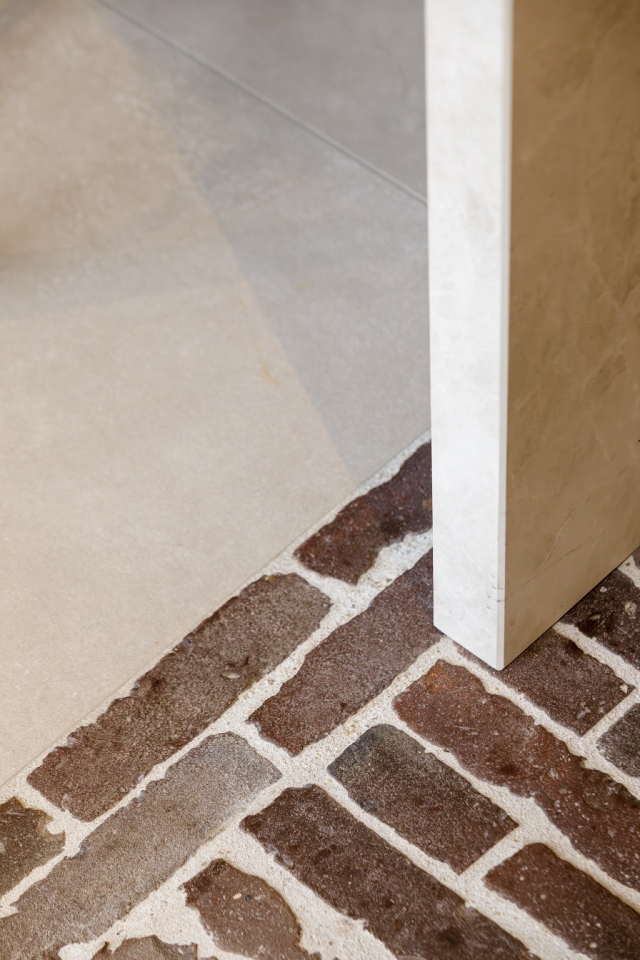
That restraint matters in a room with several materials competing for attention. The patterned tile flooring detail, the pale worktop, the wood-look fronts, and the darker inserts all meet at clear junctions. Nothing is overdrawn. The floor pattern is especially visible at the thresholds, where the tiles meet the cabinetry and where the lines in the floor help frame the island. It gives the room texture underfoot without asking for the spotlight.
Light, openings and the view to the terrace
The indoor-outdoor connection is easy to read from the kitchen side. Large glazing opens the room to the terrace floor outside, and the interior flooring continues toward that threshold without a dramatic step or change in tone. The effect is practical first: the room gains depth and a clear outward view. Visually, it also keeps the kitchen from feeling boxed in, because the glass reflects daylight back across the work surfaces and the cabinet fronts. The terrace itself stays secondary, but its presence sharpens the sense of width inside.
Across the room, the light wood and white surfaces hold the daylight rather than swallowing it. On the island, the darker insert grounds the composition and gives the pale top a clear edge. That contrast repeats in the tall cabinetry, where the wood-look finish stands beside lighter wall areas and open recesses. The whole interior reads through measured shifts in tone, not through one dominant finish. It is a quiet room, but not an empty one.
Details that keep the space moving
Even in close-up, the project keeps linking one zone to the next. The grain on the wood-look panels appears again around the open shelving, while the long handles repeat the vertical pull of the cabinet wall. The kitchen island sits in the middle as a fixed point, yet the room never feels sealed around it. A glimpse to the side shows the passage beyond; another view catches the dining table zone and the warm pendant light above it. These partial views keep the interior in motion.
The custom interior treatment is what makes those transitions possible. Doors, recesses, shelving, and tall storage all follow the same language of clean edges and measured openings. The result is not about filling every wall. It is about placing storage where it can support the room without flattening it. The built-in niche storage, the kitchen island, and the cabinet wall each carry a different part of that task, and together they define the character of the plan.
A composed interior made through custom joinery
What stands out most is the consistency of the joinery. The modern country style interior with a custom kitchen does not rely on a single statement piece. Instead, it uses the cabinet wall, the island, the niches, and the utility zone as linked parts of one system. The wood-look finish softens the straight lines, while the stone-like worktop and the patterned tile floor give the room enough contrast to stay clear at every angle. Seen from the entrance, the kitchen reads as the center. Seen up close, it becomes a collection of precise surfaces and openings.
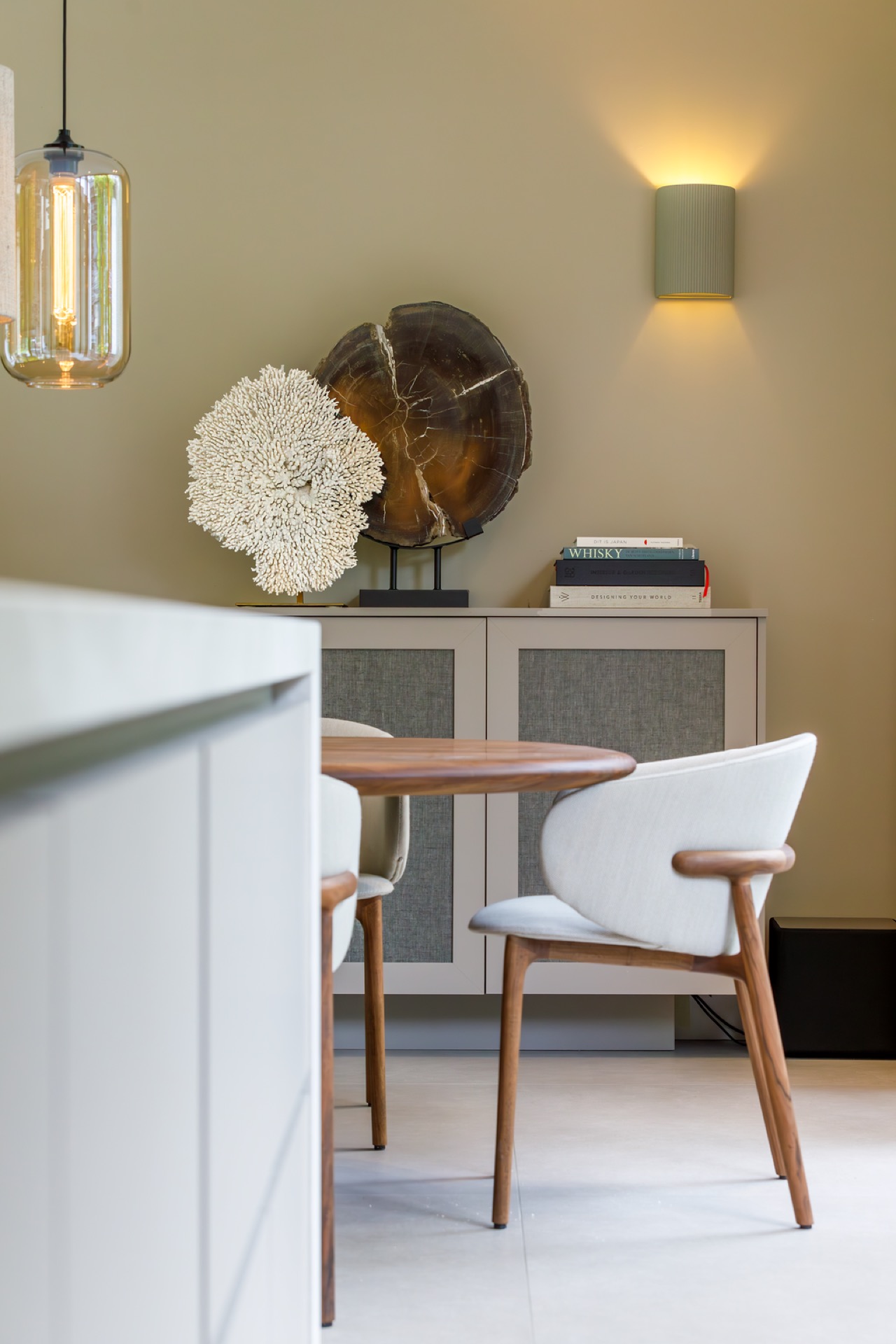
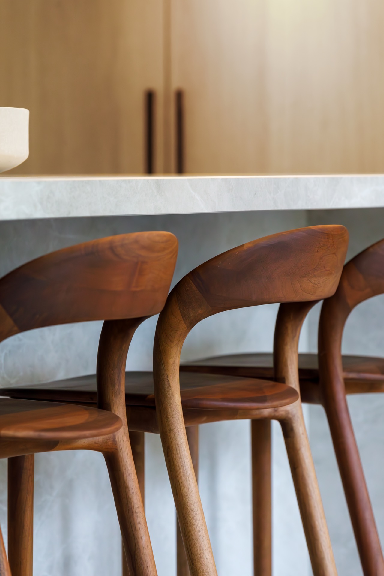
The photography also underlines how the room is used as a connector. A chair leg, a shelf, a handle, and a lit recess each mark a different scale of the same project, from furniture detail to full room composition. That range is where the interior finds its strength: in the way one material moves across cabinet fronts, storage zones, and wall sections without losing its edge. The space stays open, yet the joinery gives it structure.
Want to see more of Paul Theuws Interieur? View the page of Paul Theuws Interieur for even more great projects and company information.


NEW 2026 Jubileum Edition The Best Interior Designers Benelux
Order Now €125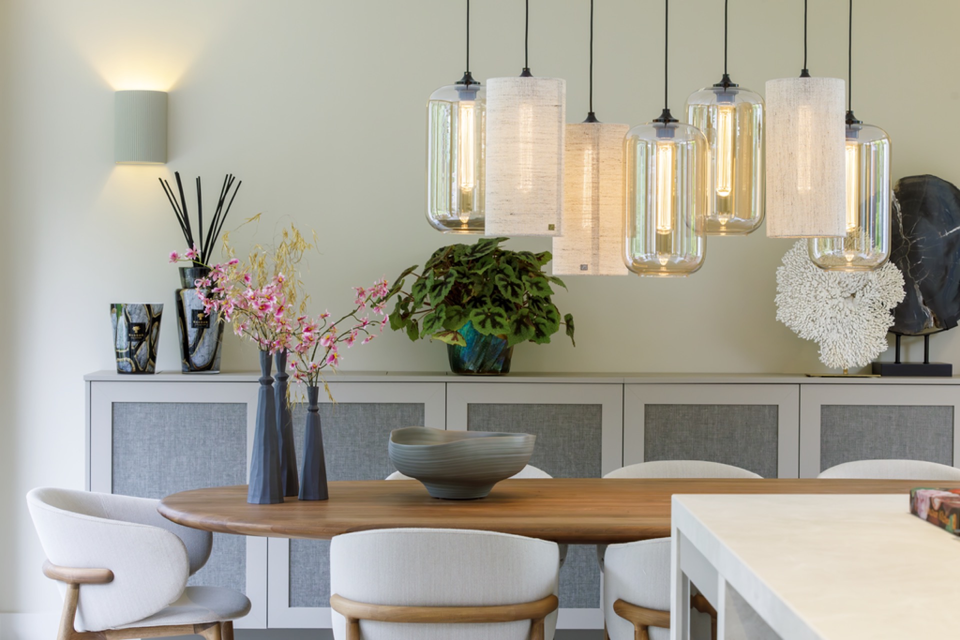
NEW 2026 Jubileum Edition The Best Interior Designers Benelux
Order Now €125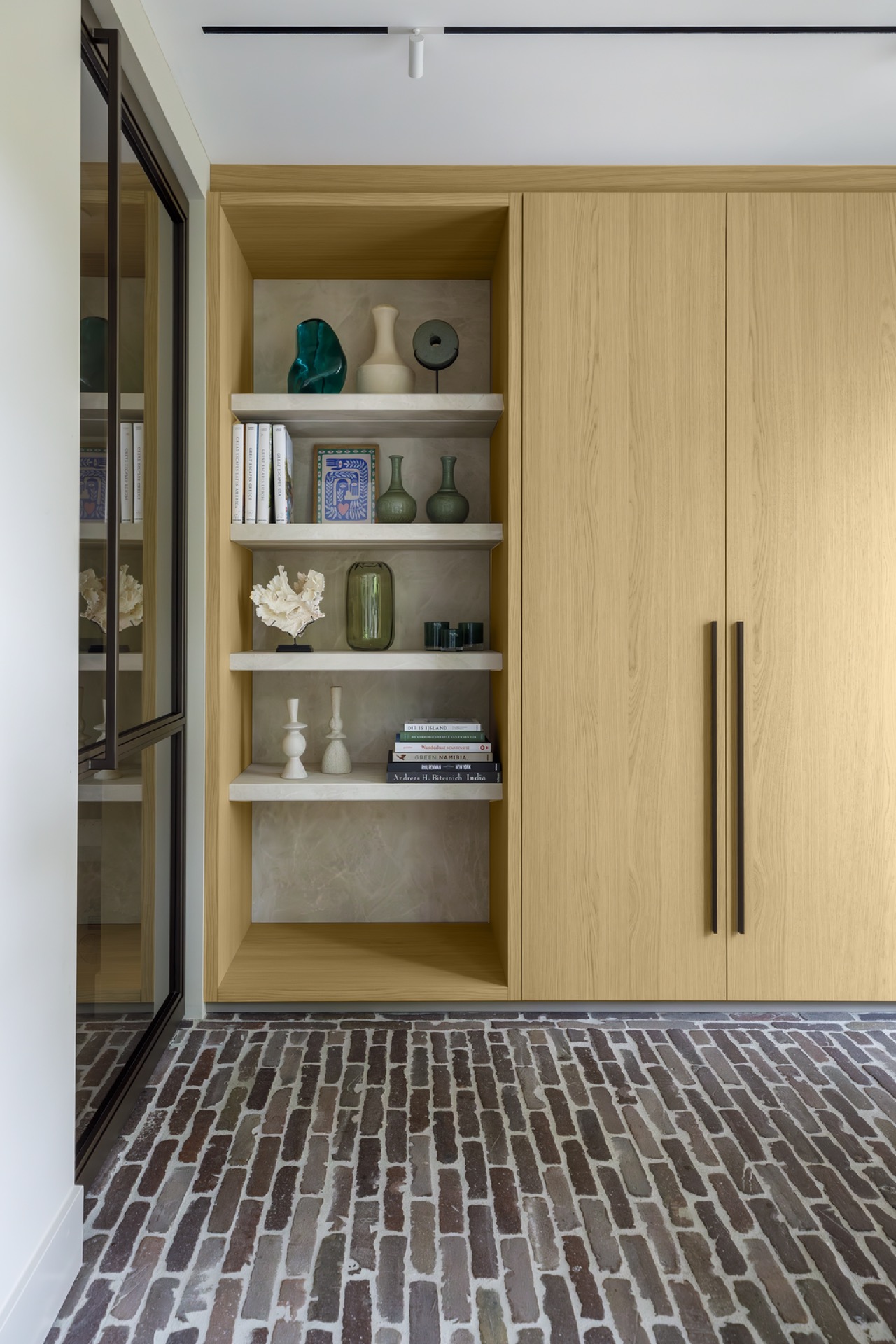
NEW 2026 Jubileum Edition The Best Interior Designers Benelux
Order Now €125