Renovated interior with travertine-look flooring and dark wood veneer
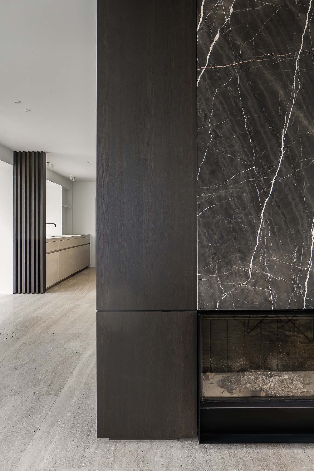
Travertine-look flooring runs through the rooms and sets the tone before the eye reaches the darker surfaces. The renovation keeps the interior restrained, with dark wood veneer accents, stone edges, and long views toward the garden through large windows. What stands out first is the contrast: light walls, quiet flooring, and a few measured material shifts that guide the house from one zone to the next.
A calm route through the house
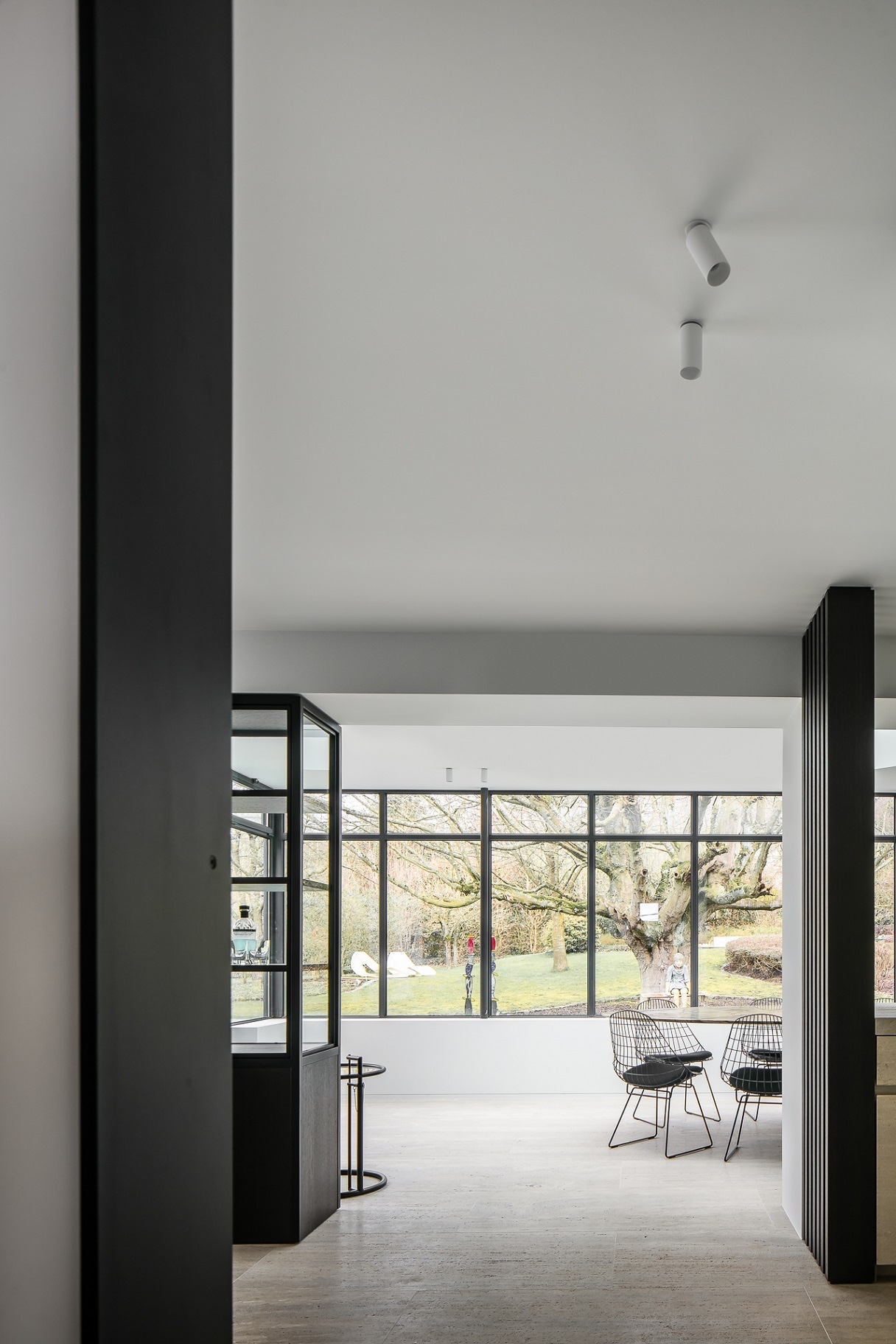
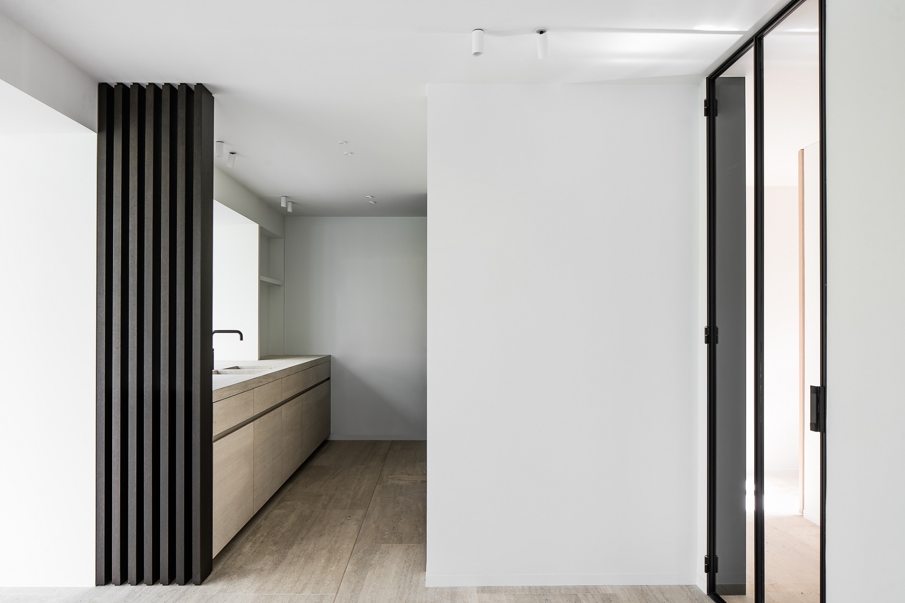
The layout reads as a sequence of clear openings and framed transitions rather than a single open volume. In several places, a dark vertical surface marks a threshold, then gives way to white wall planes and recessed lighting. The result is a sober minimal interior that relies on proportion and detail instead of ornament. Travertine-look flooring keeps the base continuous, while the darker veneer gives each zone a defined edge.
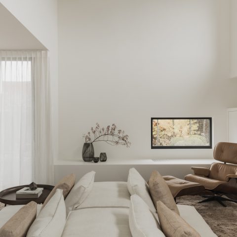
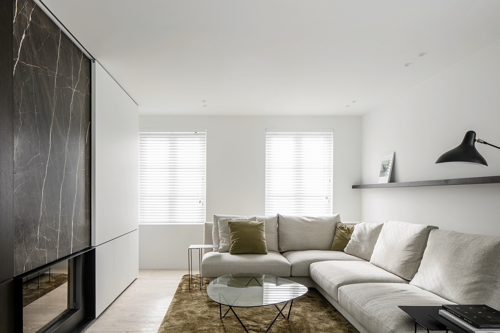
Large glazing brings in a broad wash of daylight and keeps the interior connected to the outdoor view. In the living areas, the floor stretches uninterrupted beneath a neutral sofa and low furniture, so the material remains visible across the room. The composition is quiet, but not flat: a stone panel with visible veining catches the light, and the ceiling spots create a subtle rhythm above it.
Dark wood veneer and stone in measured layers
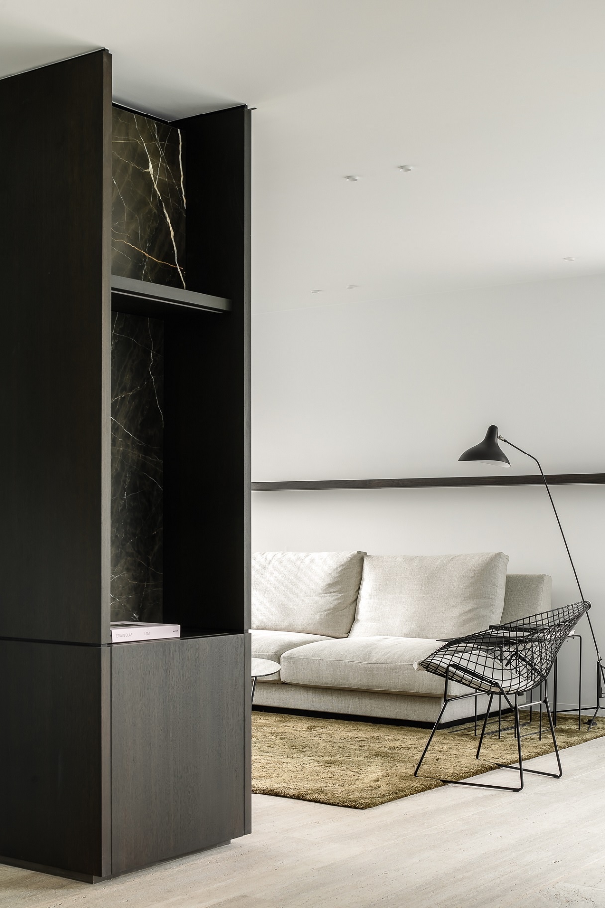
Dark wood veneer accents appear in vertical panels, column-like wraps, and built-in frames. They sit close to the stone rather than competing with it. That pairing gives the renovation its character: the veneer softens the harder mineral surfaces, while the stone keeps the room grounded. In the image sequence, this appears in close-up as a precise joint, a sharp edge, or a recessed opening cut cleanly into the wall.
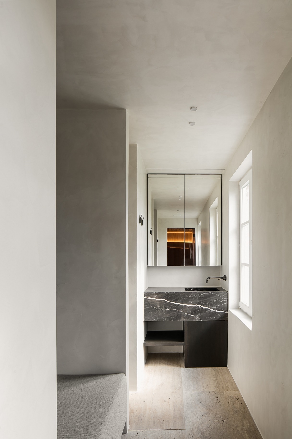
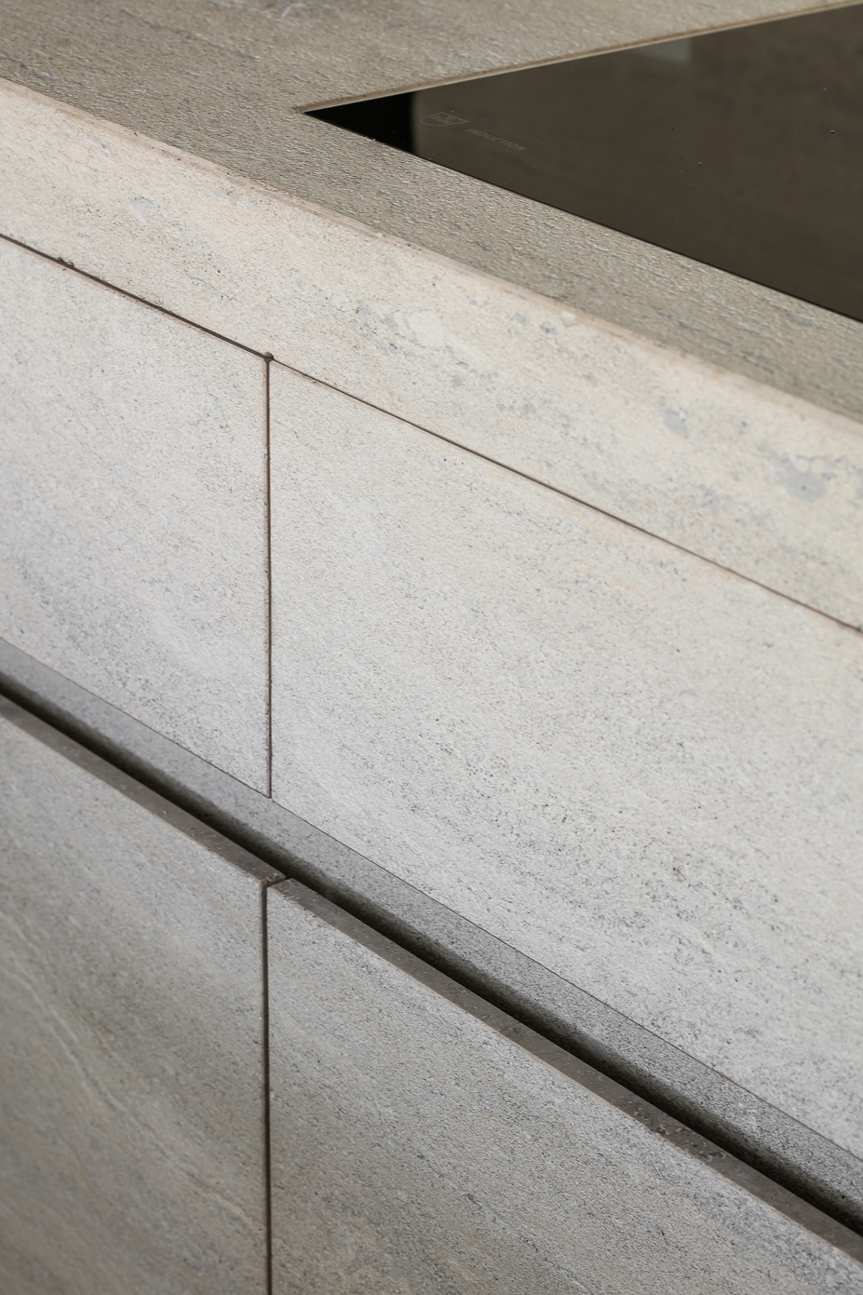
The stone itself shifts between darker panels with marble-like veining and lighter surfaces with a travertine feel. Those changes are small, but they matter. A tall stone slab beside a niche, a narrow return at a doorway, or a flush panel around an opening gives the home a calm discipline. The minimal stone detailing avoids decoration and instead draws attention to the way the materials meet.
Built-in niches that hold the composition together
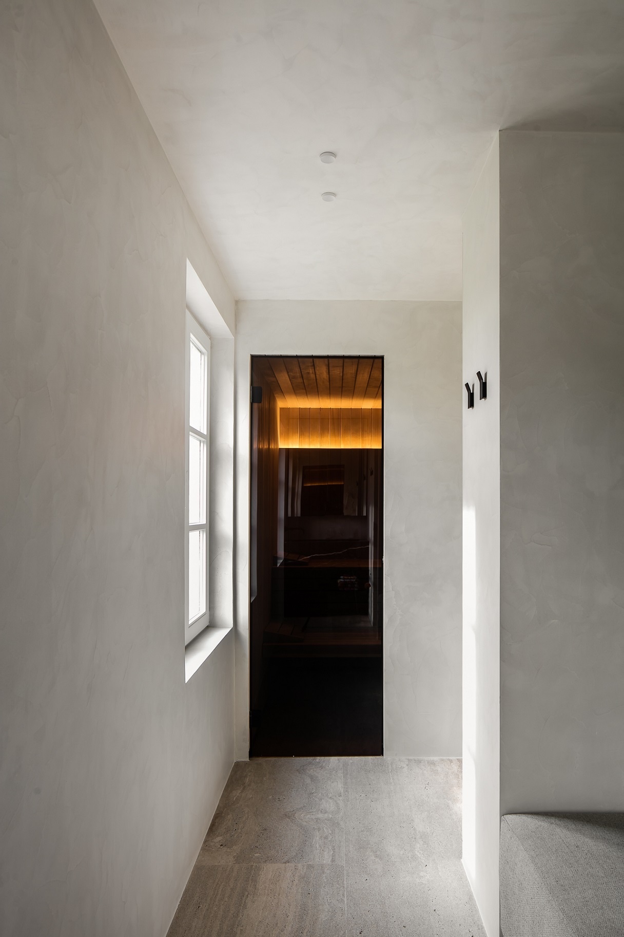
Several built-in niches break up the walls and add depth without adding clutter. One niche is framed with warm light, another sits beside a dark stone surface, and another opens toward the kitchen zone. These carved-out sections are small but important. They keep the interior from becoming purely planar and allow the stone and veneer to register as part of the architecture, not just a finish applied to it.
In the corridor-like spaces, the niches and openings are paired with spotlights in the ceiling. That lighting keeps the surfaces legible after dark and gives the darker materials a clear outline. The effect is especially visible where a recessed opening meets a polished edge or where a stone sink front sits below a mirror. Nothing is overdrawn; the details are left to do the work.
A wellness living area with a restrained palette
The project includes a wellness living area and a room set up for relaxation, but the atmosphere comes from the material choice rather than any decorative gesture. Dark stone, pale walls, and travertine-look flooring create a clear visual order. In one image, a warm-lit recess and a stone basin read almost like a small indoor retreat, with the light contained inside the opening and the surrounding surfaces kept plain.
That same restraint runs through the broader house. The plan does not rely on contrast for drama; it works through repeatable elements: a stone edge here, a veneer wrap there, a glazed opening that interrupts the wall, a floor that keeps moving forward. The wellness living area therefore feels integrated into the renovation, not set apart as a separate concept. It belongs to the same sober minimal interior as the living room and corridor.
Kitchen surfaces kept dark and direct
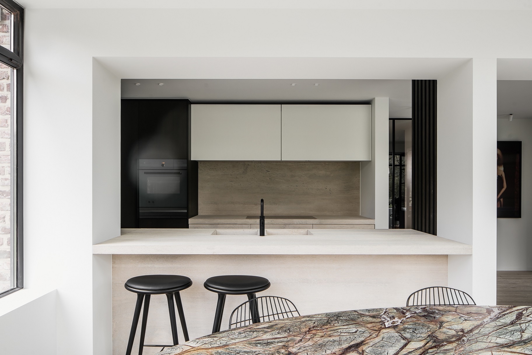
The kitchen zone stays visually tight. A black stone look kitchen surface appears beneath the window, and the front of the sink or work area carries the same dark tone. Above it, the window breaks the wall into smaller panes, so the light lands directly on the countertop and picks out the edge of the stone. The scene is compact, with no extra decoration to interrupt the line between opening, worktop, and wall.
Seen from another angle, the kitchen front sits alongside taller dark elements that repeat the language of the rest of the house. That repetition matters more than variety here. It keeps the renovation coherent without leaning on stylistic labels. The dark surfaces are used sparingly, but they are placed where the eye needs a stop: at a corner, under a window, or at the edge of a passage.
Light, edges, and the way materials are cut
The strongest moments in the project come from the cuts and edges. A stone panel ends cleanly at a niche. A veneer frame turns a corner. A ceiling spot lands just off the wall and throws a small pool of light across the surface below. These are modest gestures, yet they define the reading of the rooms. The house depends on precision, not display.
Even the travertine-look flooring contributes through its continuity. Because the floor stays visually calm, the darker materials can appear as inserted elements rather than competing layers. That makes the interior easy to read from one space to the next. The eye follows the floor line, then pauses at a dark panel or a lit recess, then moves on again toward the garden-facing windows.
Materials that stay visible in the details
The named materials are few: dark tinted oak veneer and travertine natural stone. The images show how those materials are carried through in practice, from the floor finish to the built-in framing and the stone surfaces around the wet or relaxation zones. There is no attempt to overload the rooms with texture. Instead, the renovation lets each surface remain legible, including the subtle veining in the darker stone and the softer grain of the veneer.
That material discipline suits the rest of the house. The large windows, the recessed lights, the stone niches, and the dark inserts all work within the same measured register. Nothing pulls attention for long, but each detail leaves a clear trace in the room. The result is an interior that reads as controlled and calm, with enough contrast to keep the surfaces distinct and enough continuity to let the rooms flow together.
The photographer credited for the project is Cafeine – Thomas De Bruyne.
Want to see more of vers interieur? View the page of vers interieur for even more great projects and company information.


NEW 2026 Jubileum Edition The Best Interior Designers Benelux
Order Now €125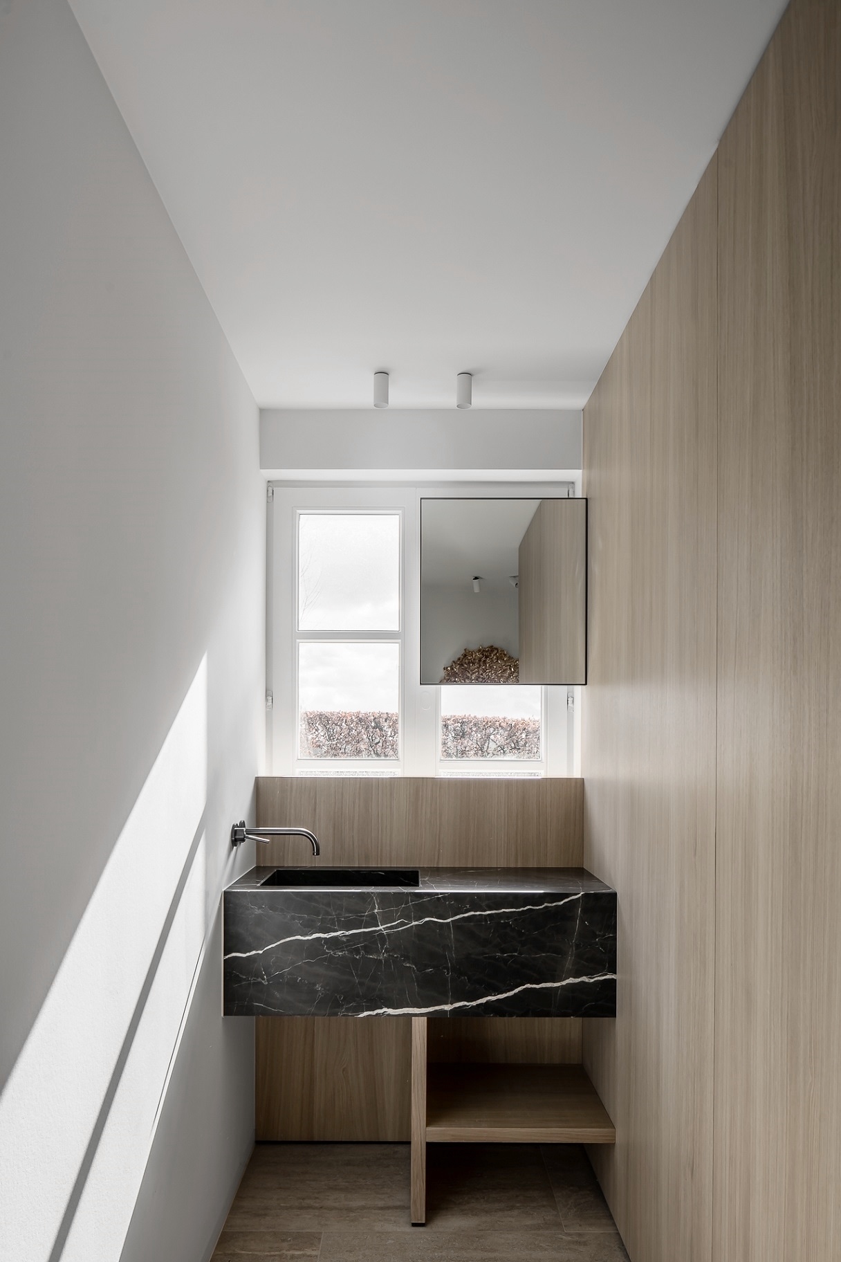
NEW 2026 Jubileum Edition The Best Interior Designers Benelux
Order Now €125