Lime finish interior with a seamless matte wall and ceiling look
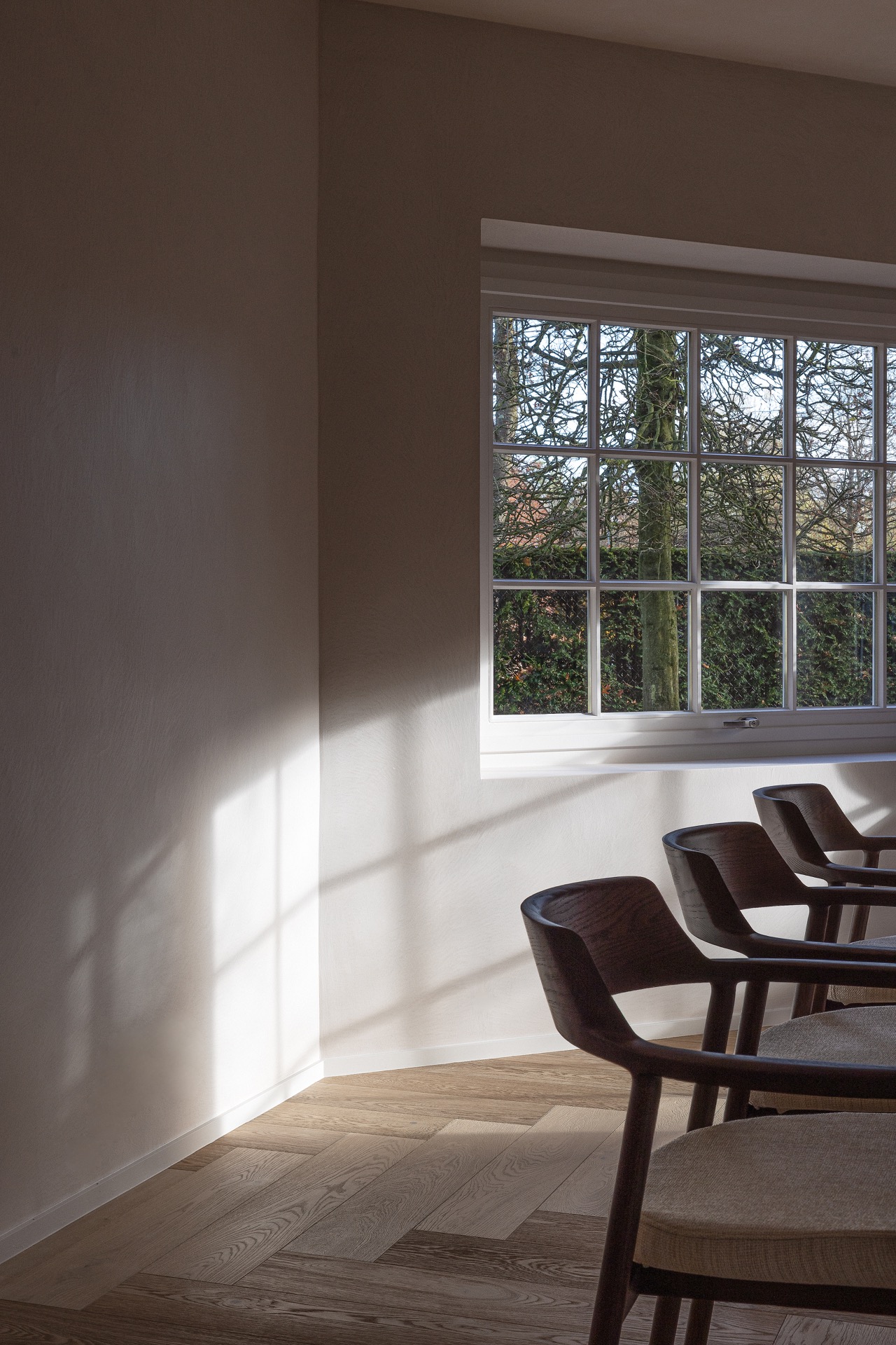
The first thing you notice is the surface: matte, even, and slightly soft in the way it catches daylight. In this lime finish interior with seamless wall and ceiling look, the walls keep that quiet texture from room to room, while wood floors and stone accents interrupt the calm with sharper notes. The result is not built around display, but around surfaces that hold light and shadow without drawing attention to themselves.
Walls that run from utility room to living areas
Microtopping is used across several parts of the home, from the utility room and toilet floors to the living room, the kitchen walls, and even custom-finished furniture. That continuous surface gives the rooms a shared base, but each zone still reads differently because of what sits on it: parquet tones underfoot, stone beside the kitchen, and cabinetry set against the wall. The effect is quieter than contrast, yet far more exact than a neutral backdrop.
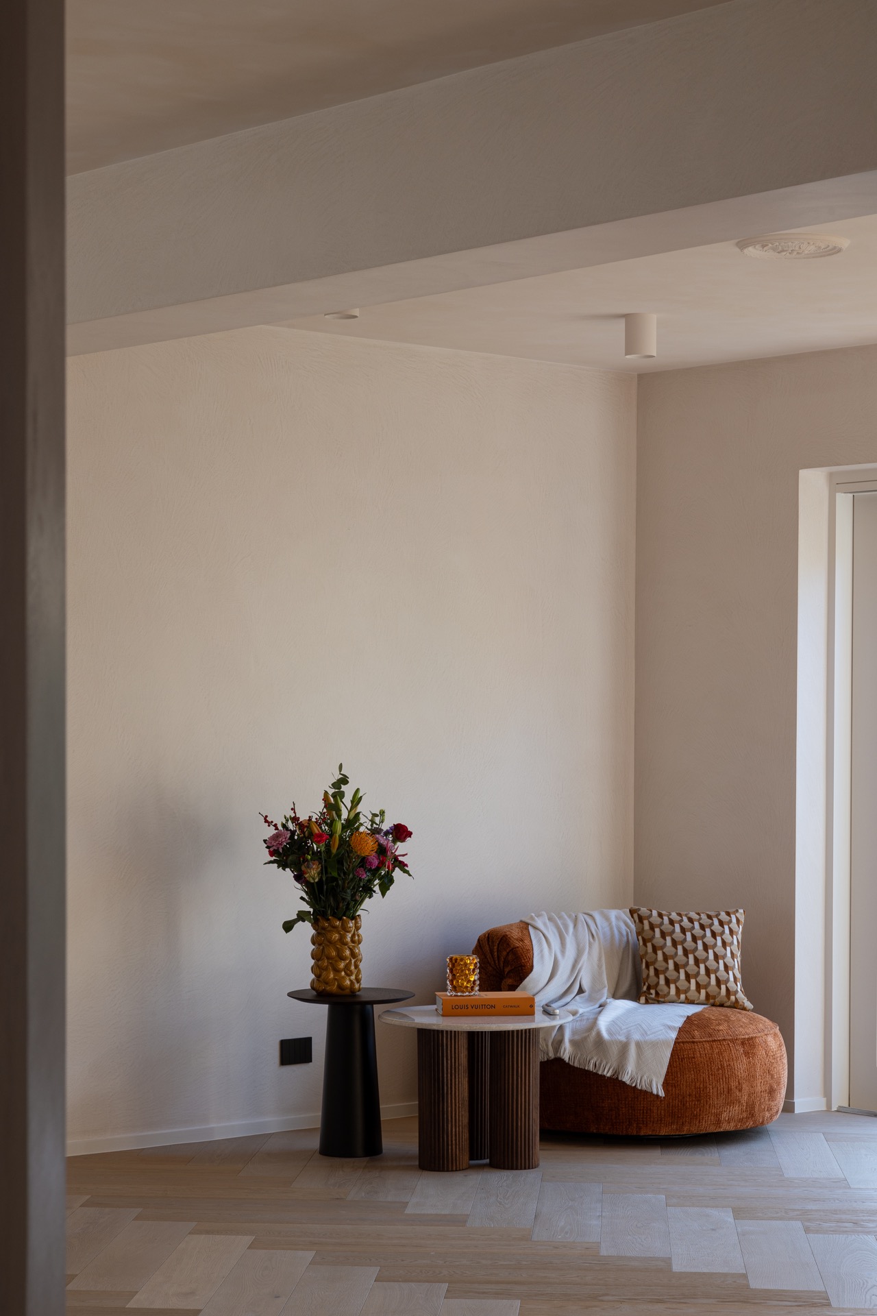
In the living areas, the seamless wall finish stays close to the architecture. The surface carries only subtle texture, so the eye moves instead to the change in light across the wall and the way the floor line stays crisp beneath it. That restraint lets the furniture and built-ins sit into the space instead of floating apart from it. The same material language reappears in different rooms, which makes the layout feel steady as you move through the house.
Ceilings and hallways in a matte lime finish
The ceilings and hallways are treated with a custom lime-paint technique, and the difference is visible in the way these areas absorb light. In the hall, the finish softens long sightlines and keeps the transition between rooms from feeling abrupt. The ceiling does not disappear, but it stops competing with the walls. That is especially noticeable near the openings, where daylight cuts across the matte surface and shows its faint tonal shifts. This is where the ceiling lime paint in hallways becomes part of the route itself.
One of the strongest visual cues is the large glazing. Daylight lands in broad patches and leaves shadow shapes on the matte surfaces, especially in the living room. Because the walls are not glossy, the light stays readable; it does not bounce away. The large window daylight also gives the interior a slower rhythm, with the surface changes becoming visible as the day moves. A minimal ceiling light fitting appears only where it is needed, keeping the overhead plane quiet.
A kitchen wall with a stone-like face
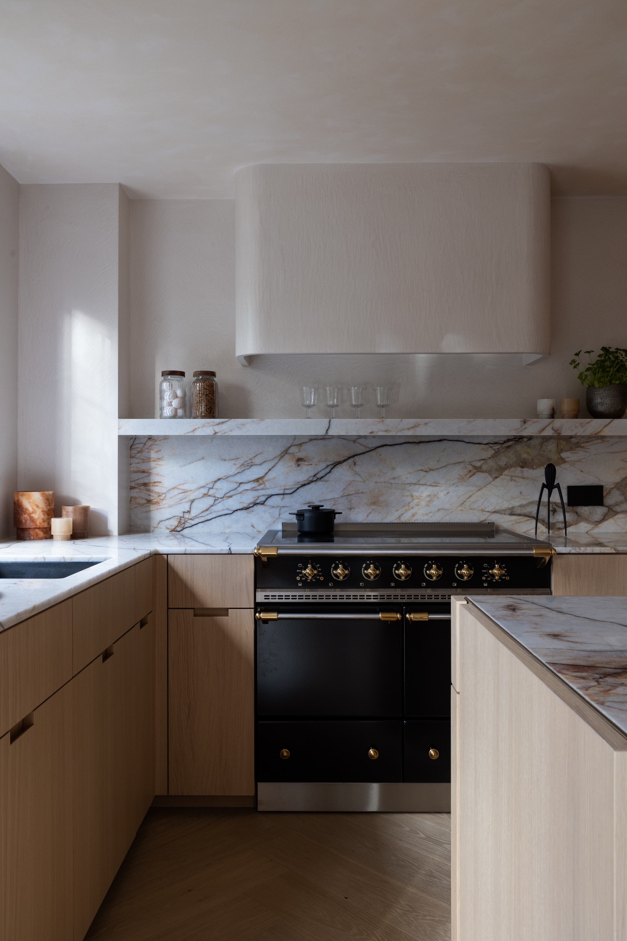
The kitchen brings a different texture into the sequence. A marble-look kitchen wall forms a clear counterpoint to the softer lime finish around it, and the pattern in the stone-like surface gives the room a sharper edge. Above the cooking area, the dark hood sits against that background without breaking the composition. The wall reads as part work surface, part visual anchor, which is why the kitchen feels anchored by material rather than by ornament.
That same material is echoed in smaller details near the kitchen, where the wall treatment and the adjoining finishes keep the room visually controlled. The surface does not try to imitate polished stone; it works as an accent with a drawn, veined appearance. Against the matte surroundings, the kitchen wall becomes a pause in the sequence of plaster-like planes. The shift is subtle, but it gives the room a distinct identity without changing the language of the interior.
Built-in storage that sits flush with the room
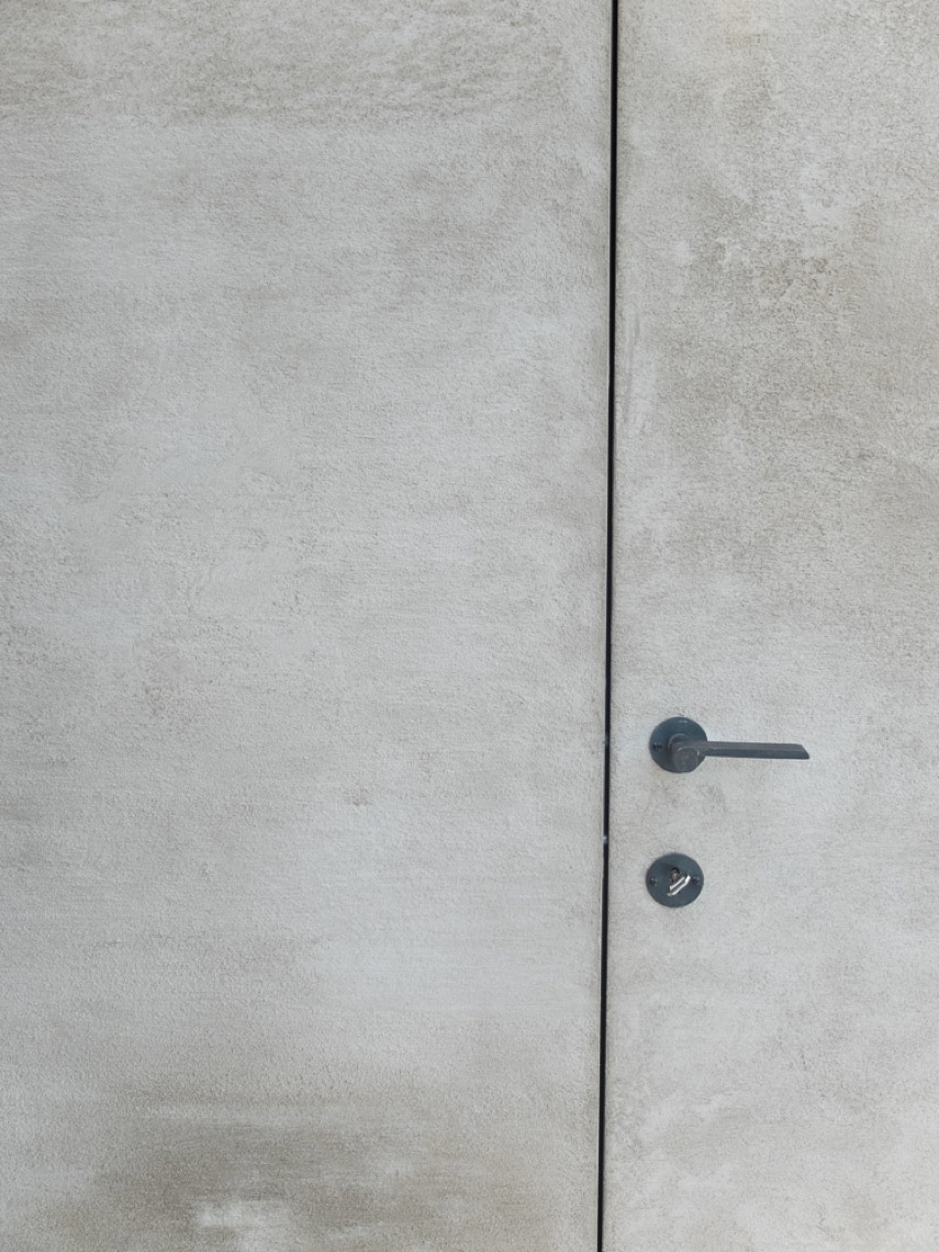
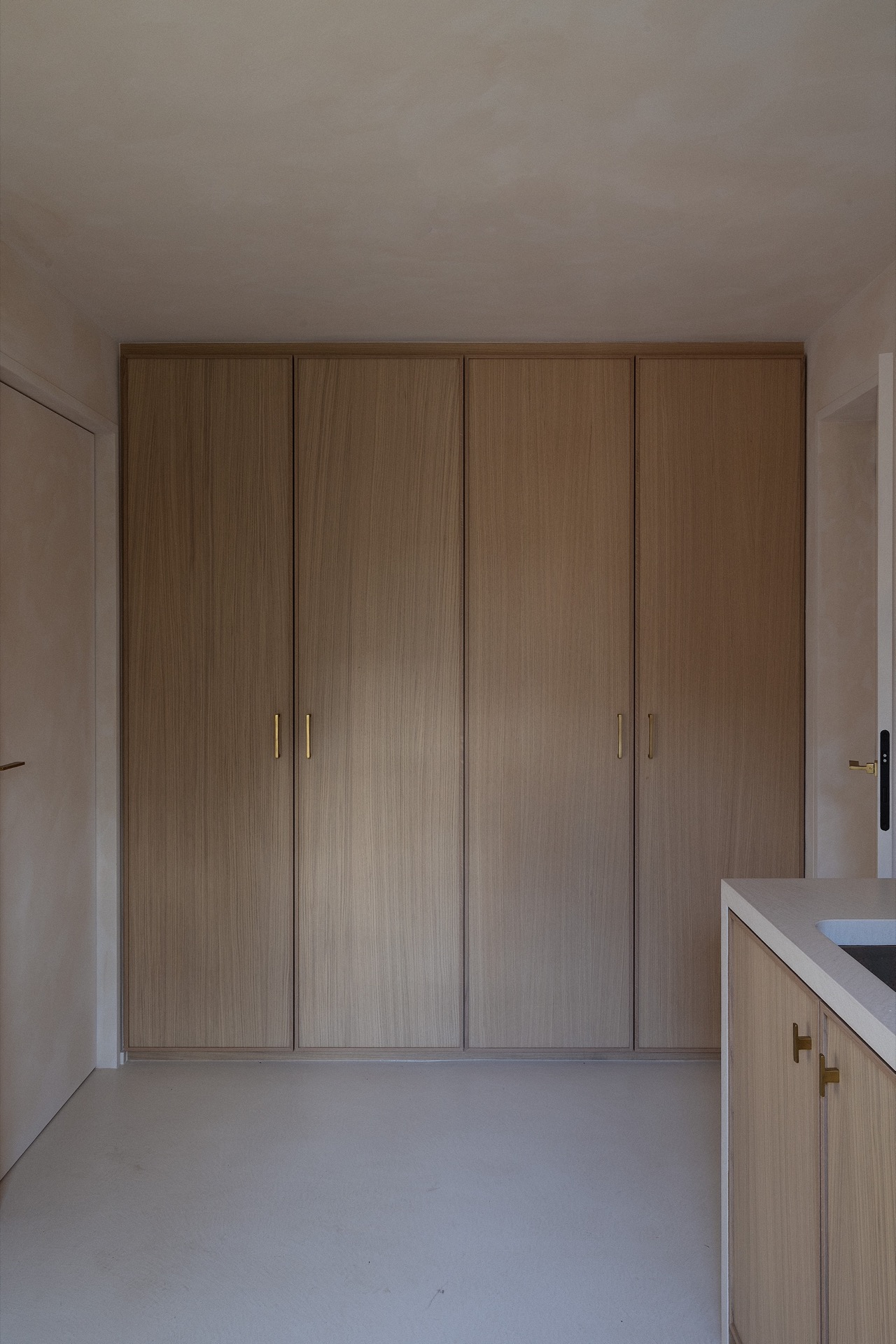
In the hallway, a tall storage wall runs in four sections, each marked by vertical panels and narrow handles. The fronts are set up as built-in cabinet panels, so the volume behaves like part of the architecture rather than a loose piece of furniture. Its height draws the eye upward, while the panel rhythm keeps the scale manageable. The result is practical in use, but in visual terms it is mostly about line, proportion, and the way the doors settle into the wall.
Nearby, the same measured approach returns in the custom-finished furniture. Because the wall surfaces and the joinery share the same restrained tone, the pieces do not fight for attention. They absorb it. The hallway feels narrower in a good sense: more directed, less interrupted. Light falls across the panel joints and handles, turning a storage run into part of the interior composition rather than a separate object placed along the route.
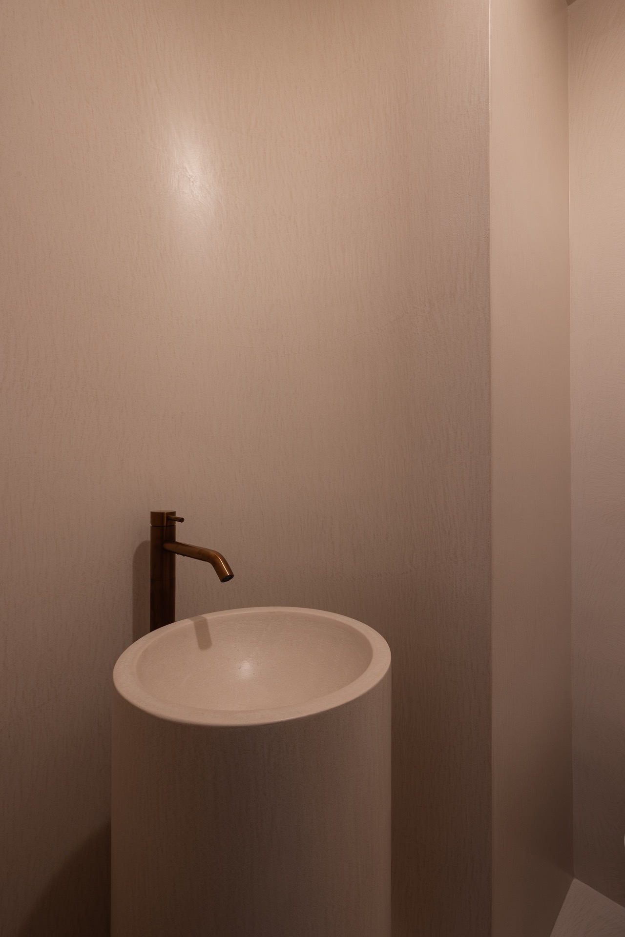
A toilet with a circular wall and freestanding basin
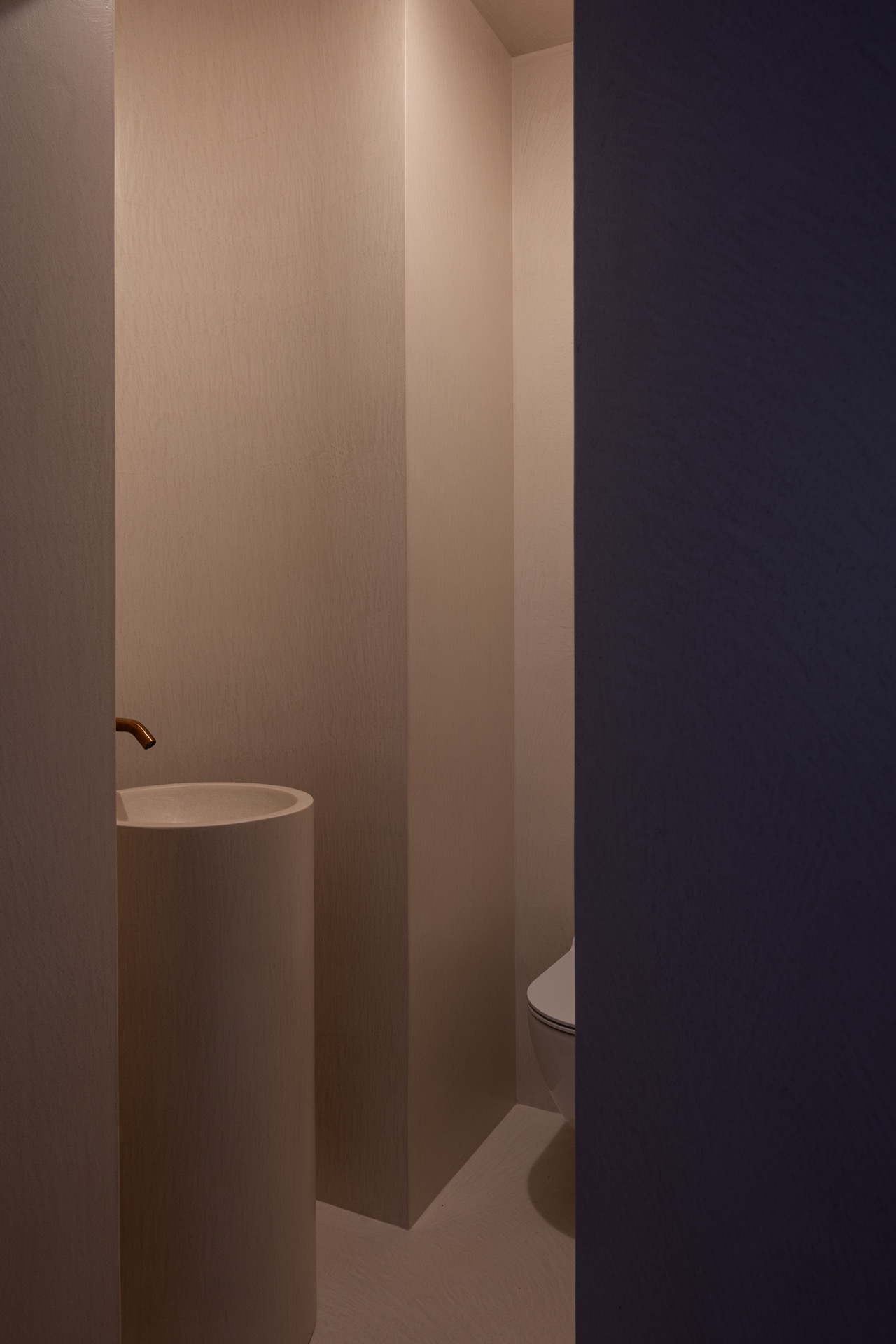
The toilet contains one of the clearest details in the project: a round wall shape paired with a freestanding basin. That circular form breaks the otherwise linear language of the home. It also sits well with the natural stone and parquet tones mentioned in the source text, because the rounded edge softens the transition between the floor and the wall. The basin stands independently, leaving space around it and letting the shape read in full.
Seen close up, the basin zone is more about geometry than decoration. The round bathroom sink sits against a matte background, and the wall curve gives the room a focal point without crowding it. This kind of detail matters because it changes the pace of a small room: instead of a hard corner, there is a gentle pivot. The toilet floor continues the same material logic as the rest of the home, which keeps even this compact space connected to the larger plan.
Stone, wood and colour-matched frames
Natural stone and parquet tones guide the palette, but they do not flatten the rooms into one surface. Instead, they set up a measured sequence of darker and lighter bands: wood underfoot, matte walls around the body, and stone where the eye needs a point of rest. The lacquered window frames are carefully colour-matched, so they stay close to the surrounding surfaces instead of cutting across them. That small decision changes the way the glazing reads from inside.
The window treatment matters because of the daylight it frames. Large panes bring in long spans of light, and the matched frames prevent that light from being interrupted by strong colour breaks. As a result, the room edges remain legible, even in the shadow areas. The surfaces do not try to reflect everything back. They hold the light, which lets the interior read in layers: floor, wall, frame, and the line of the opening.
Where the details settle into place
The project was developed together with an interior partner, but the finished interior speaks mostly through the visible work: matte wall planes, lime-painted ceilings and hallways, stone accents in the kitchen and toilet, and a storage wall that sits flush with the room. Nothing here is loud. Instead, the details are arranged so that each surface has a role, whether that is catching daylight, supporting a cabinet front, or giving the eye a place to stop.
What holds the scheme together is the repeated attention to edges. The transition from wall to ceiling is softened by the lime finish. The kitchen wall uses a marble-look surface to mark the cooking zone. The hallway storage is handled as a vertical plane rather than a bulky object. Even the basin in the toilet is shaped to stand apart. In this lime finish interior with seamless wall and ceiling look, the rooms are linked by material logic rather than by decoration, and that is what makes the sequence feel so clear.
Want to see more of Texture Painting? View the page of Texture Painting for even more great projects and company information.


NEW 2026 Jubileum Edition The Best Interior Designers Benelux
Order Now €125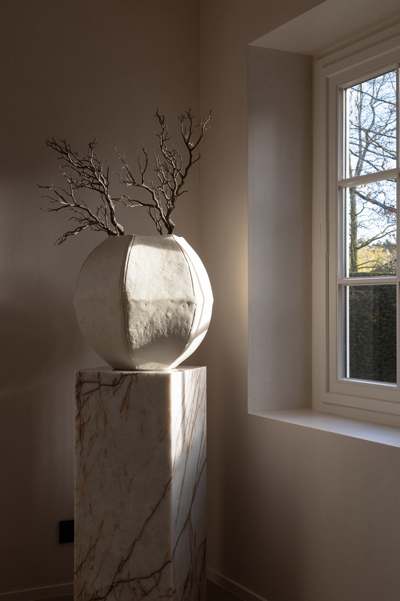

NEW 2026 Jubileum Edition The Best Interior Designers Benelux
Order Now €125