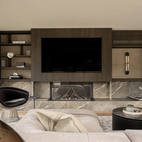
Luxury custom interior with bespoke details
A pale ceiling, a black countertop, and wood grain in the door panels set the tone for this luxury custom interior. Across the home, the surfaces stay restrained, but the details change from room to room: a living area with decorative ceiling work and blinds, a kitchen built around crisp white fronts, a bathroom with stone-look walls and timber shelving, and a work niche that folds neatly into the wall.
Living room details set the pace
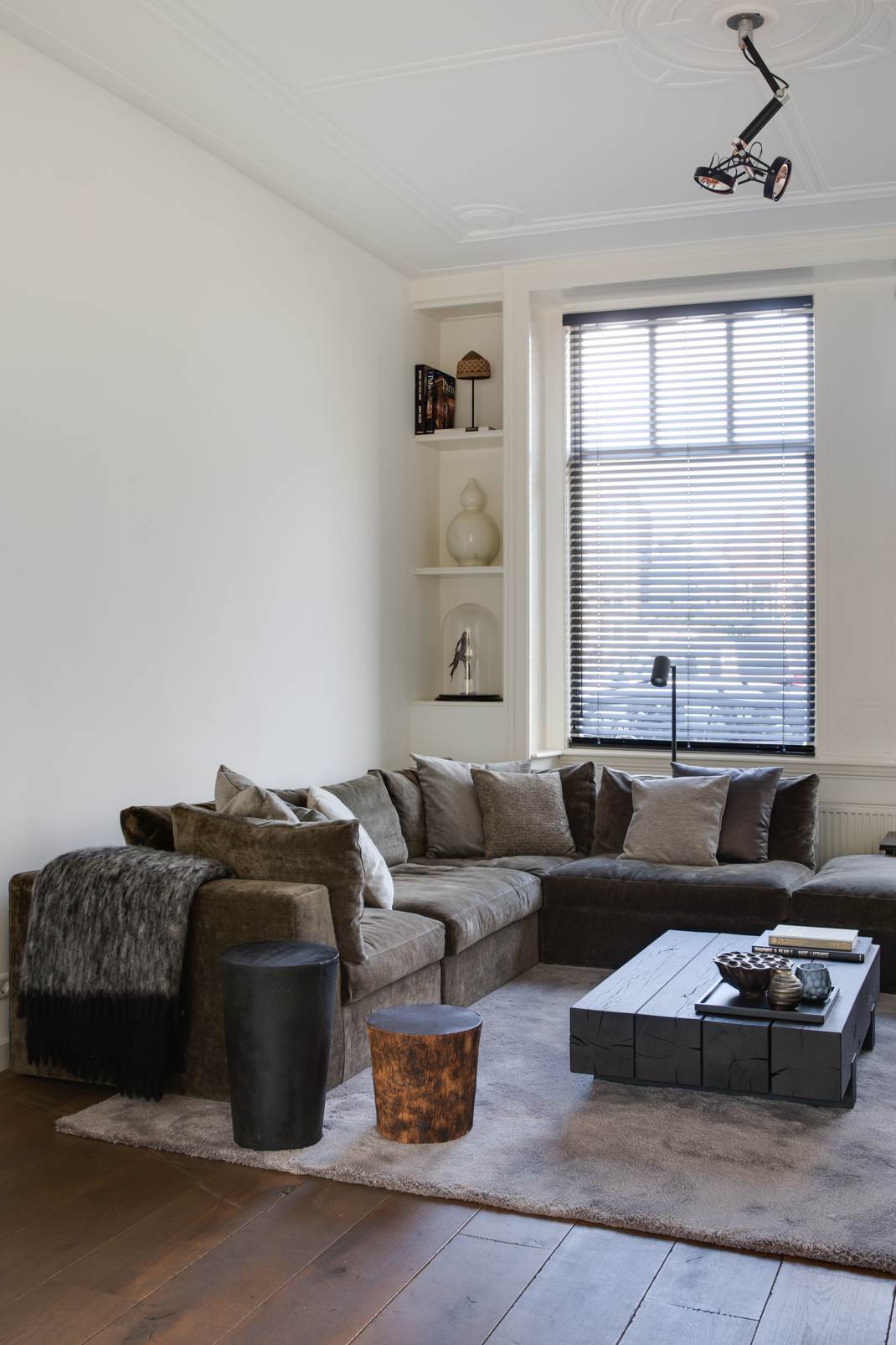
The living room opens with a low, dark sofa placed against a broad window, where blinds filter the light into narrow bands. Above it, the ceiling draws the eye up with a central ornament and a pale painted surface that keeps the room open. The furniture stays close to the floor, which makes the ceiling detail read more clearly. In this luxury custom interior, the living room does not rely on excess; it is the spacing between the sofa, the window, and the ceiling line that gives the room its structure.
A second living area view shows the same calm base from a slightly different angle. The wall finishes remain light, while the ornament in the ceiling and the framed artwork add just enough interruption to the empty surfaces. The result is not decorative for its own sake. It is a custom interior design approach that uses proportion, light, and a few precise elements to keep the room readable from every angle.
Built-ins and niches carry the home
Several rooms use built-in shelving as both storage and surface. Open compartments are stacked in layers, some painted white, others set into stone-look walls. That shift matters: the shelving becomes part of the wall rather than a separate object. In one niche, the shelves are set behind a desk screen; in another, the openings sit above a worktop and beside darker framed details. These are the places where the modern luxury interior shows its most practical side, though the practical part never looks separate from the finish.
The integrated home office niche is especially direct. A screen sits centered between shelves, with wall lights that have gold-toned inner rings placed on either side. Two chairs face the work surface, and the surrounding wall surface keeps the composition tight. It is a small area, but the framing gives it weight. The niche reads as a deliberate pause in the wall, not as an afterthought. Within a luxury custom interior, that kind of embedded work zone changes how the room is used.
Open shelving and layered storage
Elsewhere, the shelving shifts toward display. Open ledges hold small objects, while deeper compartments create pockets for stored items. The structure stays square and disciplined, but the contents soften the hard lines. Even the transitions between white paint, stone-look surfaces, and timber edges stay visible. That mix of materials is one of the clearest threads through this project, especially where built-ins need to support both storage and visual rhythm. The custom interior design relies on those transitions to keep the home from feeling overworked.
The kitchen is built around contrast
The kitchen with black countertop and white fronts is one of the strongest contrasts in the house. The dark work surface runs cleanly across the base cabinets, while the upper zone uses white planks and open recesses to lift the wall. A cooktop with dark elements sits under those shelves, and the sink area introduces a metallic tap that breaks the monochrome line. Nothing here is ornamental in the usual sense. The interest comes from the way the materials meet: matte against gloss, white against black, open storage against closed fronts.
Seen from another angle, the kitchen with black countertop reads as a compact composition of planes. The edge of the worktop is crisp, the fronts sit flush, and the shelving above keeps daily objects within reach. That arrangement gives the room a measured pace. It also keeps the eye moving from the cook zone to the surrounding niches, which is where the kitchen connects back to the wider luxury custom interior. The room feels specific, but not isolated from the rest of the home.
White fronts, black worktop, and open ledges
Open shelving plays a clear role here. It breaks up the flat wall above the counter and lets the kitchen carry the same layered logic seen in the other rooms. The black countertop anchors the composition, while the white fronts prevent the kitchen from becoming visually heavy. The balance is exacting without looking rigid. It is the kind of kitchen where the storage, cooking area, and wall treatment all work together as one built-in surface.
Stone-look walls and timber details in the bathroom
The bathroom stone look and wood palette is more tactile than the kitchen, with a wall finish that reads like natural stone and a run of timber shelving placed into a recessed area. Towels are rolled and stacked on the shelves, which adds shape to the otherwise linear wall. Below, the vanity combines a white top with a darker base, and that darker band pulls the fixtures visually into the room. The bathroom does not rely on ornament. It uses texture, contrast, and the depth of the niche to do the work.
Another bathroom view shows the same material logic in closer detail. The stone-look surface sits behind the open shelf, while the wood shelves bring warmth through their grain rather than through color alone. The white towels reinforce the light palette, and the recessed storage keeps the room tidy without hiding the structure of the wall. For a modern luxury interior, this is a useful move: storage is visible, but organized, and the finishes remain readable instead of blending into one soft blur.
Bedroom and passage details keep the material thread going
The bedroom shifts the mood through scale rather than through a new palette. A tall upholstered headboard takes up most of the wall, and the bedding stays in grey and beige tones that echo the rest of the home. Accent lights appear in more than one form, some mounted and some picked out in the reflections around the room. The wall behind the bed stays quiet, which makes the headboard’s height and fabric surface the main event. It is another example of a luxury custom interior using restraint to sharpen the room’s outline.
A wood-paneled wall with an inset screen adds a firmer edge to the bedroom area. Black frame details and a white open gap cut into the wood, so the surface is not read as a single block. In the doorway view, wood grain and dark hardware appear together, turning a simple passage into a measured transition between rooms. These details matter because they repeat the same language found in the living room, kitchen, and bathroom: light base, clear joints, and a preference for built-in surfaces over loose pieces.
What holds the interior together
Across the home, the material palette stays consistent: painted plaster, stone-look wall surfaces, wood, metal, and textiles in grey, beige, black, and off-white. That consistency does not flatten the rooms. Instead, it lets each space register through a different kind of detail. The living room is shaped by the ceiling. The kitchen is led by the counter and shelving. The bathroom depends on recesses and texture. The work niche is defined by its frame and lighting. Together they form a luxury custom interior that is easy to read because each room keeps its own clear line.
The strongest impression is the control of transitions. Walls become storage. Storage becomes display. A niche becomes a work area. A dark worktop becomes the anchor for a pale kitchen. Those moves are small, but they are repeated with enough consistency to make the house feel planned from room to room. That is where the custom interior design is most visible: not in a single feature, but in the way built elements keep changing function without changing language.
Want to see more of Clairz Interior Design? View the page of Clairz Interior Design for even more great projects and company information.





NEW 2026 Jubileum Edition The Best Interior Designers Benelux
Order Now €125


NEW 2026 Jubileum Edition The Best Interior Designers Benelux
Order Now €125


NEW 2026 Jubileum Edition The Best Interior Designers Benelux
Order Now €125


NEW 2026 Jubileum Edition The Best Interior Designers Benelux
Order Now €125


NEW 2026 Jubileum Edition The Best Interior Designers Benelux
Order Now €125


NEW 2026 Jubileum Edition The Best Interior Designers Benelux
Order Now €125


NEW 2026 Jubileum Edition The Best Interior Designers Benelux
Order Now €125


NEW 2026 Jubileum Edition The Best Interior Designers Benelux
Order Now €125