Wood-look kitchen island with marble-look countertop and Art Deco-inspired accents
Warm wood, white panel moldings, and a stone-look surface set the tone from the first view. The wood-look kitchen island with marble-look countertop sits in a light interior where the lines stay clean, but the details carry more weight than they first appear to. Black accents on the cooktop and in the lighting sharpen the palette, while bronze and gold-toned finishes soften the transition between kitchen, living area, and hall.
Kitchen surfaces that do the talking
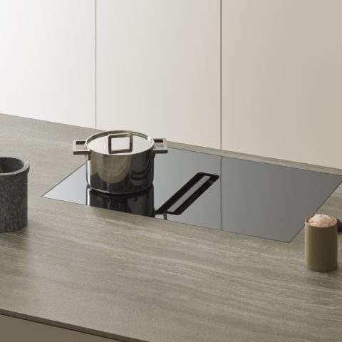
The kitchen is built around the wood-look kitchen island with marble-look countertop, with a black cooktop sitting flush in the pale surface. Behind it, tall cabinets run in a wood grain finish, keeping the vertical lines calm and continuous. The composition reads as closed and open at once: a working kitchen along one side, and an island that gives the room a clear center. A black-framed oven niche and the stone-look worktop add contrast without breaking the quiet rhythm of the room.
What stands out most is the way the island meets the surrounding wall treatment. Framed panels and light plastered surfaces keep the room from feeling flat, while the cabinetry stays visually restrained. The effect is not about display. It is about how the wood tones, pale walls, and dark appliances hold the space together. Seen from the side, the island becomes the strongest horizontal line in the room, anchoring the open kitchen with a surface that is both practical and visually precise.
Built-in storage with a softer edge
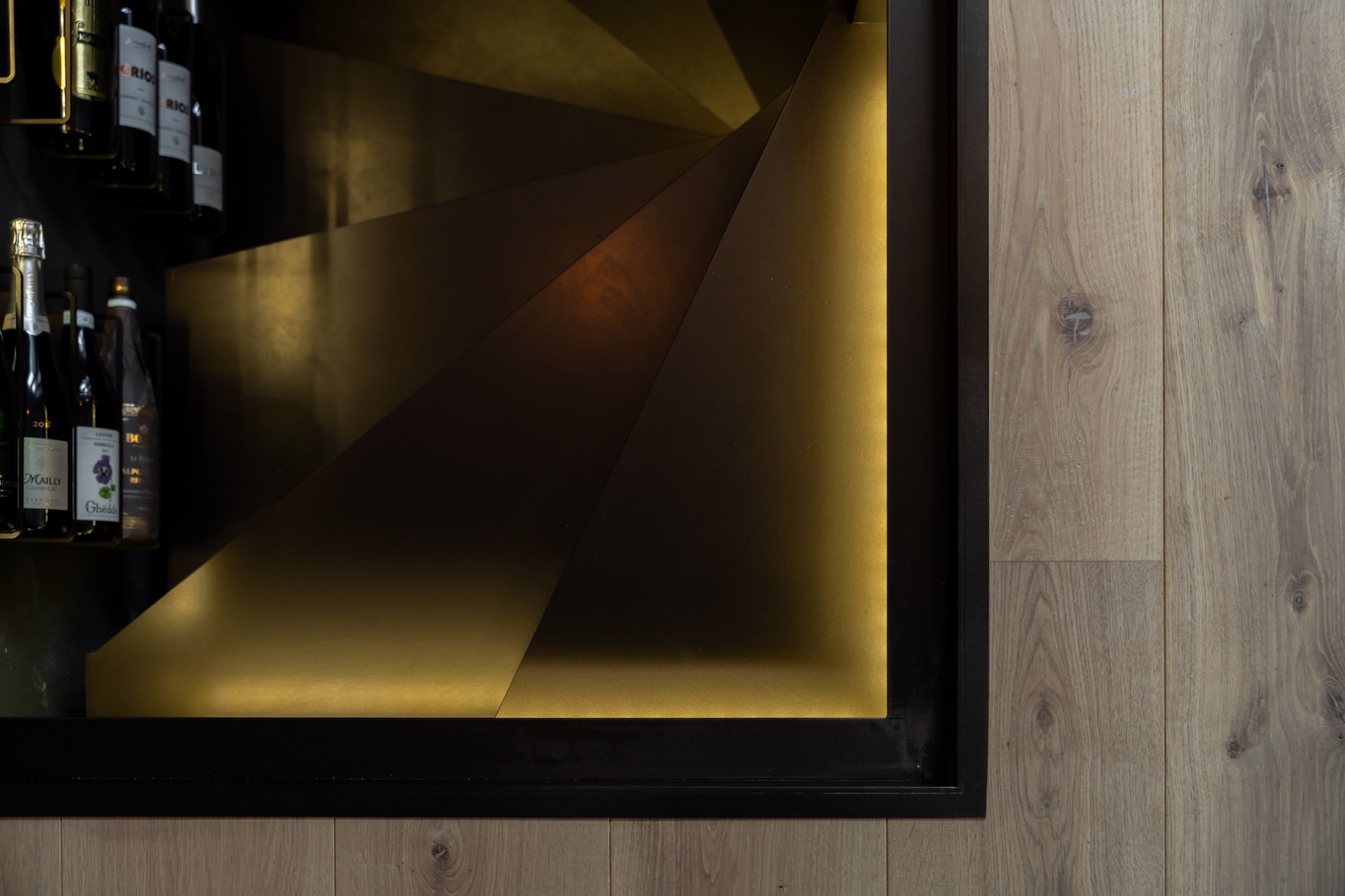
Along the living wall, built-in cabinets with lighting turn storage into part of the composition. Open niches are tucked between closed fronts, and the warm light inside them gives the shelving a measured glow. That lighting also pulls attention to the objects placed there, rather than to the cabinetry itself. Nearby, white panel wall moldings lift the wall from a plain background into a more structured surface, with the raised frames catching light and shadow throughout the day.
The built-in units continue the same language as the kitchen: flat fronts, controlled lines, and a mix of wood and black detailing. Instead of filling the room with visual noise, the storage stays integrated into the architecture of the interior. It works especially well next to the open living area, where the cabinets, niches, and TV wall form a single backdrop. The result is a room that reads clearly from a distance and still rewards a closer look at the joints, recesses, and lit openings.
Panels, plaster, and the edge of Art Deco
White plaster walls and raised panel moldings give the interior its classical frame. The moldings appear in the hall, the living room, and the bedroom, tying the rooms together with the same measured geometry. On their own, the panels are understated. In combination with the metallic finishes and the sculptural lighting, they take on a sharper profile. This is where the Art Deco-inspired pendant light detail comes in: the lamp introduces a vertical rhythm and a warm amber glow that contrasts with the pale walls.
There is no heavy ornament here. The classical references stay in the linework of the panels and in the oval mirror with its gold-toned rim in the hall. Those details are enough to shift the mood of the rooms. The light catches the edges of the moldings, the mirror frame, and the metallic taps, and that is where the interior gets its character. The decorative layer remains light, but it is present in every room that the eye passes through.
Living room details seen in layers
The living area opens with a herringbone wood floor that brings movement under the furniture. The pattern is visible beneath the L-shaped sofa and around the round coffee table, giving the room a directional base without overpowering the rest of the scheme. Large wall panels and a glazed door keep the space open to light, while the window treatment on the far side filters the daylight into softer bands. The floor, wall, and furniture all remain in separate registers, which makes the room easy to read.
From one angle, the sofa settles into the room as a low block of fabric, while the built-in wall behind it stretches across the room with a darker insert and lit niches. That contrast between soft upholstery, wood tones, and white paneling keeps the living room from becoming too uniform. A few carefully placed accessories finish the scene, but they never dominate. The room depends more on proportion and material shifts than on decoration, and the more you look, the more those shifts matter.
Bathroom finishes in stone, glass, and metal
The bathroom carries the same material logic into a tighter space. A glass shower screen with a dark frame divides the shower zone from the rest of the room, while the wall surfaces hold a marble-look finish that brightens the room and reflects the light across the tiled planes. The double vanity marble-look surface continues the palette at sink level, giving the room a broad horizontal plane before the eye reaches the mirrors and taps. The composition feels ordered because each element has a clear job to do.
Black and metal-toned fixtures sharpen the pale surfaces, and the pair of basins gives the vanity a wider presence than a single unit would have done. The brass and bronze notes visible in the fittings echo the warmer finishes used elsewhere in the interior. Nothing in the bathroom feels overworked. The glass, stone-look surfaces, and restrained metal details do the work quietly, allowing the room to stay open and easy to read even with several materials in view.
A hall that sets the tone before the rooms open up
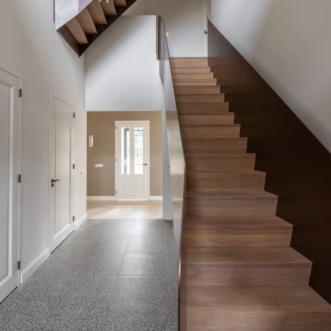
The hall introduces the same language in a smaller scale. A glass door sits beside white panel moldings, and the oval mirror with its gold-colored frame gives the space one clear focal point. Below it, the console in wood tone keeps the composition grounded. The wall lamp tucked into the niche throws light onto the molding edges and the mirror frame, which makes the entry feel measured rather than decorative for decoration’s sake. It is a short passage, but it already explains the rest of the interior.
That first sequence of glass, paneling, and metal finishes prepares the eye for the rooms beyond. The hall does not separate itself from the rest of the apartment; it introduces the same palette in compressed form. White walls, warm wood, and a reflective surface appear again and again, but each time in a slightly different proportion. As a result, the apartment feels consistent without becoming repetitive, and the transitions between spaces remain easy to follow.
A bedroom kept deliberately calm
The bedroom is quieter than the living spaces, but it still carries the same visual code. A upholstered headboard sits against white panel walls, and the raised moldings again set a measured frame around the bed. To one side, a curtain or blind zone softens the window edge, keeping the light controlled rather than exposed. The room depends on plain surfaces, a soft textile panel, and the repeating wall lines to hold its shape.
Because the bedroom stays close to the same material family as the rest of the home, it does not feel detached from the apartment. The pale walls, the restrained joinery, and the absence of unnecessary objects allow the bed to settle naturally into the room. It is the most subdued space in the sequence, but not empty. The paneling, fabric headboard, and filtered daylight give it enough structure to feel complete without asking for more.
Small cues that keep the whole interior connected
The strongest thread through the apartment is the repetition of surfaces rather than ornament. Wood grain returns in the kitchen and hall furniture, stone-look finishes reappear in the kitchen and bathroom, and black metal shows up in the cooktop, frames, and fixtures. Between those elements, the white panel wall moldings keep the rooms linked. Even the pendant light detail finds a counterpart in the bathroom fittings and the mirror rim, so the eye keeps meeting the same family of materials in different scales.
That is what gives the interior its clarity. The rooms are not overloaded, and the references to a more decorative period stay controlled. Instead of using one statement piece to carry the project, the design relies on repeated gestures: a lit niche, a framed panel, a stone-look counter, a herringbone floor, a gold-toned edge. Seen together, they create a home that moves easily from kitchen to living room, from hall to bath, and then into the bedroom without losing its visual thread.
Want to see more of Metaal-Art? View the page of Metaal-Art for even more great projects and company information.



NEW 2026 Jubileum Edition The Best Interior Designers Benelux
Order Now €125
NEW 2026 Jubileum Edition The Best Interior Designers Benelux
Order Now €125