Custom interior with built-in cabinetry and integrated LED niches
Warm light runs through the open compartments before it reaches the taller cabinet runs. That line of light does more than illuminate shelving: it sets out a custom interior with built-in cabinetry that moves from entrance storage to kitchen, dressing, and a wall unit around the fire. The main gesture is clear from the first view — tall fronts, recessed niches, and a sequence of closed and open sections that keep each zone connected without making it look repetitive.
A wall system that carries the rooms
The strongest element is the full-height cabinetry wall. It appears in several parts of the interior, but the language stays consistent: flat panels, deep vertical divisions, and open pockets that interrupt the closed surfaces at the right points. In the hall, the cabinets rise close to the ceiling. In other areas, the same ordering is repeated with more openness, using shelves, glazed fronts, and inset details to break up the mass of wood and lacquer.
The project uses a restrained material set, yet the combinations change from one zone to the next. Lakquered surfaces sit beside ceramic worktops and walnut-toned elements, while Corian is mentioned among the finishes in the broader interior. The effect is not decorative layering. It is a measured shift in sheen, depth, and grain, so the cabinetry reads as one family of elements rather than separate pieces placed room by room.
Integrated LED niches and open compartments
Several of the wall units are cut with niches that hold light instead of objects. The integrated LED niches cast a soft line across the shelves and underline the geometry of the cabinet system. In the images, the light sits inside the recess rather than washing over the whole room, which keeps the surfaces crisp and makes the openings read as precise cuts in the larger wall. The open compartments also introduce a rhythm that changes with height, especially where darker panels frame the brighter recesses.
Glass-front wall units appear in the kitchen zone, where they sit next to closed panels and open storage. Behind the glass, built-in appliances are visible in a neat row, and the transparent fronts prevent the wall from becoming visually heavy. The structure is straightforward: solid storage below and above, display in the middle, and a clear working zone underneath. That mix gives the cabinetry a more domestic register without losing the disciplined layout.
A fireplace niche wall unit for art and objects
The fireplace niche wall unit is treated as part of the same system, not as a separate feature wall. Its opening sits within the cabinetry, surrounded by lacquered planes and narrow shelves with light worked into them. The niche was designed to support the owner’s art collection, and the photographs show how the framing around it keeps the eye on the central opening. Nothing feels inserted after the fact; the fire niche is folded into the wall composition from the start.
Alongside the opening, the cabinet faces remain clean and vertical. This matters because it gives the niche room to breathe. The lighter recesses, the darker panel fields, and the concealed edges together keep the wall from flattening into a single backdrop. Instead, the fire zone becomes one pause in a larger sequence of storage, display, and closed volume.
The kitchen island custom and the working wall behind it
The kitchen uses a custom kitchen island as its central working surface. The island sits in front of a wall of storage, so the room reads in two layers: preparation in the middle, appliances and tall cabinets behind. Stone Brown ceramic is specified for the worktop, and its darker tone grounds the lighter fronts around it. Walnut is used to soften that structure, while the Milano-coloured cabinet wall keeps the background calm and even.
Visible in the images are inbuilt appliances, glass sections, and a tidy arrangement of shelves and drawers. The kitchen island custom layout does not depend on ornament or extra detailing. It relies on proportions, the relation between horizontal and vertical planes, and the way the cabinet fronts line up with the worktop edges. That clarity is what lets the kitchen sit comfortably within the broader interior without losing its own identity.
The source text notes semi-professional appliances in the kitchen, which fits the way the space is organized: long work surfaces, a clear appliance wall, and enough closed storage to keep the visible parts of the room controlled. A window side with a hanging light and a visible cooktop in one of the photographs adds another layer of function, but the cabinetry remains the main framework. The island, the wall units, and the appliance run all answer to the same geometry.
Wardrobe and dressing areas kept deliberately quiet
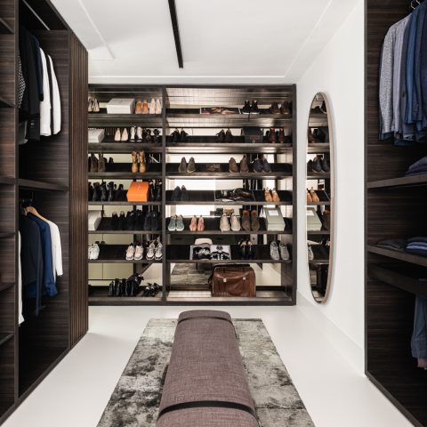
The custom dressing area and wardrobe storage are finished in textured lacquer, which gives these rooms a different surface from the kitchen and fire wall. The finish is mentioned for both the vestiaire and the dressing, and the images show how these zones rely on height and repetition more than display. Tall fronts close the walls, while smaller breaks in the surface allow circulation and access without crowding the route through the house.
What makes these pieces work is their restraint. There is no need for extra framing when the cabinet doors already define the space. The surfaces take light differently from the ceramic and walnut elsewhere in the project, so the dressing area reads as a quieter part of the same interior. It is still part of the custom built-in cabinetry, but the visual tempo slows down here.
Material shifts that keep the plan legible
Across the project, material changes are used to mark function. Ceramic appears where work happens. Walnut gives the cabinetry a warmer grain. Lacquer keeps the larger wall fields controlled, especially around the niche wall and wardrobe zones. The result is not a collage of finishes, but a series of deliberate transitions that help the eye understand where one area ends and the next begins. Even in the entrance, where the tall cabinets dominate, the room stays readable because the same front language continues from one panel to the next.
That continuity is what gives the whole interior its strength. The hall, kitchen, dressing, and fireplace area all rely on the same cabinet logic, but each one adapts that logic to its own task. Open shelves, glass-front wall units, hidden appliance runs, and the integrated LED niches are used sparingly, and that restraint keeps the rooms from competing with each other. The visitor reads the house through its storage, and the storage becomes the main spatial order of the plan.
Custom built-in cabinetry, a fireplace niche wall unit, and a custom dressing area shape the project from end to end. The kitchen island custom arrangement ties the working zone back to the tall wall units, while the integrated LED niches give the storage its finer points. It is an interior built from alignment, recess, and surface changes — a sequence of practical moves that turns a set of rooms into one legible whole.
Want to see more of Metaal-Art? View the page of Metaal-Art for even more great projects and company information.



NEW 2026 Jubileum Edition The Best Interior Designers Benelux
Order Now €125
NEW 2026 Jubileum Edition The Best Interior Designers Benelux
Order Now €125