Home design with indoor-outdoor connection and black timber facade
Large sliding glass doors set the tone immediately. They pull the garden into view, while the black timber facade holds the outside in a tight vertical rhythm. Inside, the plan follows that same clarity. Rooms line up across the ground floor, openings stay generous, and the shifts in material remain easy to read. This indoor-outdoor home design works through light, route, and surface rather than decoration.
Black timber and a sharper street side
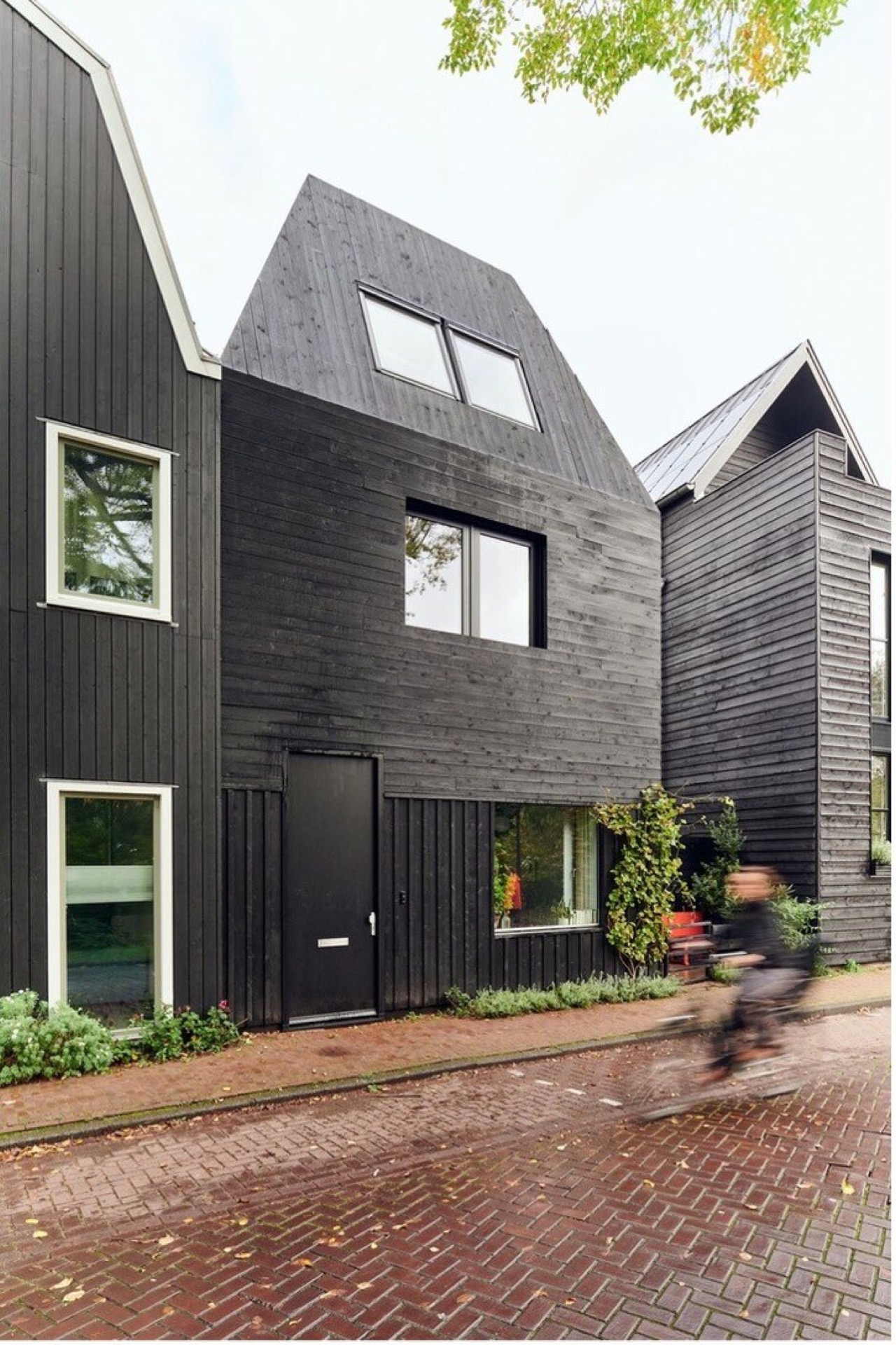
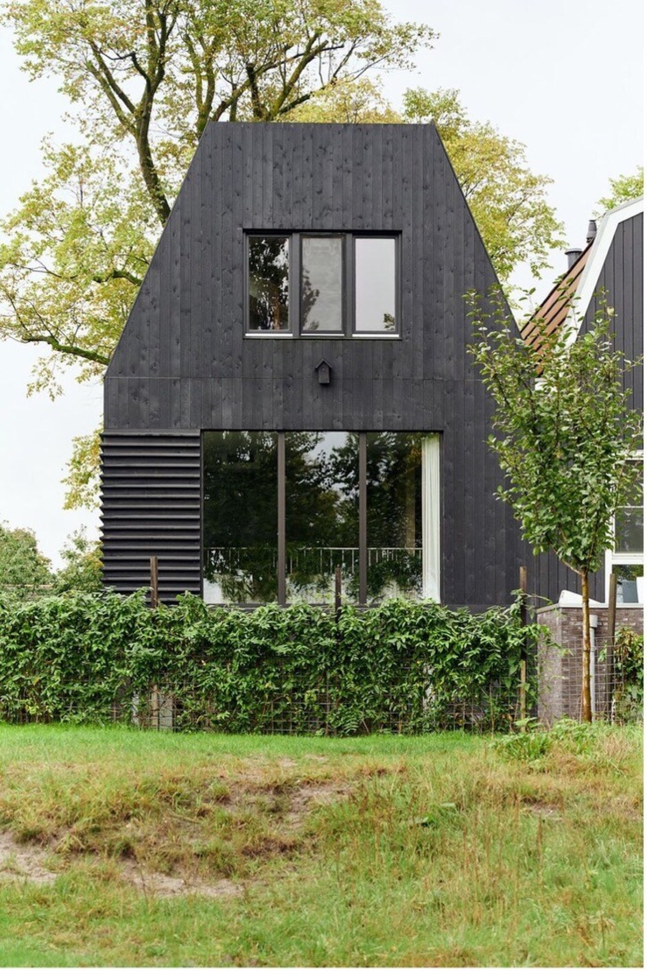
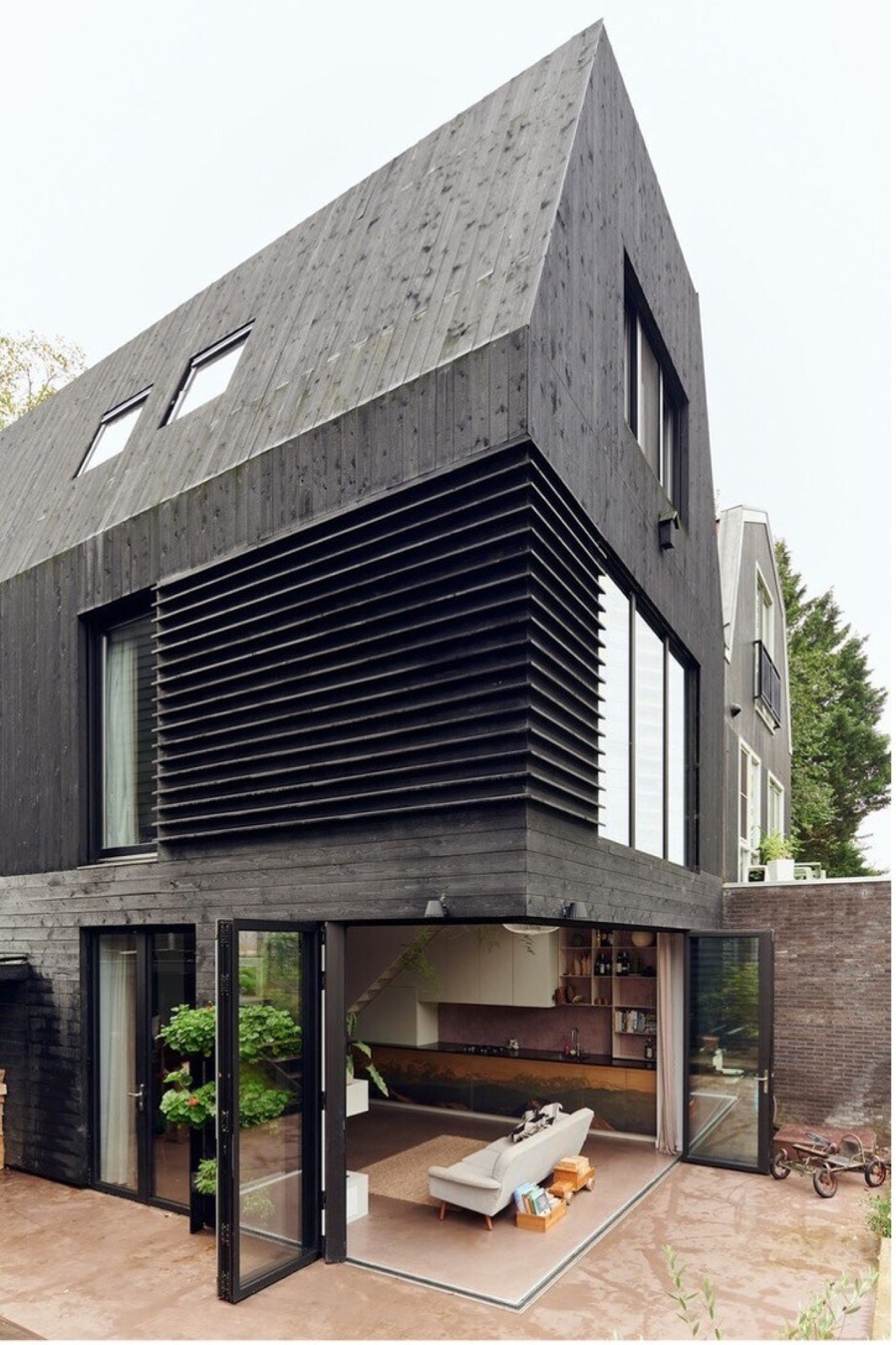
The house is wrapped in timber, but the dark finish gives the volume a firmer edge. From the street, the front reads as compact and controlled. The slatted structure lets only a few openings filter through, so the building keeps most of its presence inward. At the back, that restraint gives way to a much more open composition. The rear elevation opens as far as possible, and the contrast between the two sides becomes part of how the house is understood before you even step inside.
That shift is visible in the way the glazing lands against the wood. The black timber facade is not used as a neutral skin; it frames the openings and sets up the relation between inside and outside. Thin vertical lines and broad panes of glass give the volume a measured cadence. The result is a contemporary reading of a more traditional timber house, but one that is defined here by the tension between enclosure and openness.
Ground floor rooms on one continuous line
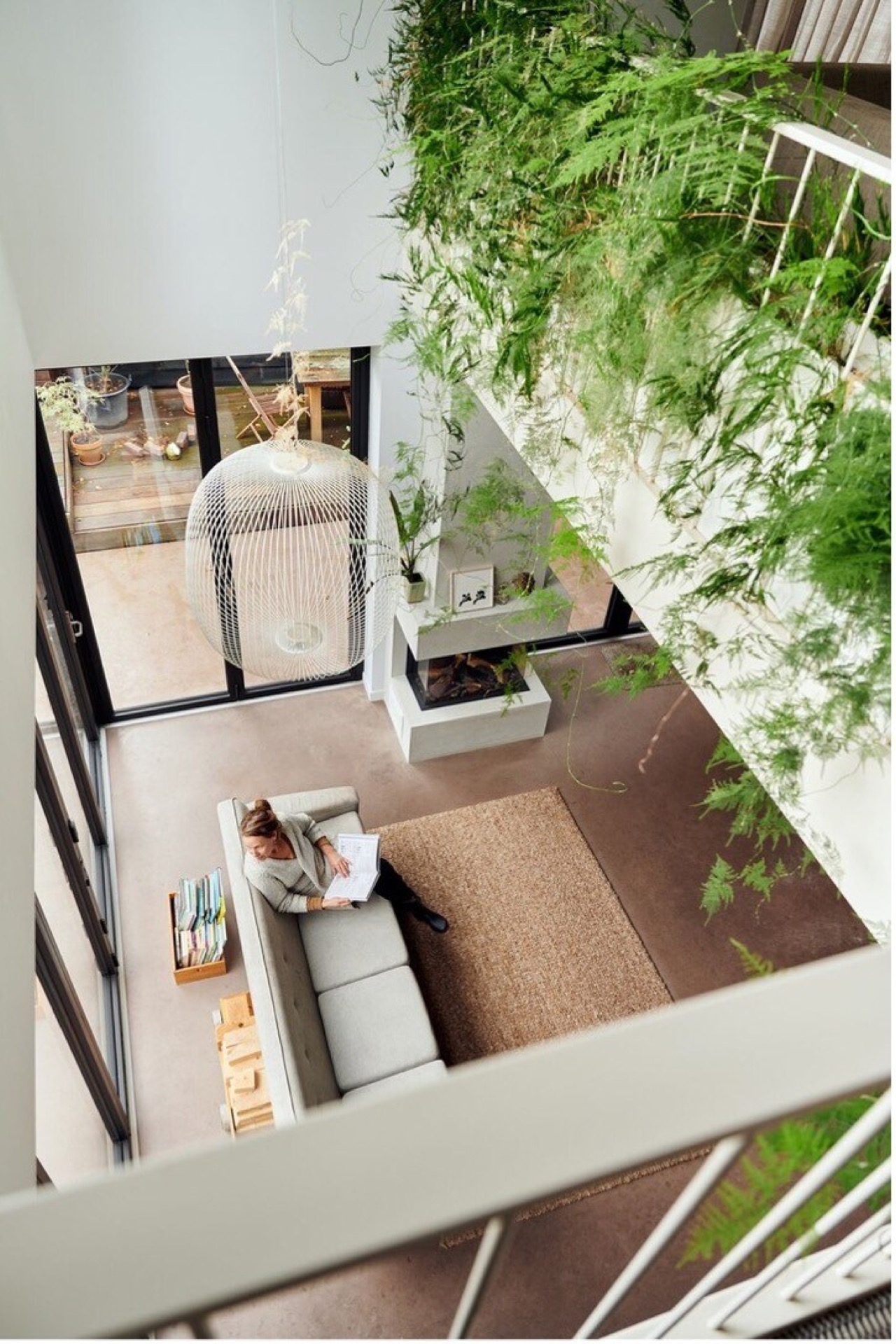
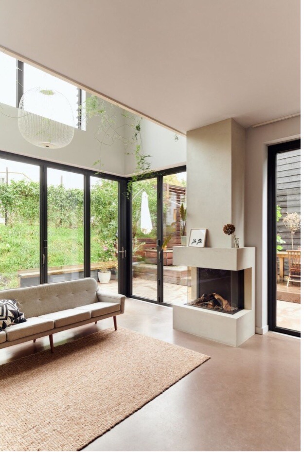
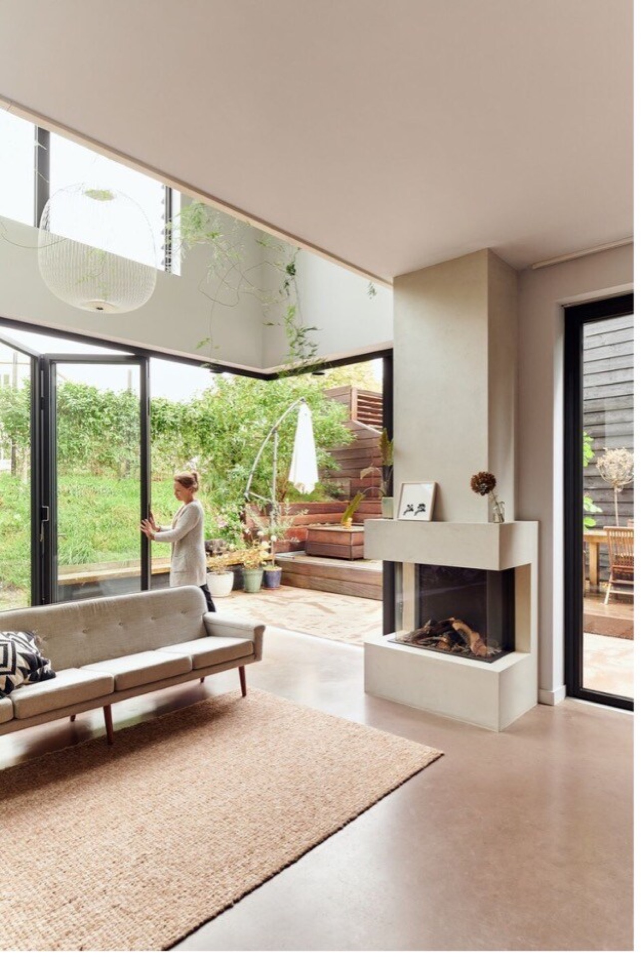
On the ground floor, the living kitchen sits at the centre of the plan. It is not treated as a backroom. The kitchen, fireplace, and work room are grouped closely together, and the floor in coloured polished concrete carries straight out toward the garden. That continuous flooring to terrace makes the exterior feel attached to the living space instead of placed beside it. The eye stays low and steady, following one surface across the threshold.
The fireplace wall feature anchors that open arrangement. Finished in a concrete-like plaster, it sits with a dense presence among the glazed edges around it. Built-in niches and cabinetry are set around the room so the walls keep working without becoming busy. Open shelving rises through the lower zone and connects visually to the level above, turning storage into part of the spatial structure. The room feels planned from the inside out, with each element carrying a clear role.
Custom joinery in the kitchen and living area
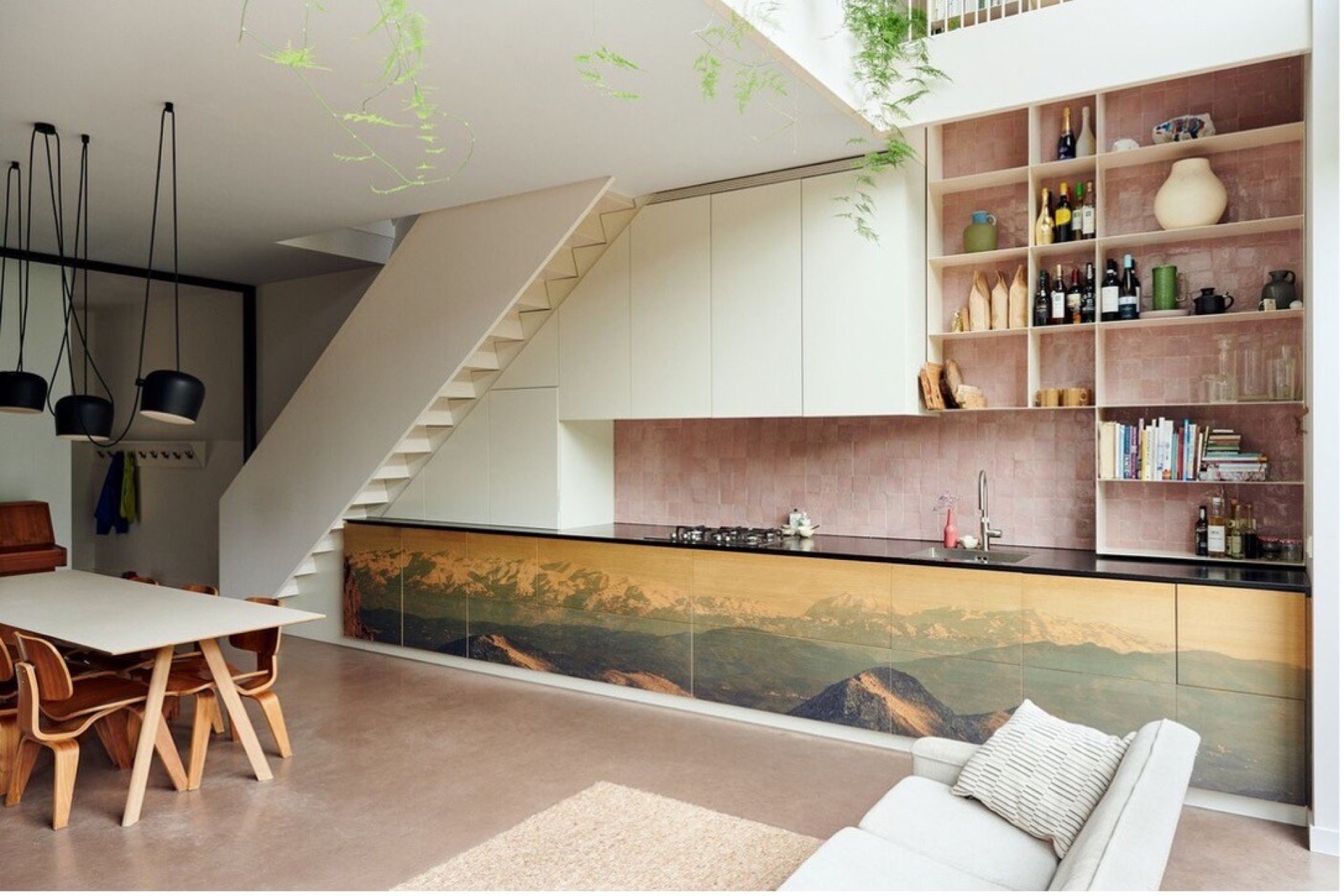
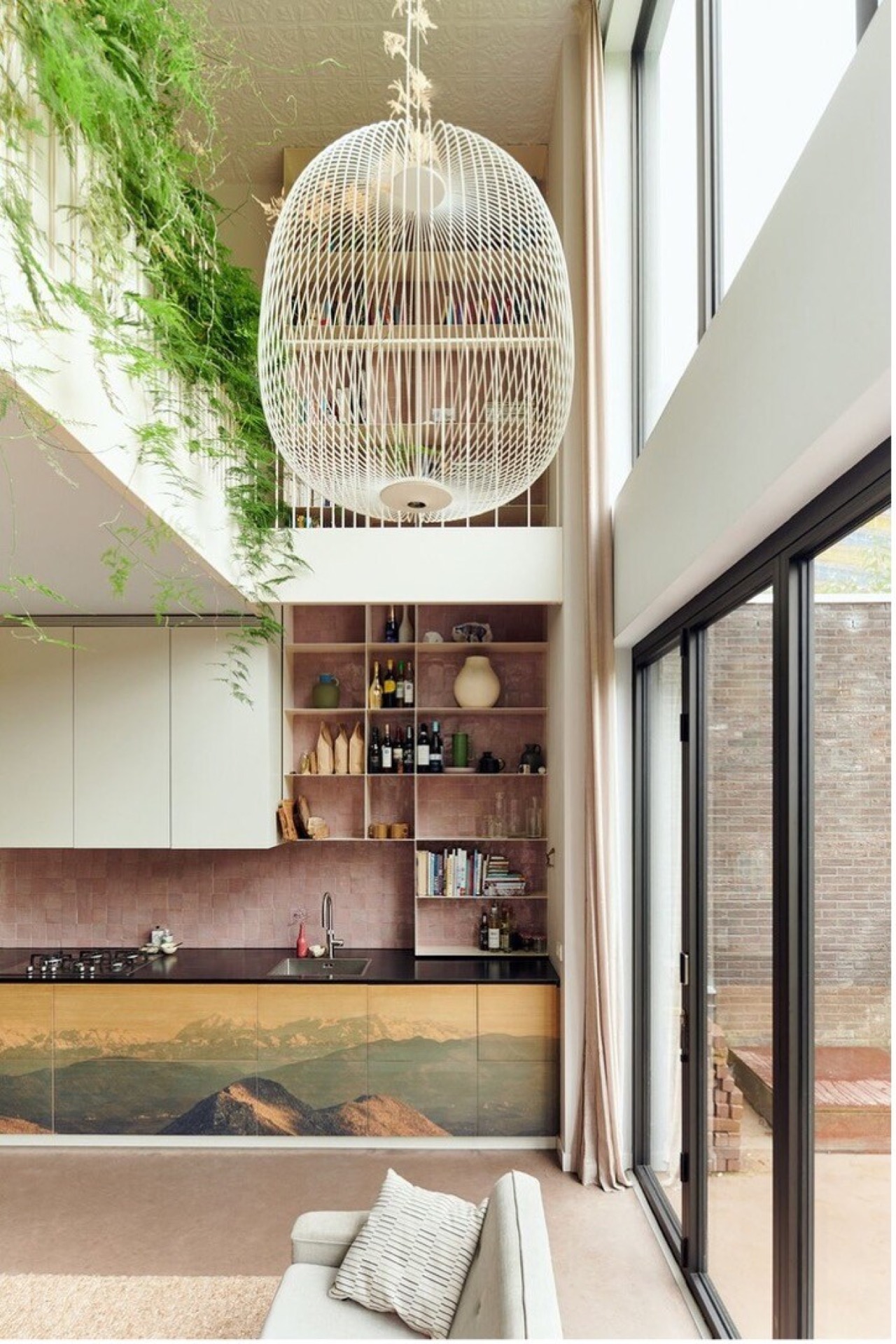
The custom joinery in kitchen and living area does more than hold objects. Open shelves, inset niches, and a passing cabinet create a direct line between the floors. The kitchen wall is not left flat; it becomes a working surface with openings and storage folded into it. In the living area, built-in elements keep the walls active while leaving the room open enough for the garden view to remain present. The whole ground floor depends on these measured insertions.
The work room can join the kitchen or be closed off with large oak panels. When open, it extends the social field of the ground floor. Shut, it gives privacy without changing the language of the interior. The panels read as a solid movable plane rather than a separate room added later. That makes the plan flexible in use, but still very clear in its structure. Spaces can open toward one another or be cut off for one task, and the geometry remains legible.
A double-height void that connects the levels
A double-height void and staircase connect the ground floor with the first level. The stair is left visible, so it becomes part of the daily route rather than a hidden utility piece. From below, the opening draws in depth and extra daylight. From above, it keeps the upper rooms related to the living spaces underneath. The void also lets the first-floor ceiling appear from multiple angles, including the garden and the seating area downstairs.
The visual link continues in the open kitchen cabinet that passes through the floor and ends as a bookcase above. It is a small move, but an important one. Instead of separating functions, it ties them together through one continuous piece of joinery. The same logic shapes the rest of the interior: few gestures, each one stretched across levels. Long horizontal and vertical lines repeat, and the house avoids decorative layering in favour of alignment and openings.
Upper rooms that share sightlines
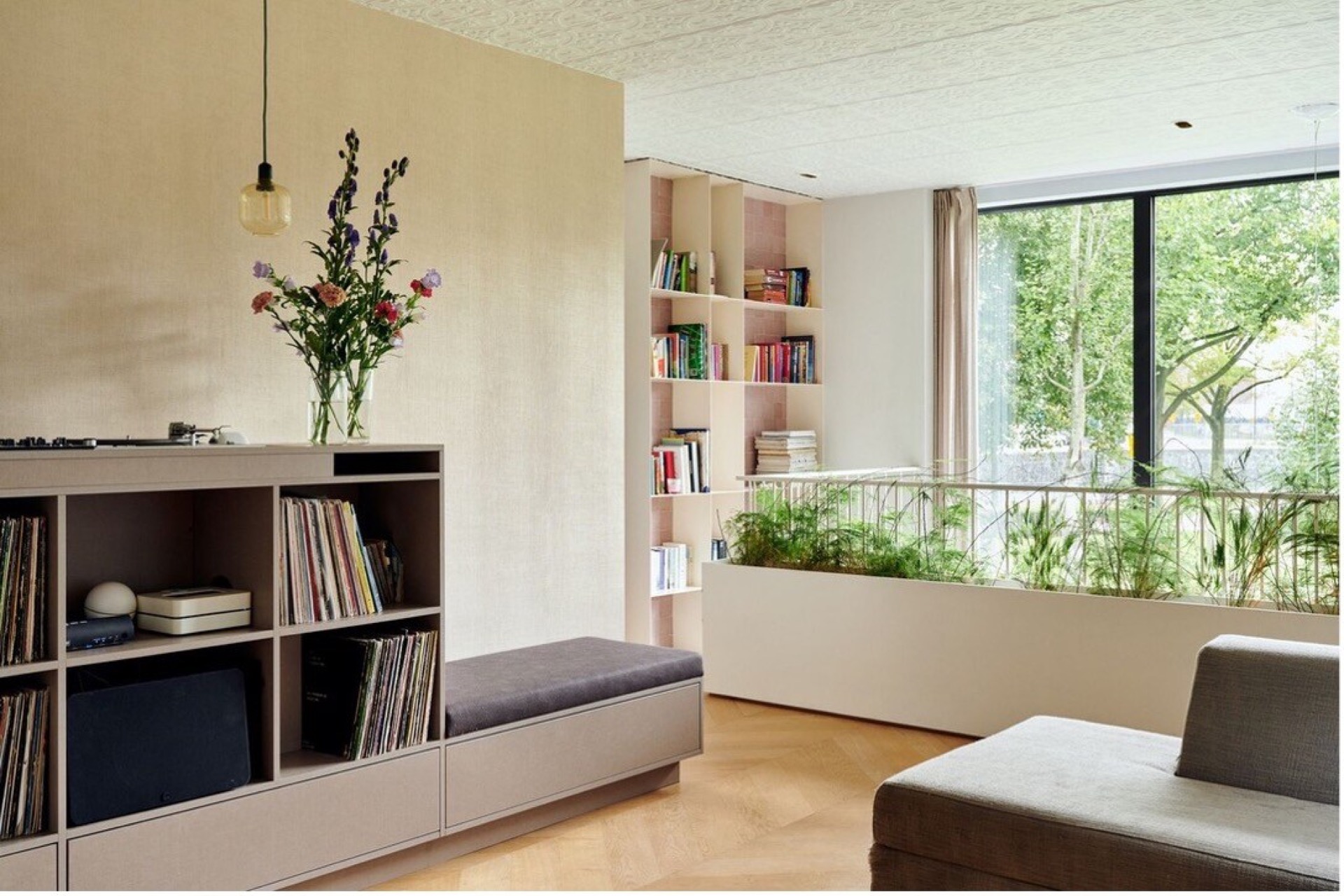
The first floor adds another living room, a DJ booth, a library, and a film corner. These spaces sit on the same level without collapsing into one undivided room. They share the ceiling plane and the same sightlines, yet each area keeps its own edge. The parents’ bedroom and bathroom are also placed here, so the floor combines shared and private uses without a hard visual break. Built-ins help movement stay smooth while leaving each zone readable in its own right.
One of the most distinctive surfaces is the first-floor ceiling, finished with original Brooklyn tins. The reflective, patterned plane appears from several directions, including the garden and the sitting area below. Against the restrained palette of plaster, timber, concrete, and glass, it adds a clear horizontal marker. It is less a decorative layer than a material field that can be read from several rooms at once. Across the void, it gives the upper level its own presence.
Why the garden stays in view
Large sliding glass doors keep the rear side active throughout the day. They set up a direct line from the living kitchen to the terrace and the garden beyond. The indoor-outdoor home design is most legible here, where the glazing, the floor finish, and the outdoor view work together. A planted edge outside and the clear opening in the rear wall make the transition feel immediate, but the interior never loses its own structure.
The same directness appears in the siting of furniture and openings around the living area. A large window wall brings daylight deep into the room, while the built-in unit in the seating area gives the wall a clear use. The house does not rely on layered ornament to connect with the outside. It does it through proportion, line, and the repeated presence of glass at the garden side. That is what keeps the whole ground floor tied to the terrace without flattening the spaces.
Bathroom surfaces kept light and direct
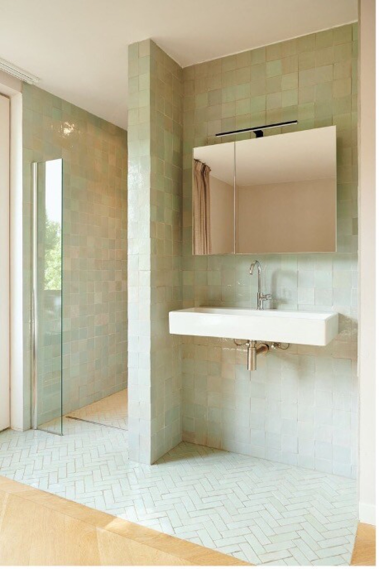
The bathroom follows the same rule of clear surfaces. Tiled walls, a glass shower enclosure, and a rectangular basin keep the room easy to read. Daylight catches the glass and tile, so the surfaces remain visible without strong contrast. The shower partition sits lightly in the room, allowing the floor and walls to keep their continuity. It is a small space, but it does not feel overworked; the details are kept plain and specific.
That sense of directness runs back through the house. The black timber facade outside, the fireplace wall feature inside, and the custom joinery in the kitchen and living area all work as parts of the same spatial logic. The house is shaped by thresholds, openings, and long sightlines. It is a home design with indoor-outdoor connection that reads clearly from the street side to the garden side, and from the ground floor up through the double-height void.
Want to see more of studio RIANKNOP? View the page of studio RIANKNOP for even more great projects and company information.



NEW 2026 Jubileum Edition The Best Interior Designers Benelux
Order Now €125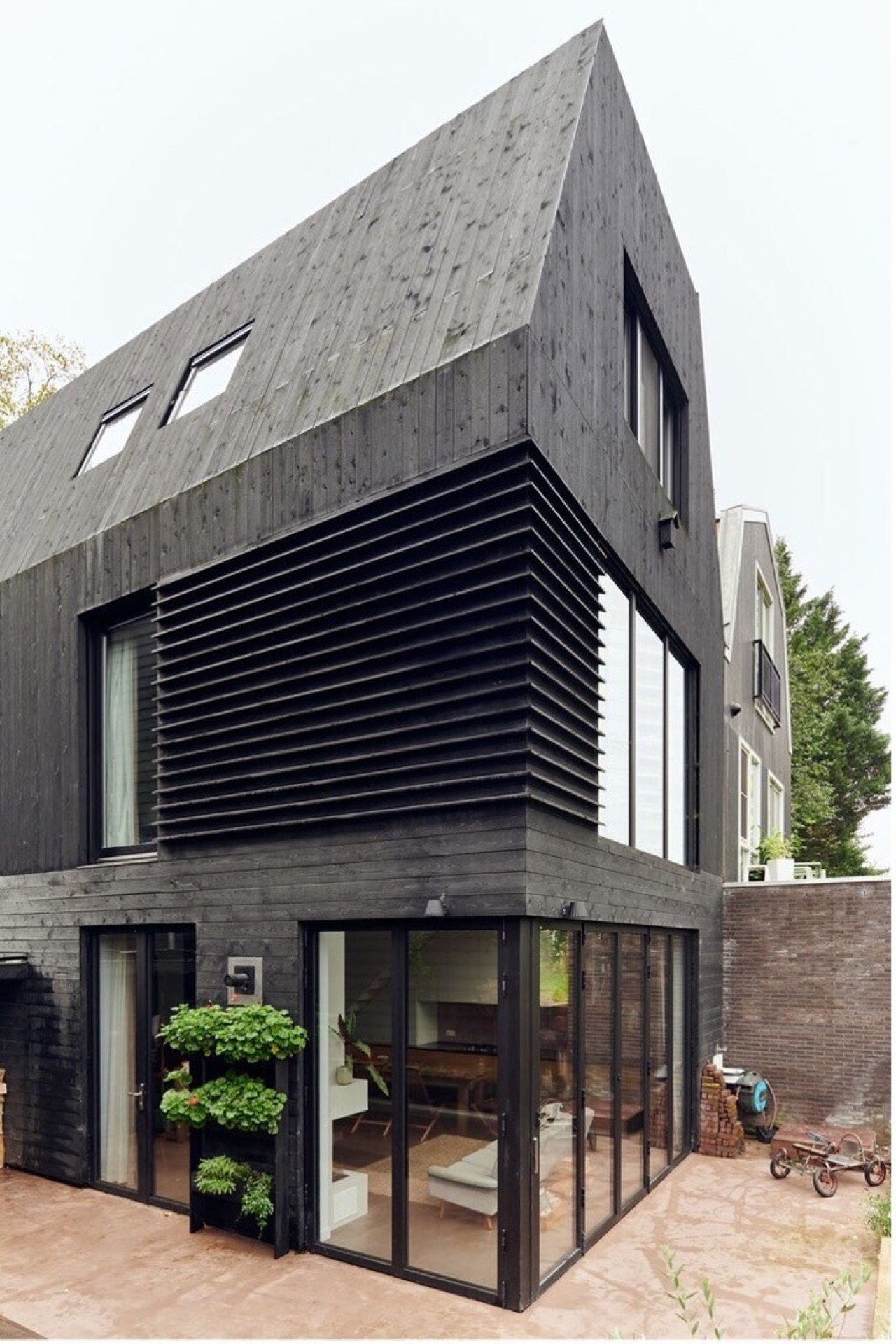
NEW 2026 Jubileum Edition The Best Interior Designers Benelux
Order Now €125