Penthouse apartment renovation with open-plan living and bespoke detailing
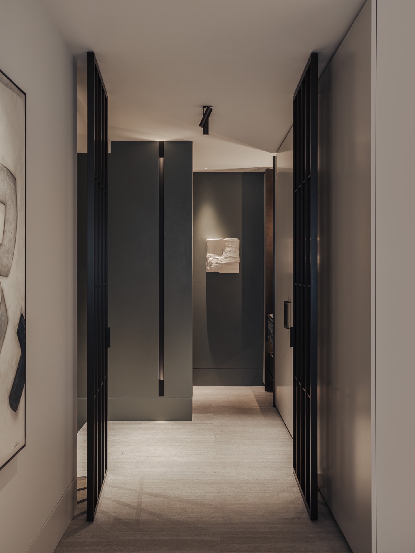
A black-framed glass partition sets the tone before the rest of the apartment unfolds. In this penthouse apartment renovation, the layout stays open, but the edges between functions are gently drawn. Light moves through semi-transparent volumes, and the rooms keep their own rhythm without breaking the long sightlines. The result is a sequence of spaces that feels connected from the kitchen to the living area, with material shifts doing the work that solid walls normally would.
Open volume, lightly divided
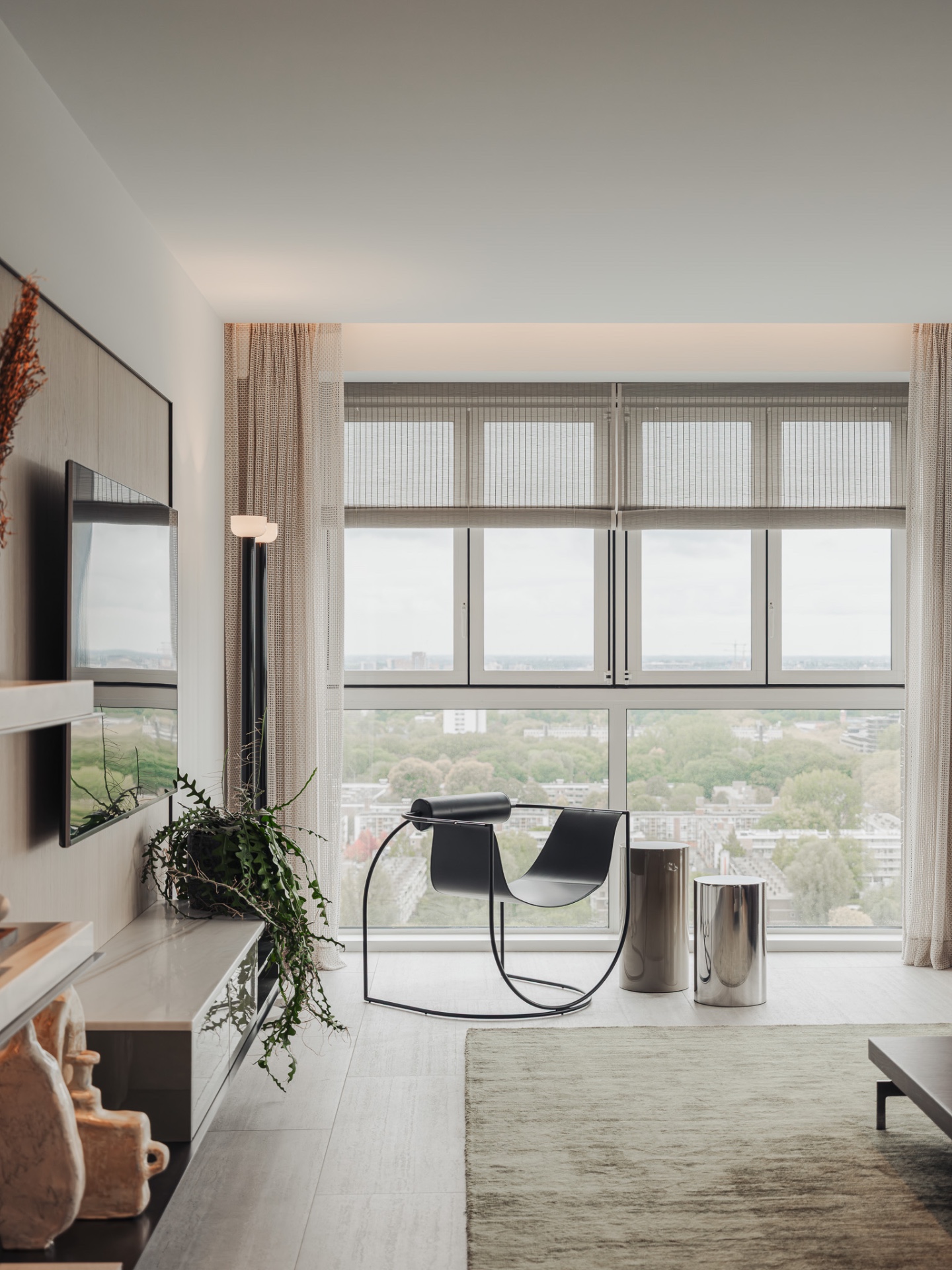
The strongest gesture is not a wall, but the decision to let one zone bleed into the next through glass and semi-transparent elements. From the entrance, the apartment reads as a broad interior with clear lines and very little visual noise. A pale base runs through the rooms, then warm earthy tones step in through wood, upholstery, and darker accents. That combination keeps the penthouse calm in plan, while the surfaces themselves carry most of the detail.
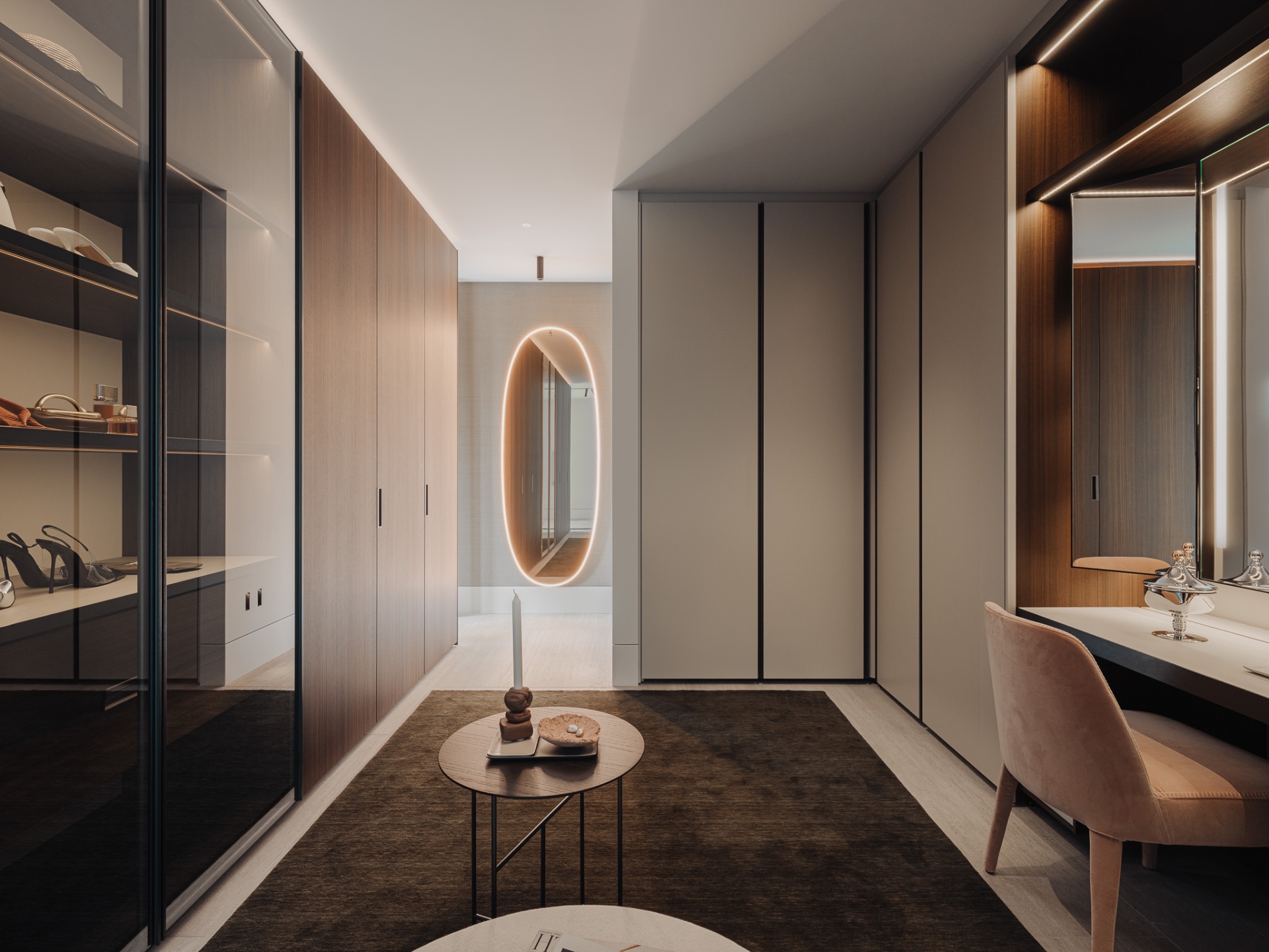
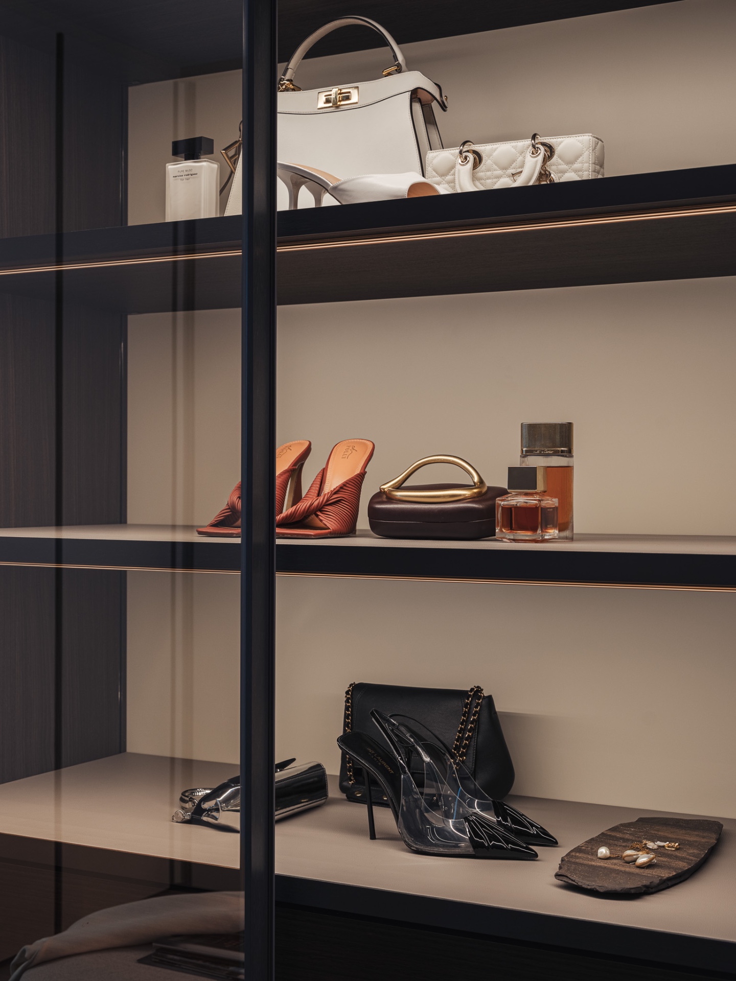
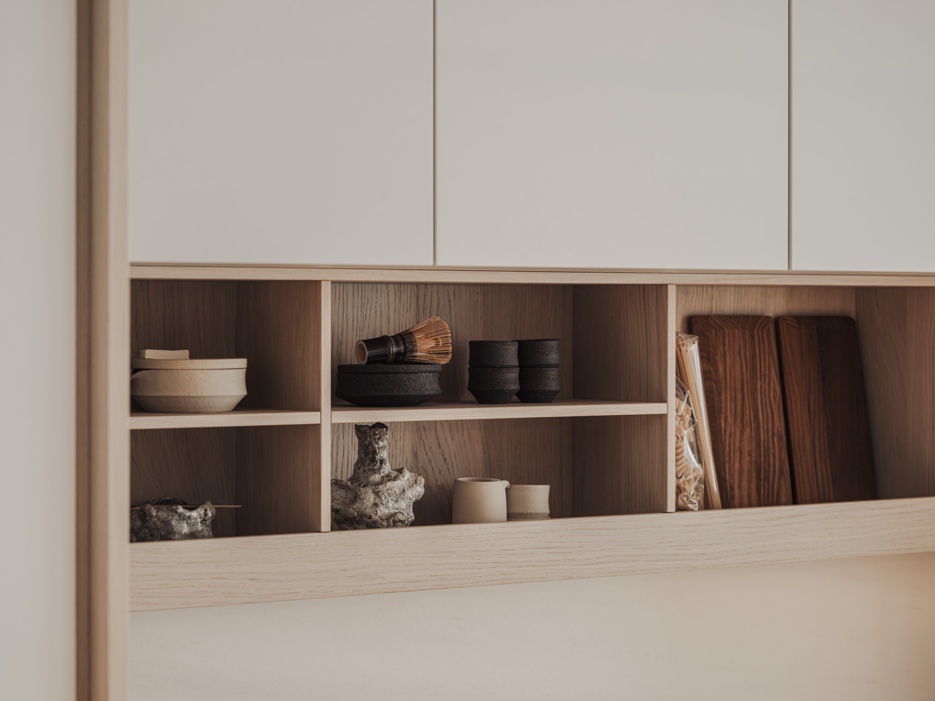
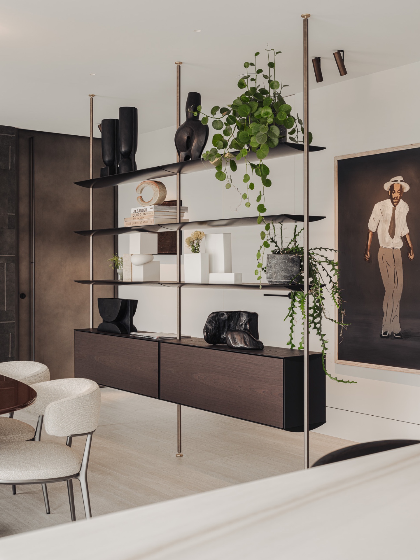
Custom cabinetry lines several of the walls, keeping storage flush and quiet. Integrated lighting picks out the edges of the joinery and adds a measured glow along the ceiling and behind built-ins. In some spots, the cabinetry meets open shelving or framed niches; in others, the finish is closed and flat, allowing the texture of stone-look panels and wood veneer to do the talking. The project relies on these small changes in depth, not on decorative excess.
The kitchen as a long, anchored line
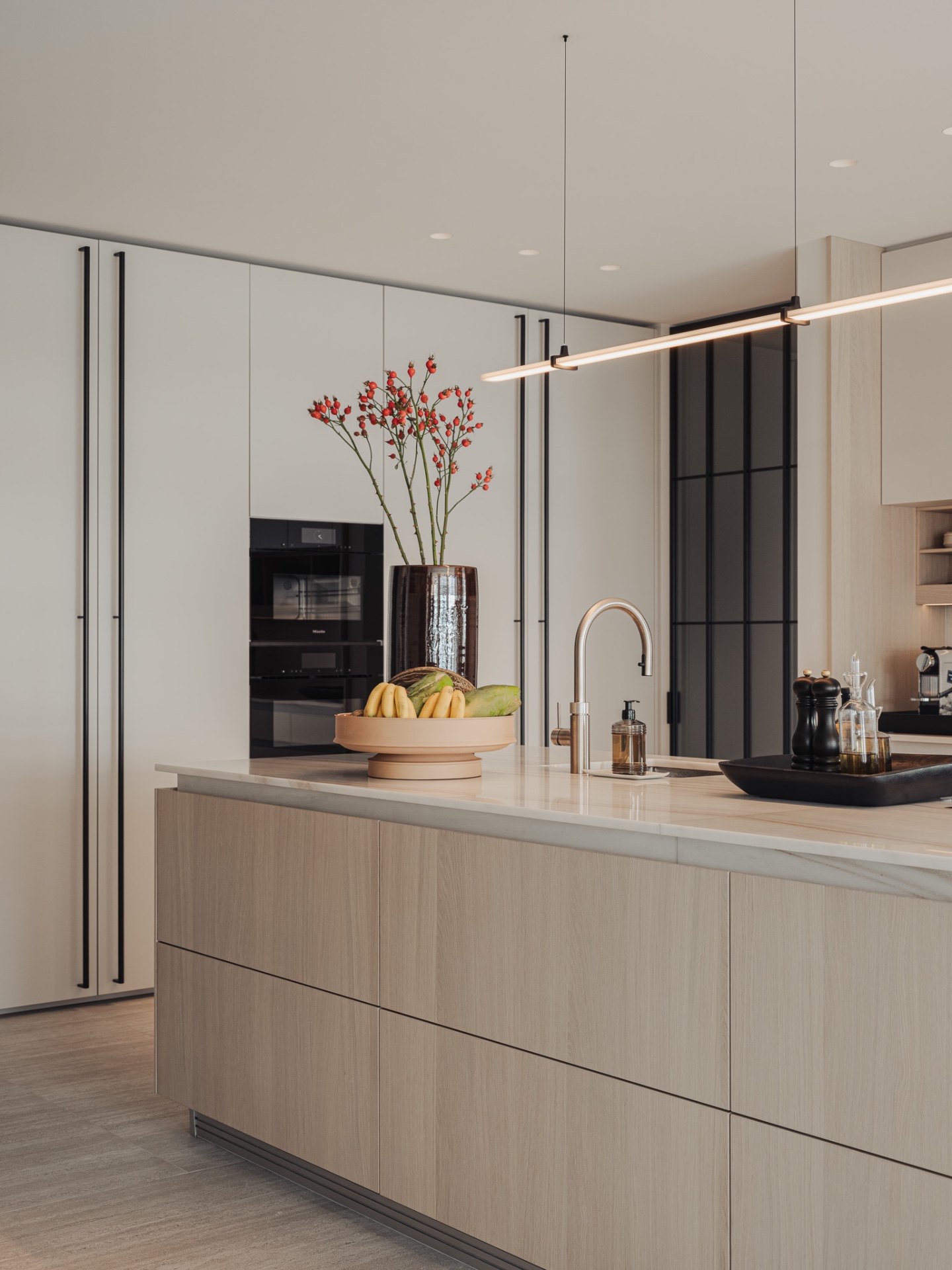
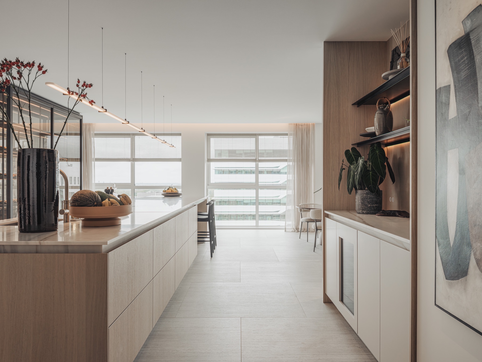
The kitchen is dominated by a six-meter-long island, a slab-like presence that anchors the room. Its stone-look surface reads as one continuous gesture, with enough length to shape the space rather than simply occupy it. From this point, the sightline runs all the way to the living area, so the kitchen never feels isolated. Instead, the island becomes a working edge, a gathering point, and a visual pause before the interior opens again.
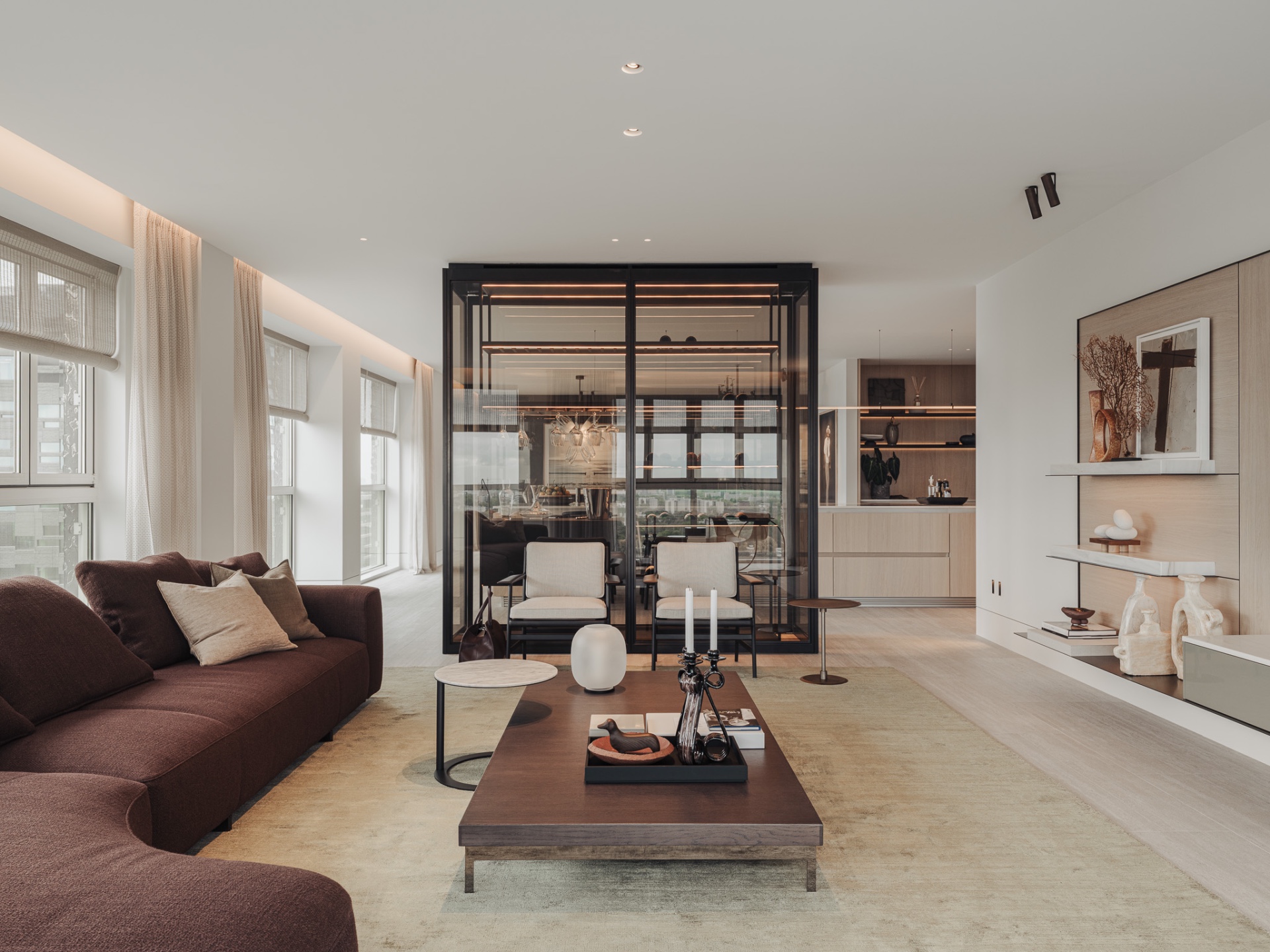
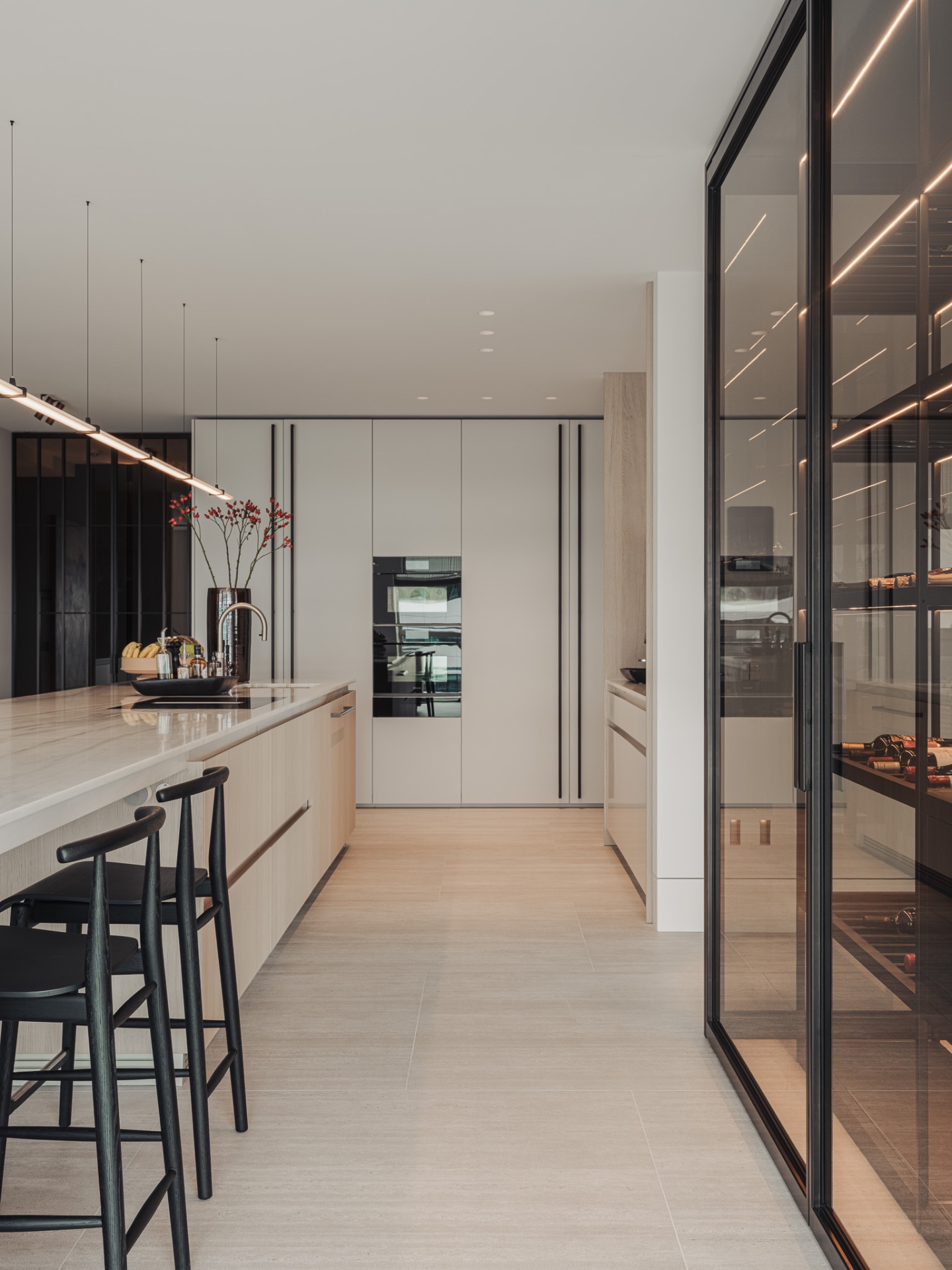
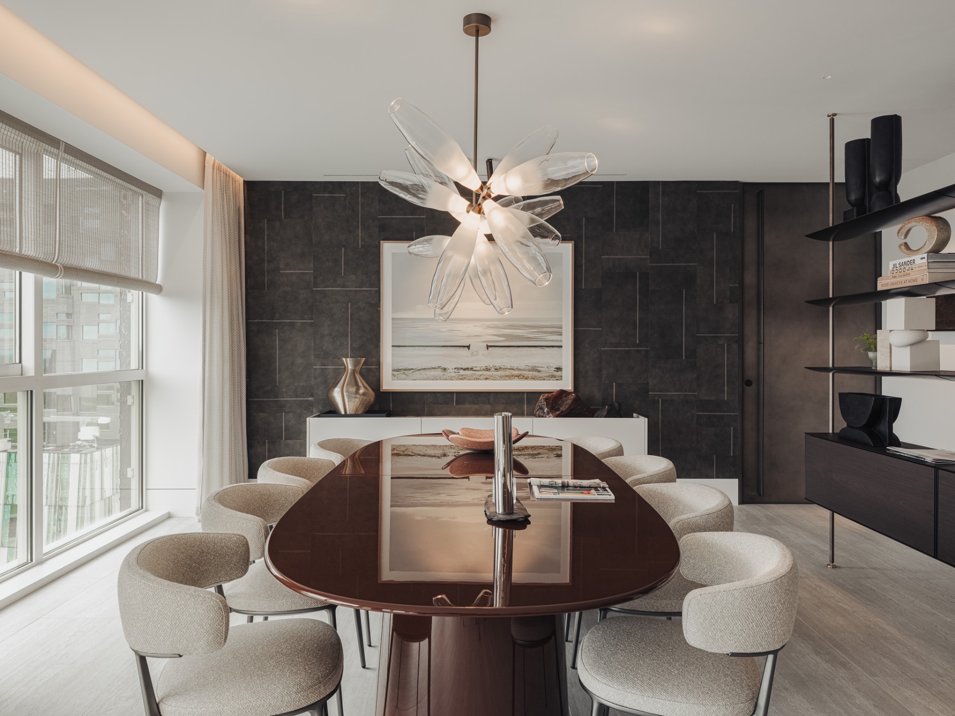
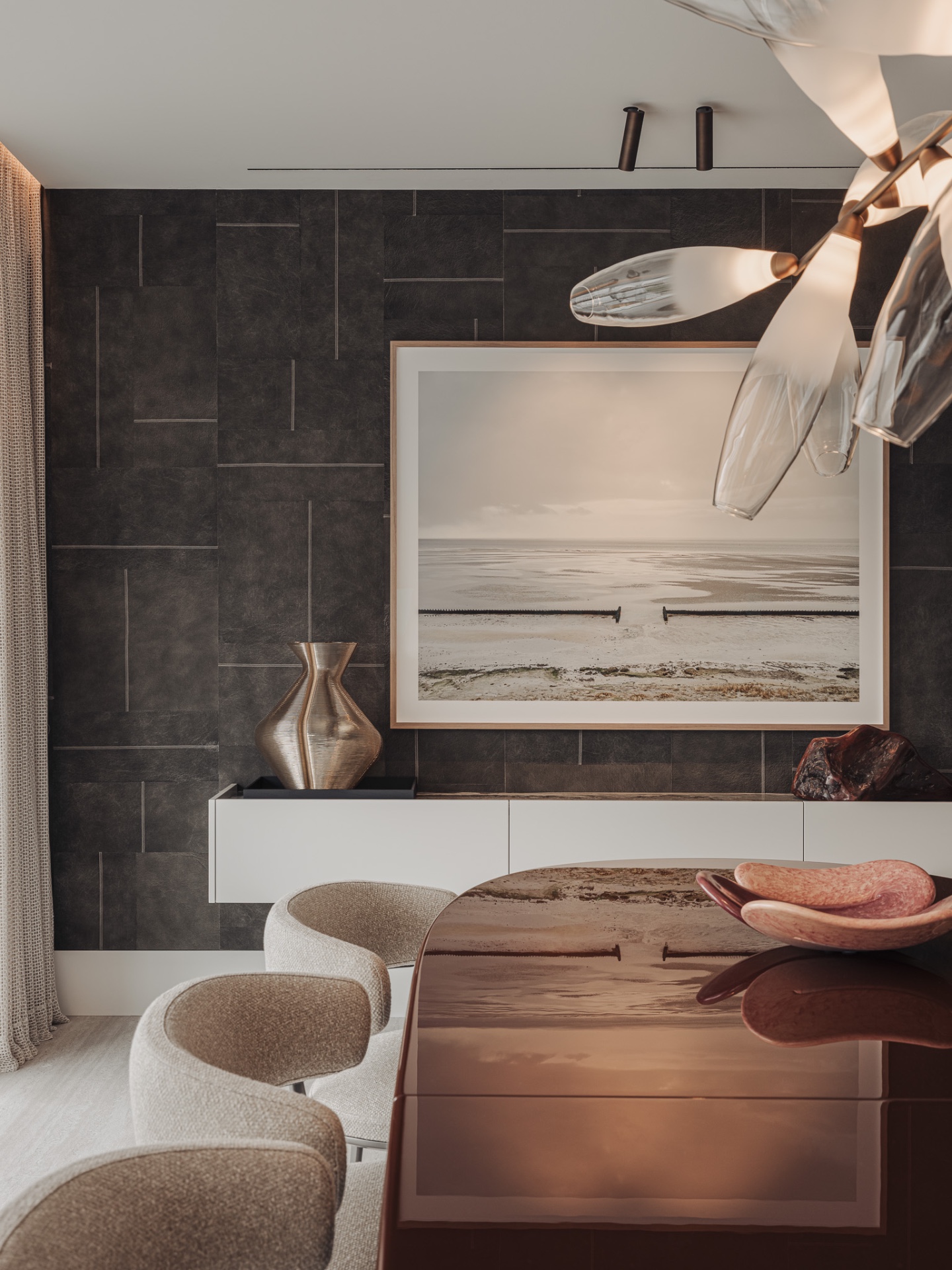
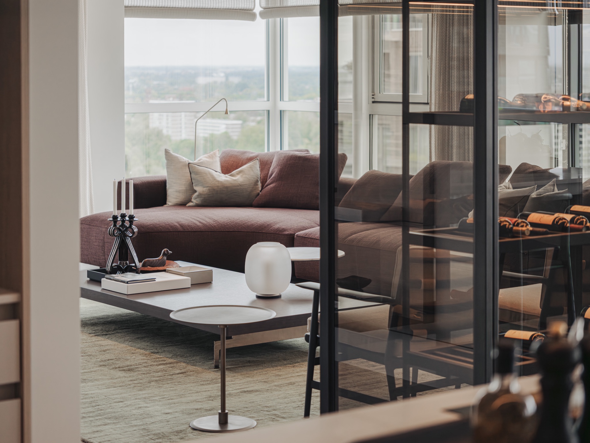
A glass wine cabinet marks the transition toward the living space. Because the cabinet is transparent, it divides without shutting anything off. Bottles, reflections, and frame lines create a finer layer between zones than a solid partition would allow. The dining area sits beyond that threshold, where a burgundy high-gloss table catches window light and reflects the room back at itself. The surface deepens the view rather than flattening it, especially when the daylight shifts across the tabletop.
Kitchen details that keep the room open
Long cabinet runs and linear lighting reinforce the horizontal movement of the apartment. The kitchen wall stays visually controlled, with built-in storage and clean front panels that avoid a busy finish. Around it, the open-plan living with glass partition remains legible even when several functions overlap. You can read where cooking ends, where dining begins, and where the living area takes over, yet none of those boundaries are hard or opaque.
That clarity matters in a penthouse interior, where the view and the room proportions are part of the experience. The kitchen does not rely on contrast alone; it uses proportion, transparency, and restraint. A framed glass section, a continuous worktop, and the steady run of cabinetry do more than divide the plan. They organize it.
Materials that shift between light and depth
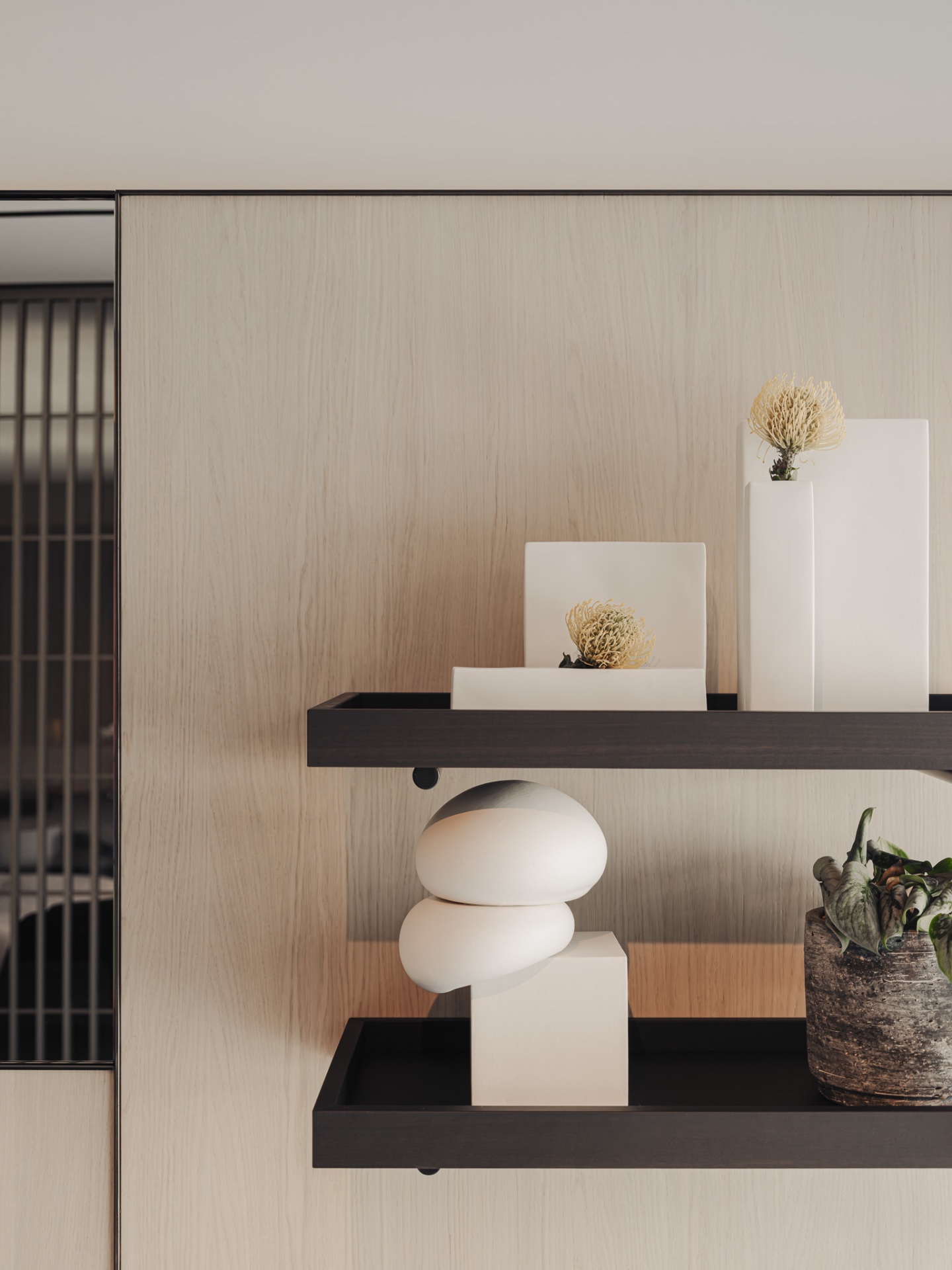
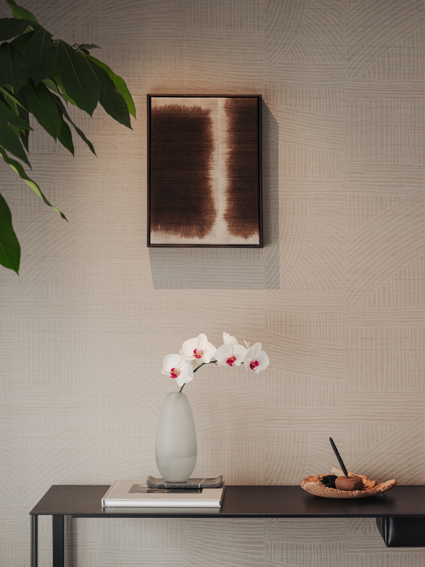
Across the apartment, the palette stays light, but it never turns flat. Earth-toned textiles, pale wall surfaces, and warm timber accents sit beside polished finishes and stone-look surfaces. The styling adds another layer: Dutch pieces stand near African and Asian objects, which gives the rooms a collected feeling without crowding them. Italian references appear in the refined lines and careful detailing, while subtle Japanese elements appear in the restraint of the composition and the way surfaces are left to breathe.
The mix is strongest when light touches it. On the cabinetry, on the glass, and on the dining table, reflections change throughout the day. In the living zone, transparent and semi-transparent partitions keep the apartment bright and readable. In the bedroom, the same idea appears in a quieter form: closing a panel changes the room from exposed to enclosed, without altering its underlying structure. The whole apartment depends on that flexibility.
A bathroom shaped by length and reflection
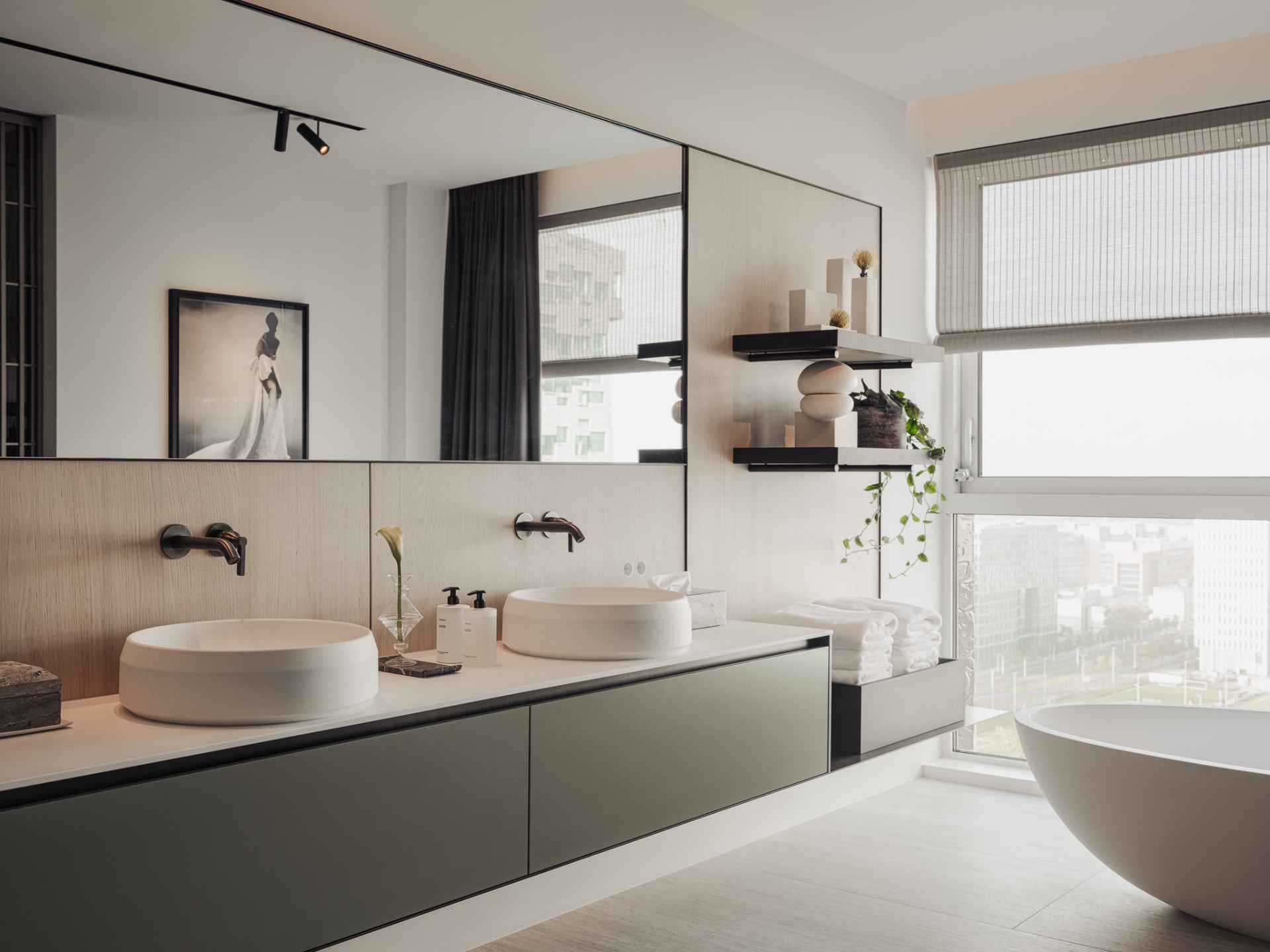
The bathroom feels longer than it may measure because the floor treatment runs through the space without interruption. That continuous path draws the eye toward the freestanding bathtub by the window, which sits at the end like a sculptural marker. The bath is not tucked into a corner; it is placed where the room opens to the view, so the window becomes part of the composition. The geometry is simple, but the effect is strong.
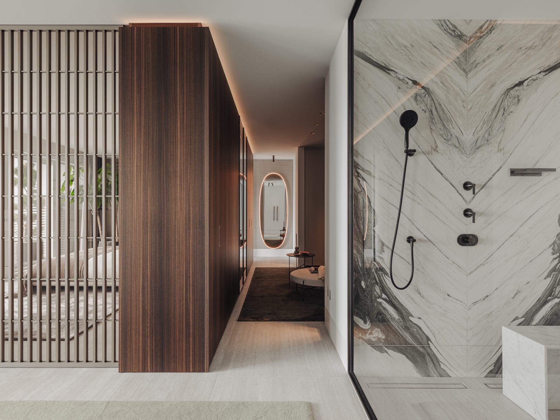
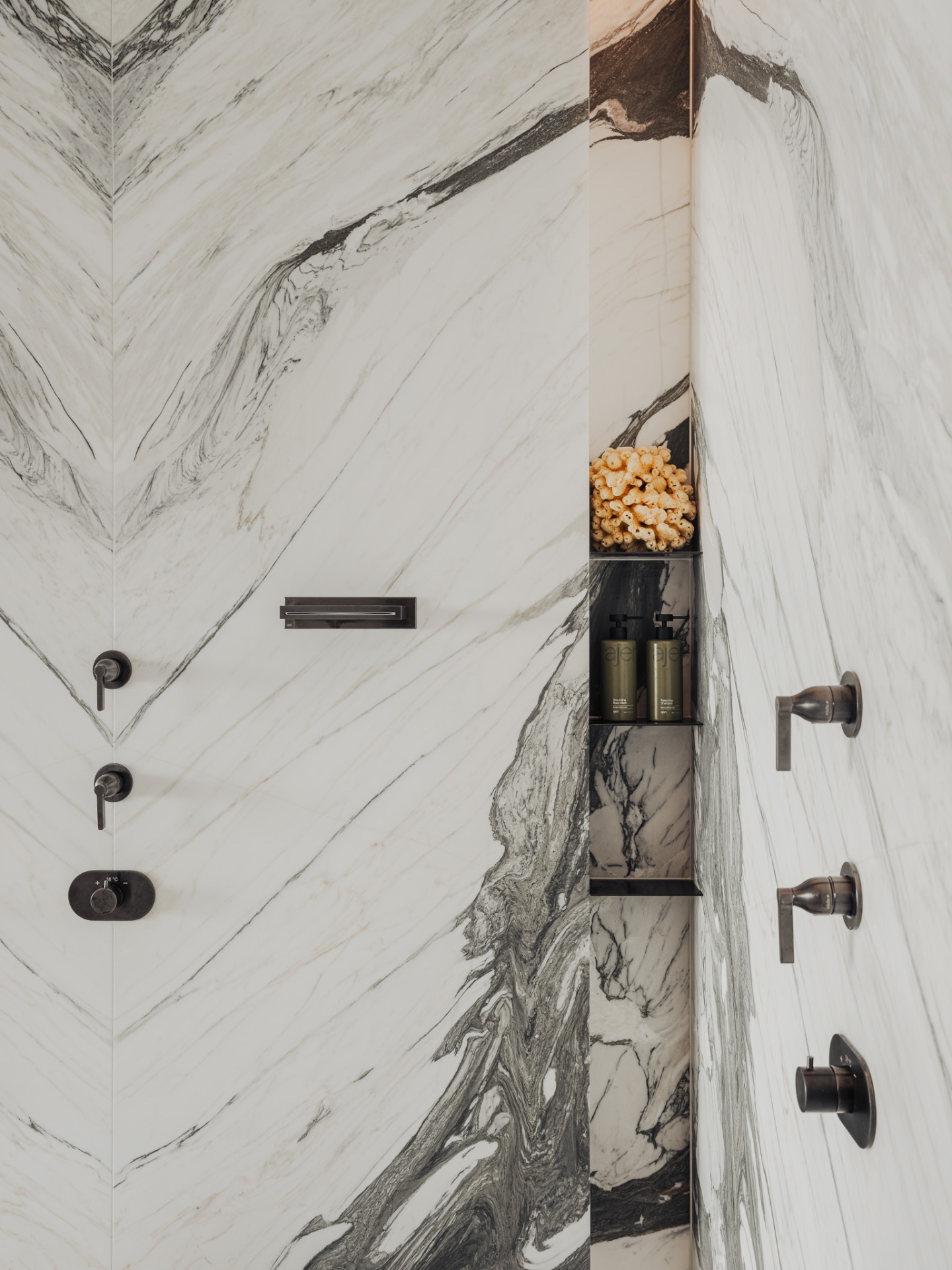
Opposite it, the shower is wrapped in marble-look wall surfaces with pronounced veining. The pattern gives the enclosure its own pace and texture, especially next to the smoother floor and the calmer cabinetry nearby. A glass shower wall keeps the volume visible, while the stone-look finish adds weight to the room. In the wider bathroom scene, the double basin zone and the narrow lines of the fittings keep the layout precise rather than ornamental.
Stone, glass and a controlled edge
The bathroom works because each material has a clear role. Glass keeps the space open. The stone-look slabs bring pattern and mass. The runner-like floor treatment stretches the room. Even the slatted or framed side element appears as a structural counterpoint rather than a decorative aside. It is a room built from straight lines and reflective surfaces, with the bathtub at the window giving the most visible pause.
Viewed together, the kitchen and bathroom share the same discipline. Both use long horizontal moves, both depend on framed transitions, and both rely on a limited palette to let form lead. In this penthouse apartment renovation, that consistency keeps the interior readable from room to room, while still allowing each zone to hold a distinct atmosphere.
Panels that change the bedroom in one movement
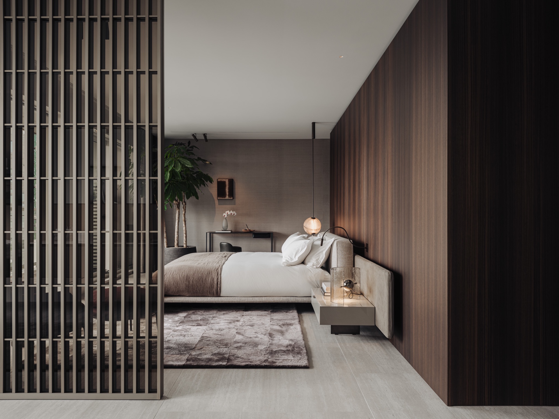
The main bedroom uses sliding panels to shift the tone of the room. When open, the space feels connected to the rest of the apartment; when closed, it gains a quieter enclosure. The system works because it changes the boundary, not the room itself. Warm wood tones appear again here, with the wall surfaces and the window zone giving the bedroom a softer texture than the kitchen or bathroom.
The bedroom detail is straightforward, but it carries the same idea as the glass partition elsewhere in the apartment: visibility can be adjusted without losing clarity. That approach ties the interior together. Across the penthouse apartment renovation, custom cabinetry with integrated lighting, the glass wine cabinet, the stone-look kitchen island, and the sliding panels bedroom all serve the same aim. They make movement through the apartment feel measured, while keeping the spaces open enough to read at a glance.
Want to see more of Grand&Johnson? View the page of Grand&Johnson for even more great projects and company information.



NEW 2026 Jubileum Edition The Best Interior Designers Benelux
Order Now €125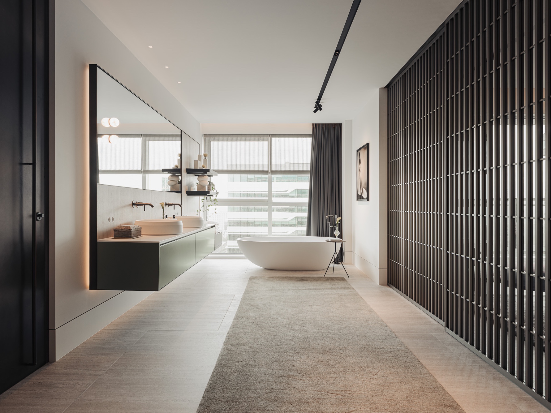
NEW 2026 Jubileum Edition The Best Interior Designers Benelux
Order Now €125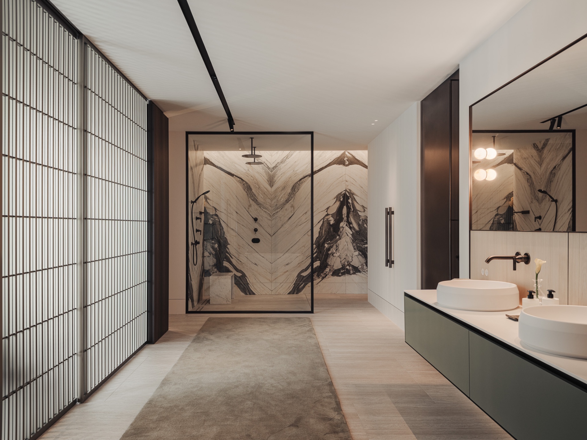
NEW 2026 Jubileum Edition The Best Interior Designers Benelux
Order Now €125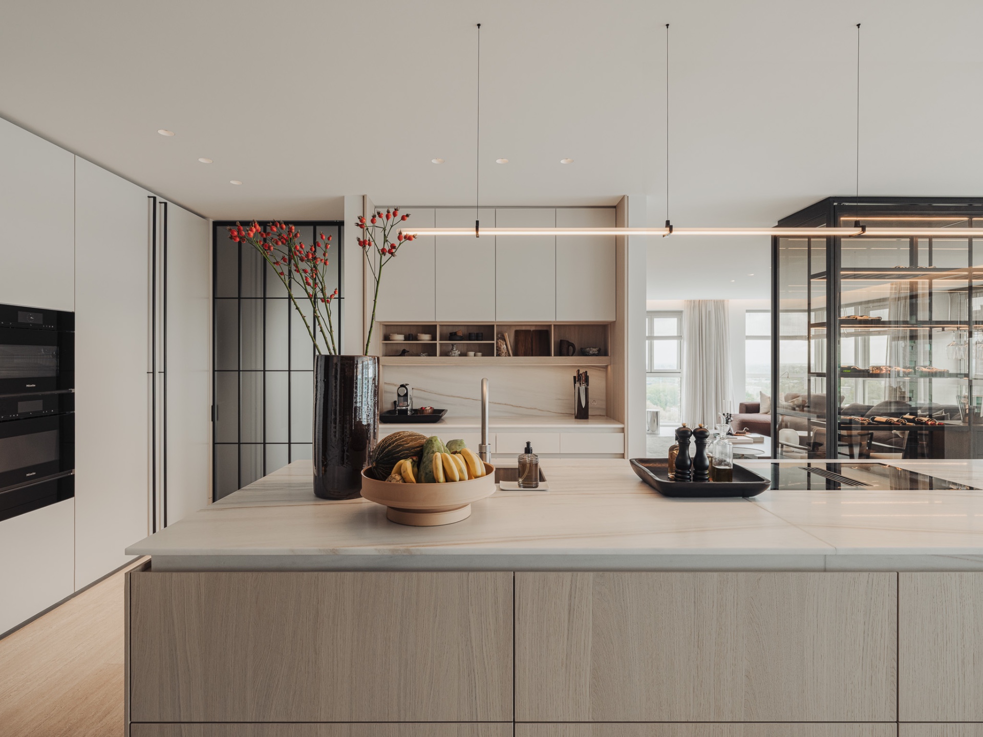
NEW 2026 Jubileum Edition The Best Interior Designers Benelux
Order Now €125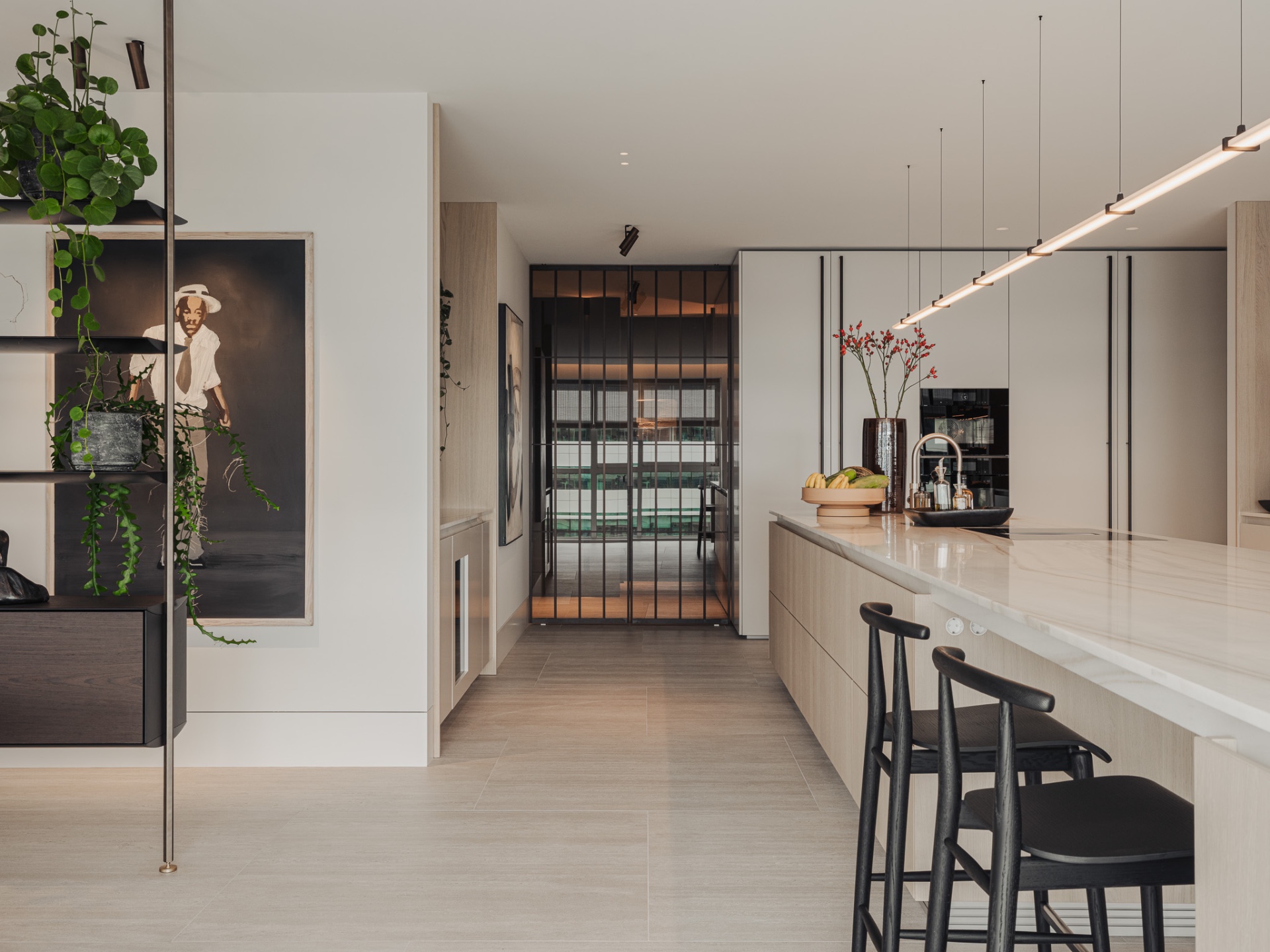
NEW 2026 Jubileum Edition The Best Interior Designers Benelux
Order Now €125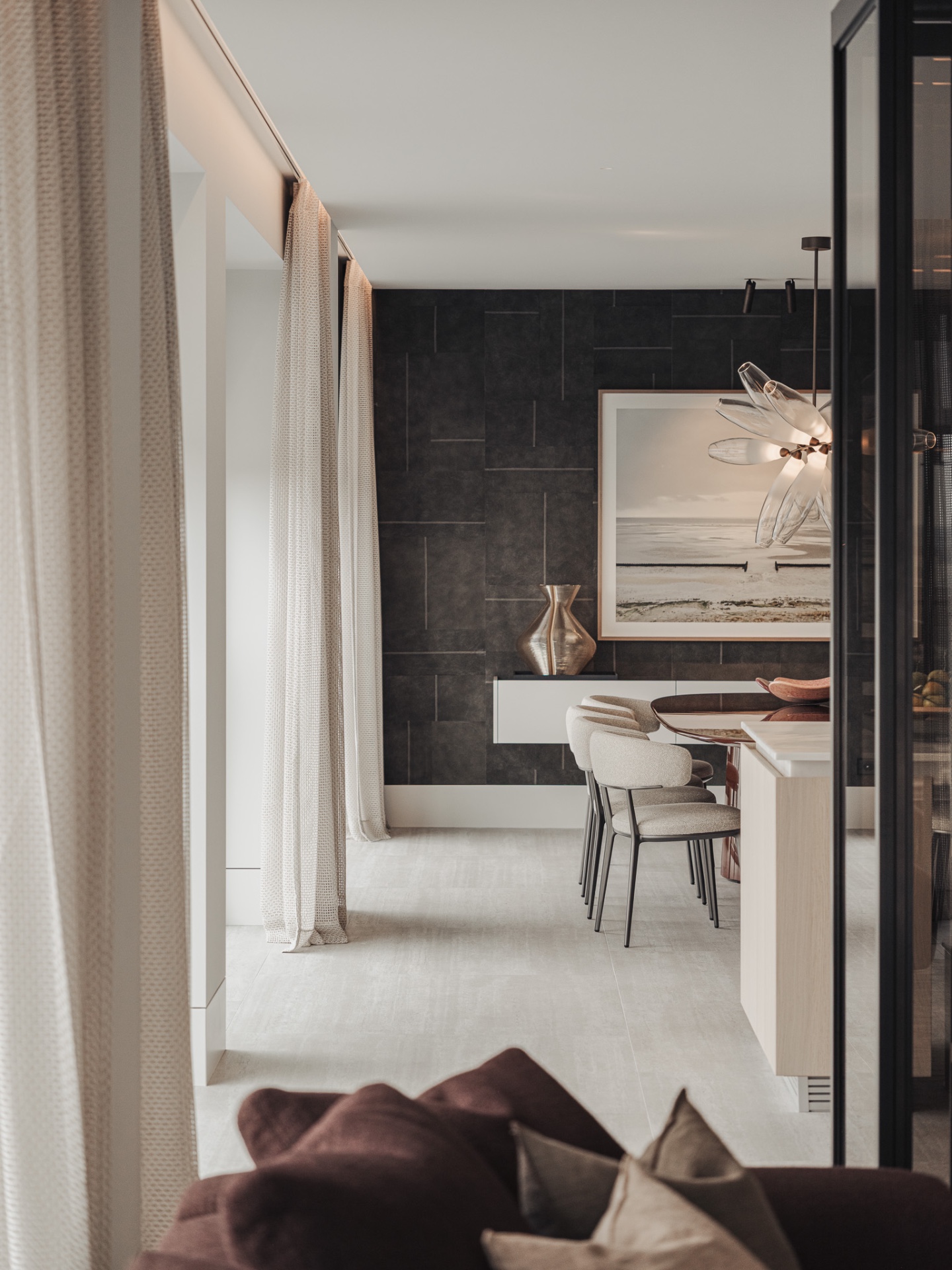
NEW 2026 Jubileum Edition The Best Interior Designers Benelux
Order Now €125