









Understated luxury interior design with stone-look finishes and warm custom lighting
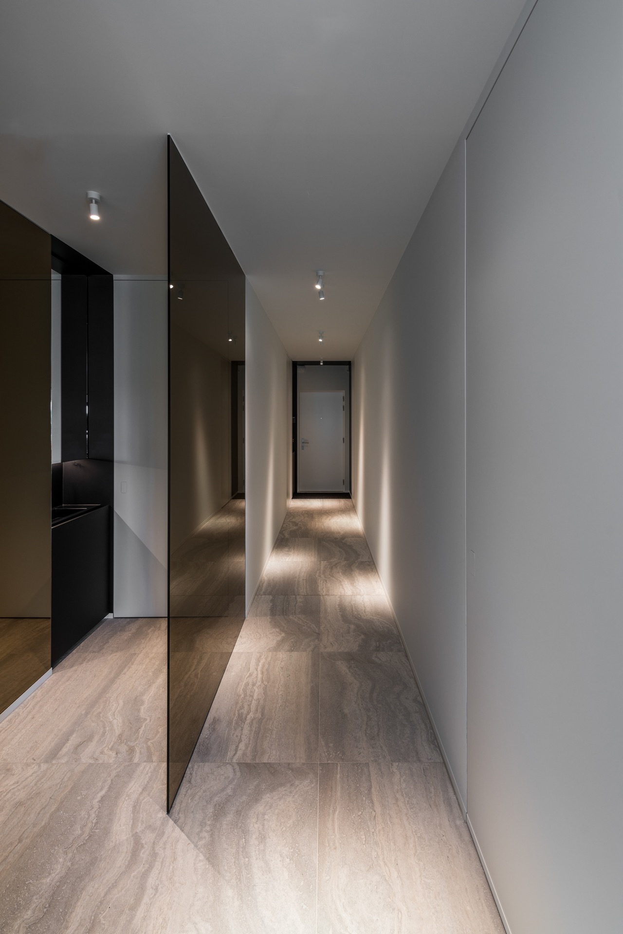
Stone-look surfaces set the tone from the first step inside. Grey travertine-style tiles run through the rooms, while dark cabinetry and pale walls keep the palette controlled. In this understated luxury interior design, the details are not pushed forward; they are built into the architecture. Light lands on the edges of niches, follows the ceiling line, and settles around the joinery, so the apartment reads as calm and precise rather than decorative.
A modern luxury apartment shaped by material and light
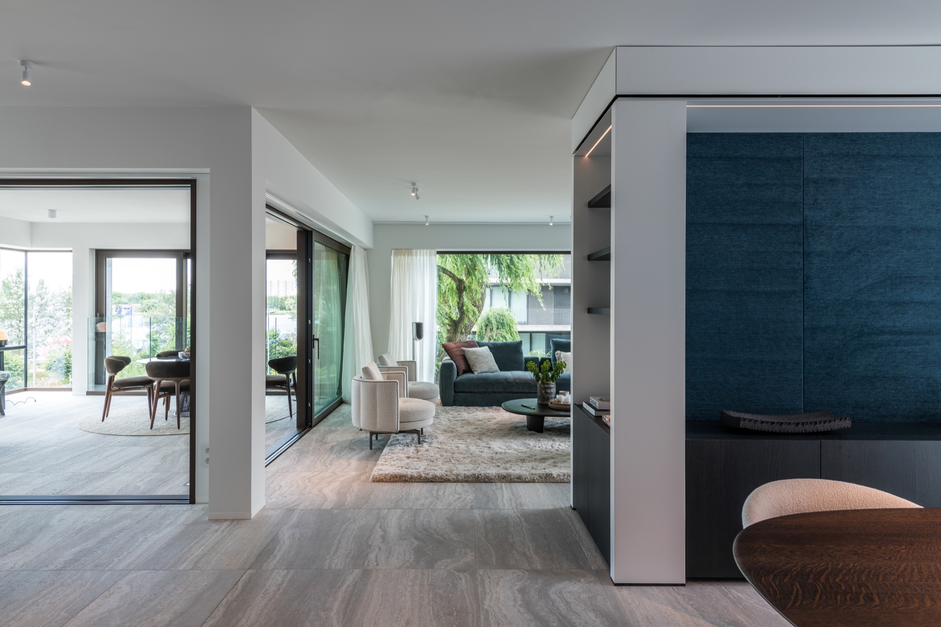
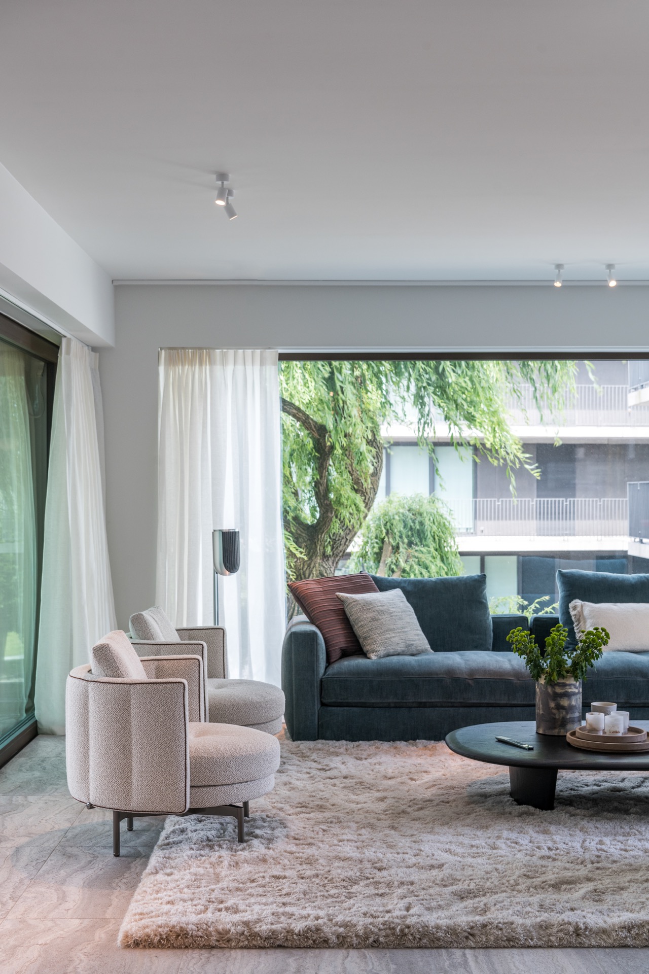
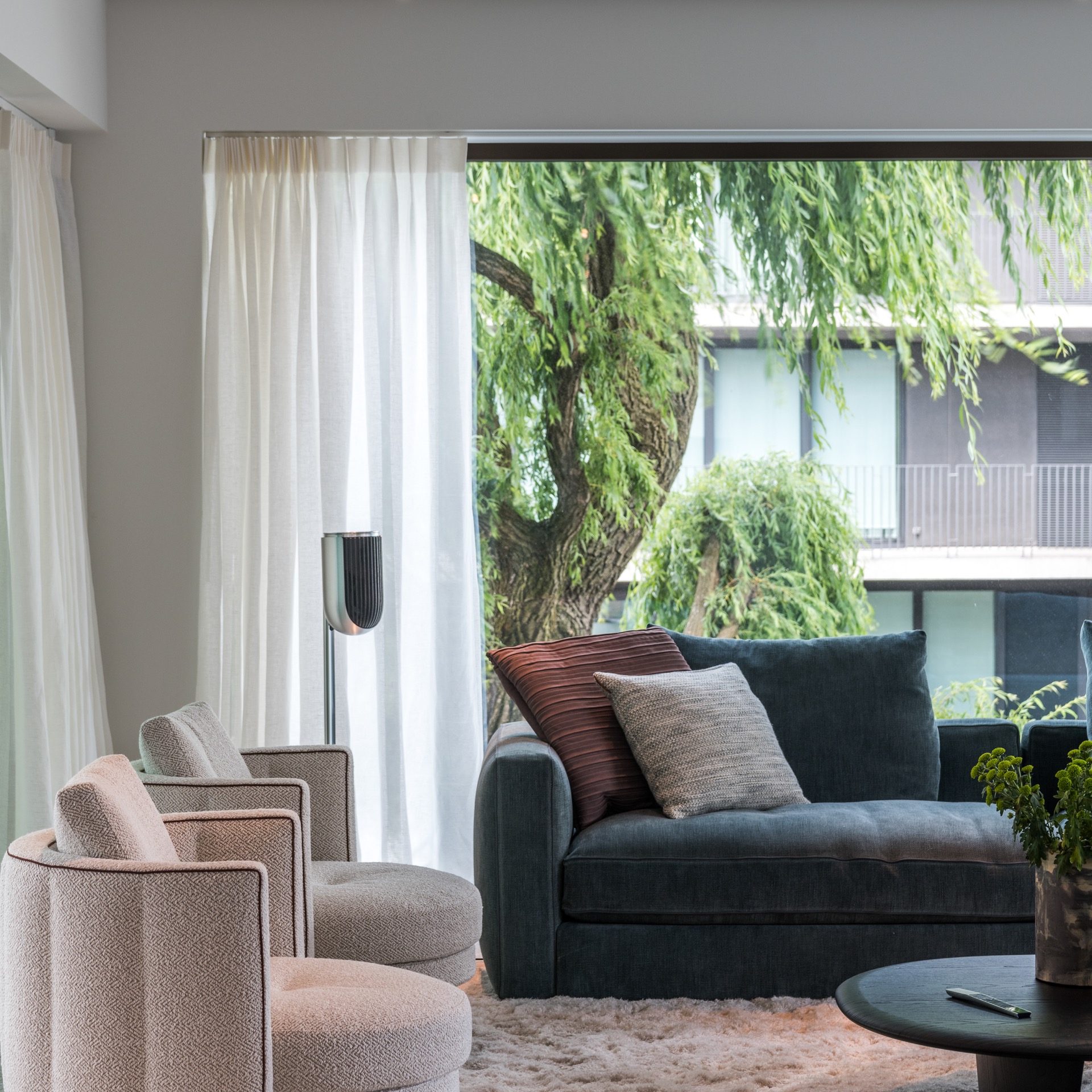
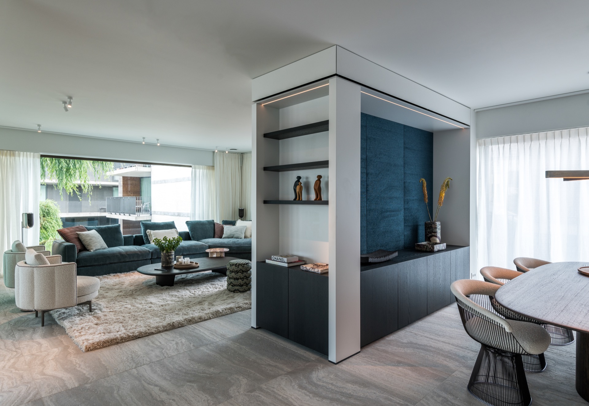
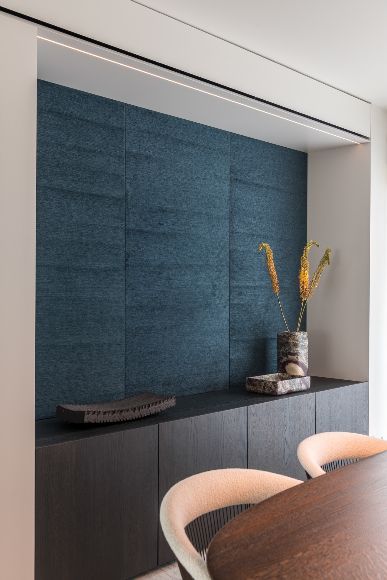
The plan moves between open rooms and smaller framed moments. Large windows bring in views of greenery, with white curtains softening the glass when privacy is needed. In the living area, a dark blue accent wall gives the room a deeper register, especially where ceiling spots pick out the panel joints. The effect is measured. Nothing here competes for attention, but each surface has a clear role in how the apartment is experienced.
The understated luxury interior design depends on that restraint. Instead of relying on contrast for its own sake, the rooms use stone, wood, and fabric to create depth. The finishes stay close to the building’s lines. That makes the apartment feel deliberate from one threshold to the next, whether the eye lands on a flush cabinet door, a recessed shelf, or the clean edge of a wall opening.
Stone-look tiles and custom niches with integrated lighting
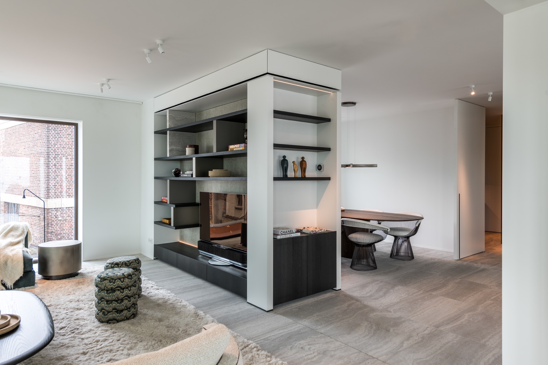
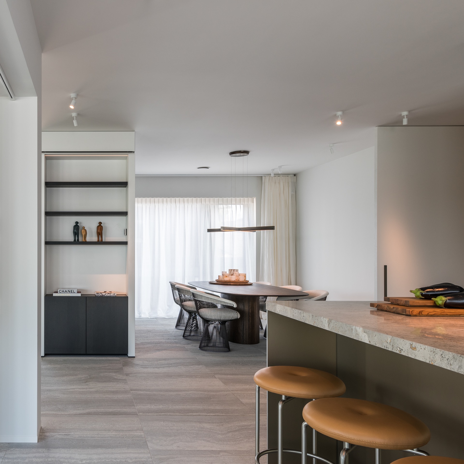
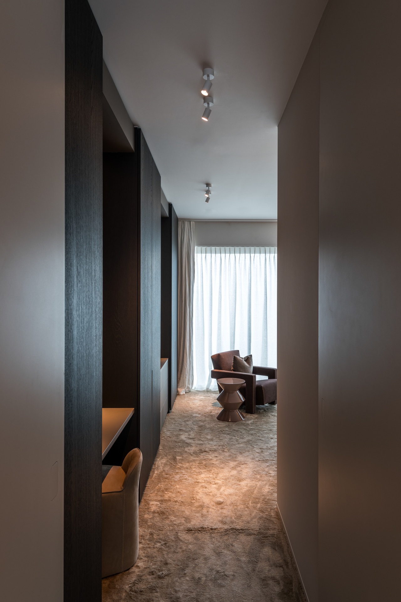
Along the circulation route, the floor is laid in stone-look tiles that extend the apartment’s measured palette. The corridor is lined with spotlights, and the ceiling lighting keeps the passage bright without flattening the surfaces. Built-in niches break up the walls, some with open shelves and others with a textured grey backing. Their proportion matters: they are deep enough to hold objects, but shallow enough to remain part of the architecture.
Warm integrated lighting sits inside those custom niches and along upper edges, turning the joinery into a visible layer of the interior. The light is not hidden completely; it traces the shape of the recess and makes the shelves read in the evening. This is where the understated luxury interior design becomes most legible. The apartment does not ask for ornament when the geometry of the openings and the glow around them already do the work.
The kitchen as a quiet focal point
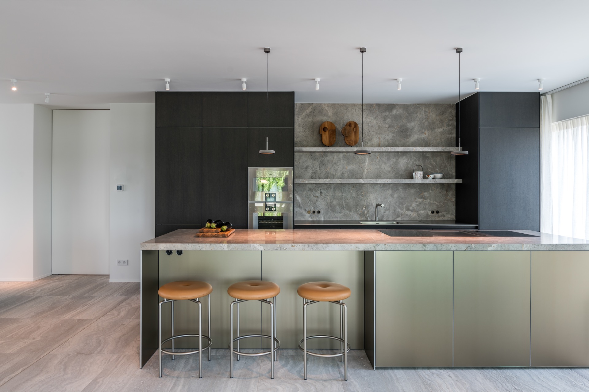
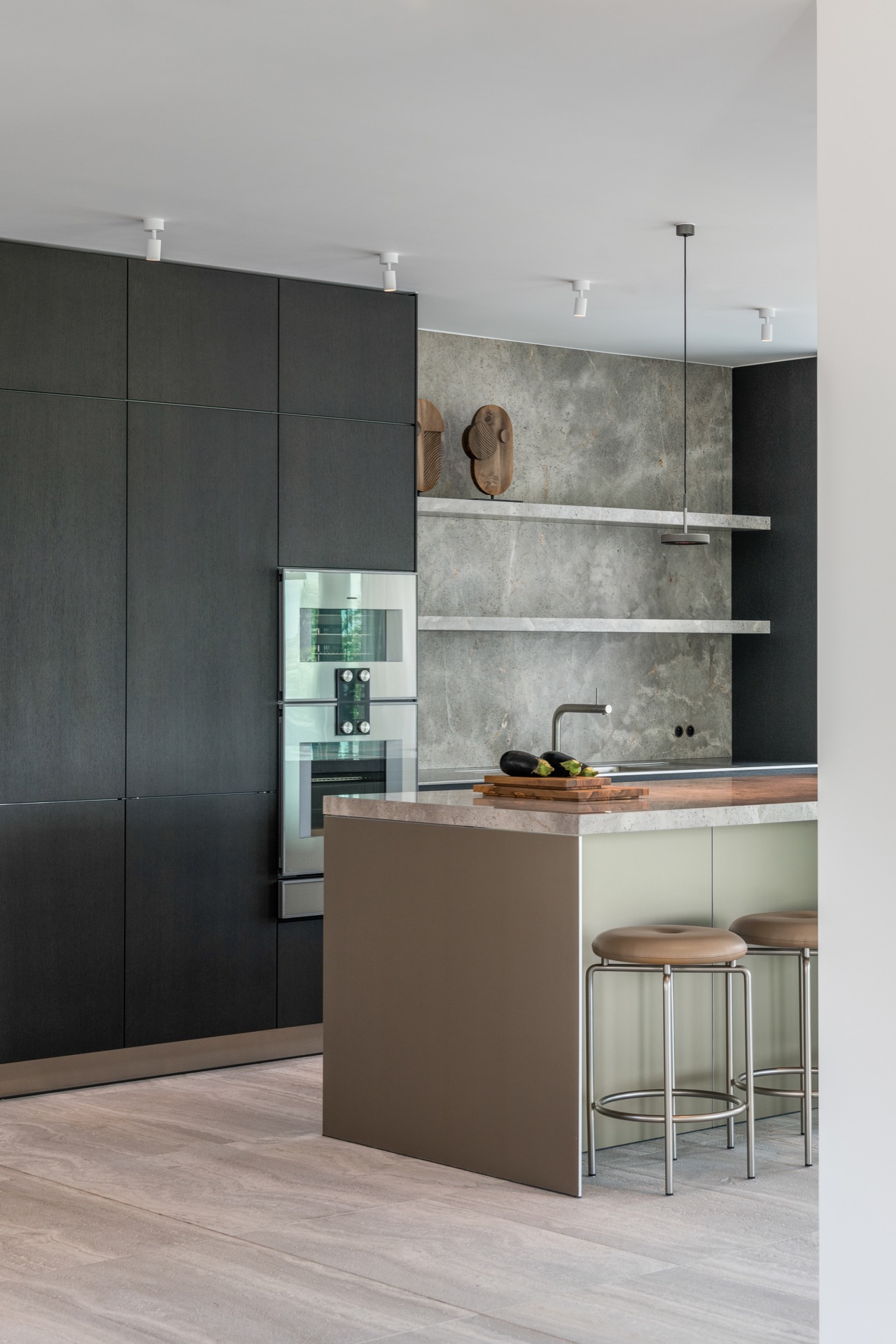
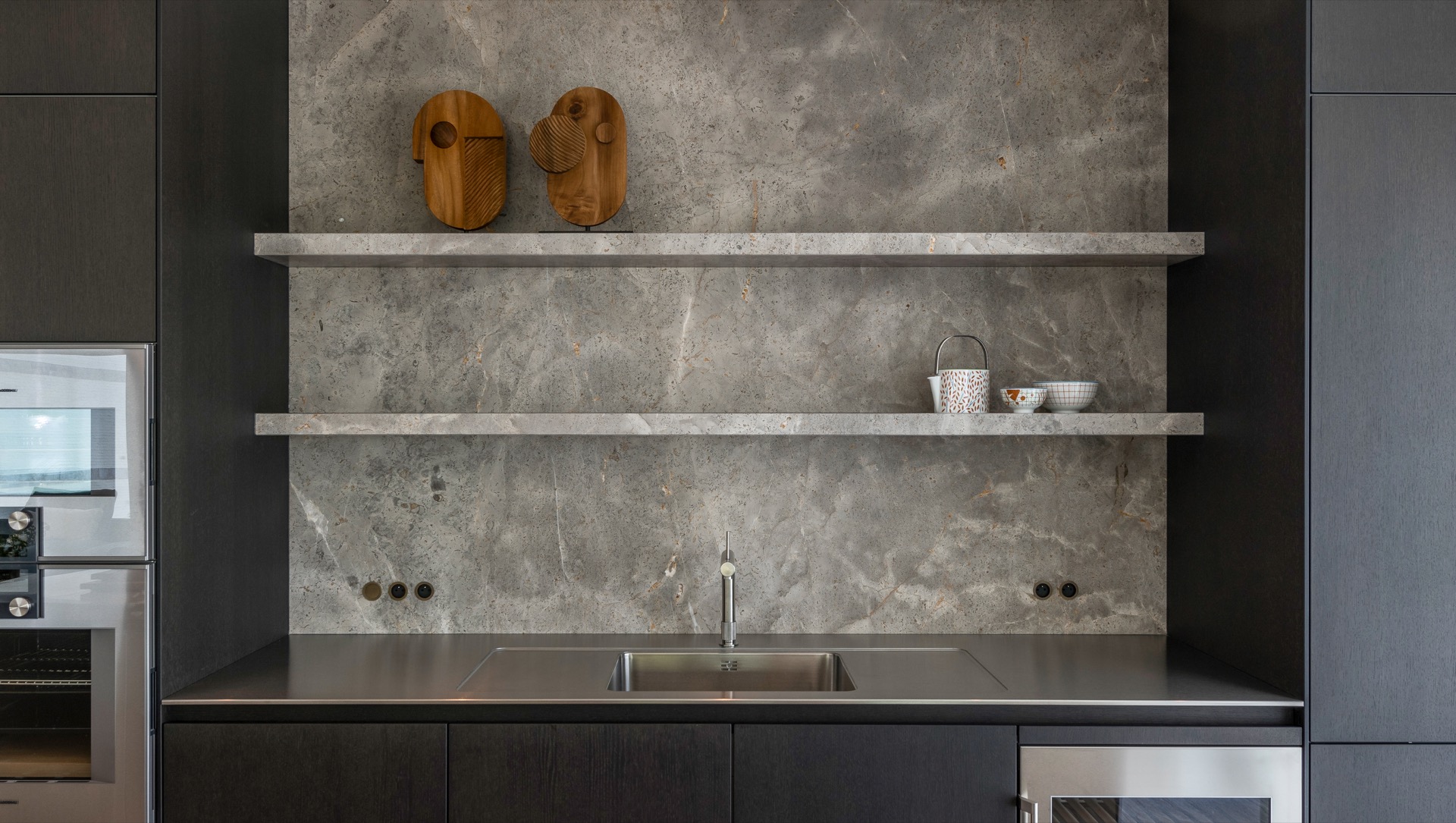
The kitchen brings the materials into sharper focus. Dark front panels frame a broad grey stone-look backsplash, and the surface behind the cooking zone carries the weight of the room. A rounded metal tap stands against that backdrop, while a pale island in the foreground keeps the composition from becoming too dense. The layout is compact, but the visual field stays open because the finishes are kept flat and the lines remain clean.
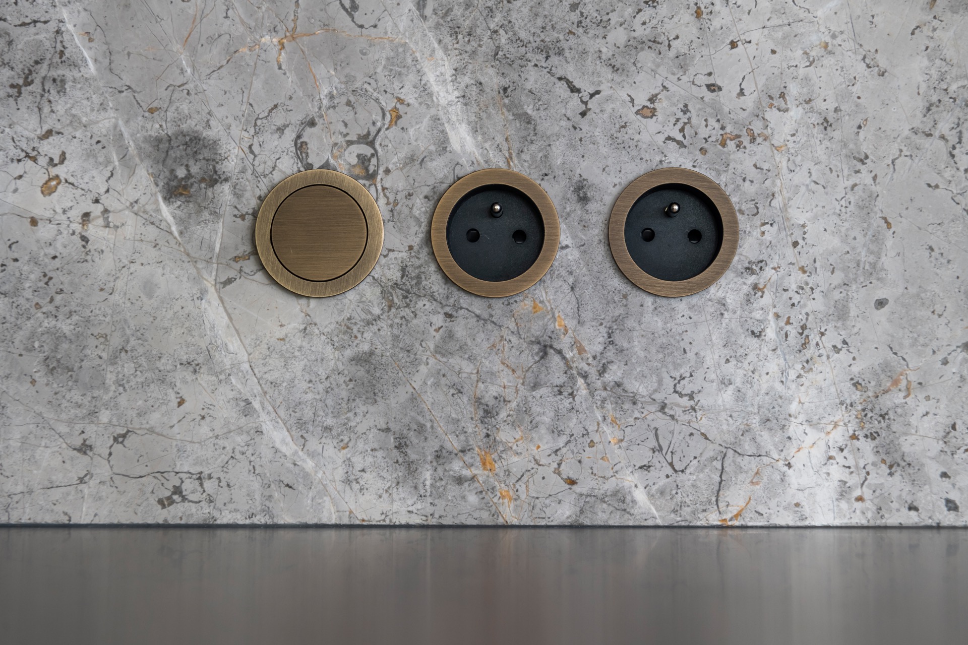
Seen closer, the kitchen with stone-look backsplash relies on small shifts in texture rather than contrast in color. The wall surface is matte and mineral in character, while the cabinetry reads smoother and more compact. That difference gives the room structure. It also ties the kitchen back to the rest of the apartment, where stone-look tiles and timber surfaces recur in different forms without becoming repetitive.
Dark cabinetry, grey surfaces, and a clear working line
The working area is arranged so that the eye reads one long horizontal band: cabinetry below, backsplash through the middle, and the upper elements kept restrained. A kitchen with stone-look backsplash works well here because the wall becomes part of the composition instead of a separate backdrop. The choice of dark fronts gives the room weight, but the pale island and the light from the adjacent windows prevent it from feeling enclosed.
A bath wall that continues into the bedroom
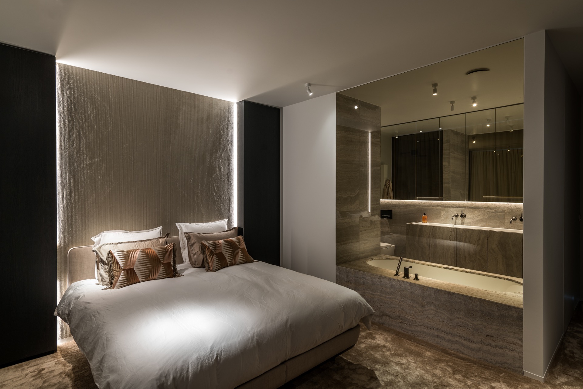
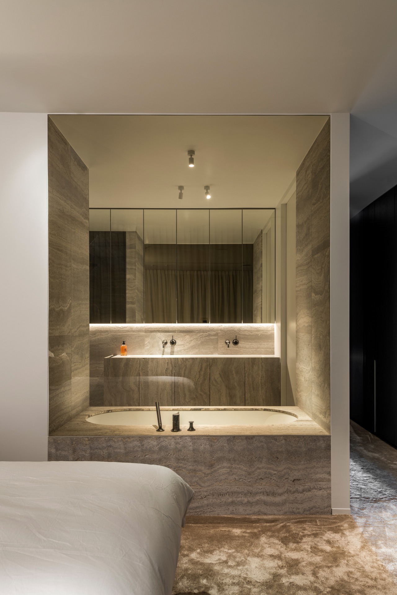
The most striking transition in the apartment appears in the sleeping area. A bath in a natural-stone feel projects from the wall almost as a single block, and a bronze-glass partition separates it from the bedroom. That partition changes the way the room is read: it divides without fully closing the space. Light passes through it with a muted tone, so the bath becomes a visible feature even when the bedroom is in use.
A bathroom with natural-stone feel gains depth from that same material logic. The surface around the bath has the density of carved stone, while the glass introduces a lighter note between two functions. The result is a room sequence that feels considered at the level of edges and thresholds. The bath is not hidden away; it is placed where its shape can be seen from the bedroom and where the stone volume can anchor the private zone.
Glass shower screen and a measured palette in the wet area
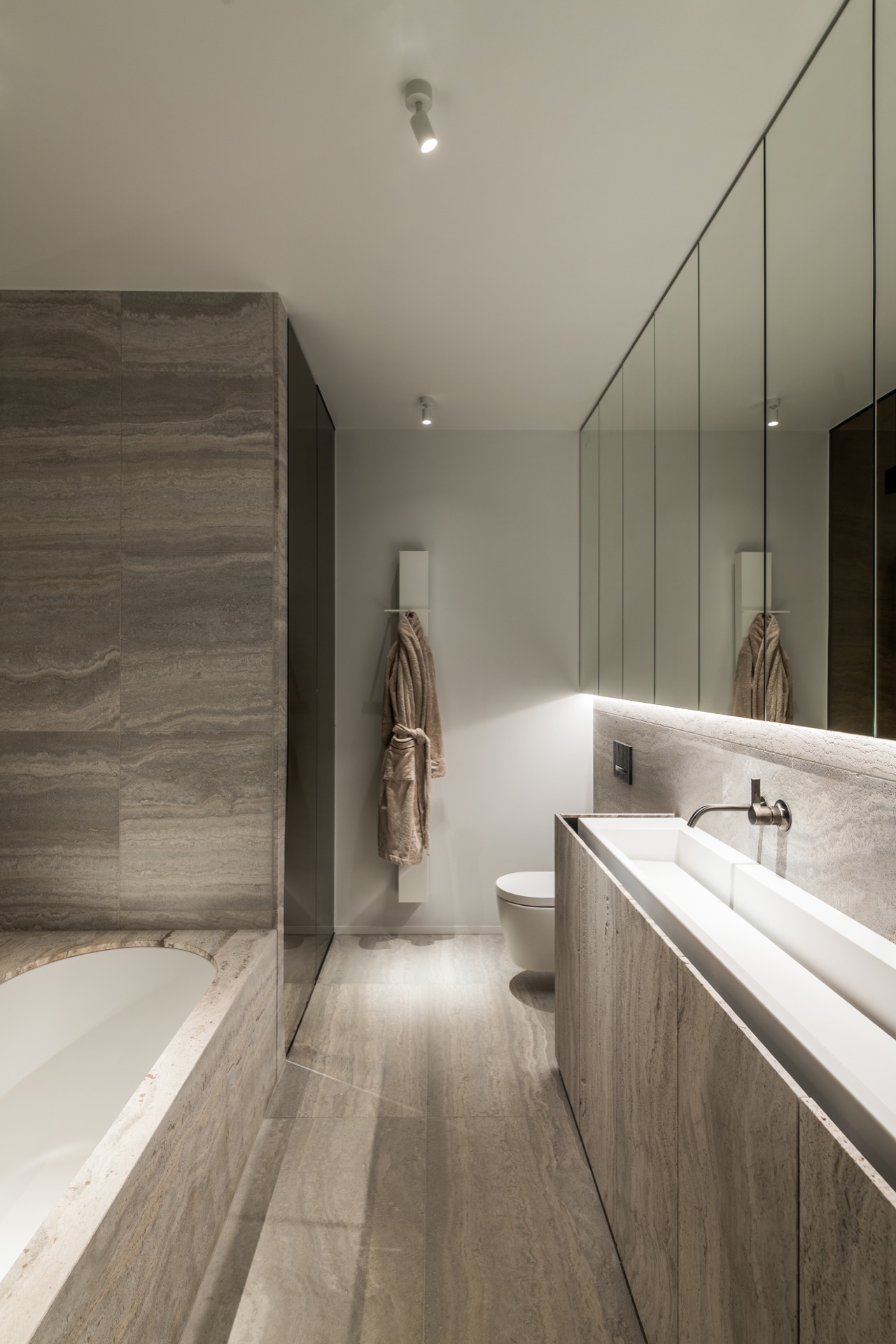
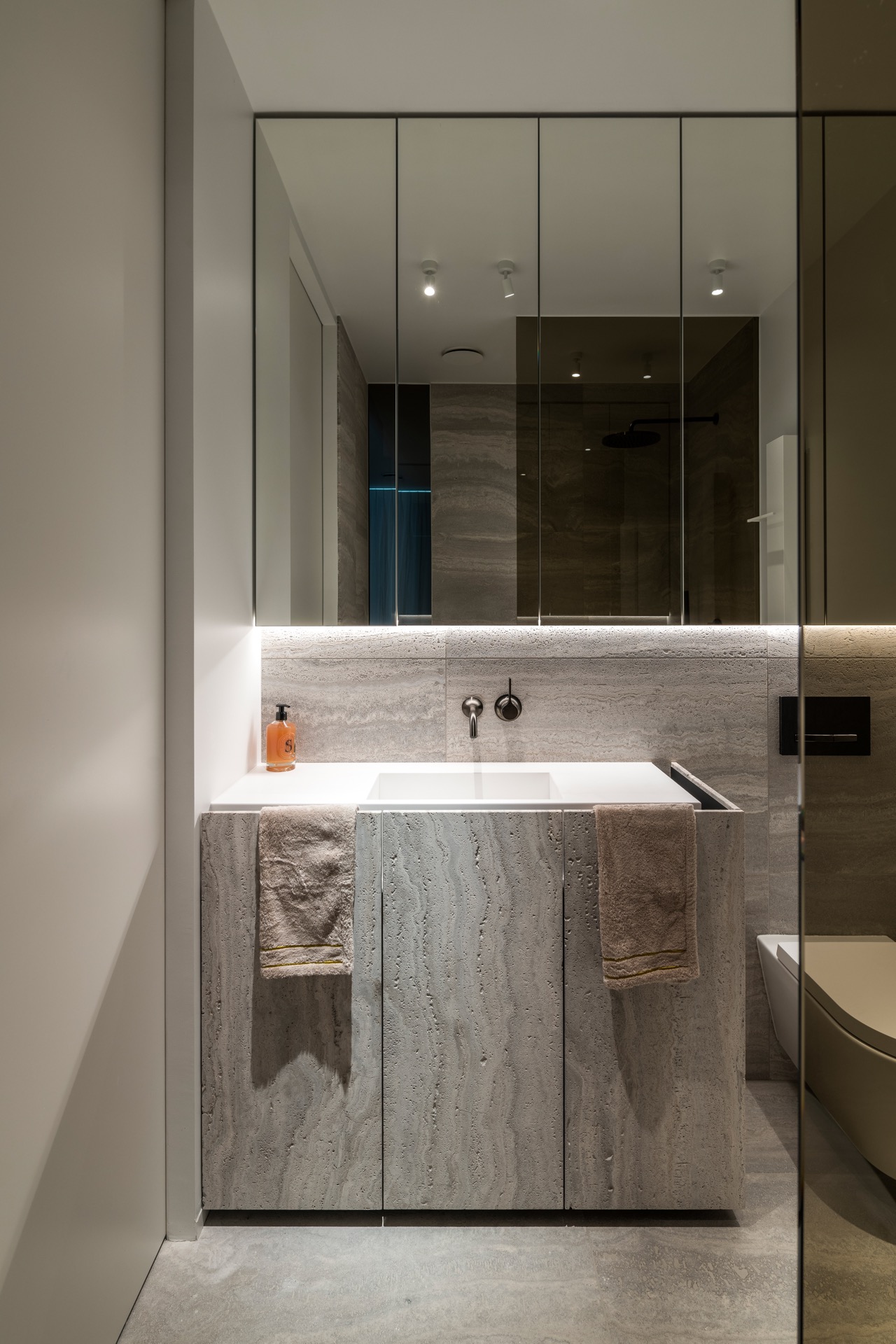
Elsewhere in the bathroom, a glass shower screen keeps the sightline open across the tiled surfaces. The shower area uses the same stone-look language, so the room feels continuous even as the functions change. A double vanity sits within a crisp run of cabinetry, and the reflective surfaces around it make the room brighter without needing strong contrast. Everything stays close to the wall plane, which keeps the room readable from the doorway.
What matters here is the sequence of surfaces. The glass shower screen marks one zone, the stone-look tiles hold the envelope together, and the vanity introduces a more refined domestic note. The understated luxury interior design is evident in the way these elements avoid excess. There is enough variety to keep the room from becoming static, but not so much that the stone, glass, and joinery start competing.
Fabric, wood, and the view beyond the glass
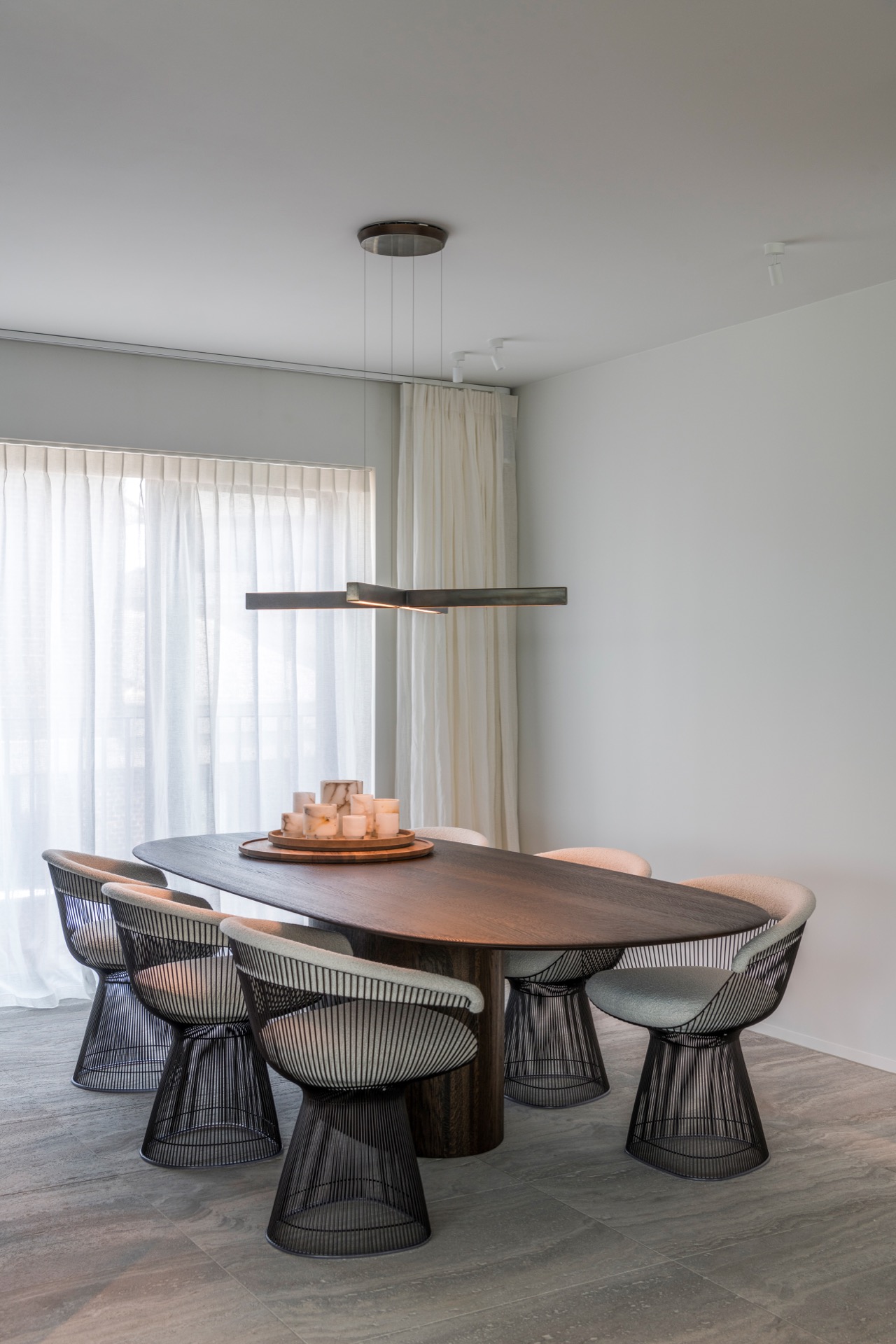
Richer fabrics appear in the softer rooms and temper the harder mineral surfaces. Wood panels and timber-toned joinery add a warmer grain, especially where they sit beneath the illuminated niches or around the dining area. A linear pendant light hangs over the table, drawing a straight line through the room and echoing the longer ceiling elements nearby. It is a simple move, but it helps the apartment feel composed around a few strong horizontal gestures.
At the windows, the apartment opens toward greenery. A treurwilg is framed by the large pane, almost like an outdoor painting with changing light. Curtains can be drawn across the glass, shifting the mood from open to enclosed without changing the room’s layout. That balance of view, privacy, and material control is what gives this modern luxury apartment its character: not excess, but a steady attention to how surfaces meet, hold light, and lead the eye from one room to the next.
Want to see more of B BRAND? View the page of B BRAND for even more great projects and company information.

NEW 2026 Jubileum Edition The Best Interior Designers Benelux
Order Now €125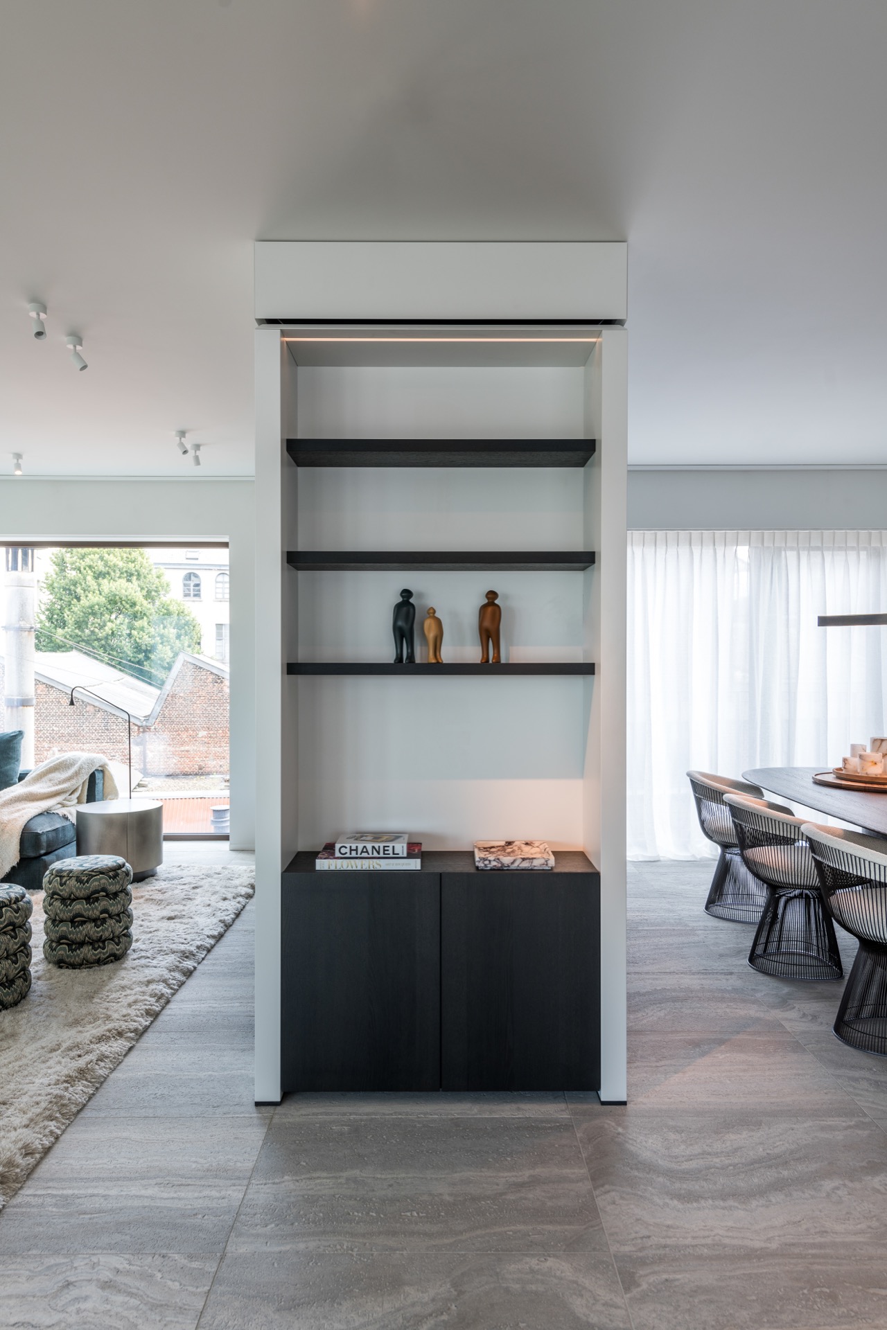
NEW 2026 Jubileum Edition The Best Interior Designers Benelux
Order Now €125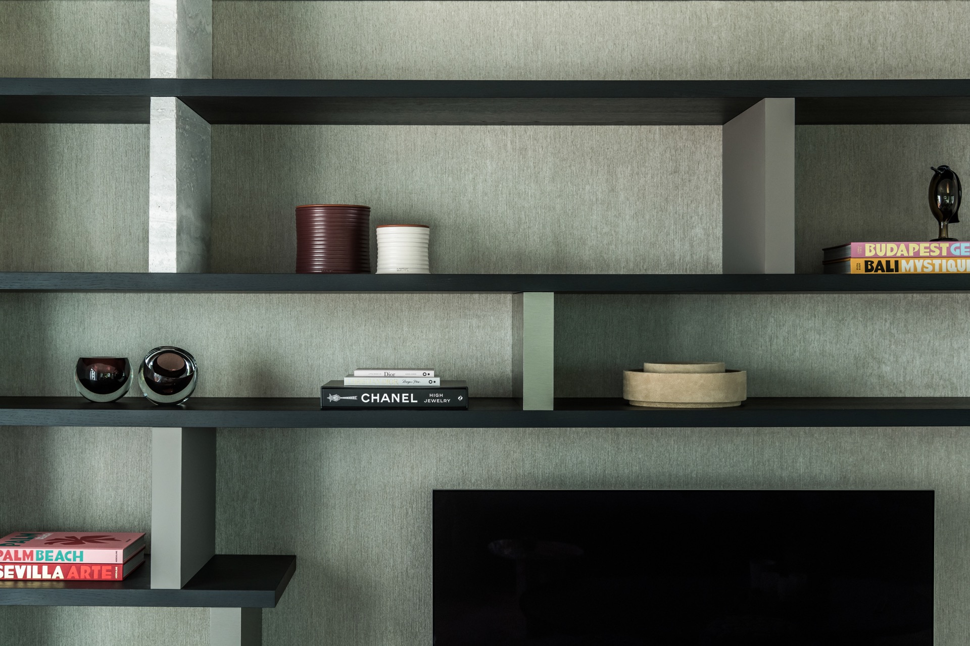
NEW 2026 Jubileum Edition The Best Interior Designers Benelux
Order Now €125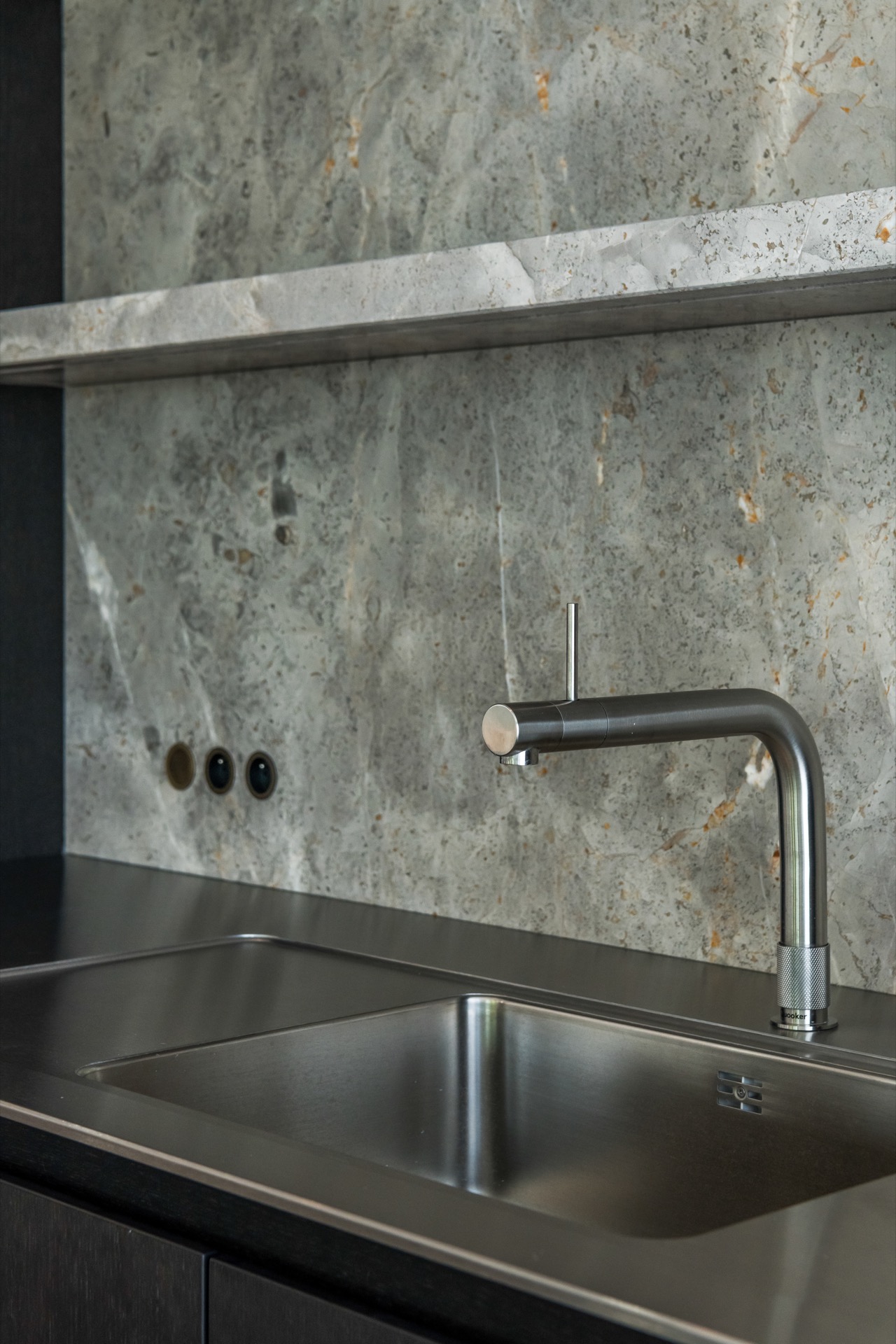
NEW 2026 Jubileum Edition The Best Interior Designers Benelux
Order Now €125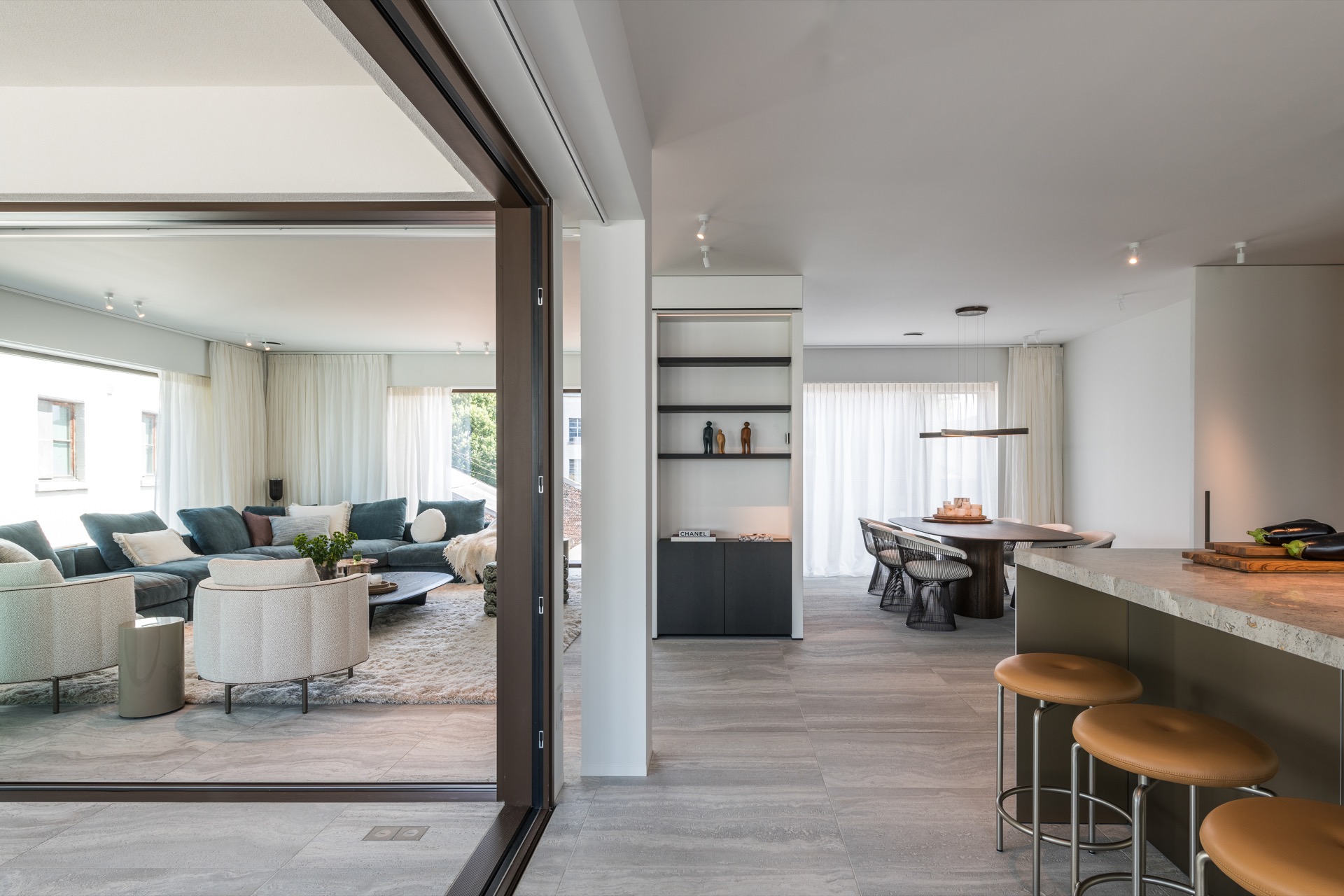
NEW 2026 Jubileum Edition The Best Interior Designers Benelux
Order Now €125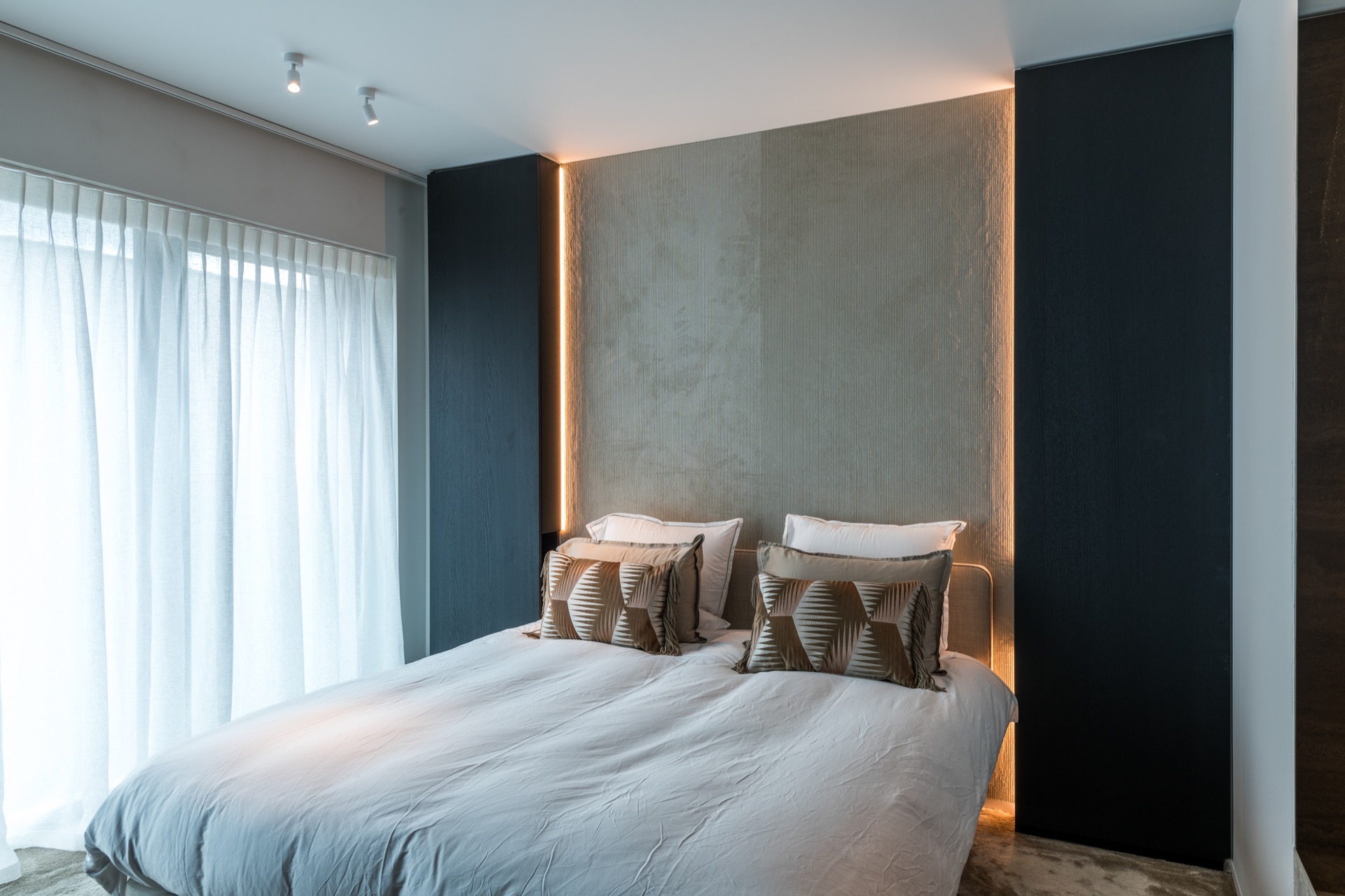
NEW 2026 Jubileum Edition The Best Interior Designers Benelux
Order Now €125


