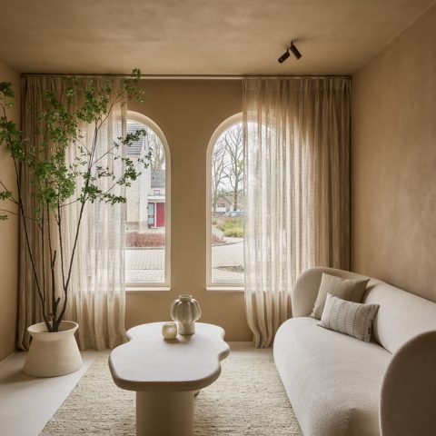
Interior renovation of a family home with classic details
Daylight reaches deep into the rooms, sliding across white ceilings, soft curtains and the long lines of a custom wood cabinet wall. The interior renovation keeps the house close to its classical shell, but the room sequences read in a much quieter way: clean surfaces, pale walls, stone-like finishes and the rhythm of tall windows. In the living areas, the mix of historic detail and restraint is visible at once, especially where the classic ceiling moulding meets the pared-back furniture layout.
Light, curtains and a room lined with wood
Large windows set the pace in the family home interior. Their height brings in a soft spread of light, which is filtered again by full-length curtains in a muted tone. Against that backdrop, the woodwork carries more weight than decoration: a broad cabinet wall, panelled fronts and built-in storage pull the eye along the room instead of breaking it up. The result is a warm minimalist interior that relies on proportion and material rather than ornament.
Across the seating area, the palette stays close to white, cream and light brown, with darker notes appearing in the timber grain and the lamp hardware. Round pendant lights hover over the room as a clear counterpoint to the straight window frames and the flat wall surfaces. The setting feels measured, but not sparse. Textiles soften the edges of the sofa group and the curtains, while the wood cabinet wall keeps the composition grounded.
Classic ceiling moulding against calm wall planes
The ceiling detail is one of the most legible elements in the project. A moulded border runs along the room edges and appears again in the circulation areas, where the ornament sits against white walls and open doorways. Rather than dominating the space, the classic ceiling moulding frames it. It gives the rooms a clear top line, while the rest of the interior stays restrained and open. That contrast is what gives the interior renovation its specific character.
In the hall and overpass, the geometry becomes stricter. Narrow openings, glazed transitions and a long sightline create a sequence of thresholds instead of one continuous room. The white surfaces stay almost blank, which makes the moulding and the door frames more visible. Even the smallest shift in level or opening feels deliberate. The family home interior moves from one zone to the next without visual clutter, and that gives the house a calm reading from room to room.
Kitchen surfaces in wood and stone
The kitchen carries the same restraint, but with a firmer material contrast. Wooden fronts run under a stone-like worktop, and the surfaces are kept visually calm so the grain of the timber and the texture of the stone finish do the work. This wood and stone kitchen is not built around display. Its strength lies in the way the darker timber tone sits beneath the lighter top, while the nearby curtains and white ceiling soften the edges of the room.
From the wider interior, the kitchen reads as part of the whole rather than a separate statement room. The same warm neutral palette continues here, only tightened around cabinetry, work surface and wall plane. The wood fronted units, clean handles and stone-look material give the space a measured appearance. In an interior renovation like this, those smaller alignments matter. They keep the kitchen visually linked to the living spaces without repeating them.
Built-in storage with a calm profile
The custom wood cabinetry is one of the most recurring features in the project. It appears as a wall-filling unit, as panelled storage, and as tailored joinery in the work areas. Rather than breaking into separate elements, the storage runs in long horizontal and vertical lines. That helps the rooms feel settled. It also gives the interiors a practical order that remains visible, even when the cabinets are closed. The joinery is not hidden away; it shapes the rooms.
In the work corner, the cabinet wall sits beside a window, so daylight lands directly on the timber surface. The contrast between the pale wall and the wood paneling is clear. Similar details return in the bedroom and the passage spaces, where built-in units and plain walls share the same measured tone. This is where the family home interior becomes more than a collection of rooms. The storage, finishes and circulation all follow the same visual logic.
Bathroom glass, stone-like tiles and a quiet surface rhythm
The bathroom keeps the palette close to white and soft stone tones. A freestanding bath stands near a glass partition, while the walk-in shower uses clear glass to hold the wet zone in place without closing it off. The shower enclosure is lined with stone-like tile surfaces, and the rest of the room stays light and plain. The arrangement is straightforward, but the material changes give it depth: glass, ceramic and smooth wall planes each catch the light differently.
A second shower view shows the same approach from another angle. The glass walk-in shower sits in a corner, with neutral tiles that shift from pale to slightly darker grey depending on the light. There is no heavy contrast, only small changes in tone and texture. That restraint fits the rest of the interior renovation. It also ties the bathroom back to the bedrooms and living rooms, where lighter surfaces and warm timber keep returning in different forms.
Why the rooms read as one family home
The project does not rely on one dominant gesture. Instead, the family home interior is held together by repeated cues: tall windows, white plastered surfaces, timber storage, classical moulding and the measured use of stone-like finishes. Each room adds a different note, but the visual language stays steady. A hallway opening, a cabinet wall, a shower screen or a kitchen top all belong to the same interior renovation because they share the same material restraint and the same attention to line.
What stands out most is the way daylight moves through the house. It hits the curtain folds first, then the cabinet fronts, then the white ceiling edges and the glass surfaces in the bathroom. That sequence makes the rooms feel connected without making them identical. The result is a warm minimalist interior with enough classical detail to keep the surfaces from feeling flat, and enough clarity to let the materials speak for themselves.
Want to see more of Martje Overmeer Interiors? View the page of Martje Overmeer Interiors for even more great projects and company information.



NEW 2026 Jubileum Edition The Best Interior Designers Benelux
Order Now €125


NEW 2026 Jubileum Edition The Best Interior Designers Benelux
Order Now €125


NEW 2026 Jubileum Edition The Best Interior Designers Benelux
Order Now €125


NEW 2026 Jubileum Edition The Best Interior Designers Benelux
Order Now €125


NEW 2026 Jubileum Edition The Best Interior Designers Benelux
Order Now €125


NEW 2026 Jubileum Edition The Best Interior Designers Benelux
Order Now €125