White villa with black window frames
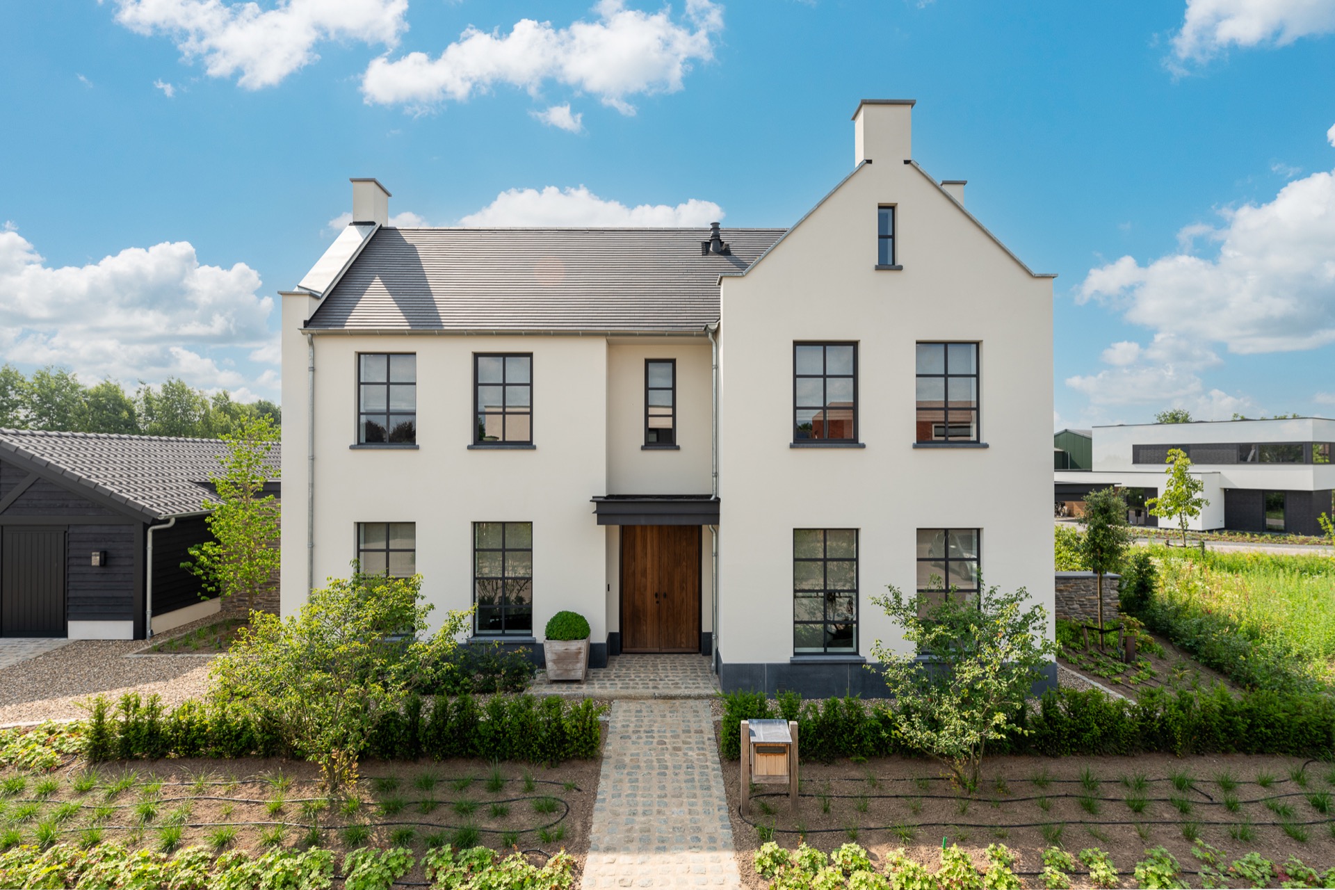
Black window frames draw a sharp line across the white walls, while the dark roof tiles keep the volume low and grounded. From the street, the house reads as a detached villa with clear geometry, but the first look reveals more than one material at work. Light plaster, natural stone accents and darker elements are set against each other, so the exterior never settles into one note for long. The result is a house that feels composed from separate parts, then tied together by its frame and proportion.
A white volume, then a second reading
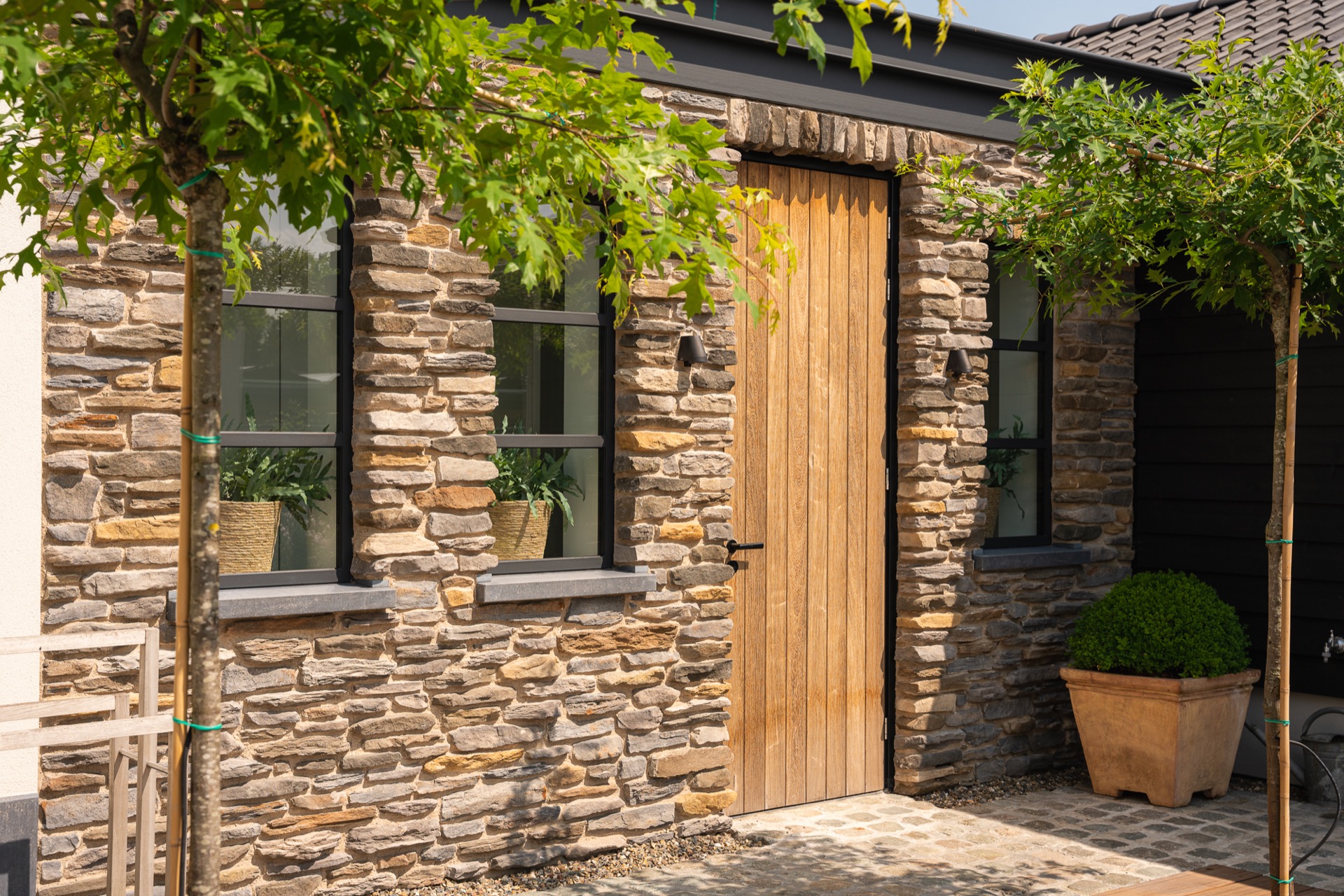
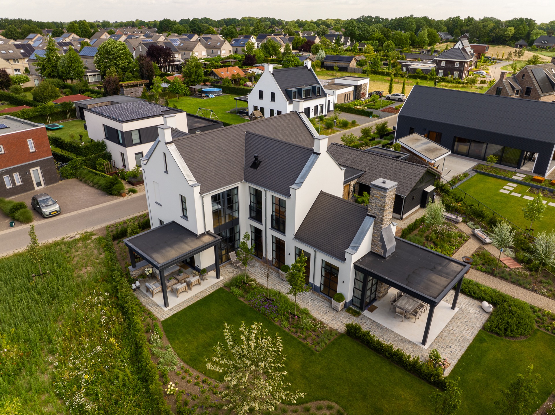
The main volume is finished in light plaster, which gives the facade a clean surface for the black frames to stand out against. A natural stone extension shifts the eye to the side, while the garage is handled in dark boarding and sits back with a firmer, more closed character. That difference in material treatment is easy to read from the outside. Instead of one continuous shell, the villa is built as a sequence of volumes, each with its own weight and texture.
Minimal steel window frames keep those parts visually linked. They are slim enough to avoid clutter, but present enough to hold the plaster, stone and darker garage in one line of sight. The villa’s Belgian-inspired mood comes through less in decoration than in that careful mix of surfaces. Light and shadow register differently on stone than on plaster, and the facade changes as you move around it. The house offers a quiet contrast, not a decorative one.
Plaster, natural stone and darker cladding
Seen up close, the materials do the talking. The white plaster reflects daylight and makes the openings look even deeper, while the natural stone section brings a rougher edge to the composition. Dark timber boarding on the garage introduces another tone and prevents the side buildings from disappearing into the background. Each material has its own surface and line, yet none of them is left to dominate. That measured variation is what gives the detached villa its particular presence.
The entrance reinforces that idea with a wooden front door set into the stone and plaster around it. It is a small move, but it changes the pace of the facade. The door becomes a focal point without needing extra ornament. Nearby, the black window frames repeat as a visual thread, linking the larger openings to the more enclosed parts of the house. The facade materials are not decorative layers; they are the way the building is organized.
A veranda held by slim steel
The steel-framed veranda extends the living zone outward without making the house feel heavier. Dark steel columns carry the canopy with a direct, almost graphic line. Underneath, the structure reads as a clear frame rather than an added room. That distinction matters here. The veranda does not compete with the main volume in plaster and stone; it sits beside it and sharpens the contrast between enclosed and open space.
From the garden side, the house gains another layer. Lawn, gravel paths and small paved areas break up the ground plane around the villa, so the building does not stop abruptly at the wall line. The exterior sequence moves from grass to gravel to stone and then back to plaster and black frames. Even the detached garage participates in that rhythm, with its dark cladding and separate roof form. It is a practical outbuilding, but it also helps define the estate-like arrangement around the home.
A stair hall with its own address
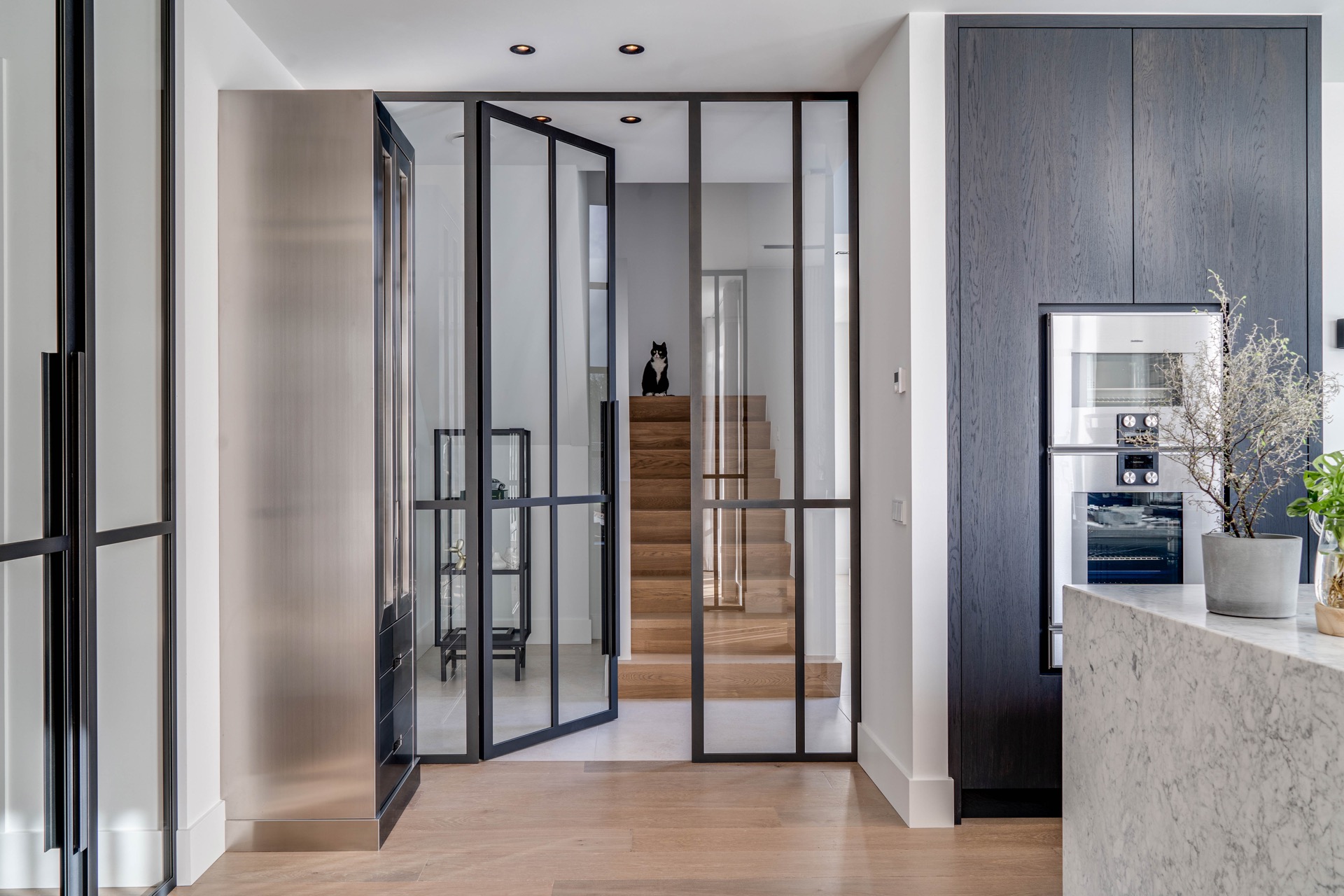
Inside, the staircase is not tucked away as an afterthought. It has its own space, and that separation gives the interior design staircase real weight in the plan. The stair hall is framed with glass and steel-like detailing, so views can pass through without the space losing definition. Wooden treads soften the path upward, while the surrounding lines remain crisp. The result is less a corridor and more a room built around movement.
The interior team also shaped the surrounding architecture with niches and sightlines. Small recesses interrupt the walls, and openings pull the eye toward the next space. That is where the house becomes more than an exterior composition. A glass stair enclosure, niches and angled views make the stair hall feel deliberate from every direction. It gives the villa a second center, one that is experienced from inside rather than from the street.
Wood, glass and a stone panel in the stair hall
One interior image shows the stair as a clear composition of wood, glass and dark frames. The treads step up against pale walls, while the enclosure keeps the volume light enough to read through. Another view adds a wood-look wall surface and a marble-like stone panel, which shifts the mood from practical circulation to a more layered interior space. Those finishes are not there to soften the architecture; they give the stair hall its own material identity.
The black framing returns inside as well, which helps the stair hall feel connected to the rest of the villa. Through the openings, you catch partial views rather than a full reveal. That controlled visibility is one of the strongest parts of the project. The interior does not try to show everything at once. Instead, it lets the stair, the niches and the openings work as a sequence. The house feels planned in steps, not as one broad gesture.
Details that keep the house grounded
The roofline adds another layer of contrast. Dark tiles, a chimney and the white wall surfaces give the upper part of the house a clear outline, especially in the images taken from the garden side. The garage sits lower and darker, so the main villa remains the primary volume in the composition. Even there, the visual logic stays consistent: white against black, smooth against rough, open against closed. It is a restrained palette, but it is used with enough variation to keep the house visually active.
What stays with you is the way the villa holds together without flattening into one uniform image. The plastered main volume, the natural stone extension, the dark-clad garage and the steel-framed veranda each keep their own character. Yet the black window frames pull them into one family. That is why the project reads as more than a collection of parts. It moves between exterior and interior, between open and enclosed, and uses those shifts to give the detached villa its clear identity.
From first sketch to finished plan
The project began with a sketch that was already close to the final idea. After a few small adjustments, that first direction became the completed design. You can see that early clarity in the way the volumes are arranged and in the discipline of the materials. Nothing here feels forced into place. The house follows a direct line from concept to built form, with each detail kept legible: the black frames, the stone extension, the veranda structure and the stair hall all speak the same language.
That is what makes the villa easy to read and still worth lingering over. The exterior gives you the broad composition first, then the materials start to separate themselves. Inside, the stair hall continues that logic with glass, steel and wood. The house never relies on one single gesture. Instead, it builds its character through clear parts that are carefully placed next to each other, from the dark-clad garage to the stair enclosure at the center of the plan.
Want to see more of EVE Architecten? View the page of EVE Architecten for even more great projects and company information.





NEW 2026 Jubileum Edition The Best Interior Designers Benelux
Order Now €125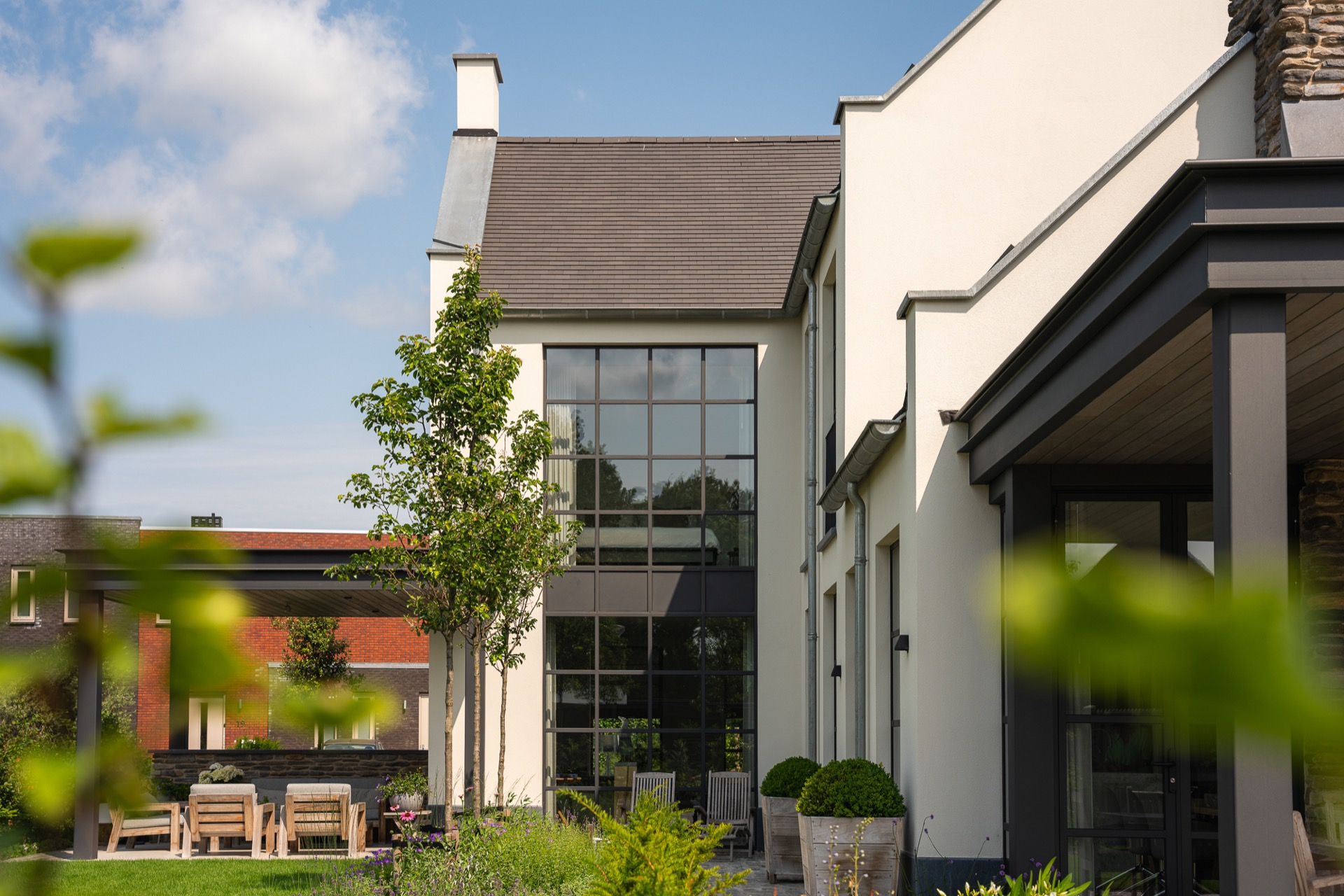


NEW 2026 Jubileum Edition The Best Interior Designers Benelux
Order Now €125