Luxury modern villa with timeless interior design
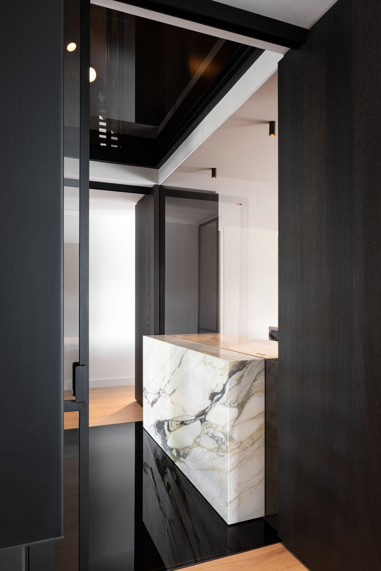
Dark wall panels and long horizontal lines set the tone for this luxury modern villa interior. The first spaces feel controlled rather than crowded: full-height openings, built-in volumes, and a palette that shifts between black, stone, wood, and glass. Instead of relying on decoration, the design works through proportion and finish. That approach gives the villa a clear identity, with each room carrying the same restrained confidence from one surface to the next.
Wall systems that do more than divide a room
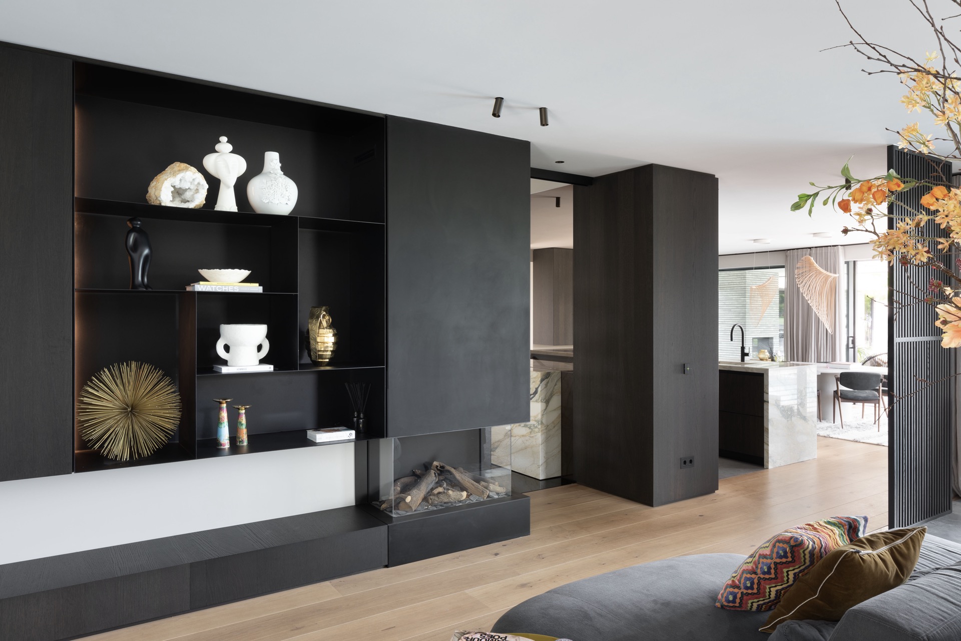
The living areas are shaped by custom interior details that turn storage and partitioning into part of the architecture. Dark panels wrap niches and wall sections, while vertical slat wall elements break up larger planes without closing them off. In one room, a large television sits inside a deep frame that reads like a built-in composition rather than a separate object. The effect is calm and deliberate, with the wall doing the work of organizing the space.
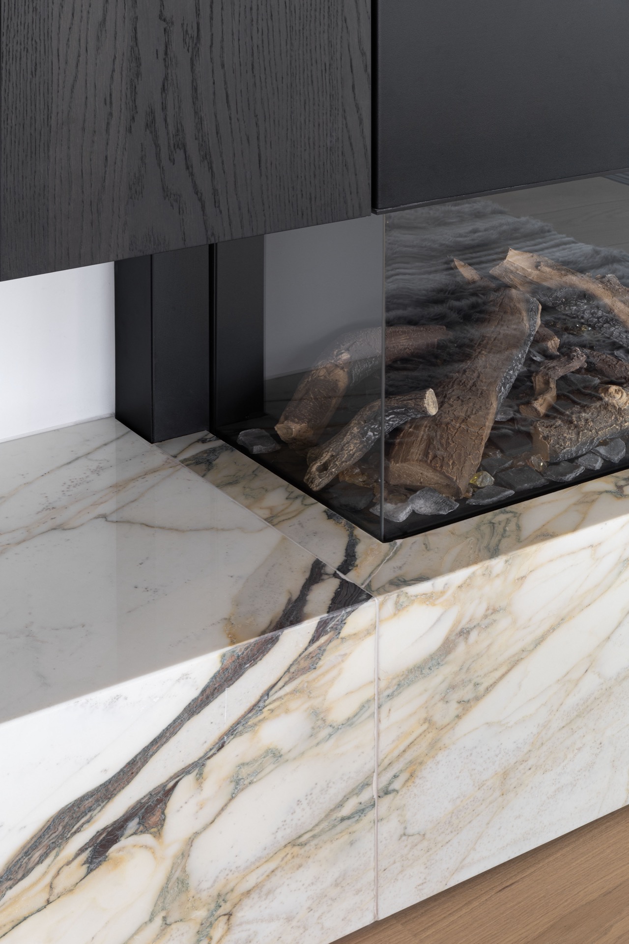
Near the fireplace, the material shift is subtle but decisive. A dark surround meets a glass front, and the stone-like finish around it catches the light differently from the surrounding panels. The hearth is not treated as a decorative focal point in the usual sense; it is folded into the wall system, aligned with the floor and the adjacent openings. That keeps the room visually steady, even when the fire is off and the glass reflects the interior around it.
Marble-look surfaces around kitchen and fire
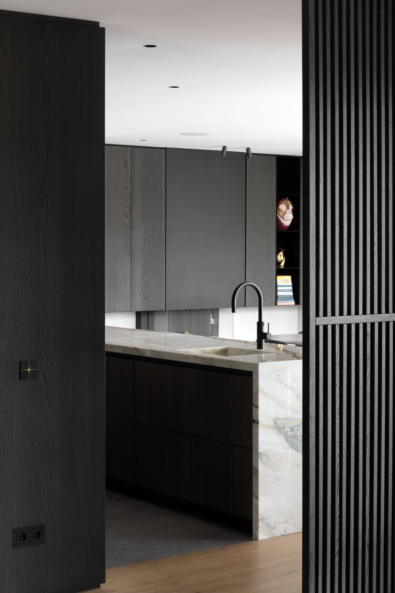
Marble-look finishes appear in several places, but never in a way that overwhelms the rooms. On the kitchen island, the light veining contrasts with a darker base, so the block reads as a piece of furniture as much as a work surface. Close by, pendant lights hang low enough to mark the dining zone, while the ceiling remains clean and uninterrupted. A second marble-look surface around the fireplace gives the same material a different role: here it works as a frame, not as a showpiece.
The kitchen and living area share one open field of movement, yet each zone is still legible. The island faces the seating area, and the vertical slat wall behind it adds a measured rhythm to the plan. Because the surfaces stay disciplined, the room can hold several functions without looking busy. It is a clear example of modern interior design that depends on line, thickness, and repetition rather than ornament.
Daylight filtered through glass, blinds, and curtains
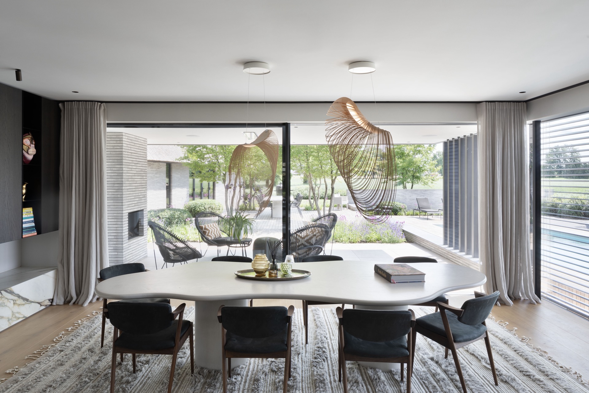
Large windows pull daylight deep into the house, but the light is never left untreated. Blinds cut the glass into narrow bands, and long curtains soften the edges of the openings. In some views the exterior garden and pool can be seen through the glazing, yet the interior remains the primary subject. The contrast between open glass and controlled shading gives the rooms a layered depth that changes throughout the day.
This play of light is especially visible in the dining area. The table runs parallel to the glazing, and the hanging lamps sit just low enough to define the seating line. Outside, the pool is only a supporting view, but it extends the sense of space beyond the room. Inside, the floor and ceiling stay quiet, so attention moves naturally to the windows, the curtain folds, and the reflection in the glass.
Openings, sightlines, and a measured route upstairs
Upstairs, the villa keeps the same disciplined language. A staircase with glass railings and a vertical slat balustrade introduces another layer of transparency and structure. The rails do not interrupt the view; they trace it. Along the landing, dark custom panels continue the language of the lower floor, and the openings between spaces feel carefully placed rather than merely practical. It is a route that reveals the house slowly, one angled view at a time.
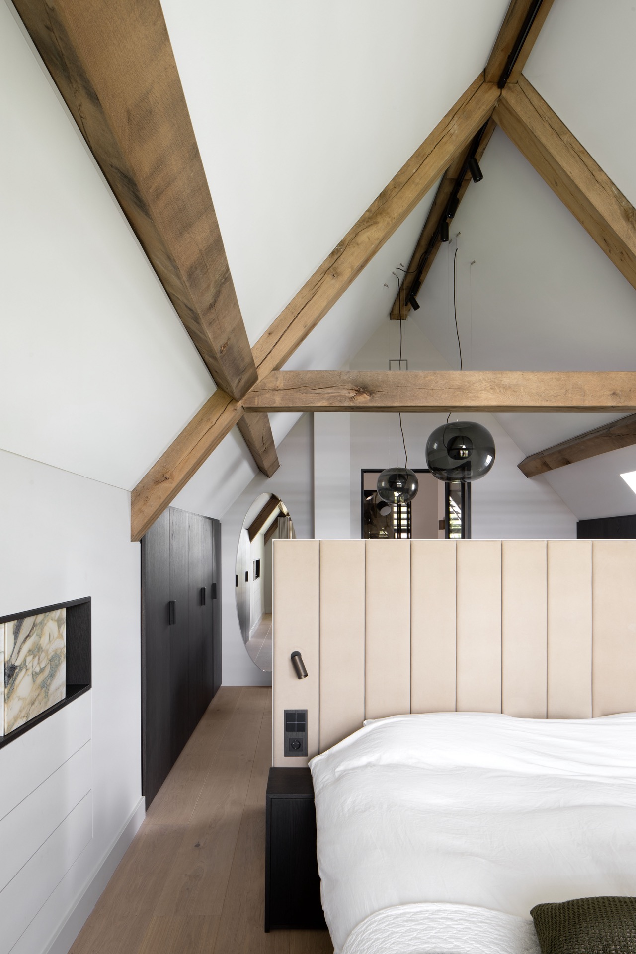
In a separate attic-like space, the exposed timber structure adds a different register. The wood sits above the more polished finishes below, and the contrast is immediate. Modern lighting units hang in a line, illuminating the beams without hiding them. That move keeps the upper level connected to the rest of the interior while letting the roof structure remain visible as part of the room, not as something concealed behind finishes.
Bathroom spaces that keep the same material discipline
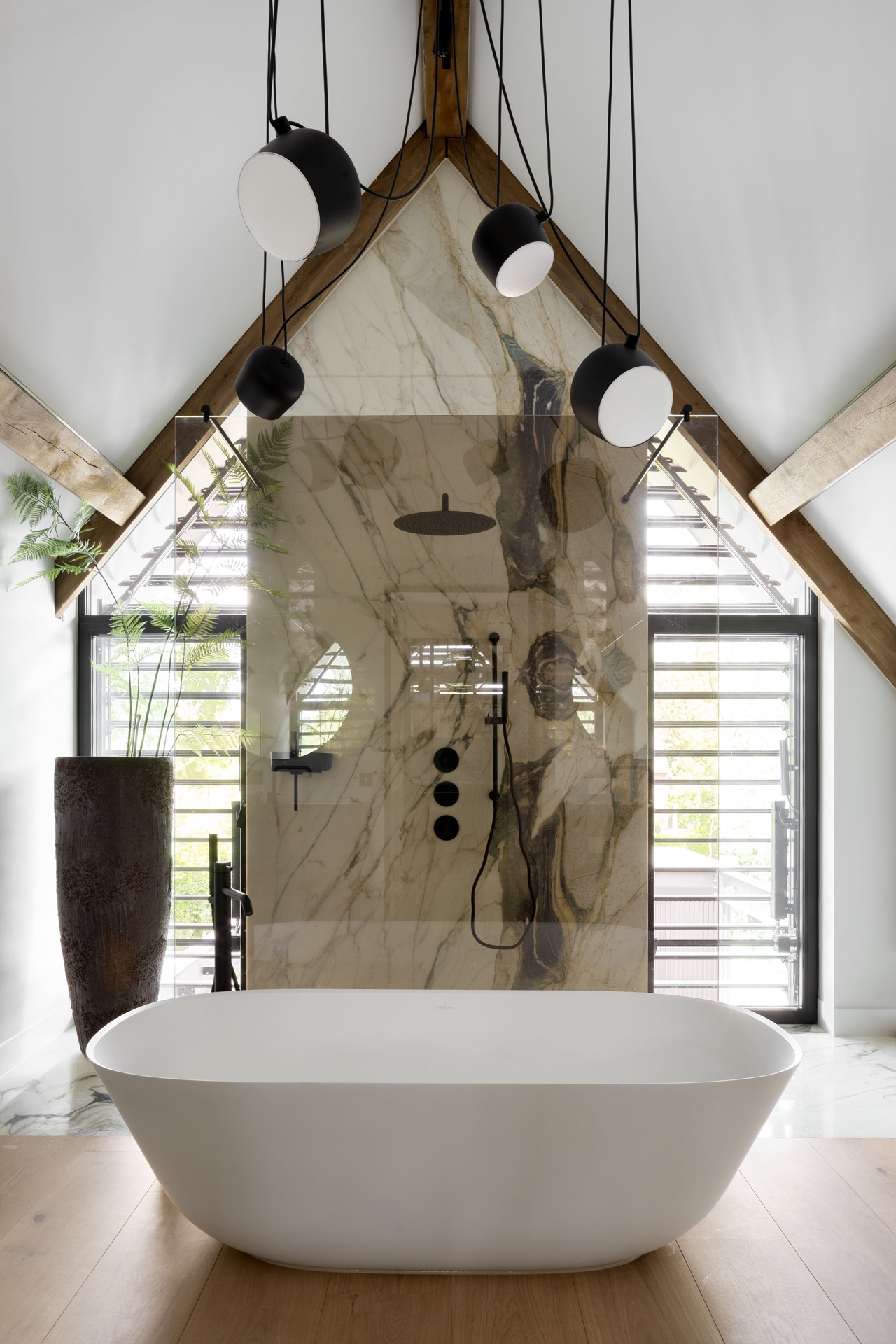
The bathroom imagery follows the same approach to surfaces and proportion. A large stone wall forms the backdrop, while a freestanding tub sits in front of it with enough clearance to read as an object in its own right. Nearby, a shower zone remains open in feel, framed by glass and stone rather than enclosed by heavy partitioning. The result is not about display. It is about allowing the material changes to do the visual work.
Even in these smaller rooms, the project avoids noise. Dark lines, pale stone tones, and reflective glass repeat the language of the main living spaces. That consistency matters because it keeps the luxury villa interior readable from room to room. A viewer moves from the living area to the bathroom and recognises the same logic: measured surfaces, clear edges, and a preference for built-in elements over loose gestures.
Outdoor water and the house in one view
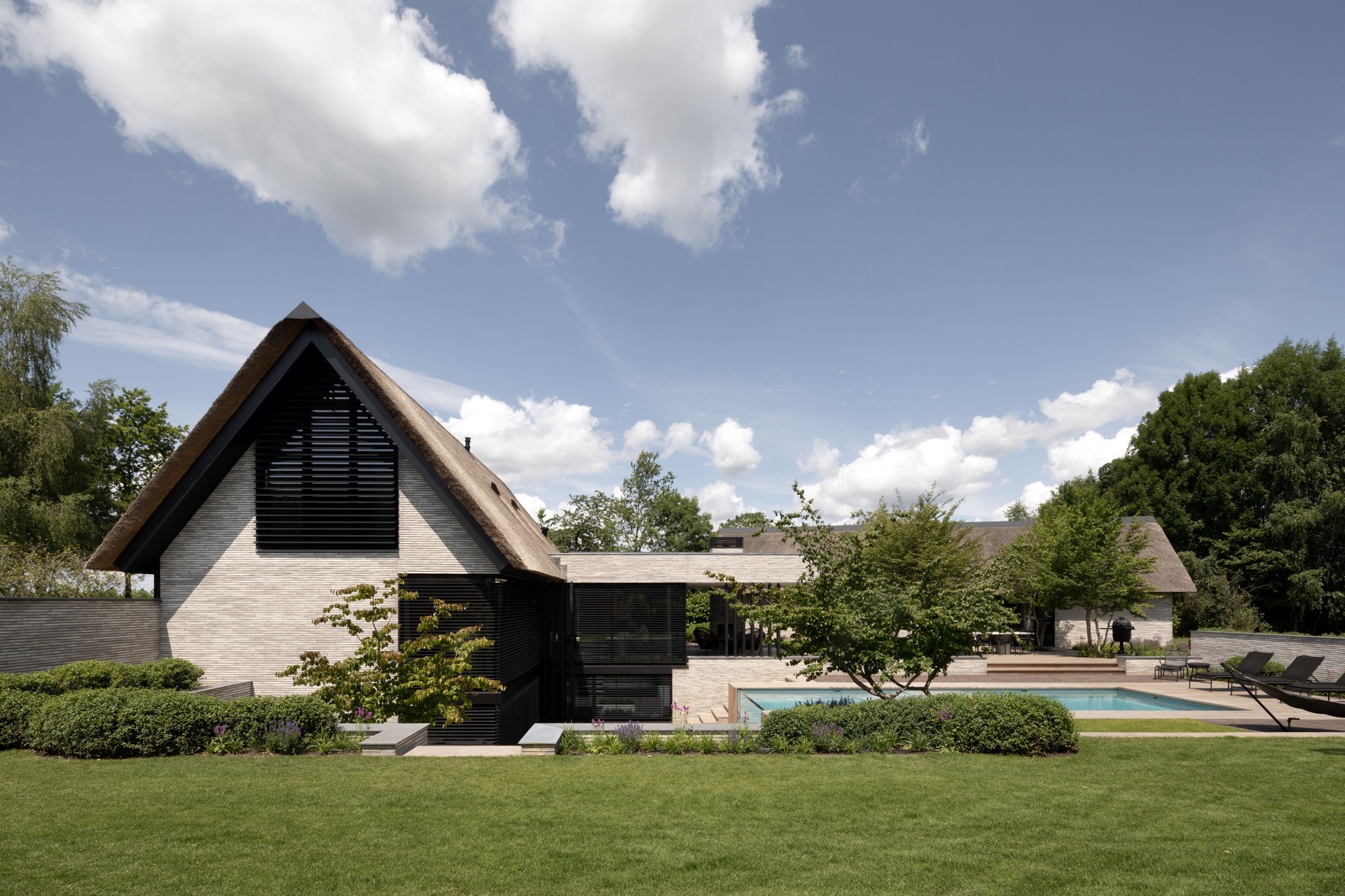
The exterior view is brief, but it reinforces the interior story. A pool sits close to the house, and the clean roof volumes give the building a sharp outline against the water. From this angle, the villa reads as a continuation of the same vocabulary seen inside: straight lines, dark accents, and glazed openings. The outside is not the main argument of the project, yet it confirms how the interior and its surroundings are tied together through simple geometry and controlled material contrasts.
What stays with the viewer is the consistency of the whole sequence. From the first dark wall panel to the last reflected view in the glazing, the house keeps returning to the same set of choices: custom interior details, marble-look finishes, glass, and carefully placed light. That makes the custom interiors feel specific without becoming loud. The rooms are not overloaded with effects; they rely on structure, surface, and the way each opening frames the next space.
Want to see more of ZOUT Ontwerphuis? View the page of ZOUT Ontwerphuis for even more great projects and company information.



NEW 2026 Jubileum Edition The Best Interior Designers Benelux
Order Now €125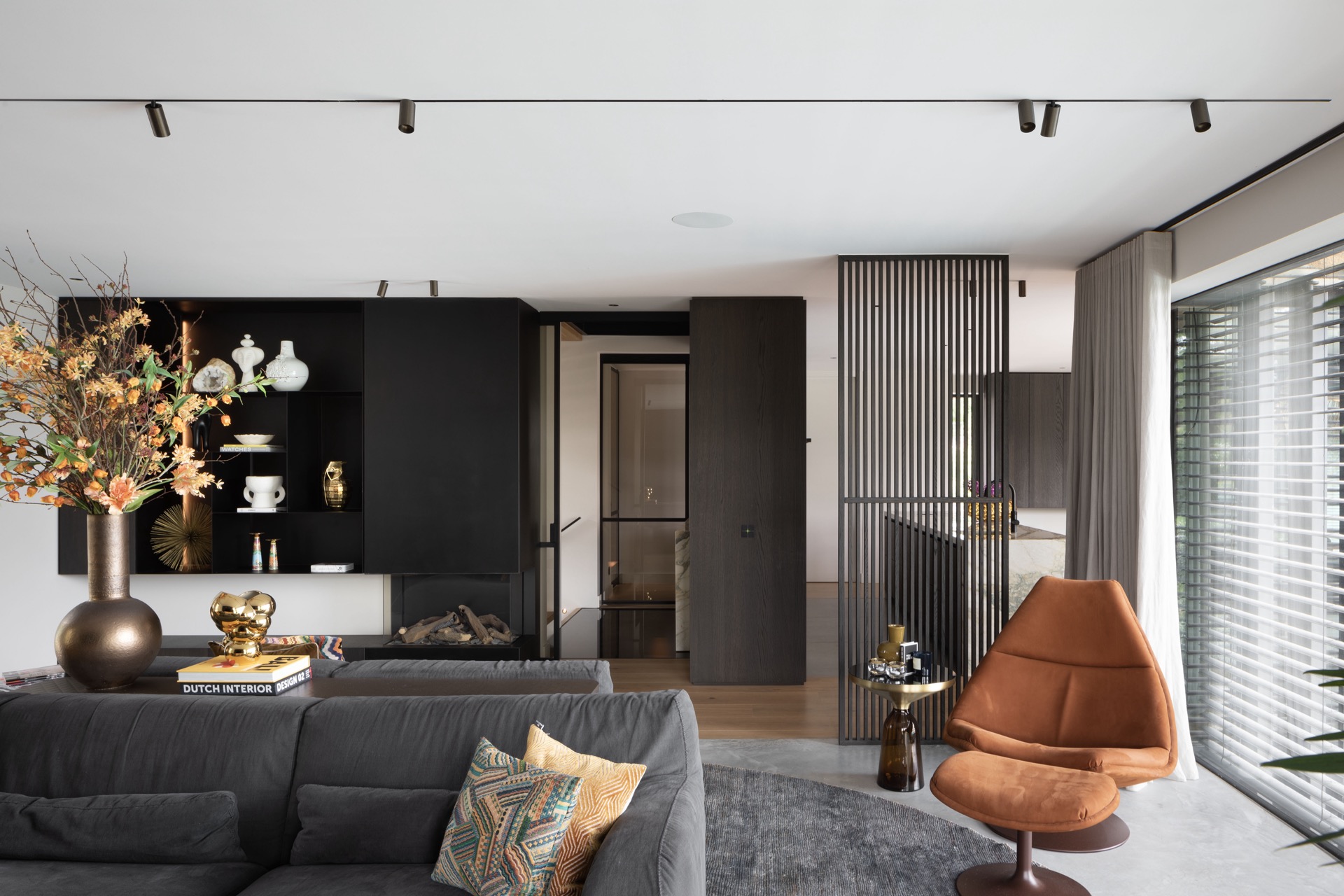

NEW 2026 Jubileum Edition The Best Interior Designers Benelux
Order Now €125


NEW 2026 Jubileum Edition The Best Interior Designers Benelux
Order Now €125

NEW 2026 Jubileum Edition The Best Interior Designers Benelux
Order Now €125