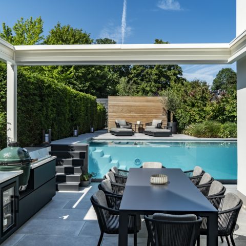
Minimalist interior with refined finishes
Light walls, dark joinery and a stone-look surface set the tone from the first step inside. The palette stays limited, but it never feels thin. In the kitchen, the island reads as a single block while the surrounding cabinetry pulls back into the wall, leaving the room to breathe. This minimalist interior relies on clear lines, controlled contrast and a custom interior finish that keeps every surface in conversation with the next.
Stone-look surfaces set the pace
The kitchen carries the strongest visual weight in the house. A stone-look countertop and matching surfaces give the island a firm presence, while dark custom cabinetry frames the work area without crowding it. Vertical slats appear behind the island and again in other parts of the interior, acting as a repeated architectural device rather than decoration. The effect is measured: hard edges, pale floor tiles and a calm ceiling plane with recessed lighting.
Seen from different angles, the room shifts between open and enclosed. The dark fronts hold storage close to the wall, and the lighter floor keeps the plan from feeling heavy. The kitchen design is not about display; it is about making appliances, storage and circulation read clearly. Even the opening around the island leaves enough room for the eye to move toward the adjacent spaces, where the same restrained palette continues.
Joinery that keeps storage out of sight
Across the interior, built-in cabinetry takes over the task of clearing surfaces. Open niches sit inside dark frames, some lit from within, so the shelving becomes part of the wall rather than an added layer. In one area, the vertical slat wall softens the transition between open and closed volumes. In another, the cabinetry folds around the room so that storage, display and structure share the same language.
This is where the new build interior shows its discipline. Doors, panels and shelving are kept in line with one another, and the joins are allowed to remain quiet. The result is a space where objects can disappear quickly, leaving the furniture and wall planes to do the work. It also gives the darker timber a clear role: not as contrast for its own sake, but as a way to anchor the lighter plaster surfaces around it.
Vertical slats as a spatial cue
The vertical slat wall appears in several views and gives the project a steady rhythm. It catches light differently from the flat panels nearby, so the surface changes as you move past it. At one point it acts as a screen; elsewhere it reads as a backdrop to shelving or a passage. That repetition helps the minimalist interior feel considered without turning it rigid. The lines stay strict, but the surfaces still respond to movement and daylight.
Living spaces softened by curtains and texture
Full-height curtains turn one side of the living area into a continuous fabric plane. Their folds break the sharpness of the hard finishes and make the room feel slower. A pale sofa, low seating and a rectangular coffee table sit in front of that curtain wall, while the ceiling spots keep the light even and low. Nothing competes for attention. The room depends on proportion, not volume, and the soft materials are placed where they can temper the stronger lines of the joinery.
From the lounge, the view opens toward adjacent spaces through rectangular cut-throughs and framed openings. Those lines of sight are important in a project like this. They let the rooms stay distinct without cutting them off from one another. The minimalist interior uses that openness carefully: not as a dramatic gesture, but as a way to keep the living zone connected to the kitchen and the circulation beyond it.
Light, openings and the route between rooms
What makes the plan readable is the way light reaches the interior surfaces. White walls catch it first, then the darker timber pulls the eye deeper into the room. The openings are clean-edged and rectangular, and they guide movement without adding visual noise. Even the staircase follows that logic. Dark timber treads rise against pale walls, with the structure kept slim so the line of the stair remains clear from below.
A bathroom finished with the same restraint
The bathroom continues the project’s limited palette instead of breaking away from it. Stone-look finishes return on the walls and around the fitted elements, while black taps and shower details sharpen the surfaces. A walk-in glass shower keeps the room visually open, and the transparent partition lets the floor and wall finishes remain visible across the full space. Here, the bathroom fit-out sits within the same visual order as the rest of the interior.
The fitted wash area uses the same controlled approach as the kitchen and living spaces. Built-in storage keeps the surfaces clean, and the lighter base materials stop the darker accents from taking over. The room does not rely on ornament. It works through alignment: the basin, the wall planes, the glass and the hardware all sit in a tight field of lines. That restraint is what carries the project from one room to the next.
Finished with the same discipline as the shell
The new build interior comes across as a project where finish and layout were treated together. Custom interior finish, dark custom cabinetry, stone-look kitchen surfaces and the repeated vertical slat wall all point to a consistent hand across the house. The furniture and decoration were handled separately from the bathroom fit-out, yet the result reads as one sequence because the colours, proportions and materials remain controlled throughout.
That consistency is what gives the house its strongest quality. The eye moves from the kitchen island to the curtain wall, from the slatted screens to the bathroom glass, and the transitions stay calm because the materials never fight each other. The project shows how a minimalist interior can still feel layered when the joinery, lighting and finishes are resolved with this much precision.
Want to see more of Laura Calleeuw? View the page of Laura Calleeuw for even more great projects and company information.




NEW 2026 Jubileum Edition The Best Interior Designers Benelux
Order Now €125


NEW 2026 Jubileum Edition The Best Interior Designers Benelux
Order Now €125


NEW 2026 Jubileum Edition The Best Interior Designers Benelux
Order Now €125


NEW 2026 Jubileum Edition The Best Interior Designers Benelux
Order Now €125


NEW 2026 Jubileum Edition The Best Interior Designers Benelux
Order Now €125


NEW 2026 Jubileum Edition The Best Interior Designers Benelux
Order Now €125