French Manor Style Villa
The first thing that reads is the roofline: stepped volumes, hip roofs, and dormer windows that break the silhouette into smaller, more precise parts. Below that, reclaimed brick gives the walls a textured surface with enough depth to catch the light, while black steel-look window frames cut clean lines through the façade. The result is a French manor style villa that keeps its historic references visible, but never lets them become decorative noise.
Roof planes, brickwork, and the manor profile
The exterior composition works through offset masses rather than one large block. Each shift in volume changes the shadow on the wall, and each roof plane adds another layer to the outline. Natural slate sits alongside blue-black Koramic tiles, so the roof does more than cap the house; it shapes the whole reading of the building. Moulded details are kept to a measured list: wall anchors, buttresses, and stone splash courses. They are small gestures, but they keep the French manor style villa grounded in familiar references.
The brickwork is intentionally uneven in tone. Reclaimed brick carries a lived-in surface that contrasts with the crisp alignment of the frames and the disciplined roof edges. Arched garage doors and a generous front door in afrormosia bring a warmer note to the composition, though the overall effect stays firmly architectural. Nothing is overdrawn. The materials do the work, and each one has a clear role in the façade.
Black frames and deep openings
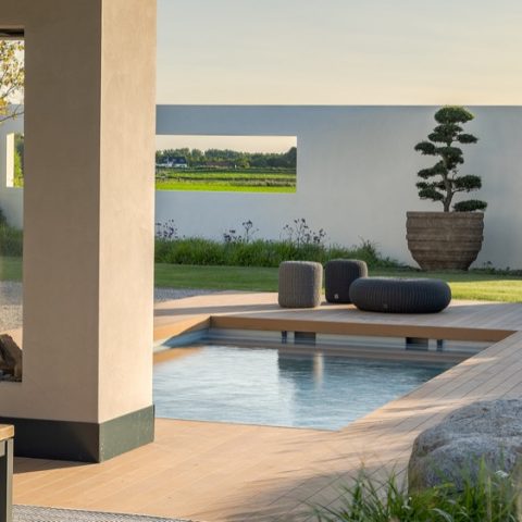
Black steel-look window frames are the strongest contemporary line in the house. They sharpen the openings and give the glazed areas a graphic presence, especially where large panes meet the brick walls. In the pictures, the glass reflects the surrounding garden and terrace surfaces, which softens the mass of the villa without weakening it. The openings are generous, but they are framed tightly, so the elevations keep their order even with broad spans of glass.
That same discipline continues inside, where the transition from exterior to interior is handled through clear edges and restrained material shifts. A dark frame around a doorway, a smooth wall plane, and a continuous floor line are enough to guide the eye. The architecture does not rely on ornament to create rhythm. It uses proportion, repeated lines, and the contrast between matte surfaces and clear glass.
A living room built around one wall
Inside, the living room is organised around a built-in fireplace and TV wall that turns storage, display, and focal point into one composition. Open niches sit beside enclosed volumes, so the wall reads as furniture rather than a separate architectural block. The fireplace is set low and precise, which keeps the room visually calm even with several functions packed into one side of the space. Nearby, the staircase appears as a second strong line, with wooden treads and a light path running through the room.
Large glazing pulls daylight across the floor and onto the darker joinery, making the room feel deeper than a simple open plan. The seating area is placed close to the glass, while the built-in elements stay slightly recessed, allowing the room to breathe around them. This is where the French manor style villa shows its more contemporary side: the room is open, but it is not empty, and every edge appears to have been drawn with a measured hand.
Open views, closed storage
The cabinetry around the fireplace wall uses recessed openings to keep everyday objects out of sight while still leaving room for objects that are meant to be seen. That balance is handled through depth rather than decoration. A niche turns a storage volume into part of the composition; a dark panel lets the TV disappear when the screen is off. The room remains structured by these choices, not diluted by them. Even the line of the staircase contributes to the same order, leading the eye upward without interrupting the living zone below.
Kitchen joinery in dark tones and a lighter worktop
The kitchen shifts to a darker palette. Custom kitchen cabinetry creates a long, measured wall of storage, and the light worktop cuts across it with a clean horizontal band. In the photos, the contrast is strongest where daylight touches the cabinet fronts and picks out the edges of the joinery. Open shelving and recessed details stop the kitchen from reading as a solid block, while the darker finish keeps the space anchored to the rest of the house.
This is not a kitchen that asks for attention through excess. Its force comes from alignment: cabinet fronts line up, work surfaces stay uninterrupted, and the openings are placed where they support use rather than spectacle. The room appears close to the dining area, so the cabinetry has to hold the same visual discipline as the rest of the interior. That is where the project’s custom work becomes most visible. The joinery is doing practical work, but it is also setting the tone of the space around it.
Marble-look bathroom surfaces and glass partitions
The bathrooms move into a brighter register, with marble-look surfaces and stone-like tiles that reflect light instead of absorbing it. Glass shower walls with black profiles keep the enclosure visually light, and the double vanity gives the room a clear central axis. In one view, LED-like light lines trace the edges of the tiling, turning the wall surfaces into a measured backdrop rather than a flat field. The effect is restrained, but the material contrast is easy to read.
These rooms repeat the same principle as the rest of the villa: surfaces are selected for their effect on space, not only for finish. A glossy stone look near a shower, a dark vanity below, a clear glass panel in front, and linear lighting along the edges all work together to make the room feel more legible. The bathroom does not drift into spa language. It stays grounded in the architecture of the house, with every line kept clean and every plane easy to follow.
Light, lines, and daily use
The strongest detail in the bathroom is not a single fitting, but the way the light tracks the surfaces. A narrow illuminated edge at the tile line changes how the room is read in the evening, while the glass shower keeps the floor plan open to view. The double vanity sits firmly below that light band, so the room is split into layers: storage below, reflection at eye level, and a transparent enclosure beside it. It is a simple sequence, but it gives the room a clear spatial logic.
Throughout the house, the French manor style villa keeps shifting between reference and restraint. The roofscape and brickwork carry the manor character, while the black frames, custom joinery, and pared-back interior detailing bring the building into the present without forcing a contrast. That is most visible in the way the spaces are held together: through material continuity, disciplined openings, and a steady preference for surfaces that have a job to do.
Want to see more of Inarto Architecten? View the page of Inarto Architecten for even more great projects and company information.



NEW 2026 Jubileum Edition The Best Interior Designers Benelux
Order Now €125


NEW 2026 Jubileum Edition The Best Interior Designers Benelux
Order Now €125


NEW 2026 Jubileum Edition The Best Interior Designers Benelux
Order Now €125


NEW 2026 Jubileum Edition The Best Interior Designers Benelux
Order Now €125


NEW 2026 Jubileum Edition The Best Interior Designers Benelux
Order Now €125