Custom interior design with a calm, unified feel
The first thing you notice is the line of wood running through the room. It repeats in the tall cabinetry, the wall panels and the low joinery, pulling the living area, kitchen and dining zone into one quiet composition. In this custom interior design, the furniture does not sit in front of the architecture; it sits inside it. That decision gives the home its calm interior character, while a few sharper details, such as glass fronts and dark lighting elements, break the rhythm where needed.
Joinery that follows the architecture
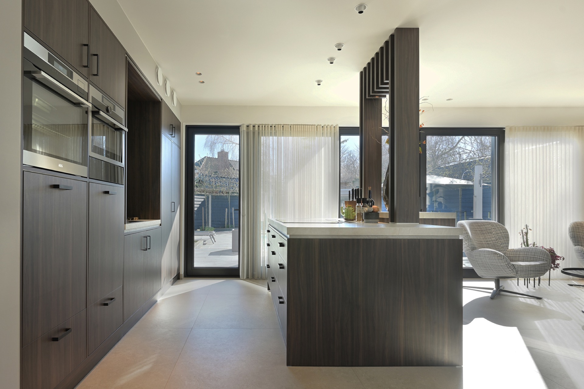
The made-to-measure furniture works with the shell of the house rather than against it. Tall built-in cabinets rise in long vertical runs, and the front panels keep their lines restrained so the surfaces read as one continuous plane. In the kitchen, the same approach returns in the large storage wall and the fitted elements around the work zone. The result is a luxury interior that is defined less by ornament than by the way each cabinet, niche and panel meets the next one.
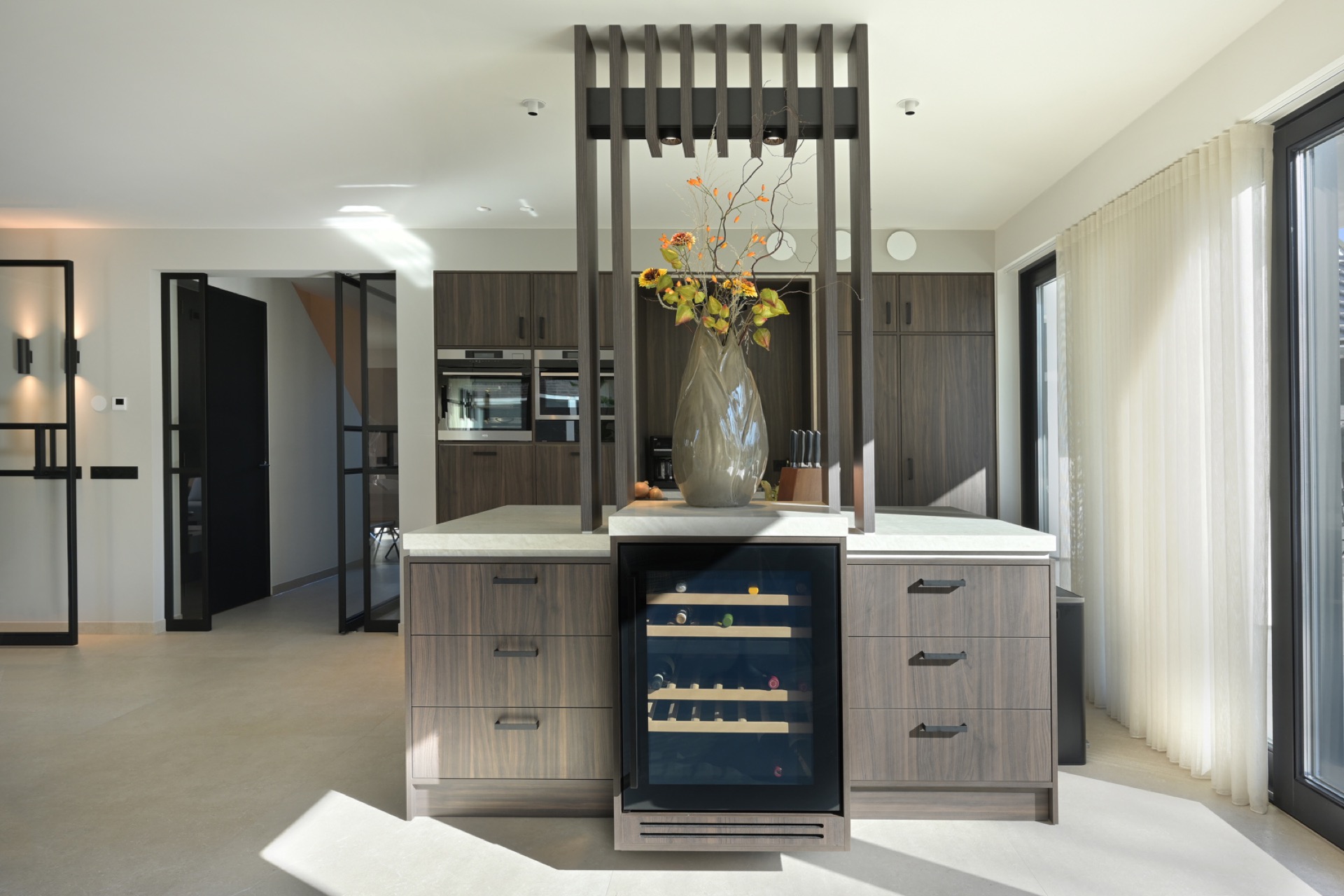
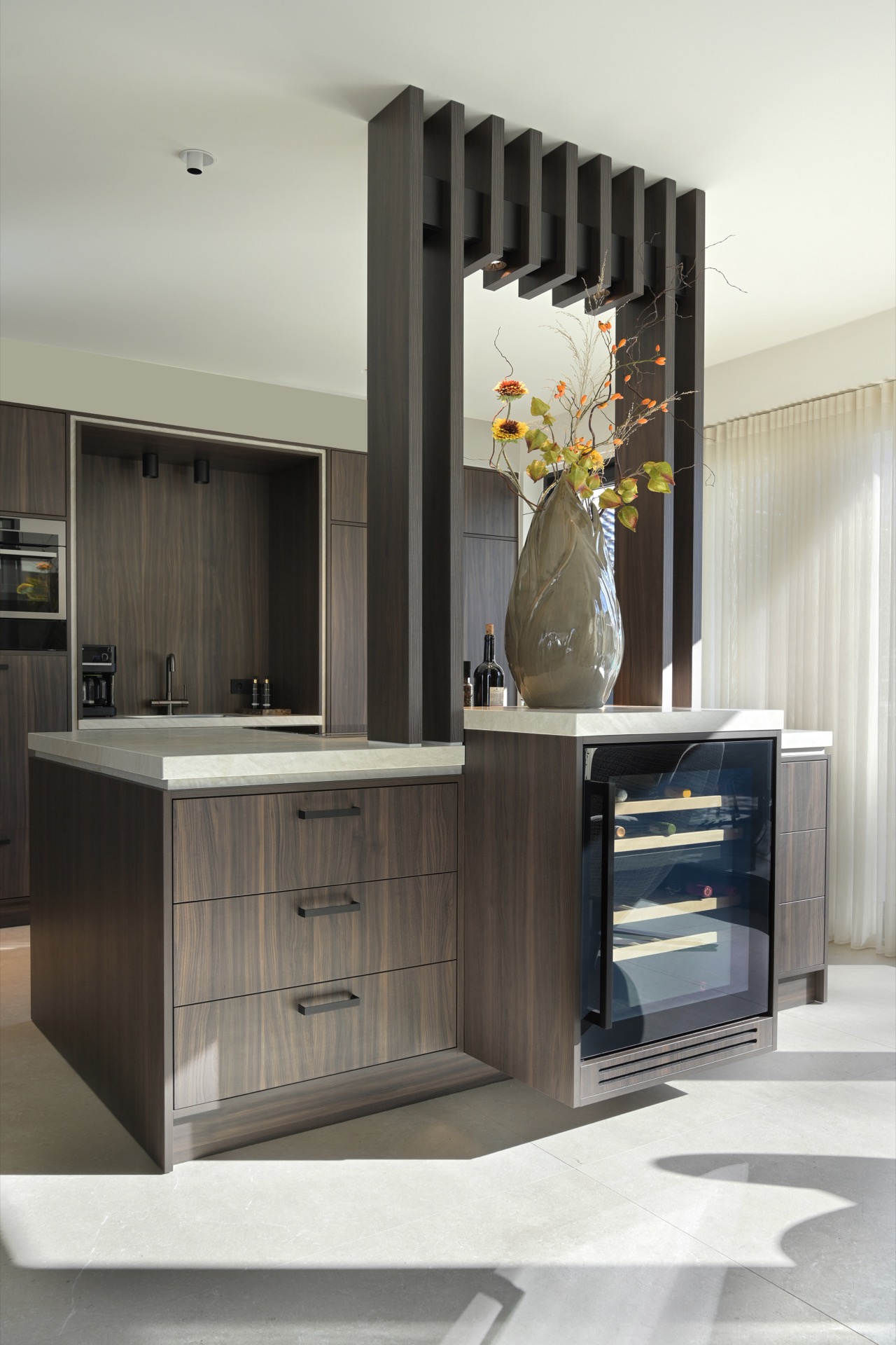
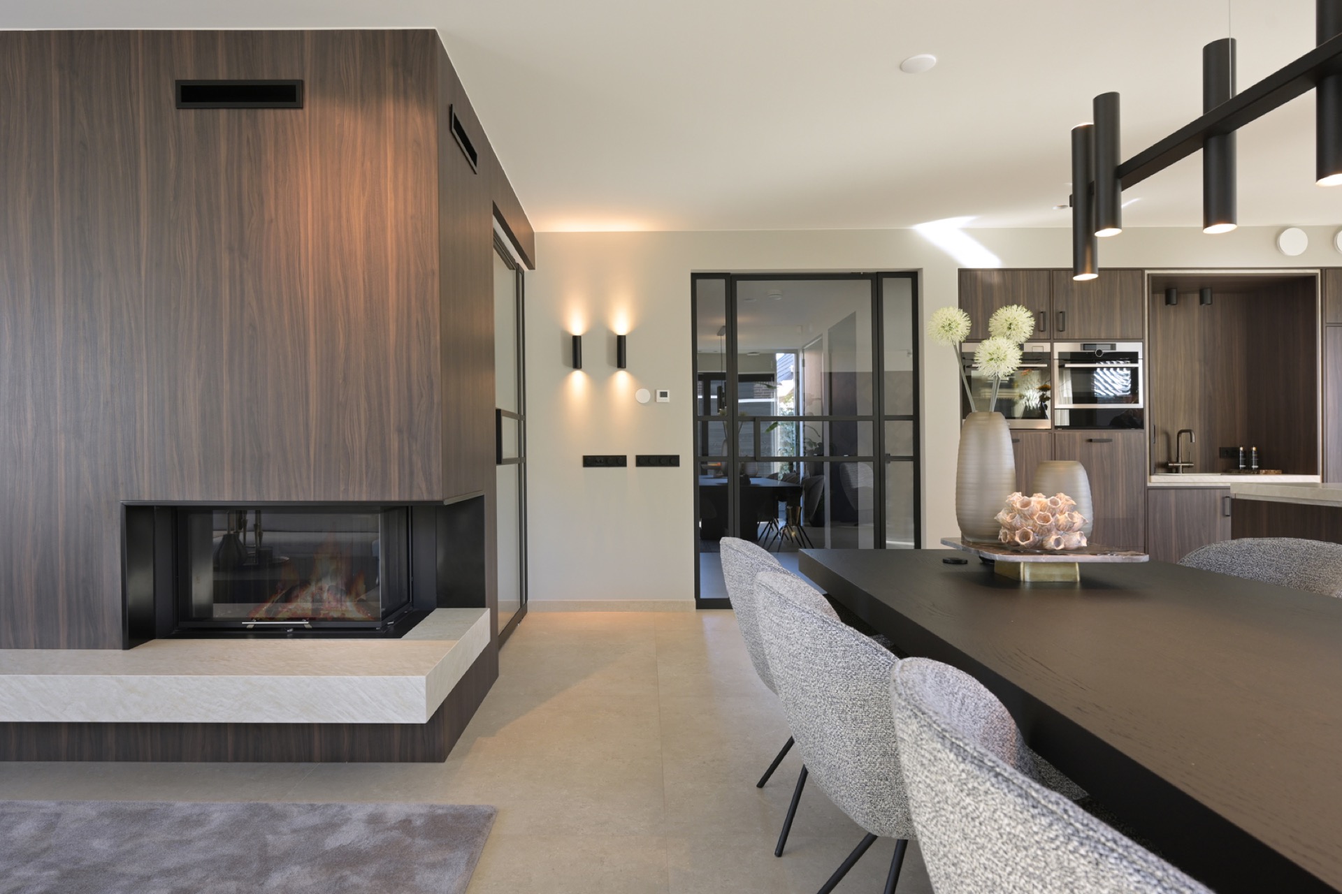
That approach is visible again in the smaller details. A glazed section breaks open one of the cabinet blocks, while a slim niche introduces depth without disturbing the calm surface. The material changes remain limited: wood tones, glass and a stone-like floor form the main base. Because those materials are repeated across the plan, the custom interior design keeps moving in one direction even when the eye shifts from storage to seating or from kitchen to living room.
An open plan kitchen dining room with clear sightlines
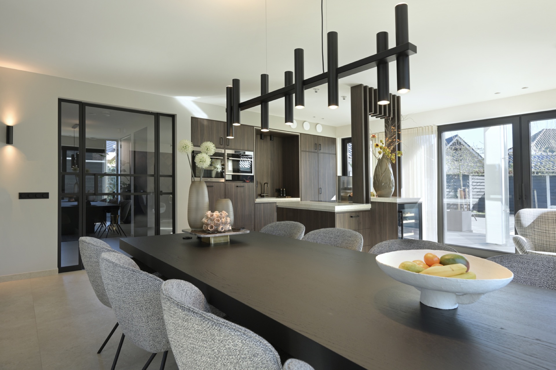
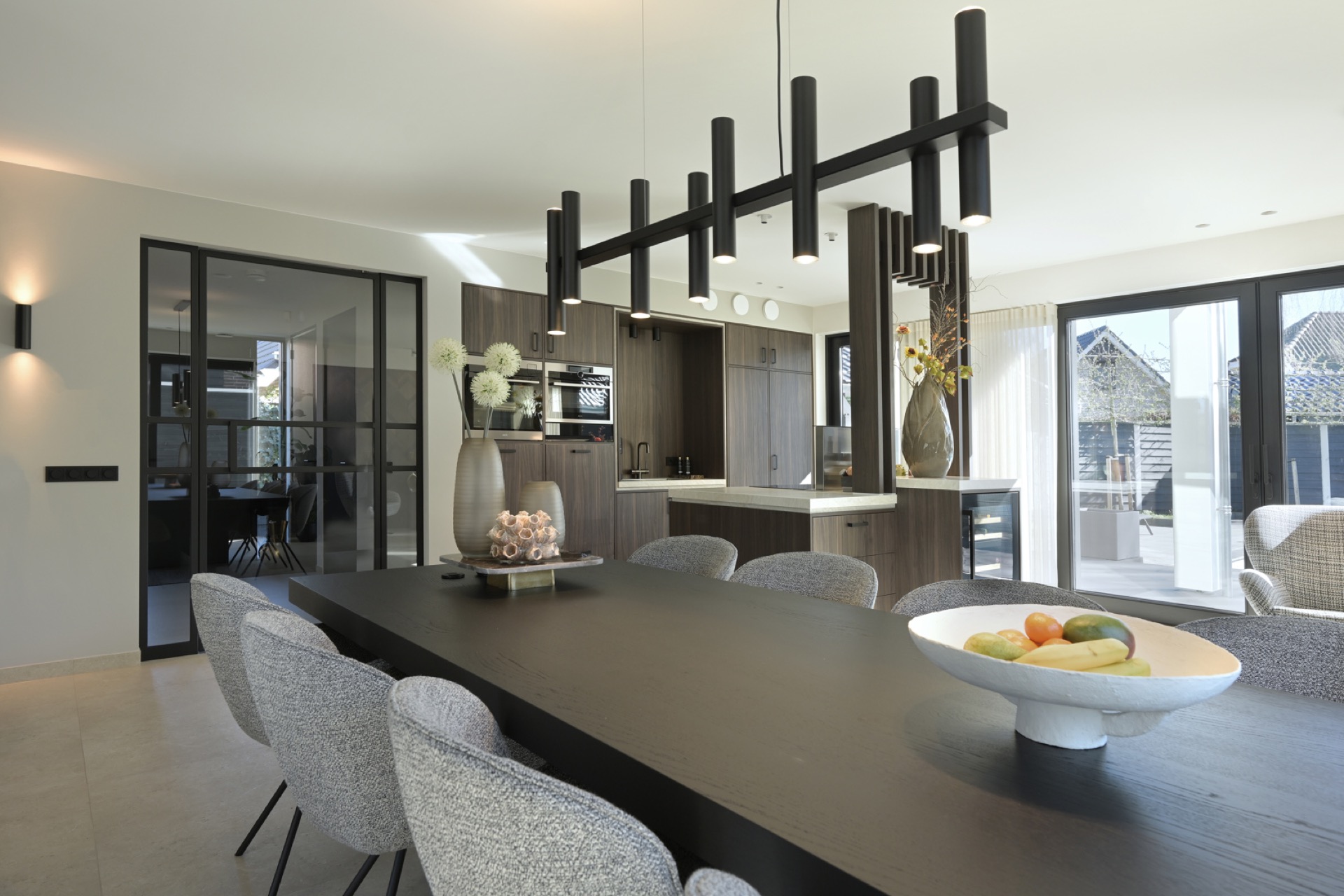
The open plan kitchen dining arrangement gives the home its widest view. From the table, the eye travels past the kitchen block, along the raampartijen and out toward the terrace. A large dining table sits as the central object in that field, with slim pendant lights hovering above it and drawing the ceiling lower over the middle of the room. Around it, the room stays open and legible, with enough space left between the kitchen wall, the dining setting and the lounge to keep each zone distinct.
What makes this interior read as a single whole is the way the kitchen finishes repeat in the dining area and back into the living room. Soft colours keep the transitions quiet. Natural materials interior choices, especially the wood-look fronts and the muted floor finish, absorb the stronger edges of the glass and black framing. That contrast is small but important: it lets the rooms stay connected without becoming visually flat.
Built-in cabinets and a discreet place for display
Built-in cabinets do most of the structural work here. They hide the practical side of daily life, but they also set the pace of the room. Long handles, flush fronts and repeated vertical divisions keep the storage calm and architectural. In one of the fitted blocks, an integrated glass section and a small display niche introduce a lighter note. It is the kind of detail that lets art objects and personal pieces appear without turning the wall into a showcase.
That balance between storage and display appears in the broader styling as well. Artworks and design objects are placed where they can be read against wood, stone and glass, not lost in a busy backdrop. Their role is clear: they interrupt the large surfaces and give the interior a more personal register. Because the furniture is custom made, those objects sit comfortably within the layout instead of competing with it.
Lighting that shapes the evening atmosphere
Architectural lighting has a visible part in the project. Ceiling spots are set in small groups, and the wall lights add a second layer that draws attention to selected surfaces. The effect is not theatrical. It works by marking the edges of the room, bringing depth to the wood panelling and making the darker details register after daylight fades. In a calm interior like this, light does more than illuminate; it edits what you see first.
That editing is especially clear around the seating area and the passage to the kitchen. The room carries daylight through large windows, but the artificial light keeps the space readable after dark. Spots in the ceiling pick out the furniture and the wall planes, while the pendant lights over the table give the dining zone a stronger centre. The result is a layered scheme that lets the interior shift between day and evening without changing its basic tone.
A fireplace wall with enough weight to anchor the room
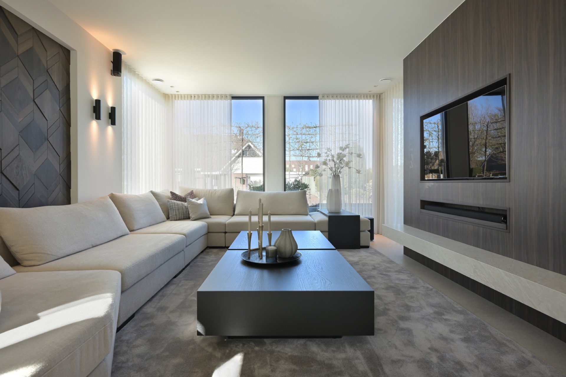
The fireplace gives the living room a second focal point. Framed by lighter stone-like surfaces and adjacent wood panels, it sits as a solid element rather than a decorative accent. Around it, the wall treatment stays measured, so the opening and its surround hold their place without taking over the room. Seen from the seating area, it acts as an anchor at one end of the plan, balancing the kitchen and dining zone across the open space.
The same room also shows how the design uses contrast in small doses. A large L-shaped sofa sits near the window wall, softening the hard lines of the joinery. Vertical blinds filter the light on the glazed side, while the ceiling grid of small spots adds another layer above. None of these elements tries to stand out alone. They work because the custom interior design keeps their scale aligned with the room.
Soft colours, natural materials and familiar objects
The palette stays close to sand, grey, brown and black, with white surfaces lifting the darker wood and glass. Those tones keep the material transitions restrained, but they do not make the room cold. Instead, the soft colours allow the grain of the wood and the texture of the stone-like flooring to do the work. It is a quiet way of building a luxury interior: through repetition, measured contrast and materials that hold up under daylight.
Personal meaning enters through the objects, not through decoration in the usual sense. The source content mentions artworks and design objects that reflect the residents’ stories, and the layout gives those pieces room to breathe. They are placed against long panels, open shelving moments and fitted storage blocks, which makes them visible without turning the room into a gallery. That restraint keeps the home tied to everyday use while still giving each object a clear place.
What remains after the first reading is the way the whole plan has been pulled tight around use, light and material. Built-in cabinets absorb the practical side of living. The open plan kitchen dining space keeps sightlines open. Architectural lighting adds depth after dark. And the custom interior design, repeated through joinery, panels and furniture, gives the home a steady visual order that suits a family setting without flattening it.
Contributors:
Wood panels – Wonderwall studios
Lighting and home automation – Lightboxx
Custom woodwork – Stijlvol Hout
Photography – Jaro van Meerten
Want to see more of Studio Reinder Veenstra | Soothing Luxury? View the page of Studio Reinder Veenstra | Soothing Luxury for even more great projects and company information.



NEW 2026 Jubileum Edition The Best Interior Designers Benelux
Order Now €125