Modern kitchen with island and warm wood fronts
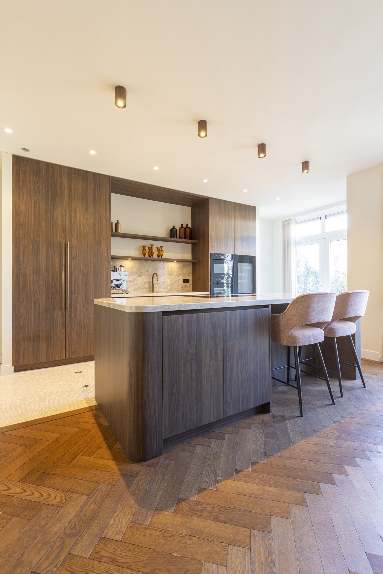
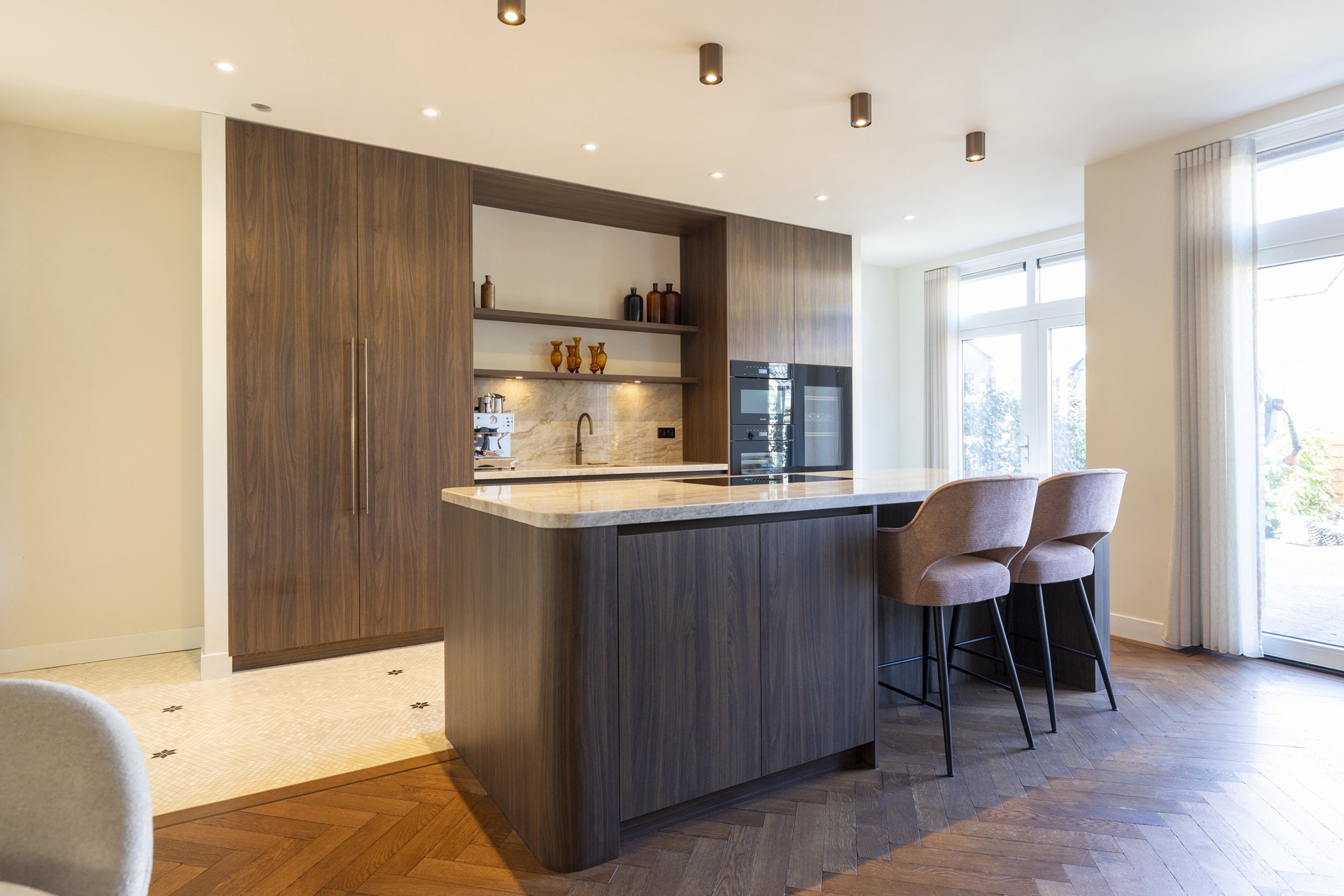
The kitchen island sets the pace here, stretching through the room as a continuous volume with rounded edges and a stone-look surface. Warm wood cabinet fronts frame the composition and keep the darker lines of the worktop from feeling hard. The layout reads clearly from the first step in: island, niche, wall storage, light.
The island as the main line through the room
The kitchen island runs long and low, with front panels that follow its full length without interruption. That steady line gives the room its structure. At the same time, the rounded end softens the turn of the composition, so the island does more than divide the space. It guides movement around it and holds the open plan together without drawing attention away from the materials around it.
Seen from the side, the island’s stone-look worktop creates a clear contrast with the wood beneath. The edge is precise, but the surface itself carries a pale mineral pattern that breaks up the dark and light bands in the room. Ceiling spots hover above this zone and keep the work surface legible, while the adjacent wall still reads as part of the same kitchen rather than a separate backdrop.
Warm wood fronts and vertical pulls
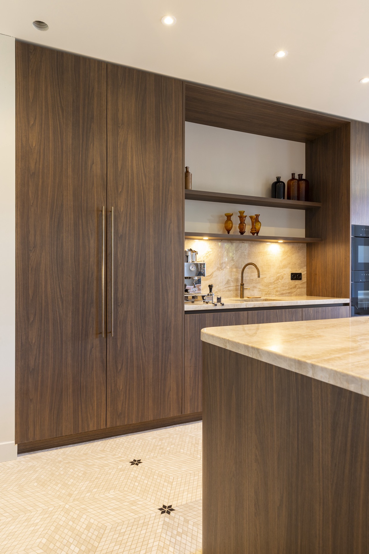
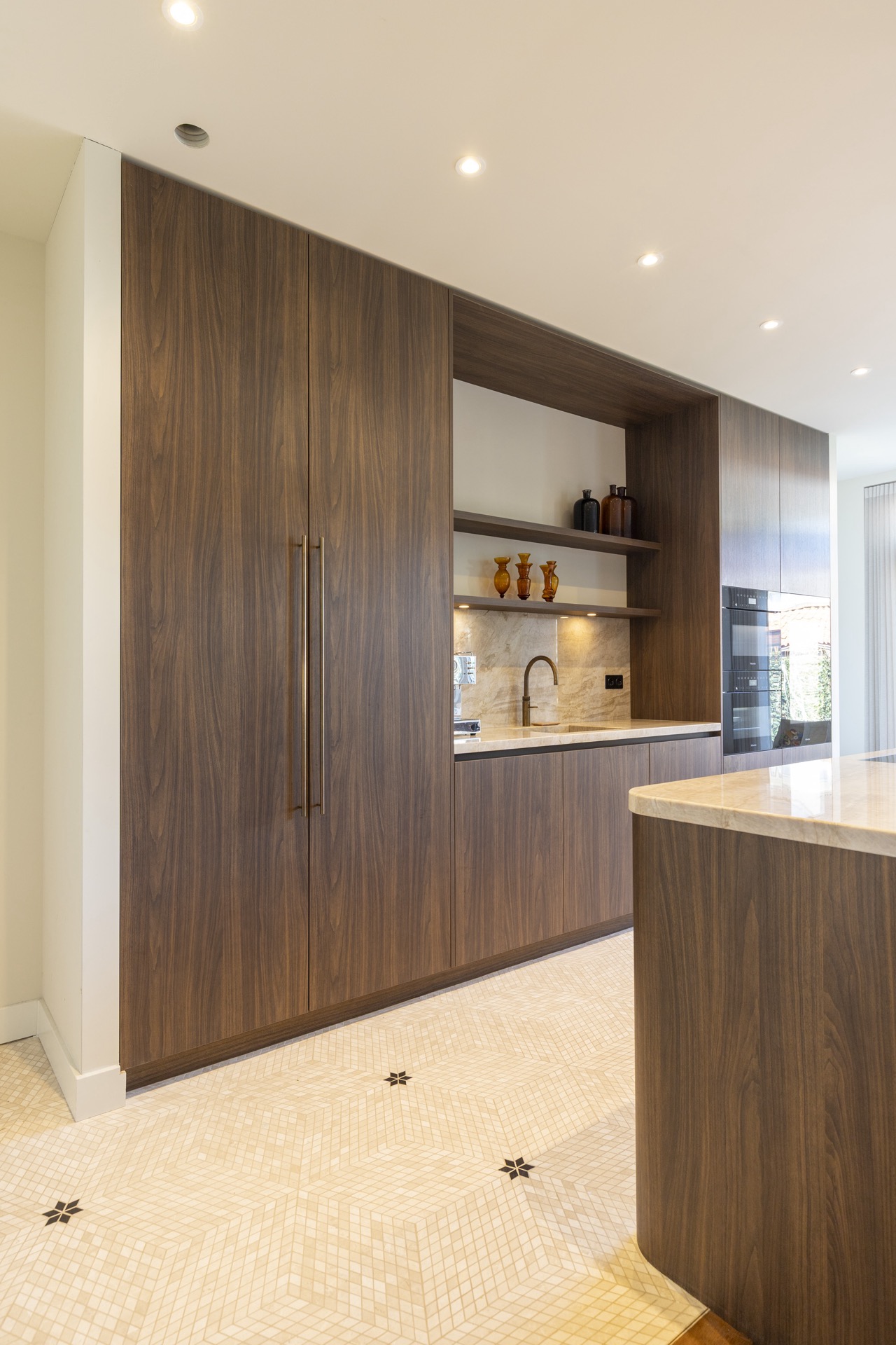
Large wooden fronts bring a measured rhythm to the cabinetry. Their grain is visible, and the vertical pulls reinforce the height of the tall units. Nothing is overly decorative. Instead, the handles mark the doors cleanly and make the storage wall read as a single field of panels. The effect is quiet, but not flat; the wood carries enough variation to stop the surface from becoming anonymous.
In the darker and lighter zones of the room, the wood does most of the visual work. It sits beside beige and cream tones, with black accents appearing only in the hardware and thin shadow lines. That restrained palette keeps the kitchen grounded. The cabinets feel built into the architecture rather than placed in front of it, especially where the tall units rise beside the open niche.
A lit niche that breaks the wall into layers
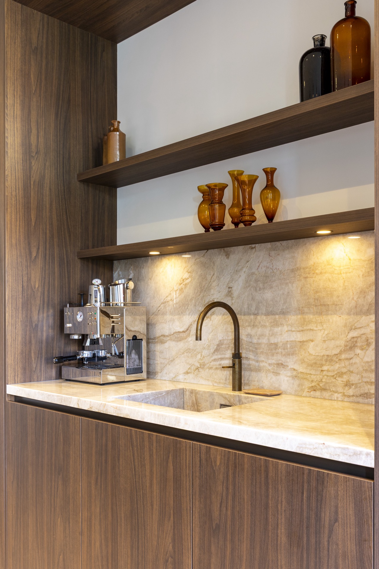
The lit kitchen niche is one of the strongest details in the room. Open shelves sit inside a recessed frame, and the indirect light picks out the depth of the opening instead of washing over it. That makes the niche read as a layered element: back wall, shelf line, front edge, light strip. The result is simple, but the geometry matters. The recessed area gives the kitchen a pause between the tall cabinetry and the work zone below.
From several angles, the niche also acts as a visual counterweight to the island. Its warm glow softens the harder surfaces of stone and wood, while the shelf structure gives the composition a place to break and breathe. The light does not announce itself. It sits under the shelf line and around the opening, where it can trace the cavity and make the materials easier to read.
Stone texture across worktop and backsplash
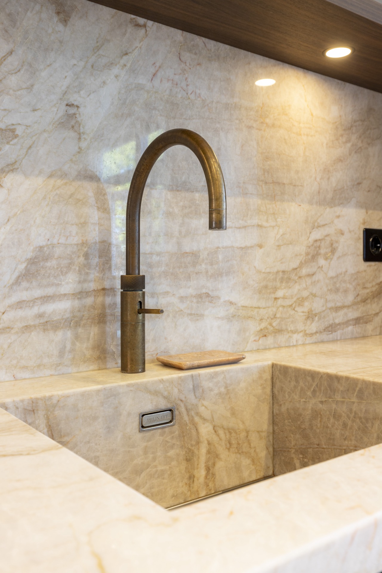
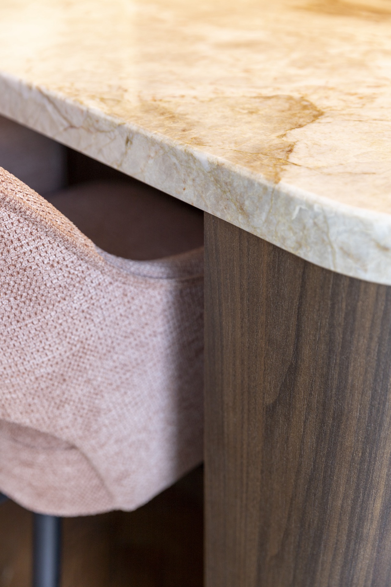
The natural stone look countertop carries through the kitchen in more than one place. On the worktop, the veining is subtle and mineral rather than dramatic. Behind the niche and around the sink zone, the same family of tones continues on the backsplash, so the room keeps its material thread even as the functions shift. The surface is calm in colour, but close views reveal movement in the texture and edge detail.
A close-up of the worktop shows how the stone surface meets the wooden front. The transition is direct, with no heavy trim interrupting the line. Nearby, the tap in a bronzed metal finish adds one more material note, but it stays secondary to the larger planes around it. This is where the kitchen becomes most tangible: grain, vein, edge, reflection.
Light from above, and around the base
Cylindrical ceiling spots punctuate the ceiling plane and help define the main working areas. Their spacing is visible, and that regular rhythm gives the room a clearer reading than a single central fixture would. The spotlights fall on the island, the niche, and the lower cabinets, so the kitchen is lit in parts rather than all at once. That keeps the deeper recesses visible without flattening the surfaces.
Plinth light and niche lighting add a lower band of illumination. It runs close to the floor and under the shelving, where it can catch the edge of the cabinetry and the surface beneath. The ceramic or porcelain tile floor reflects just enough of that light to show its joints and texture. Under daylight, the large window softens the room further, but the layered lighting remains what gives the kitchen its structure after dark.
A room built from clear transitions
The most interesting part of the kitchen is the way one material hands over to another without losing the line of the design. Wood becomes stone. Stone meets light. Light reaches into the niche and then falls back to the floor. Even the tall cabinets are handled as part of this sequence rather than as a separate block. That is why the room feels measured: every element is visible, but nothing competes for the centre.
Viewed as a whole, the kitchen island anchors the plan while the lit niche and the tall cabinetry bring height and depth to the room. The colour range stays close to earth tones, with black used sparingly for contrast. Across the images, the same themes repeat in different ways: continuous forms, warm wooden cabinet fronts, a lit kitchen niche, and the natural stone look countertop that ties the surfaces together. The design relies on those visible details, not on ornament.
Want to see more of Rhijnart Keukens? View the page of Rhijnart Keukens for even more great projects and company information.



NEW 2026 Jubileum Edition The Best Interior Designers Benelux
Order Now €125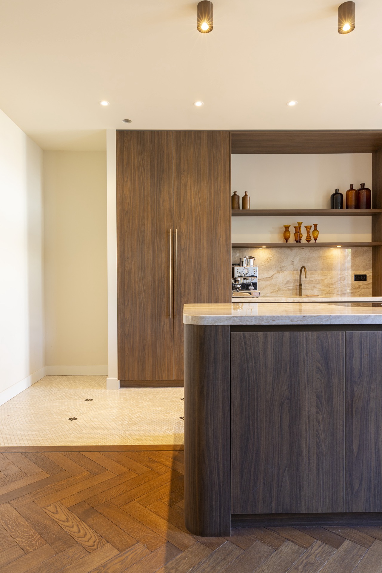
NEW 2026 Jubileum Edition The Best Interior Designers Benelux
Order Now €125