Two-tone fitted kitchen in light gray and taupe
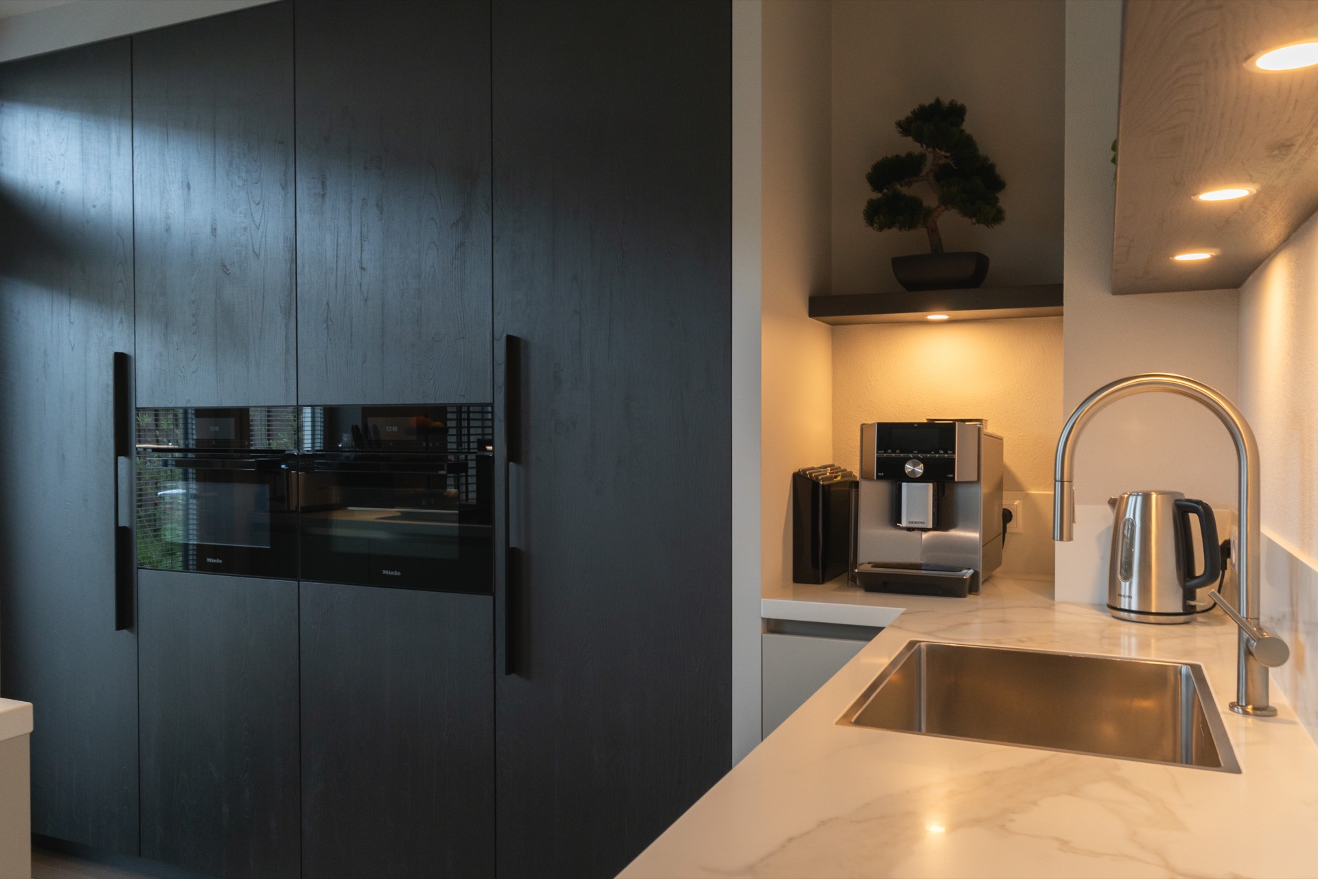
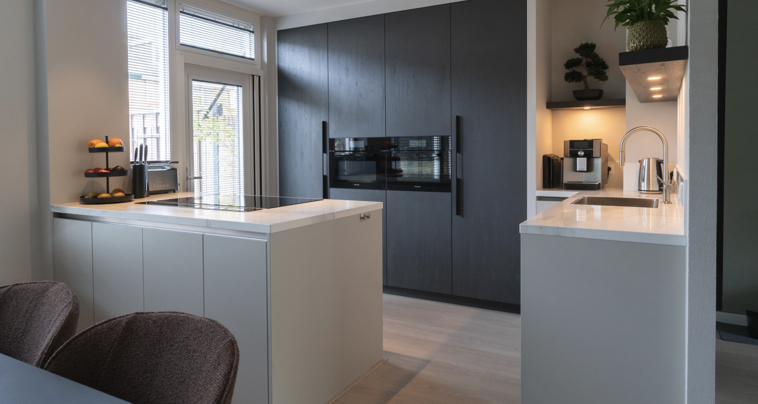
The light gray cabinet wall sets the tone straight away, especially against the taupe peninsula that projects into the room. Together they form a two-tone fitted kitchen where the contrast is visible in every line, from the tall storage wall to the open cooking zone. Dark glass fronts break up the composition and keep the built-in appliances from reading as separate elements.
Light gray on the wall, taupe at the center
The cabinet wall runs in a restrained band of light gray, with the darker appliance section tucked into the surface. In front of it, the taupe peninsula softens the overall scheme without losing clarity. This is where the room turns: one side holds the storage and preparation zone, while the other brings the cooktop forward. The result is a two-tone fitted kitchen that relies on material contrast rather than ornament, and on straight edges rather than decorative gestures.
The finish stays calm because the fronts are kept clean and the lines continue across the composition. Vertical seams add rhythm to the tall wall, while the peninsula reads as a solid block beneath the worktop. Seen from a distance, the kitchen is about order. Seen up close, it is about small changes in shade, the transition from light gray to taupe, and the way the darker inserts pull the eye toward the appliances.
The cooktop and the downdraft stay visually quiet
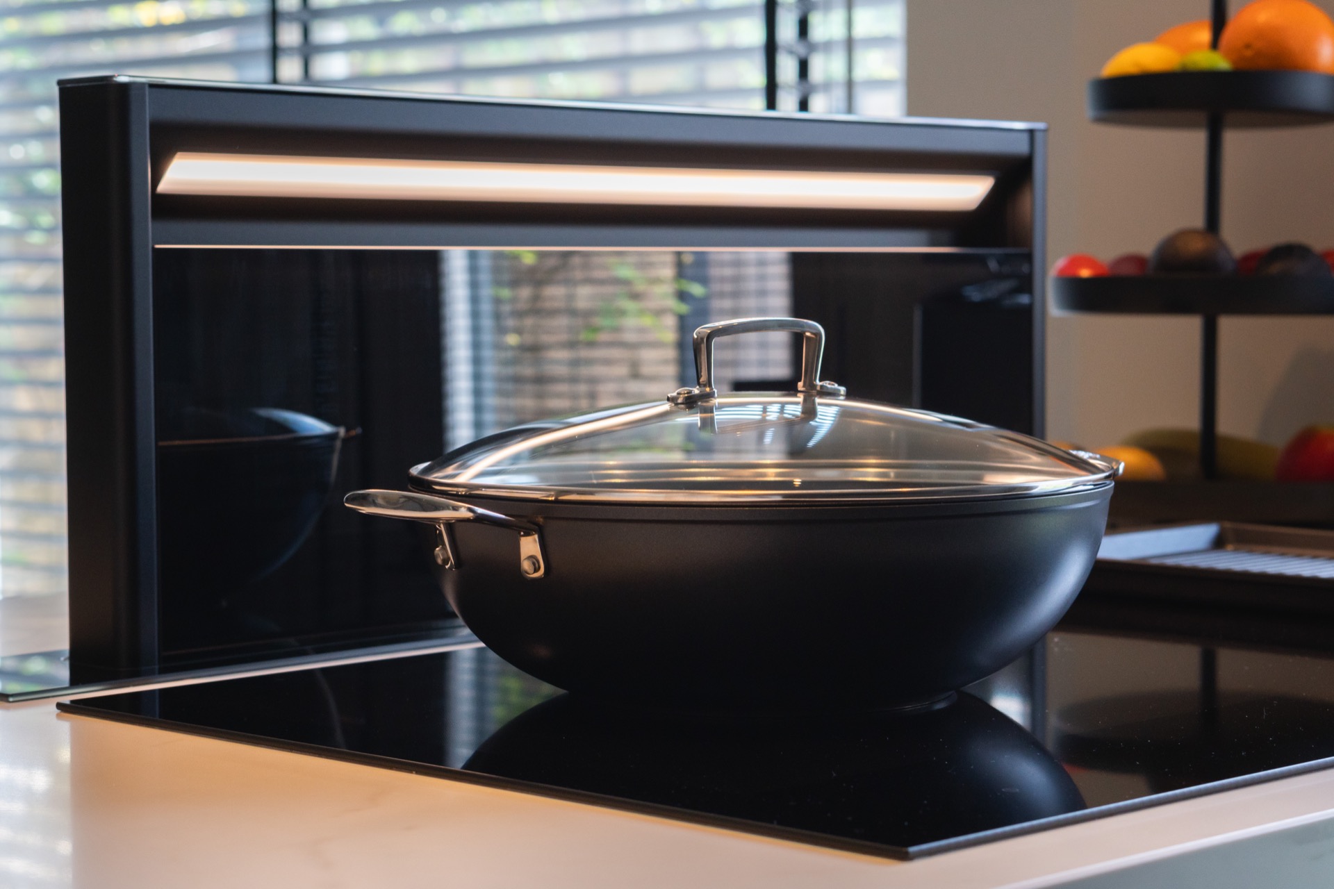
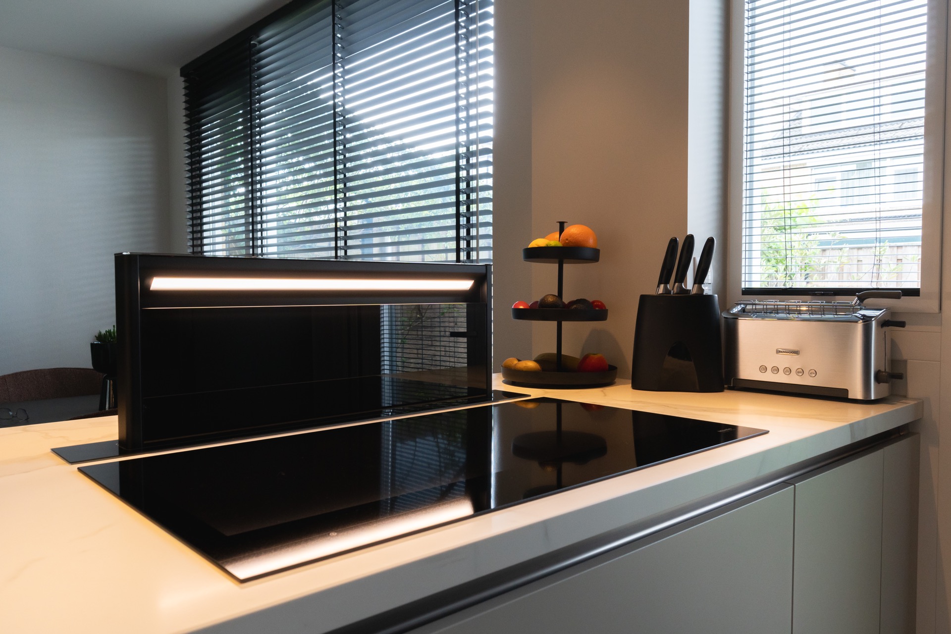
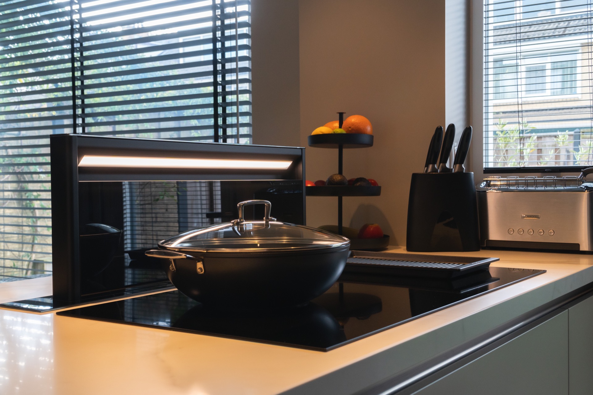
The peninsula carries a black glossy cooktop, and the extraction is built directly behind it. That downdraft in countertop disappears into the worktop when it is not in use, leaving the surface clear for the rest of the day. It is a practical detail, but also a visual one: nothing hangs above the cooking area, and the open sightline keeps the peninsula compact. In this two-tone fitted kitchen, the cooking zone stays present without taking over the room.
Integrated lighting where it matters most
Light is built into the kitchen rather than added as an afterthought. Warm integrated cooktop lighting marks the niche and the working edge, making the deep surfaces easier to read in the evening. It also draws attention to the structure around the peninsula, where the darker framing and the lit recess create a clear horizontal line. The kitchen needs that light because the palette is restrained; the illumination gives the worktop and the cook zone enough definition to feel precise.
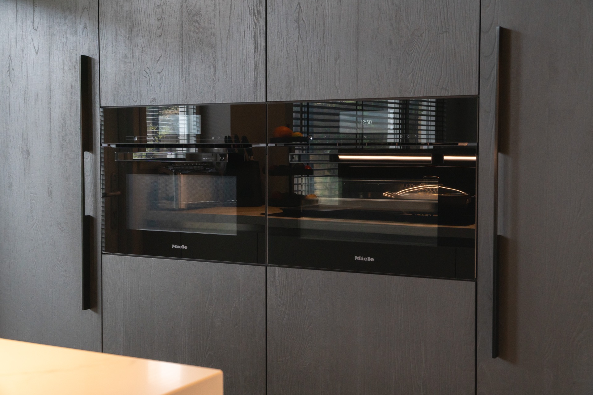
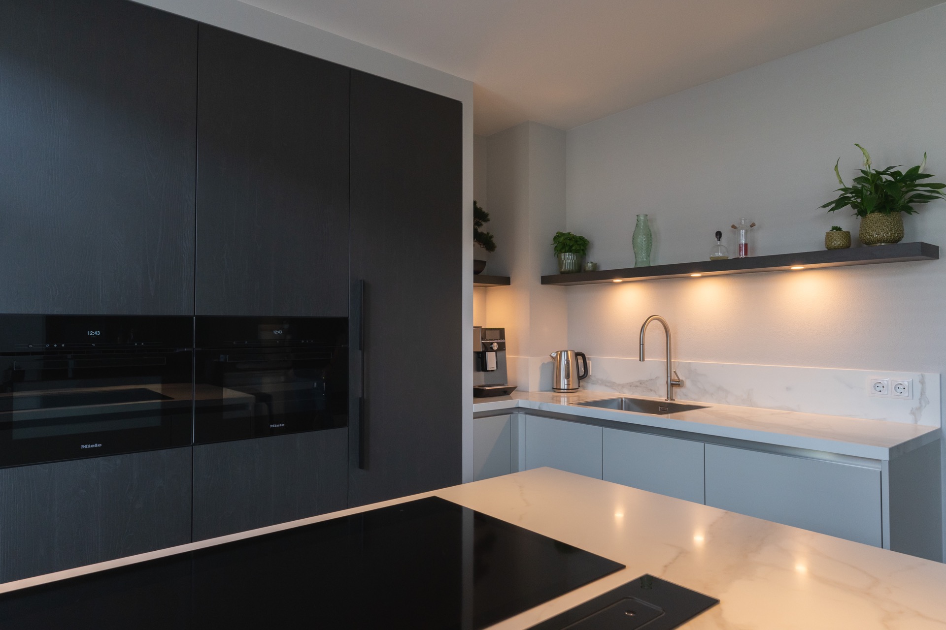
The same logic appears in the storage wall, where the dark oven and glass elements sit inside the light gray cabinet wall instead of interrupting it. A tall faucet is placed at the sink area, giving that side of the room a vertical accent against the low sweep of the countertop. The surface itself has a stone-like appearance, which helps connect the cabinet wall, the peninsula, and the sink zone into one readable layout.
Handleless fronts keep the kitchen linear
Handles are not used to break the front line, so the cabinetry stays visually flat and direct. Sleek handleless cabinetry works well here because the project depends on long horizontal runs and a limited number of materials. The storage wall can therefore read as a continuous plane, while the peninsula holds its own as a separate block. Dark appliance panels deepen the composition and prevent the lighter sections from becoming too soft or washed out.
The built-in ovens and glass fronts bring a darker note into the cabinet wall, which sharpens the contrast with the light gray surface around them. That contrast is repeated again in the cook zone, where the glossy black surface sits inside the taupe peninsula. The repetition is subtle, but it ties the room together without resorting to matching finishes everywhere. It is a two-tone fitted kitchen that uses restraint as its main tool.
Material choices that stay close to the surface
The worktop has a stone-inspired look, with a surface that reflects enough light to show its edge but not so much that it becomes shiny. Around it, the cabinetry stays matte or softly closed in tone, which lets the countertop act as a boundary line between the wall and the island. These visible layers matter more than decoration. They give the kitchen depth by separating the tall storage, the cooking peninsula, and the sink area into clear parts of the same composition.
Because the room avoids unnecessary gestures, the details do the work. The warm lighting sits inside the structure, the downdraft disappears into the counter, and the fronts remain uncluttered. Even the taupe kitchen cabinets on the peninsula feel measured rather than dominant. That is what makes the project read as a custom kitchen: the proportions, the hidden technology, and the materials all stay within one disciplined layout.
A custom kitchen built around clear use
The kitchen is not arranged around display. It is arranged around the way the work zones are used: storage in the cabinet wall, cooking on the peninsula, washing along the side with the tall faucet. Each zone has its own visual cue, yet none of them fight for attention. The black glossy cooktop, the light gray cabinet wall, and the taupe peninsula sit in a direct line of sight, so the room reads quickly and cleanly from any angle.
That directness is what gives the project its appeal. The fitted kitchen remains calm because the design choices are few and exact: two tones, built-in appliances, hidden extraction, and light placed where the eye needs it. The structure is easy to read, but it never feels bare. Instead, every surface has a role, and every material has a place in the room’s layout.
Viewed as a portfolio piece, the kitchen shows how a two-tone fitted kitchen can rely on simple contrasts and still feel rich in detail. The cabinet wall holds the darker appliances, the peninsula carries the cook zone, and the integrated lighting ties the working surfaces together. It is a kitchen where the eye moves from the light gray cabinet wall to the taupe island and back again, always guided by the lines, the light, and the hidden downdraft in countertop.
Apparatuur and details are kept close to the build: a kitchen with integrated extraction, warm lighting, and a custom ombouw that supports the layout without drawing attention to itself. The result is measured, readable, and built around the visible qualities of the surfaces rather than around display. That is what gives the two-tone fitted kitchen its strength here.
The composition closes with a clear contrast between the grounded peninsula and the taller storage wall. It is a small set of moves, but they are enough to shape the room. In that sense, the project is less about adding elements than about deciding what can disappear: the downdraft, the handles, and the excess visual noise. What remains is a practical kitchen with a sharp profile and a very controlled palette.
Want to see more of Diepeveen Keukens en Badkamers? View the page of Diepeveen Keukens en Badkamers for even more great projects and company information.



NEW 2026 Jubileum Edition The Best Interior Designers Benelux
Order Now €125