Modern Rustic Interior Design
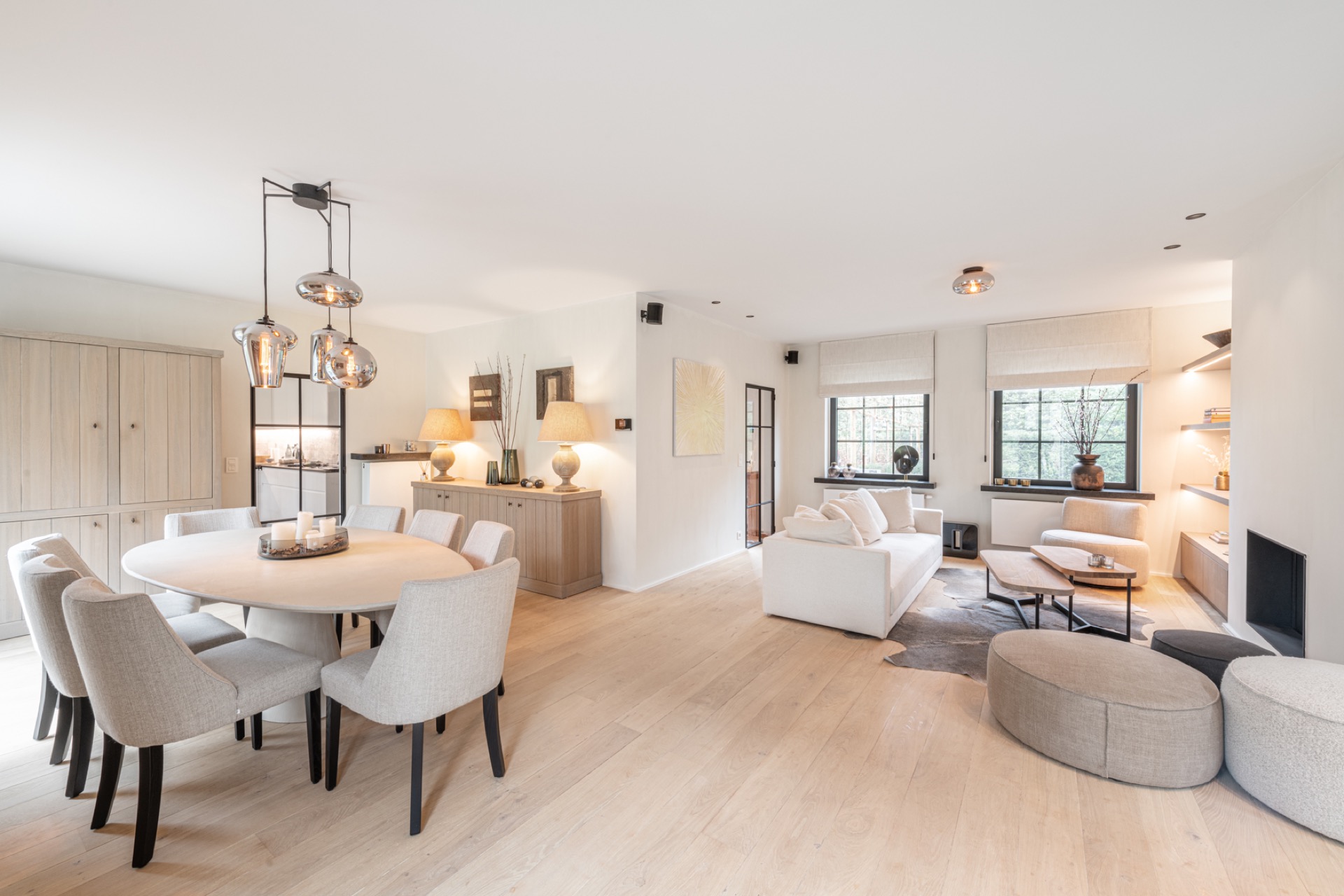
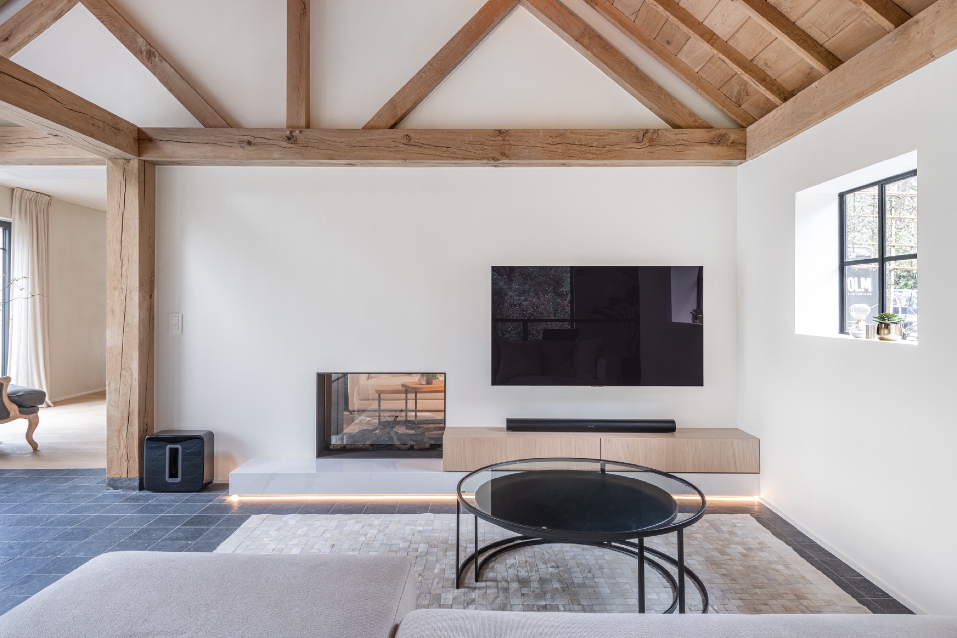
Wood beams set the tone before the joinery does. In this home, the existing structure stays visible, so the room reads as a conversation between height, timber and precise lines. The result is a modern rustic interior design that feels built from contrast rather than decoration. Across the main living spaces, integrated light strips, dark stone surfaces and pale oak surfaces keep the eye moving from one plane to the next without breaking the flow of the plan.
Wood beams and measured lines in the living spaces
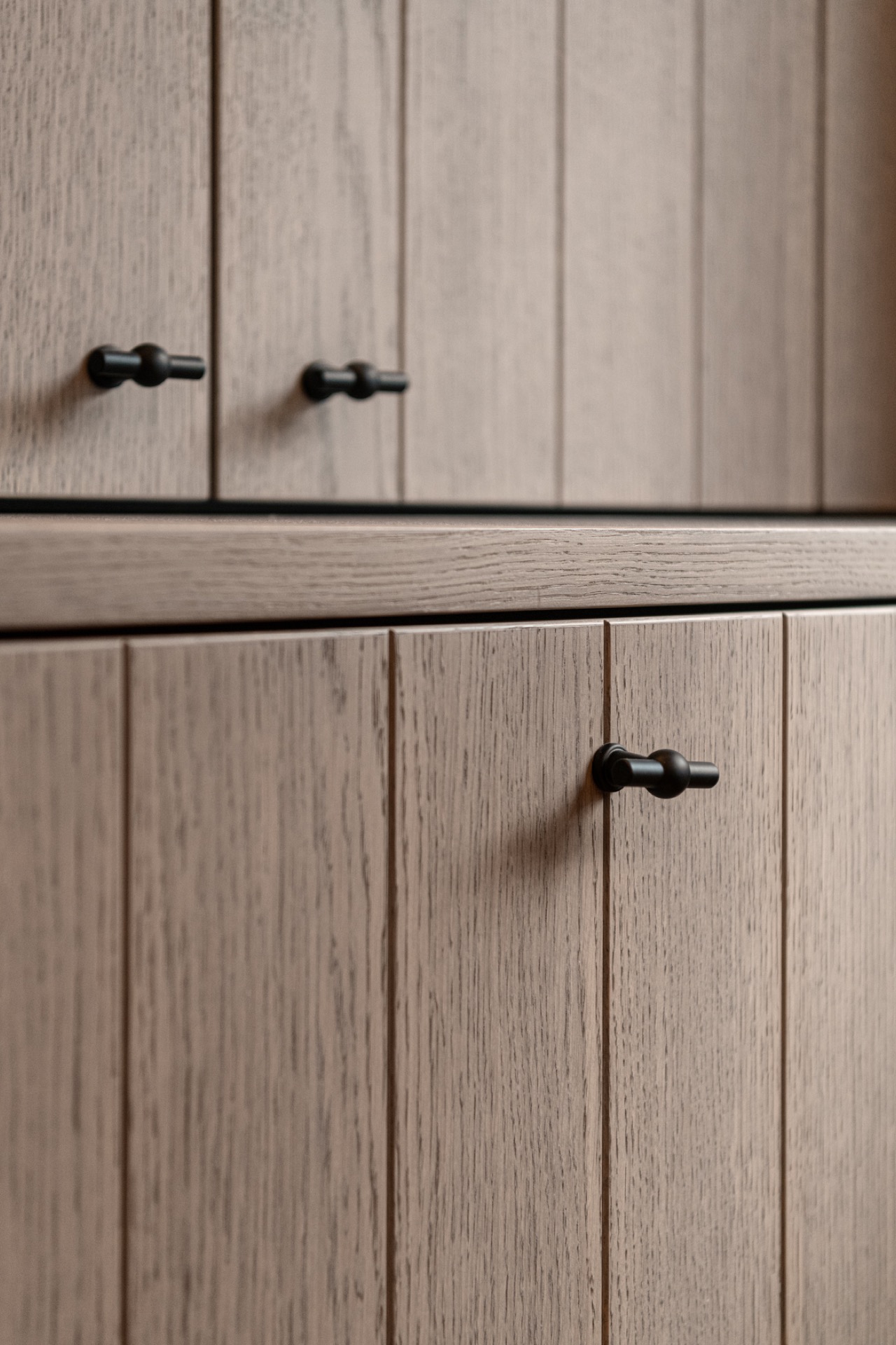
The ceiling holds its rough timber quietly, while the custom cabinetry beneath it keeps to straight edges and flush fronts. That tension is where the room becomes interesting. Oak veneer appears in fitted elements and wall units, but it never tries to imitate the beams above. Instead, it sits against them, drawing a line through the volume and giving the larger space a clearer rhythm. In several views, glass openings and black frames widen the sightlines and let the architecture stay readable.
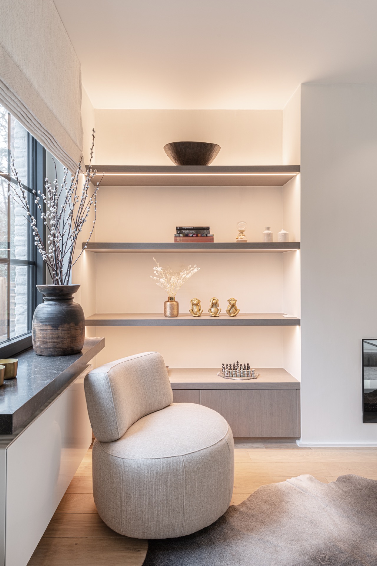
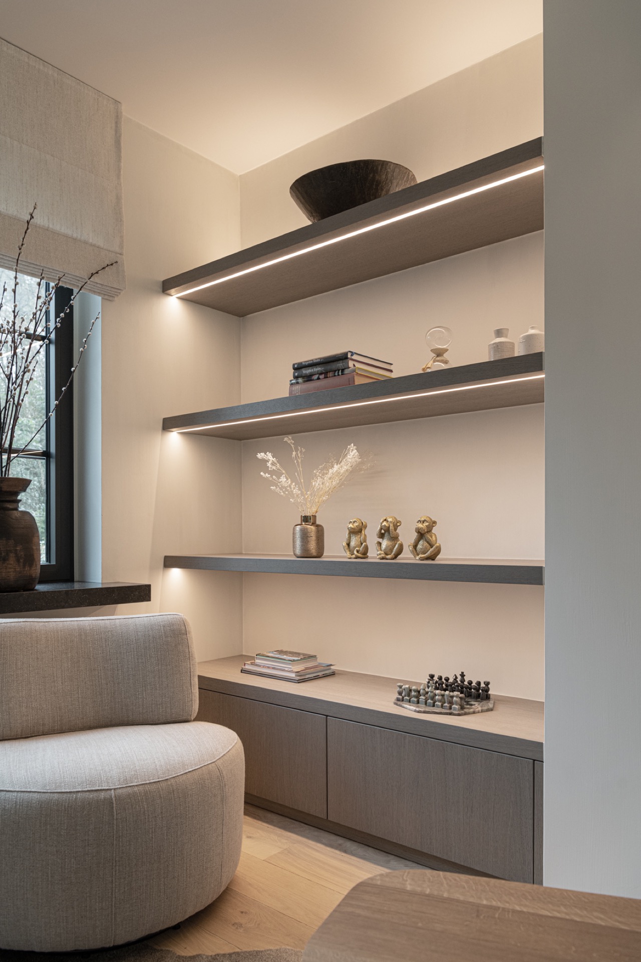
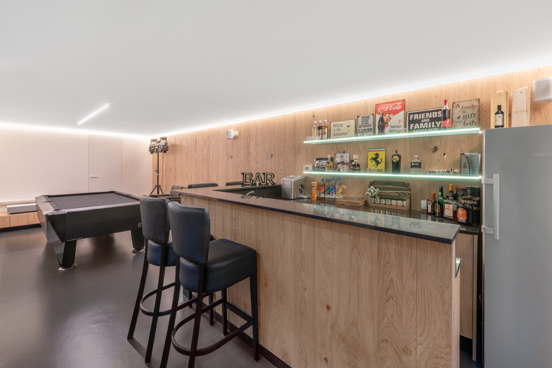
Light is built into the furniture rather than added later. Along shelves, niches and cabinet runs, LED lines trace the edges and pull the surfaces forward at night. The effect is subtle in the daylight shots and much more legible in the darker corners, where the illuminated joins turn the joinery into a spatial marker. This is one of the clearest expressions of the modern rustic interior design: the room stays grounded in timber, but the detailing is controlled and exact.
A see-through fireplace that holds the plan together
The see-through fireplace sits on a floating composite base, lifted enough to feel separate from the floor and heavy enough to anchor both sides of the room. A transparent opening lets the fire connect one living zone to another without closing either off. Because the fireplace is handled as a cross-connection rather than a focal object, it shapes circulation as much as it shapes atmosphere. The black outline and the integrated lighting below it sharpen the geometry and keep the composition from becoming soft.
From one side of the room to the other, the fireplace reads like a hinge. It marks the shift between seating areas, but the glass opening keeps both sides in view. That openness matters here: the house never turns into a sequence of closed boxes. Instead, the architecture allows rooms to borrow light and depth from each other, which is why the modern rustic interior design feels calm even when the materials are in strong contrast.
Joinery that stays quiet in the background
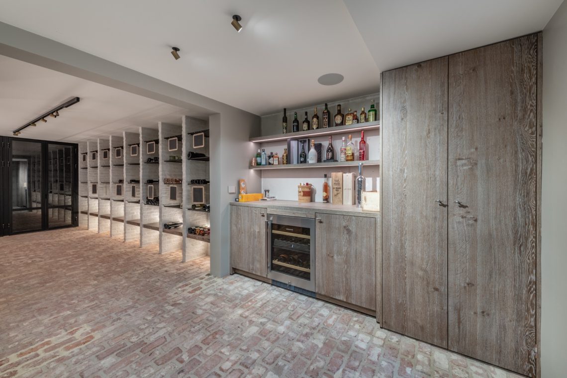
Built-in cabinets with LED lighting appear throughout the home as long, controlled surfaces. Some are set into walls; others form low runs beneath niches or sit beside darker finishes. The oak veneer gives them warmth, but the framing stays slim and the lines stay straight. That restraint lets the more textural parts of the house, such as the rough beams and the stone-like flooring, remain visible. The joinery never competes with them. It gives them order.
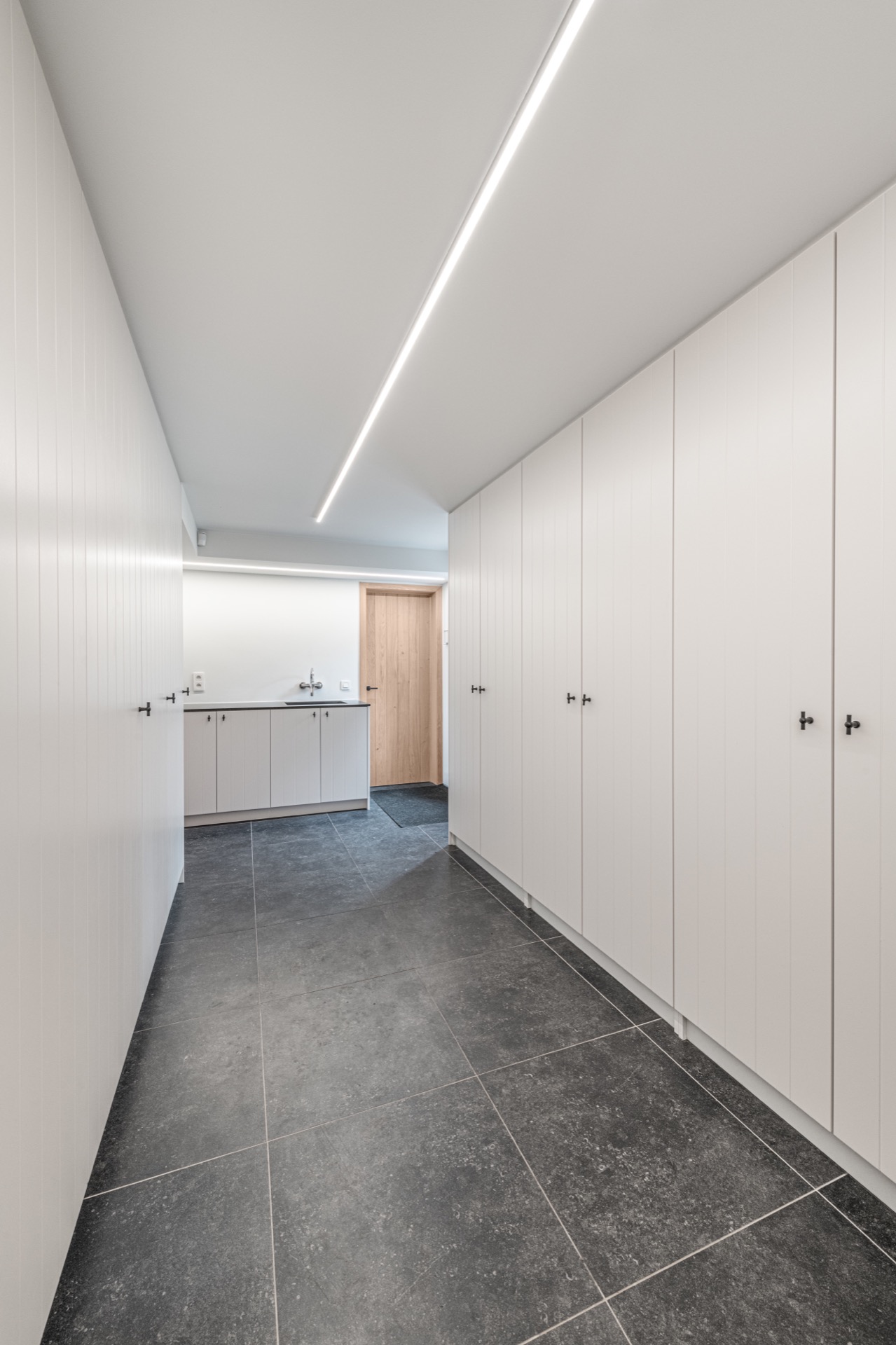
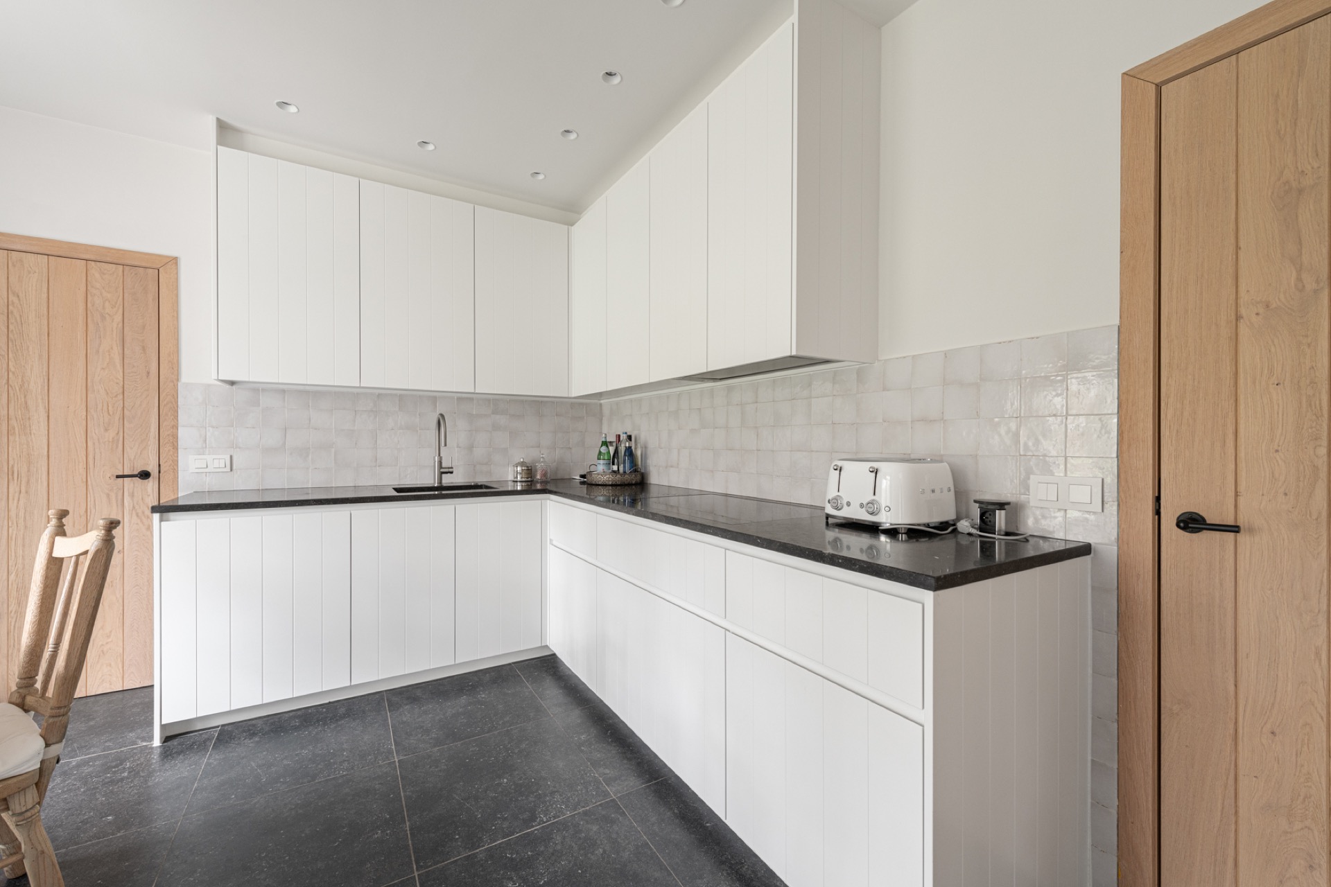
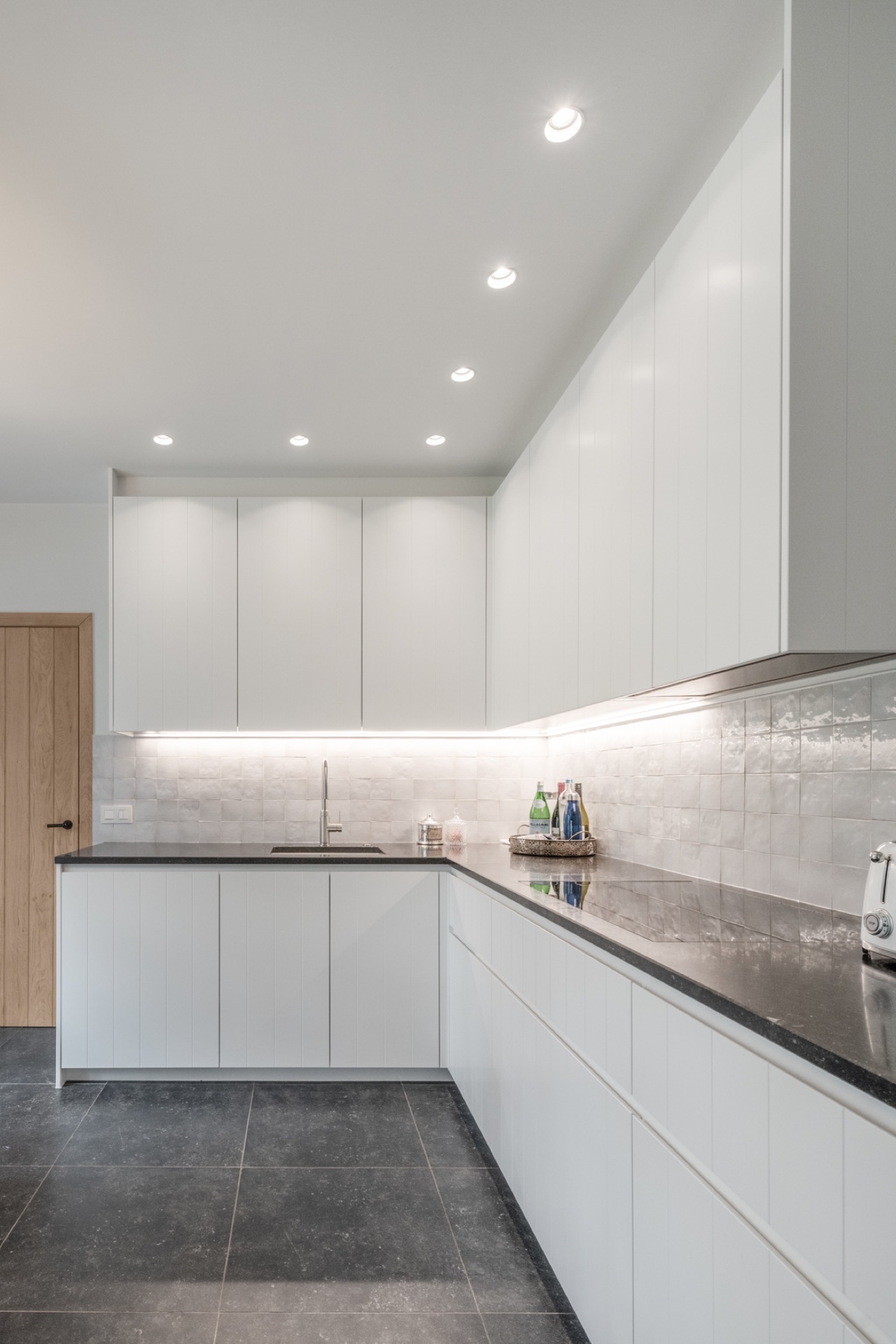
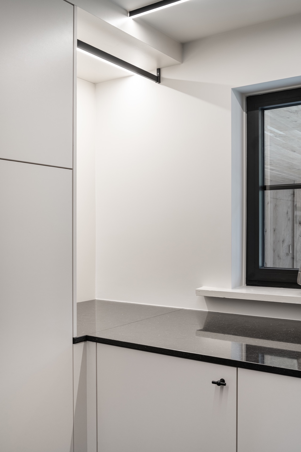
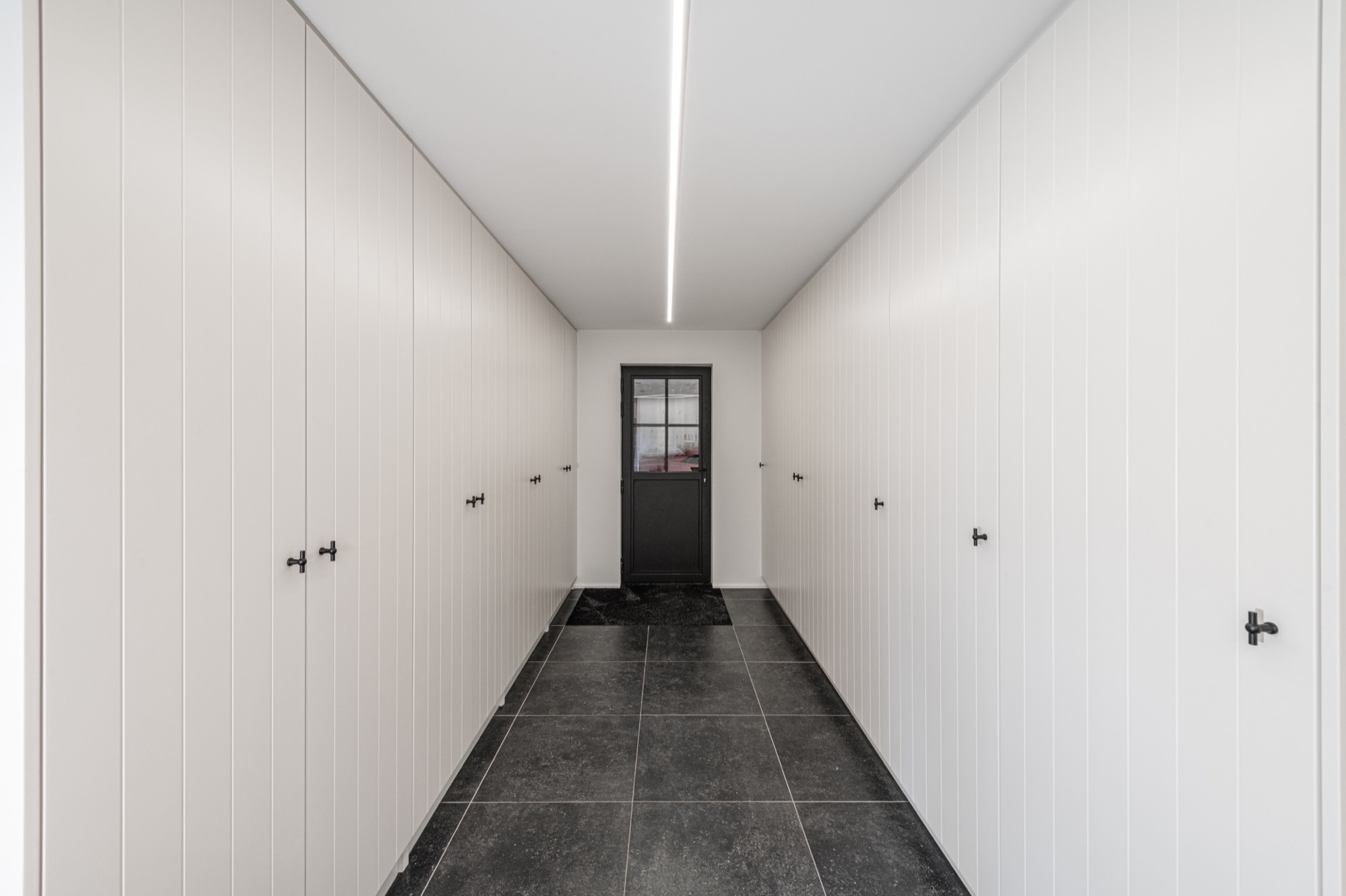
In the utility and back-of-house areas, the cabinetry becomes cleaner still. White fronts without handles run up to the ceiling, while a black composite countertop cuts across the base like a dark line. The contrast is immediate. Against the lighter wall surfaces, the worktop and the cabinet gaps make the room easy to read. A backdrop of small Moroccan zellige tiles adds movement without turning the space busy, a small shift in surface that catches the light.
Handleless white kitchen with a dark worktop
The handleless white kitchen keeps its profile flat from one cabinet to the next. There are no decorative interruptions, just front planes, joints and the length of the black composite countertop. The countertop gives the space weight and defines the work zone clearly, while the lighter tile behind it softens the change between wall and cabinet. It is a practical room, but the materials give it a sharper presence than a standard utility area. Every surface is doing a job in the composition.
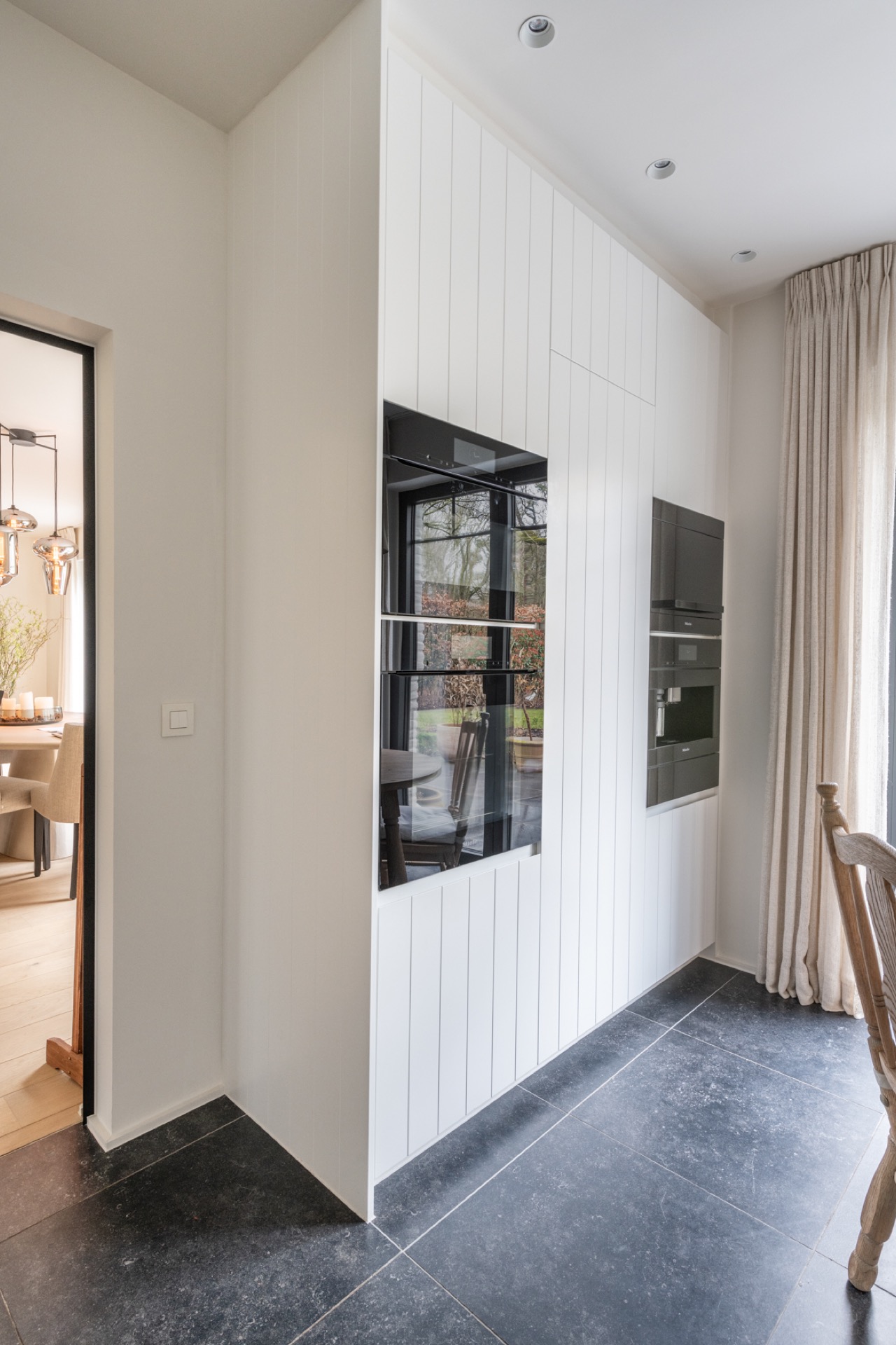
Further into the service spaces, the same discipline continues in tall white storage walls and recessed lighting. The ceiling spots and the cabinet fronts draw the eye upward, making the room feel taller than the footprint suggests. These areas may sit behind the main living spaces, yet they carry the same logic: reduce noise, keep edges clear, and let the material differences do the speaking. That approach ties the kitchen and utility zone back to the wider modern rustic interior design.
Concrete-look bathrooms with oak details
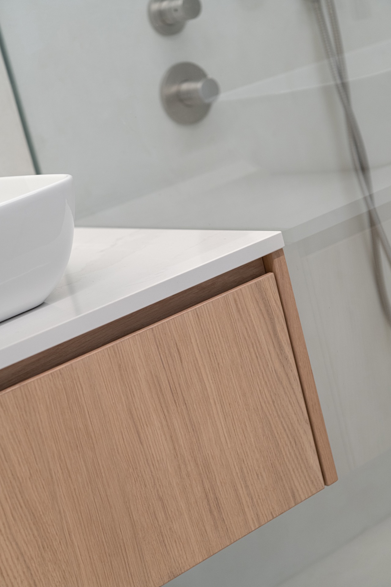
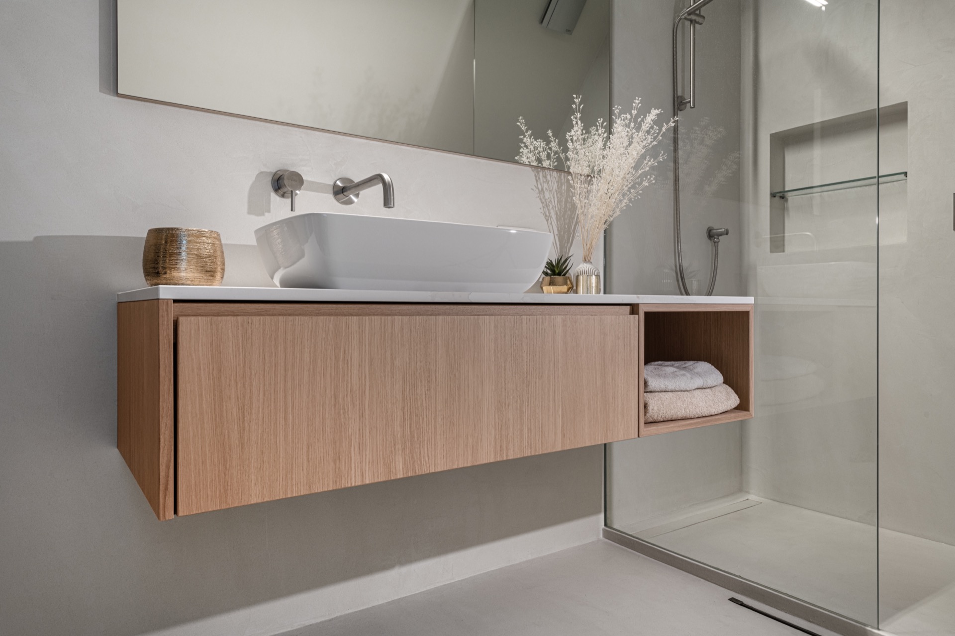
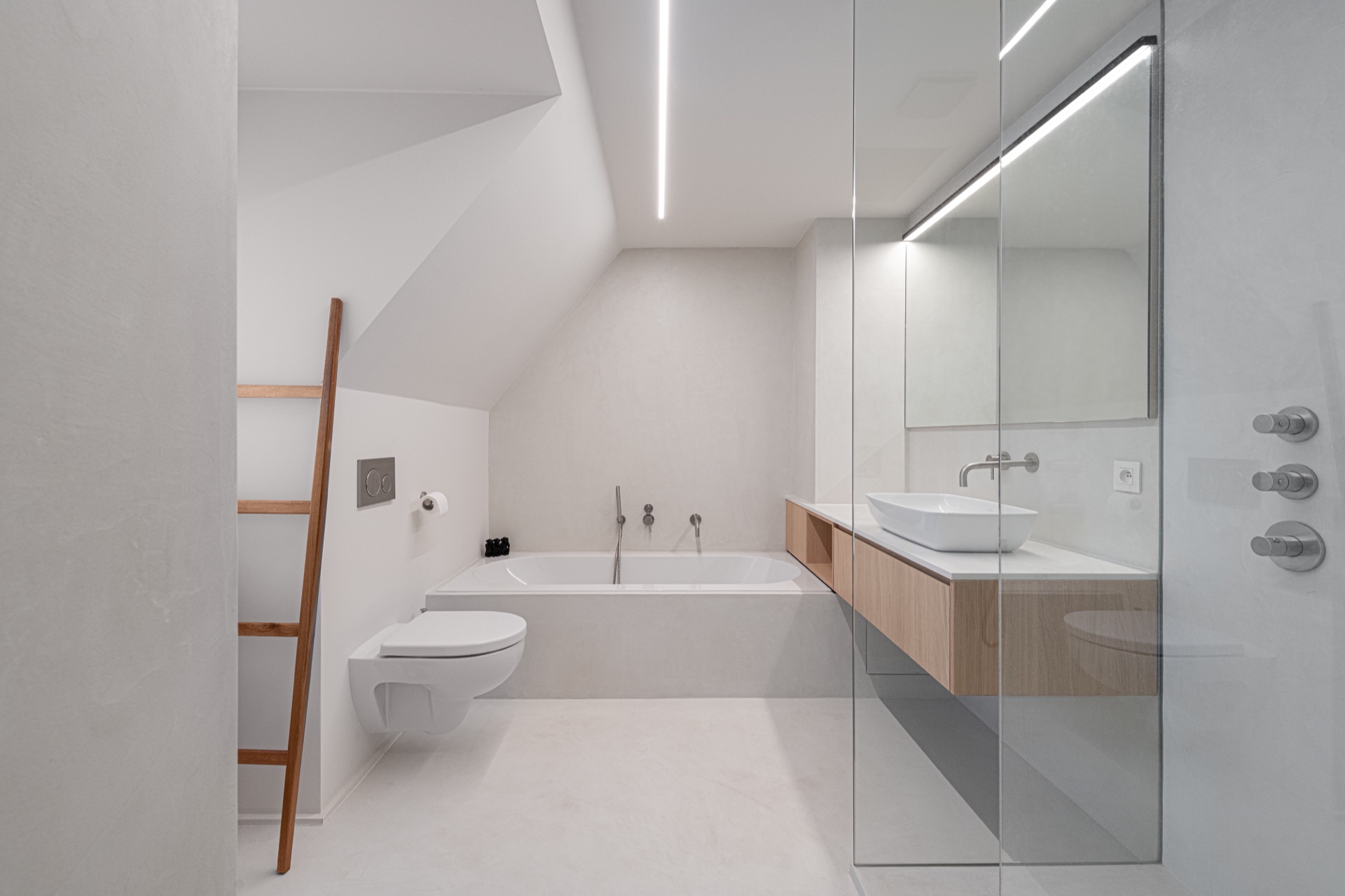
In the bathrooms, mortex covers the surfaces in a continuous concrete look. The finish is muted rather than polished, so the rooms hold their light gently and avoid sharp reflections. Against that pale, mineral backdrop, the oak veneer vanity stands out by tone alone. It does not need extra profile or decoration. The grain and the join lines are enough to give the furniture a place in the room. Glass shower partitions keep the volume open and allow the materials to stay visible from corner to corner.
The bathroom layout relies on recessed niches and integrated furniture, which keeps the floor area clear and the walls legible. Because the basin furniture is built in rather than placed in the room, the surfaces read as one continuous sequence. That makes the contrast between the concrete look bathroom finish and the timber cabinetry even more direct. The effect is restrained, but not flat. Light catches the subtle shifts in surface and gives the room depth without adding ornament.
Glass partitions, dark frames and open views
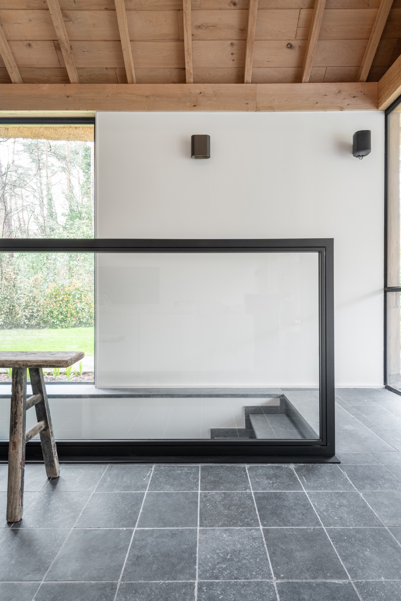
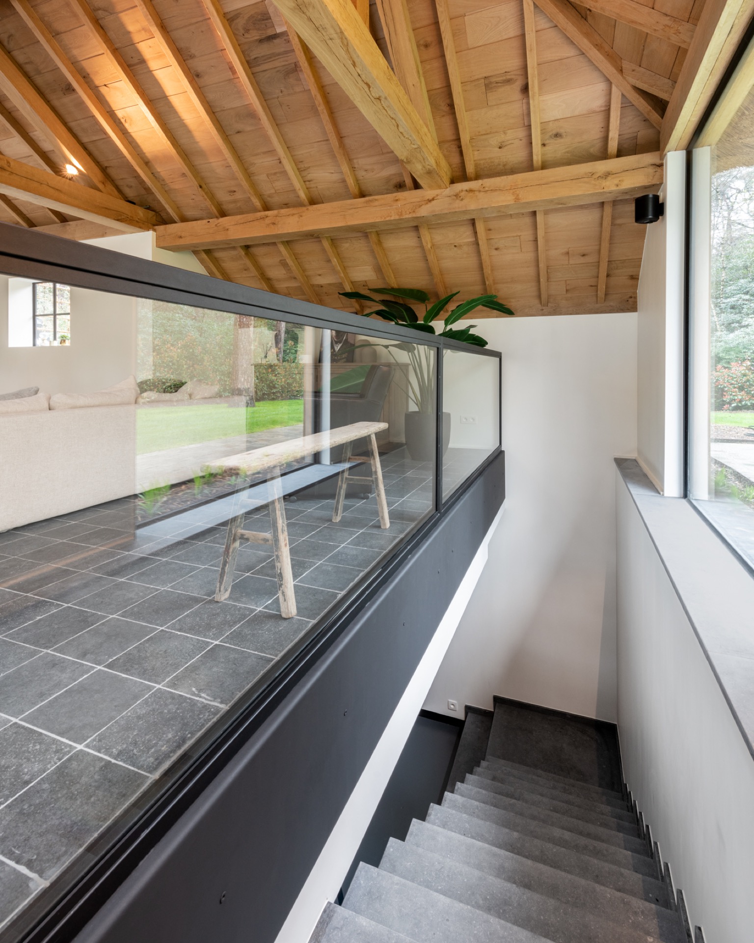
Several interior views use glass partitions and black-framed openings to extend the line of sight. The frames are thin, but they have enough presence to mark transitions between rooms and covered outdoor areas. In the overlaid views, dark tile floors continue beneath timber ceilings, and the change in material underfoot signals the shift from one zone to another. The glass keeps that shift visible, which is why the circulation feels open instead of fragmented.
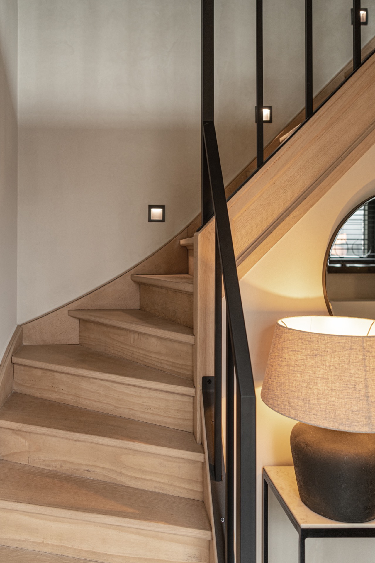
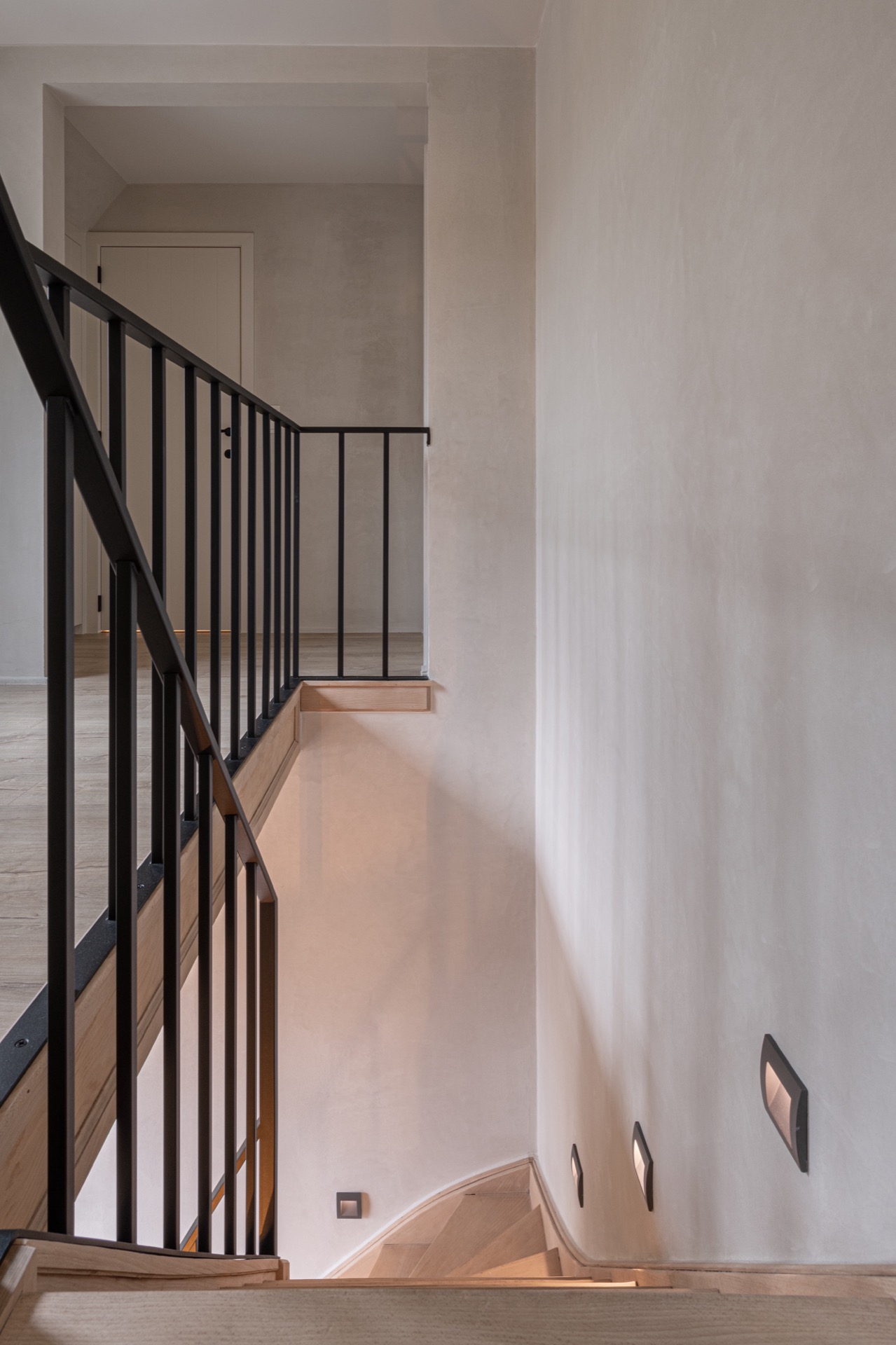
Black accents also appear in the stair balustrade, where slender vertical bars contrast with the wooden treads. The stair reads as part of the same material language as the rest of the house: timber, dark lines, measured light. Nothing here is overworked. The strength of the project lies in how consistently those elements repeat in different rooms, from the fireplace wall to the utility run to the bathroom vanities. That repetition, handled with restraint, is what gives this modern rustic interior design its clarity.
Where contrast becomes the quiet structure of the house
The most successful moments in the project come from places where rough and refined surfaces meet without trying to smooth each other out. Timber beams stay visible. Oak veneer cabinetry stays linear. Dark composite, tile and mortex surfaces hold their own against the lighter elements. Rather than settling into one finished look, the house keeps those differences legible. That is what allows the rooms to feel settled: not sameness, but a clear order of materials, light and openings.
Seen as a whole, the house is defined by that order. The fireplace links spaces instead of dividing them. The cabinetry lifts into the walls and then disappears. The bathrooms keep to a mineral finish, while the kitchen uses white fronts and a black countertop to sharpen the working edge. It is a measured interior, but never severe. The structure, the joinery and the light all work together to keep the modern rustic interior design grounded in the architecture itself.
Want to see more of STOLM Totaalinterieur? View the page of STOLM Totaalinterieur for even more great projects and company information.

NEW 2026 Jubileum Edition The Best Interior Designers Benelux
Order Now €125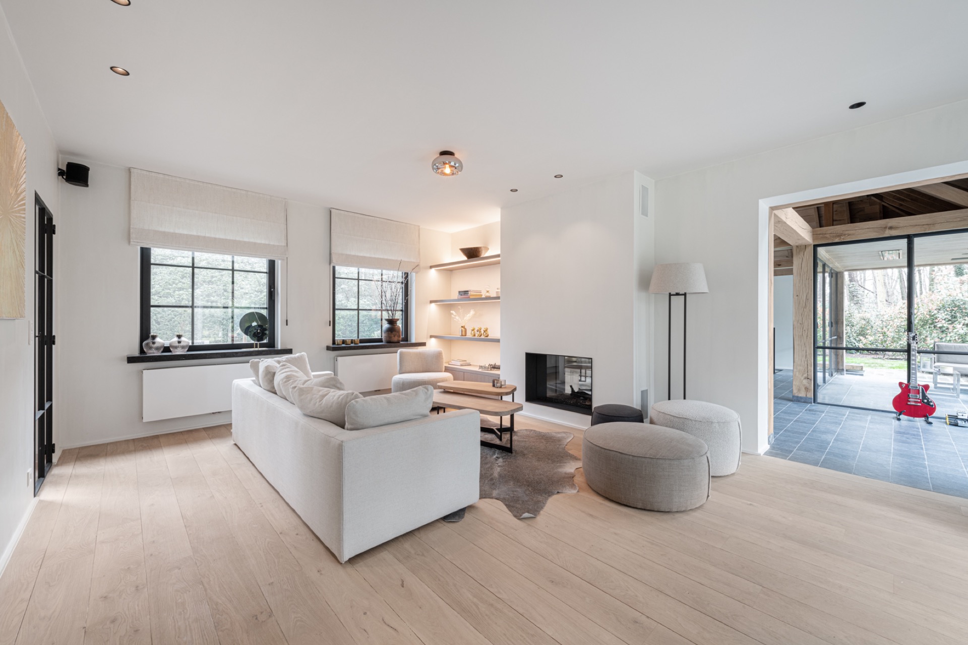
NEW 2026 Jubileum Edition The Best Interior Designers Benelux
Order Now €125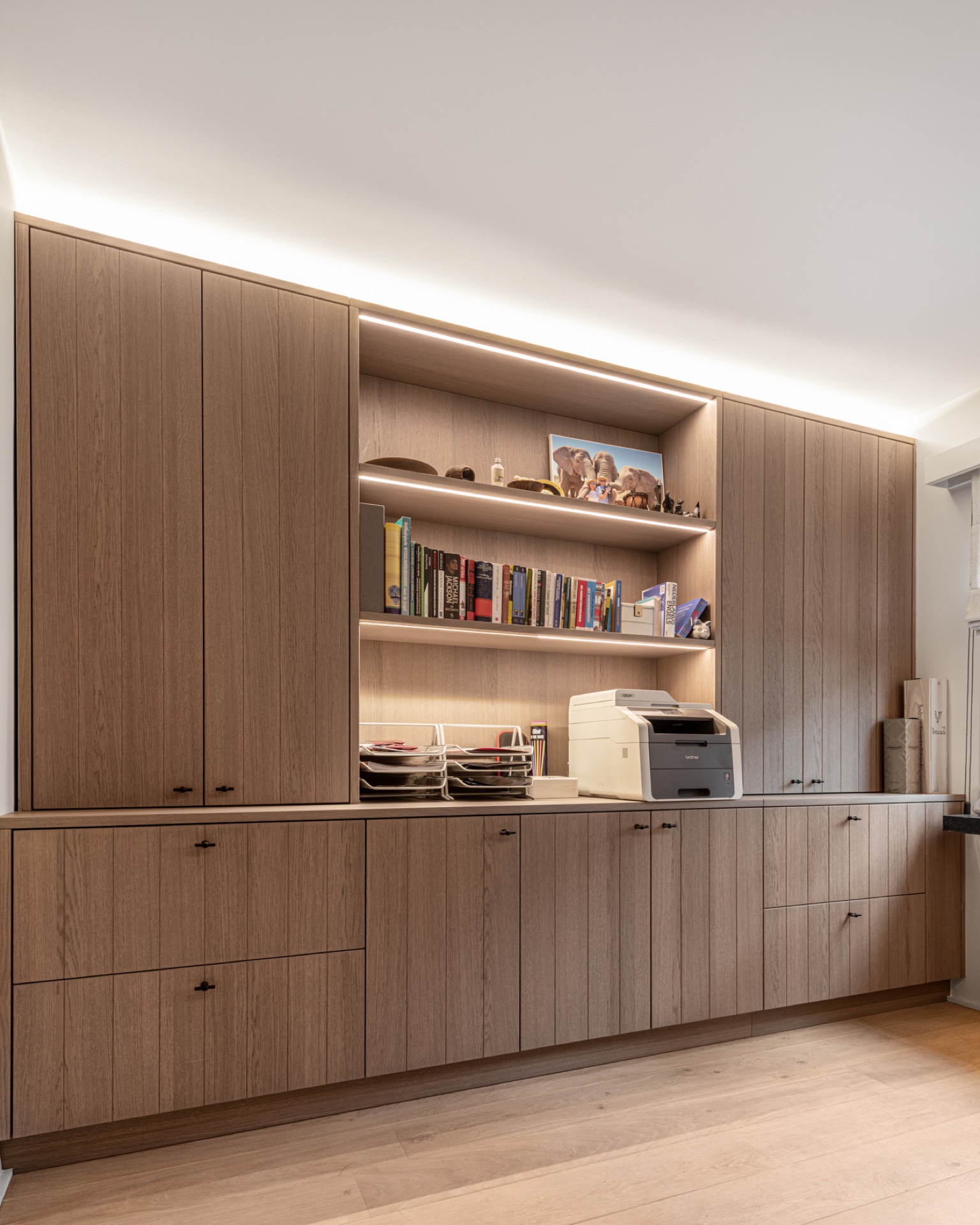
NEW 2026 Jubileum Edition The Best Interior Designers Benelux
Order Now €125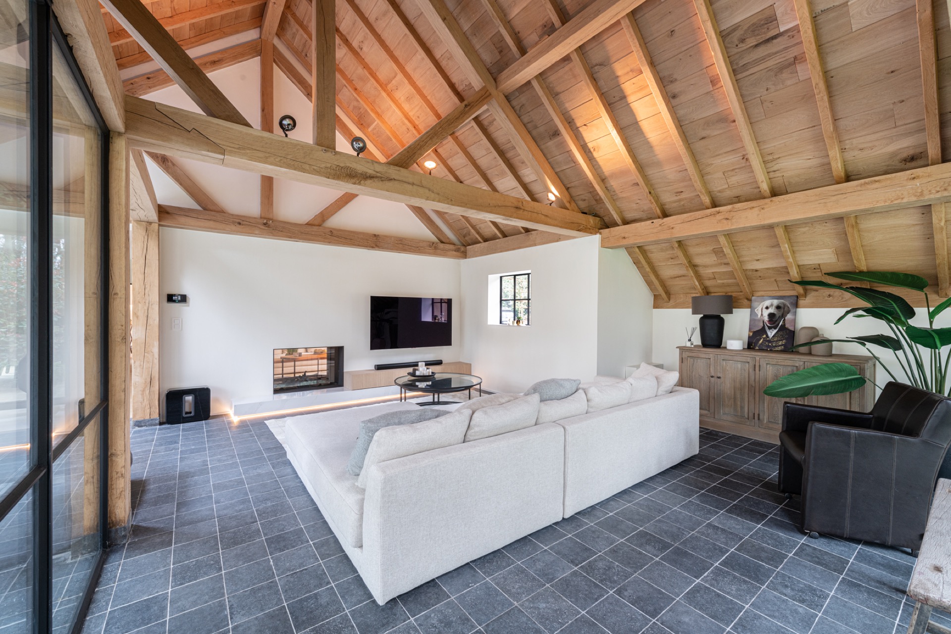
NEW 2026 Jubileum Edition The Best Interior Designers Benelux
Order Now €125
NEW 2026 Jubileum Edition The Best Interior Designers Benelux
Order Now €125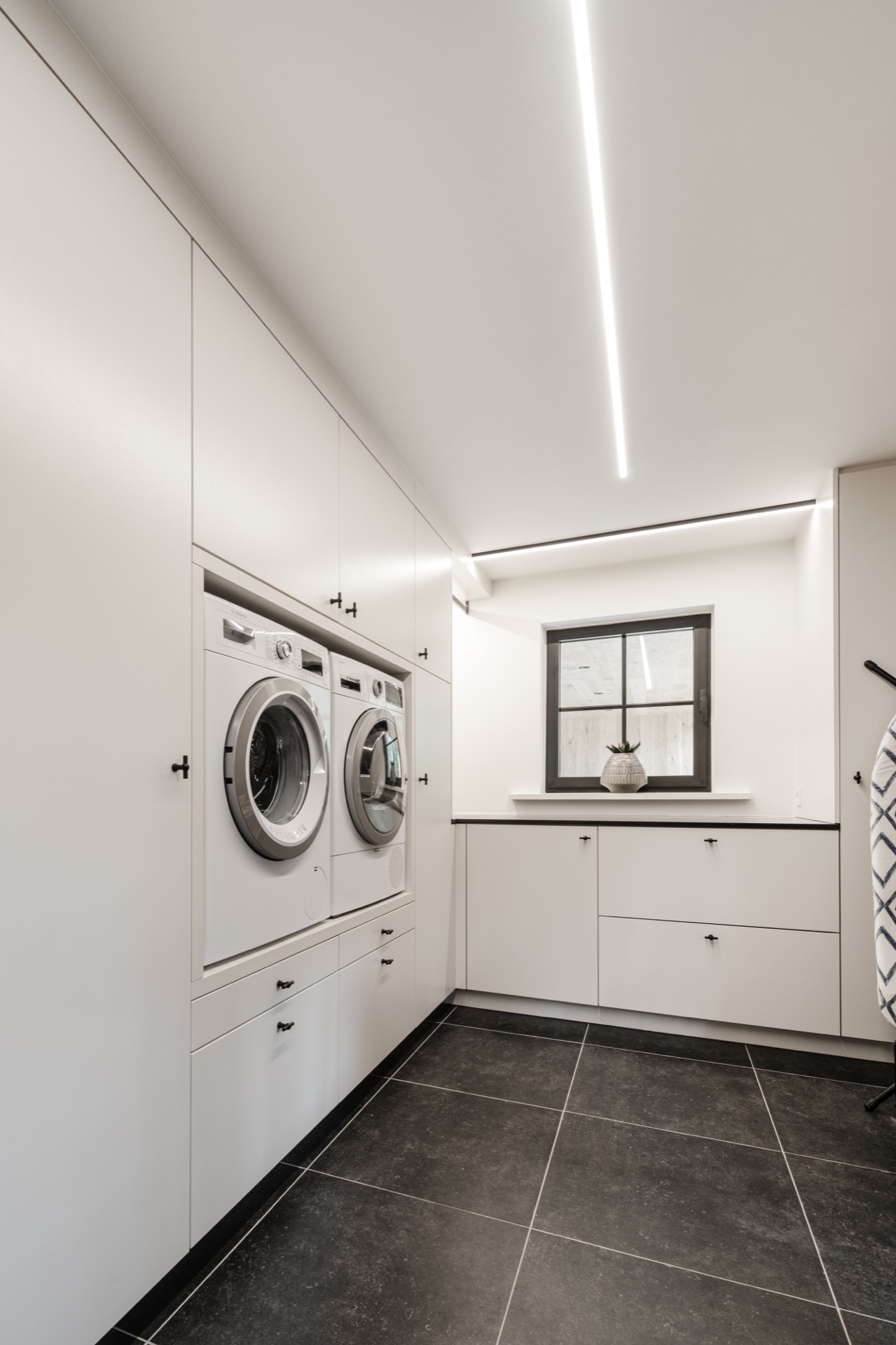
NEW 2026 Jubileum Edition The Best Interior Designers Benelux
Order Now €125