Renovated apartment with minimalist interior
Arched openings pull the eye through the rooms before it settles on the water beyond. In this renovated apartment with minimalist apartment interior, the clearest gesture is restraint: fewer objects, longer sightlines, and surfaces that let daylight take over. The layout feels edited rather than filled, with pale walls, built-in lines, and a steady move from the living area toward the balcony view.
Arched openings and daylight shaping the plan
Large windows and arched openings shape how the apartment is read. They soften the straight geometry of the rooms and keep the views open from one zone to the next. Daylight reaches deep into the interior and lands on matte cabinet fronts, stone edges, and light upholstery before moving across the floor. Because the openings are broad and curved, the apartment reads less as a set of separate rooms than as a connected sequence oriented around light.
The renovation uses that openness as its main tool. Instead of filling corners or breaking the plan with freestanding pieces, it leaves space between objects. A window frame, a niche, or the edge of a bench becomes visible in its own right. That quiet spacing is what keeps the minimalist apartment interior legible. The glazing, the terrace line, and the pale wall surfaces all work together to hold the view in the background without pushing it forward too aggressively.
A neutral palette with warm accents
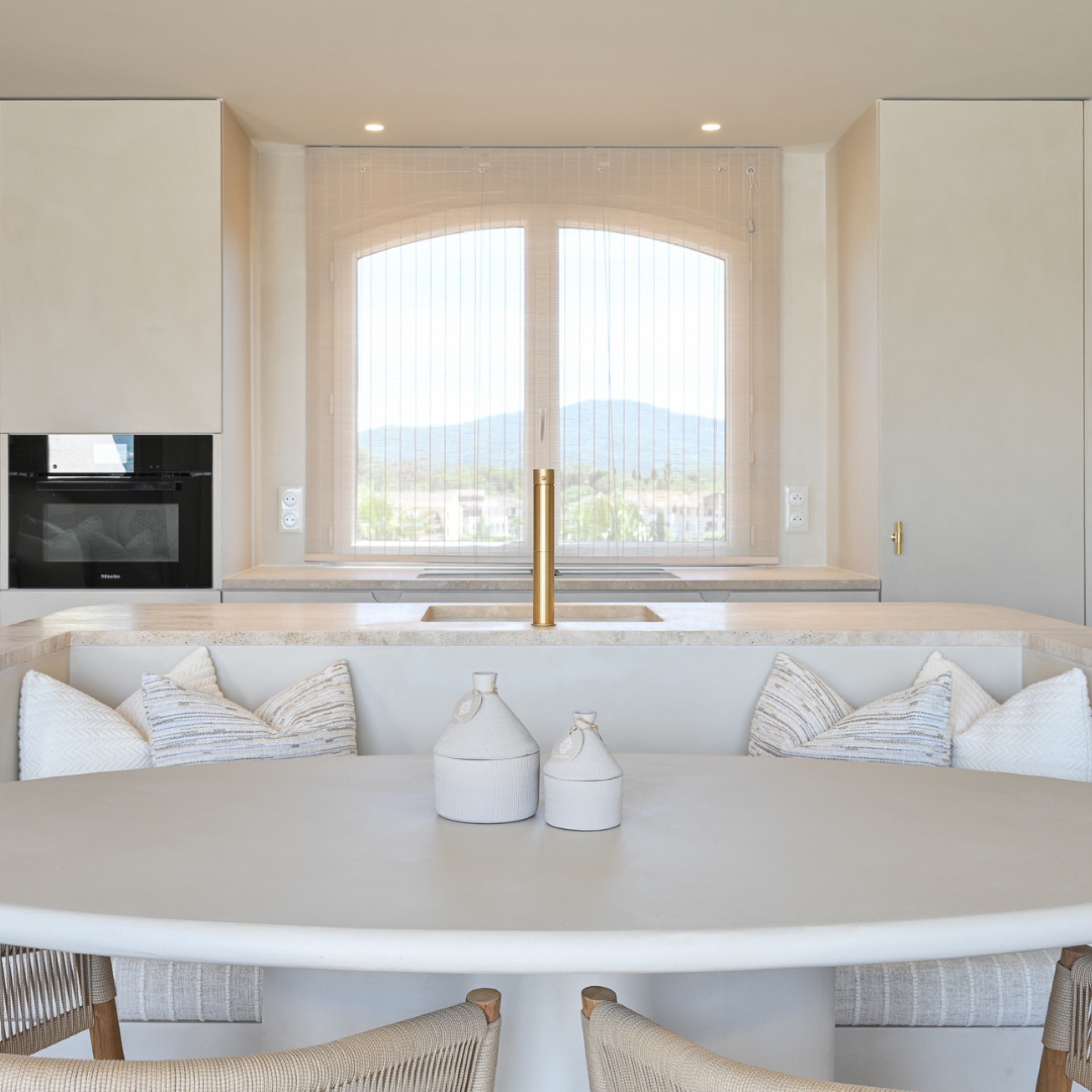
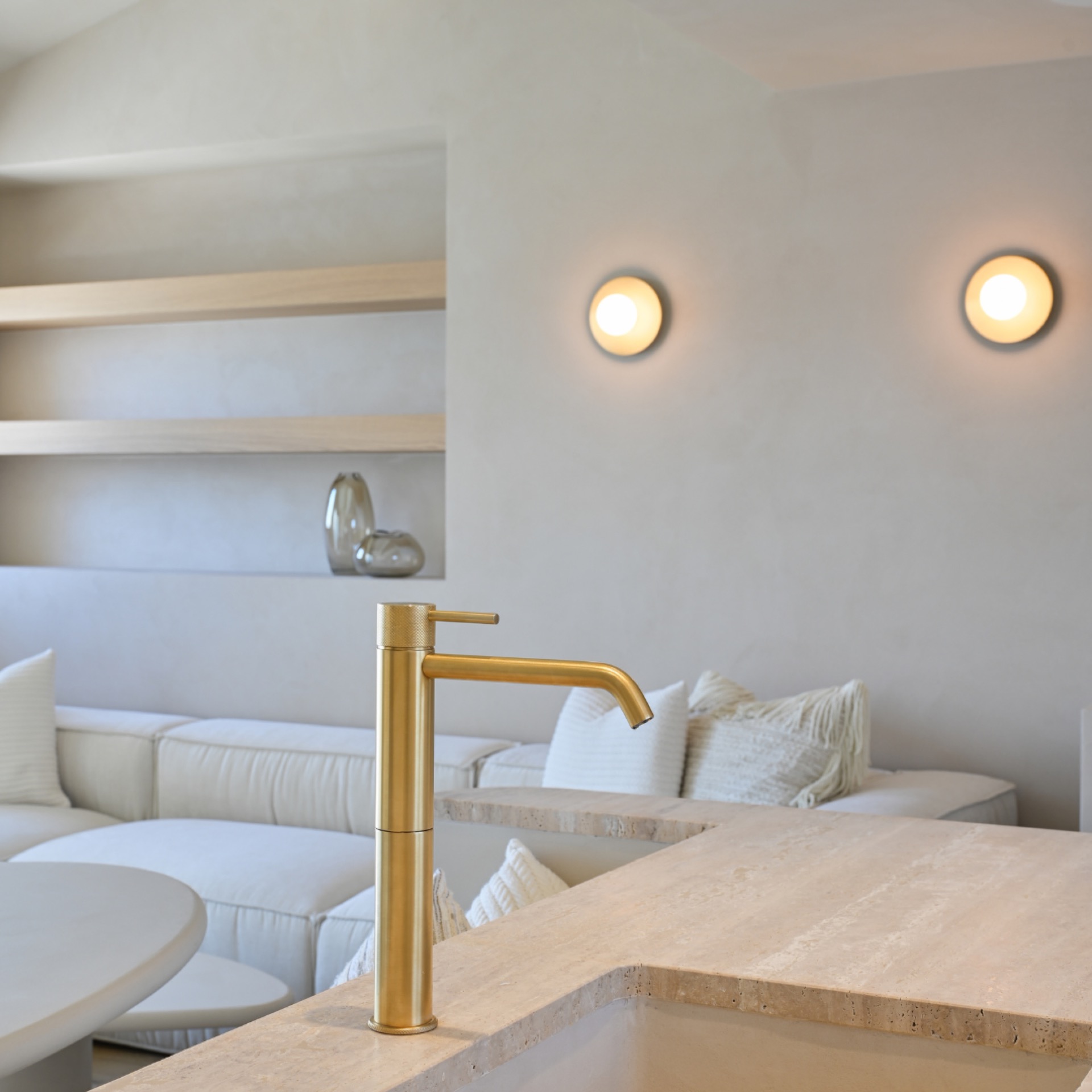
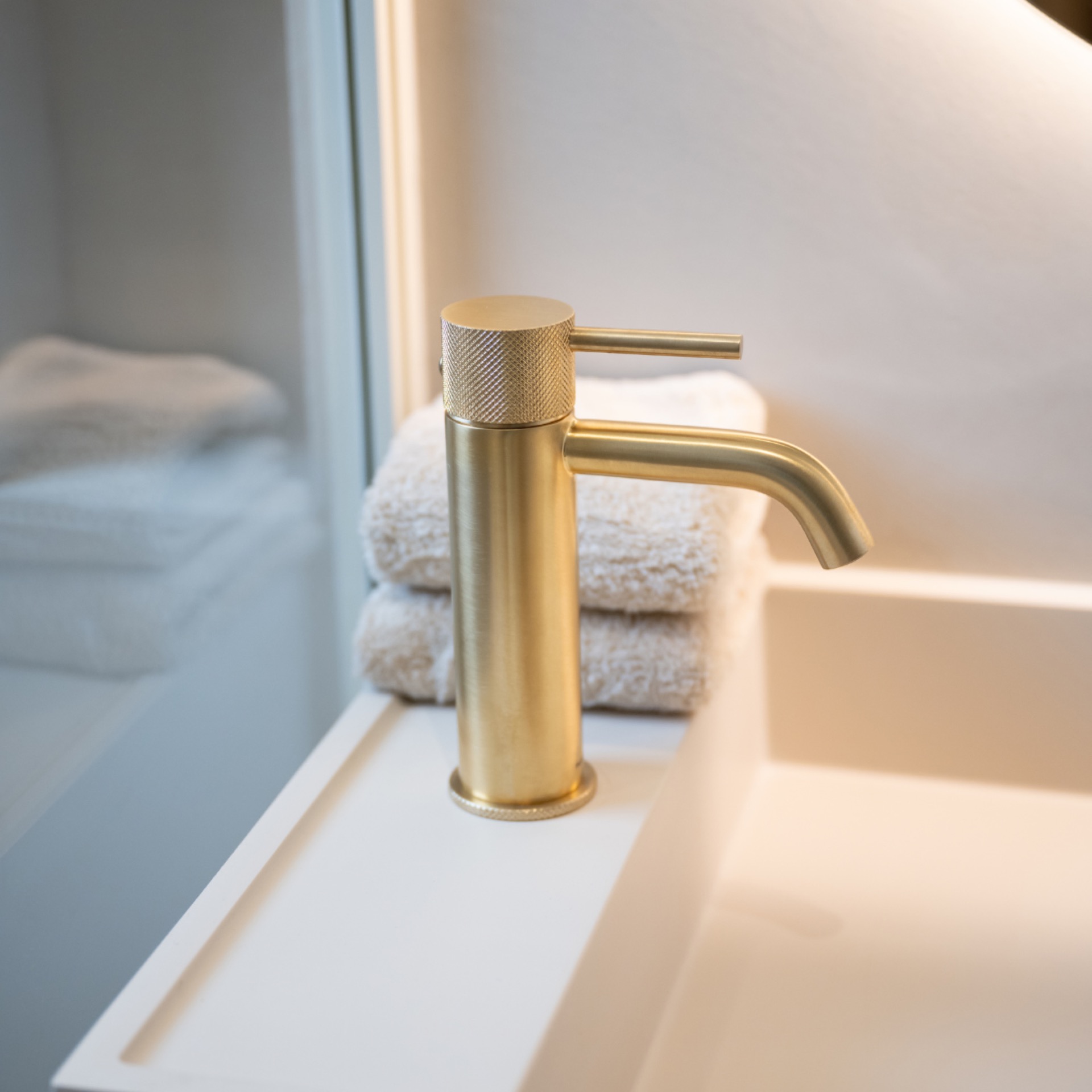
The material palette stays close to white, cream, sand, beige, and soft stone tones. Against that base, gold details mark a few points in the apartment: a faucet, slim handles, and narrow metal trim. These accents are most visible in the wet zones and on storage fronts, where they catch light at eye level and give the surfaces a sharper edge. The result is restrained, but never flat. Every reflective detail has a role in the room.
In the living areas, pale upholstery and light-toned walls hold the brightness coming in from the windows. The metal touches shift that brightness slightly, adding a fine line of sheen without taking over the composition. This neutral palette with warm accents gives the apartment a readable rhythm. Soft planes are followed by a harder edge, then a niche, then a slender line of metal. The sequence repeats without becoming predictable.
Built-in niches and cabinetry keep the floor clear
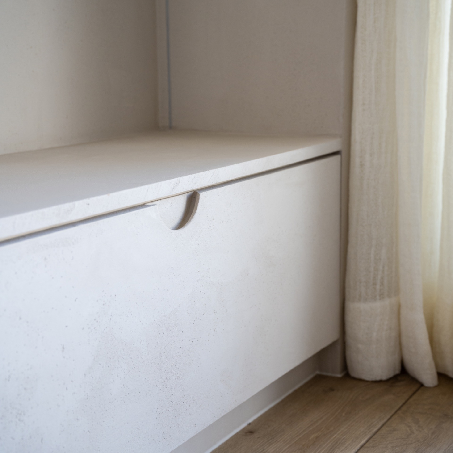
Built-in niches and cabinetry do much of the quiet work in the apartment. Rather than adding free-standing storage, the renovation folds cupboards and wall recesses into the architecture. That keeps the floor open and lets the rooms hold more light. It also makes the joinery part of the room’s structure, not an extra layer applied on top. The cabinetry sits flush, and the recesses create depth without visual clutter.
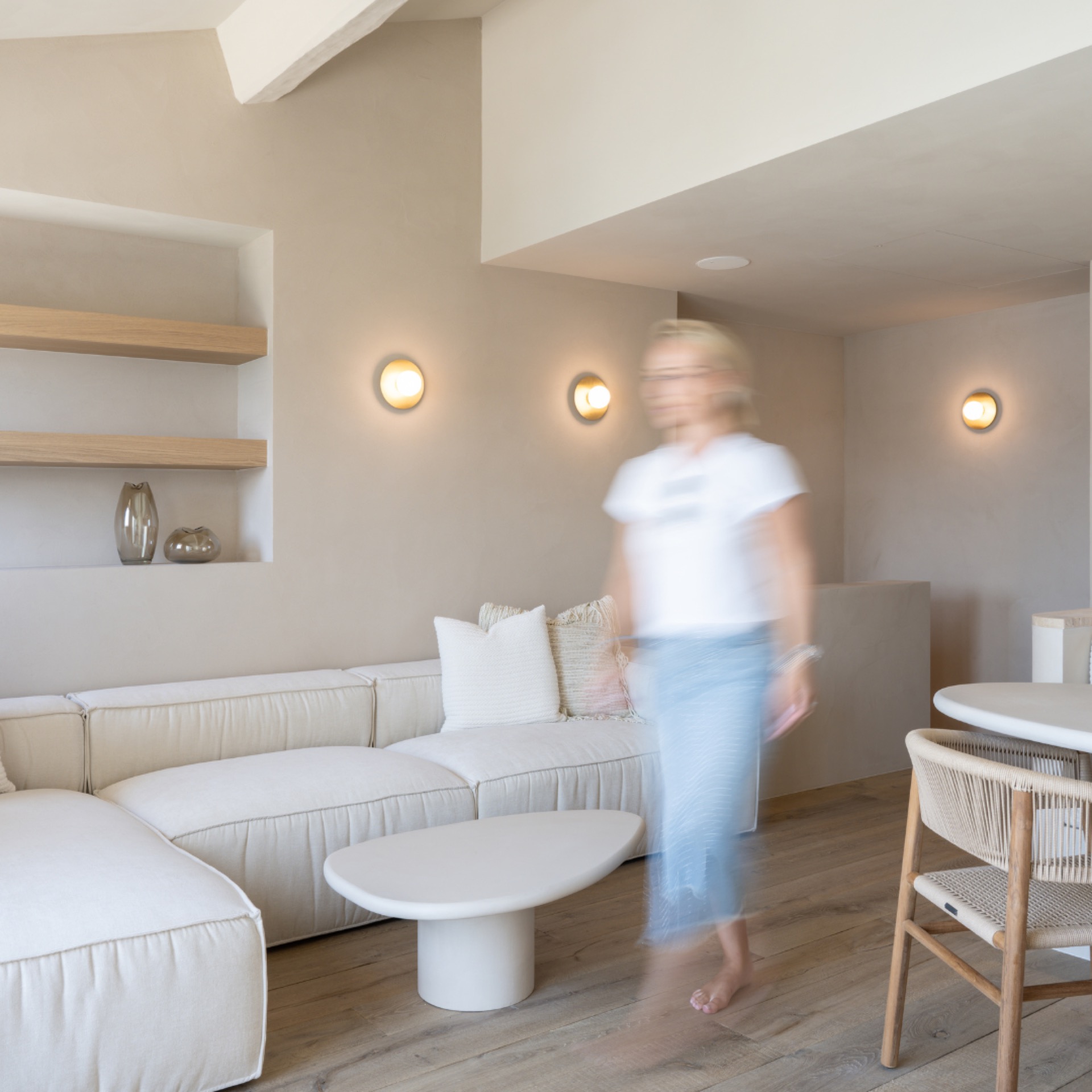
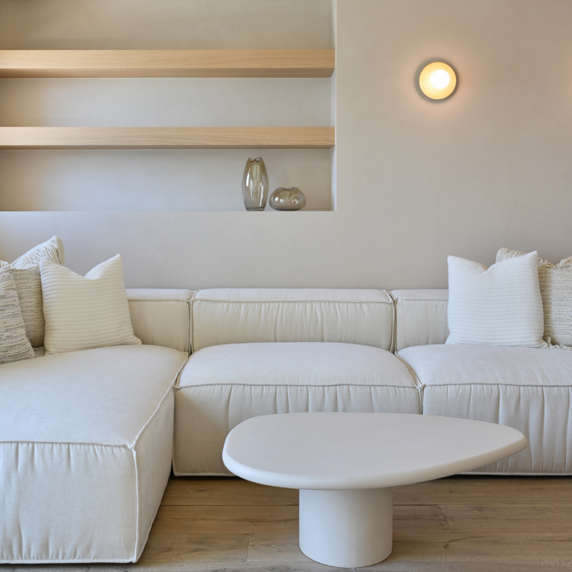
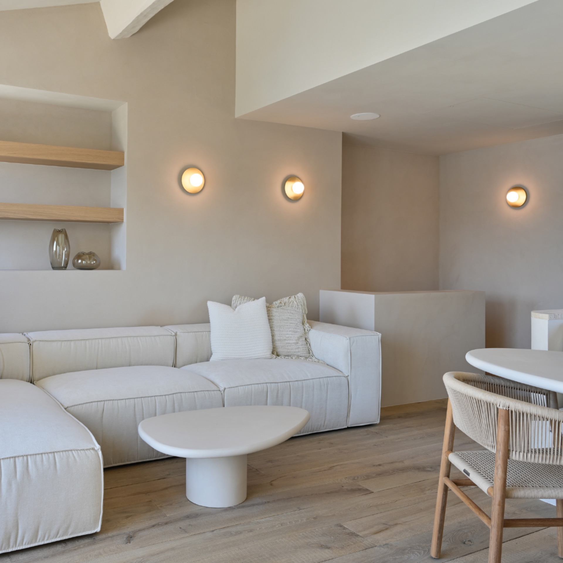
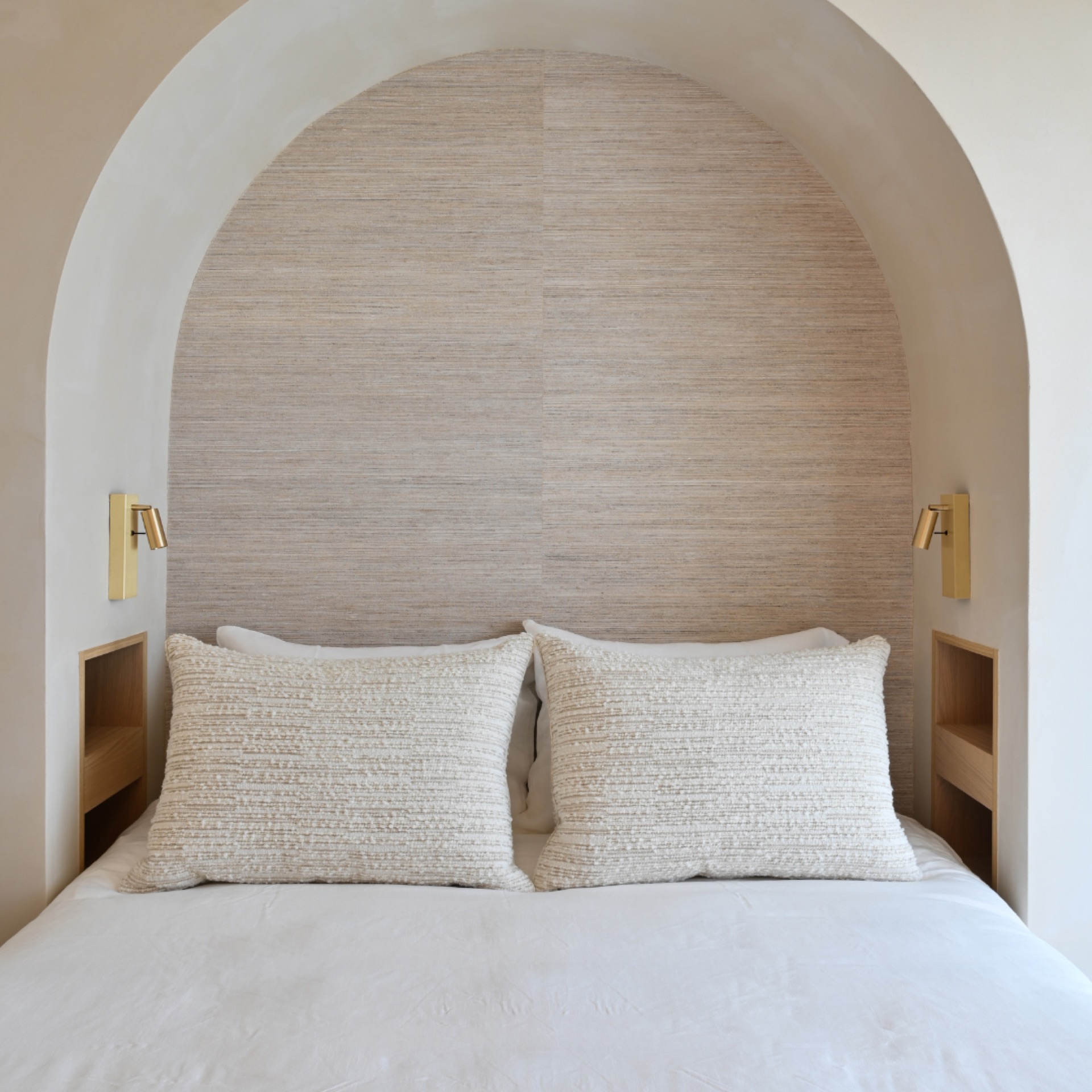
In the living area, open shelving sits beside round wall lights, so storage and lighting share the same wall plane. In the sleeping area, the built-in form follows the curve behind the bed and continues into side niches. The joinery is precise enough to disappear at a glance, yet visible enough to guide the eye. This use of custom joinery gives the apartment its calm structure: shelves, recessed lines, and continuous surfaces that hold the plan together.
Warm light inside the wall
Warm round wall lights appear where the architecture needs a softer edge. They repeat across the living room wall and give the space a measured glow instead of one central burst of light. In the niches, the light catches the shelf edges and turns each recess into a small framed surface. That makes the wall read in layers: plaster, opening, shelf, and shadow. The lighting is subtle, but it clarifies the geometry of the room.
The same approach continues in the bedroom and bathroom zones. Around the bed, the arched wall shape gains depth when the lamps sit beside it, and the curve feels built into the room rather than applied afterward. In the wet areas, the light follows the sink edge, mirror line, and cabinet joints, which helps the gold faucet read cleanly against stone and plaster. The surfaces stay bright, but never harsh.
Stone, wood, and the details you keep seeing
Stone and wood appear on the visible planes that need grounding. Stone shows up on the window ledge, the vanity surface, and other horizontal edges that carry weight in the room. Wood appears in shelves, recesses, and selected built-in details, where it softens the cabinetry without breaking the calm of the palette. Used sparingly, these materials become more noticeable: the grain in the shelving, the subtle speckle in the stone, and the matte fronts all register clearly under daylight.
Because the materials are repeated with restraint, they start to define the apartment’s pace. A stone edge appears, then a wooden shelf, then a plain wall, then another recessed opening. The eye moves in short steps instead of one continuous sweep. That is one of the strengths of this minimalist apartment interior: it never depends on decoration to hold attention. It relies on surface, edge, and proportion.
From the living room to the balcony view
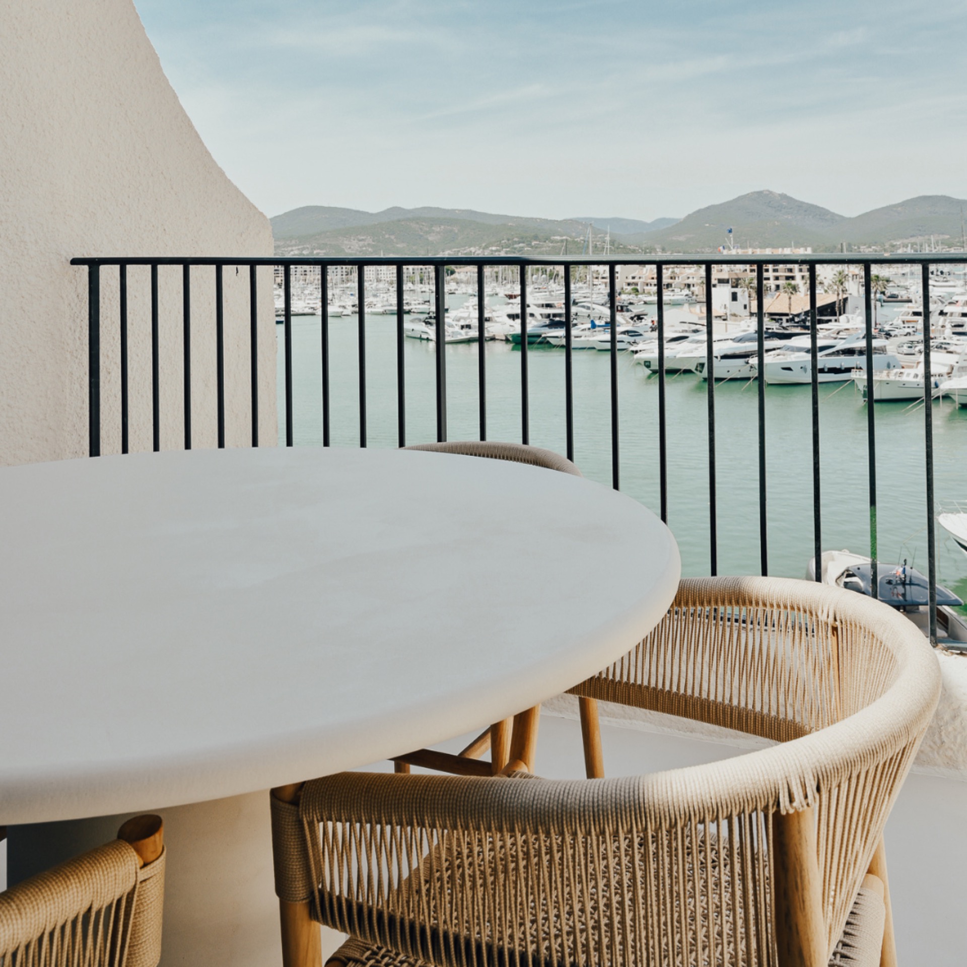
The balcony view extends the apartment without interrupting it. From inside, a dark vertical railing creates a narrow frame against the water, and boats sit beyond it like part of the room’s field of vision. Dining and seating move naturally toward that edge. The paving, railing, and horizon line form a clear pause at the threshold, so the transition feels measured rather than abrupt.
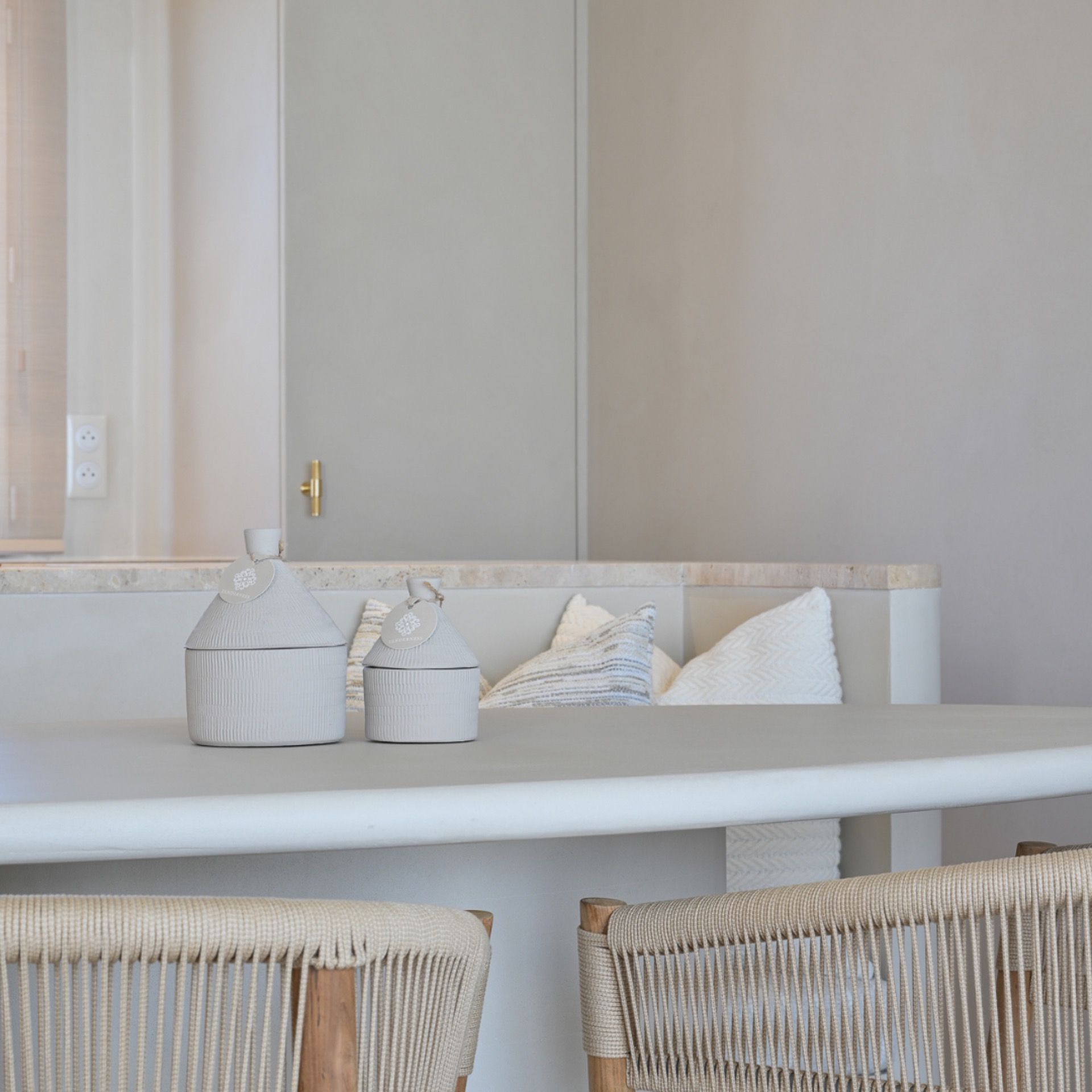
Inside the living room, the furniture stays low and pale. That choice leaves the windows and wall treatment to carry the room. The open plan lets the sightline run from the seating area all the way to the balcony, so the apartment reads as one sequence. The renovation is most visible in that movement: open, then compressed at a niche, then open again at the balcony. The room arrangement never loses the view.
Bedroom walls with a softer curve
The sleeping rooms repeat the same language, but in a quieter register. The arched shape behind the bed gives the wall depth, while the side niches keep everyday use close to the architecture. Pale textiles and curved surfaces slow the room down, and the round wall lights reinforce that pace. Nothing feels added as an afterthought. Each element is tied to the wall or folded into the room’s structure.
Across the apartment, the renovation uses repetition with care. Arches return in the windows and in the bedroom wall. Warm light reappears in the living area, then in the bathroom. Stone and wood return in ledges, shelves, and cabinet details. The apartment stays focused on light, material, and the balcony view, and the minimalist apartment interior remains readable from room to room without losing its quiet structure.
Want to see more of Siento Interior? View the page of Siento Interior for even more great projects and company information.



NEW 2026 Jubileum Edition The Best Interior Designers Benelux
Order Now €125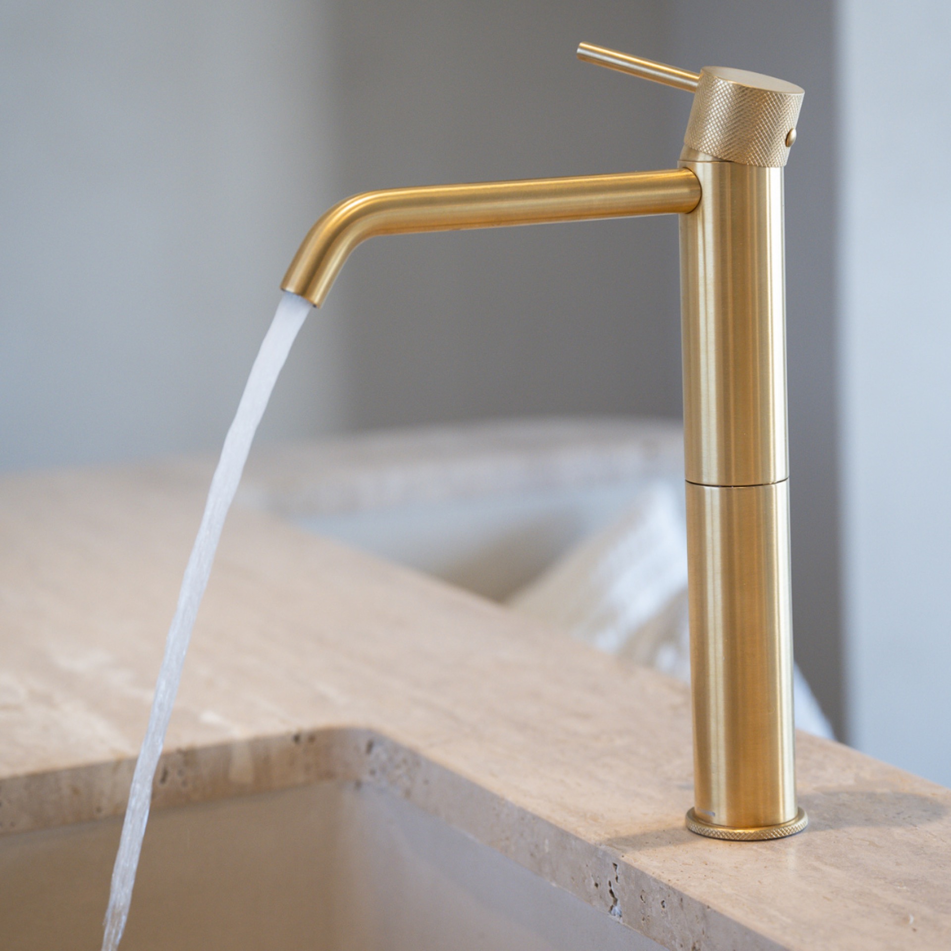
NEW 2026 Jubileum Edition The Best Interior Designers Benelux
Order Now €125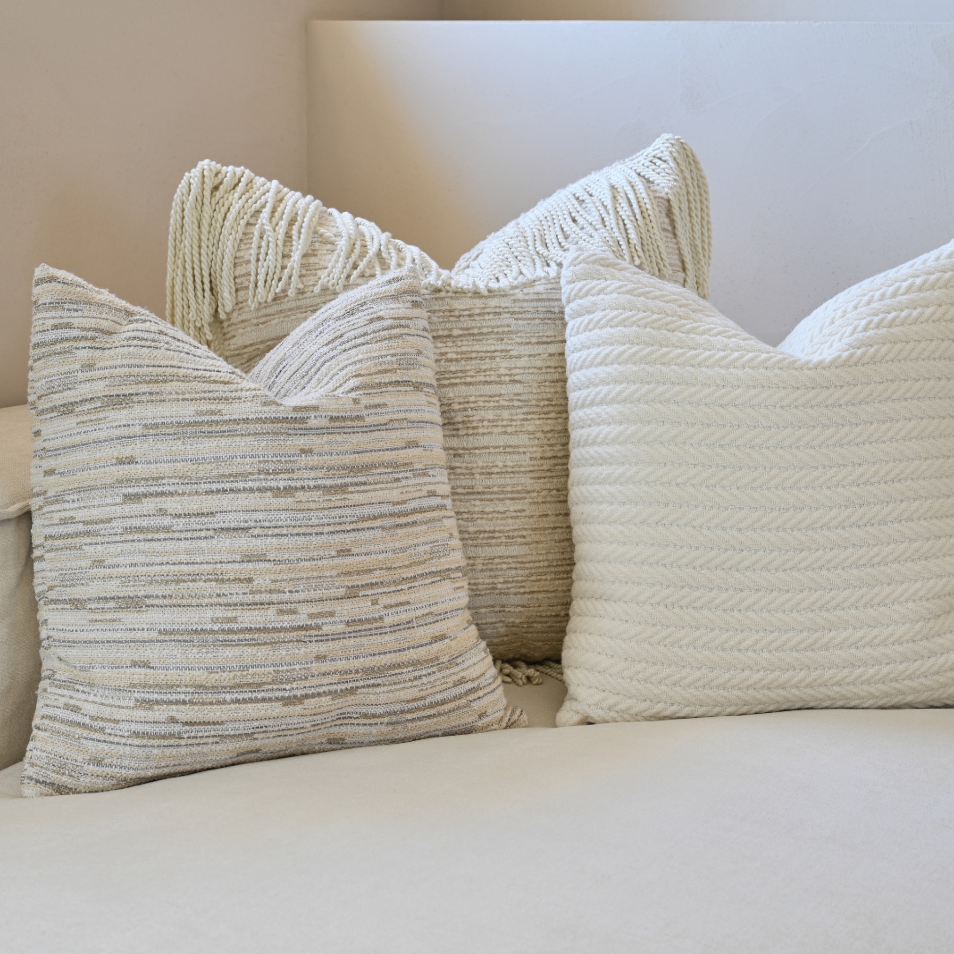
NEW 2026 Jubileum Edition The Best Interior Designers Benelux
Order Now €125