Modern custom interior in a detached dike house
A dark veneer cabinet wall meets light floors and pale window treatments from the first step into the house. That contrast sets the tone for the modern custom interior, where the material palette repeats from room to room without becoming repetitive. Marble and other natural stone surfaces return in the living areas, while the joinery keeps the lines sharp and the storage tucked into the architecture. The result is an interior that reads as one continuous sequence, but each space still has its own pace, from the open living level to the quieter rooms upstairs.
Dark veneer and light surfaces shape the living level
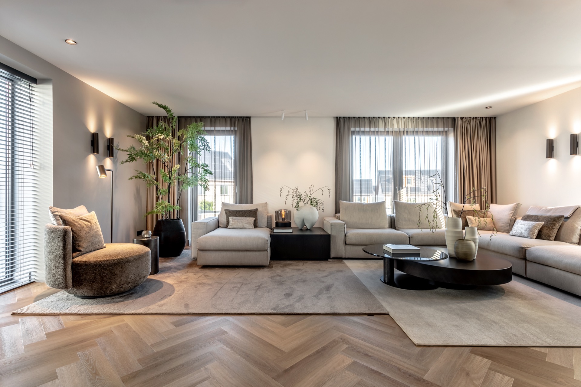
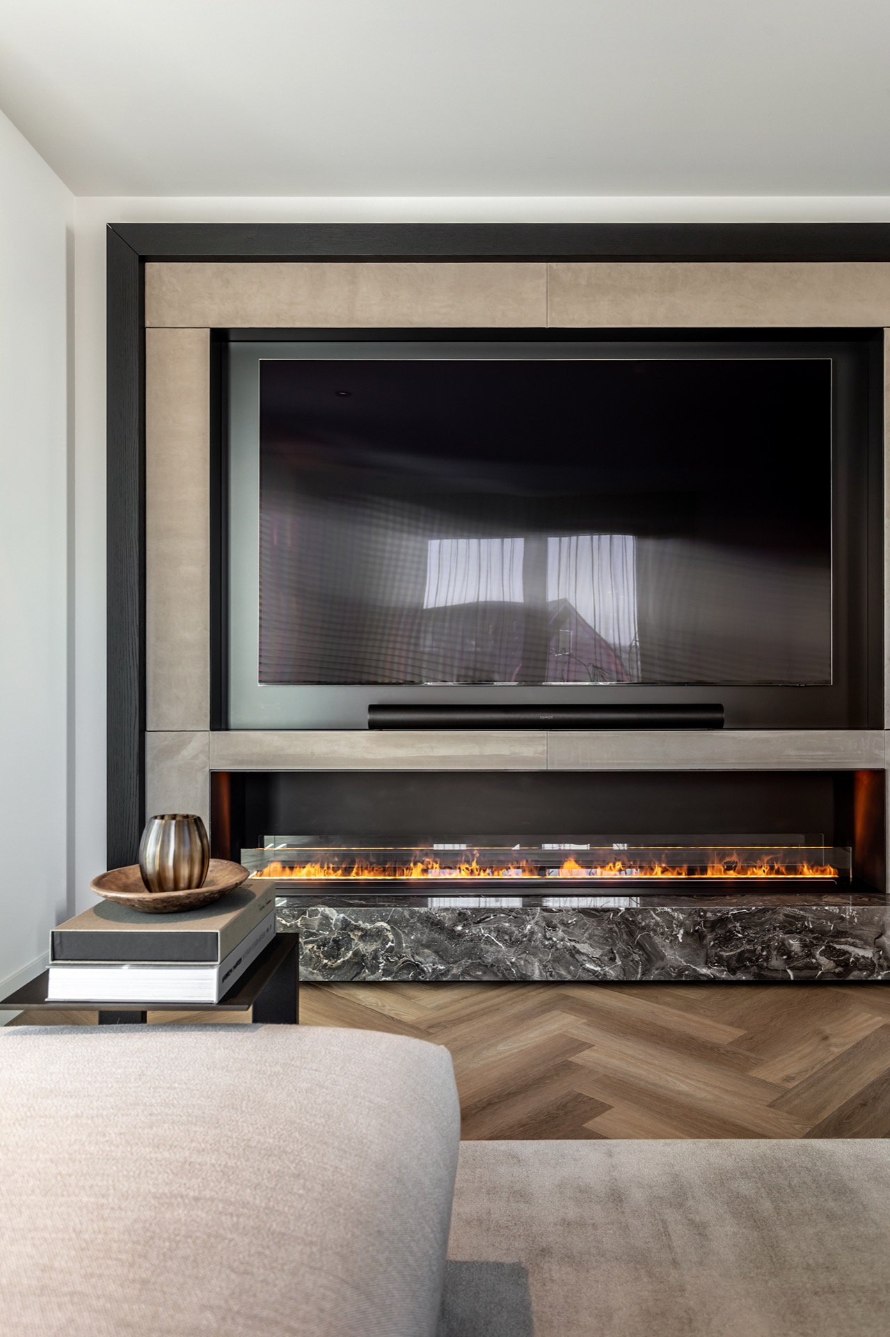
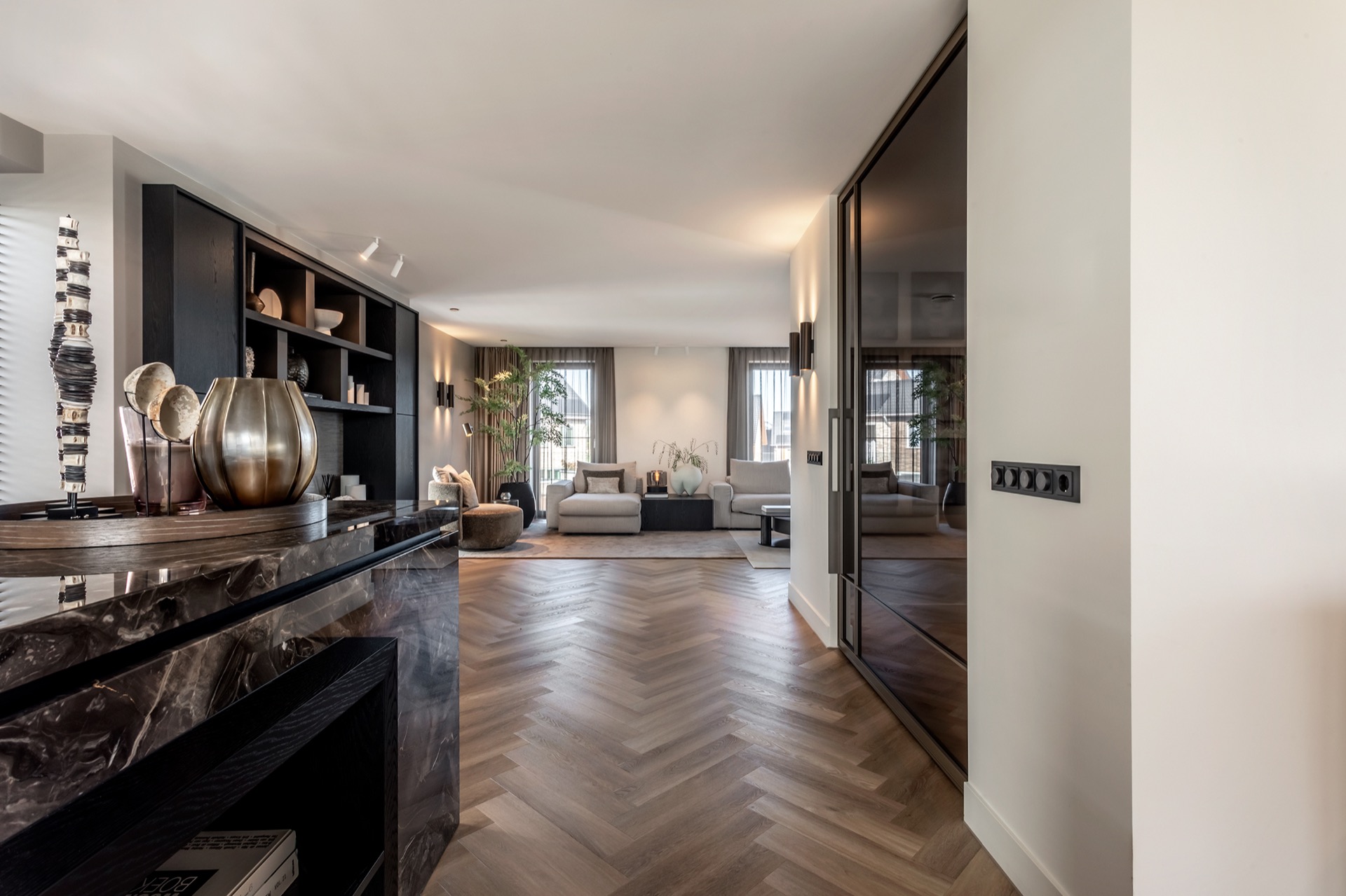
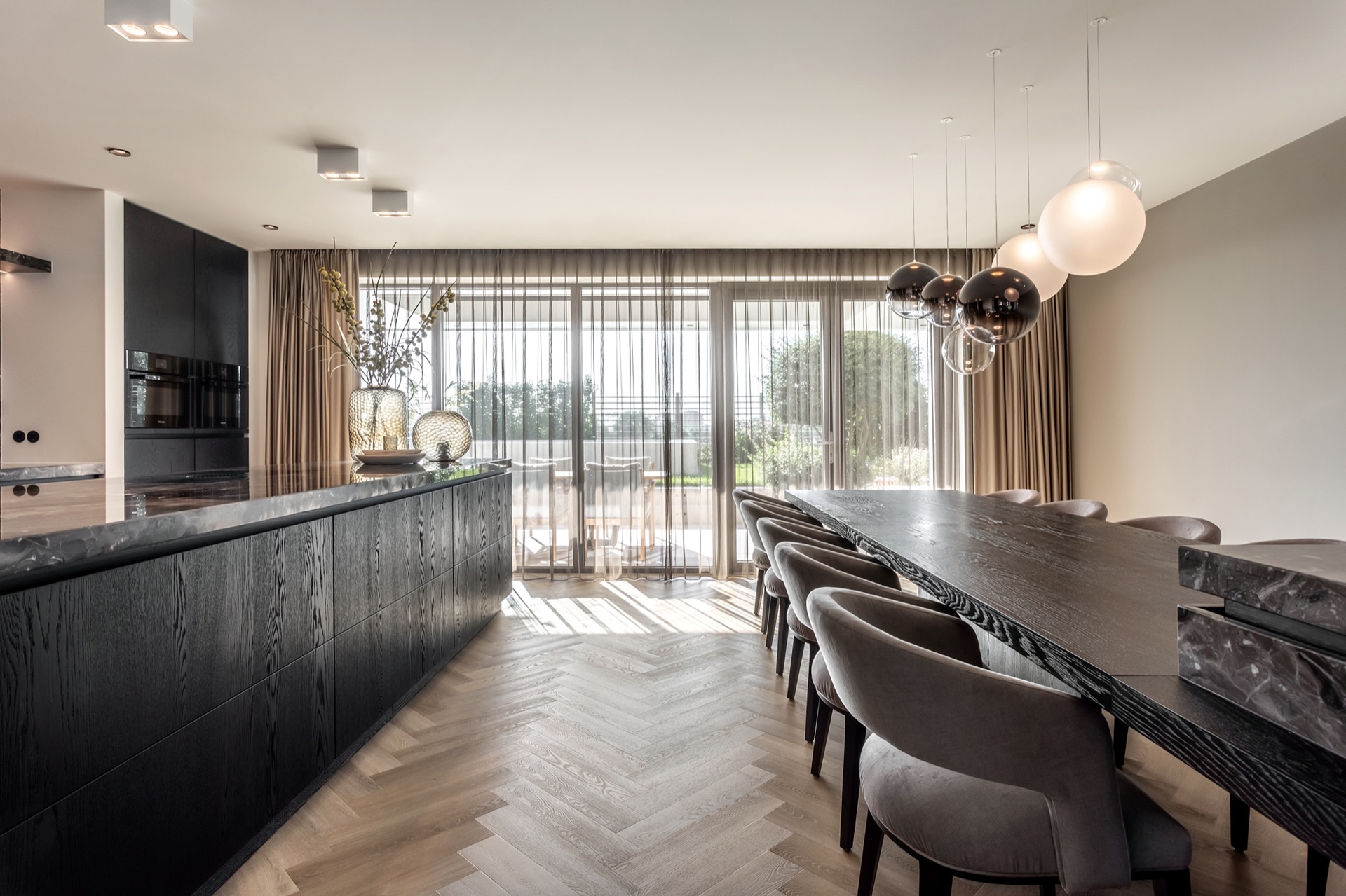
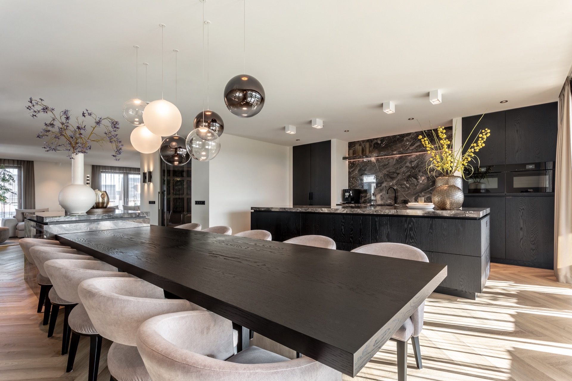
The living level is built around custom interior design that uses opposites with restraint. Dark built-ins sit against white walls, pale flooring, and soft window dressings, so the furniture volume stands out without closing the room in. A fireplace wall in natural stone gives the main seating area a fixed point, with a screen niche integrated above it. The kitchen continues that language with a large island, a stone worktop, and veneered fronts that keep the mass of cabinetry visually calm.
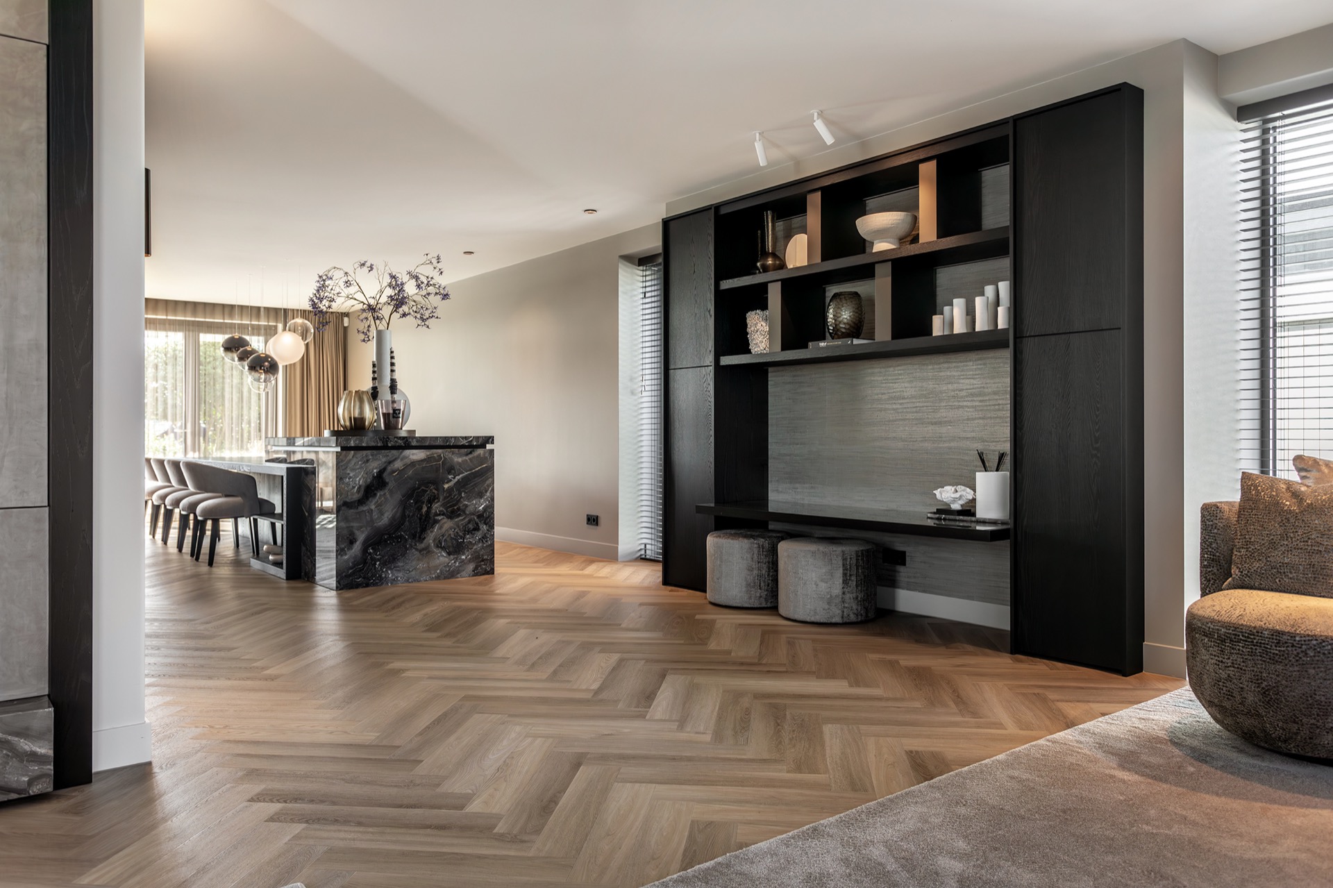
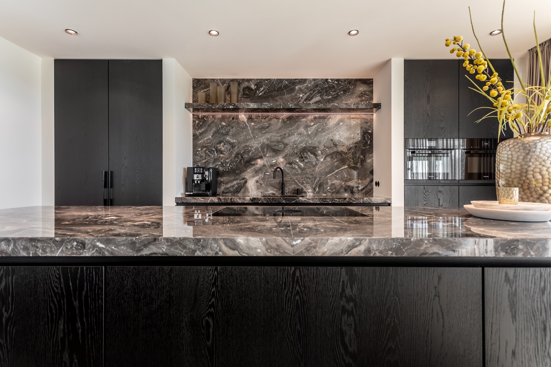
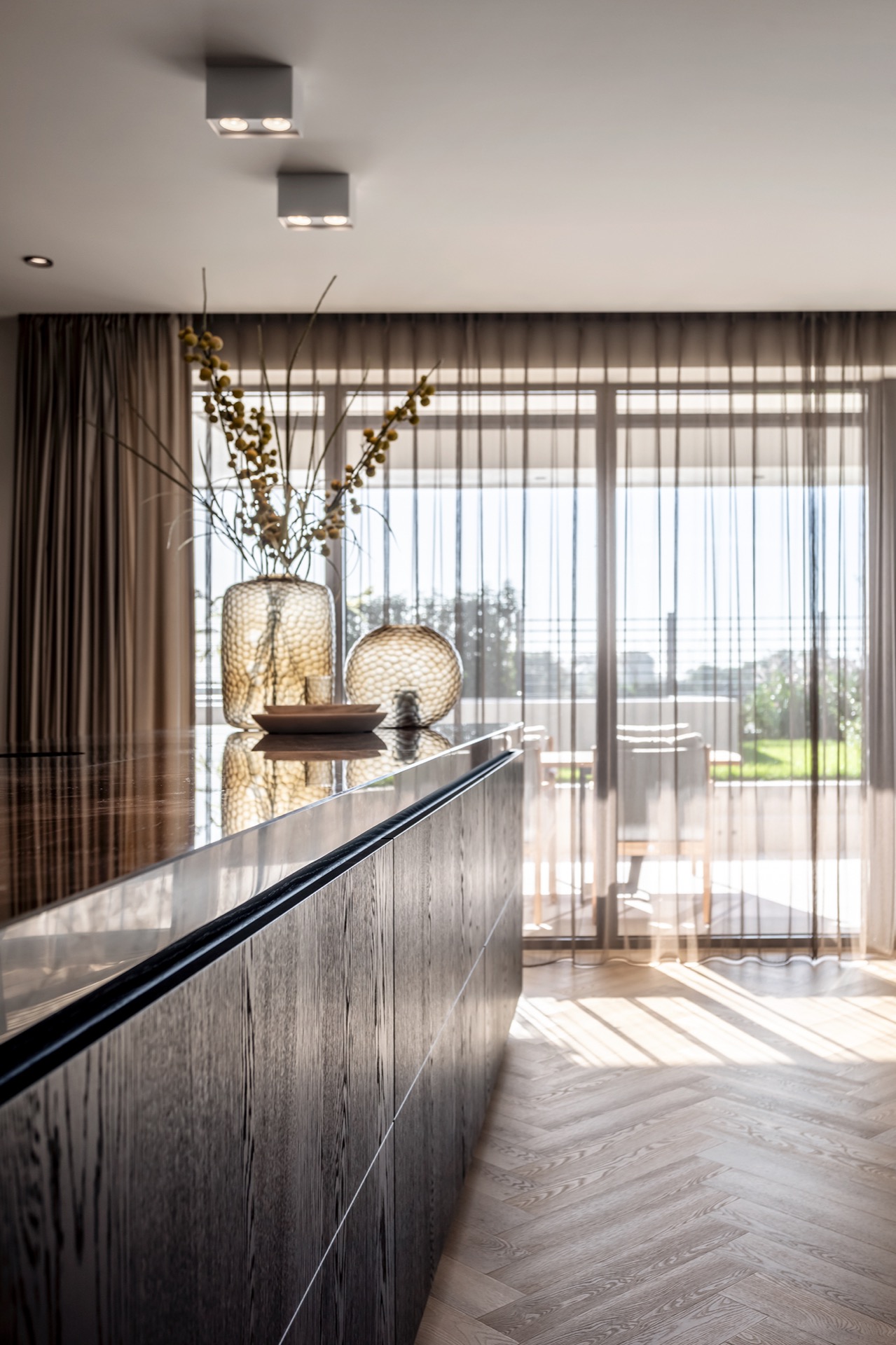
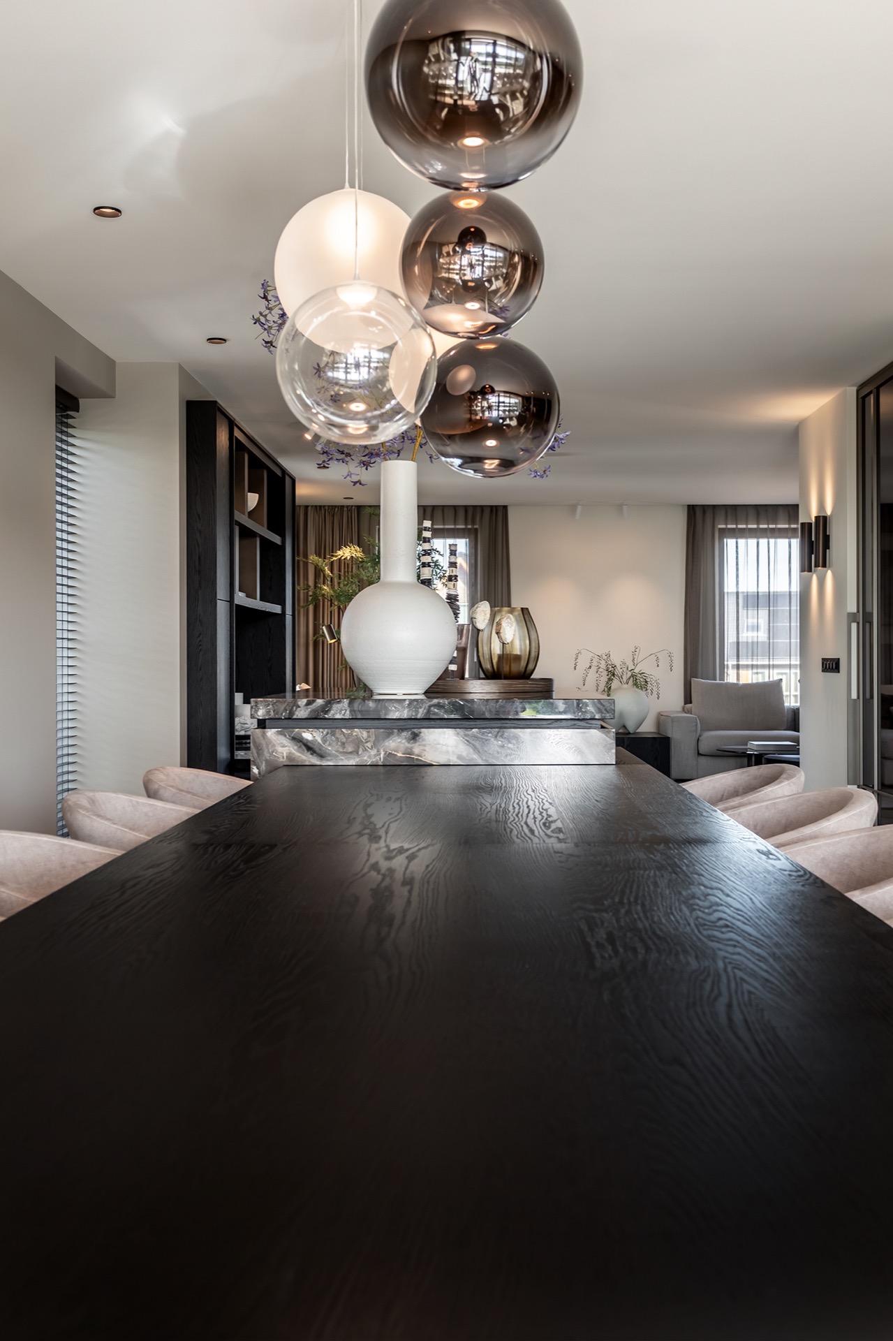
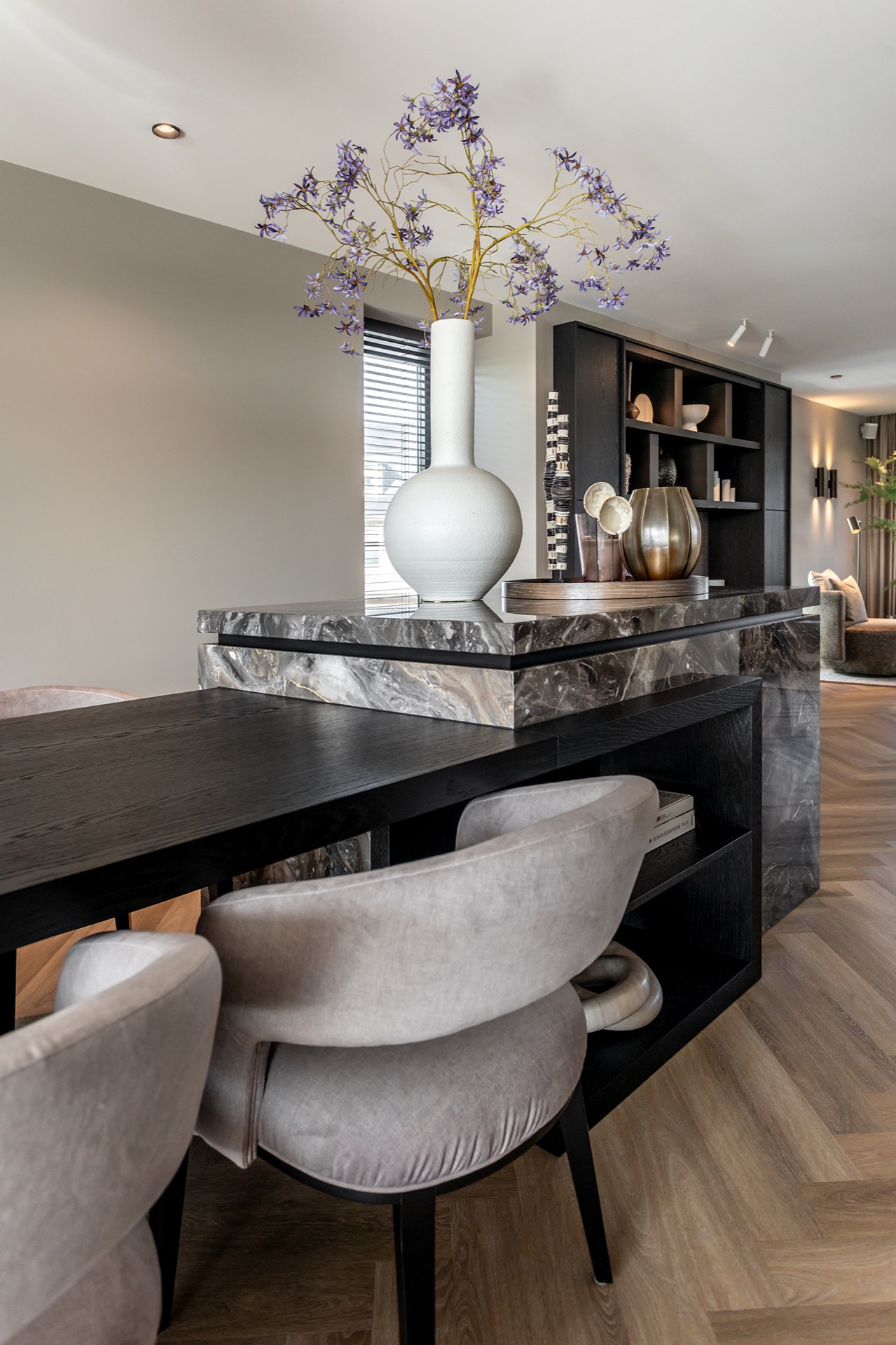
Several details show how carefully the bespoke joinery was drawn. Open niches break up the closed cabinet runs, and the island’s stone surface catches light differently from the darker fronts beneath it. In the dining and sitting zones, the room keeps long sightlines open between the kitchen, the lounge, and the glazing. That open route is reinforced by the lighting plan, which uses rows of ceiling spots and wall-mounted fittings instead of relying on one central fixture. The light is not decorative noise; it marks edges and stops the large spaces from flattening out.
A living room with fireplace and room for quiet movement
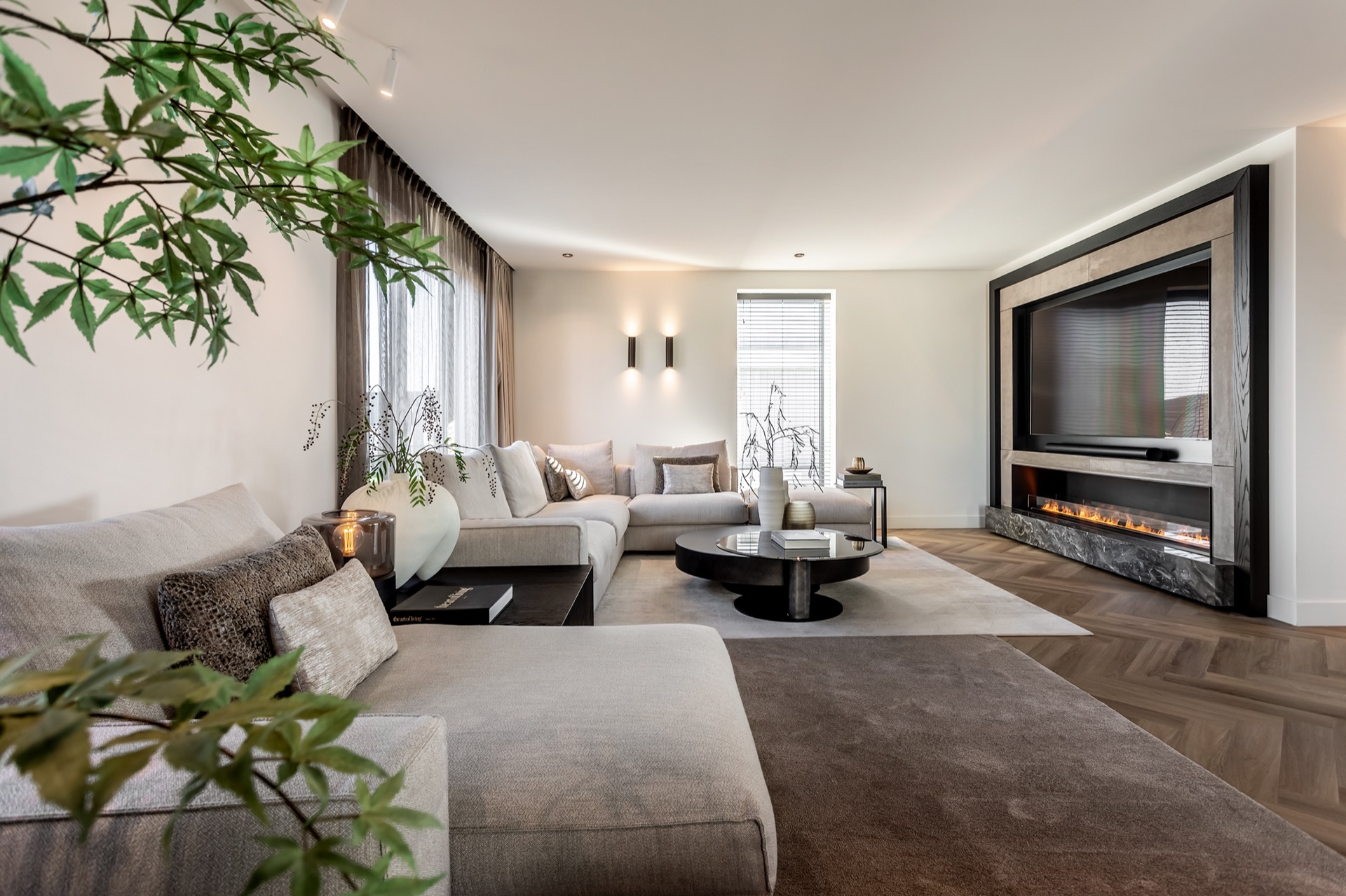
The living room with fireplace is one of the clearest expressions of the project. The stone cladding around the fire shifts the focus away from ornament and onto material texture. Dark framing around the fireplace and television niche keeps the wall compact, while the surrounding seating area remains pale and open. Curtains soften the window walls, but the geometry stays visible: straight reveals, strong horizontals, and a clean line between the built-in elements and the floor.
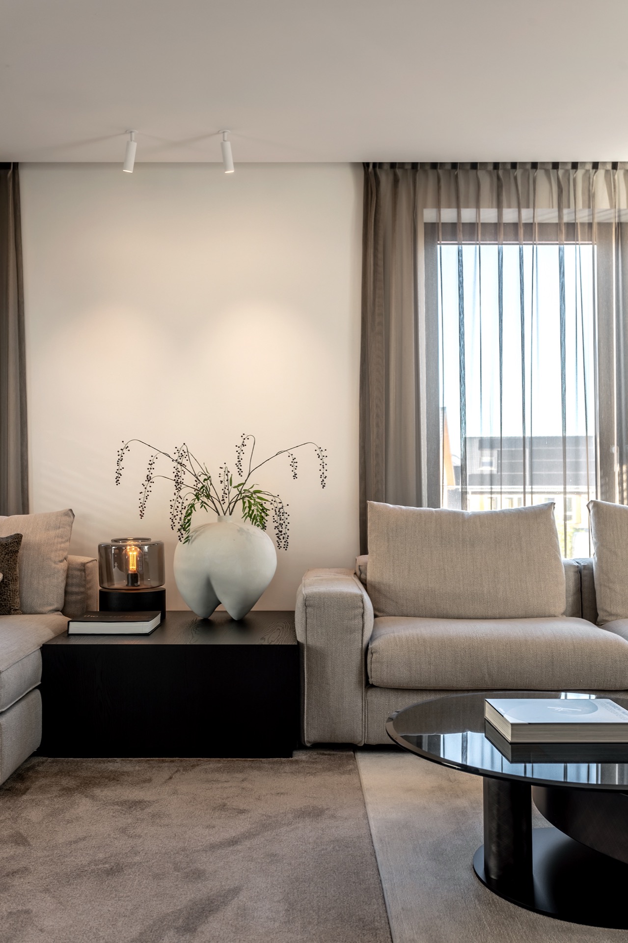
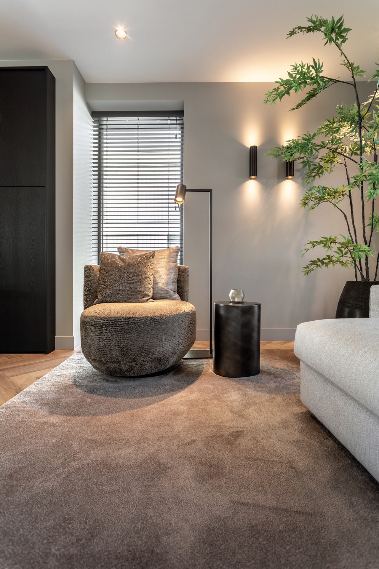
Light also changes the room’s register throughout the day. In the evening, the wall fittings throw a warm glow across the curtains and down onto the seating area. By daylight, the large windows and the pale surfaces make the dark joinery read even more clearly. It is a simple contrast, yet it carries the whole floor. The room feels designed from the inside out, with each surface chosen to either absorb light, reflect it, or frame it.
Natural stone, stonework, and a kitchen island with weight
The kitchen sits within the same material field as the living room, but the island gives it a stronger horizontal presence. Stone is used as a work surface and as a visual counterweight to the darker veneer fronts. Behind it, built-in storage runs in a dark plane with occasional open compartments, so the wall never becomes a solid block. The effect is measured rather than showy. Even the floor pattern contributes to that restraint, adding texture without competing with the cabinet lines.
Across the open-plan ground of the main living spaces, the combination of natural stone interior elements and bespoke joinery keeps the room grounded. The stone surfaces repeat in the fireplace zone and in the kitchen, which ties the two places together without forcing them into the same function. A clear lighting plan continues overhead, with spots arranged in straight rows and selected wall lights adding depth at the edges. It is an interior that depends on sequence: stone, wood veneer, pale wall, then light.
The upper floor turns quieter around the master bedroom
Upstairs, the palette shifts into a tone-on-tone composition in the master bedroom. The colors stay close to each other, so the room becomes calmer by subtraction rather than decoration. A large walk-in closet extends that feeling of order, giving the suite a practical edge without changing the room’s quiet rhythm. There are no abrupt transitions here. Surfaces move softly from one to the next, and the furniture remains integrated rather than layered on top of the architecture.
The bedroom suite also shows how the project handles privacy. The space is separated from the more active living level below, and the material contrast is reduced. That makes the room feel more enclosed, but not heavy. Light still comes in through the windows, filtered by the same kind of controlled window dressing used elsewhere in the house. The walk-in closet is not presented as a spectacle; it is part of the suite’s layout, extending storage into the room in a way that keeps clothing and circulation neatly organized.
Bronze fittings give the bathroom a precise edge
The bathroom keeps the same measured approach. Stone surfaces and pale finishes set a neutral base, then bronze taps add a sharper note at the basins. That small change is enough to give the room definition. The fittings catch the light and stand out from the surrounding material field without interrupting it. Nothing in the room is overdrawn. The emphasis stays on the surfaces that are used every day, and on how they meet at corners, edges, and built-in details.
Placed next to the bedroom level, the bathroom continues the project’s habit of linking rooms through material rather than through repetition of form. The palette remains restrained, but the surface changes are easy to read. Stone feels denser than paint, bronze reads warmer than chrome, and the joinery lines stay crisp. That clarity matters in a room of smaller scale, where a few well-placed details do more work than a long list of finishes.
A ground-floor man cave with bar, paneling, and a second service zone
On the ground floor, the mood changes again. The man cave is wrapped in dark paneling, with an oak veneer bar set into the room and steel accents sharpening the edges. It is a more enclosed space, shaped around one person’s interests, but it still belongs to the wider house because the detailing follows the same logic: tailored joinery, clear lines, and materials used for their visual weight as much as for their function. The bar reads as a built element, not a freestanding object dropped into the plan.
Behind the bar sits an extra bathroom and laundry room, which makes the floor practical as well as private. That combination gives the level a second life beyond the hobby room itself. The storage and service functions are folded into the same zone, so the layout works without spreading out. It is a good example of bespoke joinery doing quiet work: hiding utility where it is needed and leaving the central room free for the darker, more atmospheric setting around the bar.
The garden and pool extend the same straight lines outdoors
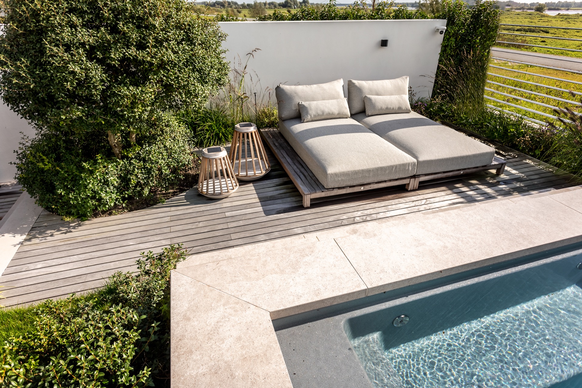
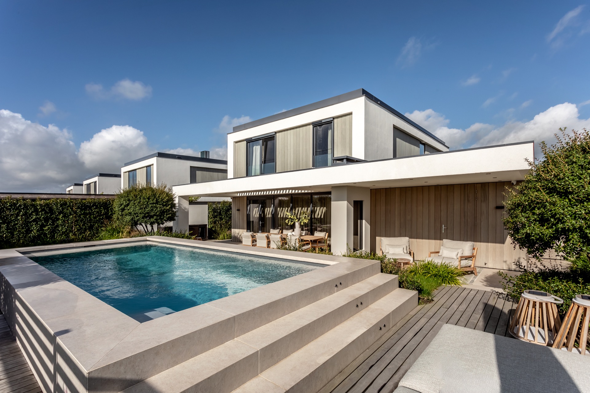
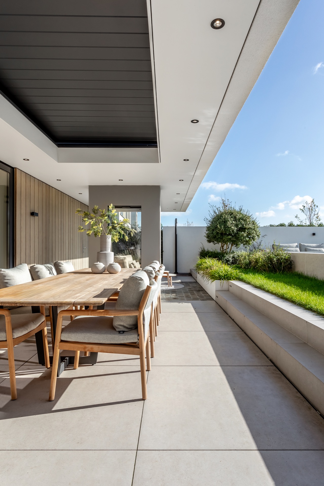
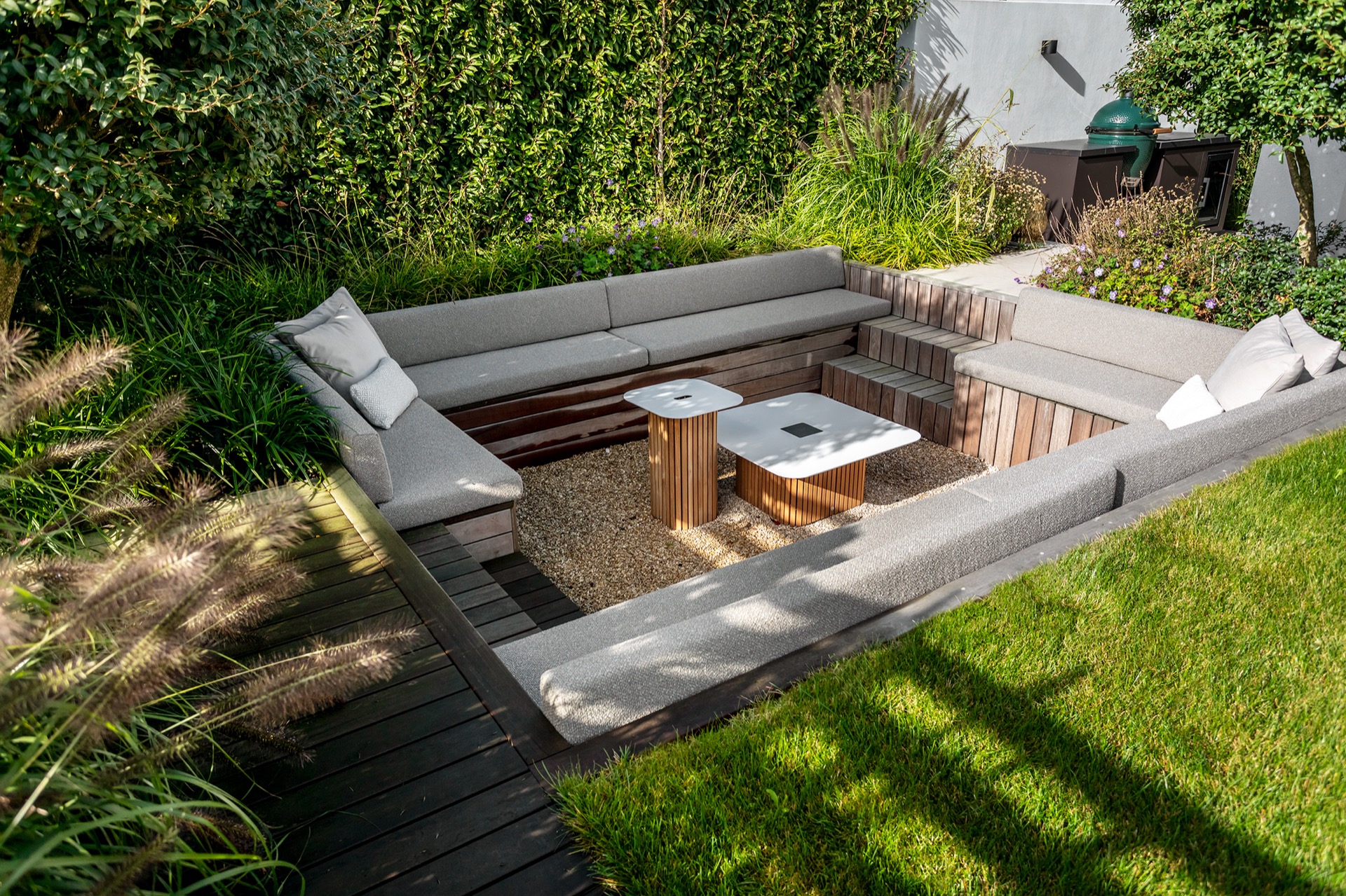
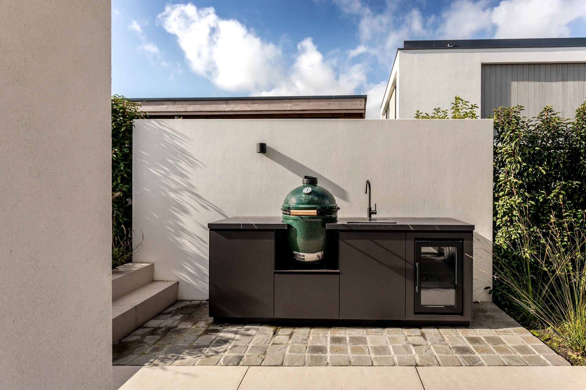
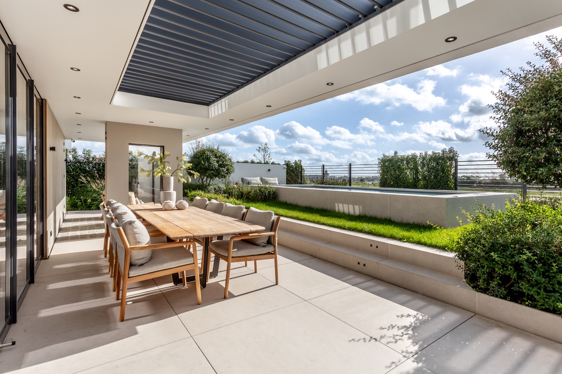
Outside, the house opens to a tightly planned garden with a pool, broad stone edging, and a covered terrace set under strong overhangs. The geometry is straightforward: rectangular pool, rectangular paving, straight planting strips. Vertical wooden slats on the house and the glazed openings tie the exterior back to the interior’s controlled rhythm. A built-in outdoor kitchen niche appears along the terrace wall, so the outdoor area is not just a backdrop but another working part of the home.
The terrace ceiling uses slats and open gaps to filter light, and that same disciplined treatment appears in the way the outdoor zone is arranged around the pool. Wood, stone, glass, and planted edges are kept separate enough to read clearly. Seen from inside, the garden gives the rooms beyond the windows a deeper backdrop. Seen from outside, it reinforces the house’s straight profile and the way the modern custom interior extends into the landscape without changing language.
The project holds together through repetition of material rather than repetition of gesture. Dark veneer, natural stone, pale wall surfaces, bronze hardware, and a detailed lighting plan move across the house in different proportions. Each level has its own register: open and public on the living floor, controlled upstairs, darker and more private below. Even the pool garden follows the same order. Nothing is overstated. The spaces are drawn with enough precision that the materials can do the speaking.
Want to see more of Studio van Strijdhoven | Interior Design Studio? View the page of Studio van Strijdhoven | Interior Design Studio for even more great projects and company information.



NEW 2026 Jubileum Edition The Best Interior Designers Benelux
Order Now €125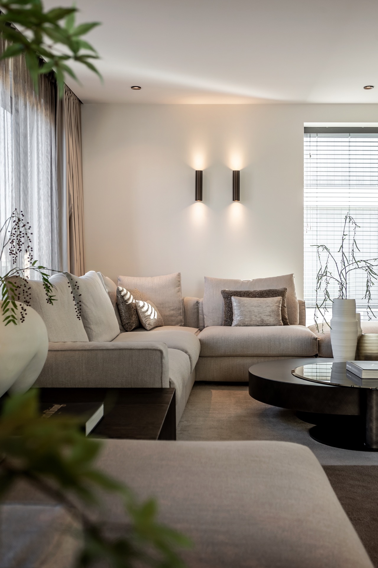
NEW 2026 Jubileum Edition The Best Interior Designers Benelux
Order Now €125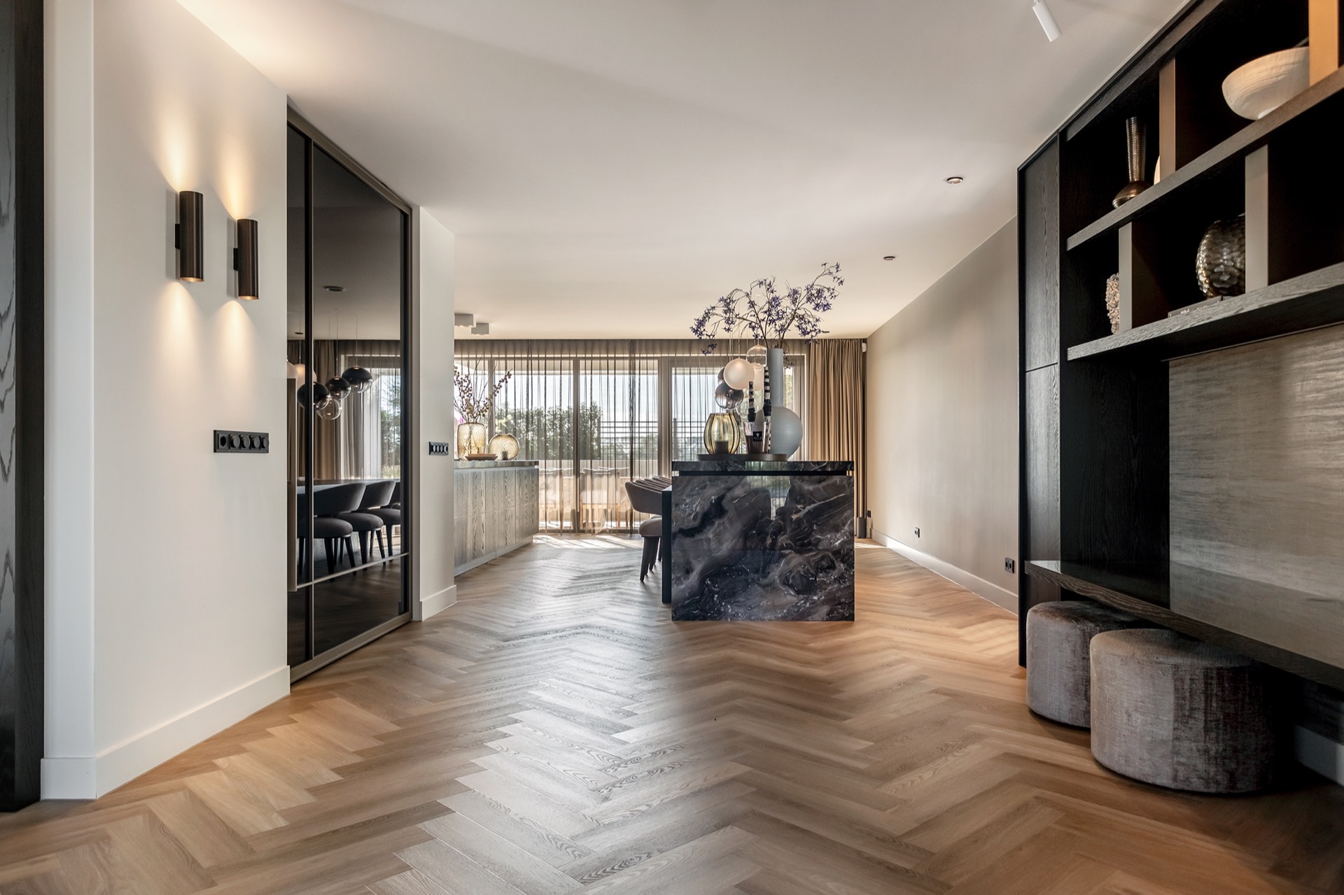
NEW 2026 Jubileum Edition The Best Interior Designers Benelux
Order Now €125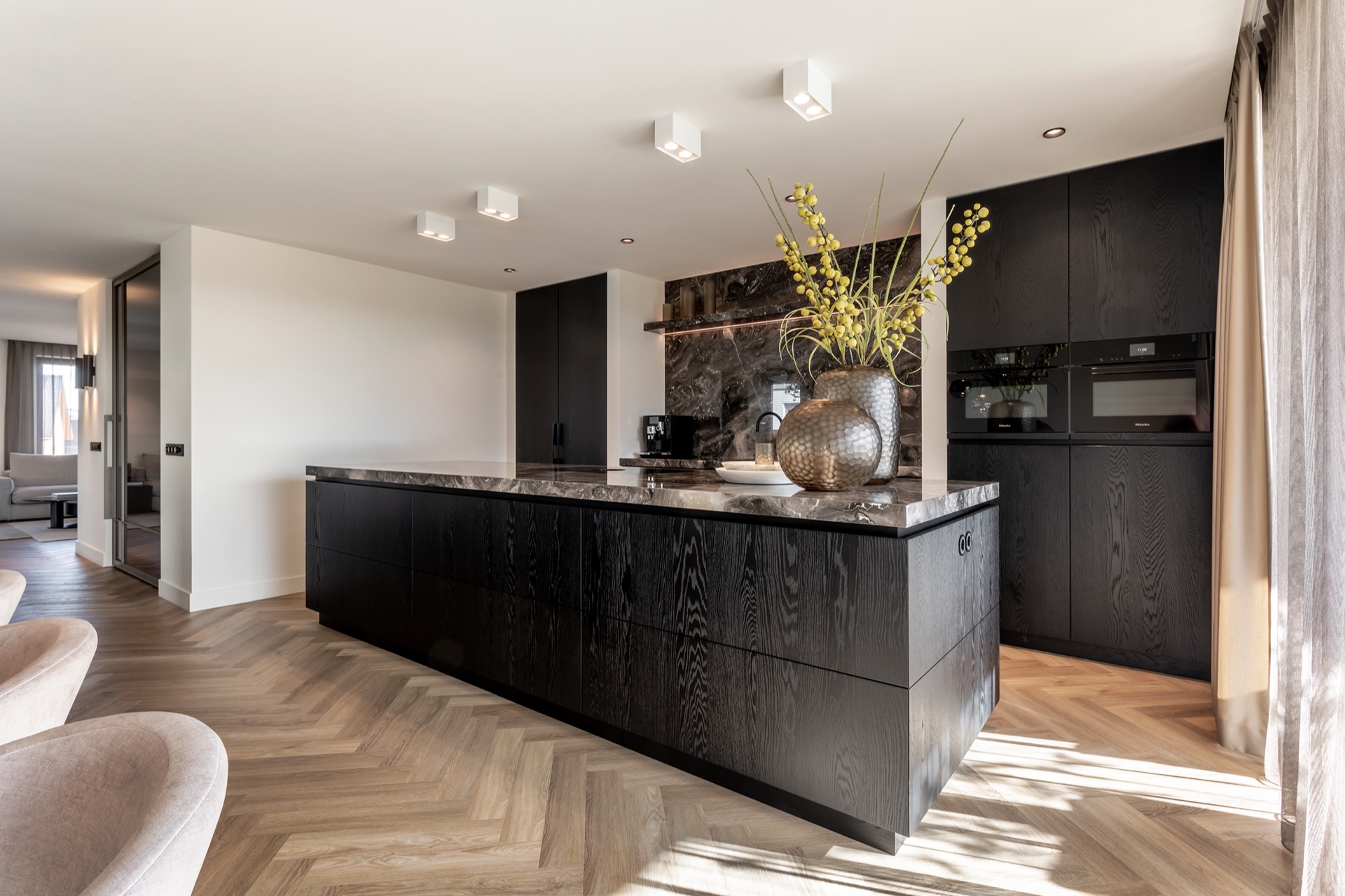
NEW 2026 Jubileum Edition The Best Interior Designers Benelux
Order Now €125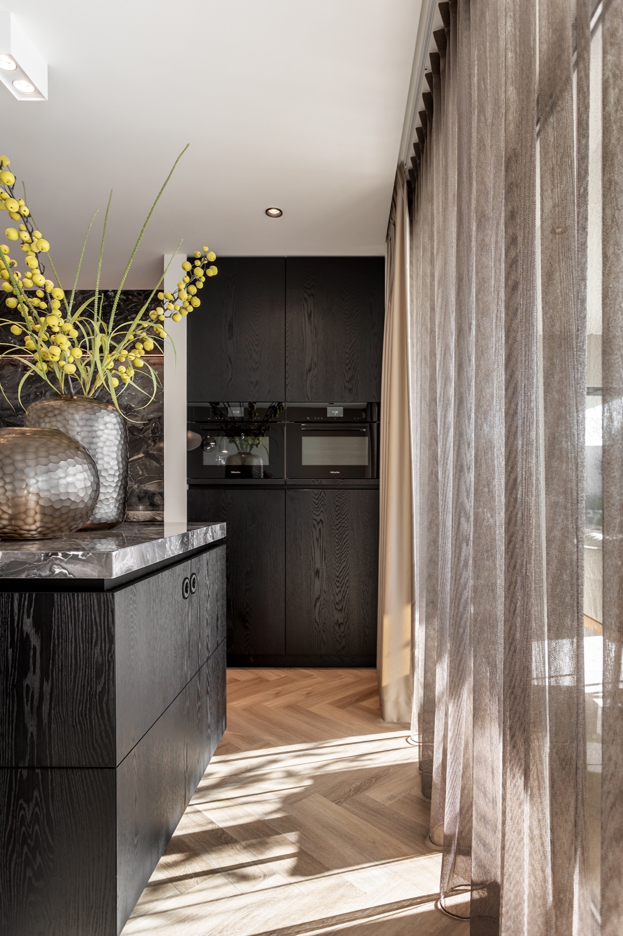
NEW 2026 Jubileum Edition The Best Interior Designers Benelux
Order Now €125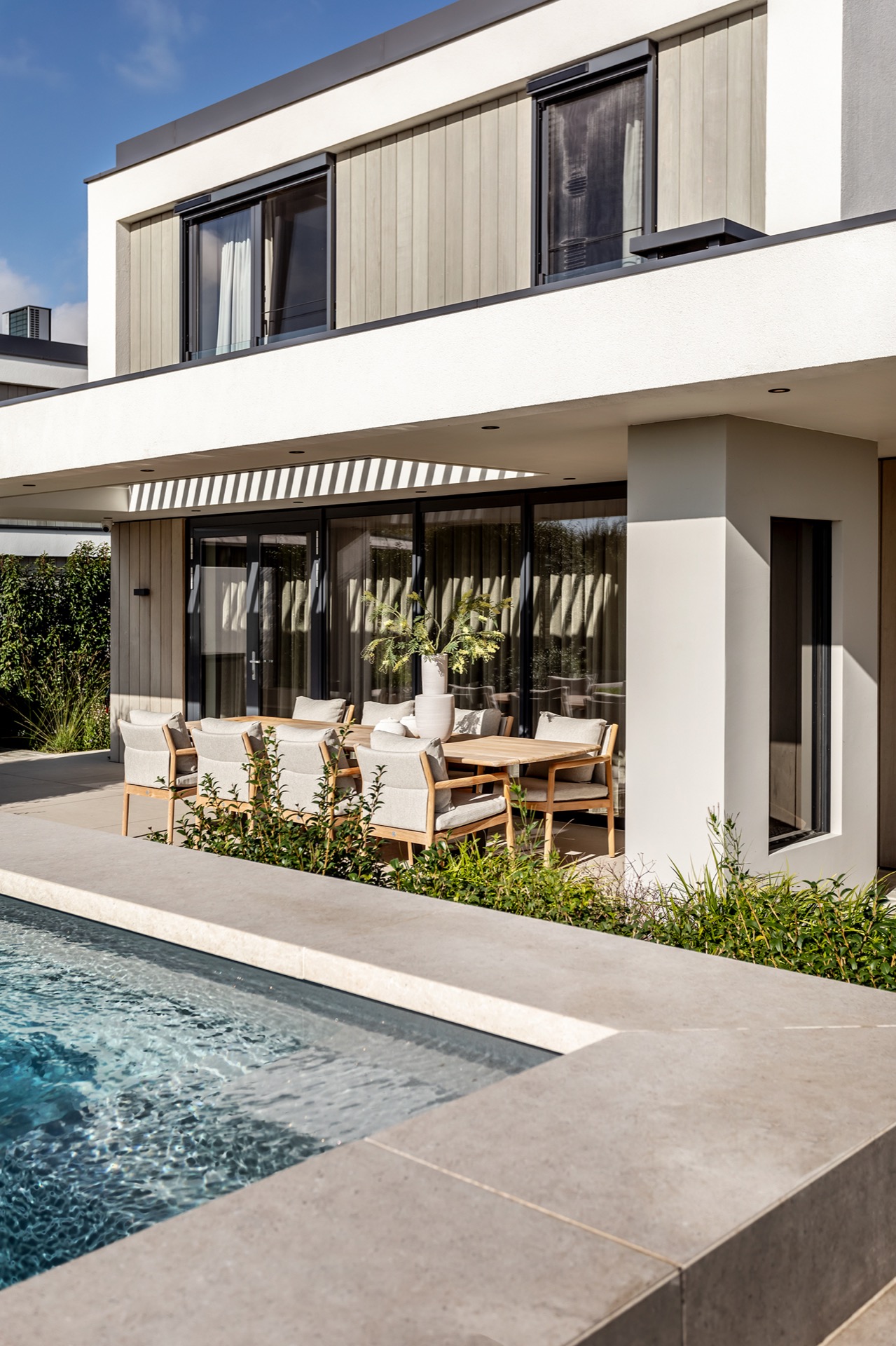
NEW 2026 Jubileum Edition The Best Interior Designers Benelux
Order Now €125