Cozy living room with warm materials and a green accent wall
The first thing you notice is the wall: a green, stone-like surface that sets the tone for the whole room. Against that backdrop, the beige sectional sofa sits low and relaxed, with cushions that break up the wide seat and soften the darker lines around it. It is the kind of setting that makes living room ideas feel grounded in real materials rather than in a moodboard. The room reads through color, texture, and light rather than through decoration alone.
Green texture as the main surface
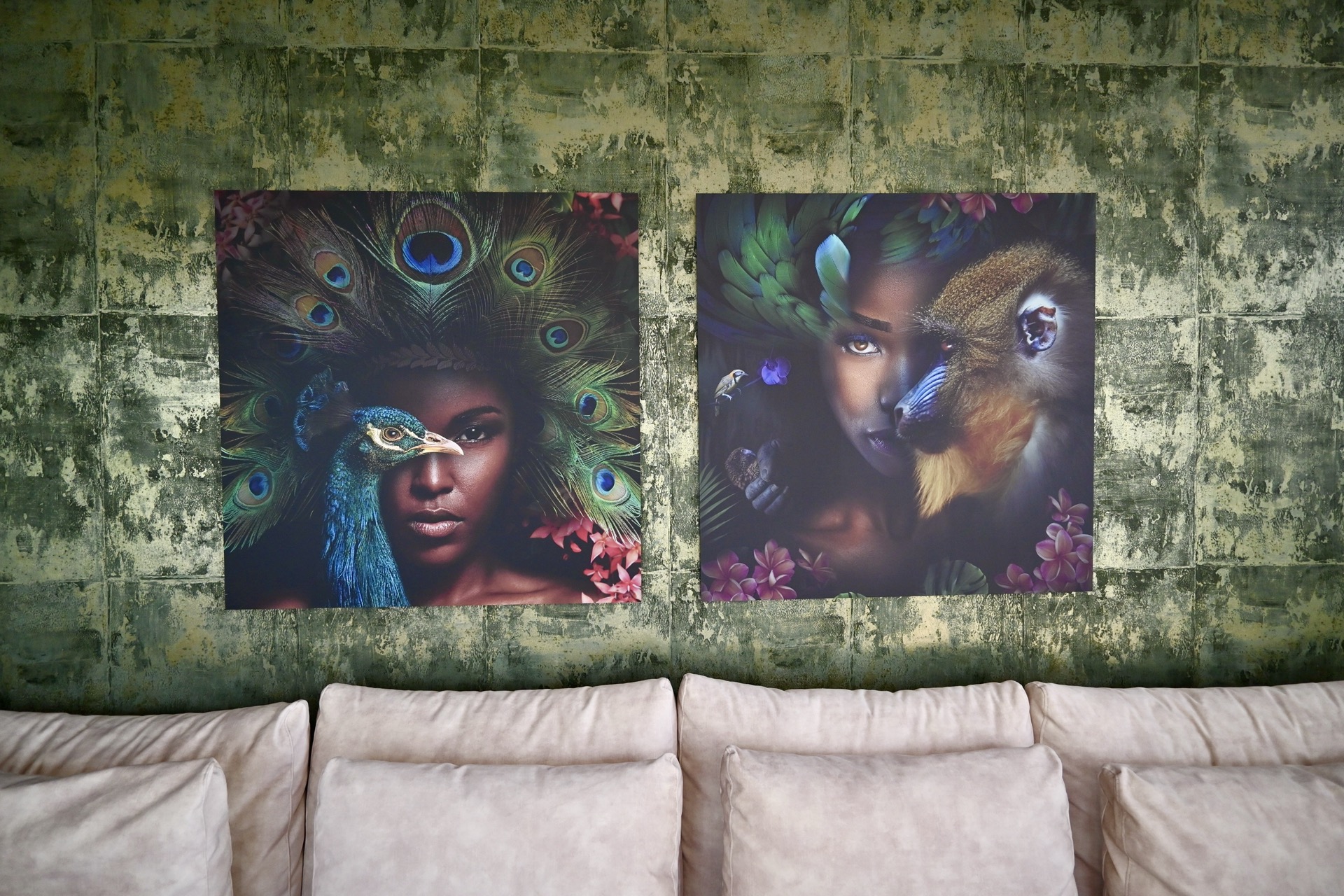
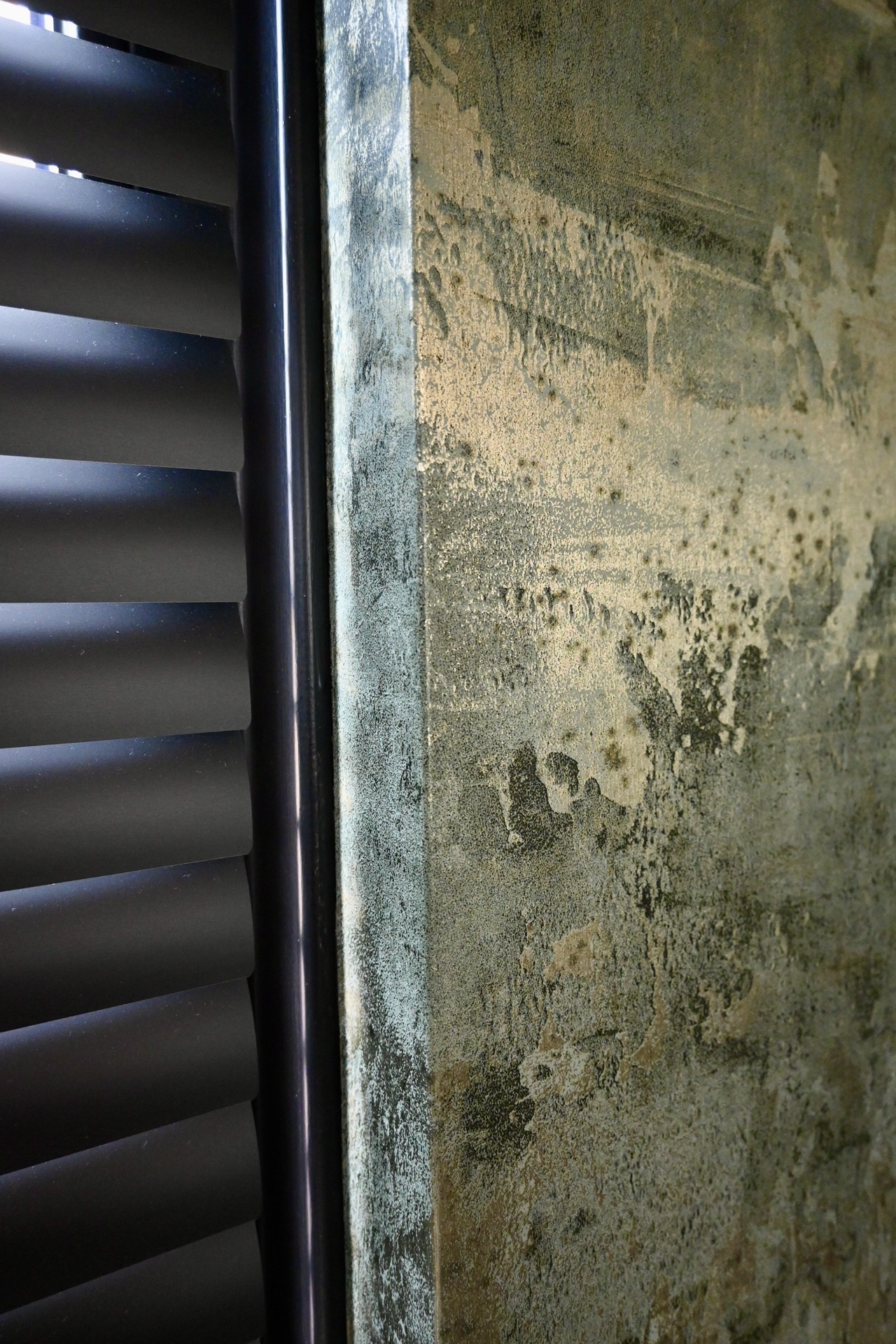
The accent wall carries the most visual weight. Its textured finish catches light unevenly, so the green shifts from deeper tones near the edges to a lighter, almost muted surface where the daylight lands. Two large artworks sit across it and give the wall a measured rhythm. The effect is not flat or decorative; it is built from surface and scale. For anyone looking at living room design, this wall shows how one material can anchor an entire seating area without crowding it.
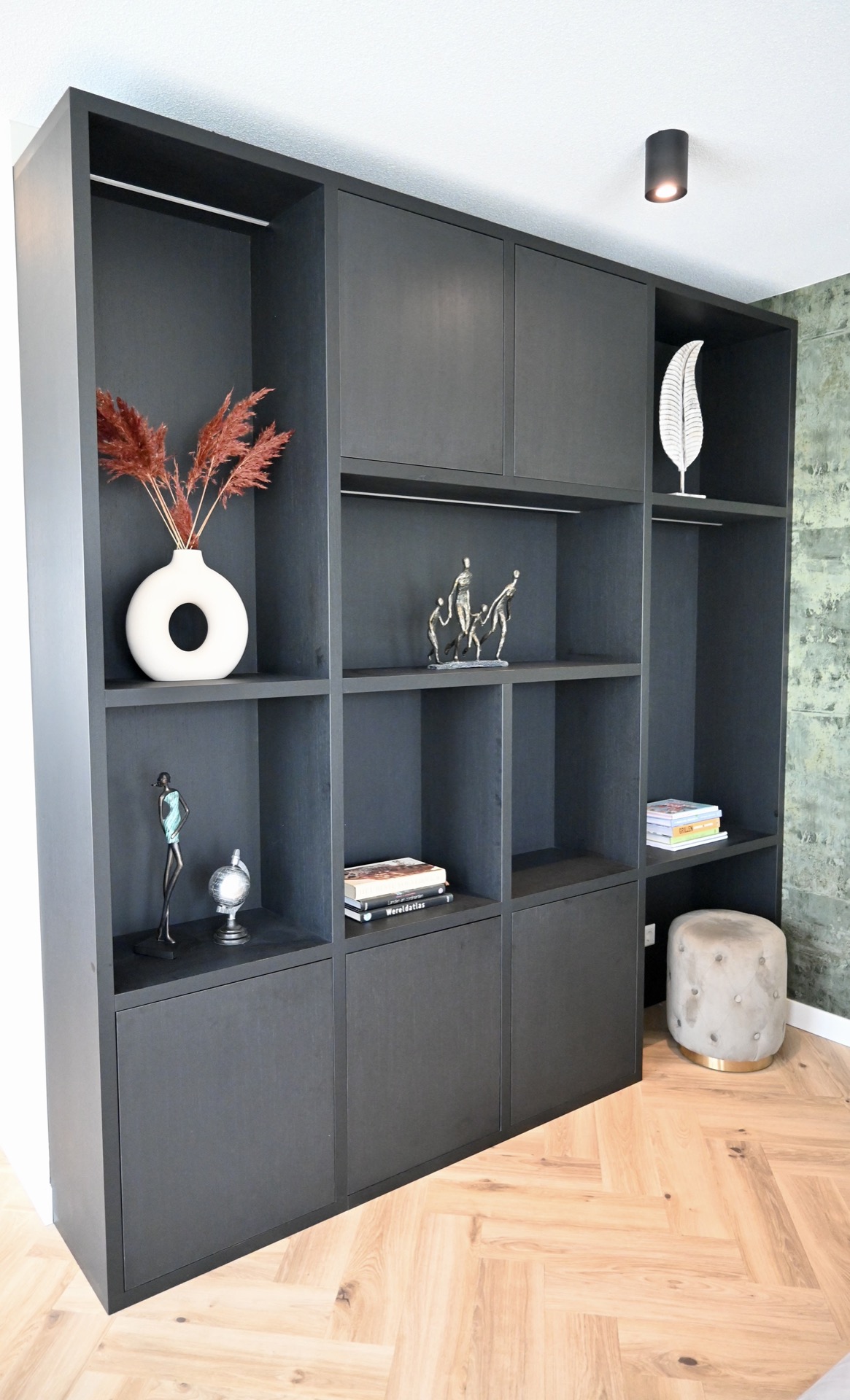
Dark custom joinery sits nearby and sharpens the palette. Open shelves, closed sections, and a niche-like composition bring structure to the room, while black frames and trim lines repeat in small points across the interior. The contrast is clear, but it never feels forced. Instead, the darker elements work like outlines, keeping the pale sofa and the green wall visually connected. This is where the project’s custom wall cabinet becomes part of the architecture of the room rather than a separate object.
Soft upholstery and round edges
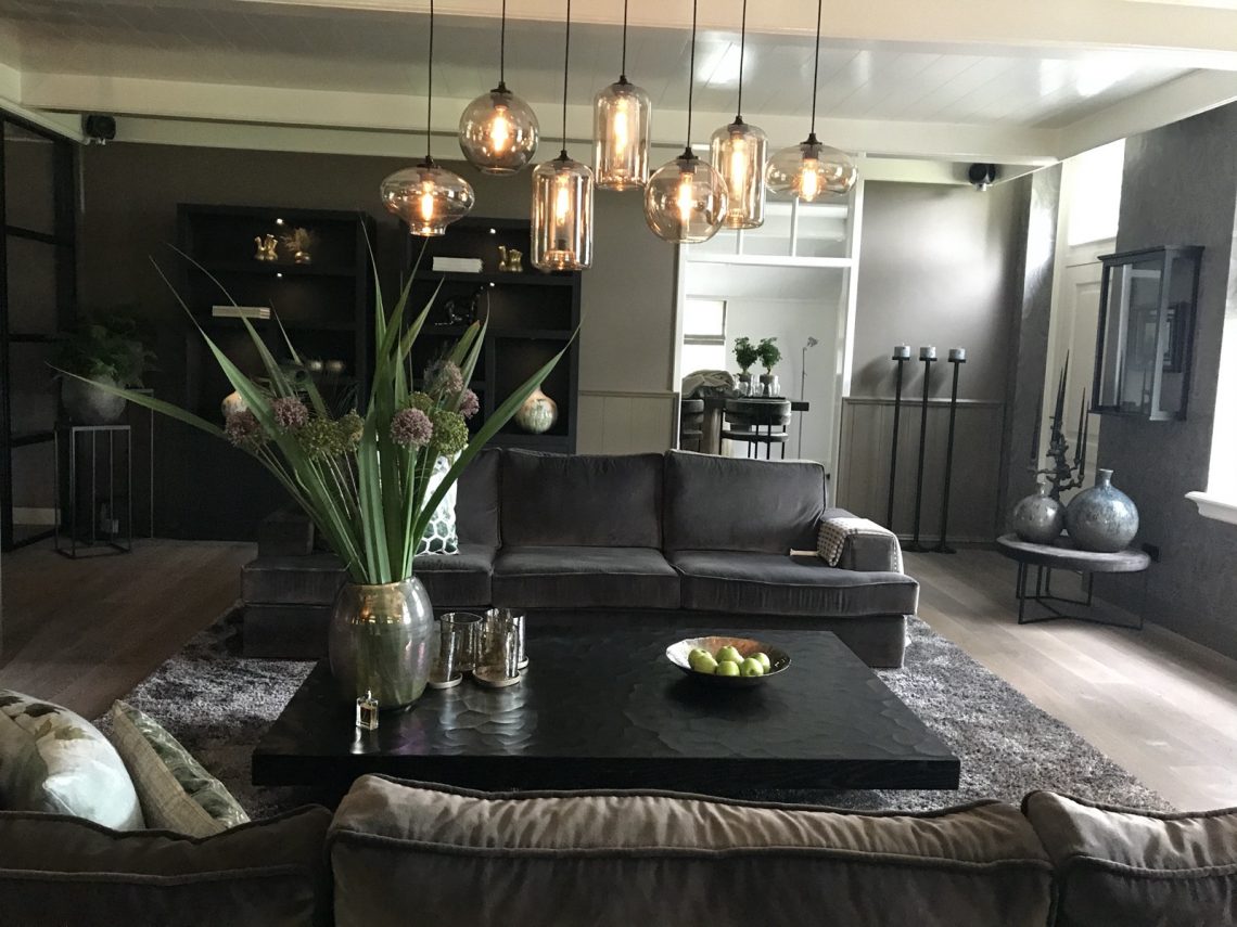
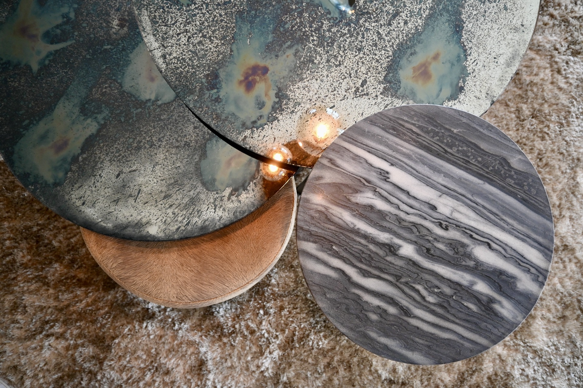
The seating shifts the mood immediately. The beige sectional sofa has a generous corner and a low profile, which keeps the room open while still giving it a strong center. Nearby, round coffee tables interrupt all the straight lines. Their dark frames and circular tops bring a slower, more casual movement to the middle of the room. A glass cloche and other small table objects sit lightly on the surface, so the tables stay present without becoming visually heavy. In a space like this, the furniture does more than fill a plan; it shapes how the room is read.
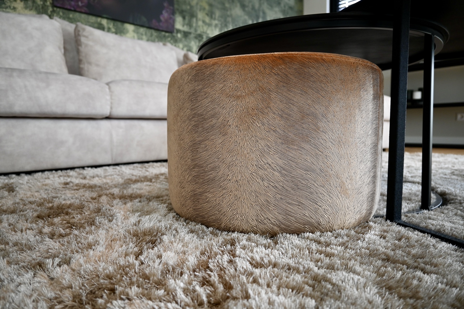
Texture is part of the story too. The upholstery shows a visible weave, the rug beneath it pulls the seating closer to the floor, and the tables introduce a smooth contrast to those softer materials. Even the cushions add variation, with plain surfaces next to patterned fabric. The result is calm, but it is built from clear differences. This is what gives these living room ideas their substance: not a single finish repeated everywhere, but a set of materials that answer each other across short distances.
Glass pendant lights above the dining area
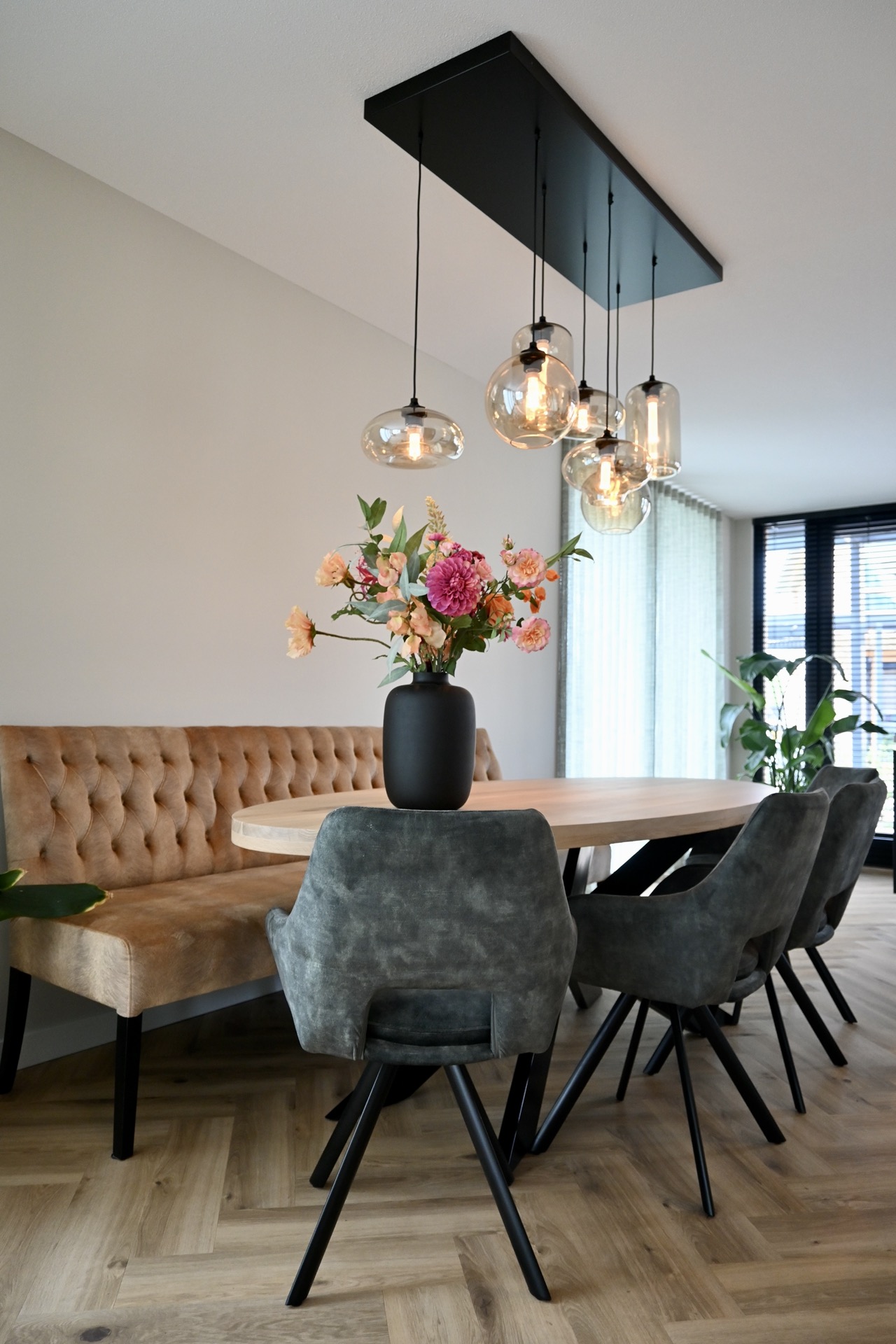
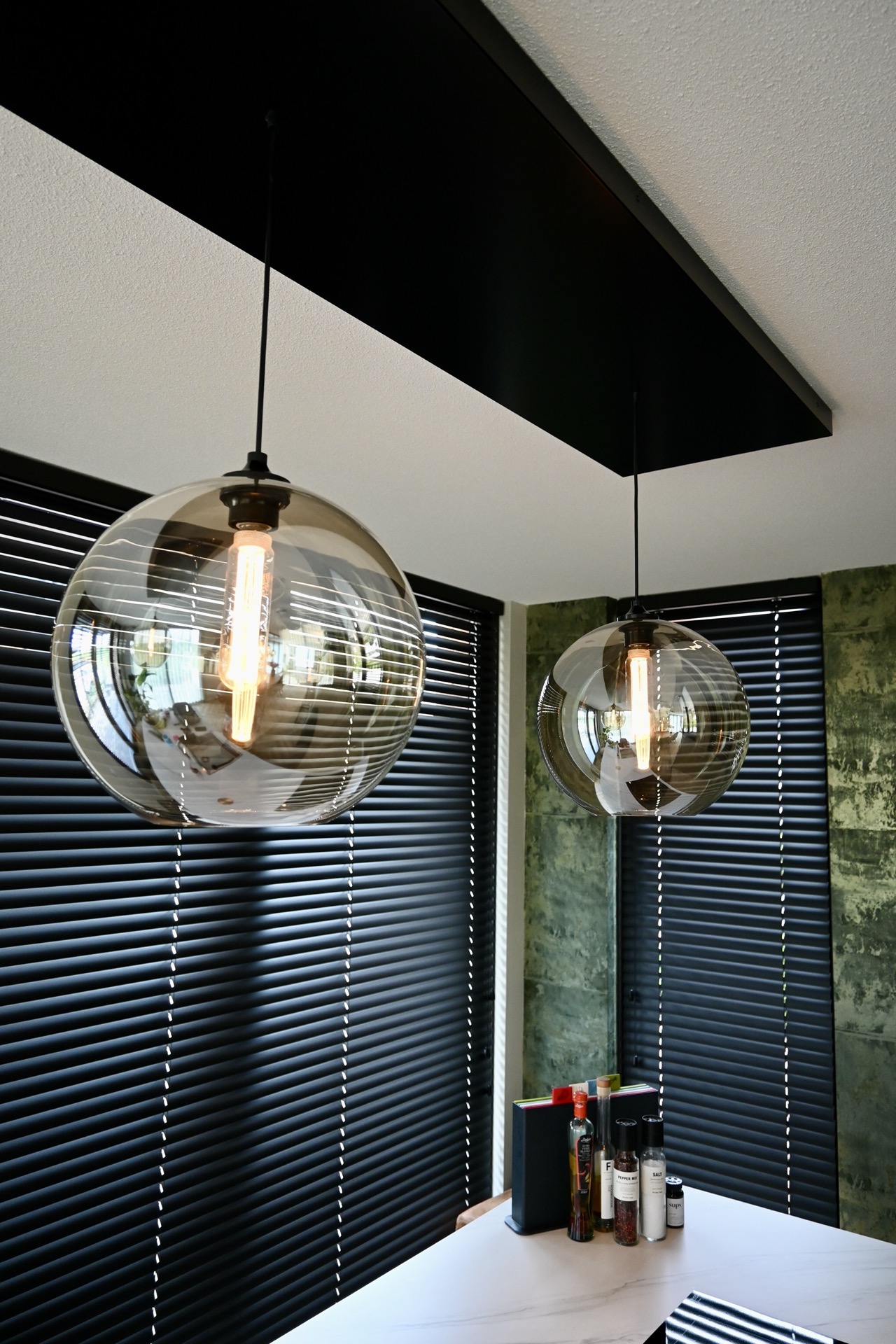
In the dining area, the light source becomes part of the composition. A cluster of glass pendant lights hangs above the table, each shade showing a warm amber glow from within. The bulbs are visible, which keeps the lighting direct and slightly graphic. Below them, the table combines a wood top with a beige bench seat, so the room continues the same restrained palette used in the sitting area. The lighting does not merely illuminate the table; it defines the zone and gives the dining area its own clear edge.
That dining zone feels closely related to the lounge, yet it has its own pace. The table surface is longer and more linear than the round coffee tables, and the bench seat tightens the composition along one side. The hanging lights mirror this arrangement from above. Their glass forms echo the transparent table decor seen elsewhere in the project, tying the open-plan spaces together through repeated shapes rather than through obvious matching. It is a subtle move, but an effective one for dining area inspiration.
Curtains and blinds that soften the windows
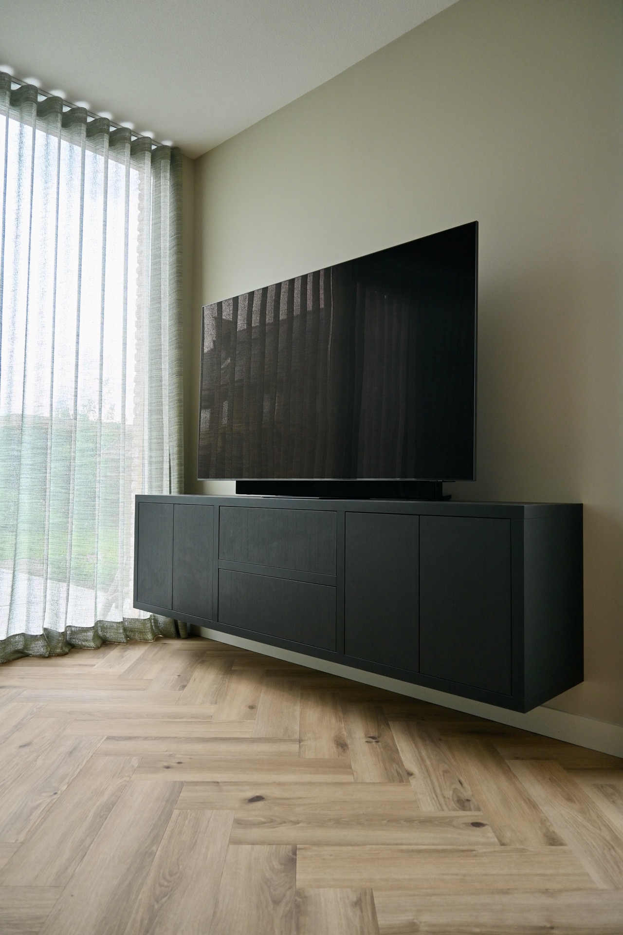
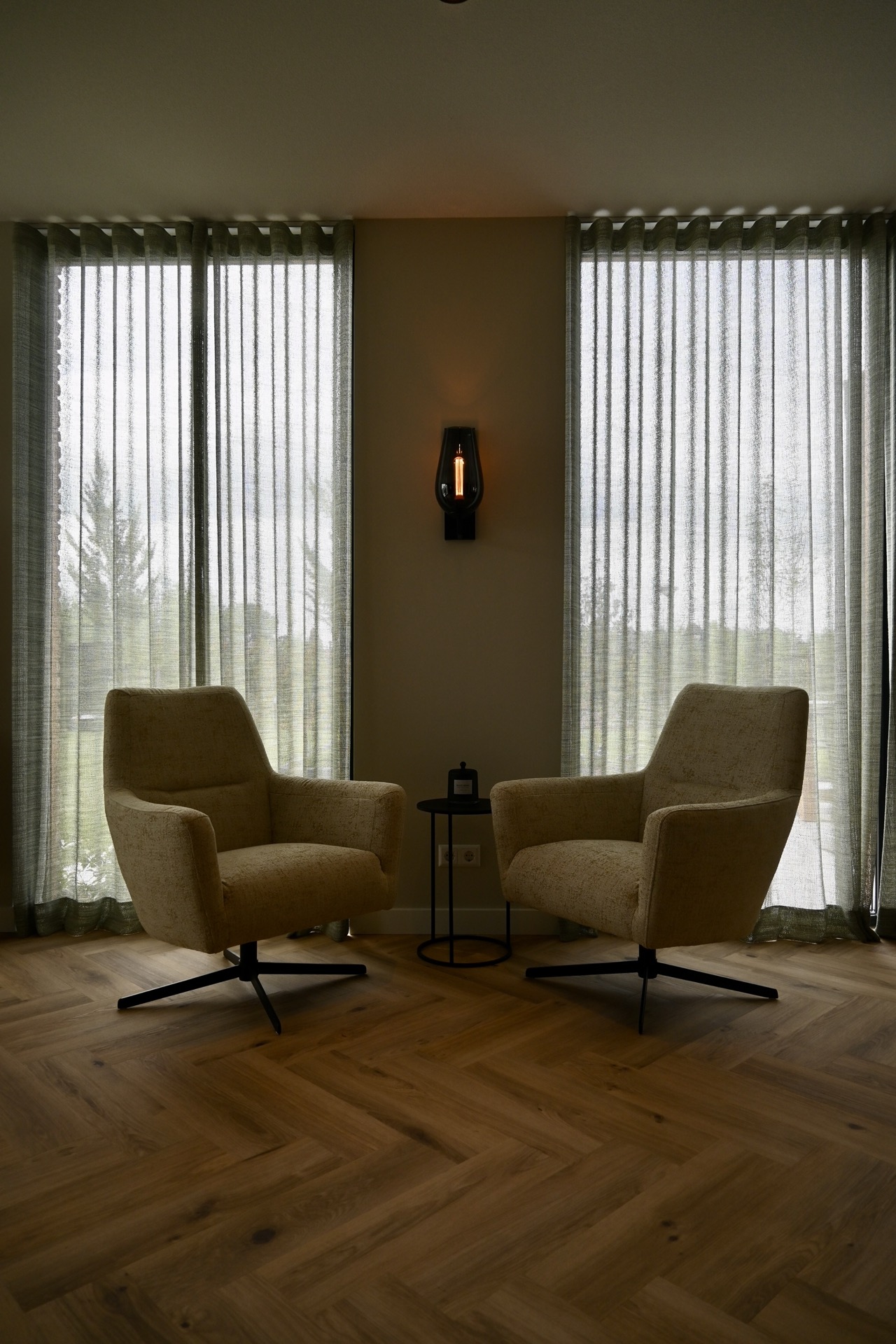
The windows are dressed in layers. Sheer fabric, heavier curtains, and blinds or slats work together to control the light without flattening it. From one angle, the textiles appear almost translucent; from another, they sit as solid vertical planes beside the glazing. That variation matters, because it keeps the room from feeling overly exposed. The window treatment also brings a soft edge to the harder details in the custom joinery and black frames. For projects focused on curtains and blinds, this is a useful example of how layers can do more than cover glass.
Light lands differently across the room because of those layers. On the sofa fabric, it stays gentle and diffuse. On the green wall, it becomes more directional and reveals the textured finish. On the pendant glass, it creates warm reflections and a small sense of depth. The room depends on these shifts. Nothing is overlit, and nothing is left in shadow without reason. The result is a living area that changes through the day, with the textiles and glazing quietly controlling what the eye notices first.
Details that keep the room grounded
Several smaller choices hold the composition together. The black bases under the tables, the dark edges of the cabinetry, and the circular silhouettes of the light fittings all repeat a similar visual language. Even the decorative objects are restrained: a glass dome, a few books, a vase of flowers, and framed artwork on the wall. These items do not compete for attention. They sit in relation to the larger surfaces and reinforce the room’s measured scale. In a project like this, that restraint is what keeps the space from feeling busy.
The furniture layout also leaves space for movement. There is enough clear floor around the coffee tables to show the wood flooring, and the seating does not block the sightline toward the dining area. That openness matters because it allows the green wall, the soft upholstery, the cabinetry, and the pendant lights to read as parts of one lived-in interior rather than as isolated scenes. The room feels assembled from recognizable elements, each with its own texture and outline, yet none of them dominates without support from the others.
What stays with you is the way the project uses contrast without raising its voice. Pale fabric sits against dark joinery. Glass hangs above wood. A textured green wall meets smooth tabletops and woven upholstery. The palette stays close to earth and stone, but the room never turns heavy because the shapes are rounded and the light is carefully layered. That combination gives these living room ideas their clarity: a cozy living room formed through material contrast, warm lighting, and a clear sequence from seating area to dining area.
Want to see more of Miryam Schotman Interieurs? View the page of Miryam Schotman Interieurs for even more great projects and company information.



NEW 2026 Jubileum Edition The Best Interior Designers Benelux
Order Now €125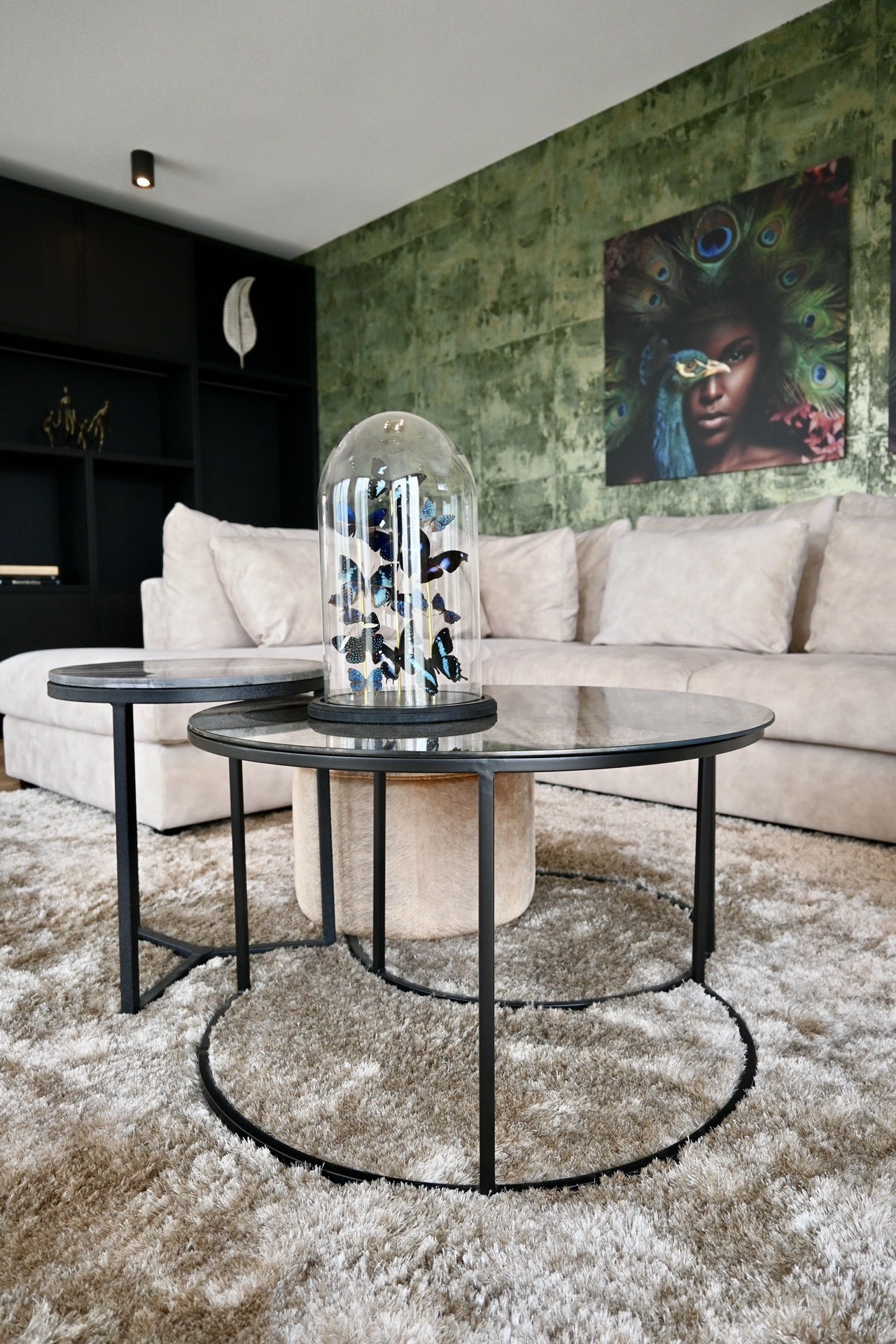
NEW 2026 Jubileum Edition The Best Interior Designers Benelux
Order Now €125

NEW 2026 Jubileum Edition The Best Interior Designers Benelux
Order Now €125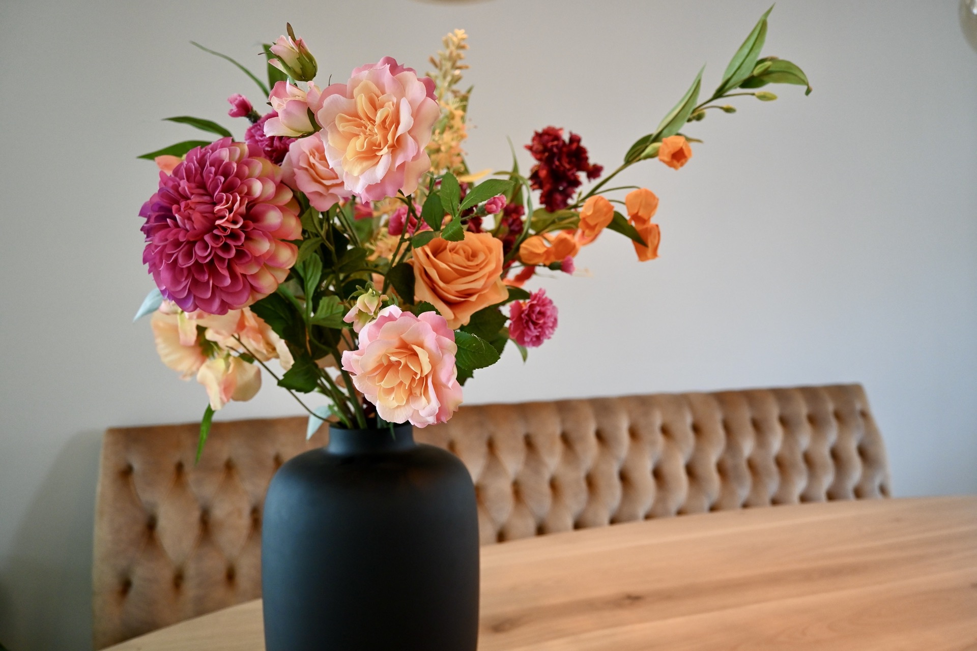


NEW 2026 Jubileum Edition The Best Interior Designers Benelux
Order Now €125