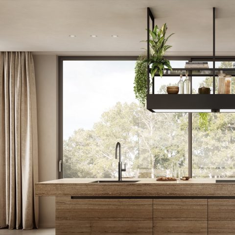
A warm cream-colored sink as a kitchen statement
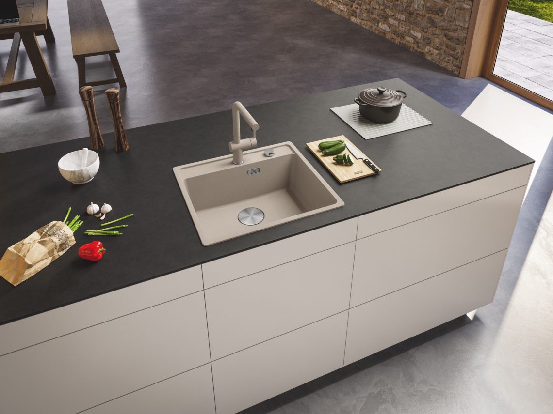
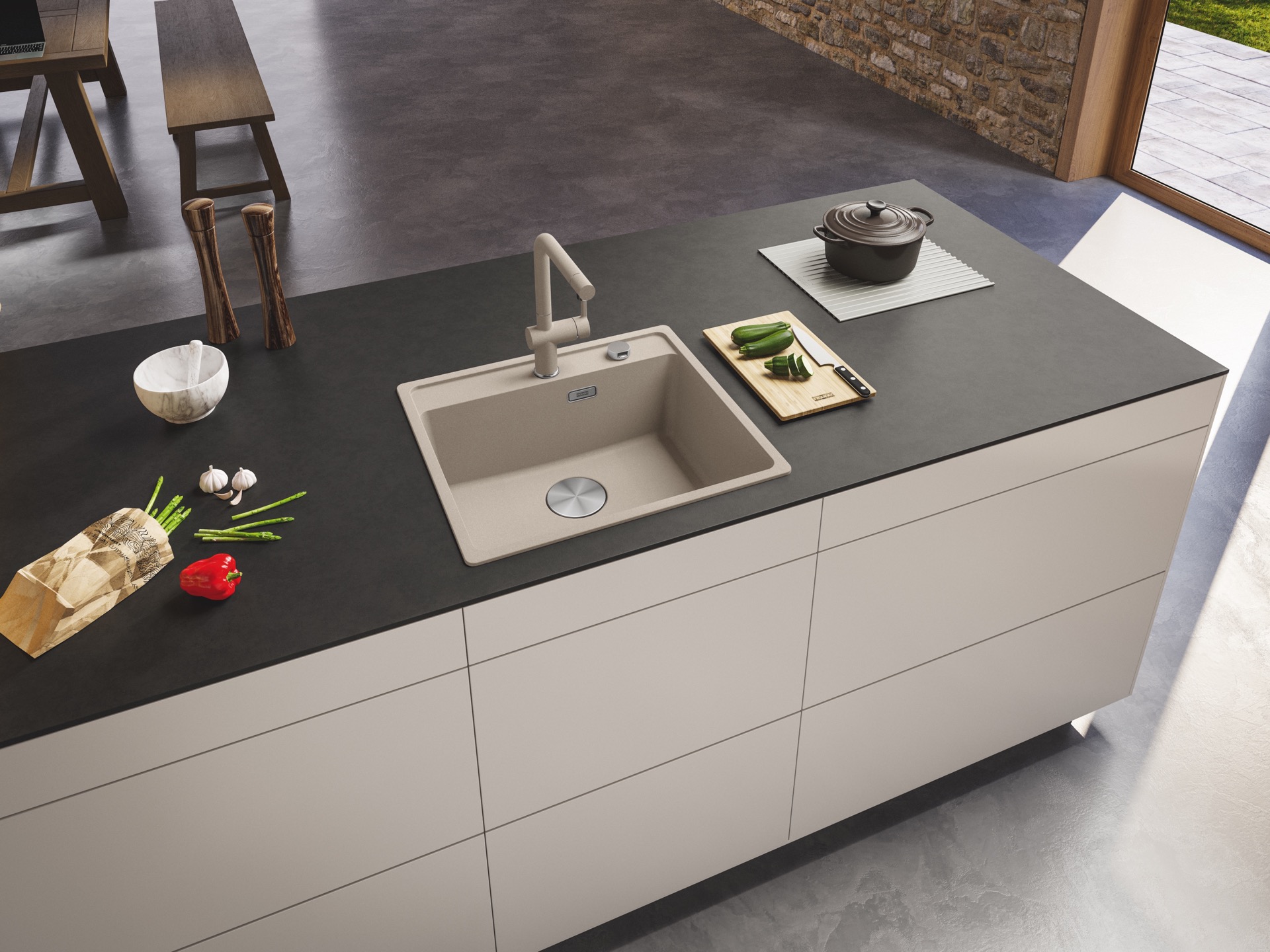
The sink sits quietly in the middle of the room, yet the finish is what catches the eye first. In this kitchen, the creamy surface softens the harder lines of the countertop and the dark edge around it. The result is a kitchen sink that reads as part of the composition rather than an accessory added at the end. Its warm tone works especially well beside a stone look countertop, where pale veining and muted beige notes keep the surface calm.
A cream tone that settles into the kitchen
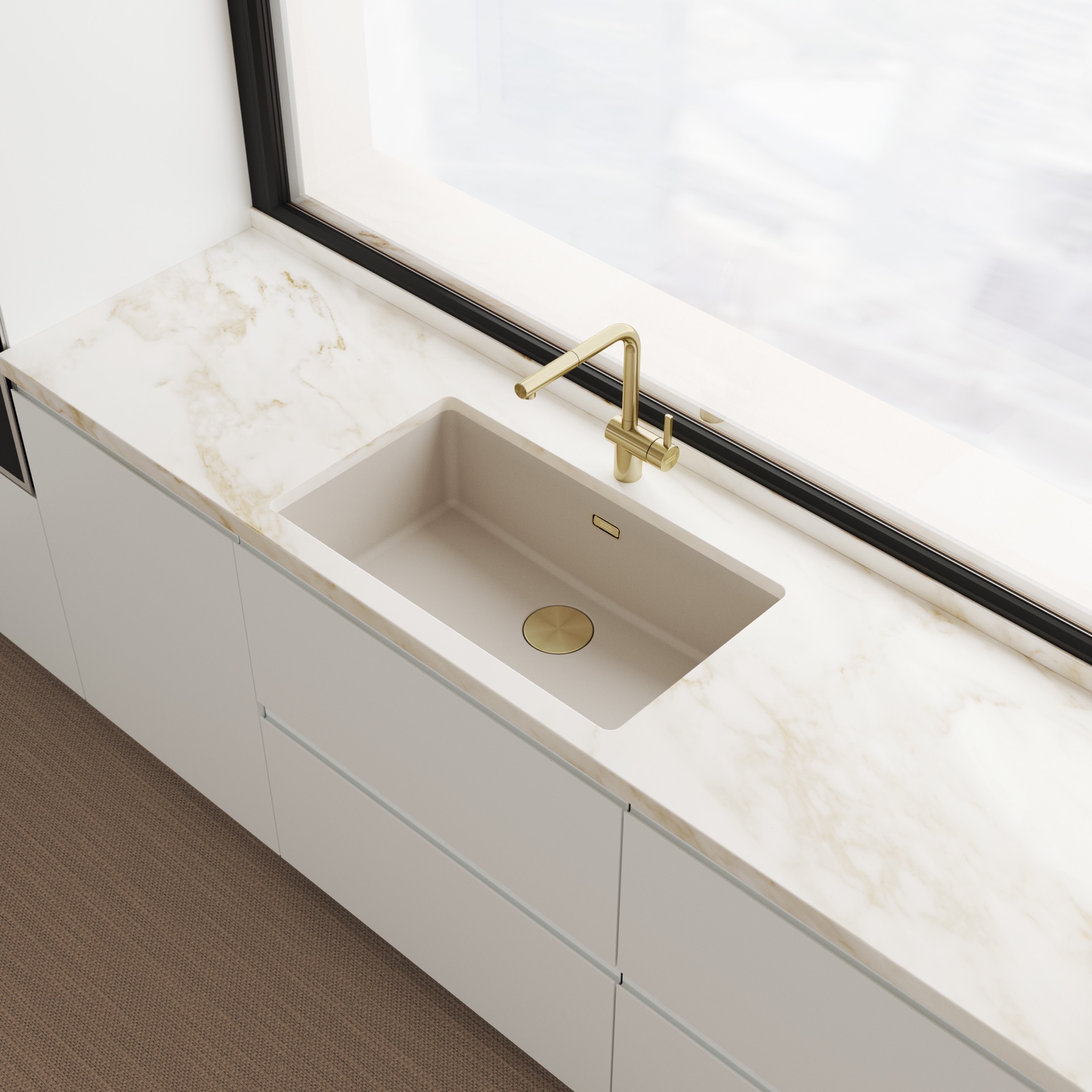
The new Coffee Cream finish brings a softer register to a modern kitchen sink. It is warm without turning yellow, and pale without feeling stark. That makes it easy to place next to travertine or other stone-like worktops, where the sink can pick up the natural movement in the surface instead of competing with it. In the wider view, the basin sits cleanly beneath the counter line, giving the worktop room to do its job while the sink anchors the layout.
This is where the material choice matters. Fragranite is described as strong and fully coloured through, so the finish is not just a skin on top of the bowl. The subtle sheen gives the basin a dry, tactile look in the images, and the rounded inside corners keep the shape from feeling rigid. Seen from above, the bowl has enough presence to read clearly, but it does not pull the eye away from the countertop or the tap.
Designed to sit flush in different layouts
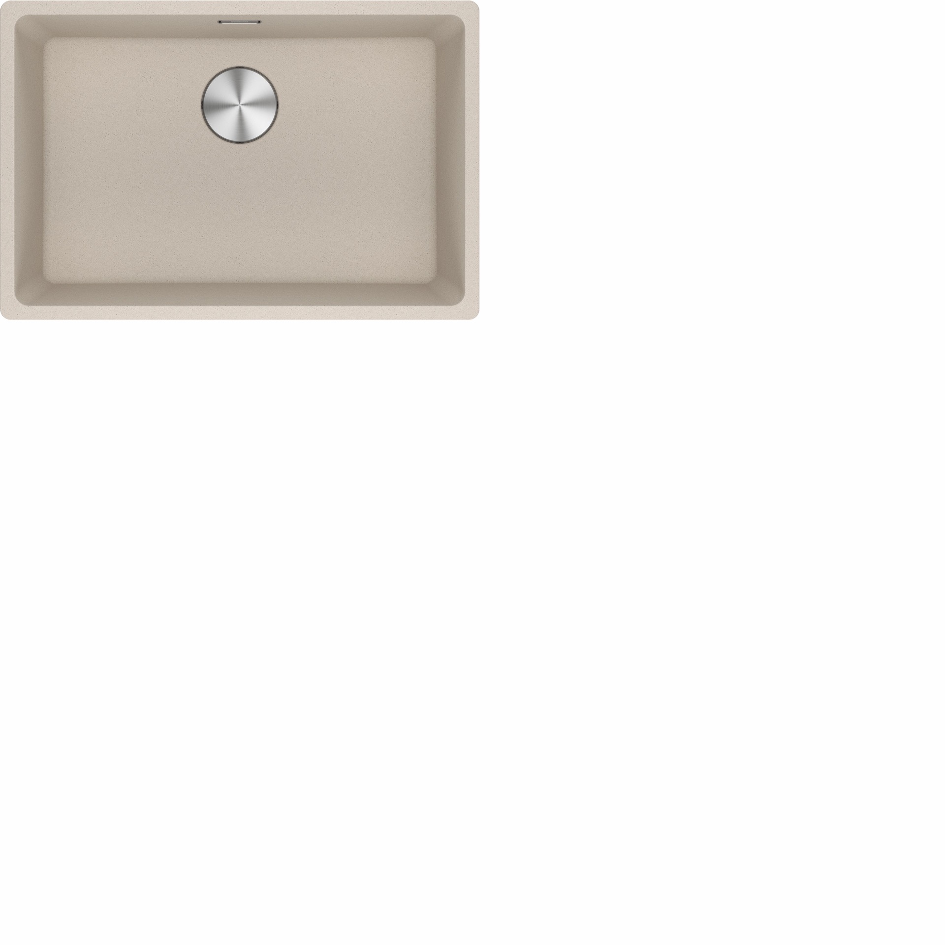
The Maris Fragranite range comes in several models and sizes, from undermount to top mount versions. That range is part of the appeal here: the same creamy sink finish can work in different kitchen layouts without losing its calm presence. In one image, the sink is set into a broad dark work surface with raised edges nearby; in another, the basin is shown more closely, where the rectangular form and softened corners are easier to read.
Because the basin is shown in more than one setup, the project feels practical rather than staged. You see how the sink sits with the counter, how the edge line is handled, and how the tap rises beside it without crowding the working area. It is a modern kitchen sink that keeps its shape clearly visible, whether viewed as a detail or as part of a full run of cabinetry.
The surface does the quiet work
The material language is restrained. There is no polished shine to announce itself from across the room, only a controlled sheen that catches light along the rim and inside the bowl. That works well with the warm-toned sink idea: the colour gives the basin depth, while the finish keeps it from looking heavy. In the close-up, the drain sits as a simple circular point in the middle, a small element that reinforces the basin’s geometric order.
Fragranite is also described as nearly resistant to scratches, knocks and stains, which is useful language for a sink that has to live with daily use. The claim is not absolute, and it does not need to be. What matters is the way the material is presented here: solid, even in colour, and suited to a kitchen where the sink is meant to be seen, not hidden. The texture reads as crisp in the images, especially against the smoother, stone-like worktop.
Warm metal beside pale stone
The tap matters as much as the bowl. Its gold-toned finish introduces a warmer metallic note that works with the creamy basin and the pale veining in the countertop. The combination is subtle but deliberate. Instead of turning the sink area into a bright focal point, the tap gives it a measured accent, one that sits well with the modern kitchen sink and the surrounding neutral palette. The effect is clearest in the wider image, where the spout rises cleanly from the counter without interrupting the line of the work surface.
That pairing also explains why the sink reads so easily in a contemporary room. The creamy sink finish is soft enough to sit back, while the warmer metal gives a small point of contrast. Around it, the stone look countertop supplies the pattern, the dark edge adds definition, and the bowl remains the most legible object in the frame. Nothing feels overworked. The elements are distinct, and each one has a job to do.
More than one colour, same clear shape
Coffee Cream is presented as a new addition to the range, not the only option. Other colours remain available, which means the same basin form can be adapted to different schemes. That flexibility is useful, but the appeal of this version lies in its specific tone: soft, warm, and grounded enough to sit beside natural materials without looking flat. In a kitchen where surfaces already carry texture, the sink does not need to compete. It needs to hold its place, and this one does exactly that.
Seen across the three images, the project shifts from full composition to close detail and back again. First the basin as a statement in the room, then the edge and proportion, then the material surface and drain position. That sequence makes the kitchen sink easy to read from different distances. It also shows why the finish matters: the colour is strong enough to register, but gentle enough to work with the surrounding stone-like surfaces and the warm faucet finish.
The overall impression is one of restraint. The sink does not try to dominate the kitchen, but it does give the room a clear centre. With its creamy tone, rounded basin corners and measured sheen, the modern kitchen sink becomes the one detail that quietly orders the rest of the space. It is an understated move, but a useful one: the kind of choice that lets the countertop, the tap and the basin speak in the same visual language.
For anyone comparing kitchen sink options, the strength of this design lies in its clarity. The undermount kitchen sink version sits neatly under the worktop, while the wider range of models suggests it can adapt to other layouts as well. The colour is the memorable part, yet the shape and material carry just as much weight. Together, they turn a working element into the part of the kitchen you notice first.
Want to see more of Franke? View the page of Franke for even more great projects and company information.