Minimalist interior with warm, serene materials
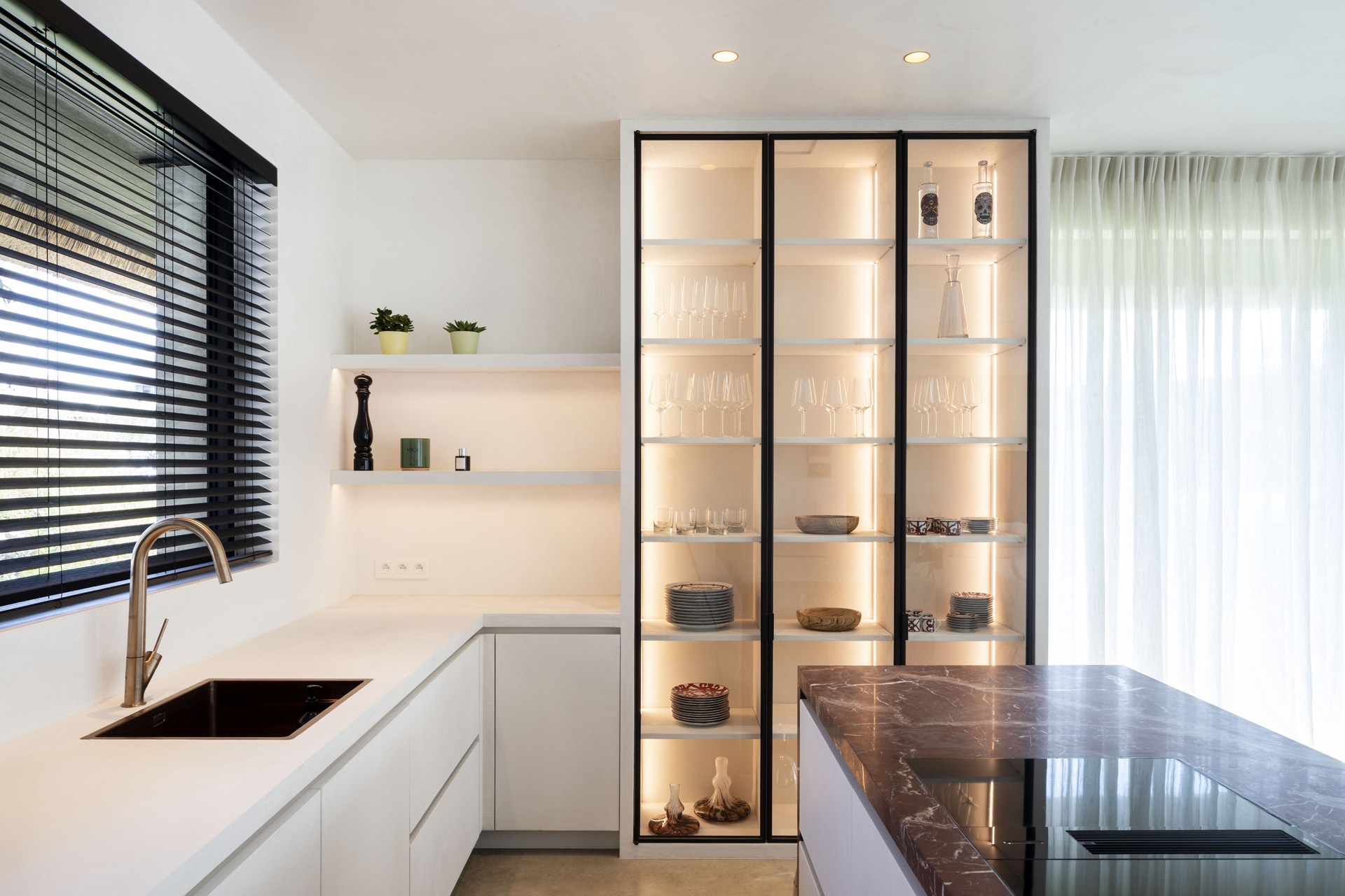
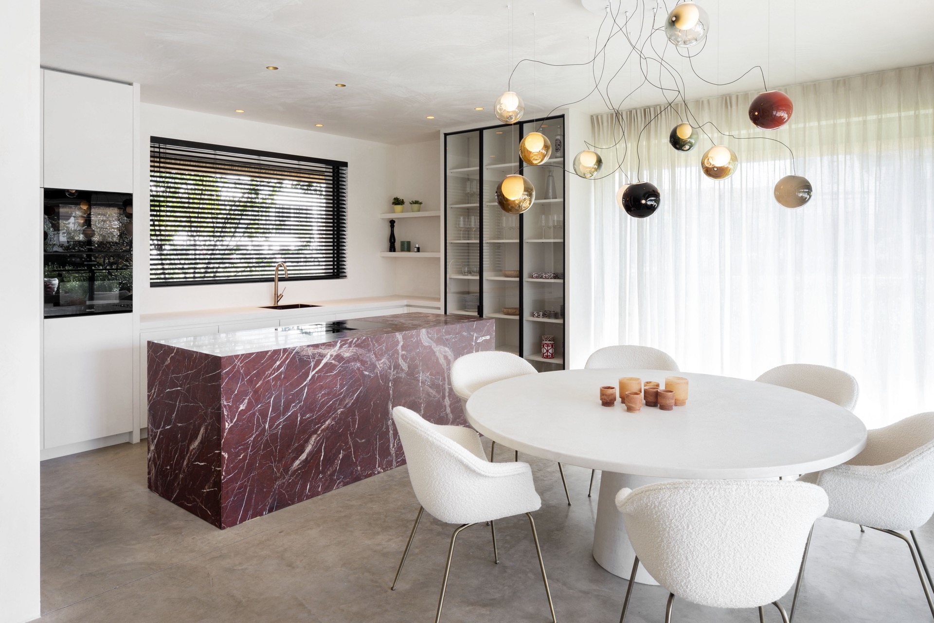
The first impression comes from the floor: concrete underfoot, pale plaster on the walls, and small gold-toned surface spots that catch the light without drawing attention away from the room. In this minimalist interior project, the palette stays restrained, yet it never feels flat. Walnut accents interrupt the neutral surfaces, and the island in polished marble with red jasper gives the ground floor a clear centre. The result is a modern minimalist interior that reads as quiet, but not cold.
Concrete floors and plaster walls on the ground floor
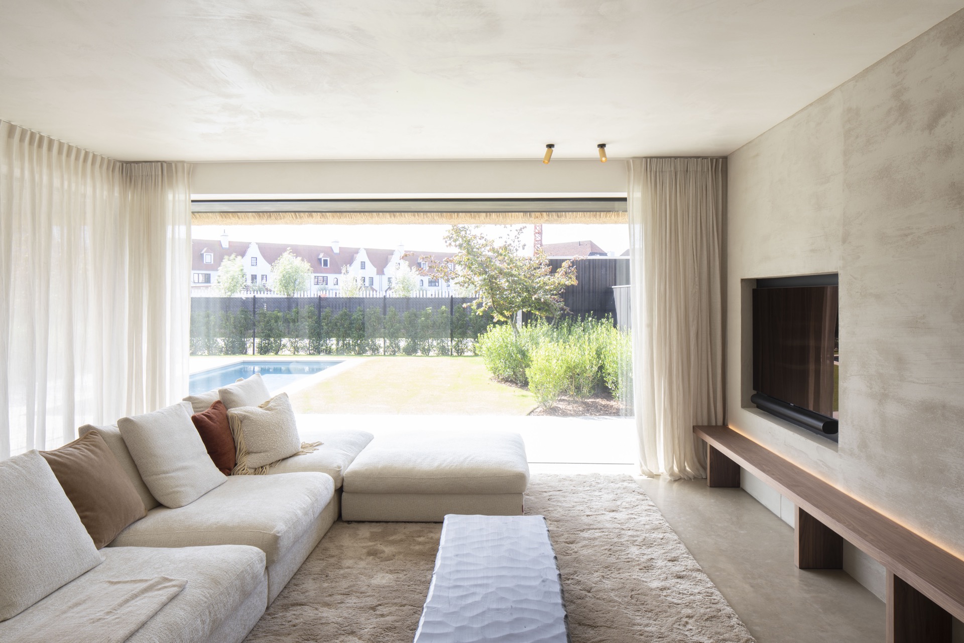
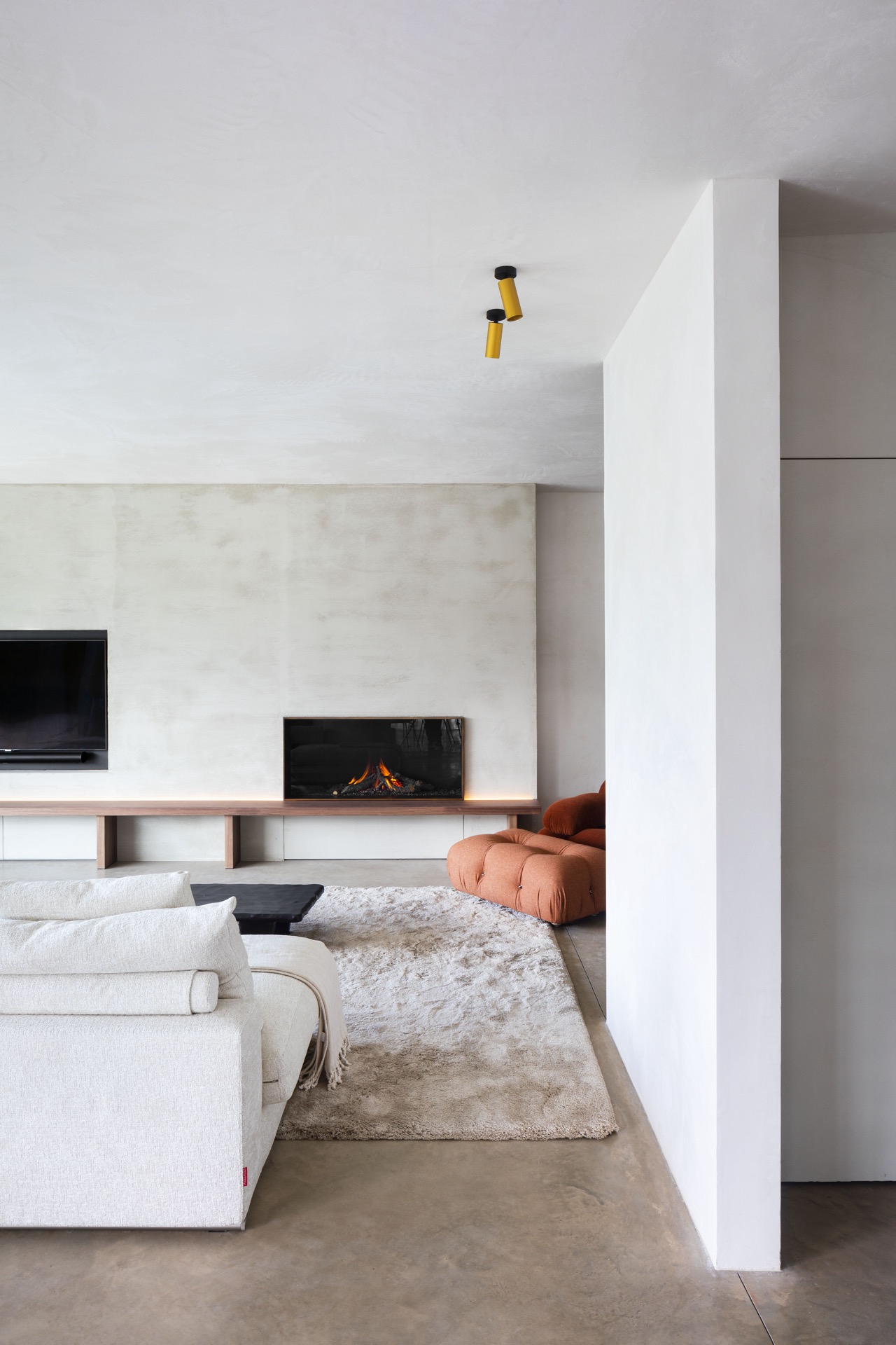
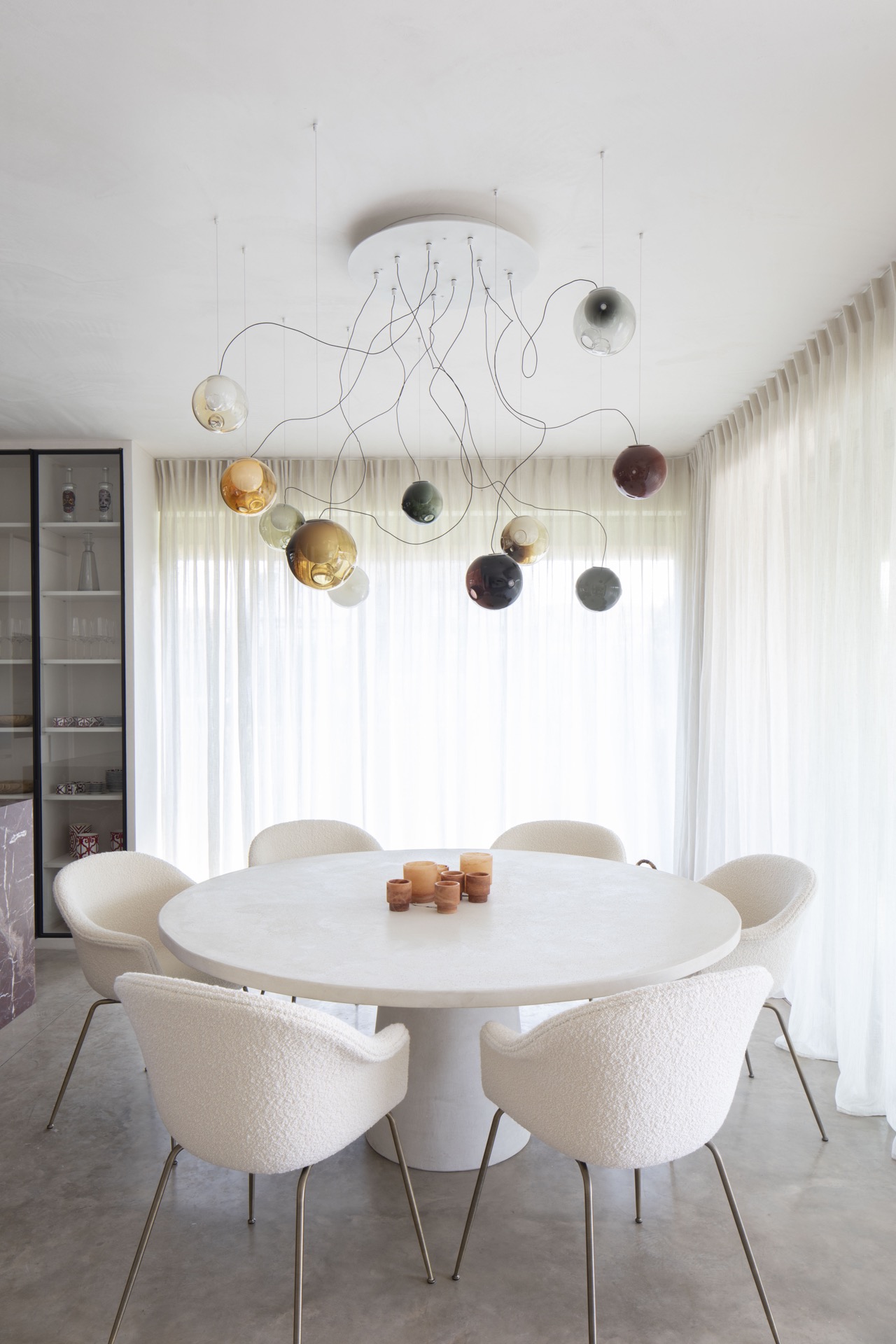
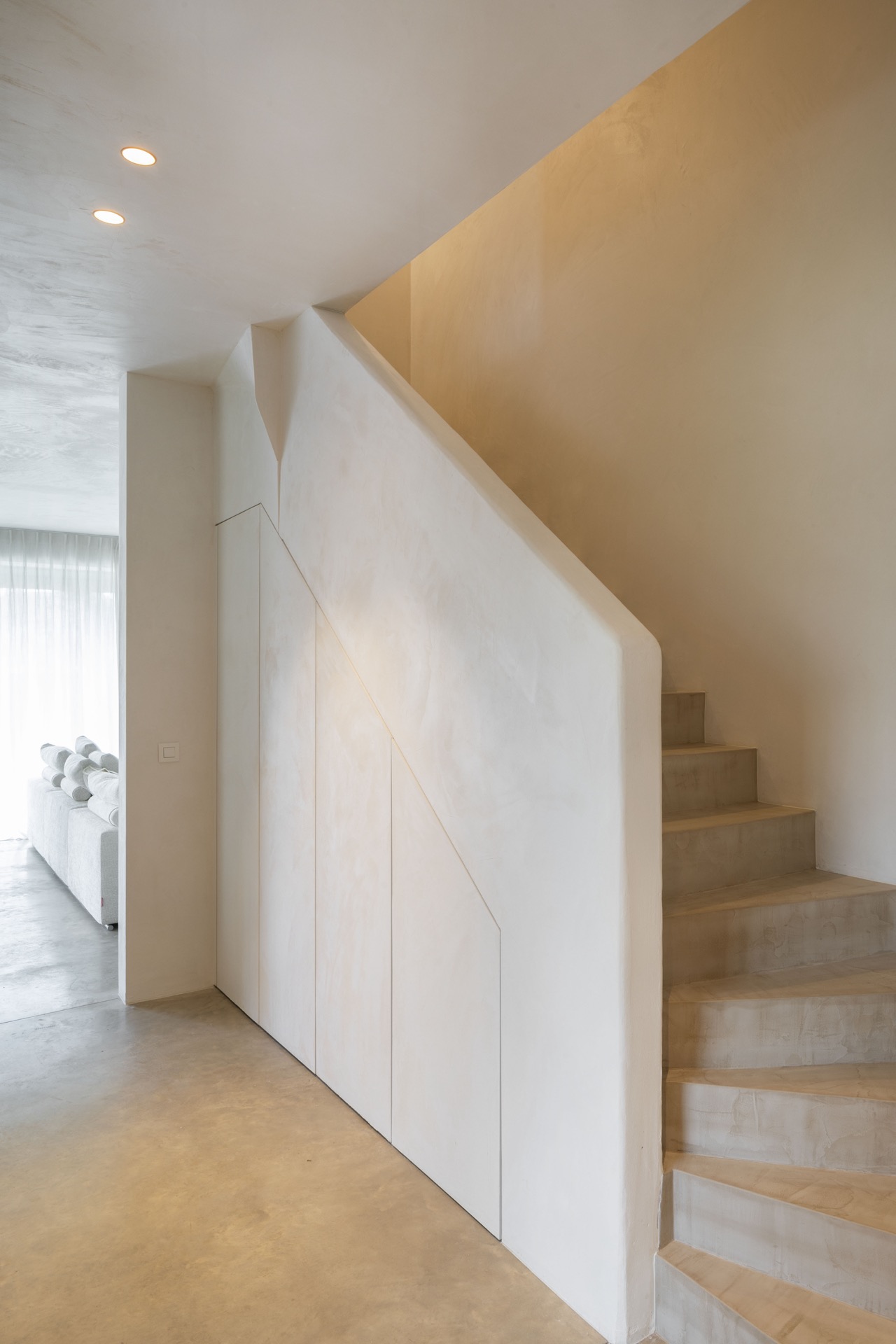
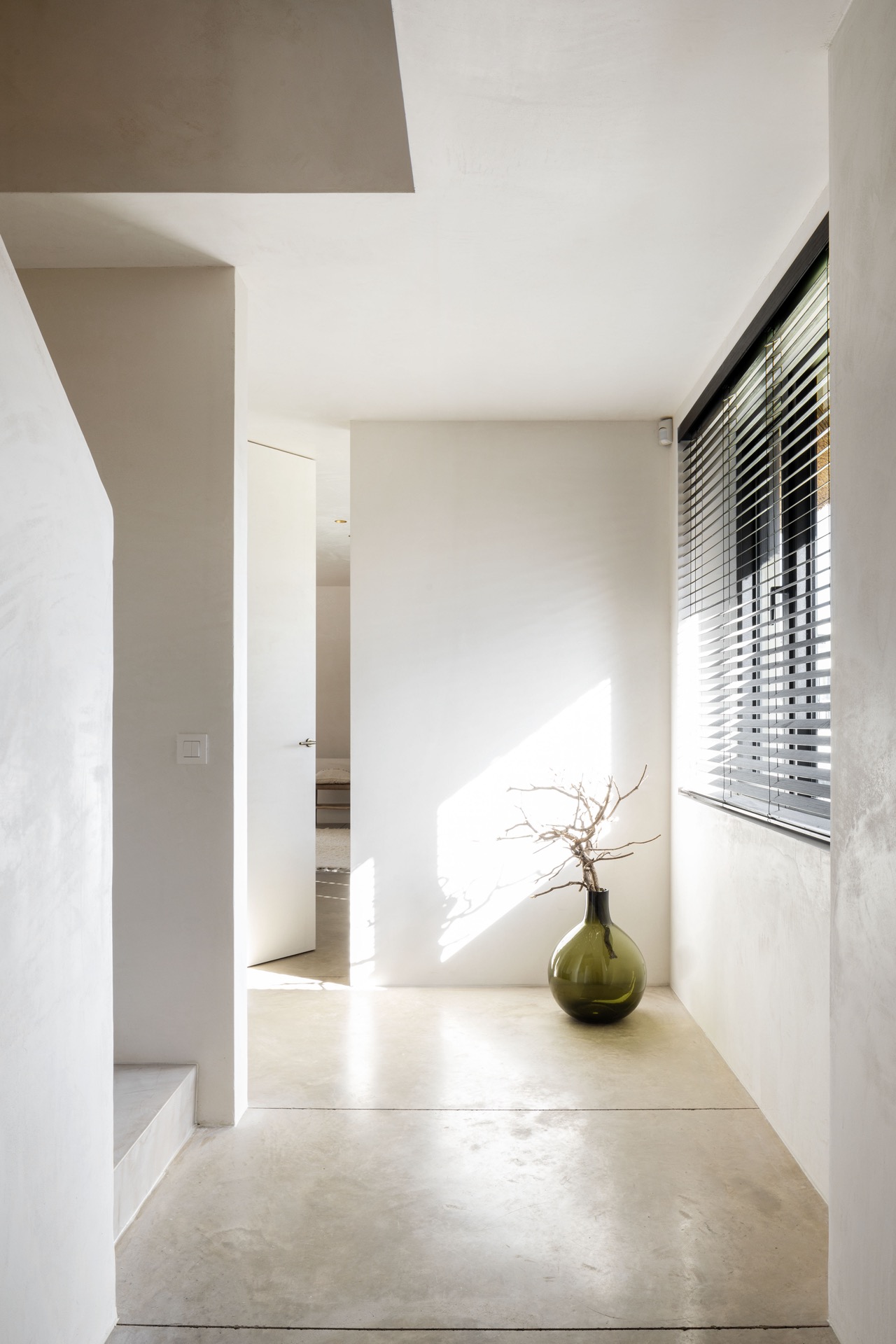
On the ground floor, the materials are kept close to their basic character. The concrete flooring runs across the room with very little visual noise, while the decorative plaster on the walls softens the larger surfaces. That matte finish matters here: it lets the light move across the room without glare. Walnut details break up the pale envelope, and the gold-coloured surface spots sit almost flush, adding small points of reflection rather than a heavy ceiling pattern. The whole level feels organised around surfaces, not ornament.
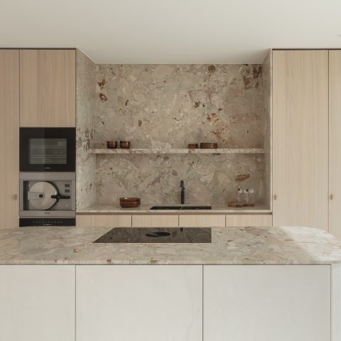
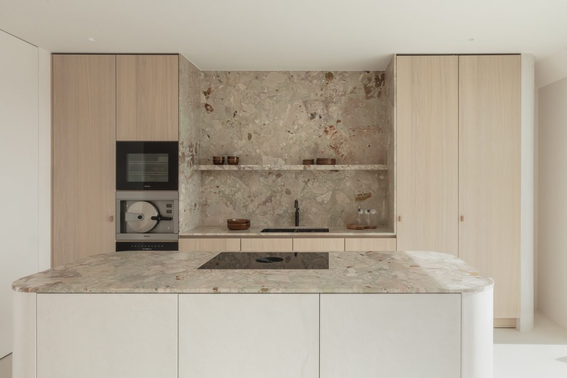
The kitchen island is the most decisive element in the space. Polished marble with red jasper sits against the quieter concrete and plaster background, so the stone reads as a deliberate interruption rather than decoration. Its surface brings movement into a room that otherwise relies on long, calm lines. Nearby, the walnut accents keep the composition grounded. This is where the minimalist interior project shows its sharper edge: one material is allowed to speak, while the others hold the room steady around it.
Upper floors with bronze, plaster and greyed poplar
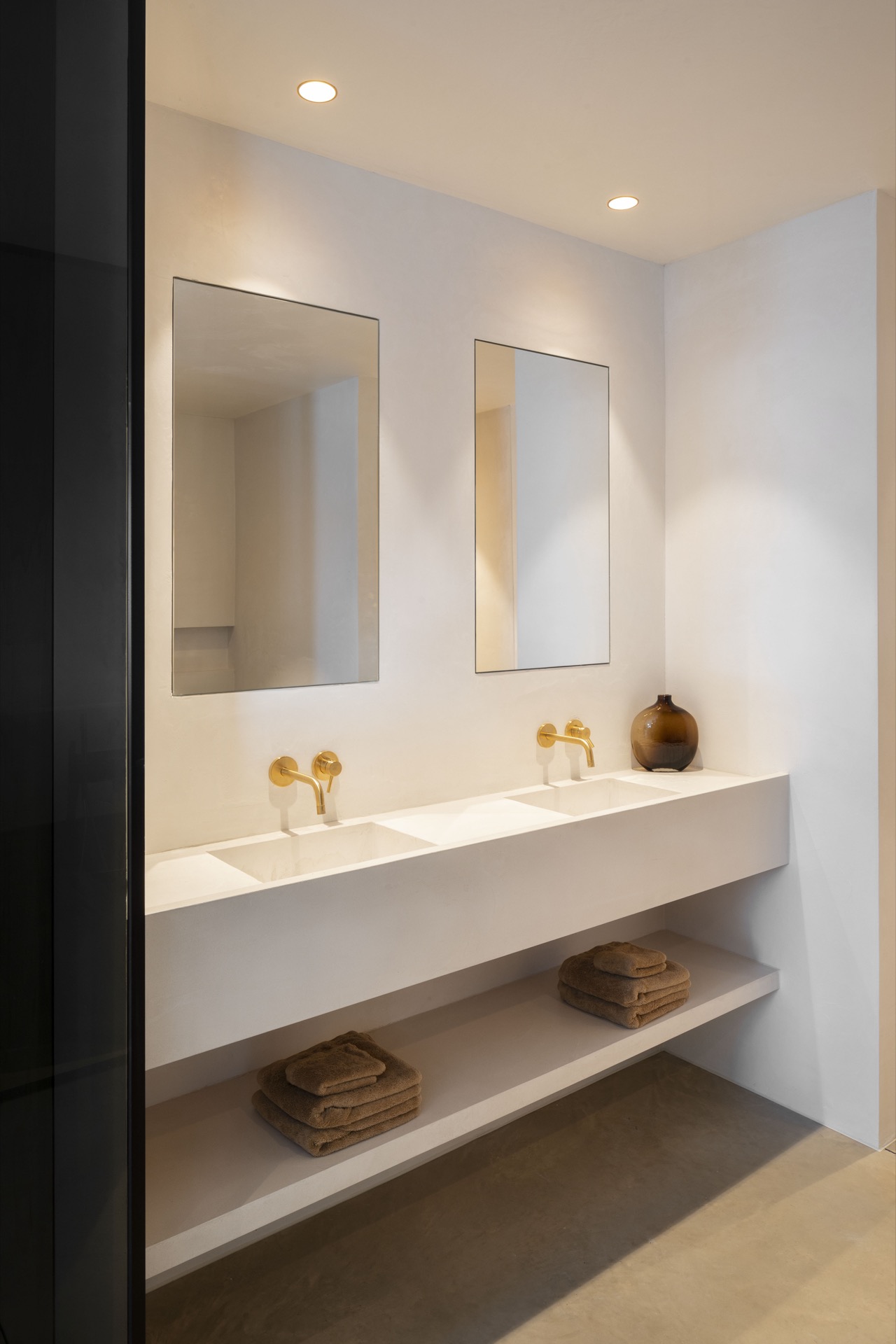
Upstairs, the atmosphere changes through touch rather than colour. Bronze tapware gives the bathrooms a darker note, especially against the lighter wall surfaces. The vanity units are finished with lime-gloss plaster, which catches light differently from the concrete below and gives the wash areas a smoother, denser look. Greyed semi-solid poplar adds another layer, its muted tone sitting between the bronze fittings and the pale walls. Together they create a luxury home interior that depends on material transitions instead of strong contrast.
The upper floors do not repeat the ground level exactly. They take the same restraint and shift it into a more refined register. The bronze taps, the plaster-finished washbasins, and the greyed poplar work as a set, with each material visible at hand level. That makes the rooms feel considered in use: water, storage, and wall surface are all given their own finish. In a bathroom design context, it is the absence of excess that keeps the details readable.
Light points, walnut and clean wall lines
Gold-toned surface spotlights are used sparingly, and that restraint helps the ceiling stay visually light. They pick up the edge of the plaster and the grain of the walnut without turning the room decorative. The wall lines remain clean, with openings cut neatly through the surfaces rather than framed with extra profile work. It is a simple move, but an effective one: the space reads as calm because the boundaries are exact. In an otherwise neutral setting, those small light points become part of the architecture rather than a separate layer.
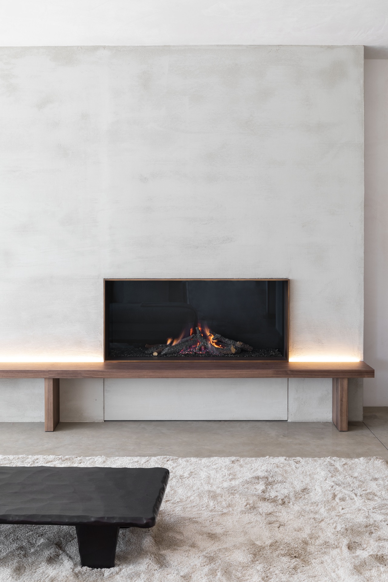
Walnut appears as a measured accent rather than a dominant finish. It interrupts the pale walls and concrete floor just enough to add depth to the room, especially where it meets the kitchen and storage elements. That measured use of wood is what keeps the interior from feeling overly sparse. The material list stays short, but the spacing between the finishes creates enough rhythm. This is the kind of custom interior joinery that works through proportion and placement, not through decoration.
A polished stone island at the centre of the room
The island in polished marble with red jasper is the clearest moment of colour in the whole project. Set against the concrete floor and plaster walls, its surface brings a subtle depth that becomes visible as soon as light shifts across it. Because the rest of the room is so quiet, the stone does not need extra shaping or embellishment. It stands on its own. The surrounding finishes stay subdued so the island can anchor the ground floor without disturbing the overall stillness.
Seen in context, the kitchen feels connected to the rest of the house through material continuity. The concrete floor runs under it, the wall plaster stays consistent, and the walnut accents tie the island back to the wider interior. The effect is less about a showpiece kitchen and more about a room that lets one carefully chosen surface take the lead. That is where the page earns its place as a kitchen design reference: by showing how a single stone finish can structure the whole level.
Bronze fittings and lime-gloss plaster in the bathrooms
The bathrooms move the project into a more tactile register. Bronze tapware sits against lighter surfaces with enough weight to be noticed, but not enough to dominate the room. The vanity units finished in lime-gloss plaster have a slightly different sheen from the surrounding walls, which helps the wash zone read as a defined piece of interior work. Nothing feels overdesigned. Each surface is left to do one clear job, and the materials are chosen to be seen up close.
Greyed semi-solid poplar extends that quiet approach into the furniture and joinery. Its muted tone avoids the yellow cast that a brighter wood could bring, so the bathrooms stay aligned with the rest of the house. The result is a room that relies on texture, finish, and touch. Even without elaborate forms, the surfaces carry enough presence to make the space feel complete. This is where the project’s luxury comes through most clearly: in the small differences between plaster, wood, stone, and metal.
Views, openings and the sense of a larger setting
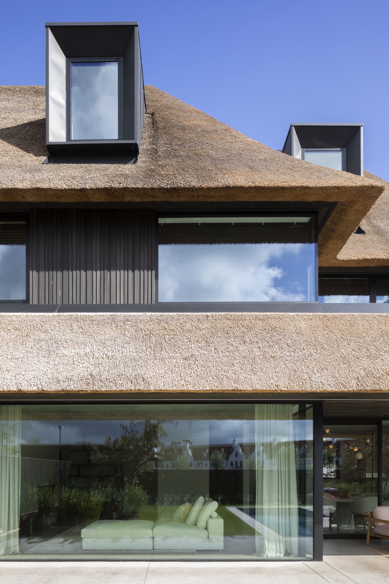
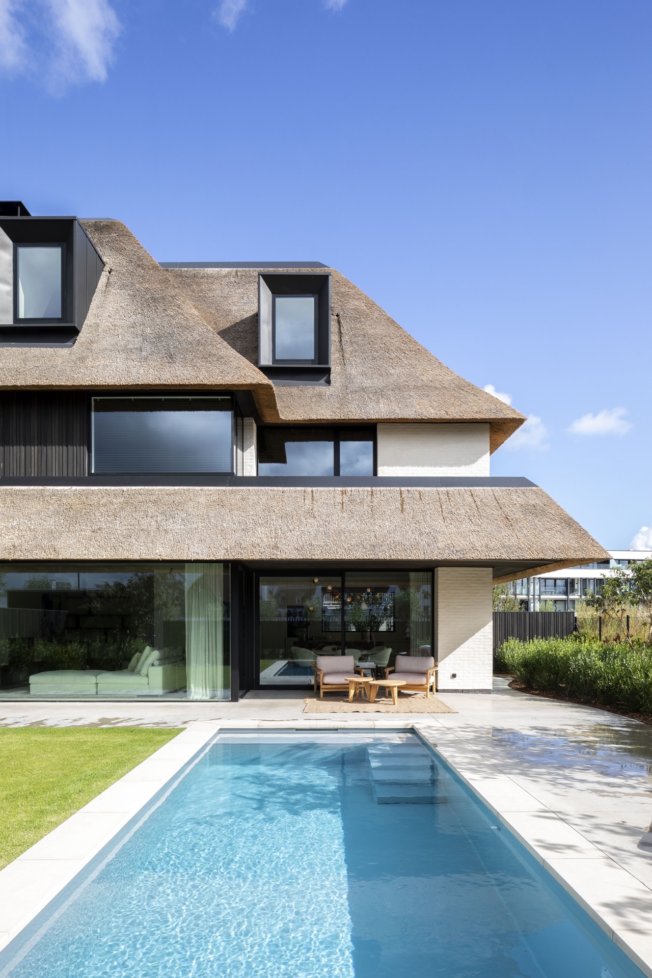
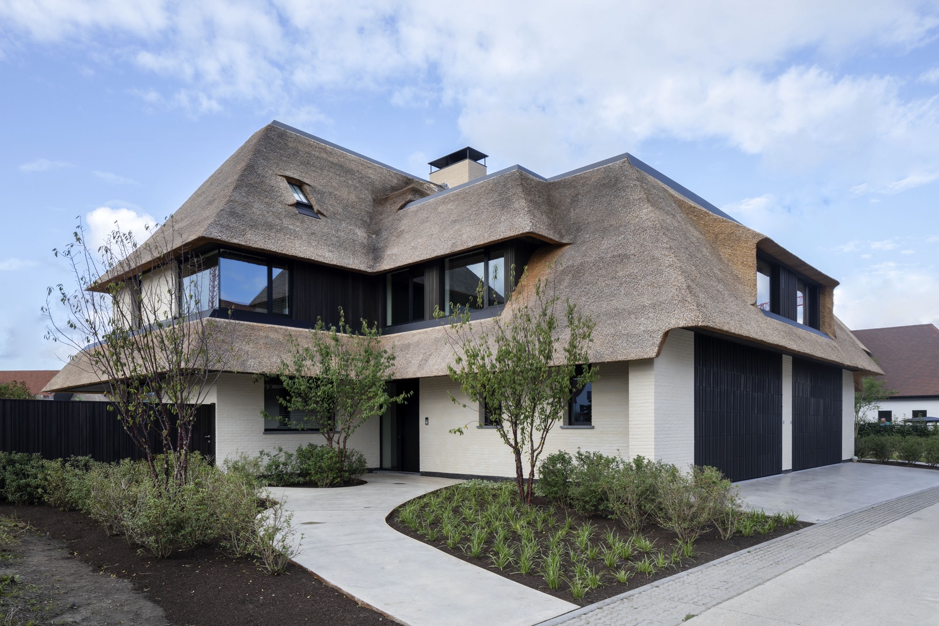
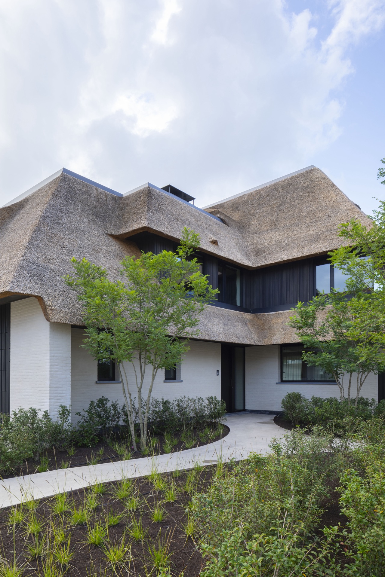
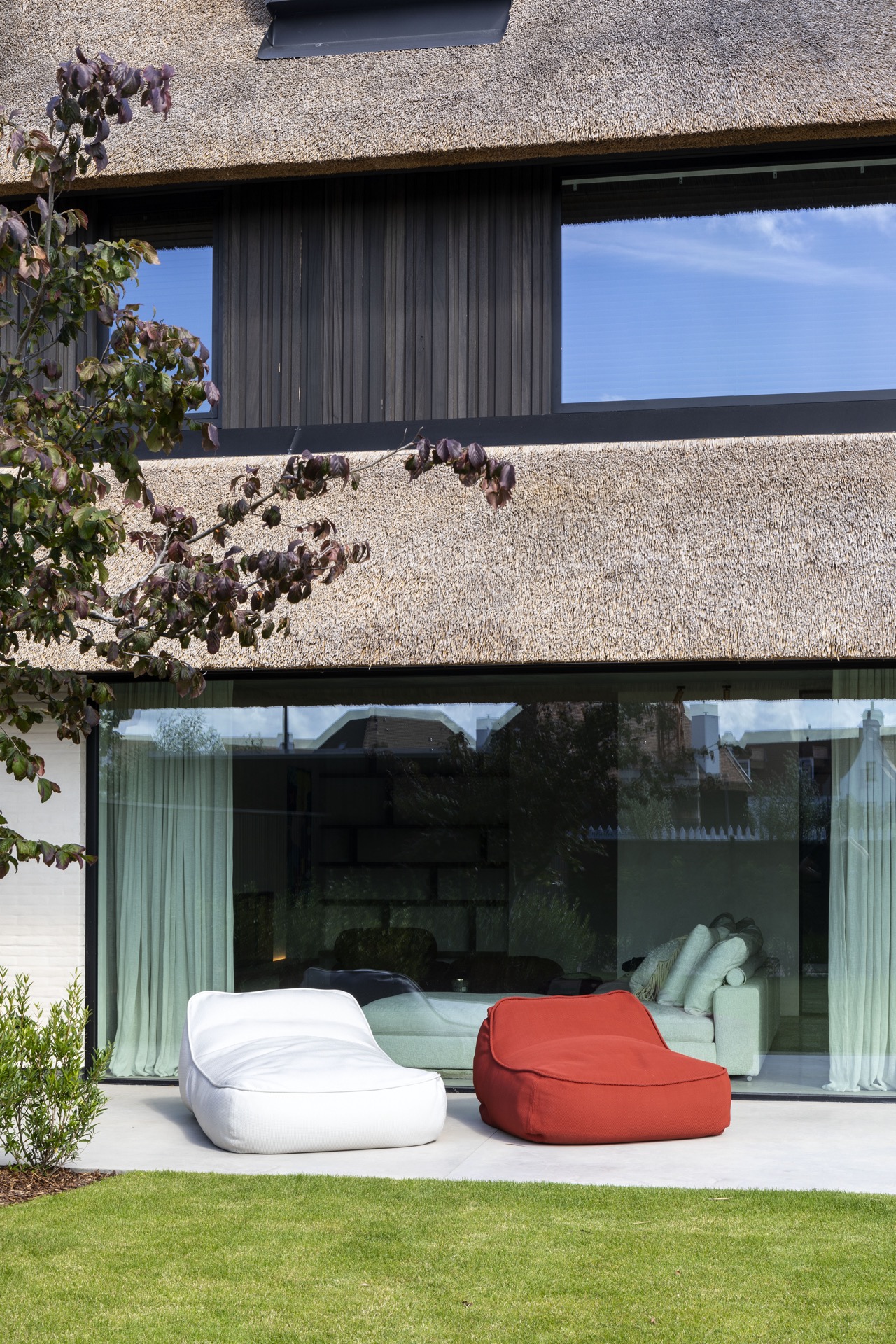
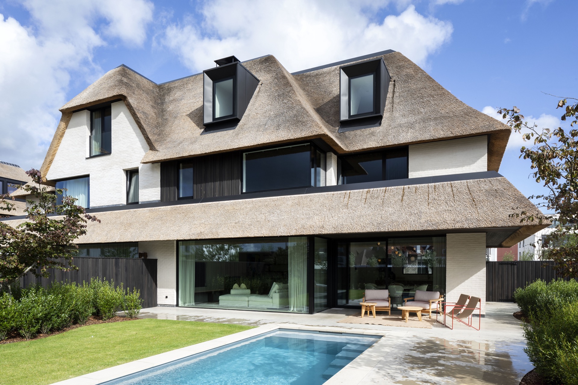
Although the interior is the focus, the visual context matters. The house is a freestanding property with a thatched roof, large panes of glass, and a long pool set into a clean outdoor area. Those exterior views frame the interior with a broader sense of scale. From inside, the large openings draw the eye toward the garden and water, while the dark window profiles and straight lines keep the composition crisp. The project’s calm comes partly from that back-and-forth between open views and controlled surfaces.
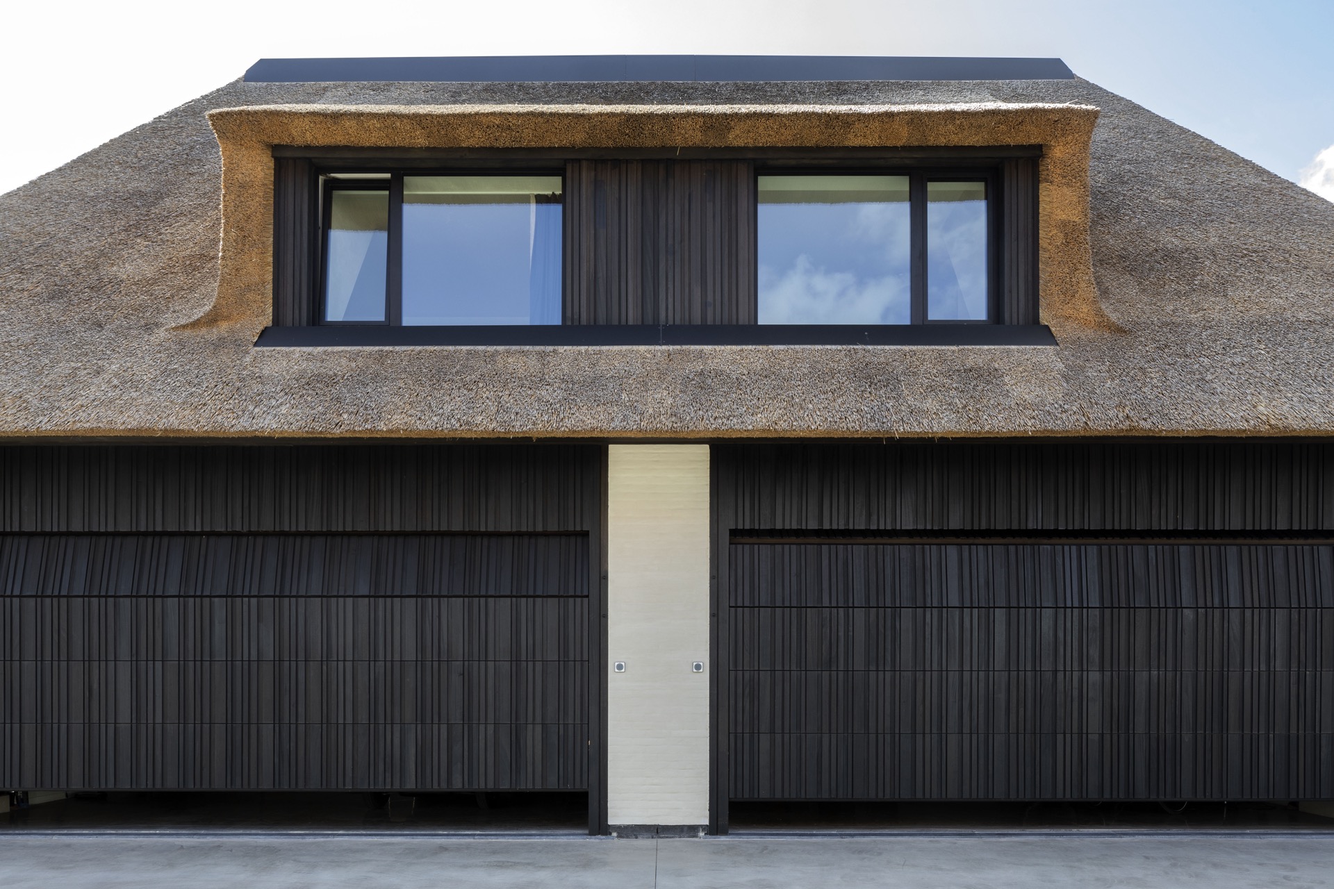
The exterior does not compete with the interior; it extends the same discipline. The roof texture, the glazed openings, and the pool edge give the house a clear outline before you even read the room materials. Inside, that outline is echoed by the straight wall lines and the measured use of finishes. For readers looking through a projects with pool lens, the appeal lies in how the water, glass, and roofline support the interior rather than distract from it.
Shower glass, black profiles and quieter contrasts
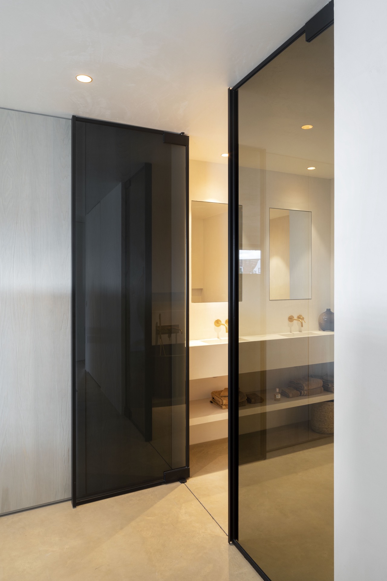
In the bathroom details visible in the images, the glass shower with black trim introduces a sharper line than the softer plaster and wood finishes elsewhere. The black framing gives the shower enclosure a clear outline, while gold faucet accents and a white vanity keep the rest of the room light. These contrasts are direct and easy to read. Nothing is hidden behind ornament. The room depends on the meeting points between glass, metal, and wall surface.
That same approach appears in the built-in fireplace niche, where the opening is framed cleanly and set into a matte wall surface. The firebox sits low, with the surrounding lines held back so the niche can remain a simple architectural cut. Seen together with the kitchen joinery and bathroom details, the house develops a consistent language: concrete, plaster, bronze, walnut, and greyed poplar, each used where it can be read clearly. It is this discipline that gives the minimalist interior project its distinct pace and identity.
Photography – The Art of Living, German Bourgeat
Want to see more of VS interieur? View the page of VS interieur for even more great projects and company information.


NEW 2026 Jubileum Edition The Best Interior Designers Benelux
Order Now €125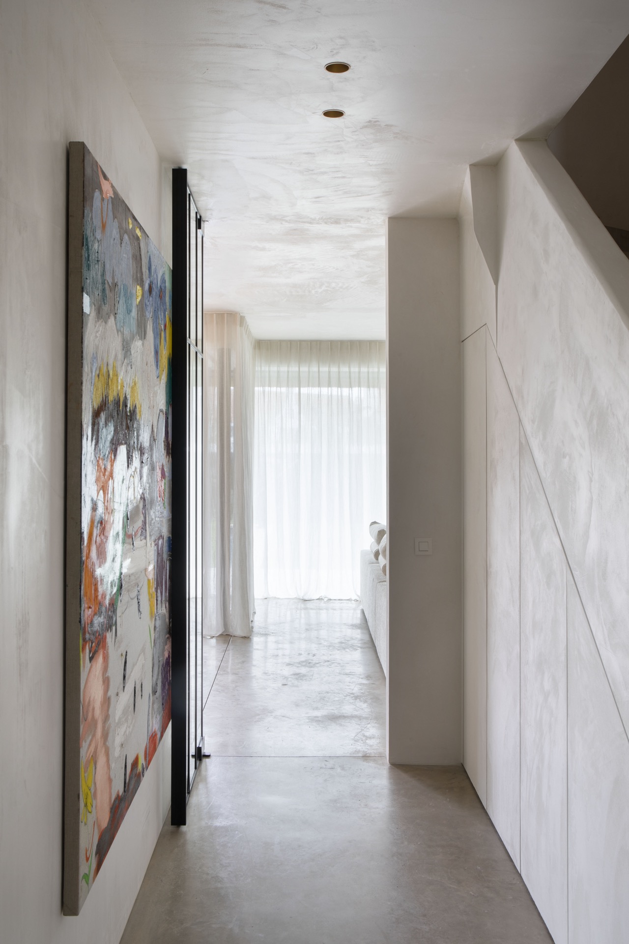
NEW 2026 Jubileum Edition The Best Interior Designers Benelux
Order Now €125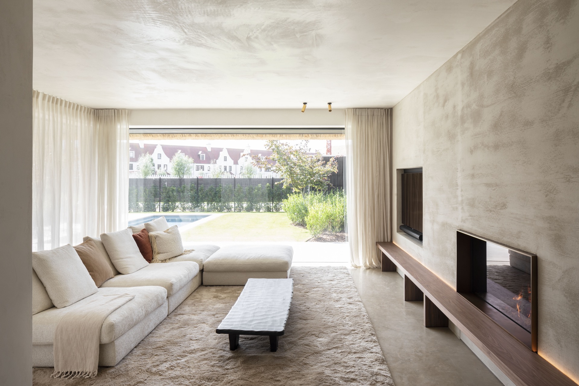
NEW 2026 Jubileum Edition The Best Interior Designers Benelux
Order Now €125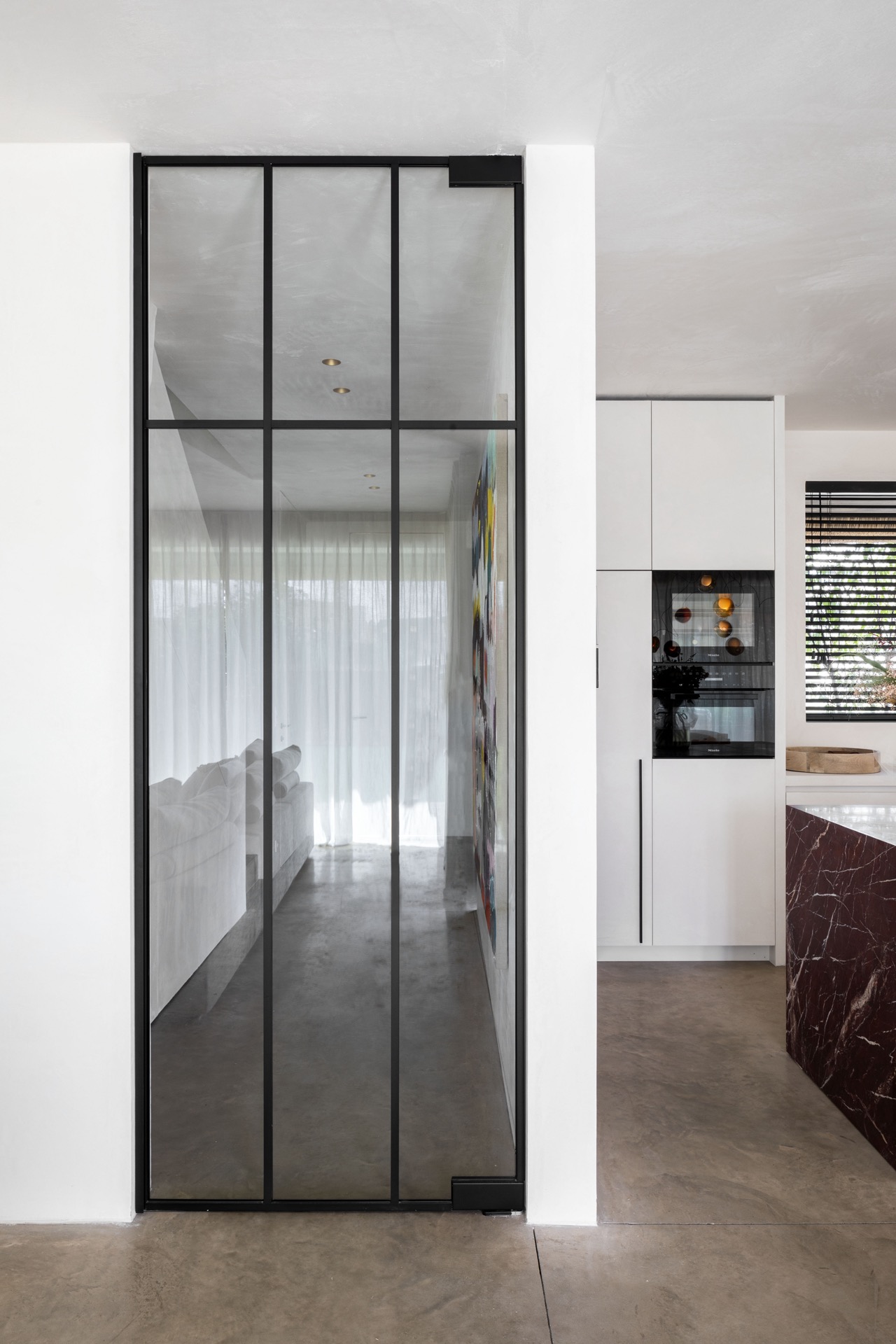
NEW 2026 Jubileum Edition The Best Interior Designers Benelux
Order Now €125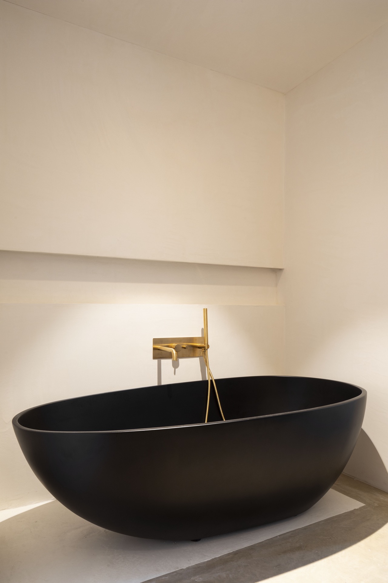
NEW 2026 Jubileum Edition The Best Interior Designers Benelux
Order Now €125