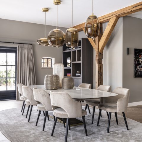
Showroom interior with seating areas
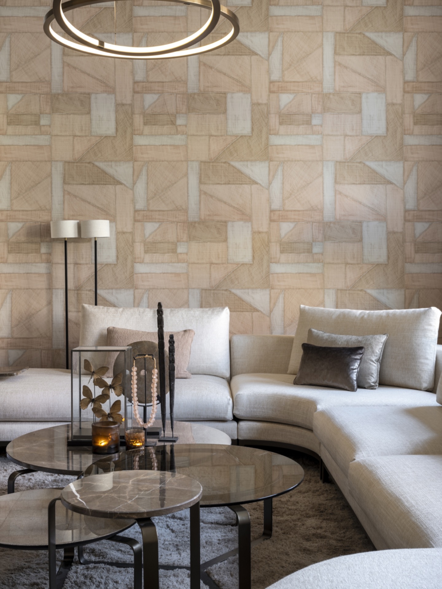
Stone-look walls set the tone as soon as you step into this showroom interior. The surfaces catch the light differently from one room to the next: some walls are smooth and pale, others carry a more tactile finish with subtle patterning. Around them sit quiet seating corners with neutral upholstery, round tables and soft cushions, so the rooms read less like display areas and more like places where materials can be studied at close range.
Seating corners built around material samples
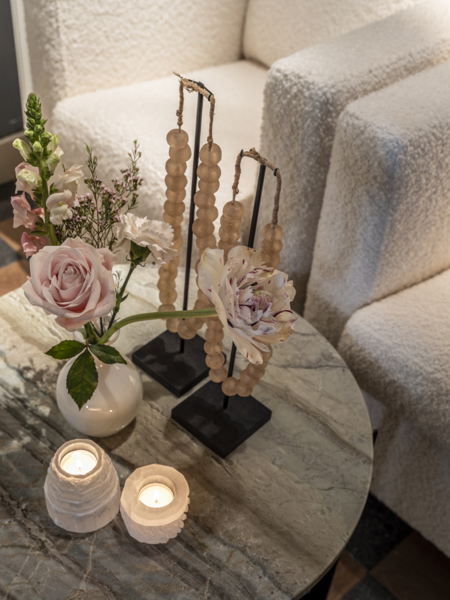
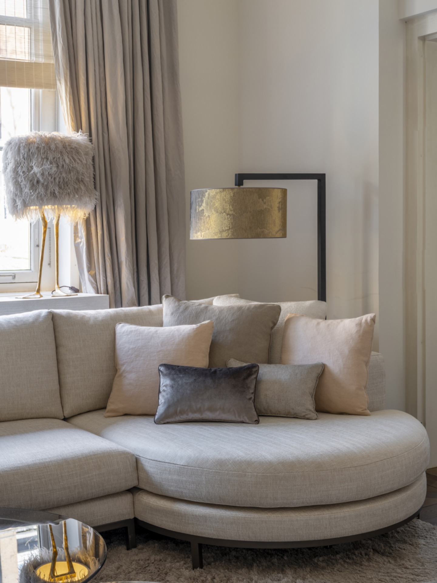
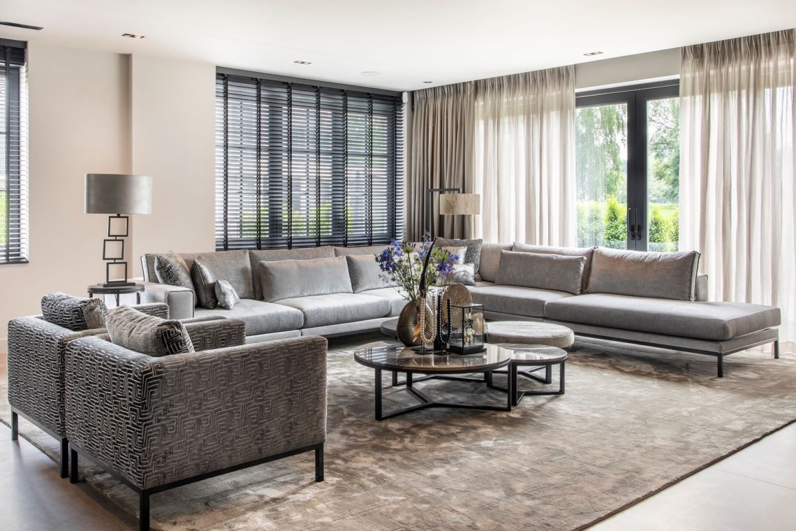
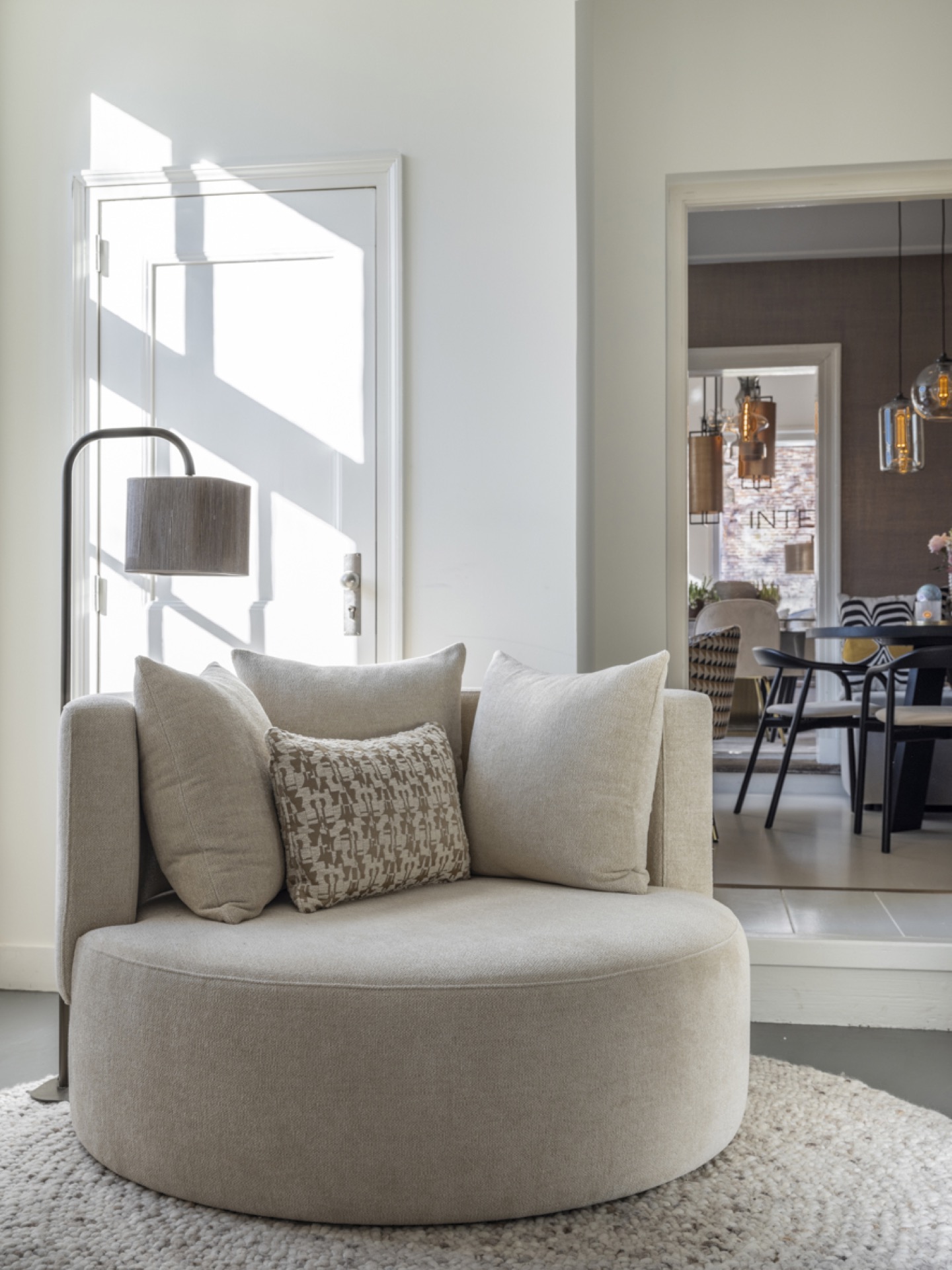
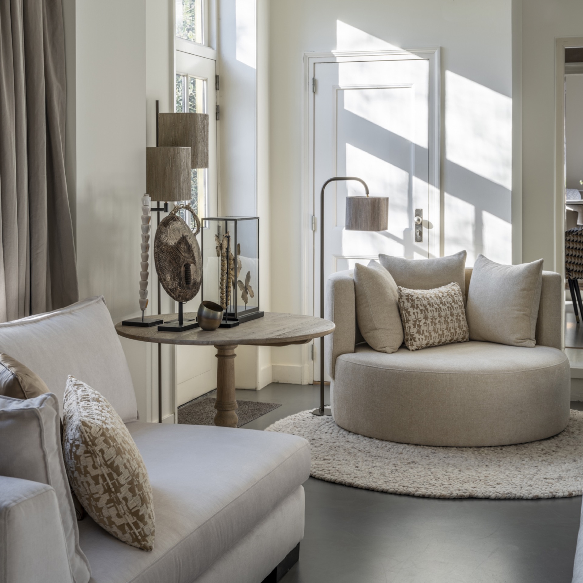
The showroom seating area is not treated as a side note. Sofas and armchairs are placed where daylight from the windows can wash over the fabrics, making it easier to read the weave, tone and depth of colour. Beige, taupe and warm grey dominate the palette, and the room uses that restraint well. A plaid draped over an armrest, a round side table, and loose cushions are enough to make each setting feel ready for conversation about a full interior concept or a smaller decision about fabric and finish.
That practical use of space is visible in the way the furniture sits away from the walls. There is room to walk around, look back, and compare one surface with another. A mirrored reflection catches another seating arrangement in the background, which gives the showroom a sense of depth without crowding it. The result is a showroom interior that works through pacing: one setting opens into the next, and each zone frames the materials differently.
Warm lighting against stone-look surfaces
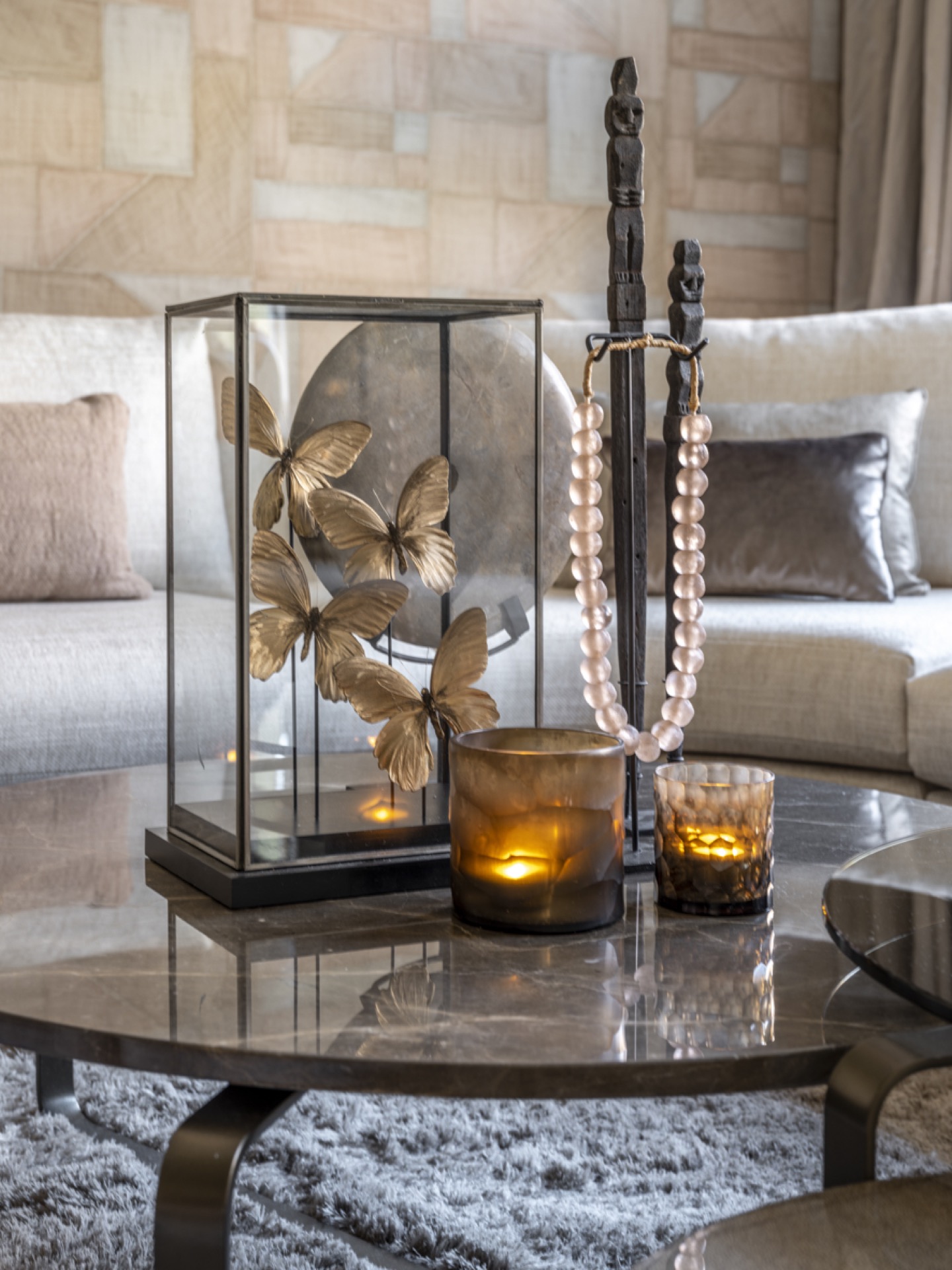
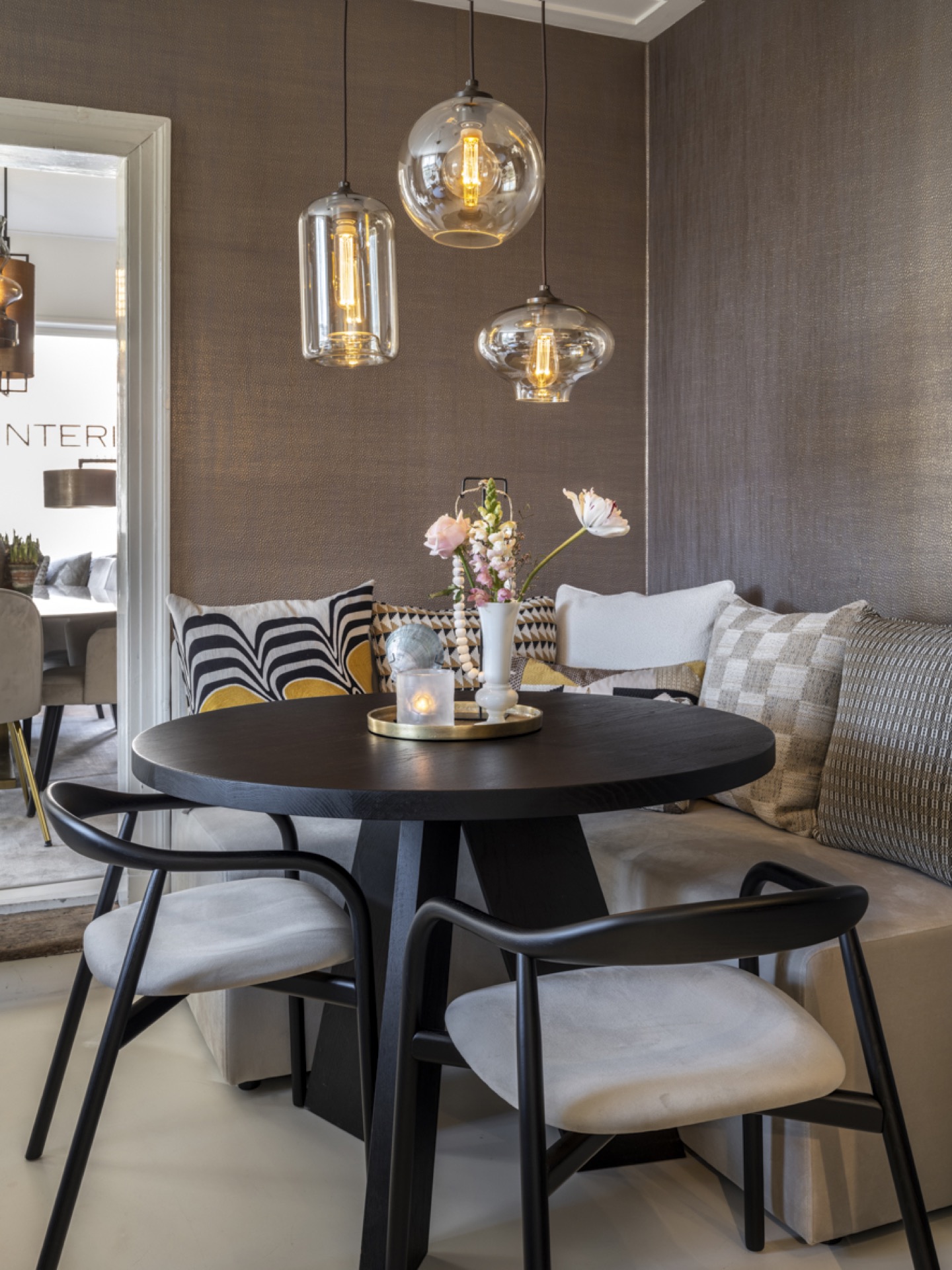
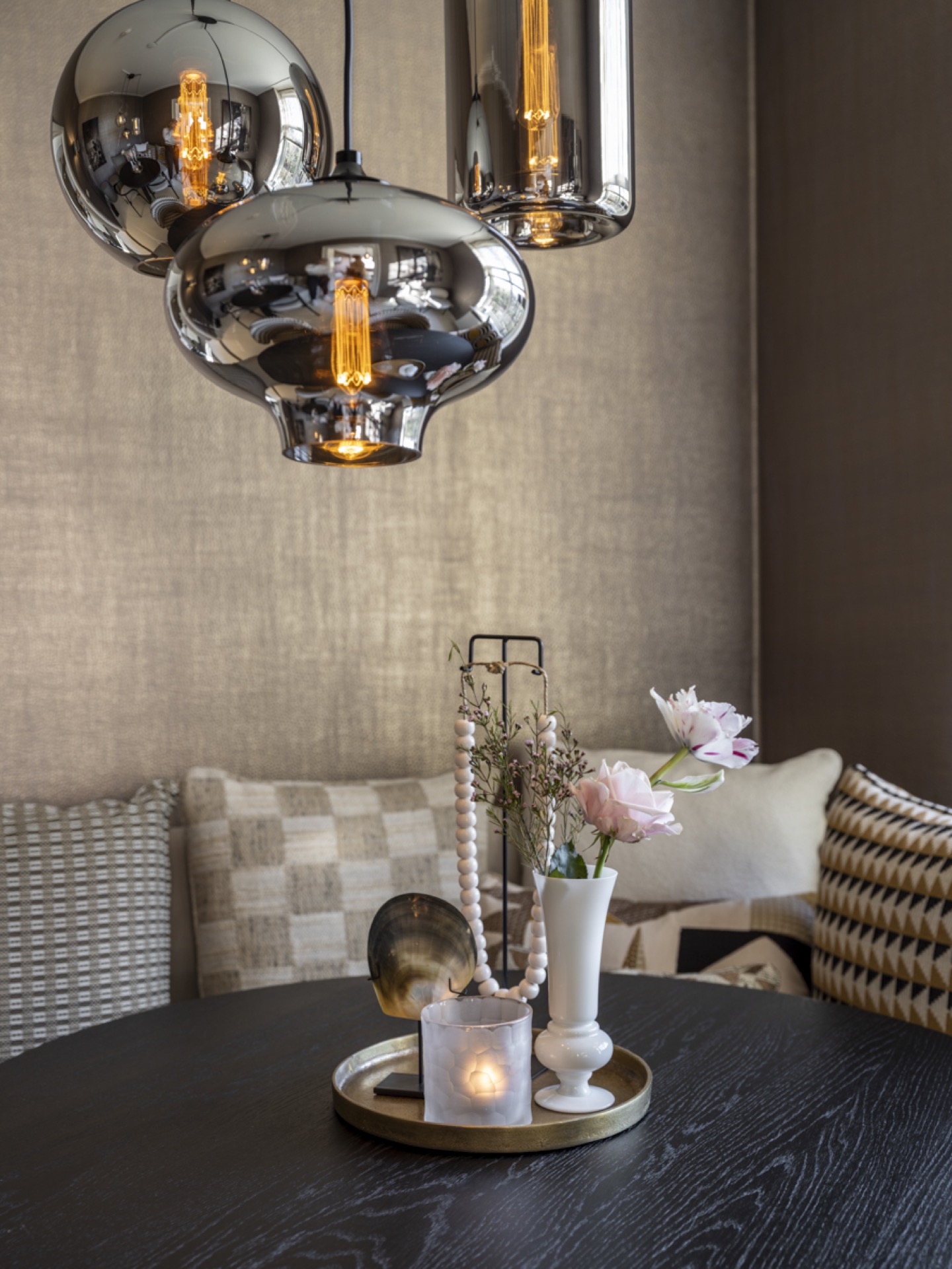
Lighting does a lot of the work here. Pendant lamps with rounded glass shades hang above a table, while other fixtures use fabric shades or slender metal frames. Their glow is warm rather than bright, and that softer light makes the wall finishes read more clearly. On a textured accent wall, the shadows settle into the grooves and seams, bringing out the surface instead of flattening it.
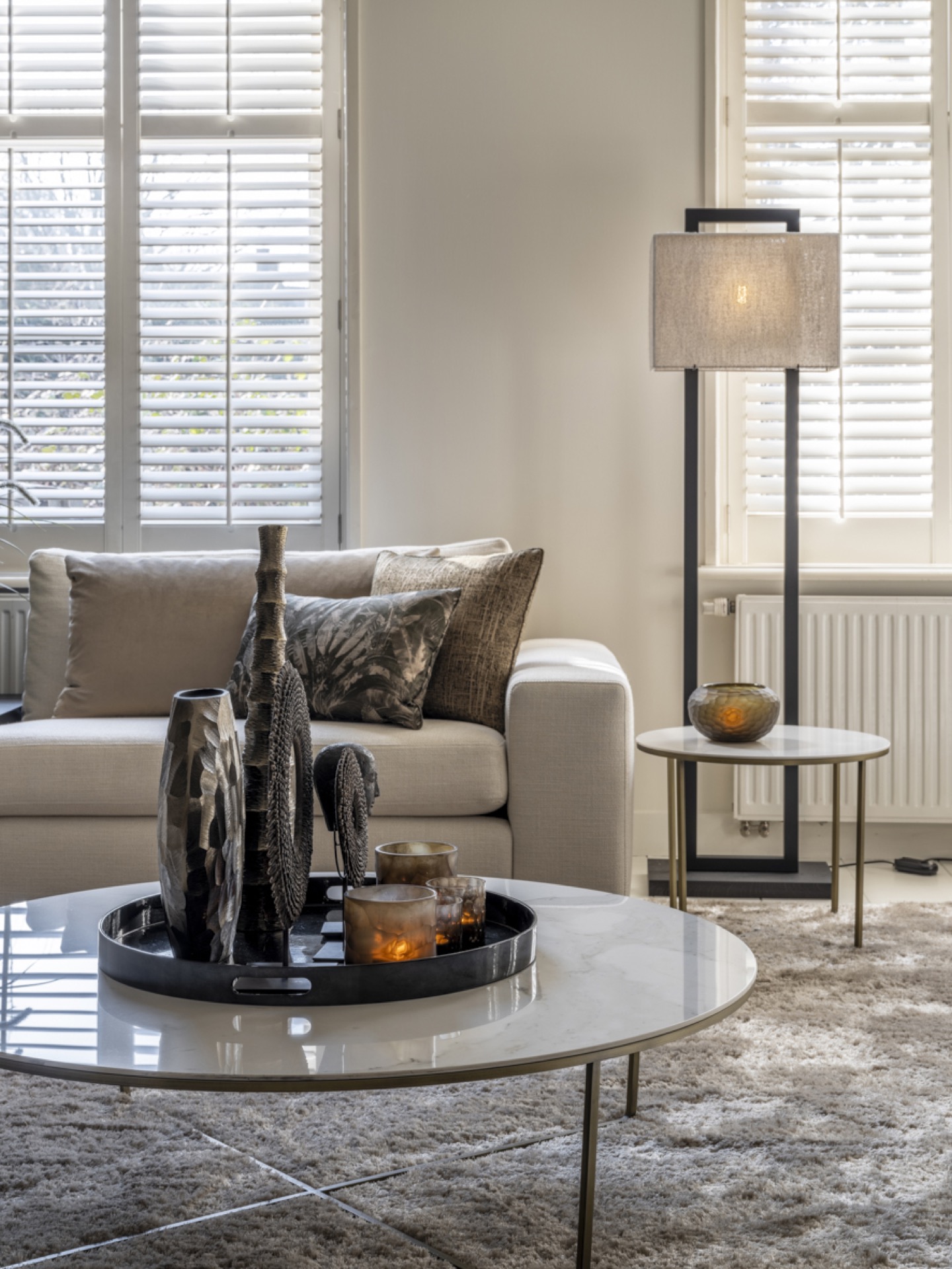
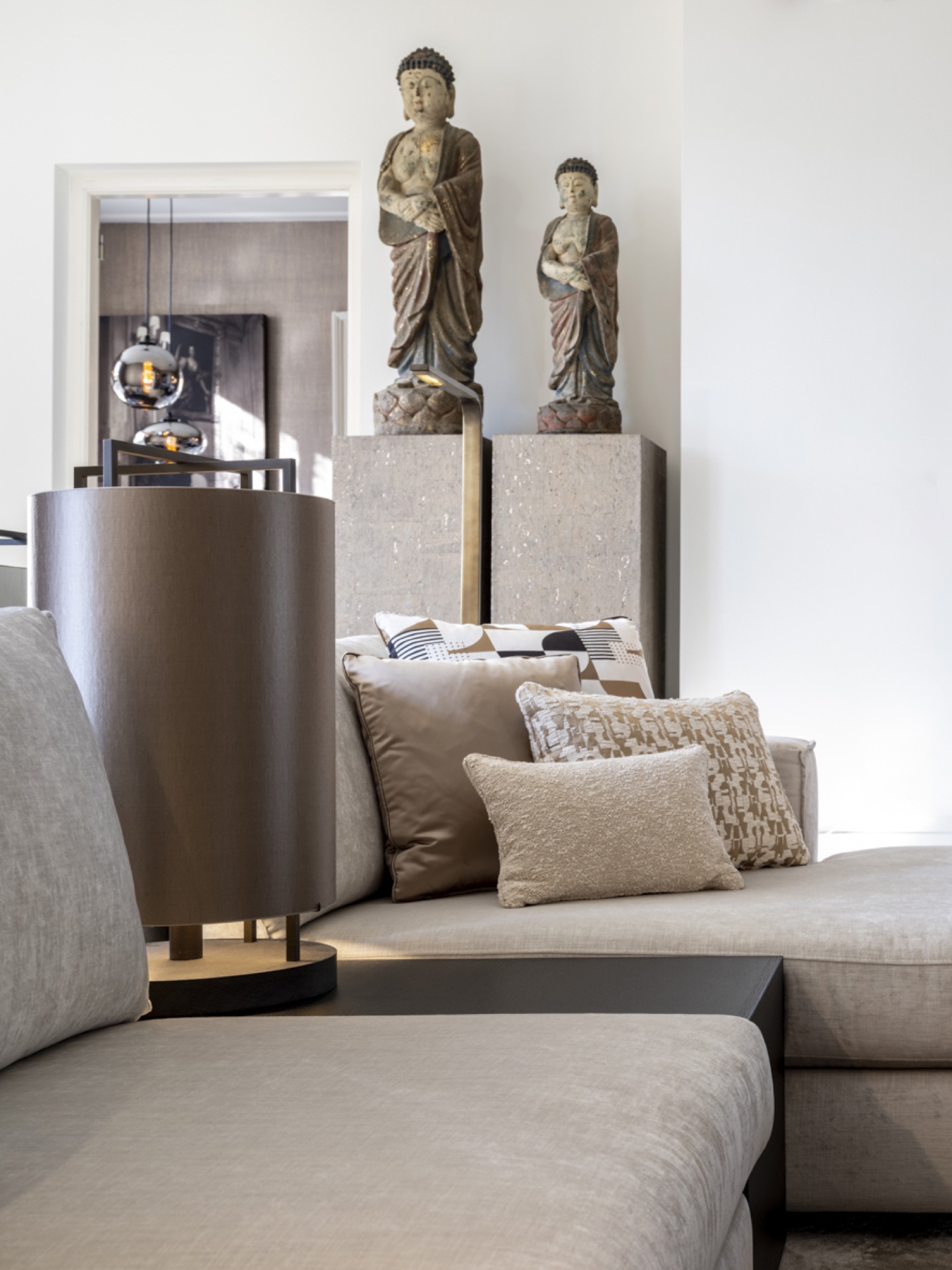
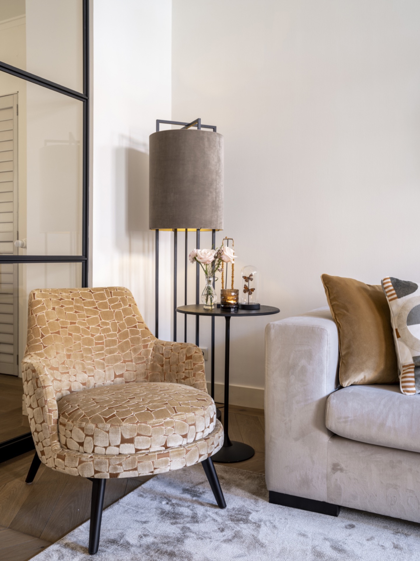
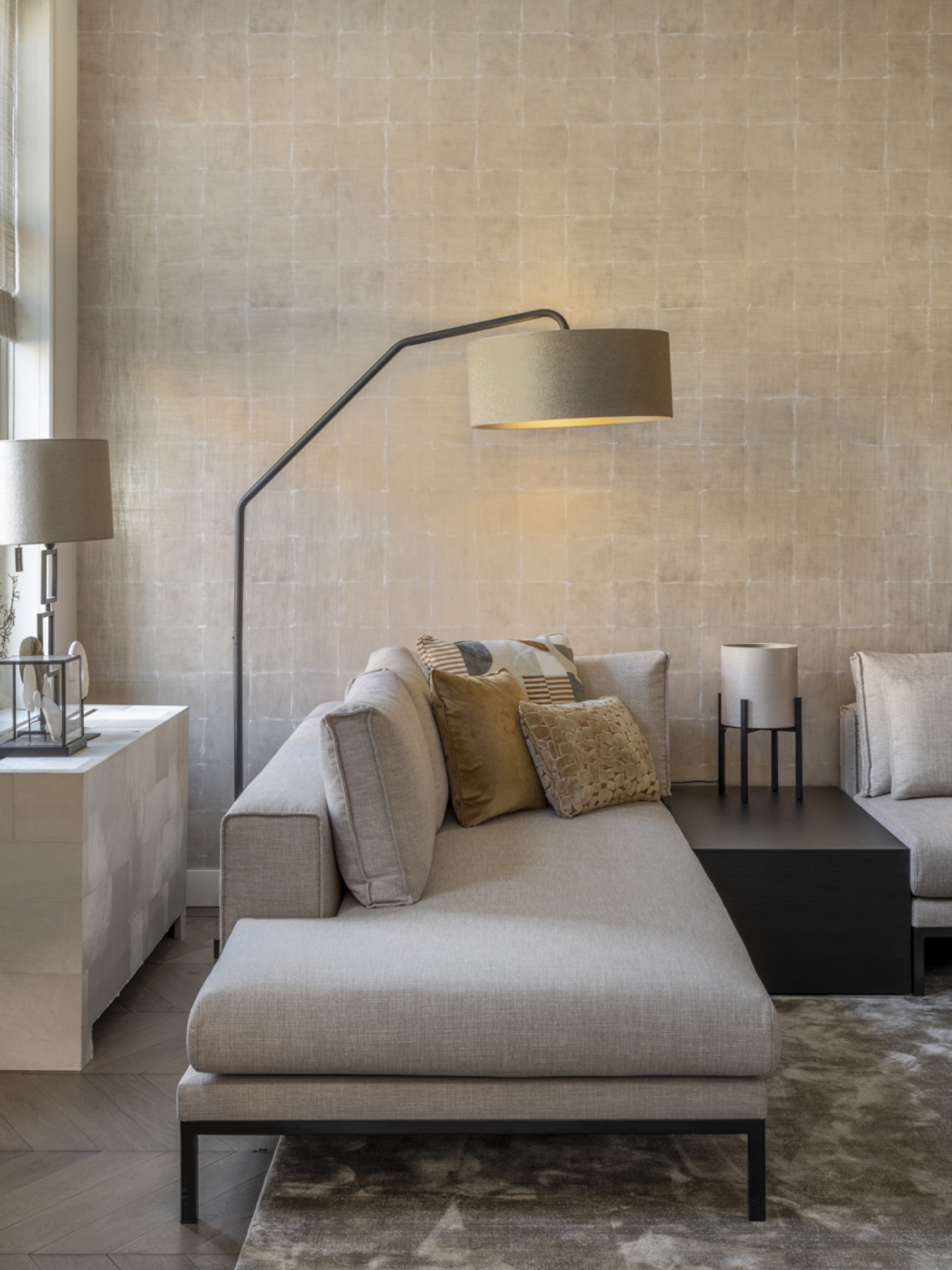
Several images show the same idea from different angles: a row of glass pendants, a dark lamp silhouetted against a patterned wall, and a standing lamp tucked into a corner beside a sofa. These are not decorative extras. They guide the eye through the showroom interior and help separate one seating area from another. Where the wall finish is more stone-like, the warm lighting keeps the room from feeling cold or hard.
Round mirrors and repeated curves
Curves recur in a measured way. A cluster of round mirrors hangs on one wall, each one set in a dark frame, and the shapes echo the circular tops of tables and the rounded lamps above the seating areas. The mirrors do more than reflect the room. They break up the stone-look background and give the wall a rhythm that changes with each step. In some views, the mirrors catch a second layer of space, which makes the showroom feel deeper than its actual footprint.
Those round elements also soften the more architectural parts of the interior. A structured wall panel, a niche, and a glazed doorway all sit beside the mirrors, so the room keeps moving between soft and hard surfaces. That contrast is what keeps the showroom interior readable. You see the wall finish first, then the mirror, then the edge of another room, each one framed by a different material.
Advice on colour, fabrics and the way rooms are finished
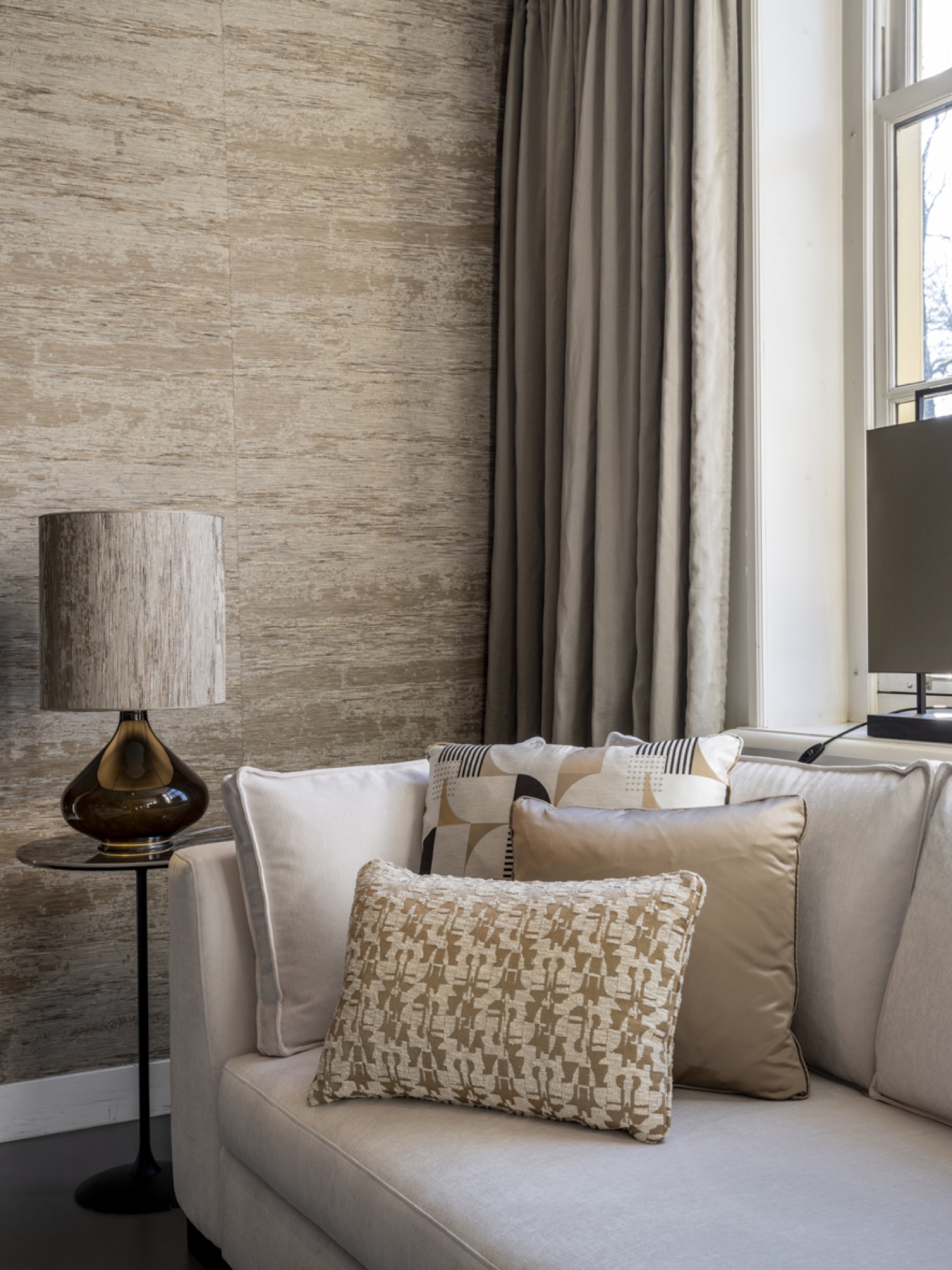
The project is not only about display. The source material makes clear that colour and fabric advice is part of the offer, and the rooms are arranged to support that conversation. Neutral upholstery gives the eye a base line, while the wall finishes and curtains add layers that can be compared without distraction. In one corner, a standing lamp with a textile shade sits beside soft drapery; in another, the window zone is broken up by slats and heavier curtains, which changes the light and the mood of the setting.
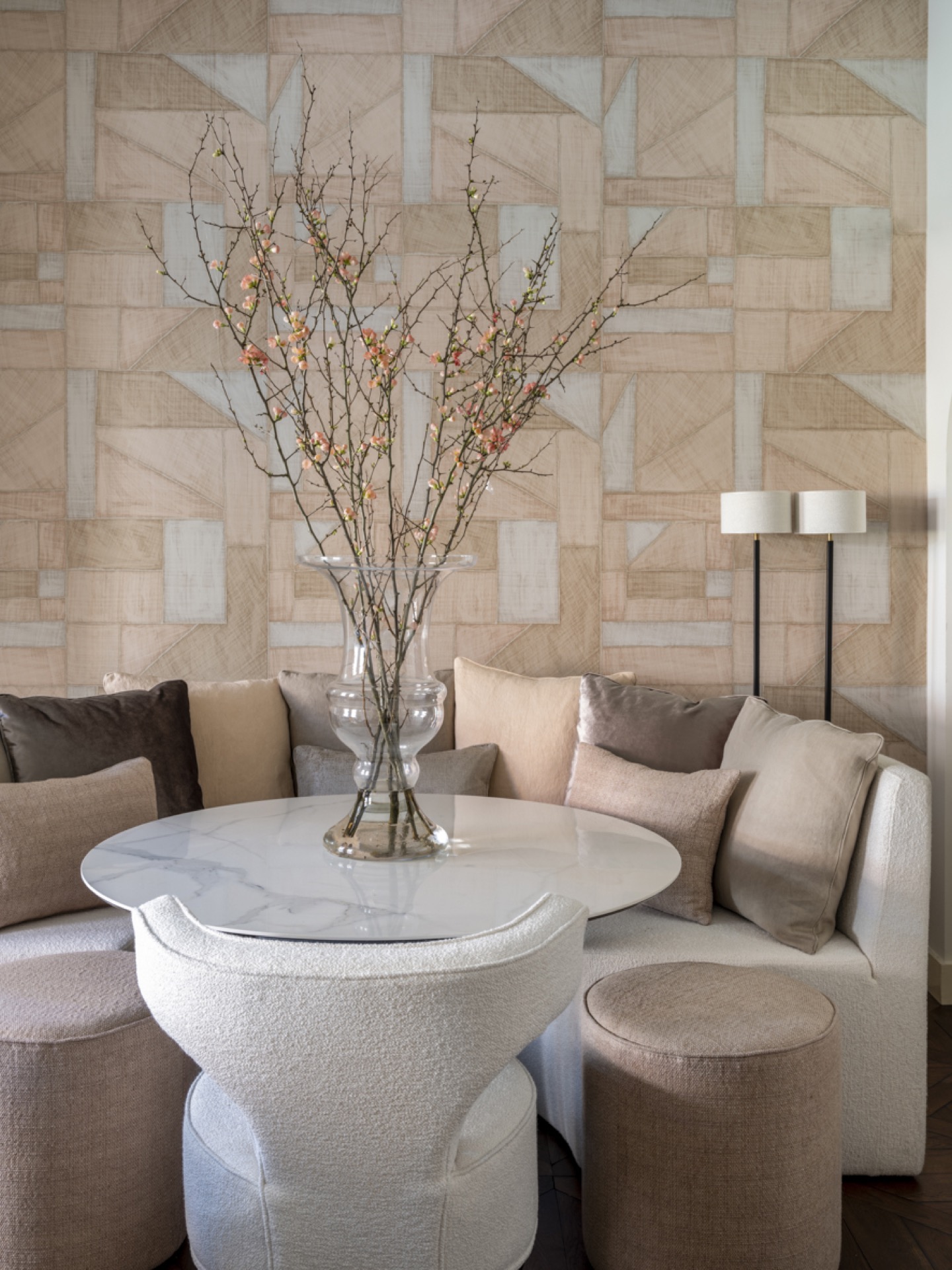
Because the showroom interior uses so few strong colours, the materials carry the interest. The stone-look wall, the plastered surface, the wood around the windows and the textile folds all read clearly against one another. That makes it easier to imagine how an interior concept might be built from a fabric swatch, a painted wall or a changed window treatment. The room is calm, but never blank. Every surface gives a clue about texture, reflection or depth.
In-house design and production
One of the more grounded details in the project is that the collection is designed and produced in-house. That matters in a showroom interior, because the display does not feel borrowed from elsewhere. The pieces belong to the room in which they are shown. The source text also refers to Dutch-made products and to upholsterers described as craftspeople from the old school. In practice, that shows up in the precise way the furniture is dressed and the way the textiles sit on the frames.
Nothing in the presentation feels rushed. The upholstery is neat without being stiff, and the soft furnishings are arranged to reveal the shape of the seats rather than hide them. When a sofa is set against a stone-look wall or next to a patterned surface, the fabrics have to carry their own presence. Here they do, through their texture and through the way light moves across them. The showroom interior uses that clarity well, especially in the seating areas where fabric is the main subject.
Wall finishes that shift the mood from one room to the next
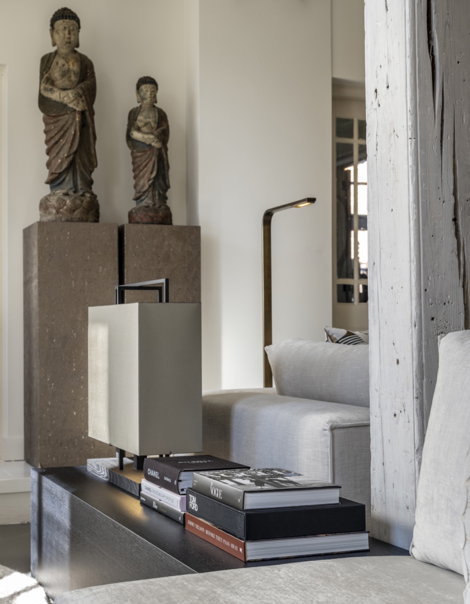
Some walls are nearly plain, others are more expressive. A structured finish with horizontal lines appears behind one seating arrangement, while another wall has the feel of stone paneling or a carefully worked plaster surface. There is also a white paneled section that opens into a different part of the showroom, where reflections and display objects add another layer. These shifts are small, but they matter. They keep the interior concept from flattening into a single repeated look.
The project shows how wall finishes can do more than create background. They change the scale of a room, catch the light differently and set off the furniture in front of them. A dark-framed mirror against a textured wall reads almost like an additional opening. A smooth painted section beside a heavier surface draws attention to the join. In a showroom interior, those joins are useful. They show how materials behave next to one another, which is exactly what a visitor needs to judge before choosing a finish.
A showroom interior that lets details do the speaking
What stays with you is not one grand gesture but the steady accumulation of details: a round mirror cluster, a lamp with a fabric shade, a beige sofa with layered cushions, a stone-look wall, a curtain pulled beside a bright window. Each object is placed so that the room can be read in parts. That makes the showroom interior useful as a portfolio piece and as a place where colour and fabric advice can happen naturally, around the materials themselves.
The visual language is restrained, but it is not spare. Texture, reflection and warm light keep moving across the rooms, and the seating areas give those surfaces a human scale. This is a luxury showroom interior that relies on structure rather than spectacle. It shows how an interior concept can be tested in real space, with wall finishes, upholstery and lighting all visible at once. The project feels measured because every detail has a job to do.
Want to see more of Interiors DMF? View the page of Interiors DMF for even more great projects and company information.


NEW 2026 Jubileum Edition The Best Interior Designers Benelux
Order Now €125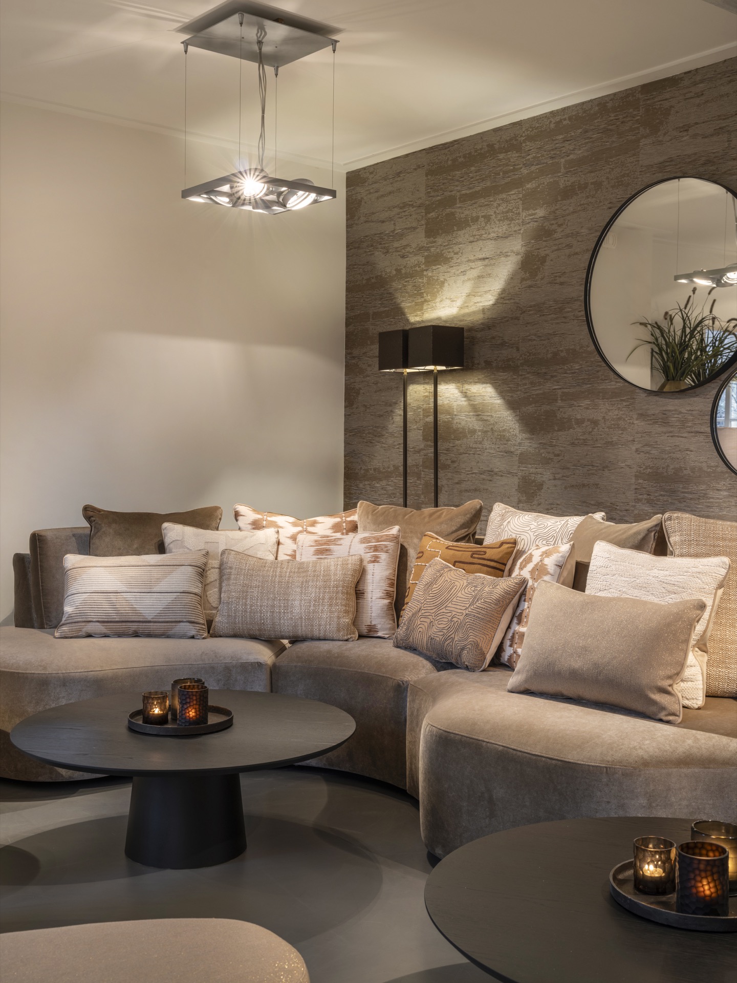
NEW 2026 Jubileum Edition The Best Interior Designers Benelux
Order Now €125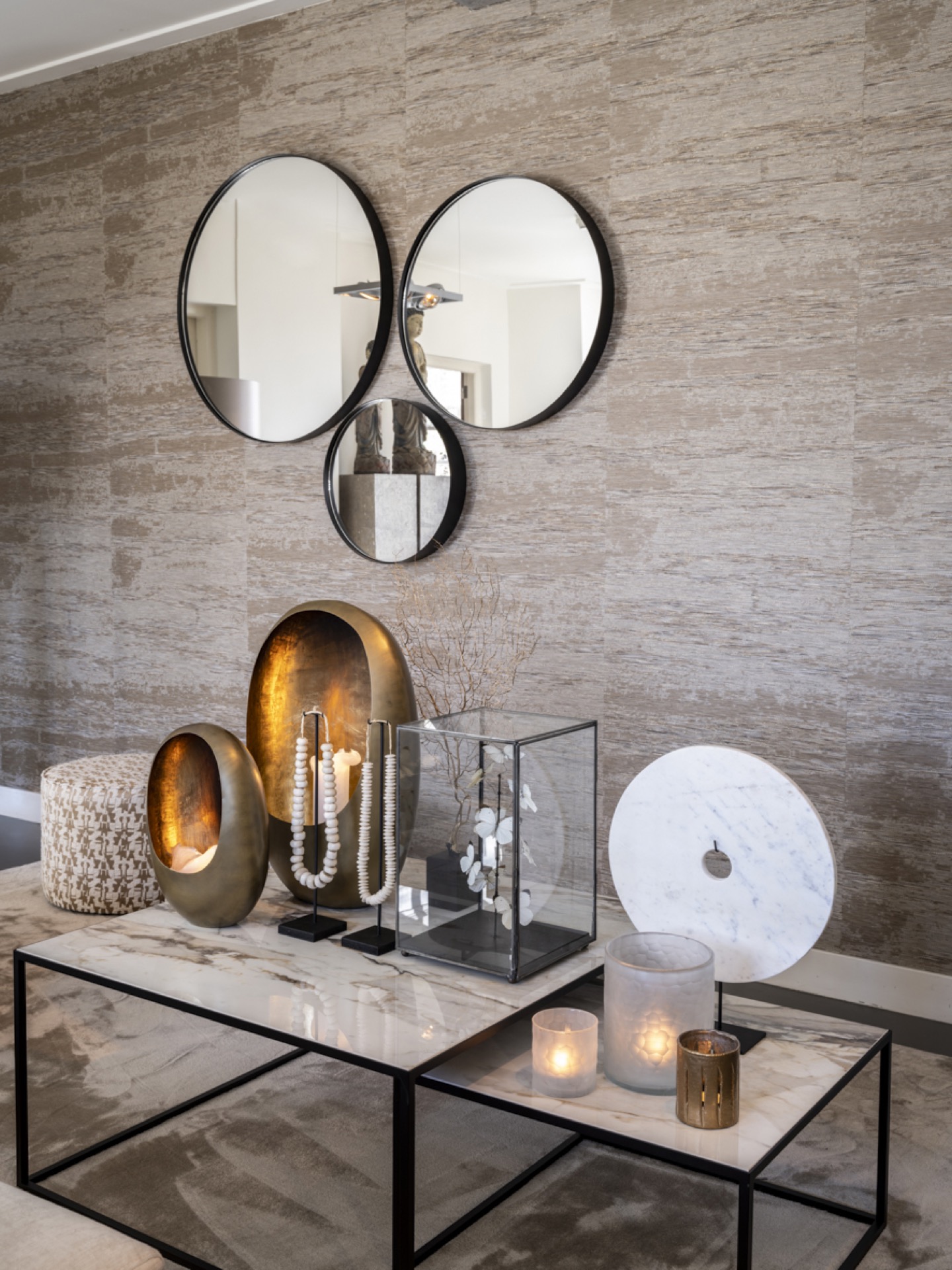
NEW 2026 Jubileum Edition The Best Interior Designers Benelux
Order Now €125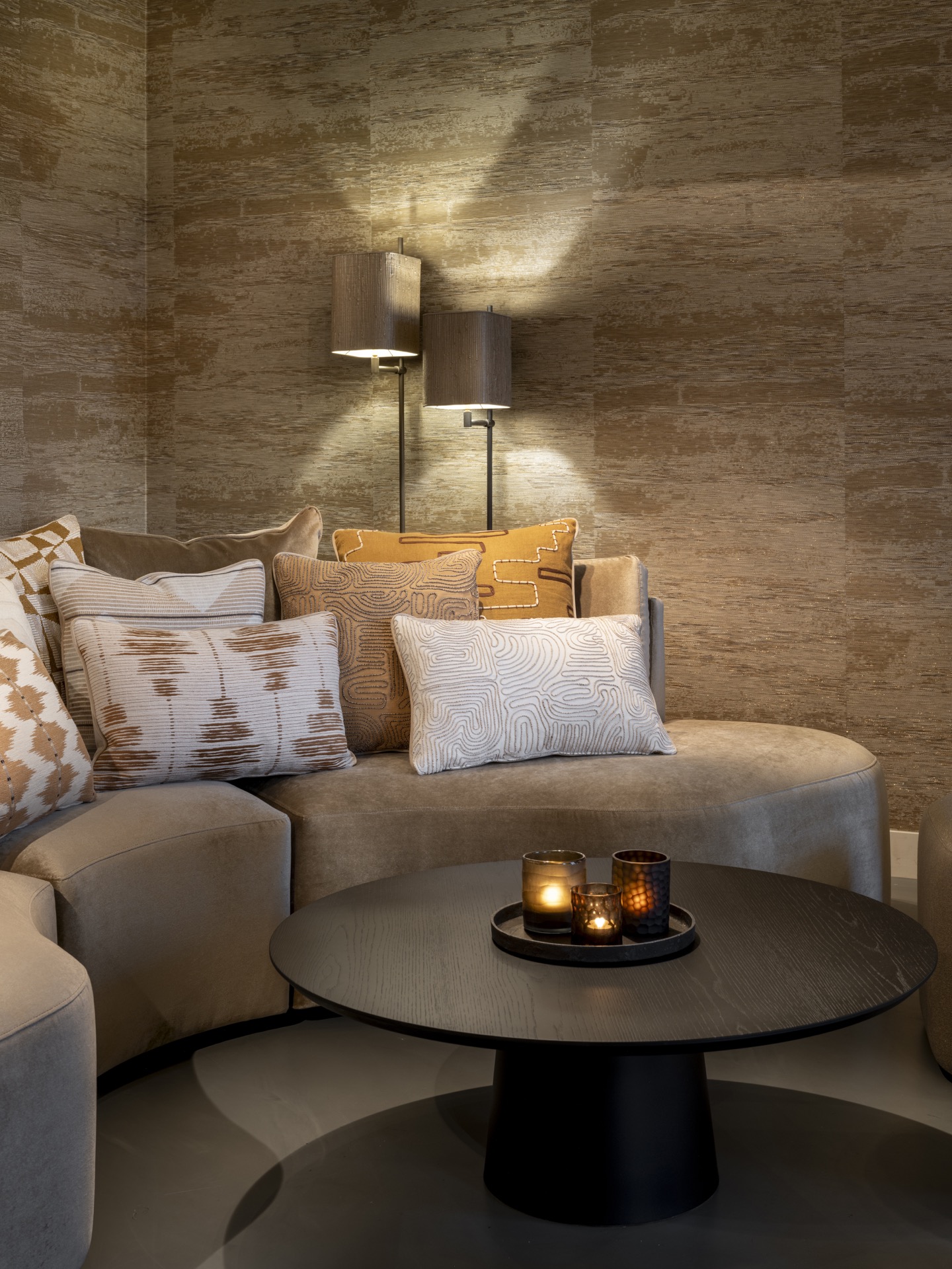
NEW 2026 Jubileum Edition The Best Interior Designers Benelux
Order Now €125