Elegant living room with a chic custom wall unit
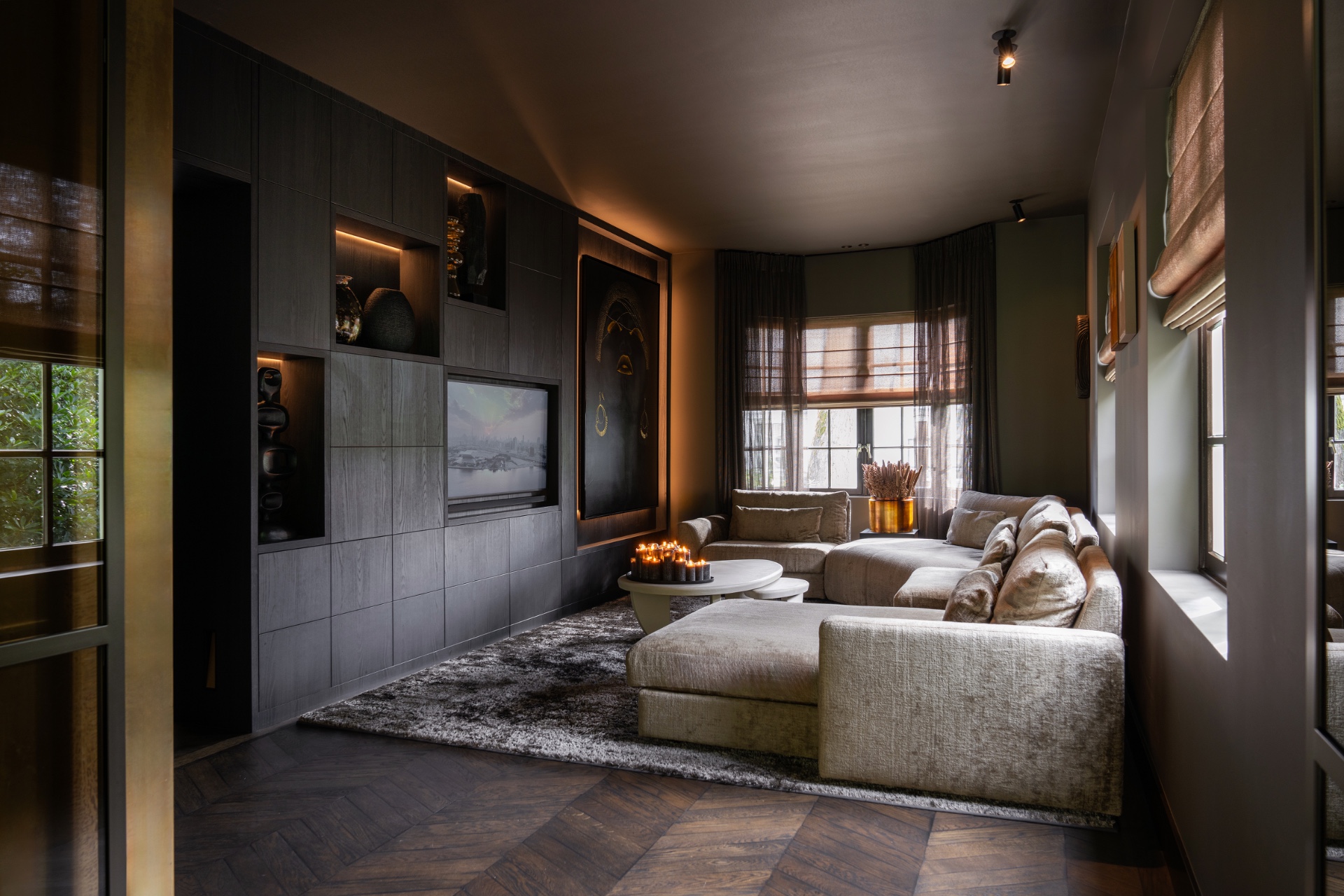
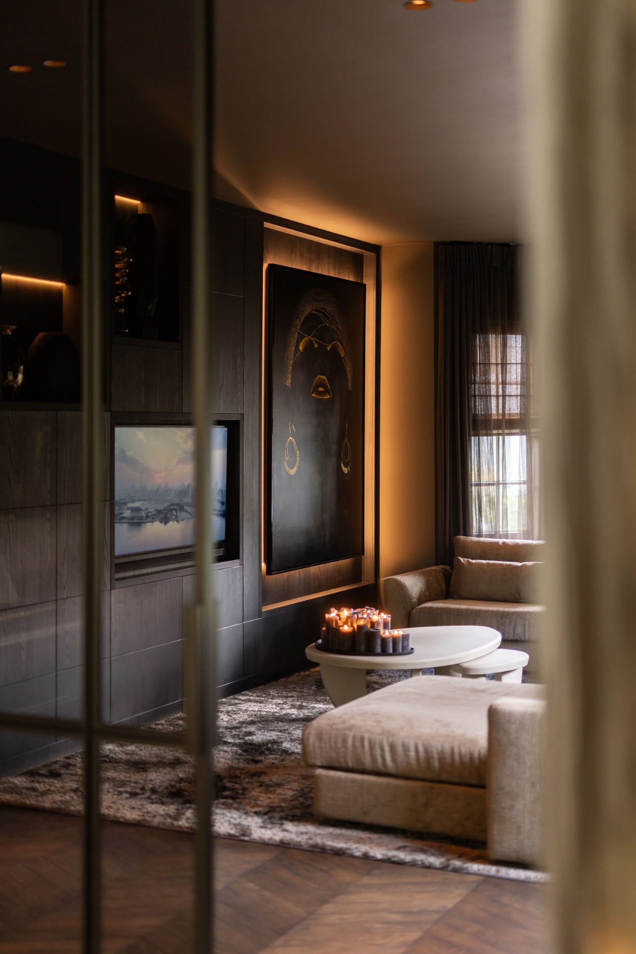
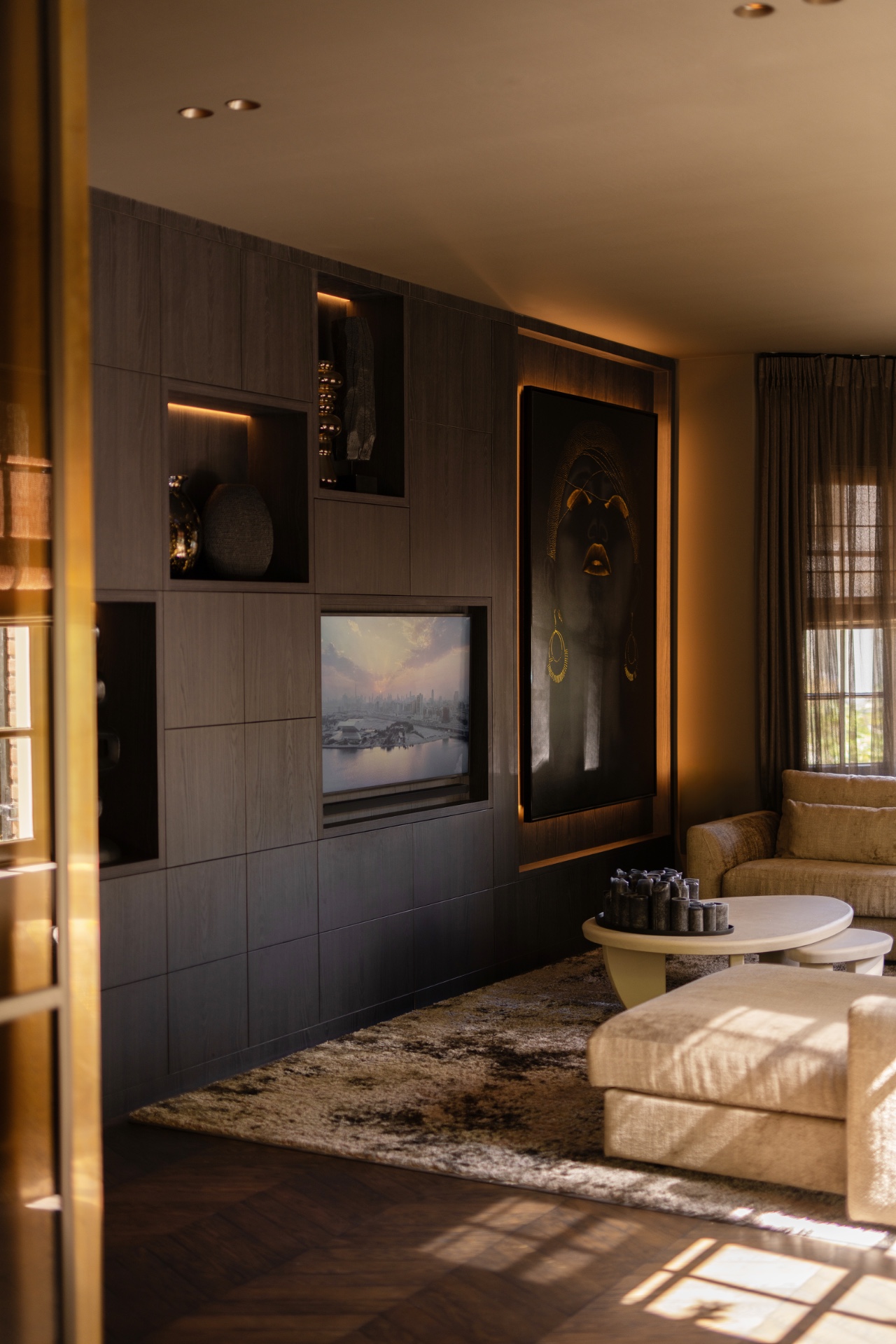
A custom wall unit living room sets the tone here before the seating area even comes into view. Dark wood-look panels run across the built-in wall unit, their grain reading clearly in the light. Open niches break up the surface and pull the eye toward the warm lines tucked into the edges. The result is calm but not flat: a composition that uses depth, shadow, and a restrained brown undertone to soften the dark base.
A wall unit that works as architecture
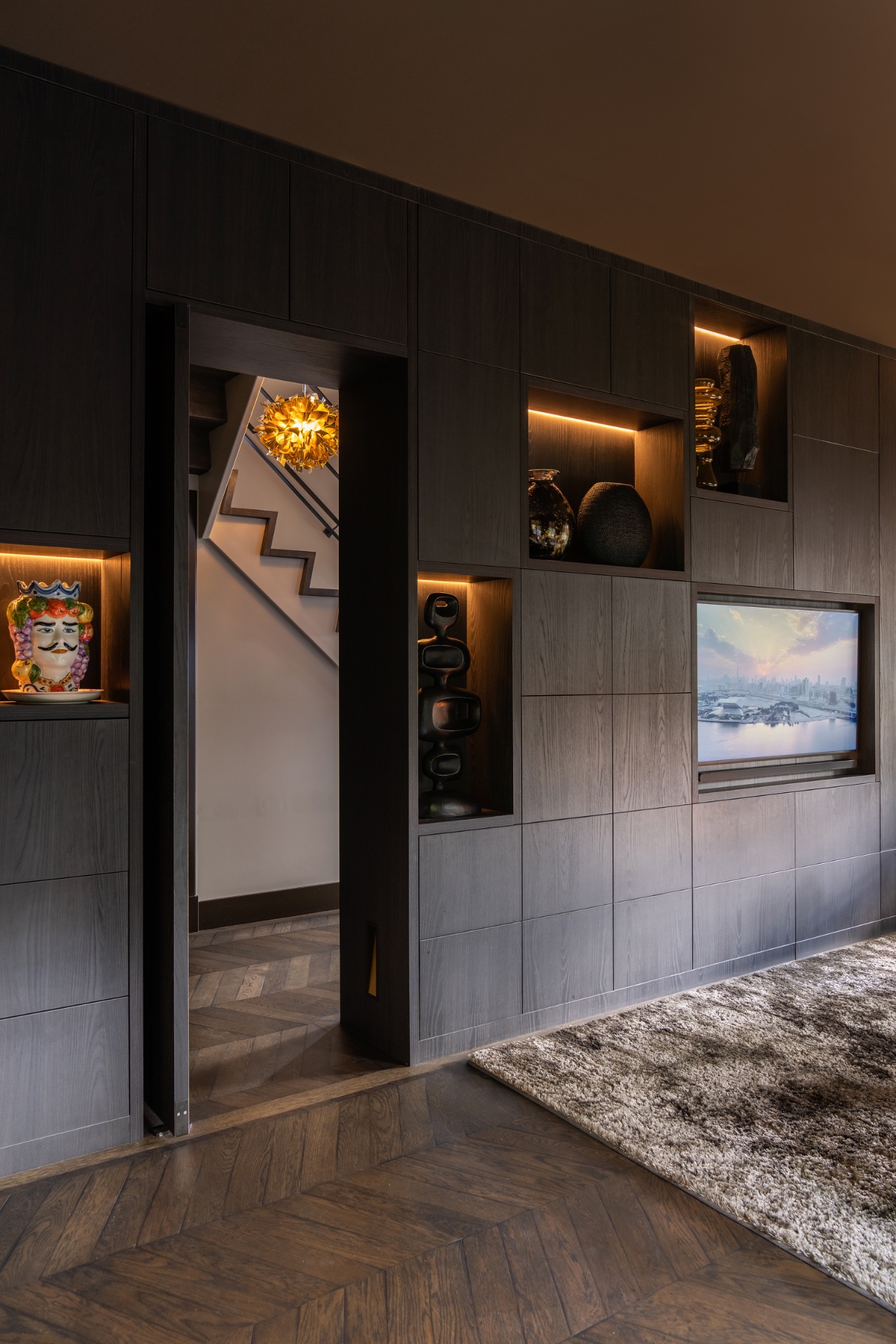
The built-in wall unit does more than hold storage. It organizes the room with a strict panel layout and a series of open compartments that sit like cutouts in a solid plane. That rhythm gives the custom wall unit living room a measured look without losing ease. In the photographs, the central frame becomes a focal point, set off by light around its edges and by the darker fields that surround it. The structure reads as part furniture, part interior wall.
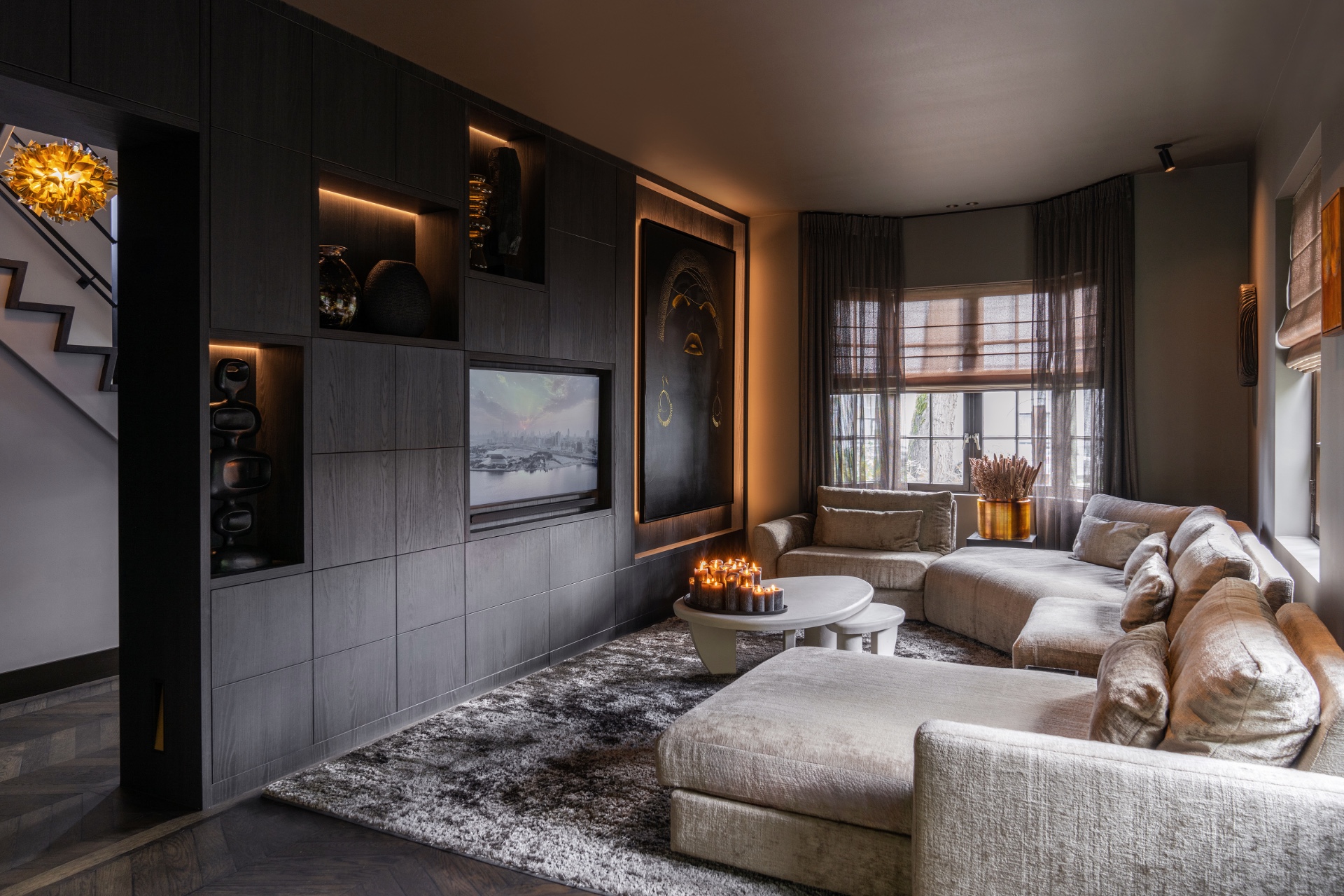
Seen from a wider angle, the dark wood-look wall cabinet sits against a pale seating zone with a beige sofa and a grey rug. That contrast keeps the room from turning visually heavy. The cabinet’s surfaces carry a realistic wood-grain decor, while the surrounding textiles stay quiet and low in contrast. A window with curtains appears at the side, adding a soft vertical counterpoint to the long horizontal lines of the unit.
Wood-grain decor panels and a dark finish
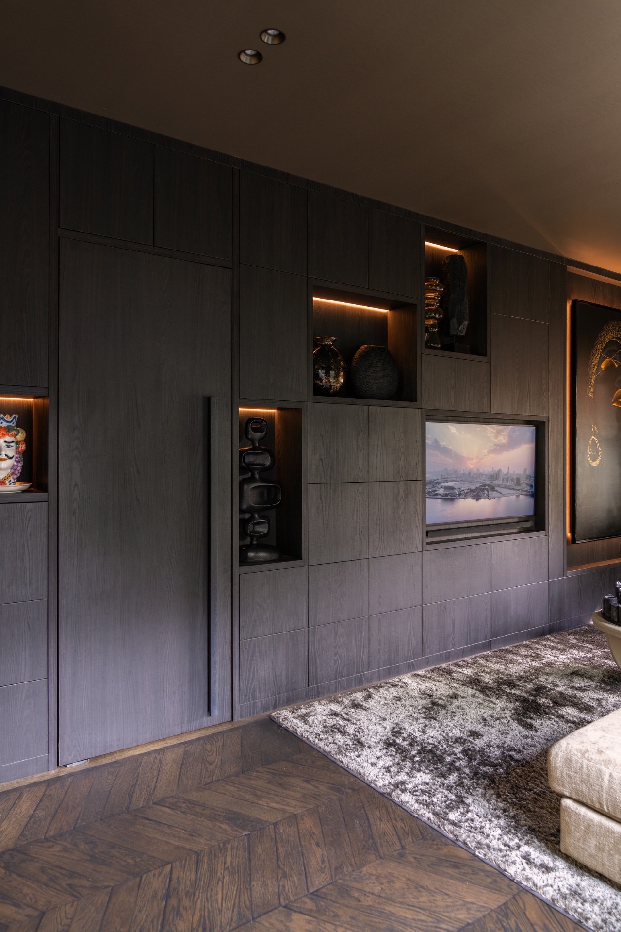
The wood-grain decor panels give the surface its main character. Their pattern is visible enough to read as material, not print, and the long grain lines keep the cabinet from feeling static. S176 Corteccia has a deep black base with a subtle brown undertone, and that note shows in the way the dark finish catches light without becoming cold. It is this slight warmth under the darkness that makes the wall unit feel composed rather than severe.
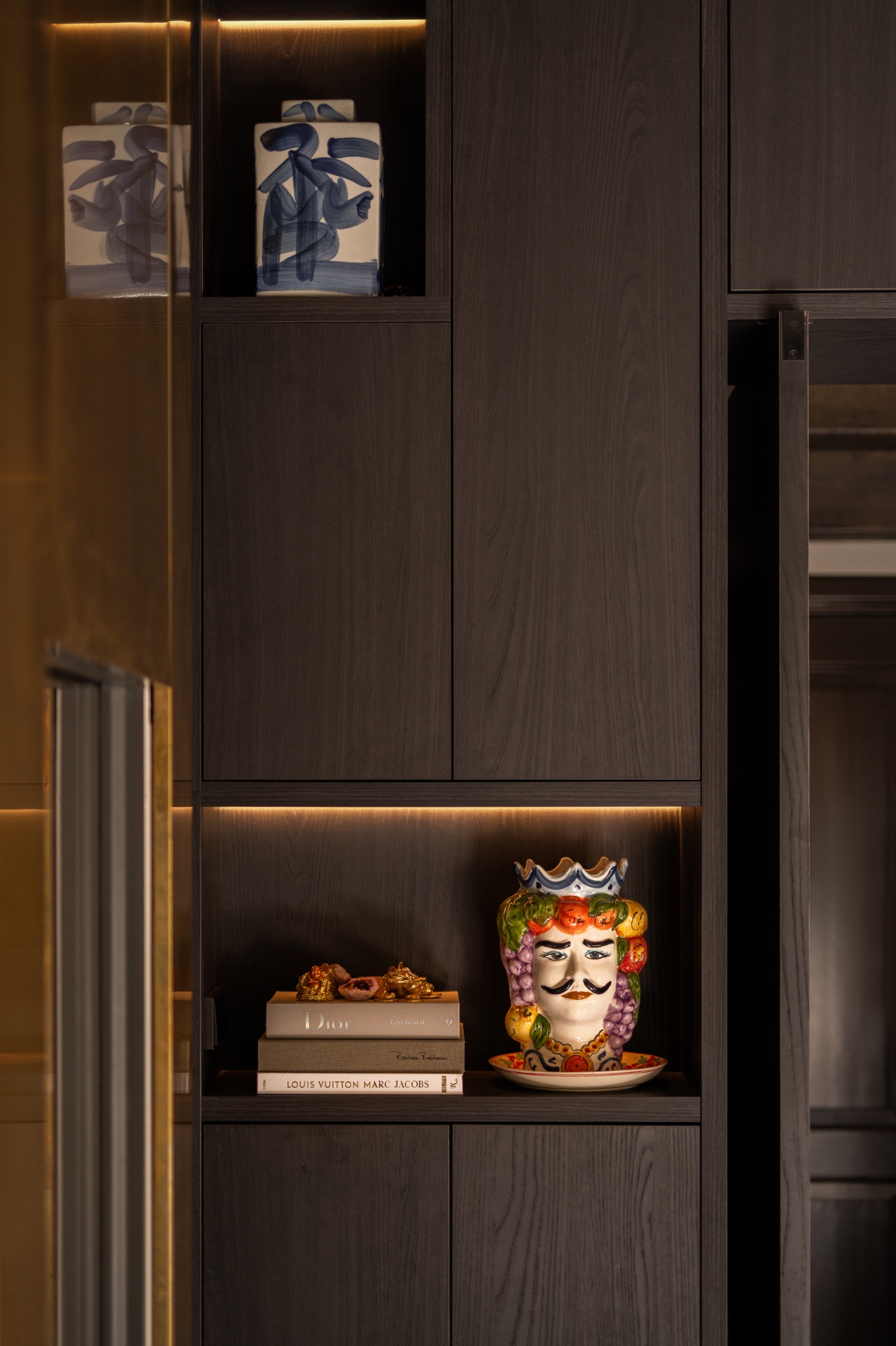
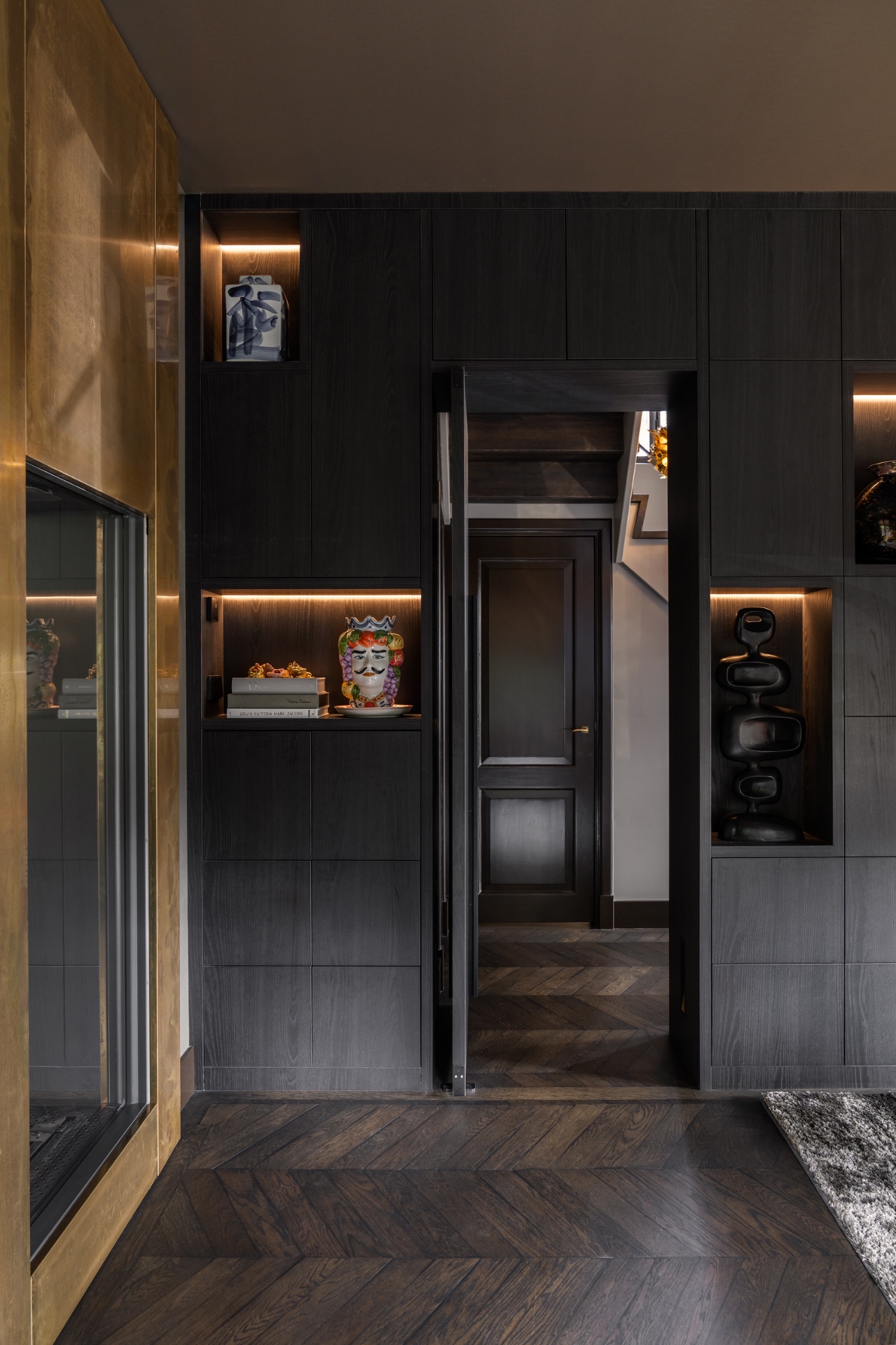
Several images move in close on the panel joints and inner edges, where the finish meets the openings with clean, narrow lines. Those details matter because the eye follows them from one niche to the next. In a custom wall unit living room, that continuity carries the whole design. The cabinet face becomes a backdrop for smaller moments: a framed piece, a lit cavity, a strip of glow running along the upper edge of an opening.
Warm niche lighting in the open compartments
Warm niche lighting changes the depth of the unit. Instead of treating the openings as plain storage, the design frames them with long, luminous lines that sit inside the cabinet and along the rims. The light is soft but direct enough to mark each compartment. In the overview shots, it traces the geometry of the wall unit and gives the darker panels a measured glow. The effect is most visible where the light wraps around a central framed recess.
One detail image shows how the illuminated edge sits just inside the opening, leaving the surface itself dark while the niche reads brighter. That contrast sharpens the outline of the built-in wall unit and keeps the composition legible from across the room. It also adds layers to the dark wood-look wall cabinet: outer shell, inner void, and lighted border. The result is a room that feels structured by light as much as by joinery.
Open niches, framed artwork, and a balanced grid
The open niches are arranged with a balanced grid, but the layout does not feel rigid. Some openings are broad, others narrow; one large frame-like section holds a piece of art or a mirrored surface, and that larger element anchors the composition. Around it, the smaller compartments create pauses. This is where the custom wall unit living room gains its pacing. The eye moves from the lit centre to the darker side fields, then back again through the repeated openings.
Because the cabinet spans a wide section of the room, it also reads as a spatial divider. One image shows a passage toward a stair or hall beyond the opening, which makes the built-in wall unit feel integrated into the house rather than placed against one wall as an isolated object. The openings in the unit do not just display objects; they connect the room to the adjacent circulation and let the architecture stay visible.
A seating area that stays visually quiet
The seating area is deliberately understated. A beige sofa, a grey rug, and the pale tone of the curtains allow the cabinet to take the lead. That restraint is important in an elegant modern living room, because the dark finish needs a lighter field beside it to read properly. The room does not depend on ornament. It depends on the contrast between the textured cabinet front, the soft upholstery, and the even wash of daylight near the window.
From the wider images, the proportions feel deliberate: the long wall unit stretches horizontally, while the furniture in front of it stays low. That keeps sightlines open and lets the warm strip lighting remain visible above the seating level. The effect is refined without drawing attention to itself. It is the sort of layout where the cabinet becomes the main visual anchor and the rest of the room quietly supports it.
Material choices that hold up in the close-up
The material story is straightforward, and that clarity helps the project. The project uses decor S176 Corteccia in a custom wall unit, supplied as decor chipboard, HPL, and ABS edging. In the photographs, the finish reads through the panel faces and edge details rather than through decoration. The surface tone stays dark, the grain stays visible, and the built-in wall unit keeps its definition even in the tighter shots. That gives the whole composition a disciplined finish.
What makes the dark wood-look wall cabinet distinctive is the combination of surface and light. The grain runs through the larger fields, the light catches the recesses, and the black-brown base holds everything together. In one image, the framed central opening acts almost like a lantern, while in another the side compartments repeat the same idea at a smaller scale. It is a measured interior, built from repetition and contrast rather than excess.
The room ends up feeling carefully edited, not because it hides detail, but because it chooses where to place it. The custom wall unit living room has enough depth to handle artwork, open niches, and indirect light, yet it never loses its strict panel rhythm. That makes the built-in wall unit the natural centre of the space. The dark wood-look finish, the warm niche lighting, and the visible grain all work in the same direction: to give the wall a defined presence without overloading the room.
Want to see more of DecoLegno? View the page of DecoLegno for even more great projects and company information.



NEW 2026 Jubileum Edition The Best Interior Designers Benelux
Order Now €125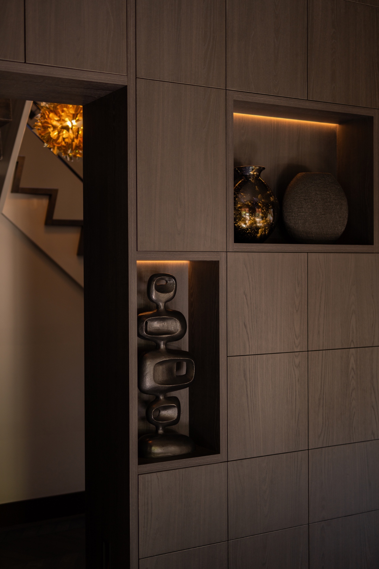
NEW 2026 Jubileum Edition The Best Interior Designers Benelux
Order Now €125