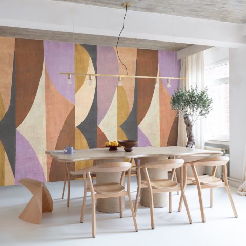
Wall paneling with texture and organic lines
The first impression is tactile: wall paneling with a surface that shifts as the light moves across it. In some views the relief is pale and quiet, in others it turns darker and more graphic, with birds, clouds, and flowing marks stretching across a full wall. The collection carries a Japanese-inspired calm, but it is the material rhythm that stays with you — line after line, fold after fold, as if a brushstroke had been translated into architecture.
Lines that read like movement
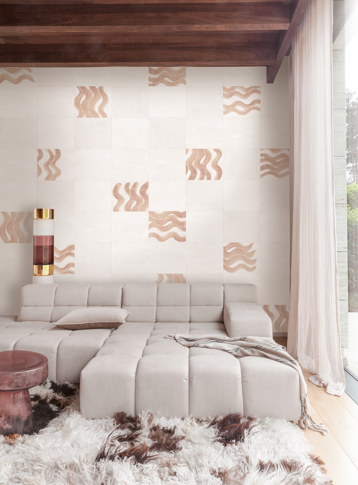
The pattern does not sit flat on the surface. It rises and falls in waves, then breaks into softer contours that recall brushwork, ripples, and shadow. That sense of movement gives the wall paneling its direction. Instead of a fixed repeat, the eye catches a sequence of organic line patterns that seem to travel across the room. On the lighter panels, the relief is almost sketch-like. On the darker compositions, the same idea becomes more graphic and assertive.
Japanese calligraphy is one clear reference point, but the translation is subtle. The collection does not copy written forms; it borrows their pressure, pace, and pause. A single line can feel deliberate and spare, while a broader field of texture reads like layered paper or pressed material. The result is decorative wall panels that are less about ornament for its own sake and more about the trace of a gesture.
A feature wall with birds and clouds
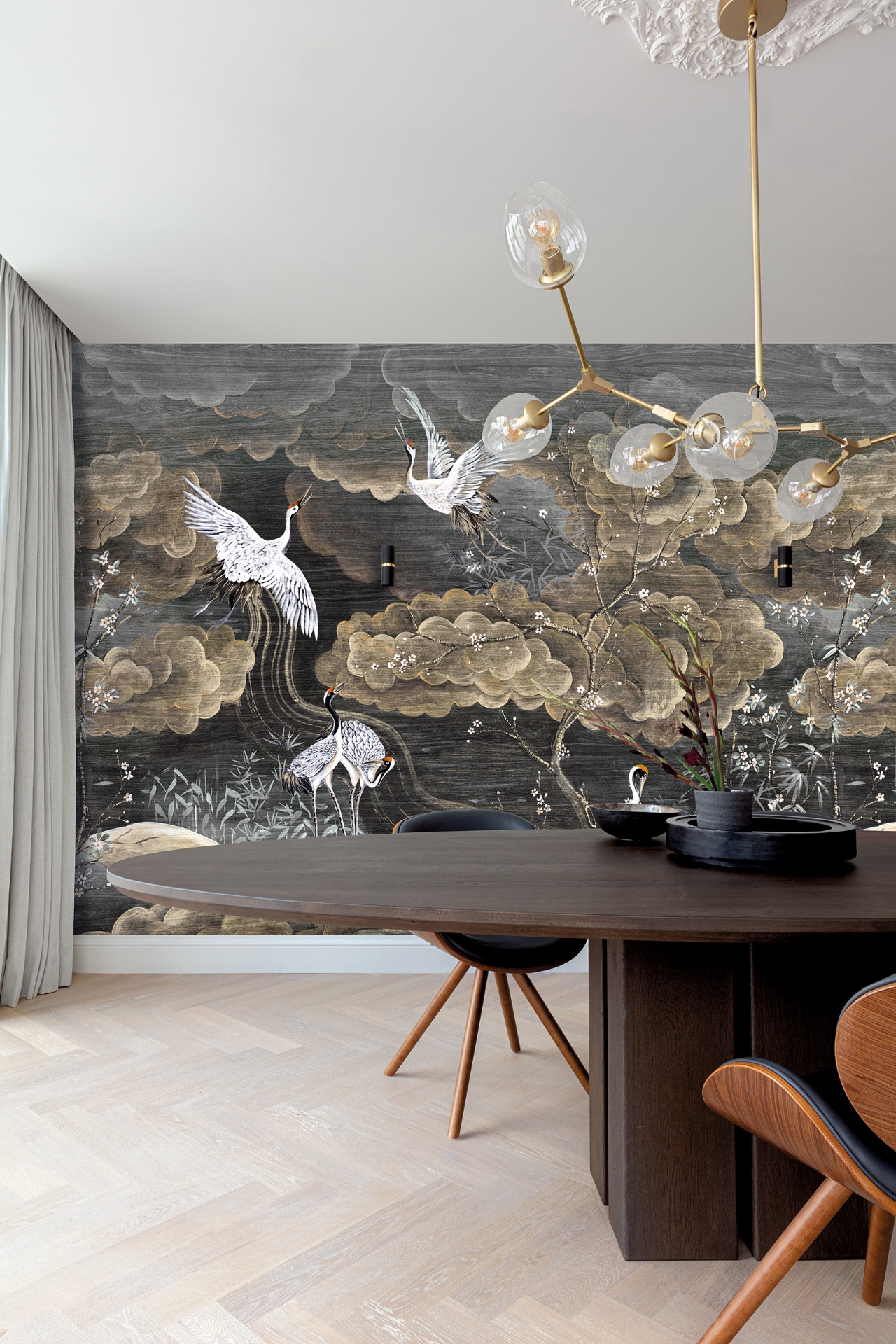
One of the strongest images shows a dark feature wall where birds and cloud shapes run across the surface in a continuous print. The motif is easy to read from a distance, yet it softens when you come closer, because the tone-on-tone contrast keeps the scene subdued. Framed by curtains and a simple dining table with a multi-light pendant above it, the wall becomes the main field in the room without crowding the furniture. It is an accent wall that works by quiet persistence rather than by volume.
That bird-and-cloud composition adds a clear narrative layer to the wall paneling. The reference to cranes in open landscape is present in the source text, but the visual impression is broader: motion through air, drift, and a surface that holds both figure and background at once. The darker ground gives the pattern depth, while the lighter marks prevent it from reading as a heavy mural. It sits somewhere between textured wallcovering and a large-scale drawing.
Dark tone, soft outline
What makes the print effective is the way it avoids hard edges. The birds are present, but they do not dominate the room; their forms recede into the texture and leave space around the table, the hanging lights, and the curtain line. The wall remains the anchor, not the distraction. In that sense, the image shows how decorative wall panels can define a setting through tone, scale, and repetition instead of through strong contrast alone.
Warm brown and gold across the surface
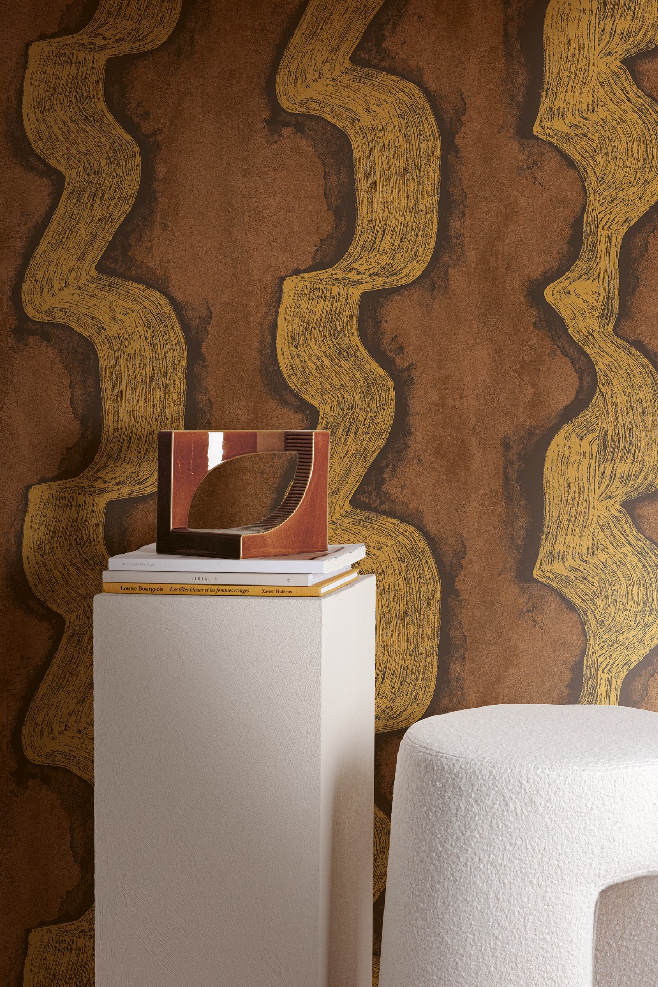
Another variation shifts the palette toward warm brown with gold-colored accents. Here the organic line patterns become more luminous, almost as if the surface were catching a low sidelight. The pattern folds and branches across a dark background, creating a clear contrast that is visible even in a partial view. This version of the wall paneling feels denser, with the lines stacking into a richer rhythm that reads well in close-up and at room distance.
The gold accents do not glitter; they trace the movement of the design. That is what keeps the surface from becoming decorative noise. A nearby upholstered chair edge and a darker field of wall help show how the pattern behaves beside simpler materials. Seen this way, the textured wallcovering is not just a backdrop. It becomes a surface that shifts depending on where the light lands and how much of the motif is visible at once.
Beige relief for quieter rooms
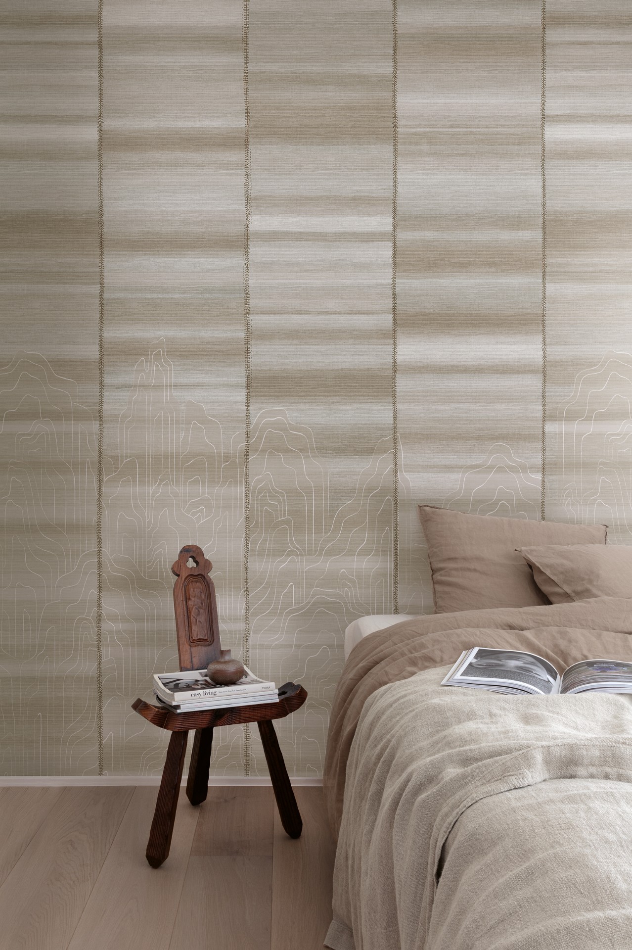
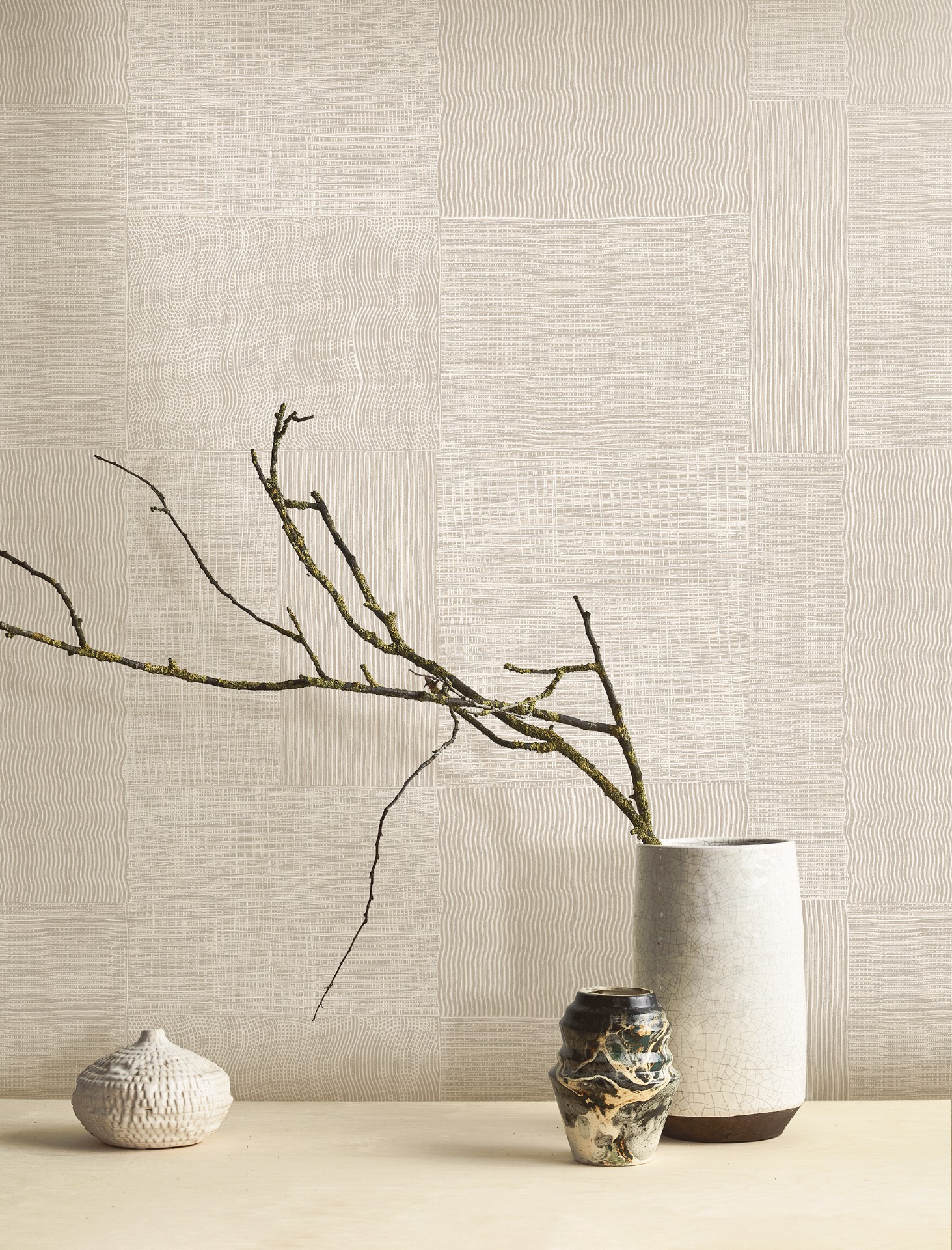
In the lighter compositions, the focus turns to beige wall texture and broad relief. The surface is built from blocks, waves, and fine linear breaks that catch the light in a softer register. From a distance it reads as calm and almost monochrome; closer in, the pattern reveals its structure. Some segments resemble folded planes, while others carry a more continuous, flowing line that moves across the wall like a drawn contour.
This is where the collection feels closest to a material study. The eye follows the joins, the raised lines, and the subtle shifts in depth. A bed edge, a wooden chair, or a pale floor plane is enough to show how the wall surface supports the room without taking over. The beige wall texture works particularly well where the furniture is low and the ceiling line stays unobtrusive, because the relief can expand across the field without interruption.
Wood grain as a calmer counterpoint
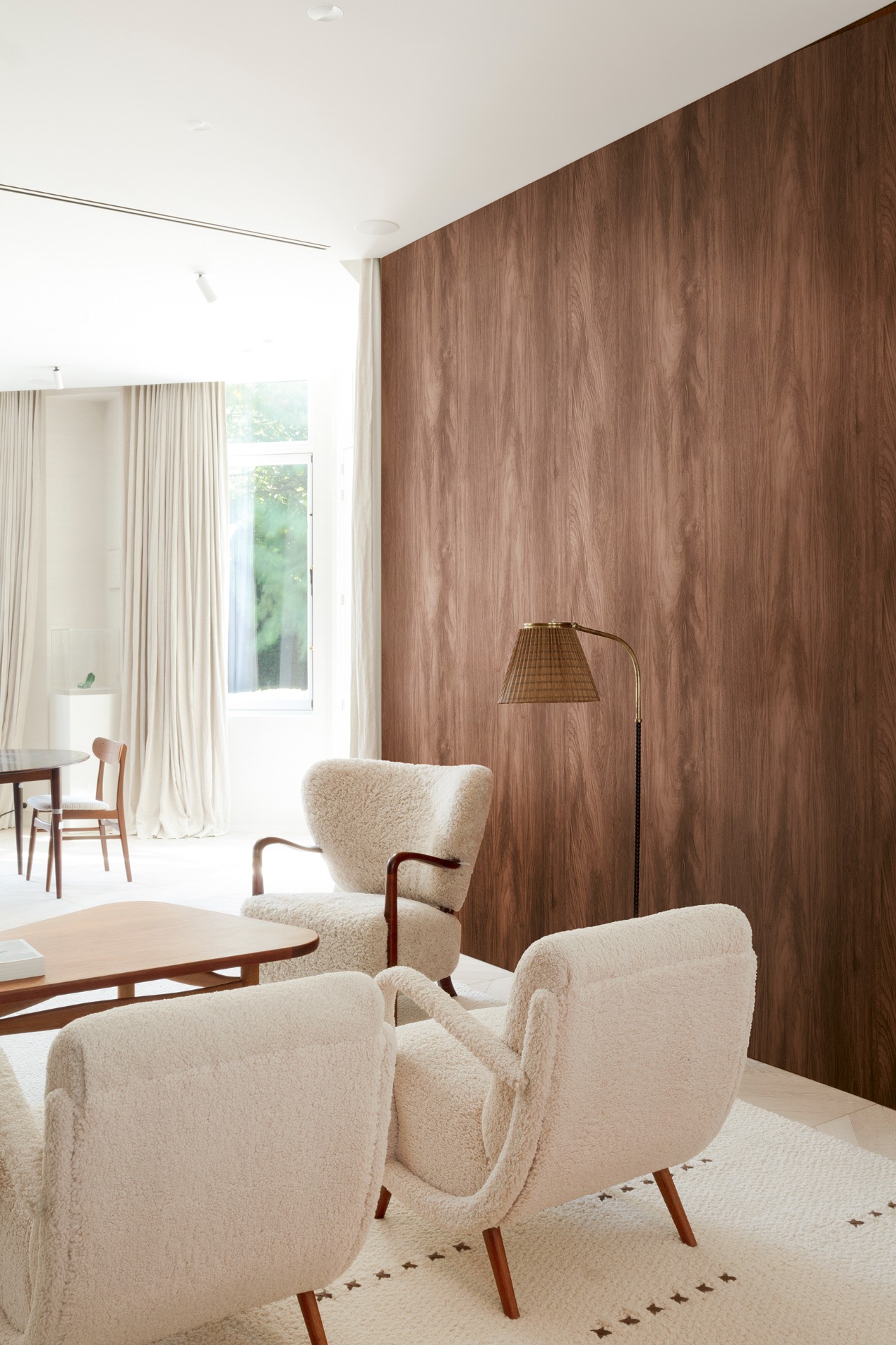
Among the image set, the wood grain wall paneling stands out for its steadiness. The broad panels carry the grain in long, continuous lines, giving the wall a steadier visual tempo than the printed motifs. It is not the most expressive surface in the group, but it is essential as a counterpoint. Next to rounded chairs and a bright window edge, the wood grain creates a quieter reading of the same project language: line, texture, and surface depth.
Because the grain runs across such a large area, the paneling acts almost like a second envelope inside the room. It frames the seating without demanding attention. The effect is practical in the visual sense: it gives the eye somewhere to rest after the denser bird, cloud, or gold-patterned compositions. For a portfolio page, that contrast matters. It shows how the collection can move from graphic to restrained while keeping the same underlying idea intact.
What stays after the first glance
Across the set, the strongest thread is the relationship between motion and surface. A brushstroke becomes a ridge, a ripple becomes a repeated line, a shadow becomes part of the pattern. That translation is what gives the wall paneling its identity. The motifs are not loud, but they are legible. Birds, clouds, wood grain, and linear relief each push the surface in a different direction, yet they stay within the same measured visual language.
The collection works best where contrast is allowed to do the talking: dark against light, matte against sheen, print against relief. Even the most minimal beige panels hold that tension, because the texture changes with the angle of view. It is an approach that suits an interior looking for a feature wall, but also a quieter room where the wall simply needs to do more than sit blank. In both cases, the surface carries the scene.
Photographer: Masureel
Want to see more of Masureel? View the page of Masureel for even more great projects and company information.


NEW 2026 Jubileum Edition The Best Interior Designers Benelux
Order Now €125