Minimal retail interior with cobalt blue accents and wood veneer
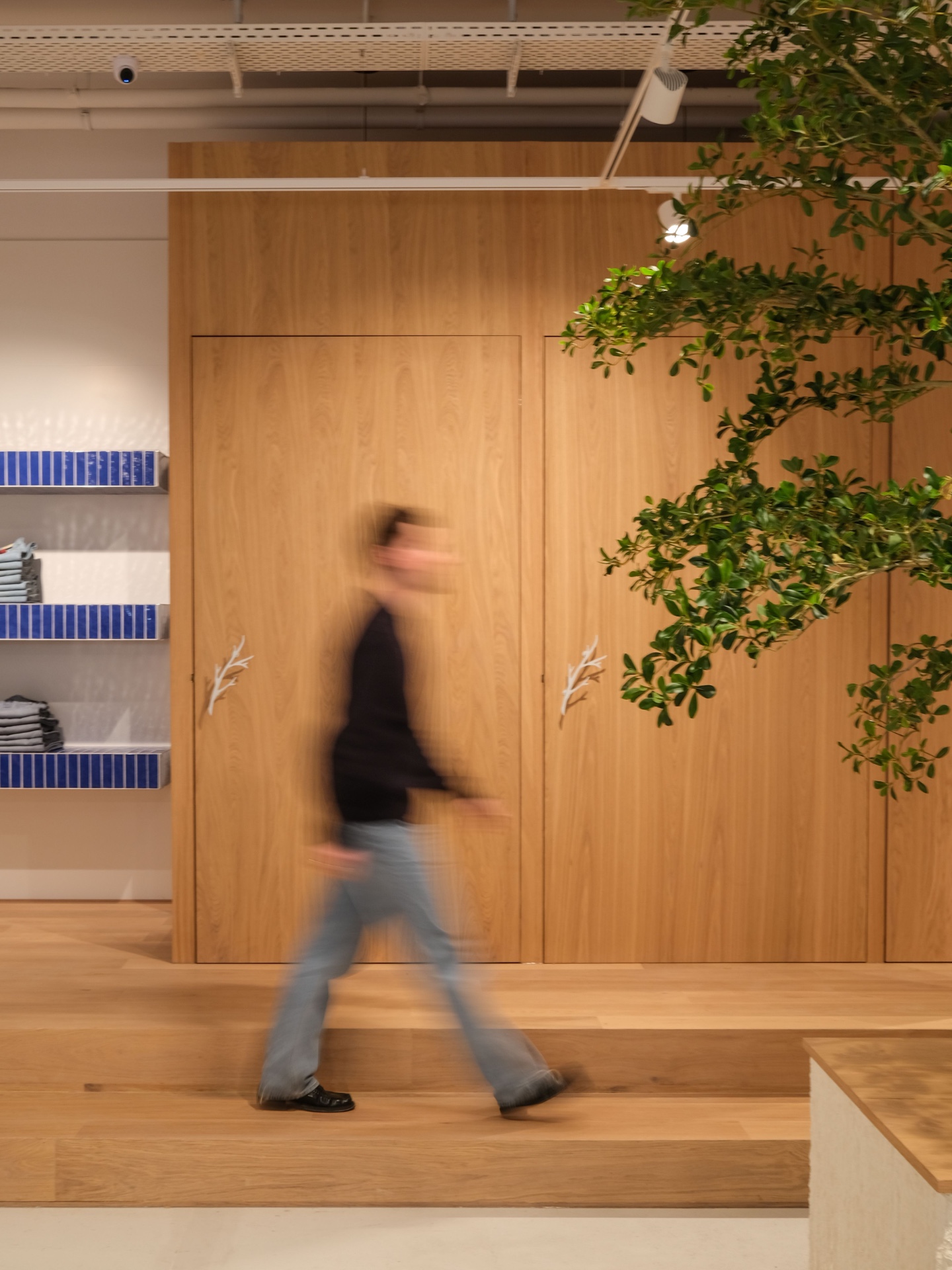
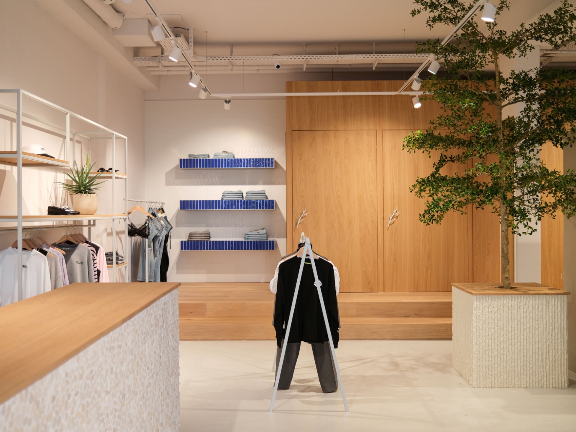
Warm wood veneer sets the pace here, while cobalt blue accents break up the long wall runs and shelves. The result is a minimal retail interior that keeps the eye moving between white wall surfaces, built-in storage, and the central planted volume. The arrangement is spare, but never bare. Materials do the talking: timber grain, painted surfaces, a few precise blue lines, and lighting that picks out the merchandise zones without crowding them.
Walls, shelves and a clear line through the store
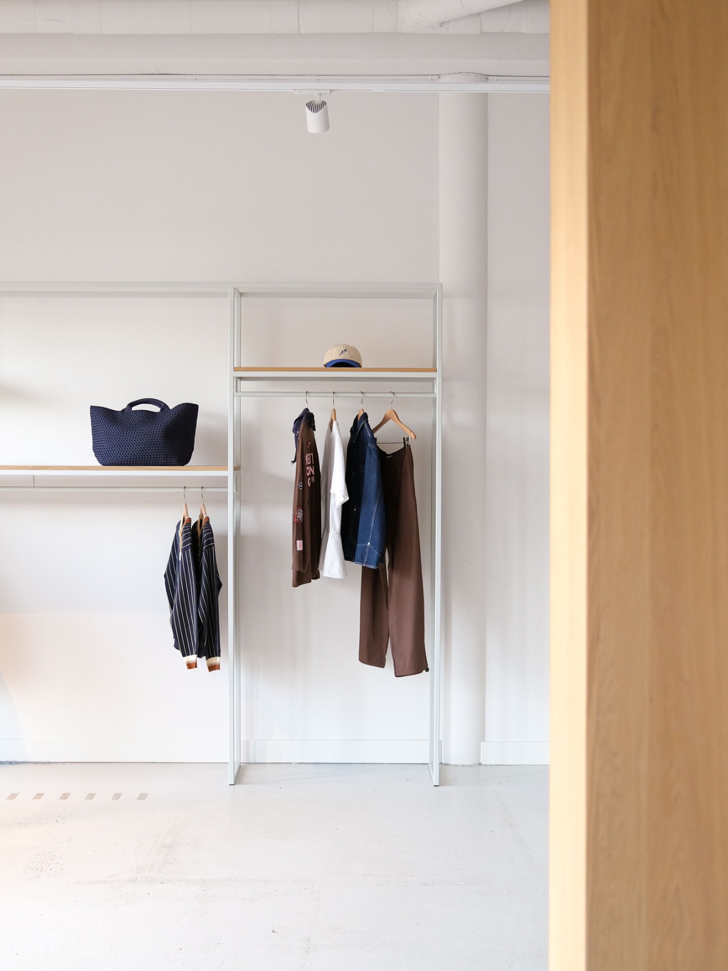
Built-in shelving system elements sit flush with the walls, creating a retail layout that reads as one continuous composition. Open niches, horizontal shelves, and narrow support rails define the display areas without adding visual noise. In the wider views, white walls keep the background light, while the wood veneer brings depth to the larger panels and storage zones. This is where the minimal retail interior feels most deliberate: every opening has a role, and every surface has a reason to stay plain.
The shelving does more than hold objects. It forms the structure of the room, guiding movement from one side to the other and keeping the display front readable from a distance. The built-in storage is integrated into the wall plane rather than standing apart from it, so the shop feels organized through architecture instead of loose fixtures. That approach makes the cobalt blue accents stand out even more clearly when they appear along shelf edges and panel details.
Cobalt blue accents against wood veneer and white walls
Cobalt blue accents are used sparingly, but they change the pace of the interior. The blue strips on the shelving and wall elements interrupt the warm timber tones and give the display system a sharper outline. Against the wood veneer and white walls, the color reads as a measured interruption rather than a loud gesture. It marks transitions, edges, and small pauses in the layout, which helps the eye register where one surface ends and another begins.
That contrast matters because the material palette stays restrained. The veneer shows a clear grain, the painted walls remain plain, and the blue appears only where the composition needs a cut line or a point of emphasis. In a minimal retail interior, those small moves carry weight. They keep the room from flattening out, while still leaving enough blank surface for the products and the shelving system to remain legible.
How the display wall is held together
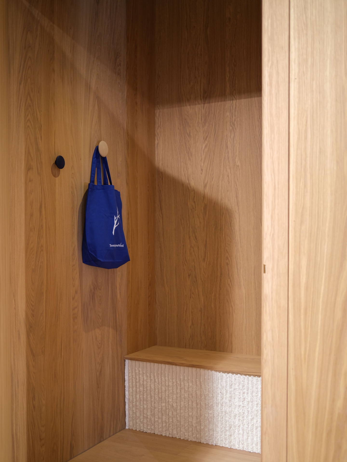
The wall panels and shelf structure work as one built-in system. Narrow ledges, framed recesses, and attached rails create a sequence of storage and display points that feels measured rather than crowded. From close up, the junctions are part of the story: wood veneer meets painted wall, then a blue strip marks the edge of a shelf or panel. These details are quiet, but they give the retail interior its order and keep the minimal concept from becoming sterile.
Because the system is built into the architecture, the shop does not rely on separate furniture to define the space. That leaves the floor line cleaner and makes the wall zone do more of the work. The result is a compact set of gestures—shelves, niches, rails, and panels—that can hold a lot of visual information without breaking the calm rhythm of the room.
Track rail spotlights guide the view
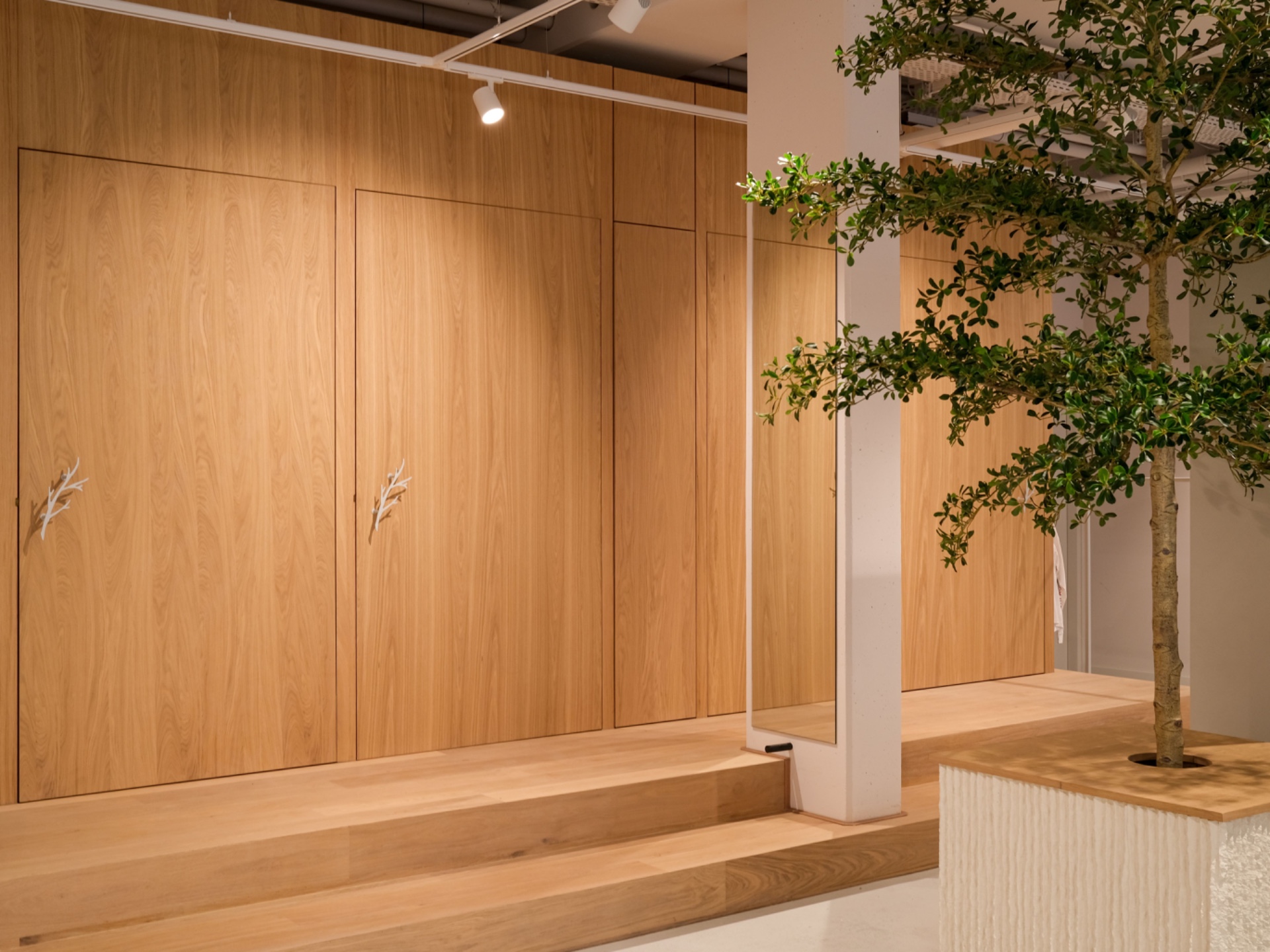
Track rail spotlights run across the ceiling and bring a second layer of structure into the room. Their directionality helps separate the display areas from the rest of the interior, while the fixtures themselves stay visually restrained. In the photographs, the lighting picks up the texture of the wood veneer and defines the edges of the shelving system, especially where the wall panels move in and out. The ceiling stays quiet so the beam pattern can do the work.
What makes the lighting useful here is its precision. The spots do not wash the entire interior in one flat layer. Instead, they create brighter pockets over the products and leave the surrounding white walls softer. That contrast gives the minimal retail interior depth, especially in the sections where shelves, panel joints, and blue accent lines sit close together.
Lighting, storage and material texture
The relation between track rail spotlights and the built-in shelving system is easy to read. Light lands on the fronts of the shelves, skims the wood veneer grain, and then falls away into the recessed parts of the wall. This keeps the display from becoming a single flat plane. A retail interior like this depends on those shifts in brightness; they reveal the geometry of the built-in structure and make the shelving feel carefully placed without overstatement.
Because the palette stays limited, small material changes become noticeable. A painted surface, a timber edge, a blue shelf strip, and a shadow line can each hold their own. The store uses that restraint well. It allows the lighting to shape the atmosphere through contrast rather than decoration, which suits the directness of the overall concept.
Indoor planting as a pause in the layout
At the center of the store, indoor planting in store introduces a living vertical mass among the built surfaces. The planted volume rises from a lighter base and sits inside a wooden surround, so it reads as part of the interior rather than as a separate object. Its leaves soften the strict lines of the shelving and panel system, but the role is spatial as well as visual. It marks a pause in the layout and gives the visitor a point to orient toward before moving on.
The planting also changes how the room is read from a distance. Where the white walls and timber panels keep the composition linear, the plant adds height and irregularity. That shift is important in a minimal retail interior, because it stops the layout from relying only on planes and edges. Here, the central volume gives the store a distinct center without disrupting the clean wall structure around it.
A minimal retail interior built from small contrasts
Seen as a whole, the project relies on a small set of repeated moves: white wall surfaces, wood veneer, cobalt blue accents, built-in shelving system elements, and targeted track rail spotlights. None of those parts asks for attention alone. What makes the interior hold together is the way they take turns being visible. The shelving frames the merchandise, the lighting directs the eye, and the planting interrupts the geometry long enough to make the room feel active.
The minimal concept stays present throughout, but it is carried by material detail rather than by emptiness. That is what gives the shop its character as a retail interior: the walls are not treated as blank background, and the storage is not left as separate furniture. Everything is fixed into the room’s structure, from the blue accent strips to the recessed openings and the central planted element. The space reads clearly, and it does so through surfaces the visitor can actually see.
Want to see more of Studio Kabel? View the page of Studio Kabel for even more great projects and company information.

NEW 2026 Jubileum Edition The Best Interior Designers Benelux
Order Now €125