Duplex apartment interior with custom joinery and soft architecture
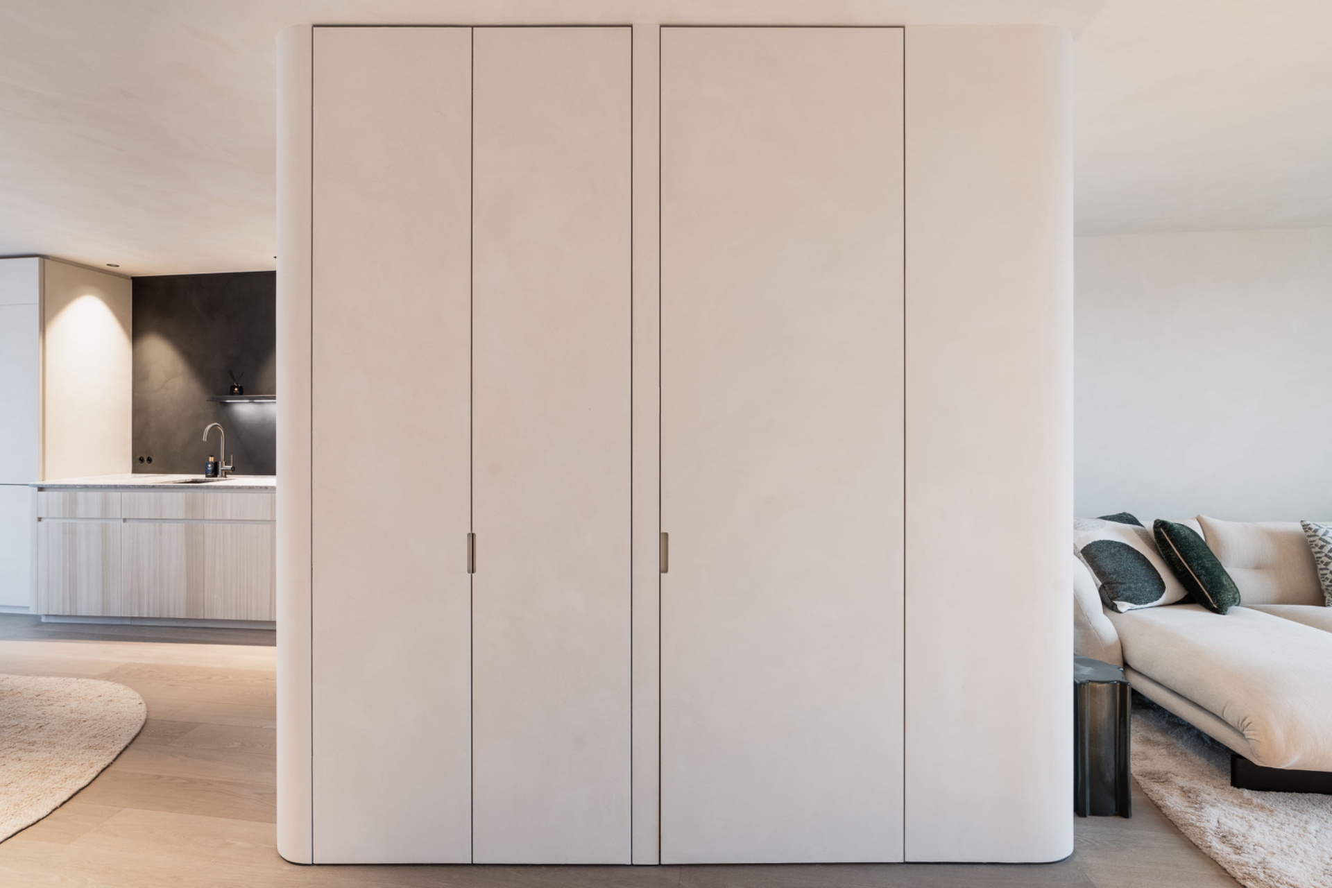
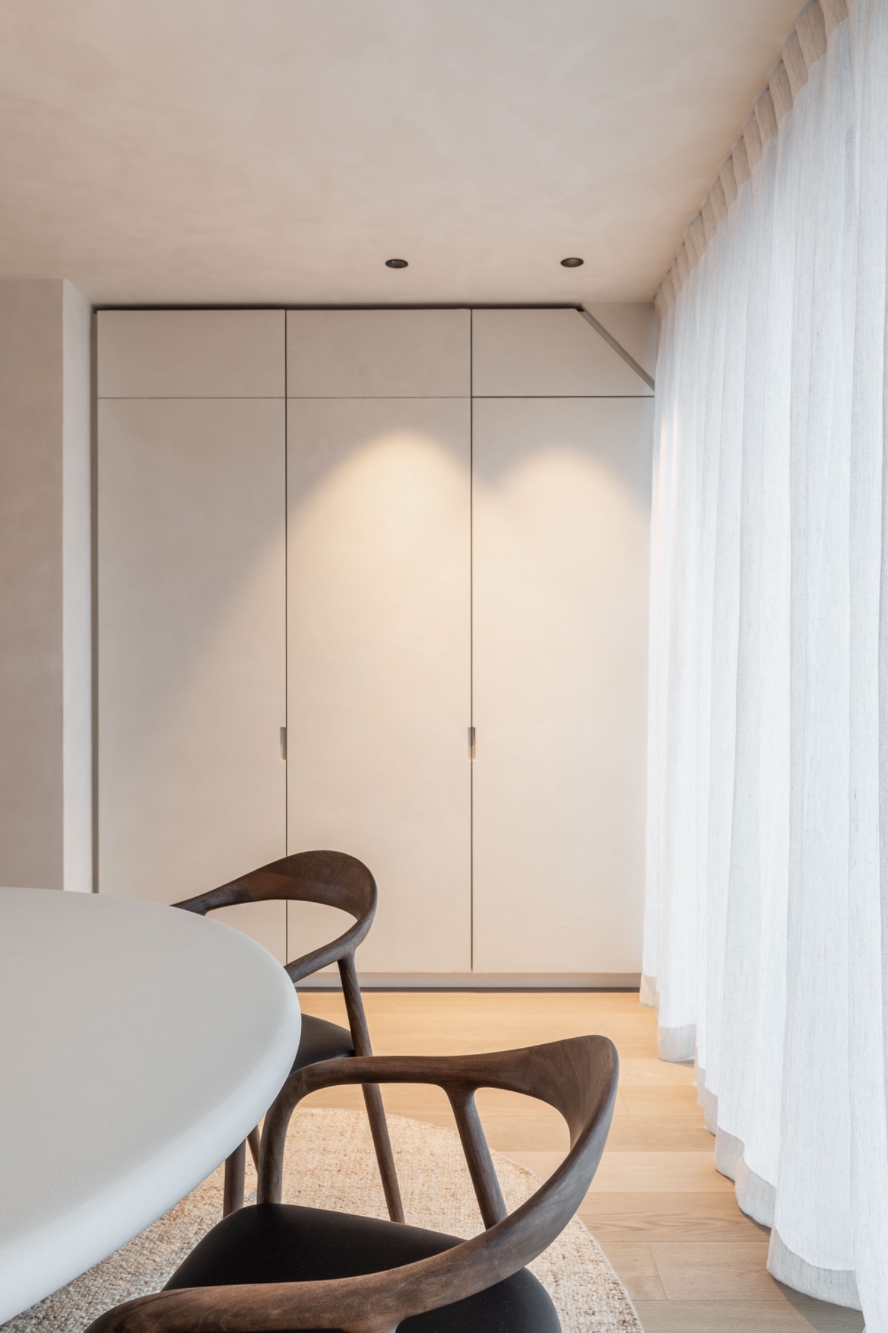
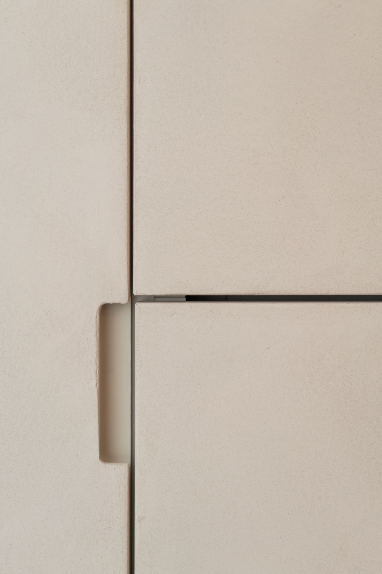
Rounded cabinet fronts set the tone before the rest of the duplex apartment interior reveals itself. A pale field of walls, light wood and matte accents keeps the rooms quiet, while the curved joinery softens the straight run of the plan. Nothing here asks for attention. The architecture holds the frame, and the furniture follows it with the same measured restraint.
Rounded bespoke cabinetry and the living area
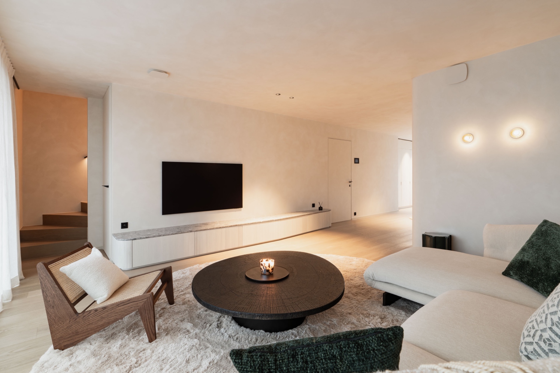
The living space opens around a low media wall, where the television sits inside a dark recessed panel and the console runs almost flush beneath it. That single move clears the room visually. Around it, custom rounded cabinetry and broad vertical panels guide the eye toward the kitchen and filter the transition between zones. Small ceiling spots sit back from the wall line, so the light lands where it is needed without breaking the calm of the surfaces.
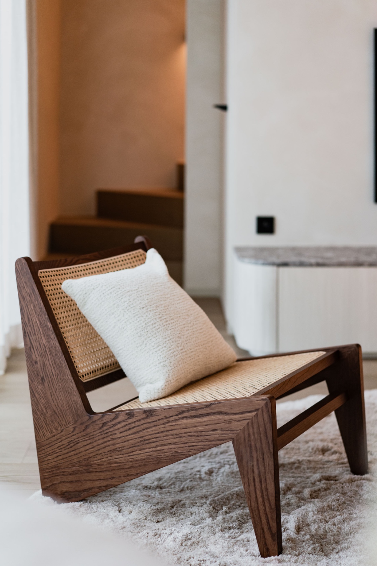
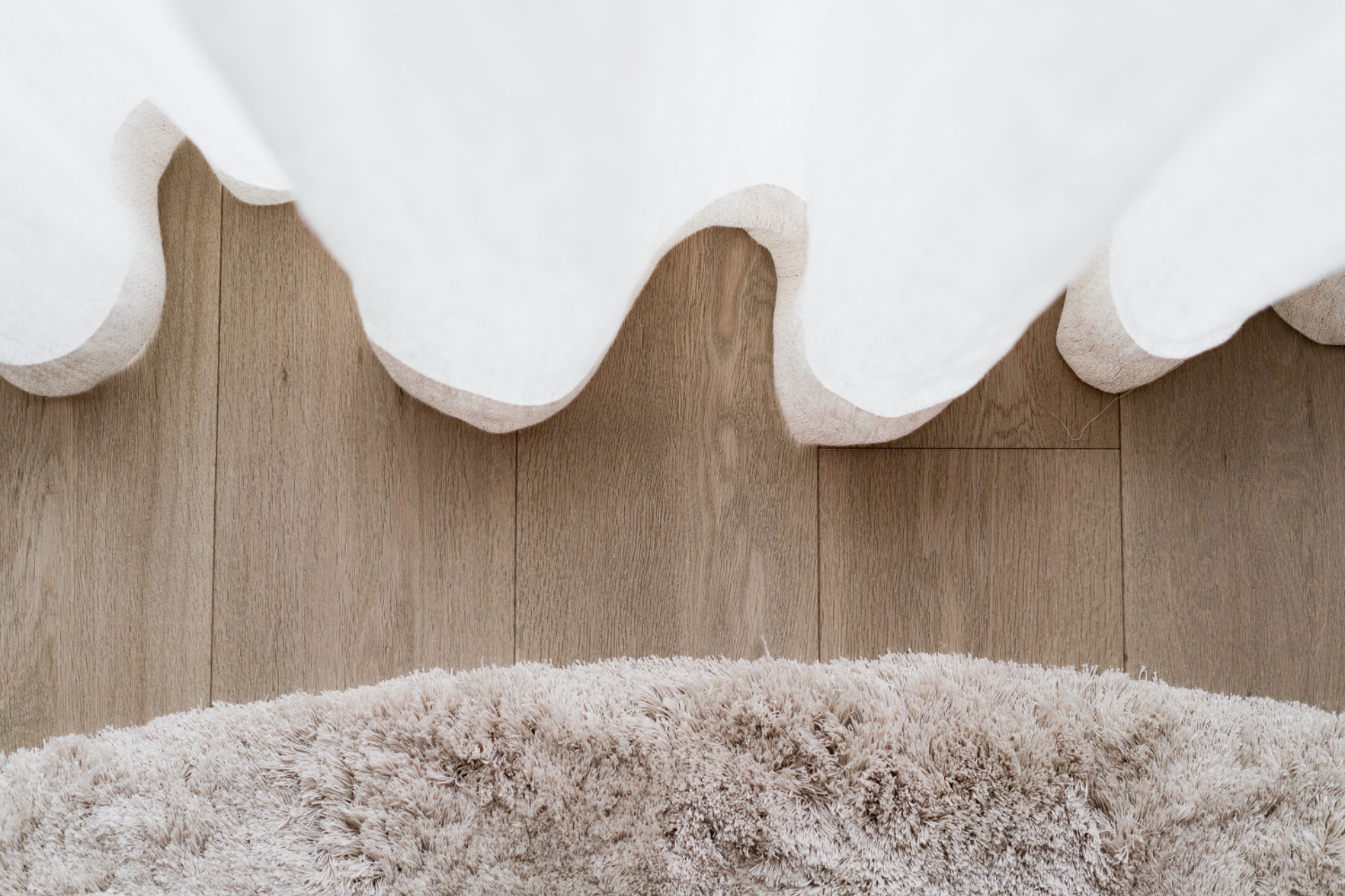
Seen from across the room, the apartment reads as one continuous composition. Pale plaster, warm beige tones and brushed light wood keep the palette restrained, but the details avoid flatness. Corners are softened, lines are shortened, and the joinery sits tight to the architecture. Even the low seating stays close to the floor, which leaves the ceiling line and the built-in volumes to define the space. That is where the duplex apartment interior makes its point: in the way every element supports the room rather than competing with it.
A media wall set back into the architecture
The media wall is not treated as a separate feature wall. It is tucked into the broader joinery scheme, with a matte dark recess that frames the screen and a low base that stays visually light. The effect is understated, but precise. The dark panel gives depth to the room, while the surrounding cabinetry keeps the composition grounded. In a project like this, the tv wall works best when it behaves like part of the architecture, not a piece of furniture added at the end.
A kitchen with a stone-look countertop and quiet surfaces
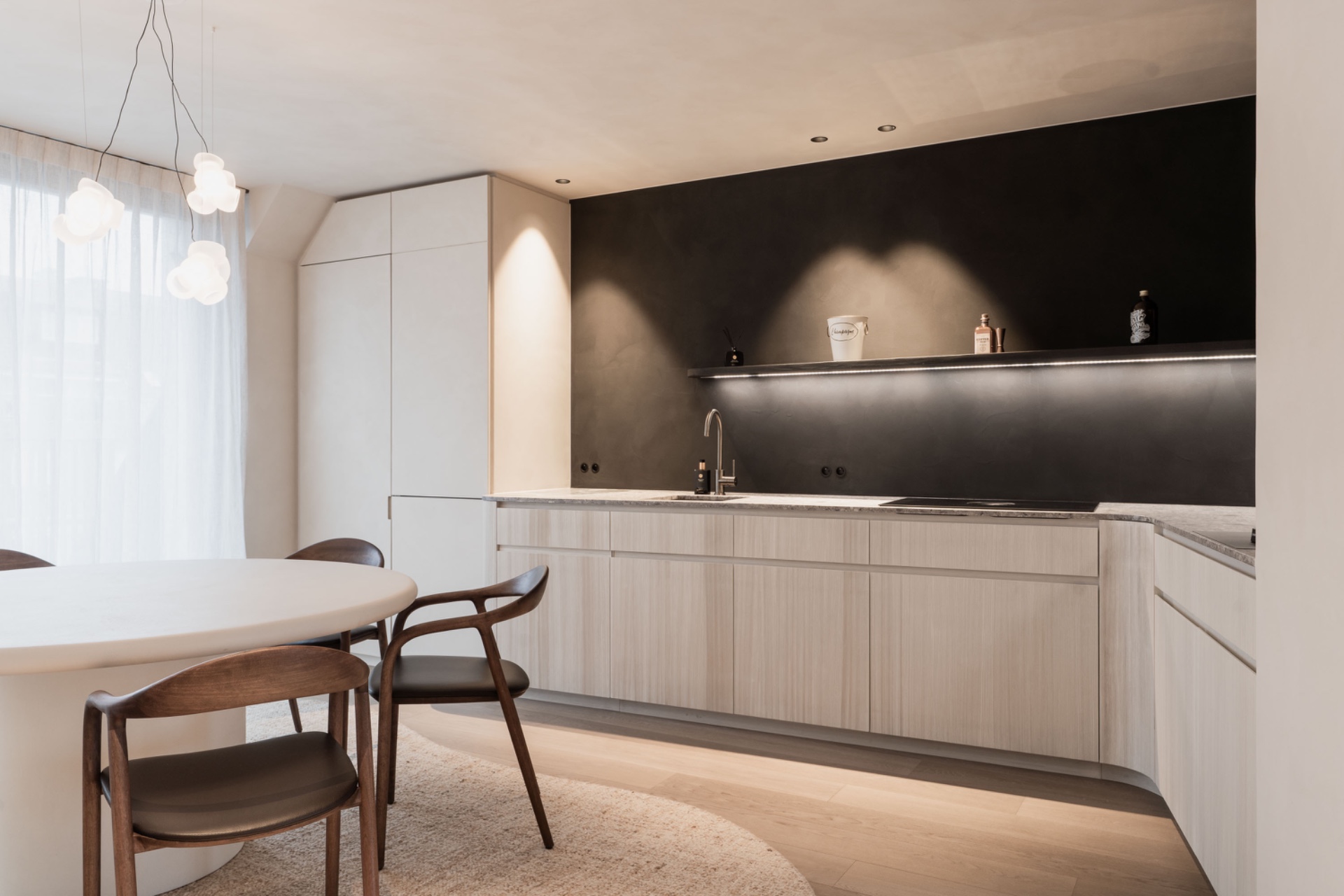
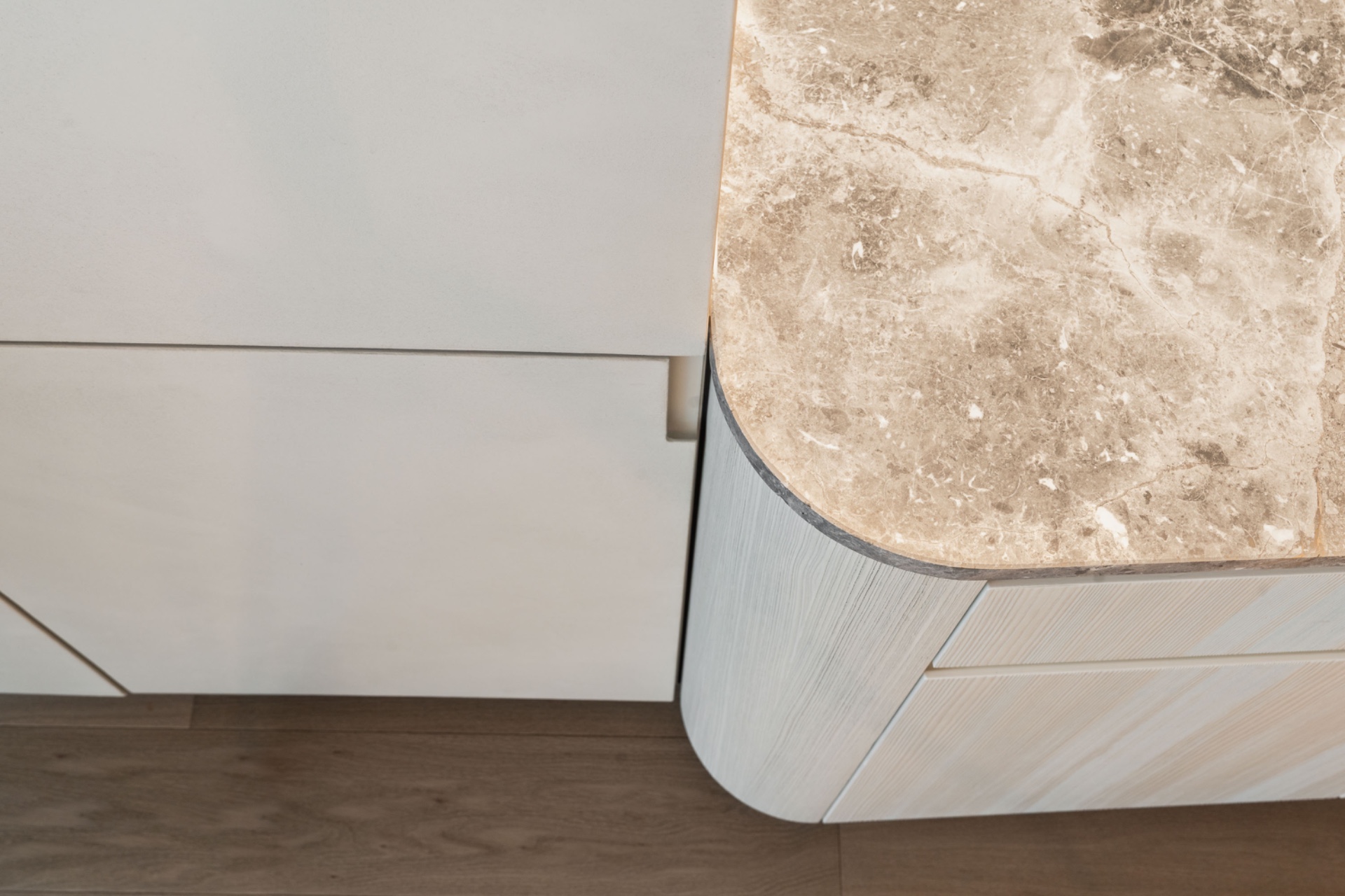
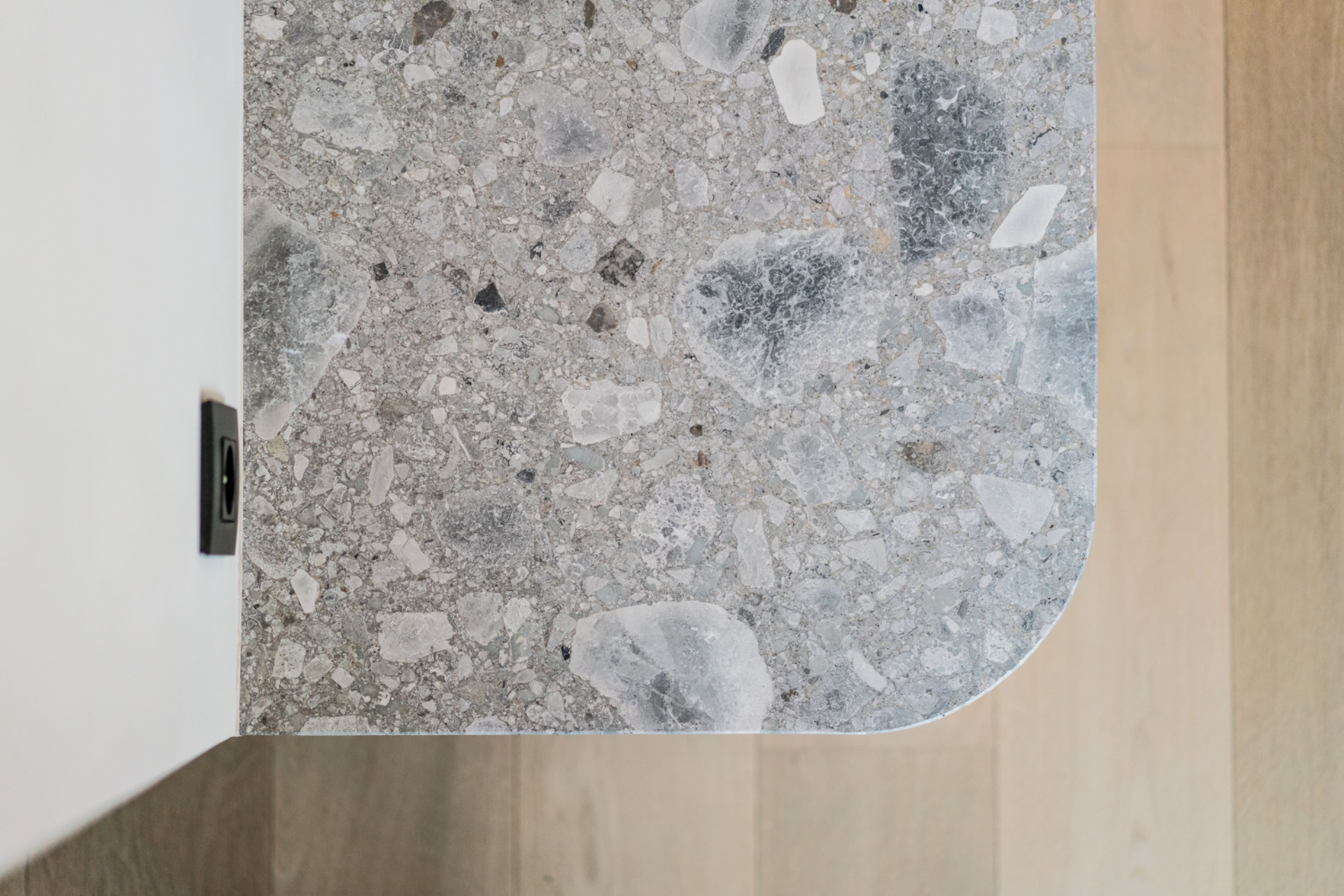
The kitchen continues the same logic, but with harder edges softened by material choice. Flat fronts disappear into the plane, the appliances are integrated, and a kitchen with stone-look countertop introduces a rounded corner that changes how the light catches the surface. The darker accent wall behind the work zone gives the cabinetry a clear backdrop, while the pale timber fronts keep the mass from feeling heavy. It is a compact piece of planning, read almost as a built-in volume rather than a separate room.
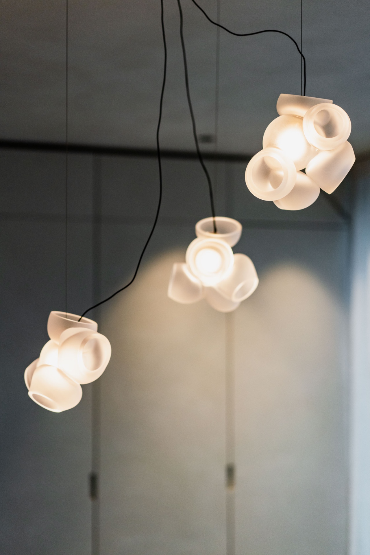
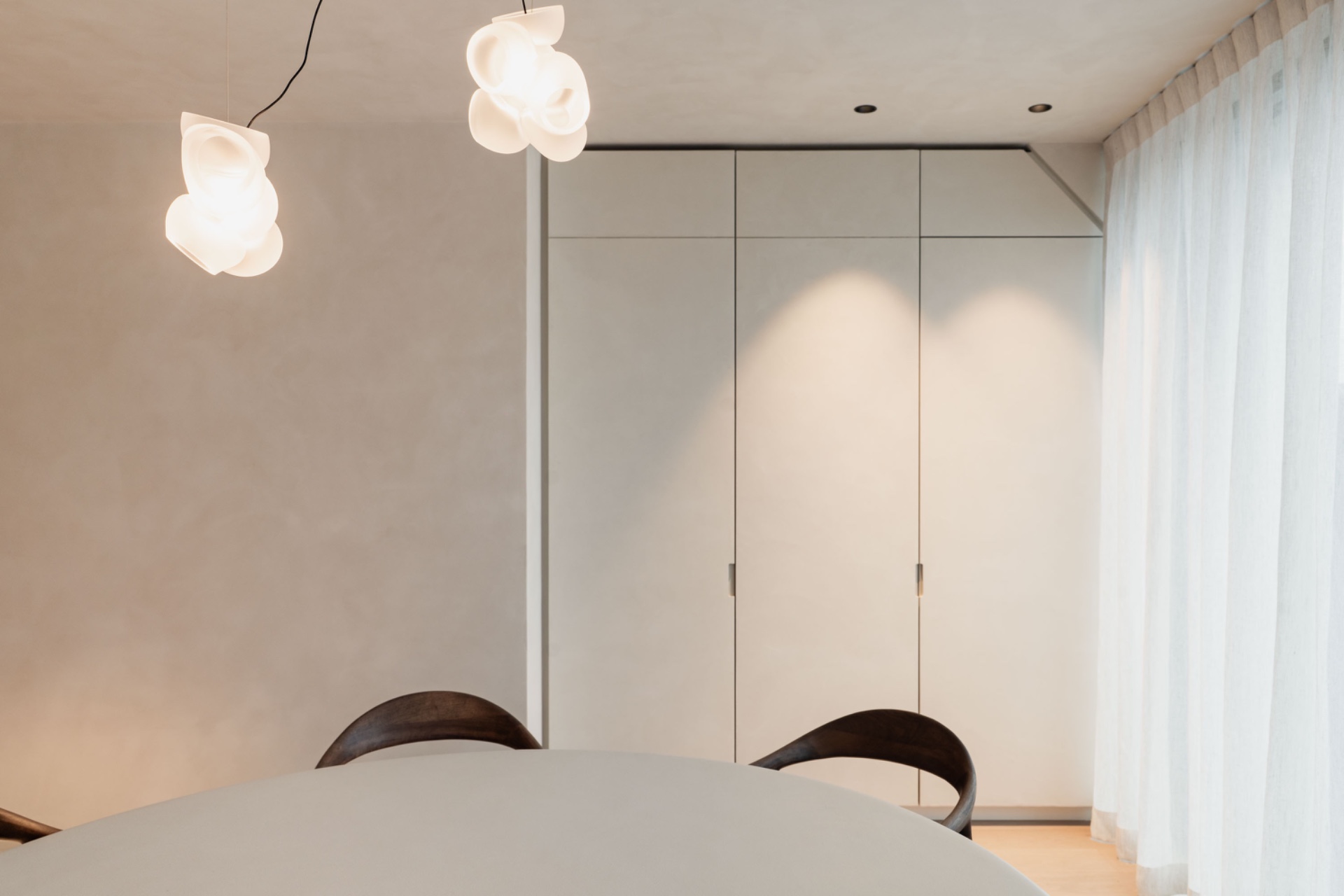
A round dining table sits against that linear setting and breaks the strictness of the cabinetry. Its shape slows the room down. Above it, the pendant lights are light in scale and diffuse in output, so they glow rather than announce themselves. The table, the pendant cluster and the adjacent joinery create a useful pause between cooking and living. This is where the duplex apartment interior becomes more than a sequence of rooms; it starts to work through small shifts in shape, height and brightness.
Light that stays close to the surfaces
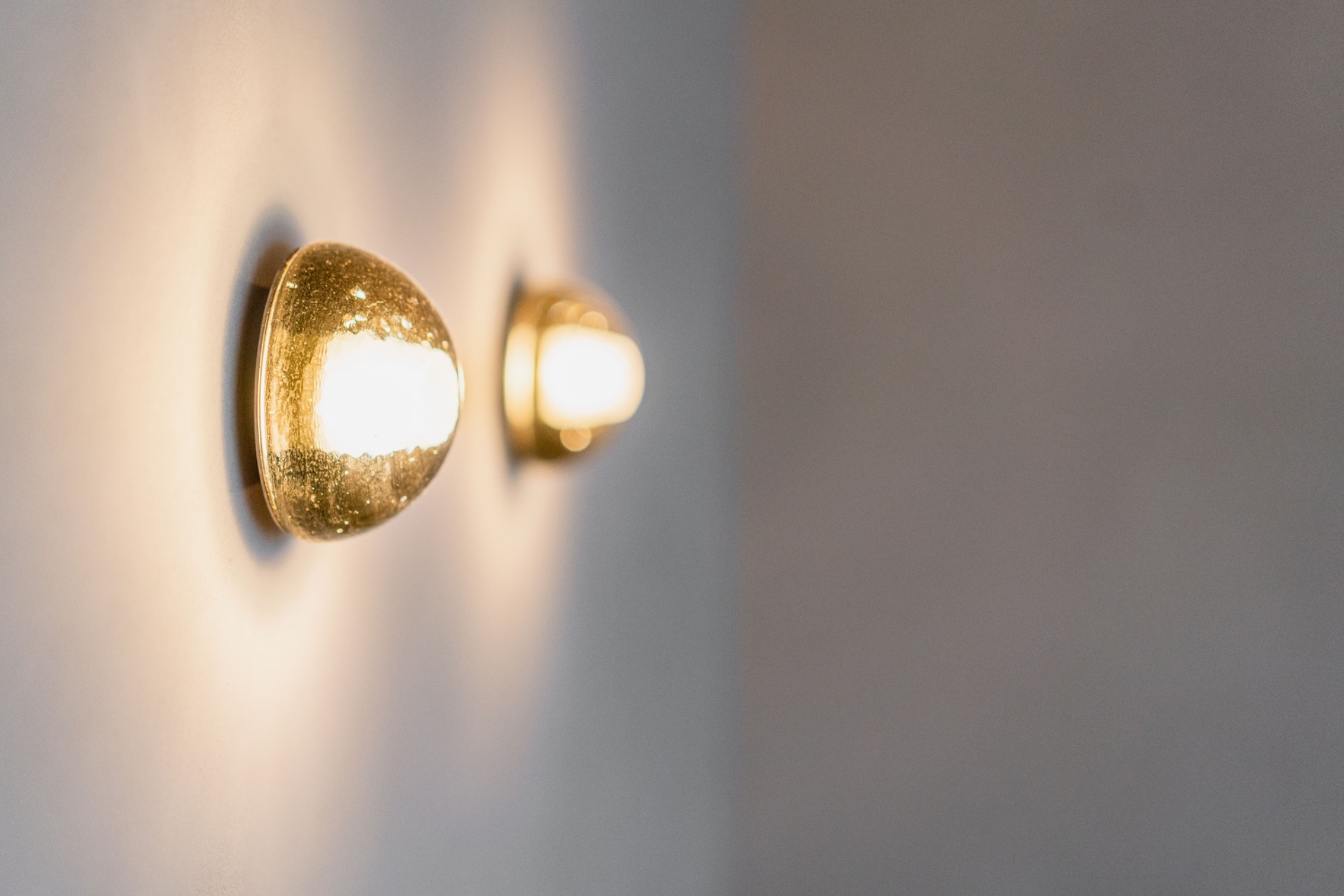
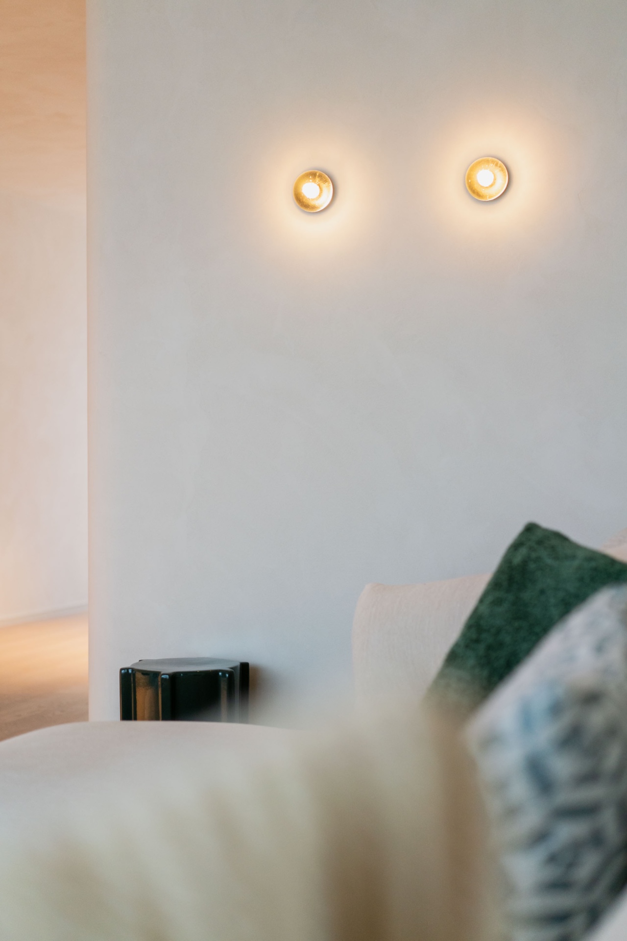
The recessed lighting plan is felt before it is seen. Ceiling spots are placed to wash the walls and work surfaces without leaving hard shadows, and the result is a room that changes slowly through the day. Matte finishes help that effect. They take light softly, especially on the pale plaster and the brushed wood. Even the darker recess behind the screen reads as a depth cut rather than a contrast gesture. The lighting never takes over. It simply keeps the joinery legible and the plan easy to read.
A staircase with an integrated light line
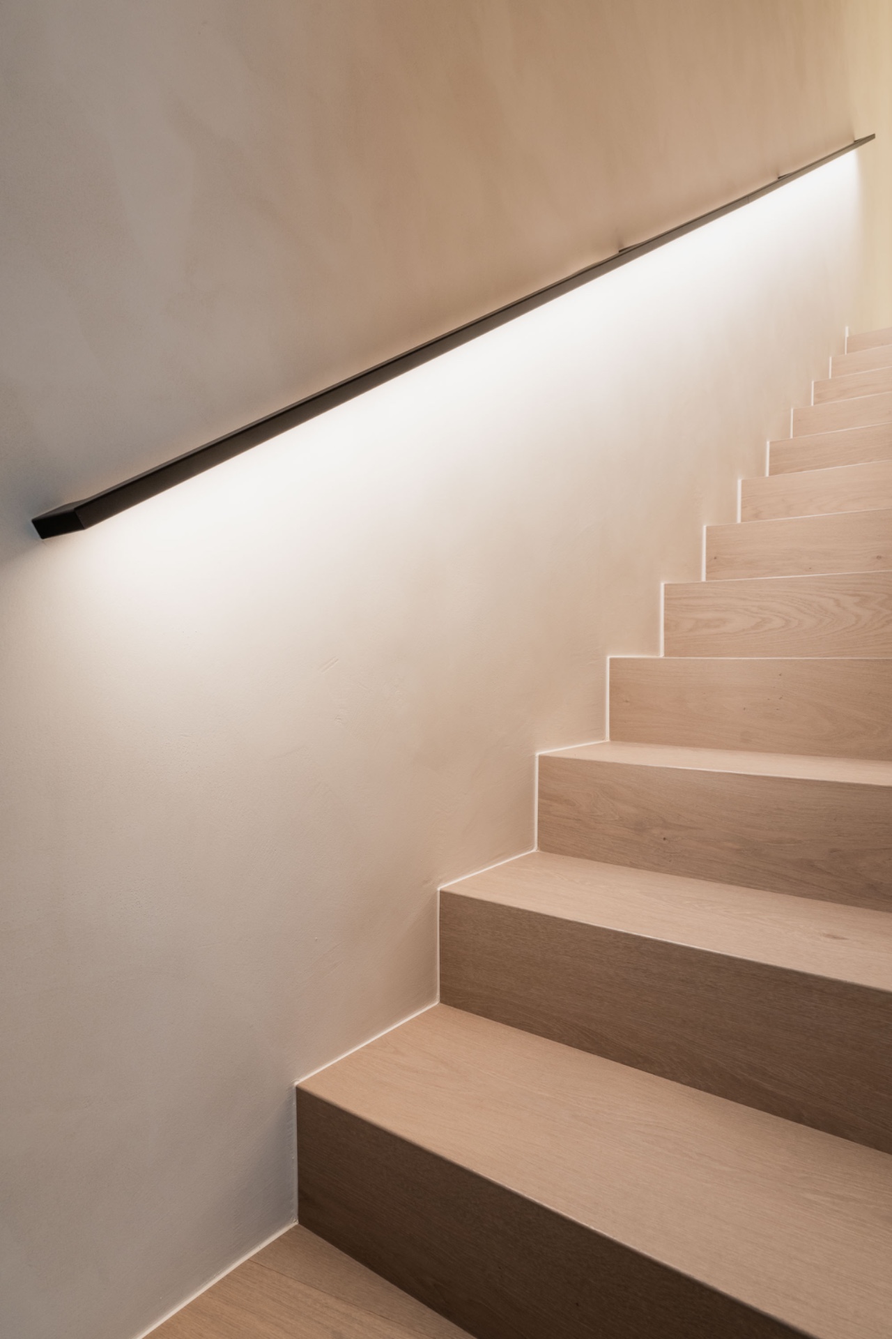
At the center of the vertical movement, the staircase becomes its own architectural object. Wooden treads step upward beside a subtle line of light that runs along the wall, guiding the eye and the body at the same time. The handrail is stripped back to the essentials, and the surrounding plaster stays plain, so the stair reads as a calm pause between the lower living level and the more private rooms above. The light line is thin, but it changes the whole route by marking the edge with precision.
From the base to the landing, the stair keeps the same measured tone as the rest of the duplex apartment interior. There is no decorative break, only a sequence of wood, wall and light. That restraint suits the project. It lets the movement between floors feel deliberate, almost ritual in pace, without turning the stair into a display piece. The detail is simple: timber underfoot, a controlled glow beside it, and a clear line leading upward.
Upper rooms shaped by the roofline
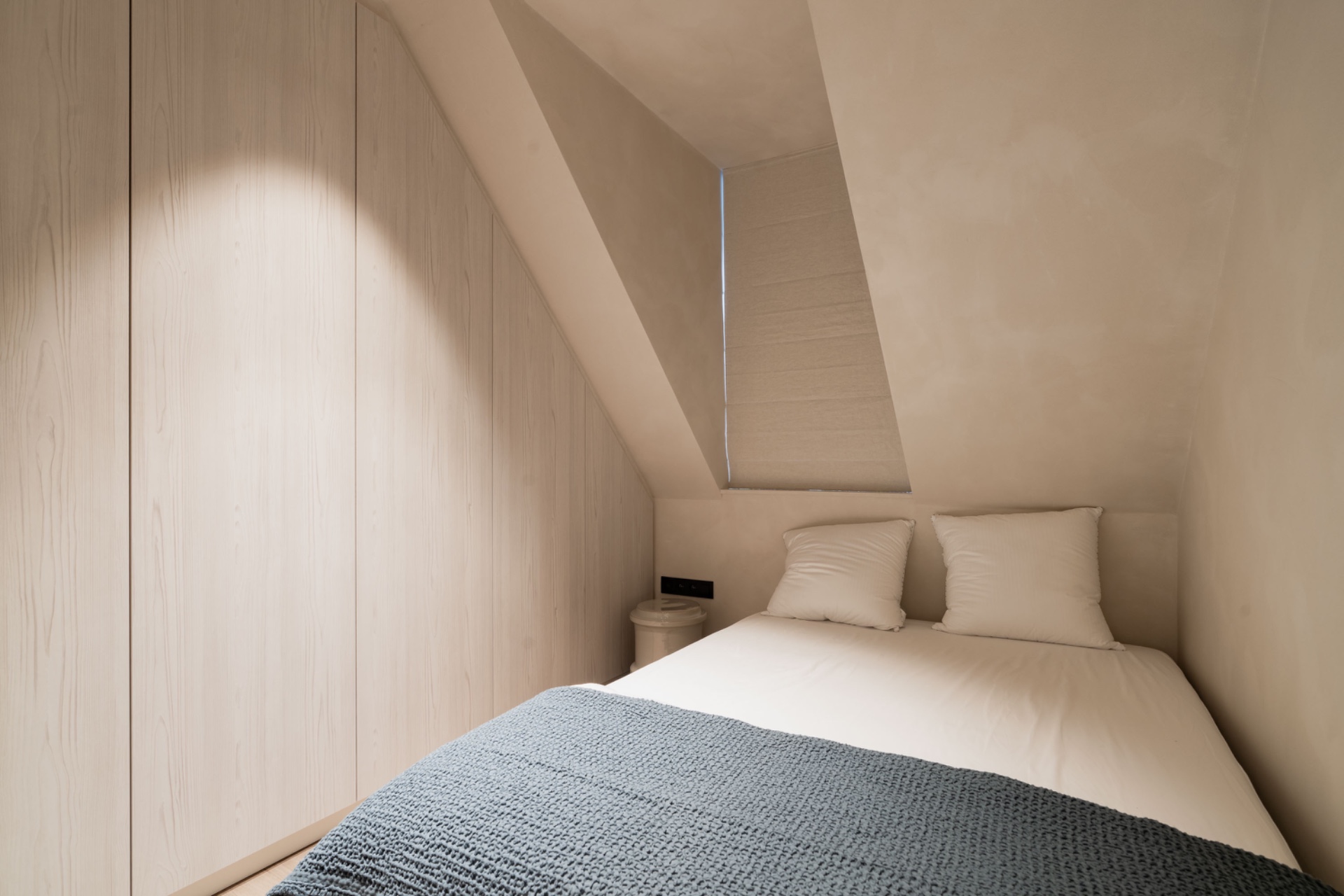
Under the sloping roof, the upper level uses constraint as an advantage. Built-in storage follows the angle of the ceiling, so the cabinetry settles into the geometry instead of resisting it. The pale fronts continue the same quiet palette found below, but here they do more work: they close off awkward corners, keep the floor area open and extend the sense of order into the most compressed part of the duplex. Light is filtered rather than spread, which suits the lower ceiling and the more private use of the room.
The bedroom stays close to the material language of the rest of the apartment. Light wood, soft walls and muted textiles keep the focus on proportion and on the slope above. A recessed opening near the window brings in daylight without making the room feel exposed. The result is modest, but exact. The space does not rely on decoration; it relies on the fit between roofline, storage and light.
A bathroom of stone, curve and reflection
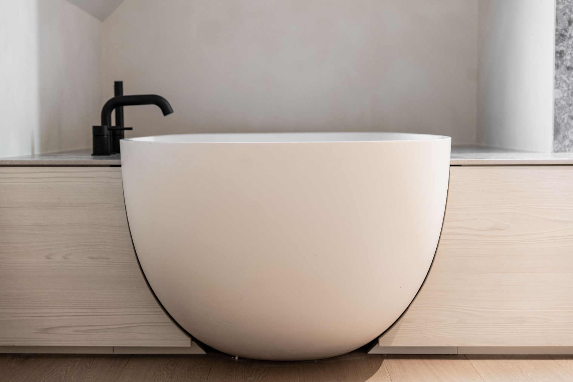
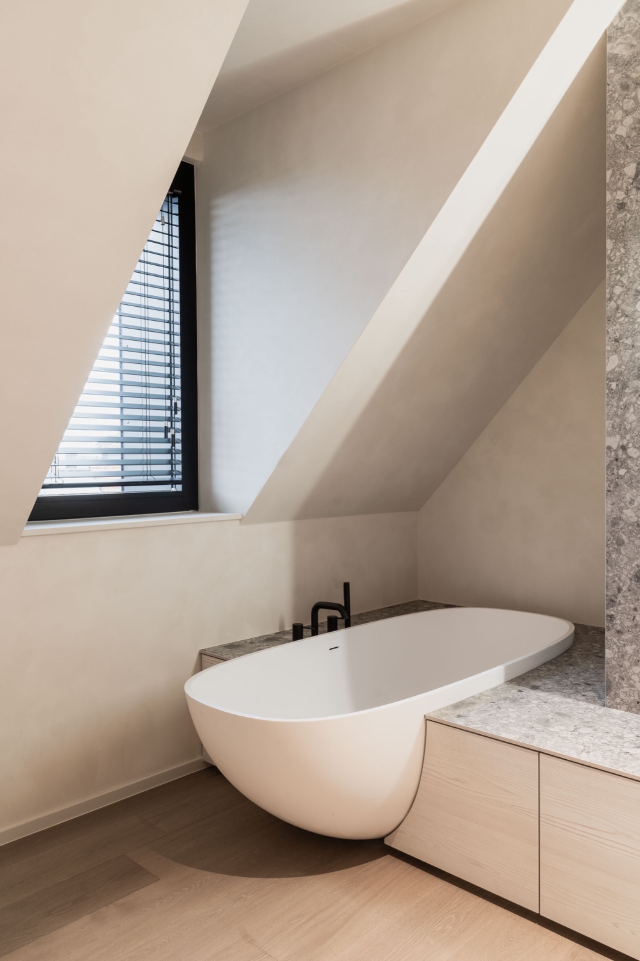
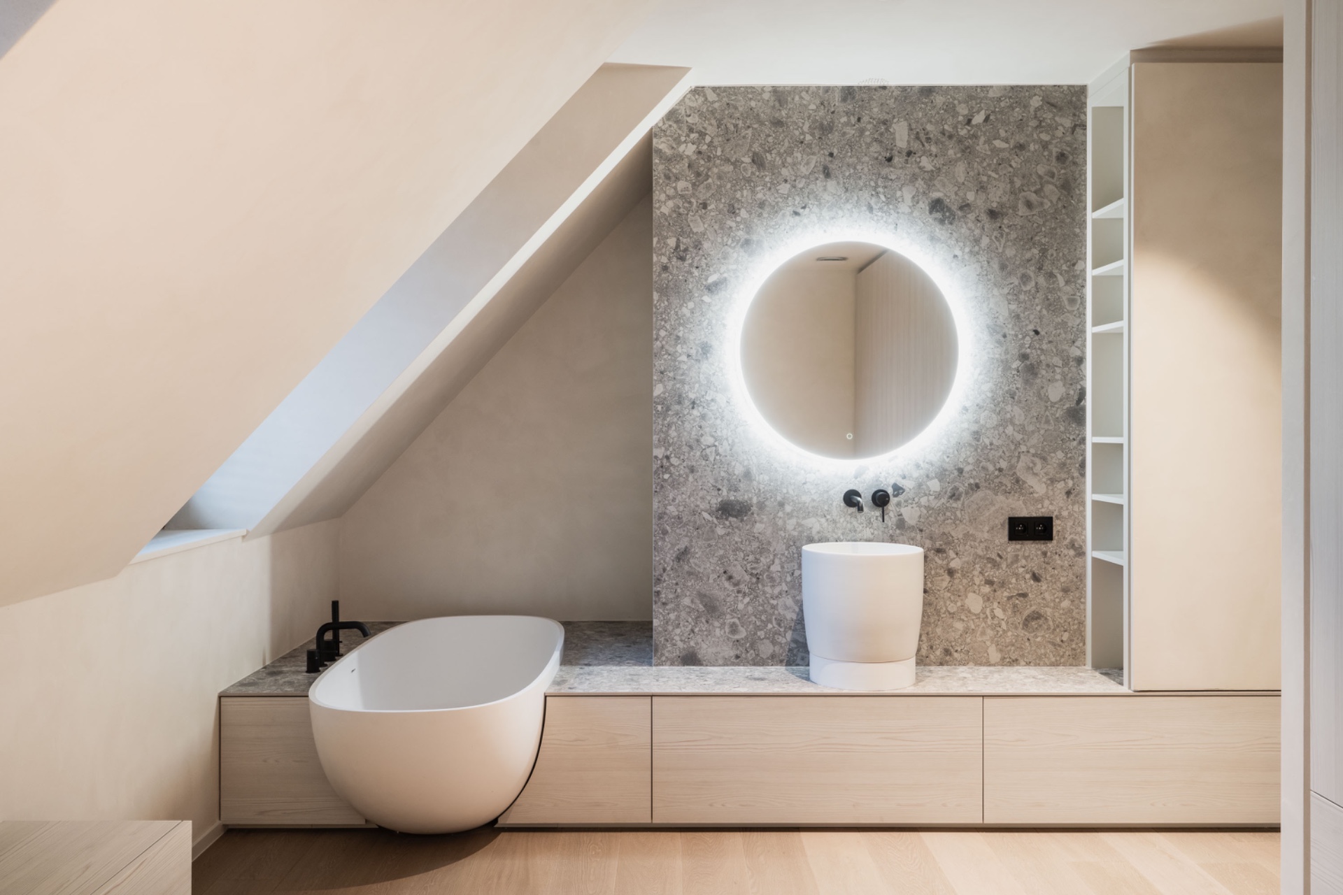
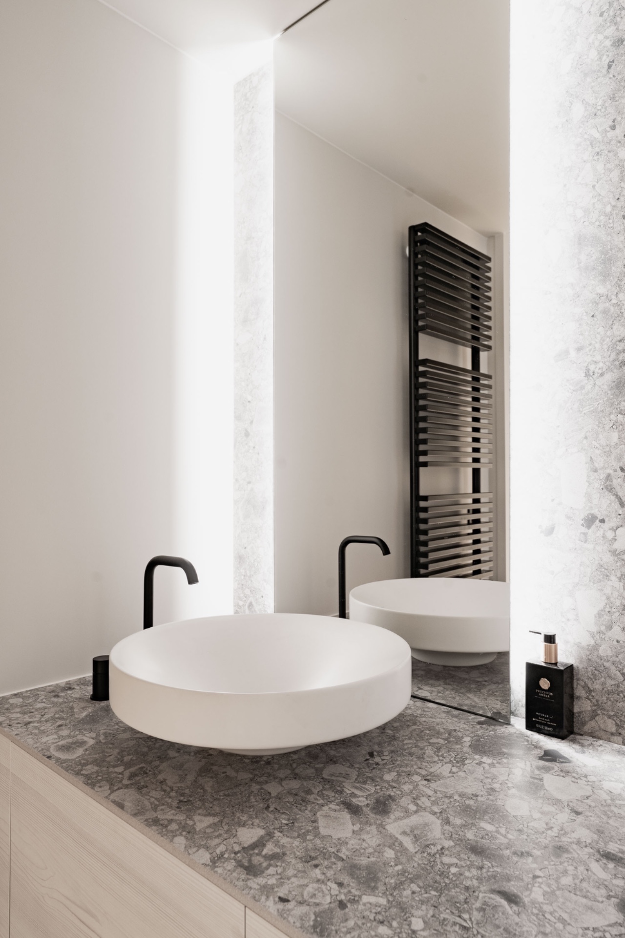
The bathroom shifts into a quieter register, but the same curved logic stays in place. A round mirror halo lighting detail turns the wall into a soft focal point, and the surrounding stone-look surface adds grain and depth. Below, a light wood vanity keeps the composition lifted, while the freestanding oval bath anchors the room with a low, smooth form. Water, light and material are arranged with little interruption, so the room feels composed rather than busy.
Here, the rounded elements do more than echo the rest of the apartment. They slow the eye and loosen the straight lines left behind by the bedroom and stair. The mirror opening, the basin area and the bath all sit within a careful field of pale stone-look finishes. Nothing shouts. The surfaces catch the light in a controlled way, and the room stays focused on the basics: reflection, water, and a material palette that remains consistent from wall to wall.
Across the whole duplex apartment interior, the strongest moves are the quietest ones. A recessed screen wall, a curved cabinet edge, a kitchen with stone-look countertop, a staircase with integrated light line: each detail adds to the same architectural language. The plan stays clear, the palette stays restrained, and the joinery carries most of the visual weight. That is what gives the project its clarity. Every room returns to the same set of gestures, and each gesture is resolved in a way that feels exact to the space.
Photographer: Olivier Strobbe Photography
Suppliers/materials: RR Interieur (furniture), Fraeye (custom joinery), Frédéric Smet (painting), The Fabric (window dressing), Genico (handrail), brushed and lacquered oak veneer in the kitchen, Calco Boss Paints painting technique, Ceppo di Gres stone, Woodstoxx parquet, Bocci lighting.
Want to see more of Lievois Interieurarchitecten? View the page of Lievois Interieurarchitecten for even more great projects and company information.


NEW 2026 Jubileum Edition The Best Interior Designers Benelux
Order Now €125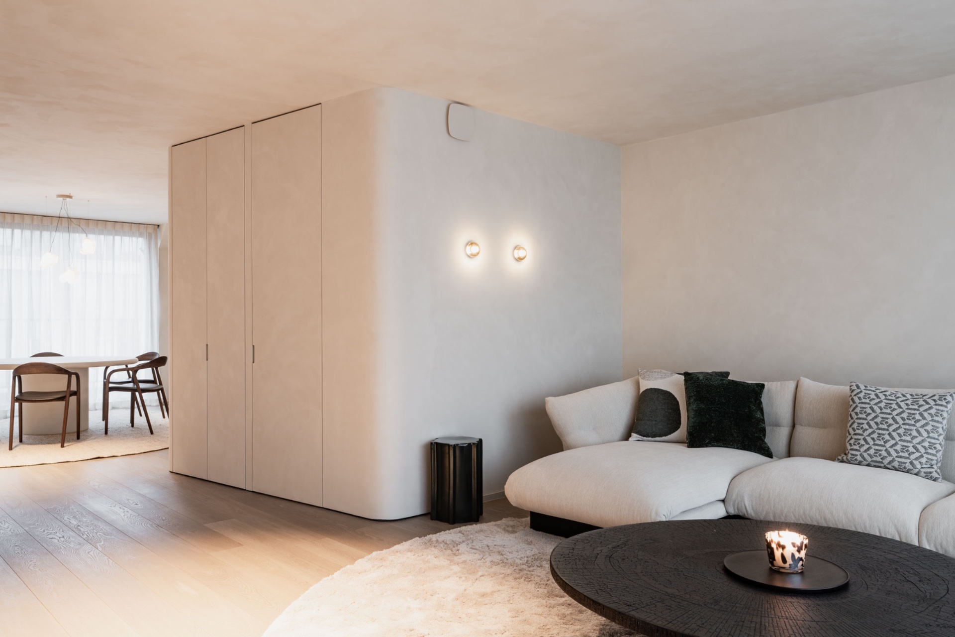
NEW 2026 Jubileum Edition The Best Interior Designers Benelux
Order Now €125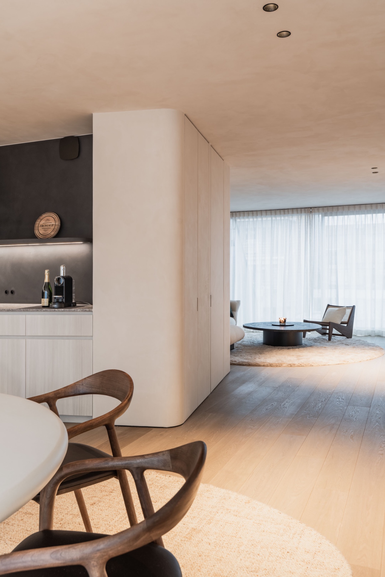
NEW 2026 Jubileum Edition The Best Interior Designers Benelux
Order Now €125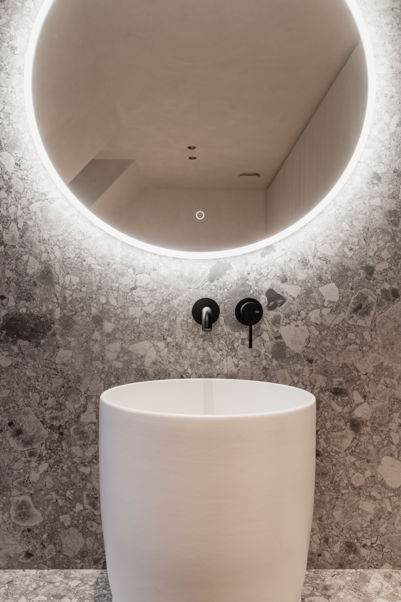
NEW 2026 Jubileum Edition The Best Interior Designers Benelux
Order Now €125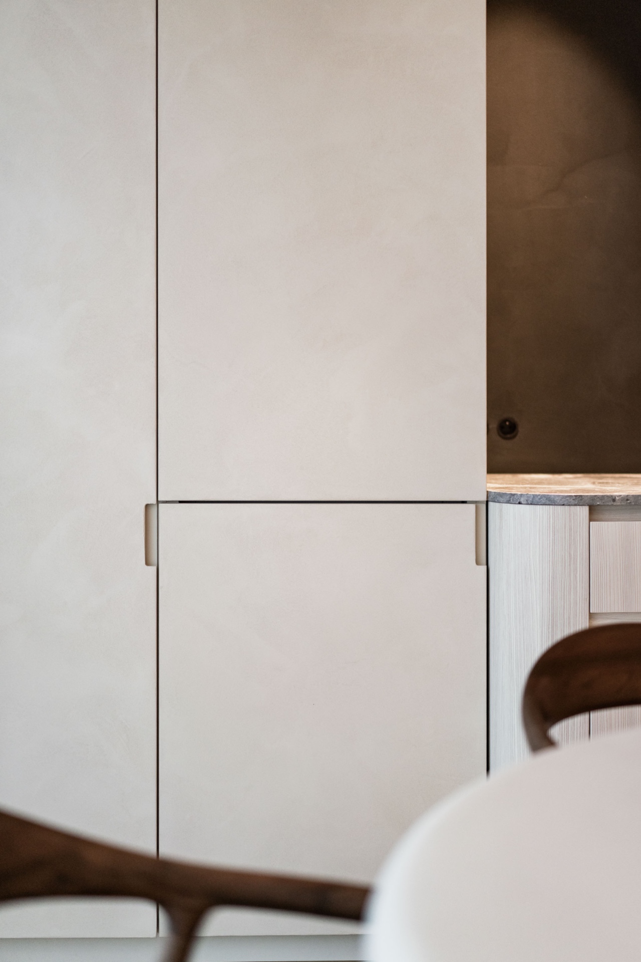
NEW 2026 Jubileum Edition The Best Interior Designers Benelux
Order Now €125