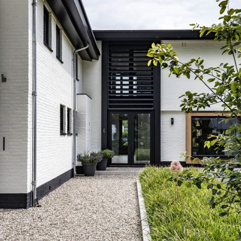
Model home with a glass rear facade, smart home automation & custom interior
Glass opens the rear of the model home before the structure disappears into it. From the living space to the terrace, the view keeps moving through a dark frame and a broad pane of light, while the interior stays anchored by custom joinery in black, white and soft grey. The result is a model home with a glass rear facade and custom interior that reads as one long sequence of surfaces rather than a set of separate rooms. Even the practical side of the house is visible in the way the layout stays level and direct.
One level, with every route kept low and clear
The plan stays on a single floor, which gives the house its calmest feature: no abrupt changes in level, no stairs interrupting the route between kitchen, living area and sanitary zones. That makes the idea of single-floor living for lifetime living easy to read in the room sequence itself. Doors, openings and built-in furniture keep close to the wall lines, so the eye moves horizontally. The emphasis is not on display, but on a layout that can be used without excess motion or detour.
Smart home automation is mentioned as part of the practical layer, but it never takes over the image. What remains visible is the discipline of the interior: flat cabinet fronts, recessed lighting and niches that sit flush with the surrounding wall. The model home with a glass rear facade and custom interior avoids decorative noise. Surfaces are pared back to what the rooms need, and the built form does the rest.
A dark custom wall that carries the living area
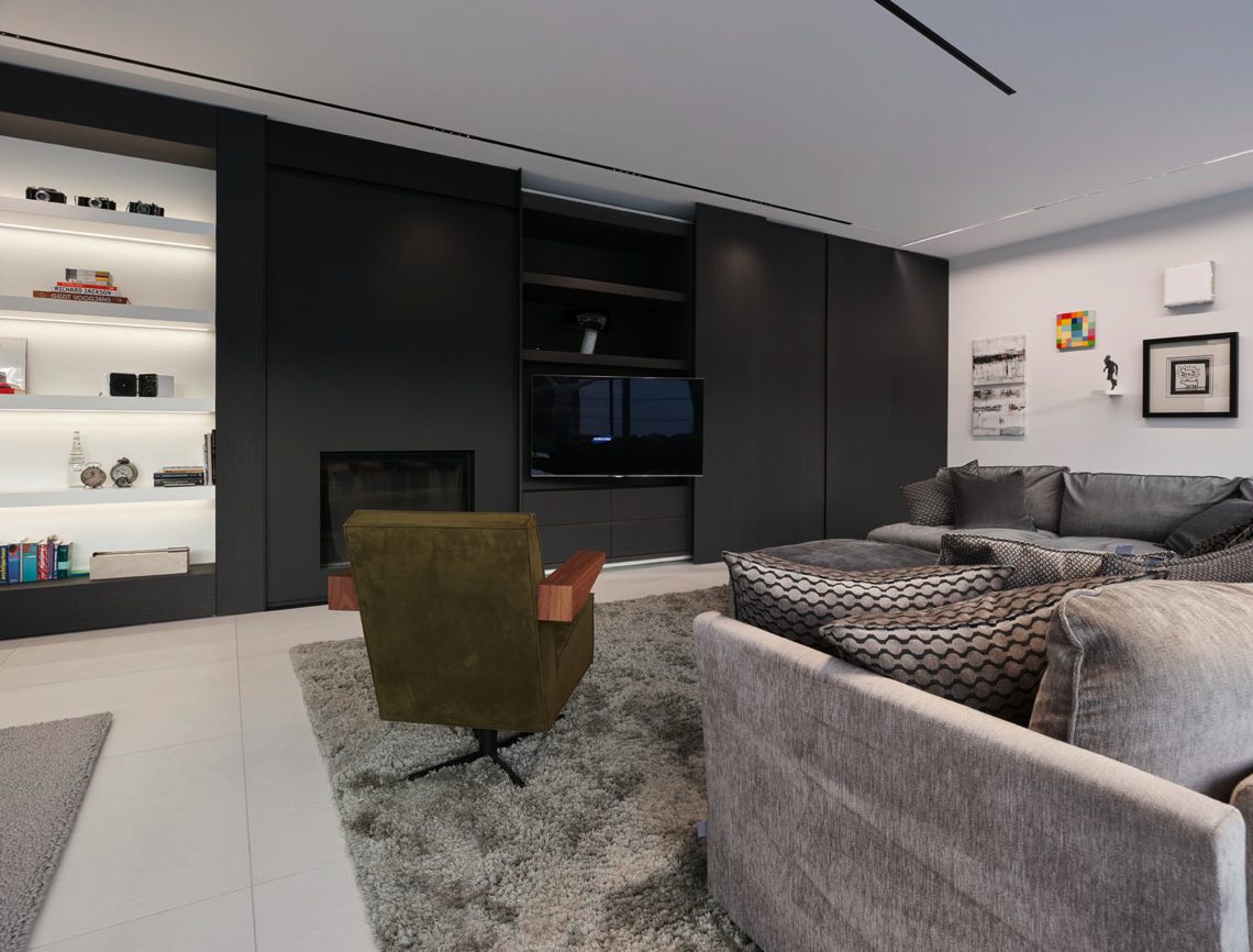
In the living room, a dark custom wall sets a firm edge against the pale floor. It is not just a backdrop for the seating area; it organizes the room through openings, inset modules and a line of integrated light that lifts the wall at night. A grey sofa sits close to this structure, which makes the built-in elements feel part of the daily use of the room rather than a display piece. The geometry is plain, but the detail is exact.
That wall is also where the eye meets the first change in depth. Recessed openings cut into the dark surface and catch light from within, so the room gains a measured rhythm instead of a single flat plane. This kind of minimal custom interior works through restraint: a few strong surfaces, a clear floor, and light placed where it can mark the edges. The room never needs extra ornament because the joinery already gives it structure.
Light, niches and the wall line
Several of the interior images show how the wall detail does more than frame a television or storage zone. It creates a sequence of voids and solids, with small illuminated recesses that break up the dark finish without making it busy. Those openings give scale to the room. They also keep the custom work readable from across the space, especially where the white floor and the softer seating contrast with the deeper wall tone.
The kitchen centers on one large island
The kitchen is built around a generous island, and the sink zone sits directly in that work surface. From the room’s main view, the island acts as both preparation area and visual hinge, with white cabinets lining the wall behind it and a darker back panel holding the composition together. The surfaces are flat and sharply edged. Nothing is left to float or overcomplicate the frame. The kitchen island sink zone is therefore not a separate feature but the clearest sign of how the room is organized.
White cabinetry keeps the perimeter light, while the dark rear wall absorbs more of the depth and makes the niches stand out. The contrast is practical as well as visual: the kitchen reads cleanly, and the island remains the one piece that gathers work, storage and circulation in the same spot. In a model home with a glass rear facade and custom interior, this room shows how the project handles daily use without losing its sharp lines.
White fronts, dark backing, precise edges
The cabinet fronts are broken by narrow vertical lines rather than heavy handles, which gives the kitchen a steady, measured face. The worktop extends cleanly to the sink zone, and the dark wall behind it makes the lighter elements appear even more direct. The room is not trying to be decorative. It is trying to stay legible. That clarity matters in a house where the interior is meant to be read as a set of controlled surfaces.
White utility zones keep the plan visually light
The sanitary and utility-like spaces follow the same discipline. White cabinets, integrated washbasins and smooth wall finishes reduce the number of visual breaks, so the rooms feel compact and exact rather than cluttered. In one image, a long double basin sits inside a pale monolithic cabinet, with one tap per side and a row of ceiling spots above. In another, a basin opening is framed by a simple white block, almost like a cut-out in a larger volume. These are small rooms, but the detailing gives them a clear presence.
What stands out here is not luxury in the obvious sense, but the way the furniture and wall plane are made to work together. The cabinet fronts align with the room edges; the basin openings are set into the surface instead of sitting on top. That makes the rooms quick to understand at a glance. The same logic runs through the rest of the house and keeps the minimal custom interior consistent from one zone to the next.
Glass at the back, sandwich panels around it
The rear of the house is the clearest exterior gesture in the project. A fully glazed back wall takes over most of the elevation, and sandwich panels frame it around the edges. The result is direct rather than elaborate: a broad transparent opening surrounded by solid panels that hold the volume together. In evening light, the interior glow is visible through the glass, so the house reads from outside as a lit box with dark framing and sharp edges. The rear facade is the point where the structure becomes most expressive.
That glazed back side also explains why the garden and terrace feel so closely tied to the house. The opening is large enough for the outside to sit almost inside the room, while the terrace reads as an extension of the floor line rather than a separate outdoor room. The project’s description of garden and terrace as one space is easy to understand here because the boundary is so visually thin. The rear facade does the work by removing what would normally stand between inside and out.
Evening light makes the rear elevation visible
At night, the contrast becomes more striking. The glazed opening carries the warm interior light outward, and the dark frame around it keeps the composition clear against the surrounding surfaces. The model home with a glass rear facade and custom interior relies on that moment to show its structure at its simplest. You read the house as a metal-framed volume with a transparent back, surrounded by panels that keep the form tight and controlled.
Low energy use is part of the architectural idea
The project is described as an E-peil 8 home, and that low figure sits naturally beside the grounded layout and the compact shell. The house is not presented as a technical display, yet the number matters because it supports the idea of a restrained, carefully ordered dwelling. The level floor plan, the controlled envelope and the clear rear opening all fit that reading. Energy performance is not isolated from the architecture here; it is part of the same direct approach to the building’s shape and use.
What lingers after the interior views and the exterior shots is the consistency between detail and plan. The dark custom wall with integrated lighting, the kitchen island sink zone, the white vanity cabinetry and the glass rear opening all speak the same language of clarity. In this model home with a glass rear facade and custom interior, every room seems measured against the same line, and that is what gives the project its precision.
Want to see more of Pas Interiors & Architecture? View the page of Pas Interiors & Architecture for even more great projects and company information.





NEW 2026 Jubileum Edition The Best Interior Designers Benelux
Order Now €125