Warm luxury interior with herringbone flooring
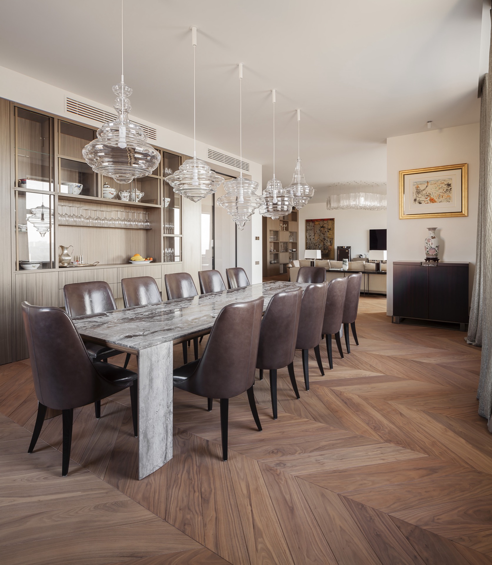
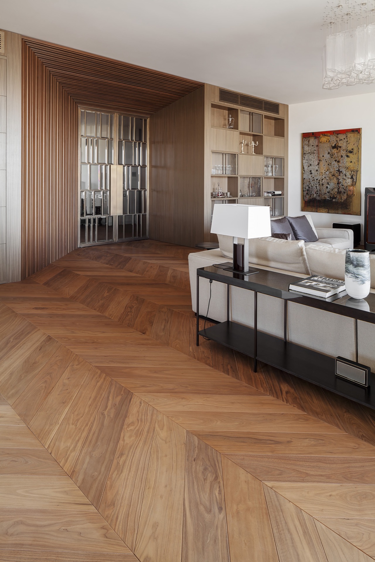
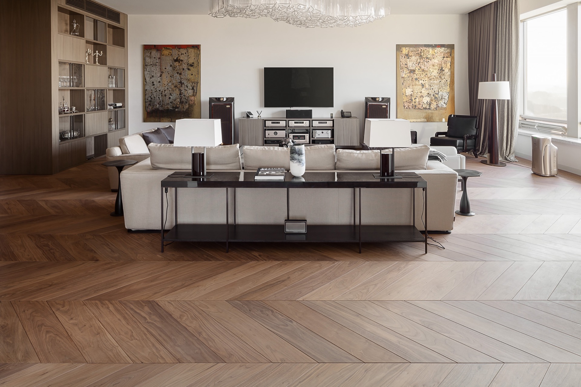
The first thing you notice is the floor. Long dark walnut boards run through the rooms in a herringbone pattern, pulling the eye past the seating area and toward the dining zone. The finish is matte, so the grain stays visible instead of catching glare. Around it, the rest of the interior is kept deliberately steady: wood, bronze, leather, and marble, each material used as a clear surface rather than decoration.
Herringbone flooring as the main line through the apartment
The herringbone flooring does more than set a pattern underfoot. It gives the interior a fixed direction, especially where the plan opens from one zone to another. In the living room, the dark timber warms the white walls and breaks up the pale ceiling and curtains. Because the boards continue without interruption, the floor reads as one long surface instead of a series of separate rooms. That continuity is what gives the project its calm, measured feel.
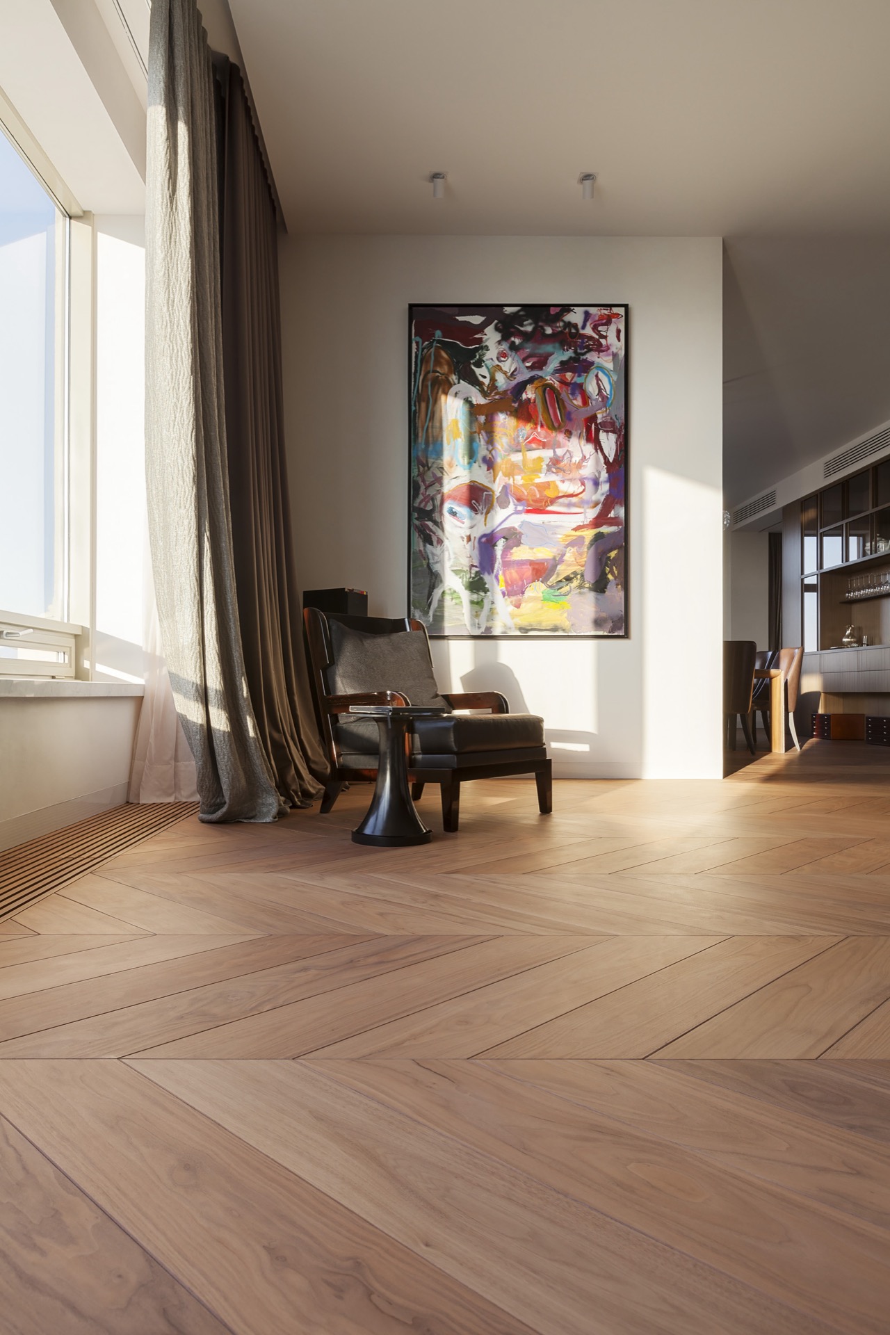
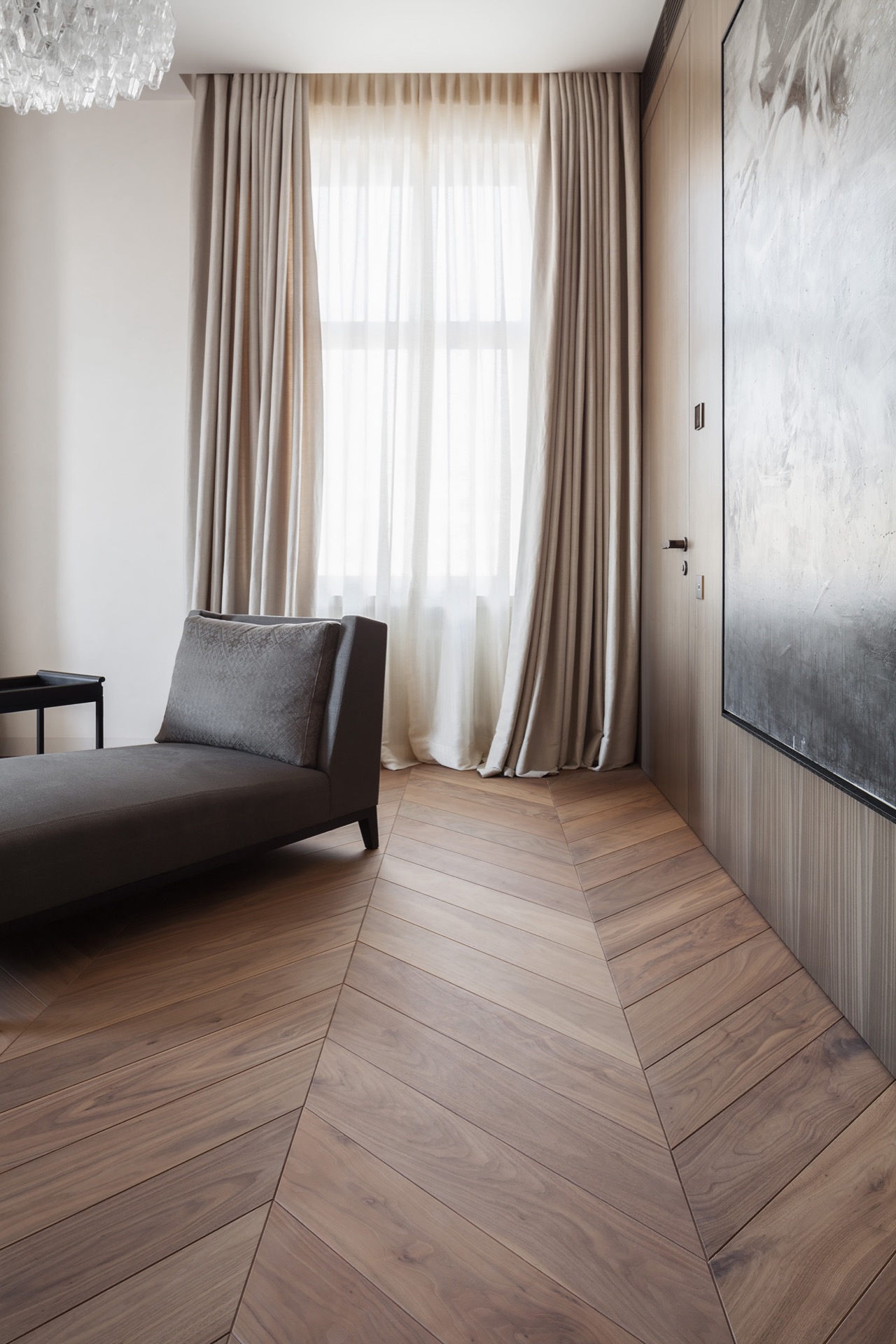
Massive American dark walnut was chosen for the floor, which gives the wood interior its deepest tone. The chevron layout adds movement, but the surface itself stays restrained thanks to the Pure Ultramatt Poly finish. Nothing here feels glossy or overworked. The wood keeps its texture, and the visible pattern becomes a structural part of the room, guiding the furniture placement and linking the sitting area to the dining corner.
Warm wood, bronze, leather, and marble in one palette
The material palette is limited, but each element has a distinct role. Wood handles the largest surfaces, bronze introduces sharper lines, leather softens the seating area, and marble appears in smaller, cooler accents. This is what keeps the room from flattening into one tone. The surfaces are not competing for attention; they sit close together and show their differences in grain, sheen, and edge detail. The result is a warm luxury interior that relies on material clarity rather than ornament.
Custom cabinetry extends that idea. Cabinet fronts are built into the walls, with open shelves, glazed sections, and recessed niches that keep the volume from feeling heavy. In the images, the joinery also takes on practical tasks: vents are integrated into the cabinetry, and the same disciplined approach appears in matching radiator cover details. These are the kinds of elements that usually disappear into a room, yet here they help define the composition.
Details that sit flush with the room
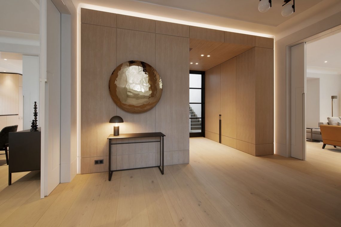
Integrated radiator cover elements and wooden socket details are small, but they matter because they keep the wall surfaces visually quiet. Instead of breaking the room with separate fixtures, the detailing follows the cabinetry language. The same wood tone appears across built-ins and trim, so the eye moves across the wall without stalling at technical interruptions. That restraint allows the furniture and artworks to stand out against larger, cleaner planes.
There is also a strong sense of hand-finished precision in the way the custom pieces are composed. A recessed opening, a grille line, a cabinet edge, or a flush outlet becomes part of the architecture rather than a late addition. This is not about making the room minimal. It is about controlling what remains visible, which is why the materials can stay rich without becoming noisy.
Glass pendant lights and the dining corner
The dining area brings in a lighter note through the lighting. Glass pendant lights hang above the table in a clustered form, so the fixtures read almost like a suspended arrangement of clear vessels. Their transparency keeps the ceiling open, while the multiple bulbs give the zone a defined center. Beneath them sits a stone-look dining table with a pale top that cools the darker wood around it and gives the room another surface to read against.
That table helps link the dining area back to the rest of the apartment. Its light-colored top sits between the walnut floor and the darker cabinetry, creating a pause in the palette without interrupting it. Because the surrounding furniture stays low and measured, the pendant lights and tabletop become the most immediate contrast in the room. It is a quiet move, but an effective one: light glass above, dense stone below, wood framing both.
Living areas shaped by daylight and wall treatment
Near the windows, curtains soften the daylight before it reaches the seating area. The room does not rely on strong contrast; instead, the light is filtered across the wood floor, the white wall behind the television, and the darker built-in storage on the opposite side. In one view, an abstract artwork sits in a black frame on a pale wall, giving the room a sharp focal point without adding color noise. The composition stays open enough for the floor pattern to remain visible across the full width of the space.
Wall treatment is used with the same discipline as the joinery. Some surfaces are smooth and painted, while others carry wood slats or stone-like finishes that shift the texture without overwhelming the room. That variation keeps the apartment from feeling repetitive. It also shows how the interior was arranged for both everyday use and receiving guests: a sofa, media wall, and built-in storage are all present, but none of them fights the timber surface that binds the rooms together.
Why the floor still leads the composition
Even with the cabinetry, lighting, and art, the herringbone flooring remains the anchor. Its scale is generous enough to be read from room to room, yet the pattern is not so strong that it overwhelms the rest of the interior. Instead, it acts as a frame for the furniture and a bridge between materials. The dark walnut adds depth at floor level, while the matte finish keeps the surface grounded and tactile. That is what makes the project feel composed rather than staged.
Seen as a whole, the apartment is built from a limited set of decisions repeated with discipline: continuous wood flooring, custom storage, controlled lighting, and a few carefully placed stone and metal accents. The rooms look settled because every visible element has been edited down to its essential role. The effect is not decorative excess. It is a measured interior where herringbone flooring, bespoke joinery, and clear material contrasts hold the space together.
Want to see more of Ebony and Co? View the page of Ebony and Co for even more great projects and company information.


NEW 2026 Jubileum Edition The Best Interior Designers Benelux
Order Now €125