Geometric house design
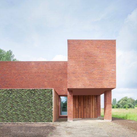
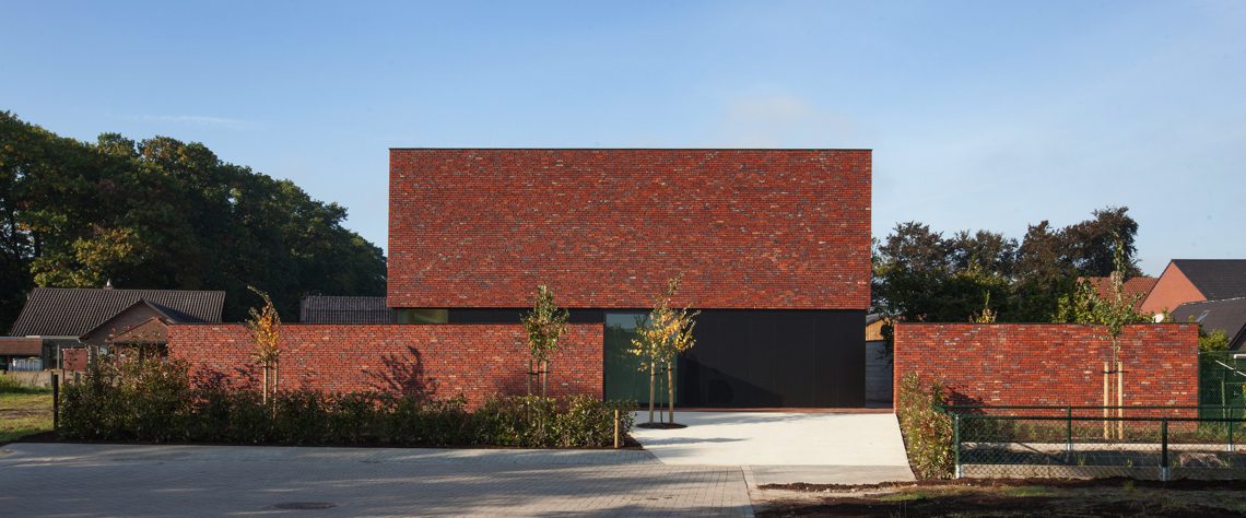
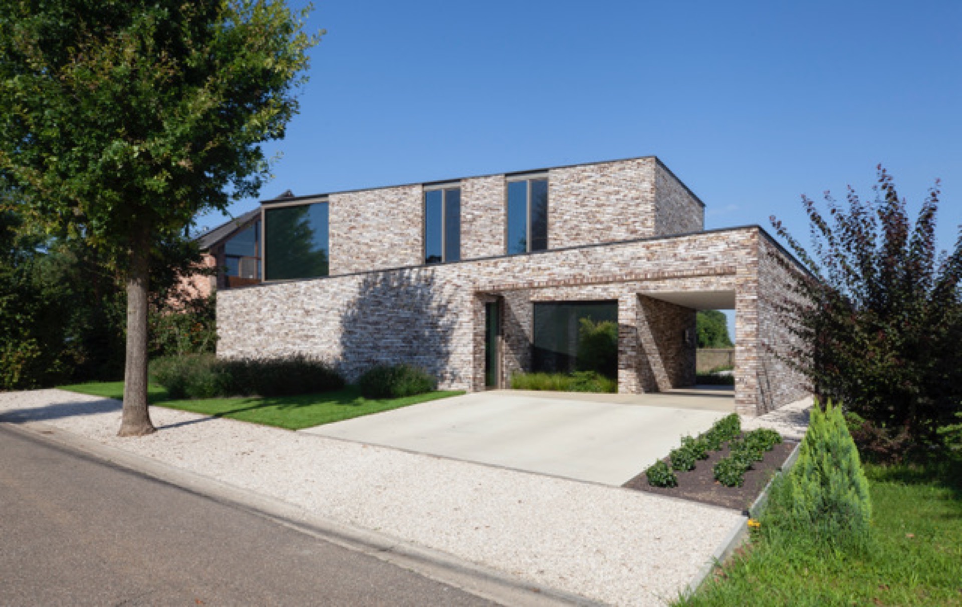
Angled along the street, the plot sets the first move of the house. Instead of following that line with the full volume, the building keeps a rectangular footprint and lets the front edge trace the site boundary. That decision leaves a wedge-shaped forecourt, a small but active slice of space that carries the entry sequence, the carport access and the shift from street to home. The result is a geometric house design that begins with land use rather than form for its own sake.
Brickwork that holds the line
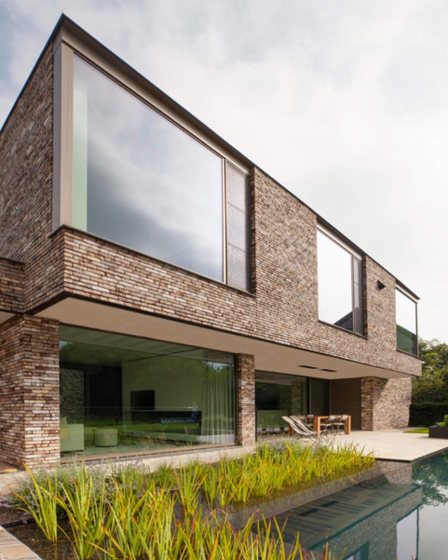
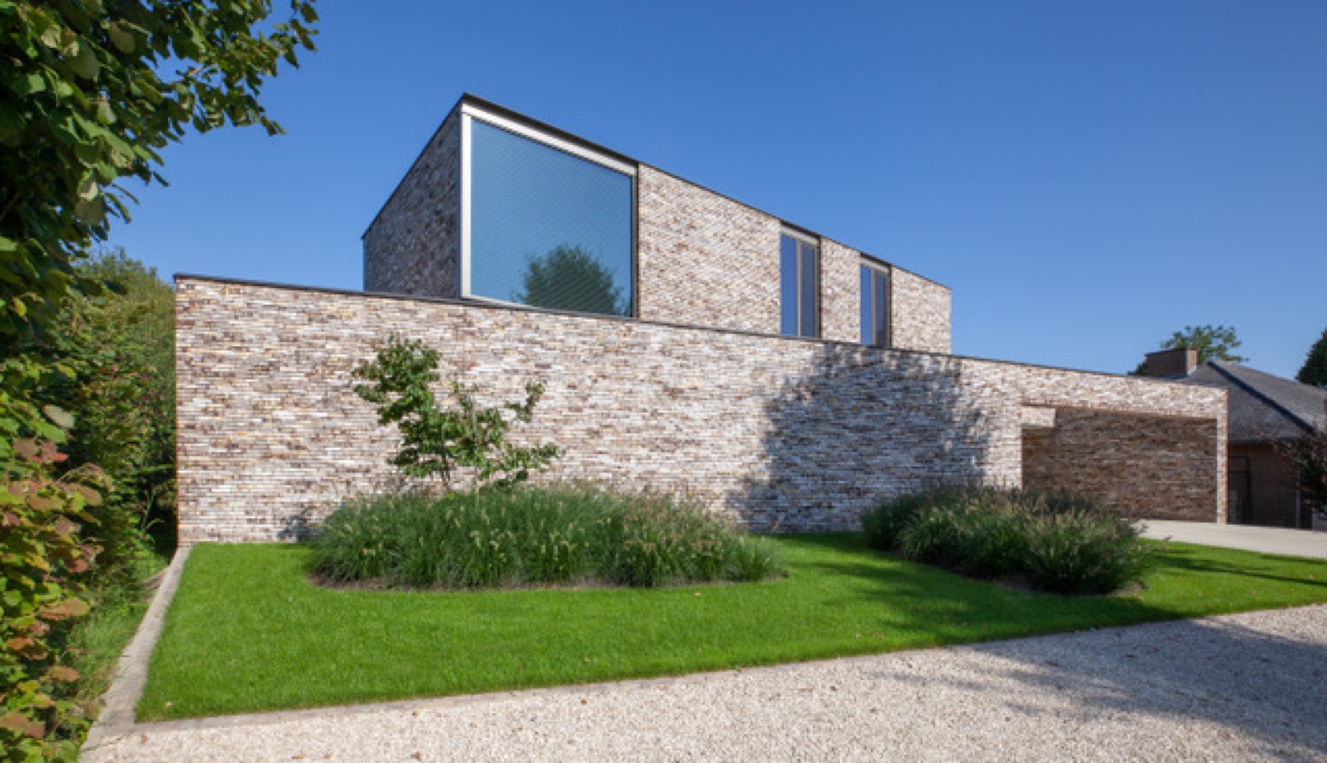
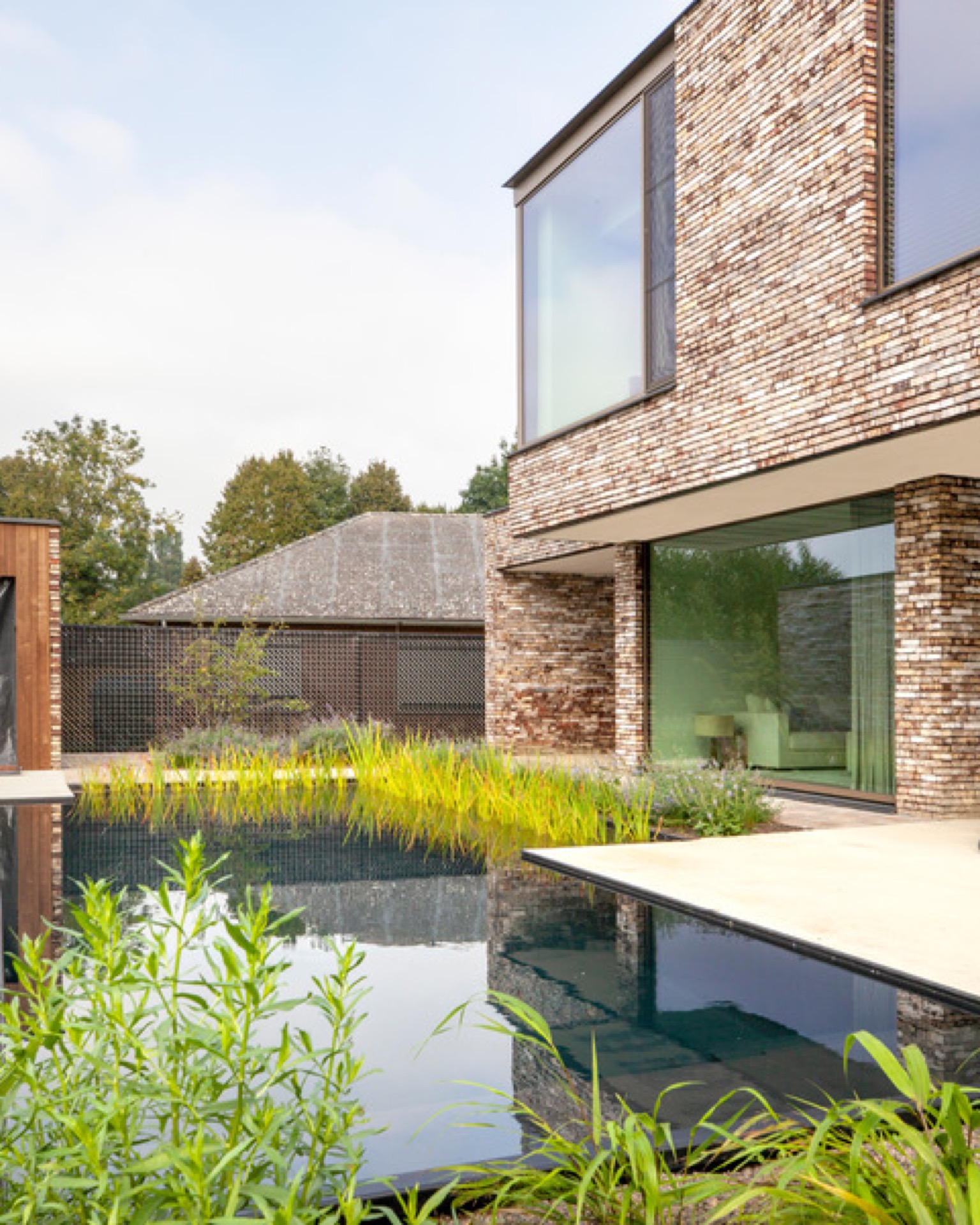
The front elevation reads as a geometric facade with a clear rhythm in the masonry and dark window frames cutting through it. The brick face follows the skewed building line, while the main volume stays calm and rectilinear behind it. This split between edge and mass keeps the living areas from being forced into the irregular shape of the site. In the forecourt, the narrow triangle of open ground becomes more than leftover space; it works as a buffer, a threshold and a place where the plan starts to unfold.
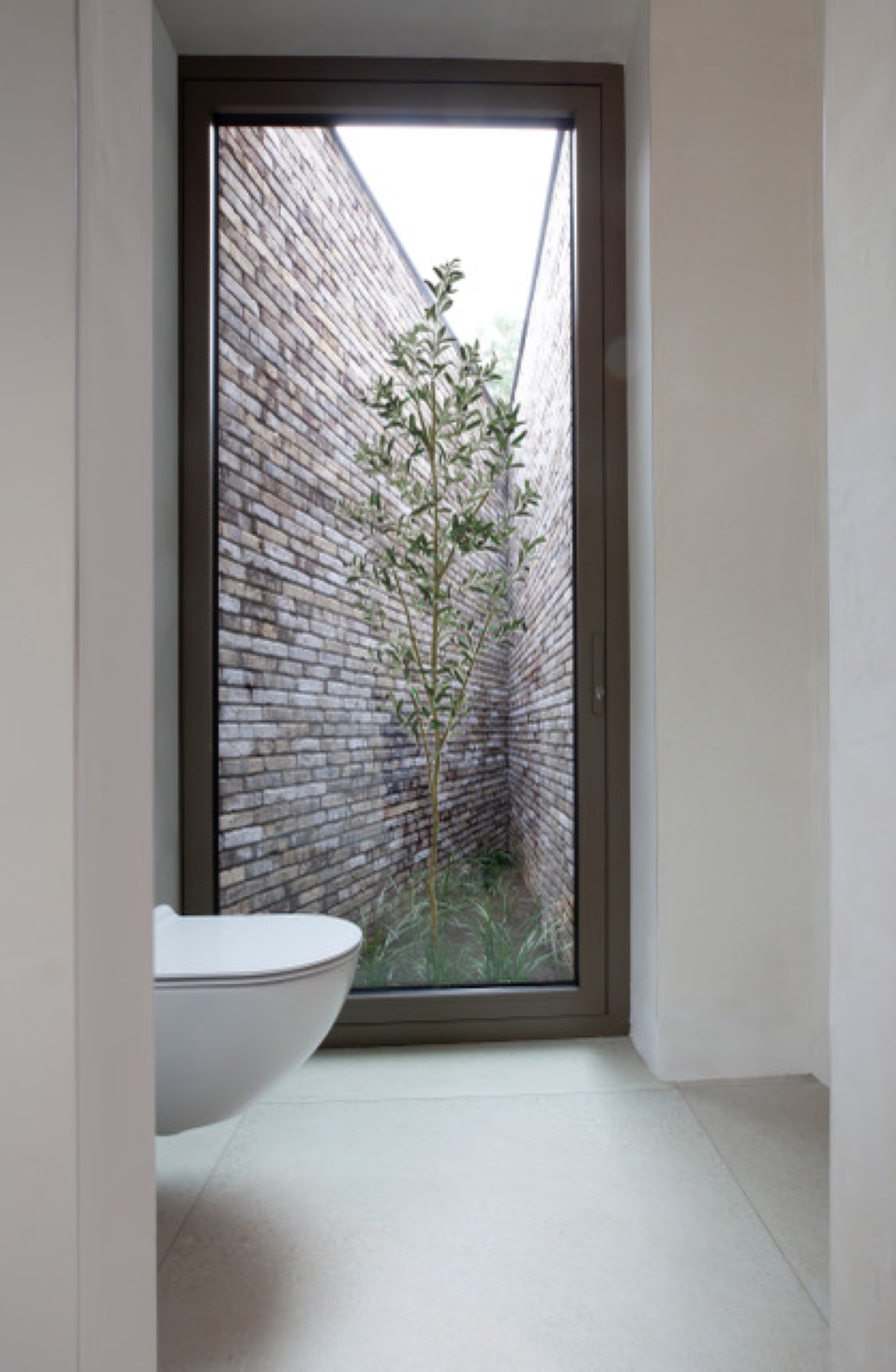
At the right boundary, the carport is positioned close to the plot edge. From there, a patio near entrance guides the route toward the hall, pulling movement through a sheltered sequence rather than straight into the house. Behind the hall, the last corner of the wedge is used for a toilet with its own adjoining patio. A full-height window gives that room a direct view of the outdoor court, so even the smallest space stays connected to light and air. It is a precise use of an awkward residual area.
Living spaces set around light and movement
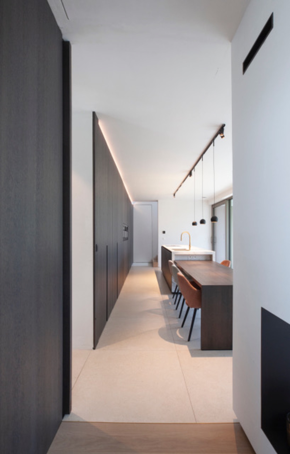
The ground floor is taken up by a generous living room and a kitchen-dining space that opens around the central stair. The kitchen stair becomes part of the daily circulation, while a technical storage room sits tucked away behind it. Nothing here is oversized for effect. The plan uses the straight geometry of the house to keep sight lines clear, so the spaces read in layers: street, hall, living zone, kitchen, and the covered outdoor edge at the rear. The geometry is practical, but it is also what gives the interior its order.
White walls and warm wood accents define the interior without crowding it. The materials are limited, and that restraint lets the openings do their work. In the living zone, large windows and daylight spread across the room and pick out the edges of the furniture and joinery. Where the light lands, the surfaces soften; where it leaves, the brick and frame details take over again. The house does not rely on decoration to create interest. It relies on openings, proportions and the contrast between pale walls and wood.
Across the rear elevation, a covered terrace sits in the middle and breaks the facade into transparent and solid parts. That central recess adds depth to the back of the house and makes the transition between interior and exterior visible from several angles. From inside, the overhang frames the garden side; from outside, it marks the point where the volume opens and closes again. This is where transparent architecture becomes legible in the simplest way: through glass, shadow, and the line of the roof above.
Two-storey landing light and the upper floor route
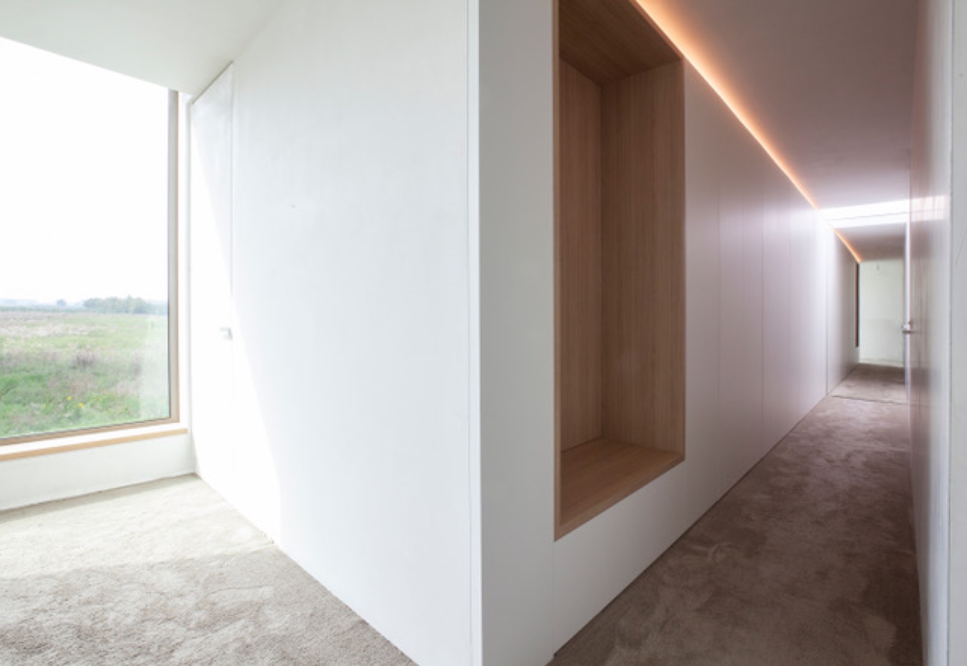
Upstairs, a generous landing links the sleeping rooms and carries daylight deep into the night hall through two full-height glazed openings. The vertical glass brings a strong two-storey landing light into a part of the plan that could easily have become a dark corridor. Instead, the circulation space acts almost like a room of its own. The change in light is immediate: the stair rises from the ground floor, and the upper hall receives light from openings tall enough to read as part of the architecture, not just as windows.
Rooms arranged by side of the house
On the street side, the children’s rooms and a wet room line the hallway. On the opposite side, the parents’ bedroom is paired with a spacious bathroom. The arrangement keeps the route clear and separates the sleeping spaces without wasting square metres on unused passage. Large windows on this floor look out to the surroundings, and their scale matters as much as their placement. They hold the views at a height that matches the landing, so the upper level feels open even where the plan is compact.
The bathroom benefit from a deeper window opening and a long view through the room, while the hallway carries the same language of restraint seen below. Pale surfaces, dark frame lines and wooden accents reappear in smaller gestures, enough to keep the upper floor tied to the rest of the house. The minimal interior with wood accents is not a style applied afterwards; it is the visible result of limiting the palette and letting the geometry stay in charge. Light, in this setting, becomes the main finishing material.
Transparency used as a planning tool
Seen as a whole, the house uses transparency to solve a difficult plot without making the plan feel forced. The brick facade gives the street edge a firm outline, while the patio near entrance, the full-height window in the toilet and the covered terrace at the rear open the volume where it needs relief. Glass is never applied as a blanket effect. It appears where circulation changes, where a small room needs a view, and where the rear wall can break into lighter parts. That careful placement gives the house its clarity.
The strongest moments are the ones where structure, light and movement meet: the wedge-shaped forecourt, the hall reached from the patio, the kitchen stair, and the landing flooded by tall glazing. Together they turn an irregular site into a sequence of sharp, readable spaces. The geometric house design is not about spectacle. It is about holding a line, using every corner, and letting openings, masonry and timber do their work in plain sight.
Want to see more of Egide Meertens Plus Architecten? View the page of Egide Meertens Plus Architecten for even more great projects and company information.


NEW 2026 Jubileum Edition The Best Interior Designers Benelux
Order Now €125